
Adidas Running is a fitness tracker that logs workouts, maps routes, and records performance data such as pace, calories, and distance. With adaptive training plans, progress tracking, and social features like community groups and challenges, it supports beginners and experienced athletes in setting goals, staying motivated, and advancing their fitness journeys.
Home Screen and Start Button
The app’s home screen centers around a large rectangular Start button ①. This is an example of clear affordance and signifiers. Its bold size, central placement, and text label make it immediately obvious that clicking will begin an activity.
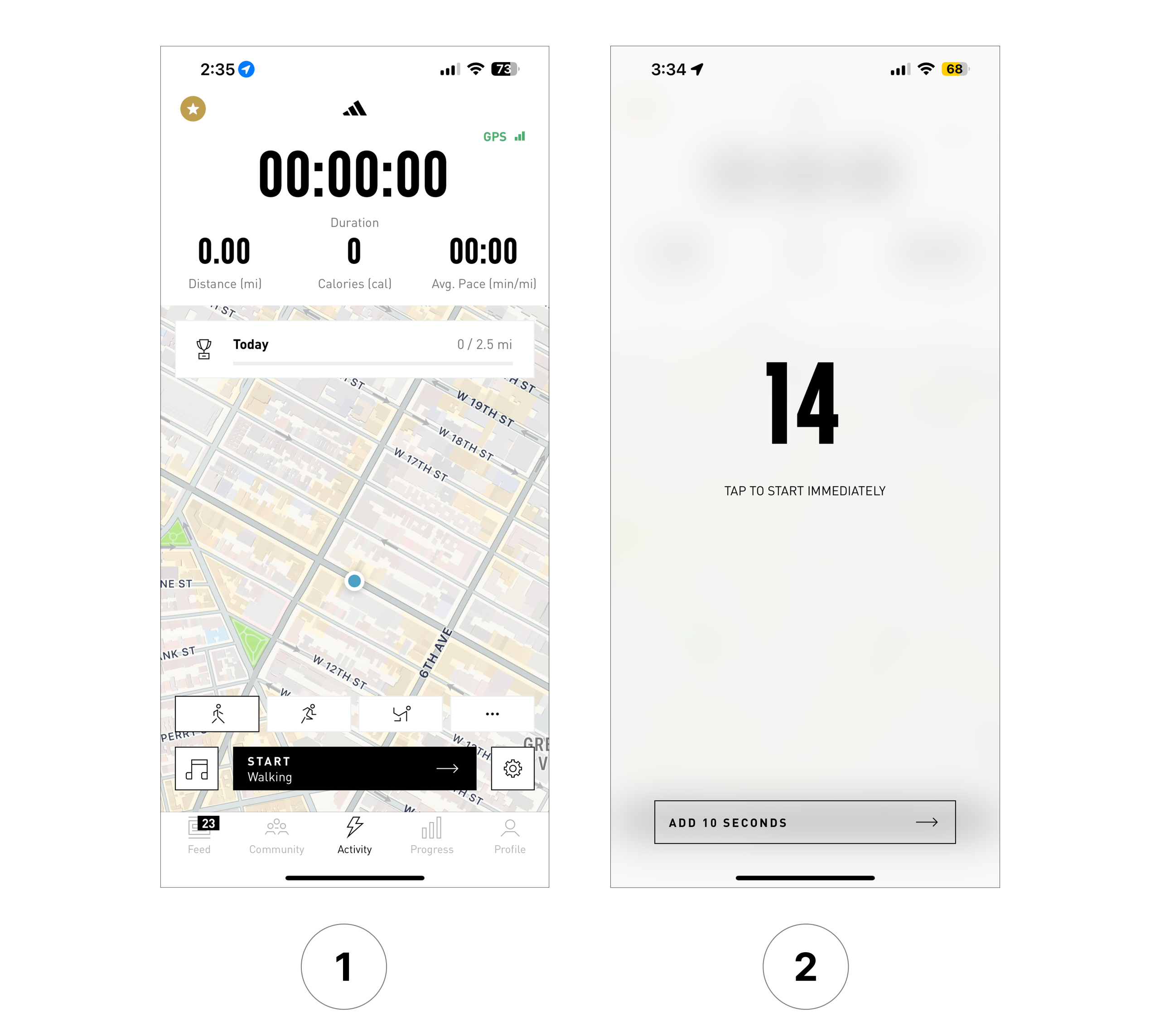
The button also aligns with users’ conceptual models: most expect a prominent control at the center of the screen to trigger the core function. Once clicked, the app provides feedforward through a countdown timer ②. On this screen, users can either “start immediately” or “add 10 seconds,” offering flexibility and reinforcing discoverability.
This design applies Norman’s principles of simplicity, visibility, and feedback, making the app’s core action straightforward and intuitive. Once an activity begins, real-time metrics such as distance, calories, and pace provide immediate feedback, helping close the Gulf of Evaluation between user expectations and the system state.
Countdown Screen
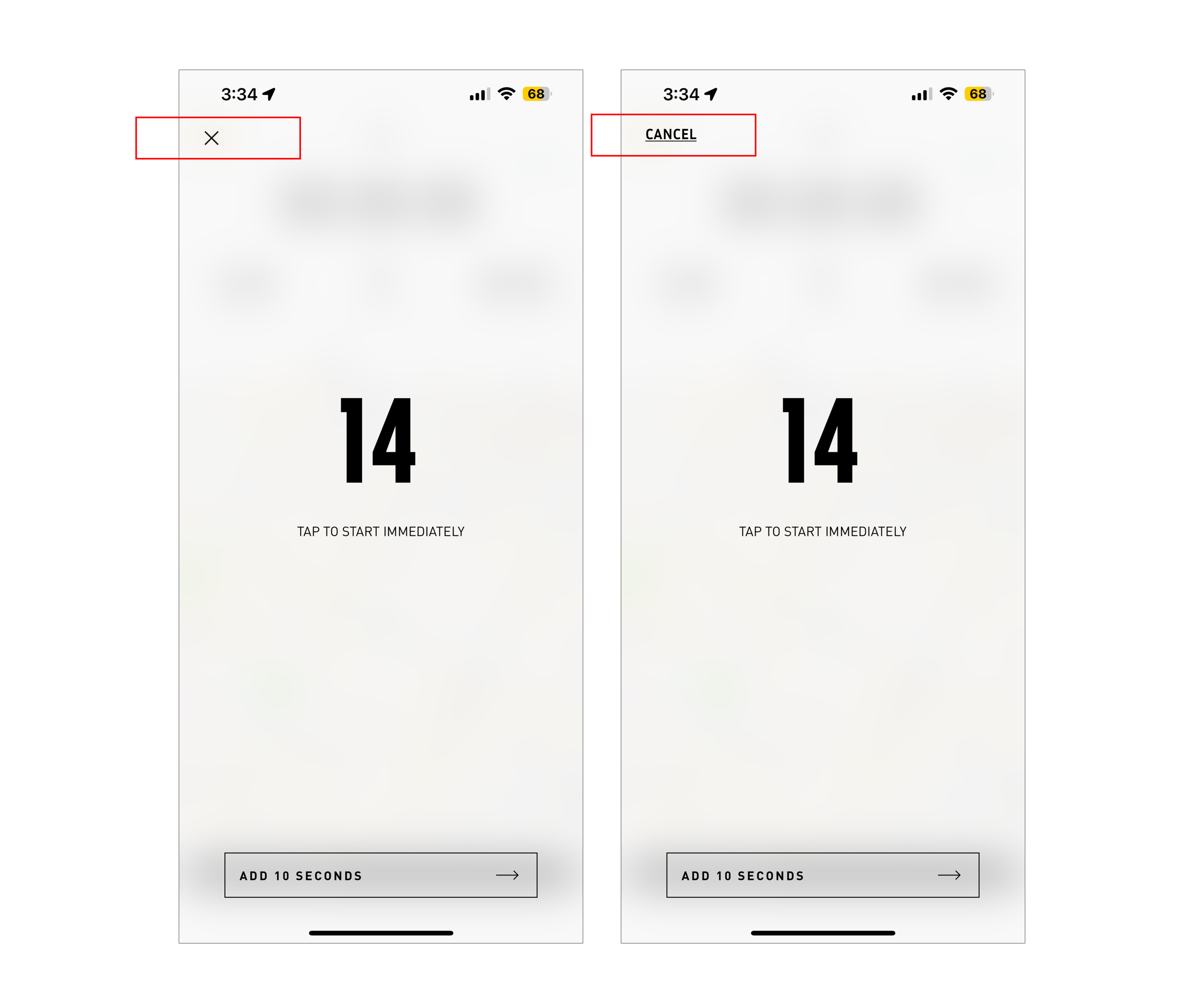
On the countdown screen after pressing “Start,” users are locked in: the only options are to start immediately by tapping anywhere on the screen or add time by clicking the button below ①. There is no direct way to return to the home screen.
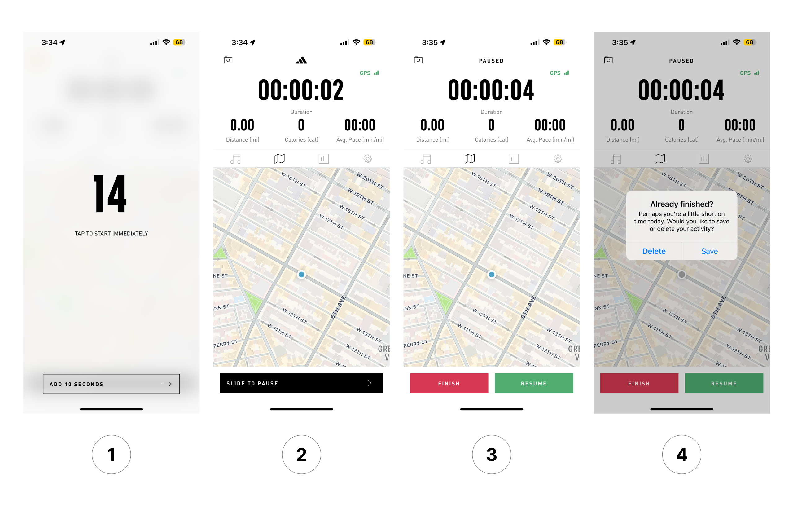
If a user changes their mind, canceling requires several extra steps: letting the activity begin ①, sliding to pause ②, selecting Finish ③, and then choosing Delete ④. The action is possible, but the flow feels indirect.
While the delay may be intended to give runners time to put their phone away, it adds an extra step to what should be the most direct action in the app. From a design perspective, this creates a constraint that prevents users from easily reversing execution once it has begun. It also adds to the Gulf of Execution, since the user’s intention (to cancel) cannot be carried out with a single, obvious action.
Solution: Add a clear “Cancel” or “X” button. This visible signifier would restore the affordance of exiting and align with Norman’s principle that users should always be able to reverse an action.
Pause Interaction
Once an activity begins, the pause function requires a different interaction. Starting an activity requires a tap ①, but pausing it requires a swipe ②. This breaks natural mapping: users expect similar tasks (start and pause) to use similar interactions. It also disrupts procedural knowledge, since a tap begins the activity but the same action cannot stop it.
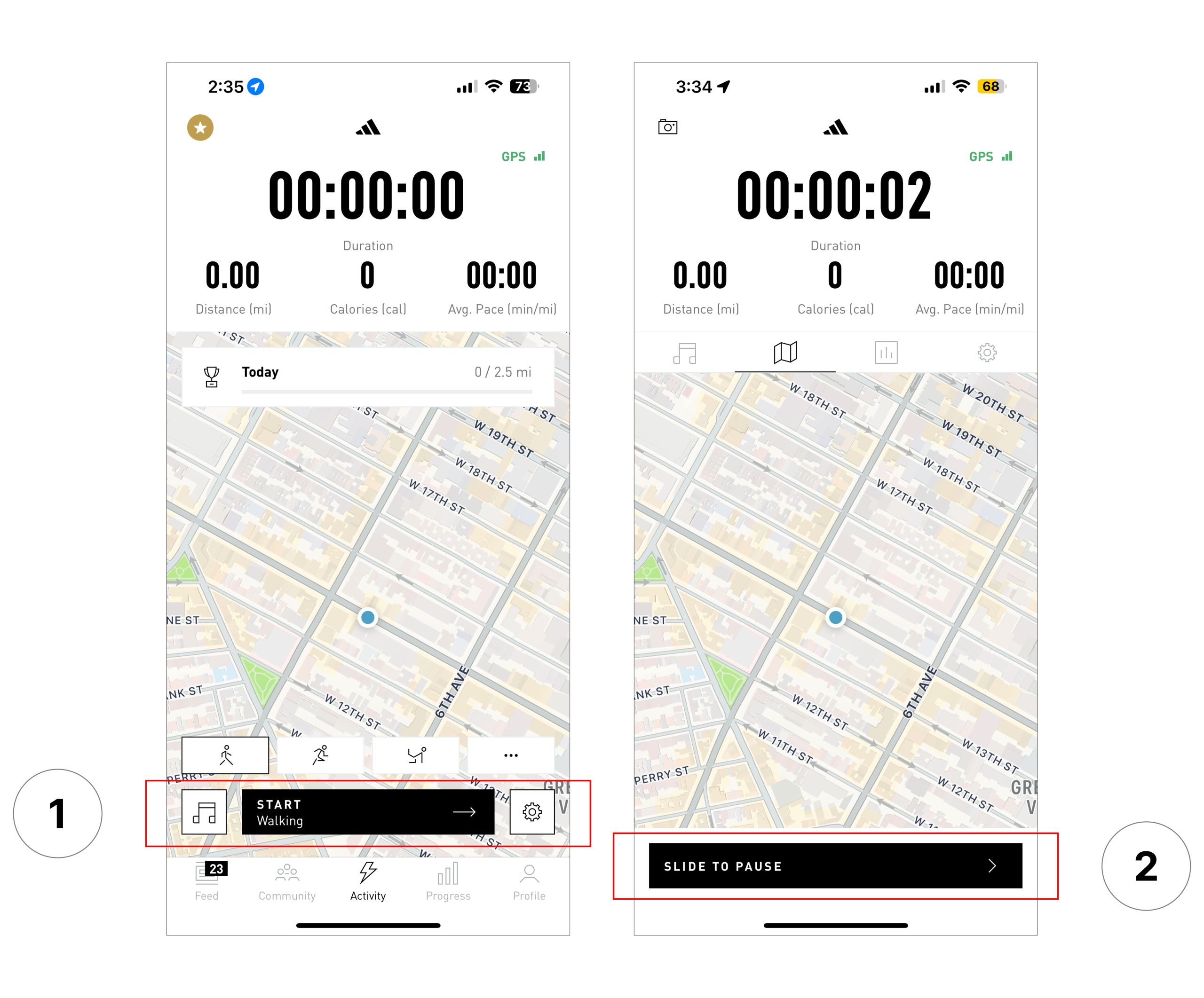
The mismatch raises the risk of slips, especially during a workout when attention is divided. Instead of reinforcing the good design of the Start button, the pause gesture undermines it.
Solution: Make the Start and Pause interactions consistent. For example, if starting is a tap, pausing should also be a tap on a clearly labeled button. Alternatively, if swiping feels safer against accidental taps, then both actions should use swipe. The key is to preserve natural mapping by keeping the same gesture for both actions.
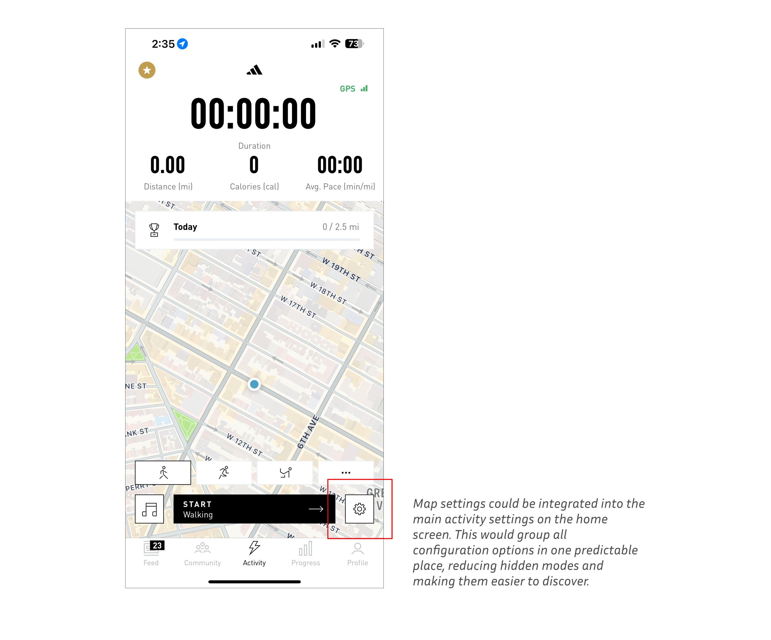
Map Interface
On the home screen, a map displays the user’s location. Most users expect to swipe or drag to explore. In the app, however, swiping in any direction ① unexpectedly opens the “map settings.” ②
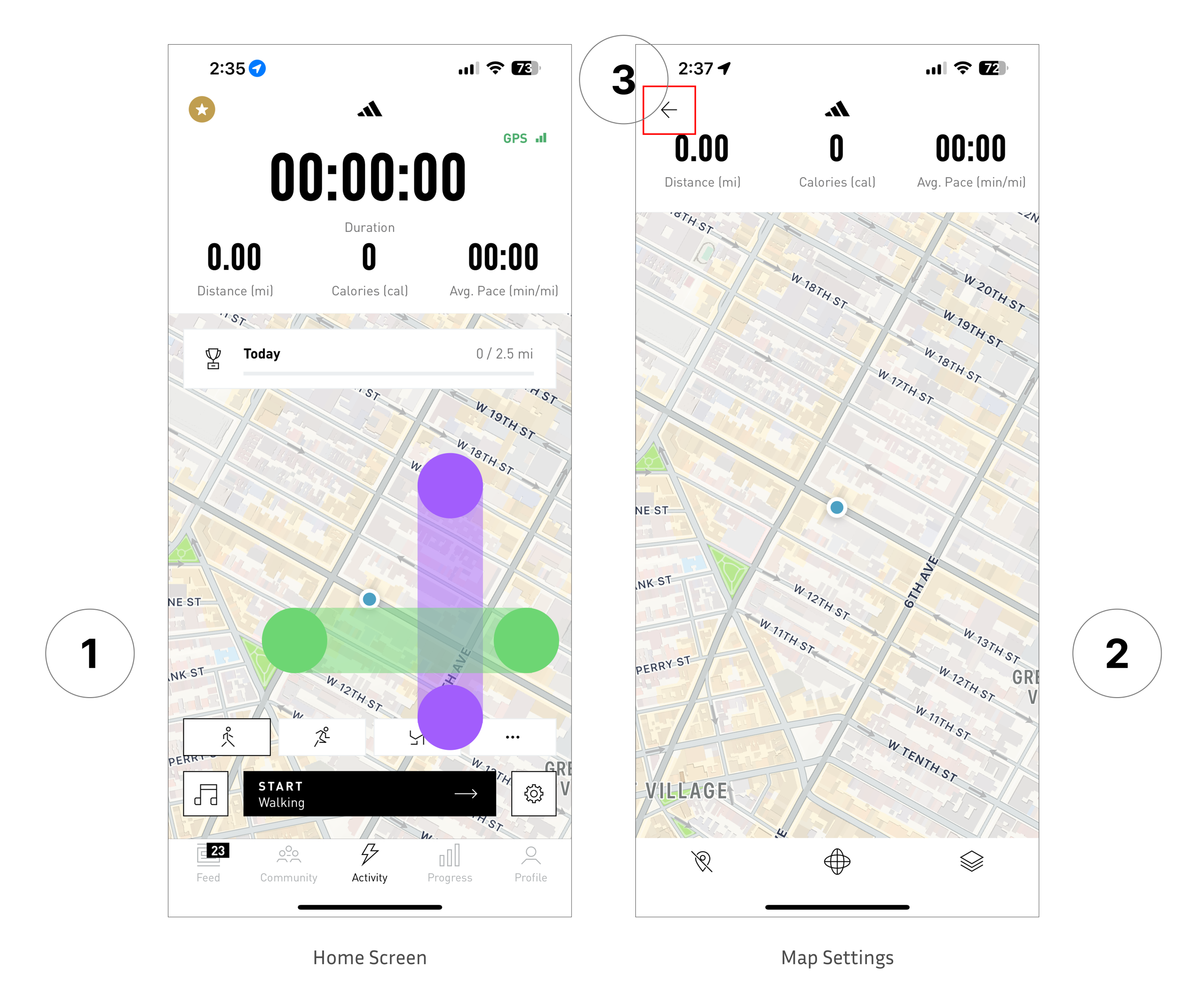
This mismatch creates mode errors because the same gesture produces an unintended result. The feature is also hidden: there are no signifiers to indicate that this mode exists. Once inside, navigation works as expected, users can pan, zoom, and drag, but entering relies on a hidden swipe, and exiting depends on a small back button in the corner ③.
Solution: Keep universal gestures for map navigation. If additional panels are necessary, access should be provided through an explicit signifier such as a button or tab. Maps must preserve their primary affordance: the ability to drag to move around the map freely.
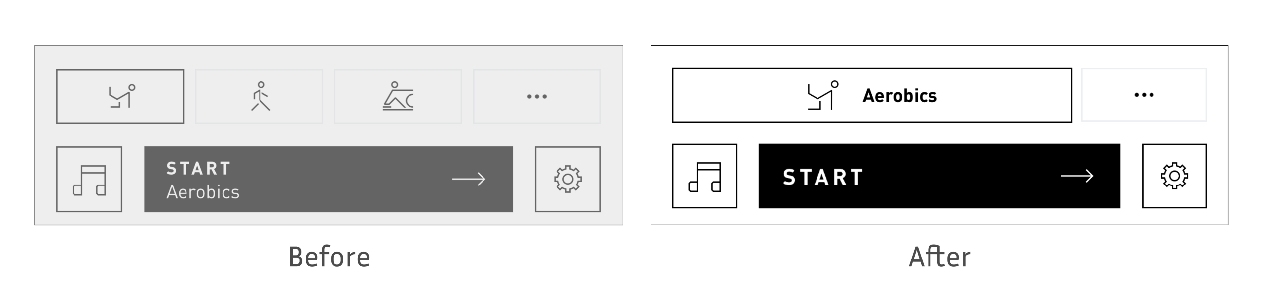
Ambiguous Activity Icons
The activity selection screen introduces unnecessary ambiguity. Many of the icons, such as rowing or aerobic, are visually abstract and difficult to interpret without supporting labels. Because their meaning is not self-evident, the app forces users to rely on knowledge in the head (memory or guesswork) rather than knowledge in the world (visible cues).
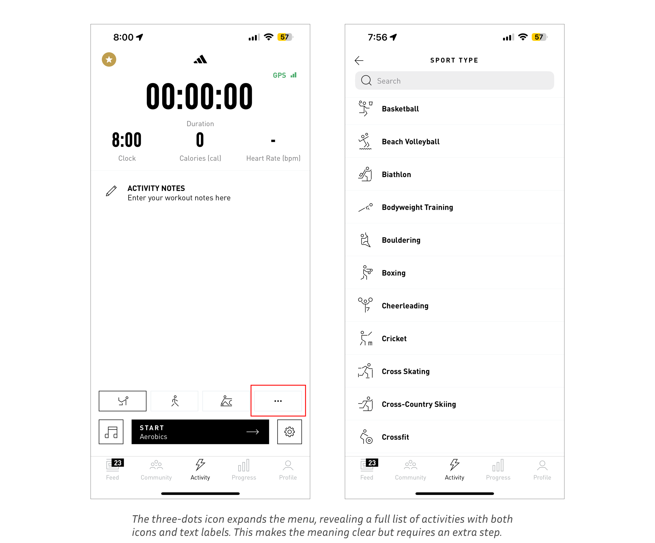
This design increases cognitive load and the likelihood of slips, especially for casual users who may not be familiar with every sport. Norman emphasizes that good design should make options immediately discoverable, reducing the need for recall. In this case, the icons fail as signifiers because they do not clearly communicate their intended action.
Solution: Pair each icon with a short text label (e.g., “Aerobic,” “Rowing”). This small addition would provide immediate clarity, reinforce discoverability, and reduce reliance on memory, aligning the interface with Norman’s principle of making knowledge visible in the world.
Conclusion
Adidas Running succeeds in putting its core function, the ability to start and track a workout, front and center with a clear and well-designed Start button. However, smaller details weaken the overall experience. Ambiguous activity icons, hidden gestures on the map, and inconsistent controls add unnecessary friction and risk confusing users. These issues are fixable: clearer labels, more consistent interaction patterns, and explicit signifiers would bring the app closer to the intuitive standard it sets with its main feature.