
Amazon Music is one of the major music streaming platforms that competes for users’ attention in the digital musical landscape. It has significantly evolved over the past 5 years with around 55 million subscribers worldwide. Even though the interface feels cluttered its high-quality audio and cross device synching make it a strong competitor in the industry.
Sign In

Logging into the Amazon music account is a straightforward process. There is no need to create a separate profile since it is tied to all Amazon accounts. Once the account is signed in can synch to different devices such as phone, desktop, speakers and TVs including Amazon’s devices, Alexa and FireTV. Thus, in terms of mapping and visibility the user understands what to expect and what actions to perform. The “email/password” and large light blue button “continue” are clear signifiers of what the users can expect.
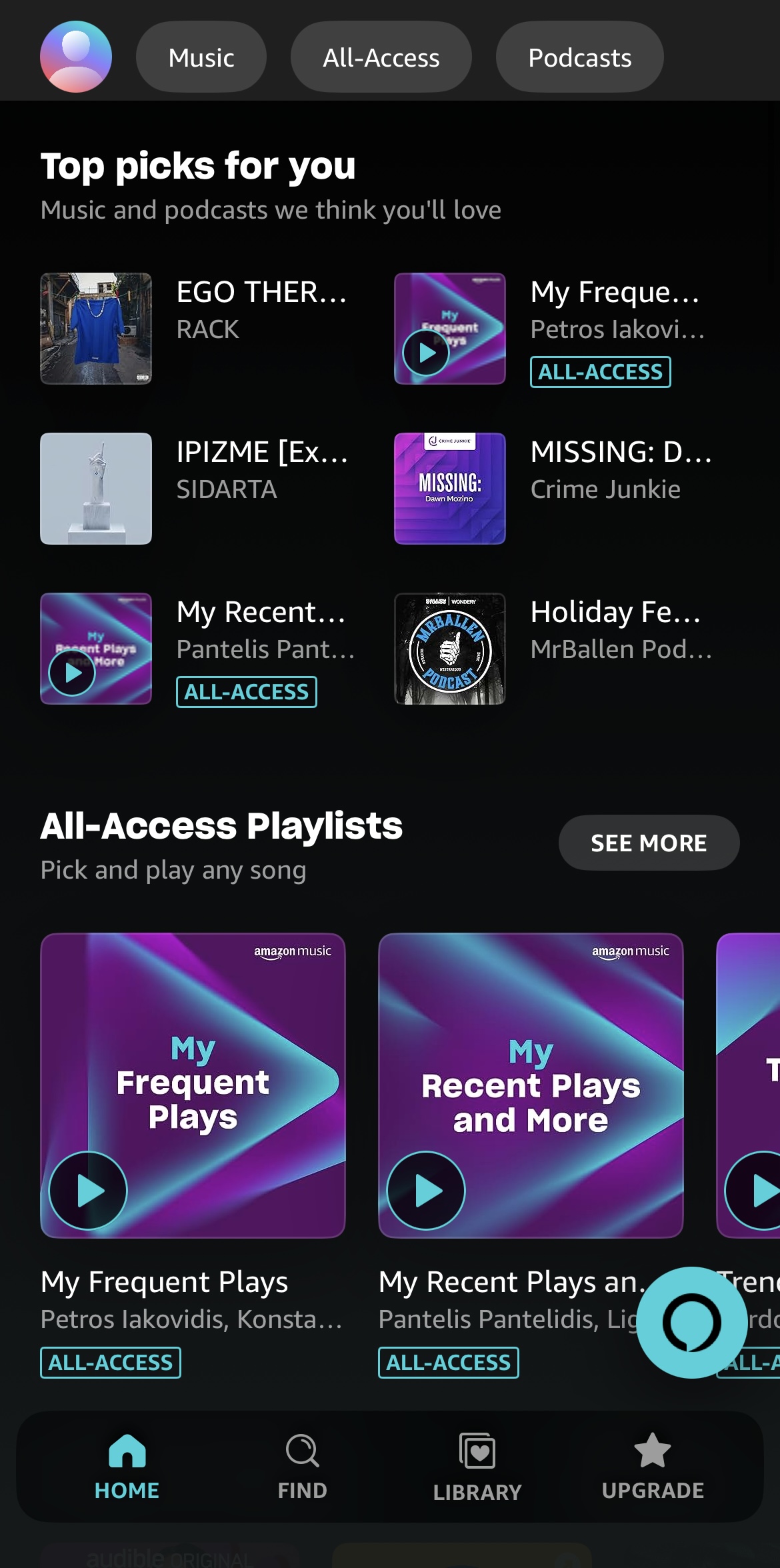
Home
Find
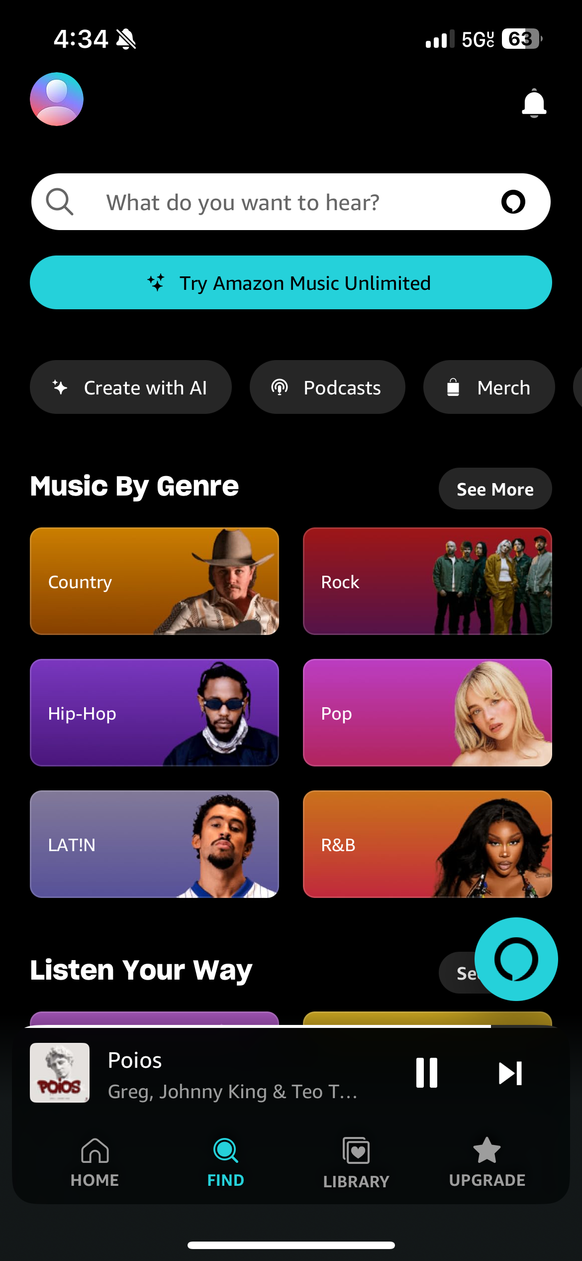
The search bar is clearly introduced at the top of the screen which implies the awareness of where to begin. The page is flat which makes it hard for key elements to stand because of the grid-based layout of buttons and static lists. In addition, the visual hierarchy is complex with the similar scale of the buttons “Create with AI”, “Merch” and “Podcasts”. A new user who might not be familiar with the app can be overwhelmed with the overload of information. Furthermore, error prevention is weak in this case as it is easy to tap on the wrong button given their small scale and close placement.
Create with AI”

Conclusion
In conclusion, the Amazon music app needs to pay more attention in its affordances and signifiers. The “Home” section provides users signifiers that guide them toward “Top Picks” “Playlist” and “Recent Played”. The filters and search affordance reinforce discoverability in the “Find” section and therefore allows users to browse across different categories which enforces the conceptual model. There is a strong foundation for users to be able to discover their preferences; however, refining affordances and mapping, considering AI features, can further improve the experience.