Astopia is an all in one astrology guide, with the goal of making difficult astrological principles understandable to everyday consumers. In this critique, I look at Astopia from the standpoint of a novice user. My focus is on how well the app bridges the gap between the user’s mental model and the system’s behavior,
On – Boarding Flow
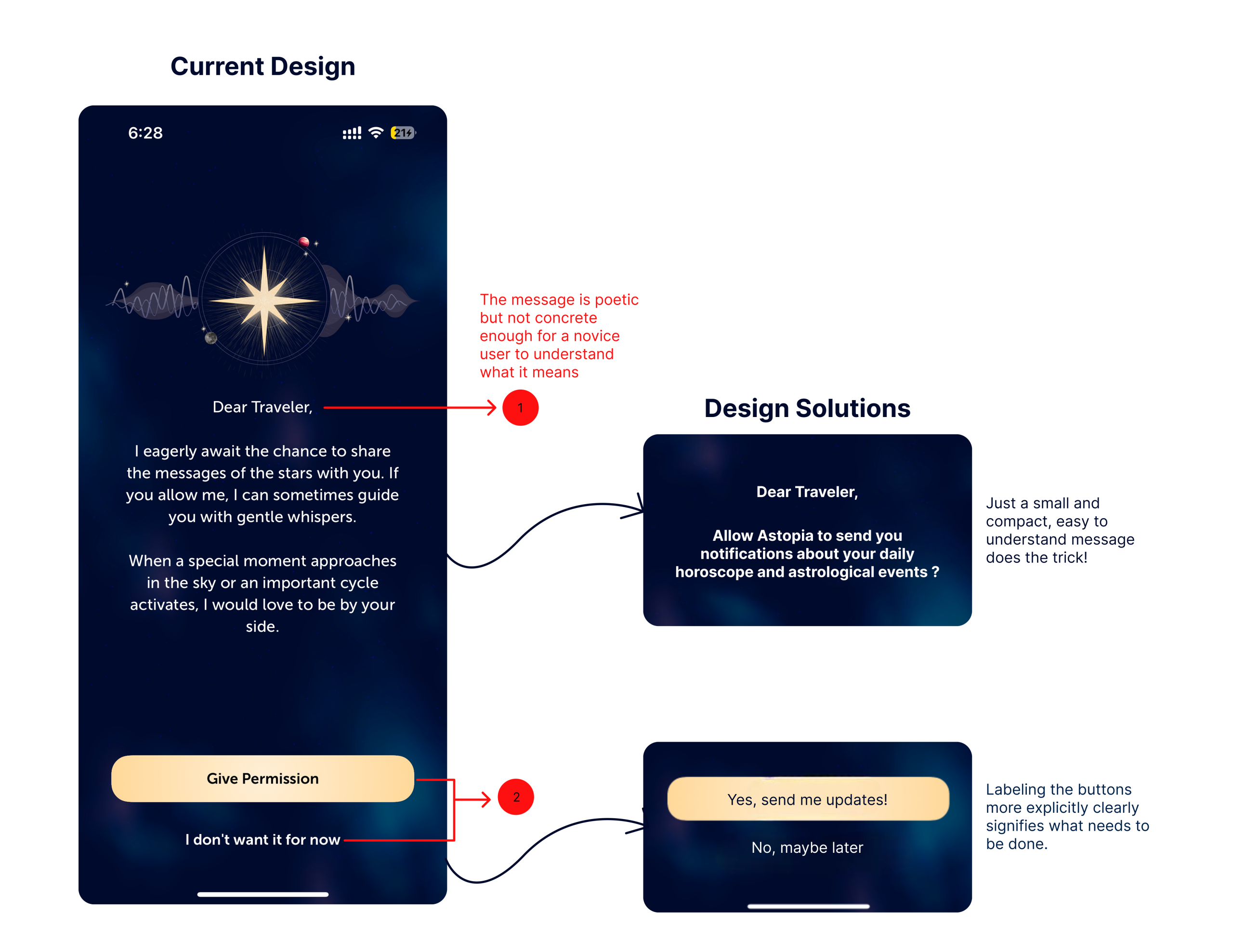
Astopia’s onboarding experience is smooth, with clear inputs for name, birthdate, and location, displaying high visibility and mapping. Users understand what is necessary and why, hence reducing the gulf of execution. However, the next screen shows a poetic message: “Dear Traveler, I eagerly await the chance to share the messages of the stars with you…”This creates a gulf of evaluation, as a novice user I could not understand what “gentle whispers” meant or what the buttons (“Give Permission” / “I don’t want it for now”) do. While the buttons allow for clicks, their outcomes are unknown.
What I would do Instead?
Rewrite the language to be clear and definite, e.g., “Allow Astopia to send notifications about your daily horoscope and astrological events”, and label buttons explicitly: “Yes, send me updates” / “No, maybe later” (as shown in point 2 above). A little info symbol could help to explain notifications more clearly, enhancing feedback and mapping.
Home Screen
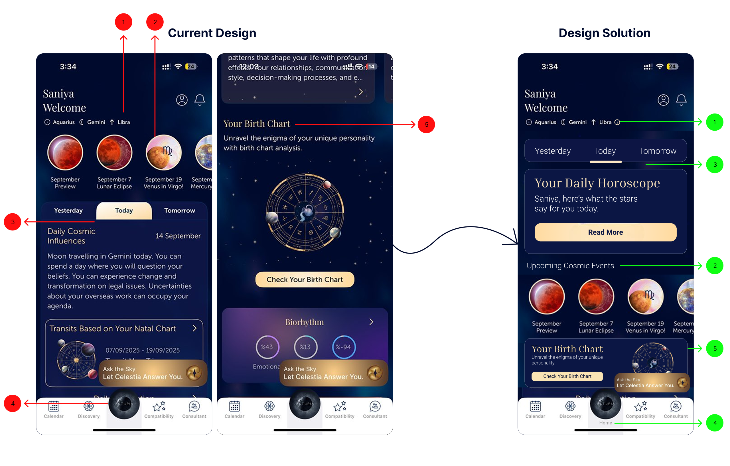
After identifying issues with the onboarding sequence, I analyzed the home screen. This screen overwhelms the user with information, and certain critical features are buried deep down in the screen, making them easy to overlook. I have redesigned the screen to reorder the hierarchy so that there is a straightforward user flow.
- Clarifying Astrological Signs
In the current design, novice users can easily get confused by the three signs displayed at the top, as most only know their sun sign and may be unfamiliar with moon or ascending signs. Adding a small information icon next to the signs addresses this issue. It acts as a signifier, allowing users to access additional details without cluttering the screen and helping them form a clearer mental model. - Reordering Content
In the current design, “Upcoming Events” appears too early, interrupting the flow of checking daily horoscopes. By moving it below the horoscope and labeling it clearly, the content hierarchy now matches how users naturally prioritize information. This improves mapping and visibility, making the section feel relevant and sequential. - Highlighting the Daily Horoscope
The daily horoscope is text heavy, which could cause users to overlook it. Placing it at the top with a clear CTA (“Read More”) improves signifiers and reduces human errors. As Don Norman suggests in The Design of Everyday Things :
“When an accident is thought to be caused by people, we blame them, and then continue to do things just as we have always done.” The button signals interactivity, guiding users to the main content effortlessly, without possible missing the first step! - Improving Navigation
This is a small yet important change. Bottom navigation icons are meant to help users navigate easily through the app. Adding a “Home” label strengthens perceived affordance. Users immediately understand where to return for the main content, lowering cognitive load. - Making the Birth Chart Visible
In the current design, the birth chart, a core feature, is hidden below the fold. Moving it higher on the screen ensures all main features : Horoscope, Events, Birth Chart, and Chatbot are visible at a glance. This improves discoverability signaling its importance without extra effort.
Compatibility
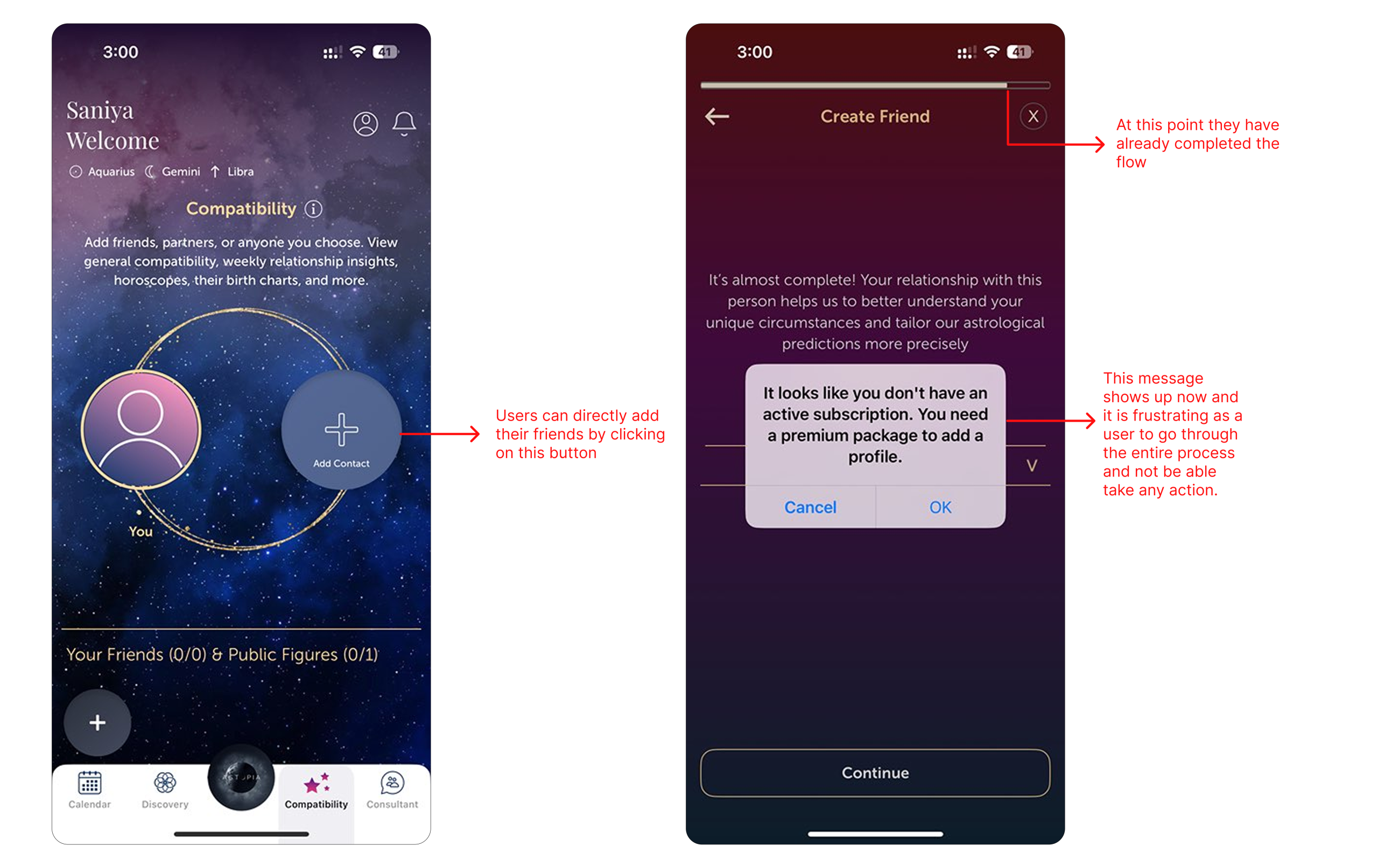
The compatibility screen fails to indicate that it is premium only, allowing non premium users to complete the flow before revealing the restriction at the final step. This leads to a knowledge based mistake, as users assume the feature is free due to missing signifiers. A simple label or lock icon would set correct expectations and prevent the user’s wasted effort.
Conclusion
Astopia positions itself as an all in one astrology app, but in trying to do everything at once, it overwhelms the user. While the UI is modern and visually appealing, the interactions fall short. With more strategic organization of information and clearer signifiers, the app could shift from “selling” to genuinely supporting users in their journey.