Introduction
Bandlab is a music creation app with a host of unique features geared towards connecting musicians, music and trend discovery, and finding inspiration. This critique seeks to provide an unbiased review of the Bandlab mobile app through a UX design lens. Several key attributes of the bandlab experience will be analyzed by seeking out irregularities and negatives, as well as calling attention to the best and most noteworthy aspects of the design (pardon the pun).
Start up and Homepage
New users are required to create a unique account upon download, after which the app reveals its true (but not full) range of features. The startup sequence encourages the user to select a wide range of music preferences (figure 1), indicating the app cares about how it can be molded to your individual preferences. This human centered aspect of the design helps show the user that there is an element of personalization to be explored, and helps the user feel more comfortable with the technology by building familiarity
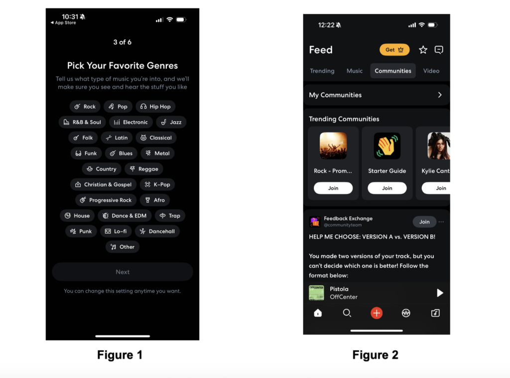
The home page is littered with swipe options and play buttons, all of which serve as signifiers for deeper actions that have yet to be explored. The front page itself offers a reasonable amount of discoverability in this regard. The navigation bar across the bottom highlights the core functions of the experience, with the bright red plus button acting as a clear focal point for the user (Figure 2).
Music Creation Studio
The key attribute of Bandlab is its music creation platform. Unsurprisingly this is accessed by the aforementioned bright red plus button (figure 2). After being pressed, the main “Create” page appears (figure 3). Music creation is inherently complicated as an artform, so the breakdown of the page must be intelligently designed to maximize understandability. The app recognizes that each musician or user is different, a point highlighted by the customization centric start up sequence. The Bandlab app prioritizes the two main headers “track type” and “tools” at the top of the page. Experienced and novice musicians of all kinds would find this useful, as this structure begins to section off music creation into more sizable chunks. The Discoverability of the page is maximized as the page is focused enough to not be overwhelming.
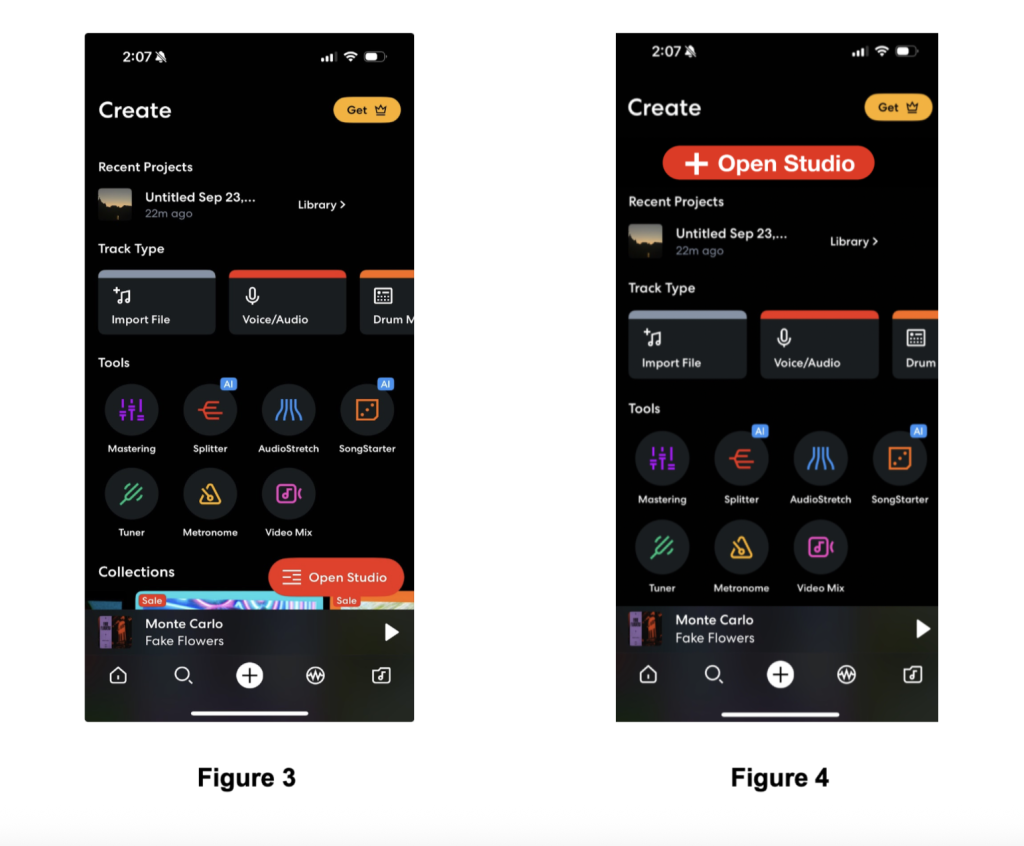
One element of the page that is lacking however, is the “open studio” button (Figure 3). Unlike the red plus button, this (also red) button is off to the side, and floating. It is not a clear focal point of the page, and it even collapses as you scroll down. Furthermore, the iconography (a series of vertical lines) serves as a poor attempt at skeuomorphic design (Figure 4). It is difficult to tell what the image means, and they should have opted for more consistent imagery. A plus sign seems like the more appropriate symbol, as it would act as a repeating element from the home screen. The user was directed to this page to create music, and the “open studio” button is where that happens in the overall experience. A more consistent UI is needed to help map this element more effectively. It would be reasonable to expect this button to be prioritized higher in the page’s architecture, as suggested in Figure 4.
Exploring New Music
Another key attribute of the Bandlab app is the ability to explore other music for inspiration, or download/ use purposes. Novice music producers as well as experienced ones would likely find value in this page as you are given the option to incorporate downloaded music of a wide variety into your projects. The search for new music in this feature is easily discoverable, with clear markings indicating where the user may find new music. The “trending” and “all beats” pages are first to greet the user, with the “advanced” search toggle easily locatable on the top right as well (Figure 5). The overall mapping of the discovery page promotes natural flow for those who wish to meander, as well as a direct path to more specific customization options for users with more specific sound requirements.
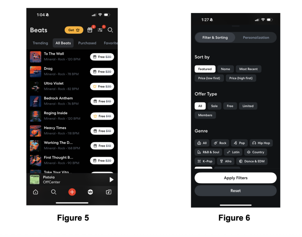
Although the explore function is large and the user never feels as though there is a shortage of material to explore, it becomes clear that there are several key constraints embedded to the page that direct the user in predictable ways. One clear example is the use of physical constraints to conduct an exploratory search. The app segments the music discovery search feature into categories in the order of price and recency, offer type, genre, temp, and key (Figure 6). That is the complete list of filter options. While this is a lot, it may not be enough for an advanced or professional user. The constraints may present too great a barrier, and act as a pain point for that group.
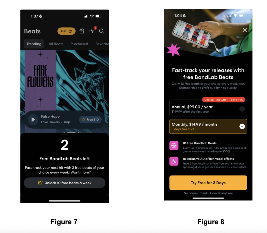
Additionally, When using the explore feature of the app, much of the music on offer is only available for purchase. The pay barrier acts as another physical constraint on the user when trying to discover new music in Bandlab. If you are a user who does not need to download anything then this is not a problem, but if you would like to download tracks and you don’t pay, you are prevented from completing the download. These pay constraints can be found elsewhere in the app for other features, and are even pressed on the user when opening the app for the first time. The yellow markings act as a signifier that more features can be unlocked if the premium service is purchased, and that clicking a yellow icon will lead to the pay wall page.
