Chewy is an e-commerce company that offers businesses such as pet food retail, pet supply and accessories retail, medicines and health products, and other pet-related products. From Chewy, users could document their pets’ information and get the needed accessories. Its mobile app is aiming to offer users a convenient shopping experience
Imperfect Shopping Details
Items deatils
As an online shopping platform, the basic feature is to add items to the shopping cart without confusion. However, Chewy has a particularly complex Affordance for this basic feature. For the item detail page, there are three different types of layout; not only did the signifiers change in color, but also the sequence of “add to cart” and “set up autoship” changed for no reason. It would cause trouble when users are trying to make the desired selection, they would spend more effort trying to decide which button to press.
For items that have promotions, “Autoship” normally is the top selection (Fig.1), but there are also occasions when “Add to cart” is the only selection for promoting items (Fig.2), while for the same type of product, “Autoship” becomes an option again (Fig.3). This occasion would make users confused about the decision making.
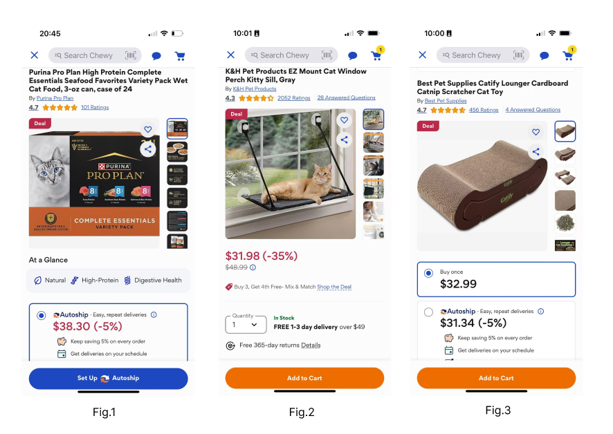
On the product detail page, users would expect a unified way to make choices. However, there is no consistent Affordance for what Chewy currently has. There is no clarity in the two selections, so the product page looks very disordered. While determining what actions are possible, the Affordances are not doing the perfect job. For users, additional judgment is required to ensure that they make the desired choice when shopping.
Searching for Iems
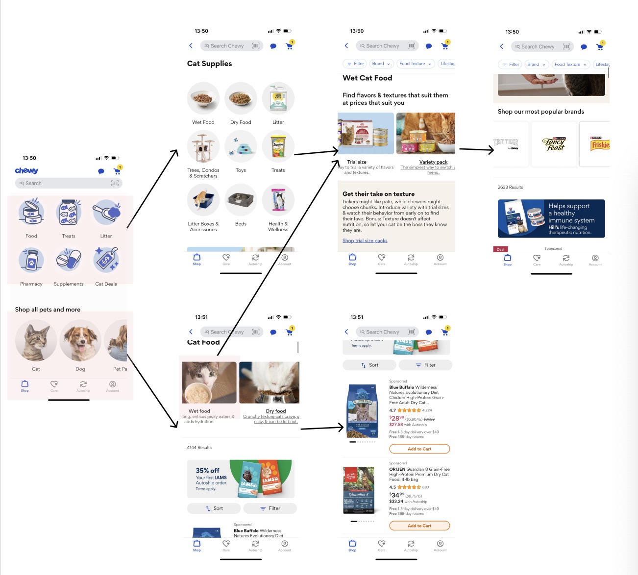
When users want to look for certain items, such as trying to look for wet food options, there are two sections designed for this purpose (Fig.4). Whether entering from the pets’ breed or the item category, the Mapping is complicated to get the result. The classification navigation is confusing, as the users may not know where they should go to look for what they need. What is more, the subcategory is put in a deep position, and the operation path is too long, which makes the Mapping between user goals and operations not intuitive.
Thinking of the goal was supposed to provide a simple shopping process and a quick selection of desired items. This overall confusing mapping system has not achieved this goal. Even the arrangement of the products is not simple, but it has made it more difficult for users to shop for their desired product.
Autoshipment
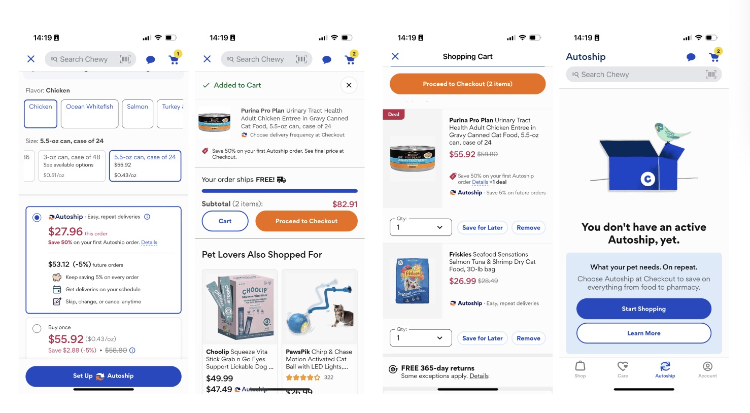
As the main feature of the platform, the autoship function does not provide fast enough settings. Even though there is an autoship option when adding to the shopping cart, after clicking, there is no Feedback that should be available in the autoship interface (Fig. 5). This result does not have enough Feedback for anyone who wants to try out autoship; users are not sure if the item is enrolled in autoship at all.
Overlong Shopping Process
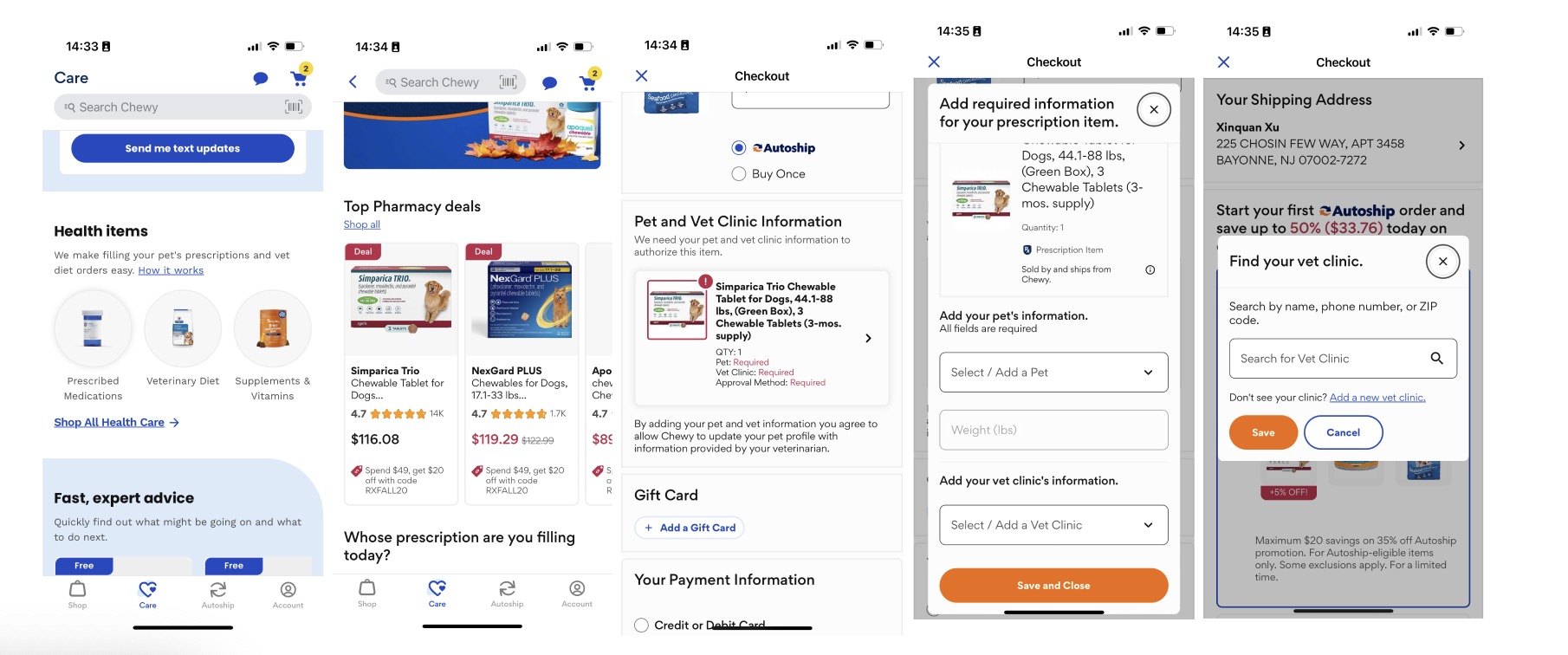
Priscription Items
The other feature of the platform is access to prescription drugs and foods, which aims to reduce some trouble for pet owners, but the order process is longer than expected, making the system difficult to use because the functions are unclear and not easily discoverable, making it hard for the user to figure out how to order prescribed items (Fig.6). The Gulf of Execution here does not fuifill users’s purpose of getting prescribted items quickly, there is a gap between the users and the designed system.
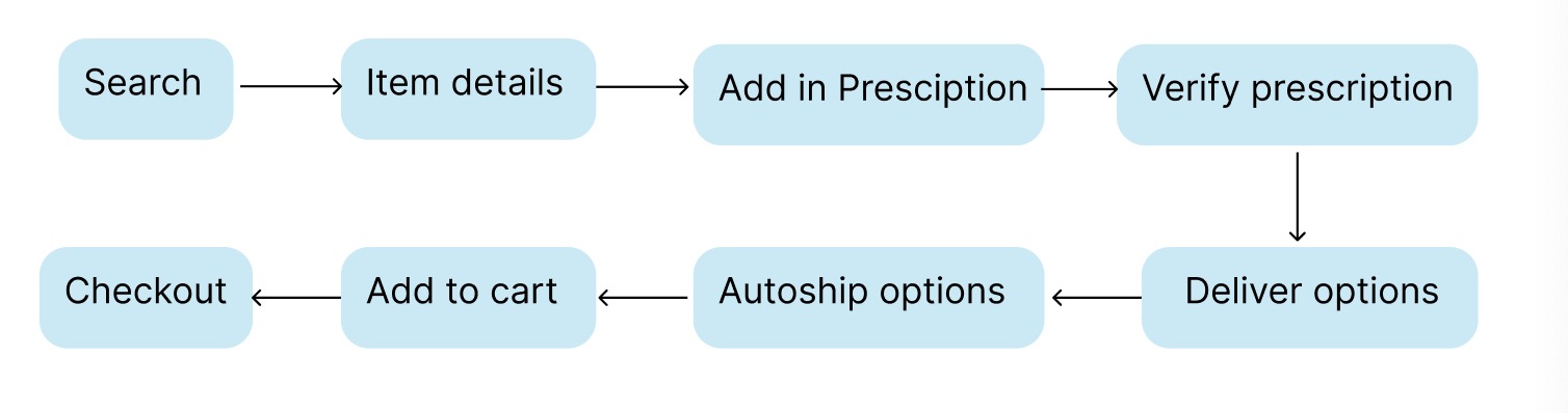
There is another option to add an item directly without adding prescriptions first. This time, the process is clearer than the previous options, but the Gulf of Execution is still overlong (Fig.7).
Conclusion
Even though Chewy’s mobile app aims to help pet owners shop quickly and find whatever they need, the overall shopping process isn’t consistent with the conceptual model. Furthermore, the overall shopping experience requires a lot of differentiation and judgments for new users, such as the distinction between autoshipment with adding items directly to the cart. While the platform does reduce the hassle of offline shopping for users, it hasn’t fully achieved the desired effect and needs more accommodations.