
About
Daak is a personal finance tracking app designed to help users log daily expenses, categorize spending, and visualize patterns over time. It also offers features like exporting data to spreadsheets and adding bank account details, though some of these functions feel incomplete. At its core, Daak aims to make budgeting simple, structured, and enjoyable by turning what is seen as an emotionally draining task into something users might return to consistently.
Imagine
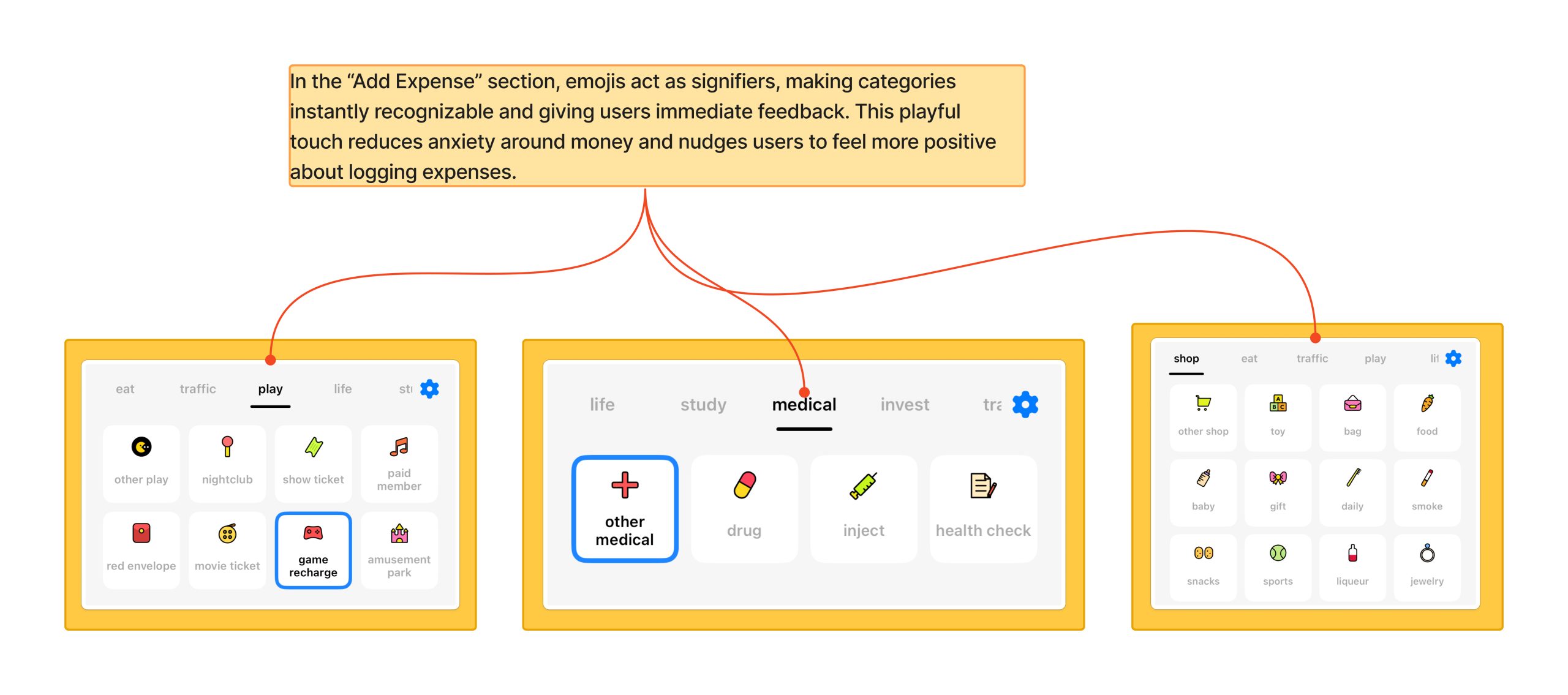
A user opening Daak right after buying lunch. Their goal is simple: quickly log the expense so they can stay on top of their budget. This is a common, almost daily activity, and the user expects it to be fast, clear, and maybe even a little rewarding. At first, Daak delivers. Instead of a dull text entry, the app greets them with a flurry of emojis. This design choice is more than decoration. Emojis act as signifiers, making categories instantly recognizable. They also provide feedback, a small visual reward that ties directly into emotional design. By adding playfulness to an emotionally draining task, Daak reduces anxiety around money and nudges users to feel more positive about returning to the app. In Norman’s terms, the design closes the gulf of evaluation, because users immediately understand and feel satisfied with the outcome of their action.
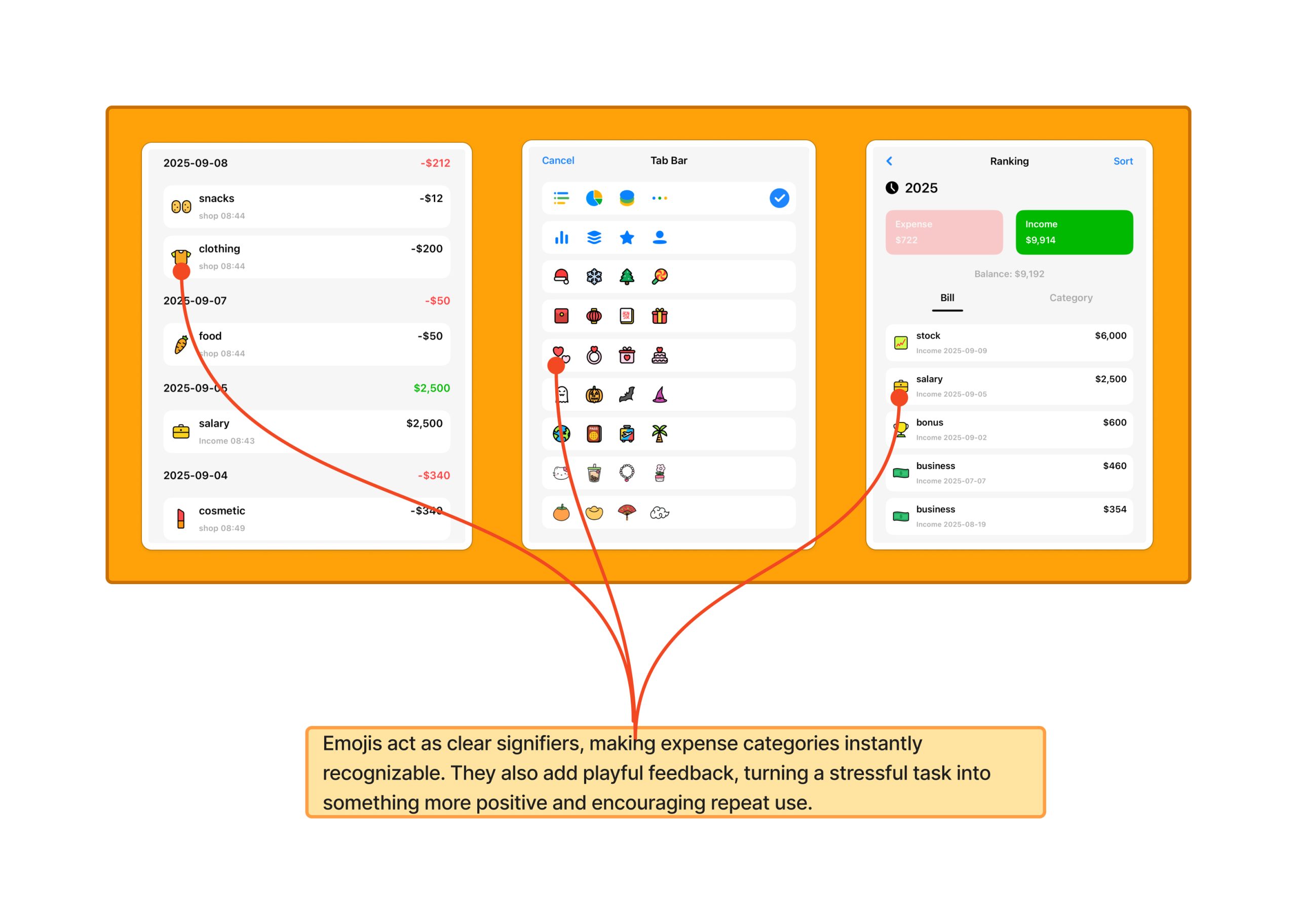
As the user continues to add items, the role of categories becomes clear. Entries aren’t just a growing list of numbers, they’re neatly sorted into traffic, food, medical, and other meaningful groups. This works because it reflects the user’s conceptual model where people naturally think about money in categories, not endless transaction logs. Clear categories improve mapping and strengthen visibility, helping users see patterns in their spending. In this moment, Daak is not just recording data but shaping behavior. By making categories prominent, it nudges users to reflect on their choices like for example, realizing how much they spend on eating out. Norman reminds us that visibility and mapping are crucial for understanding and that they help users turn raw numbers into actionable insight.
However, over time, friction begins to appear. Every entry must be typed in manually. While the feature technically affords expense logging, Norman stresses that design should make tasks simple and natural. Unfortunately here, the repetition creates cognitive friction. For a user tracking dozens of transactions per week, the effort becomes a barrier. The gulf of execution widens the user’s goal to log quickly and the system’s method of tedious manual input no longer align. As a result, users may disengage with the app.
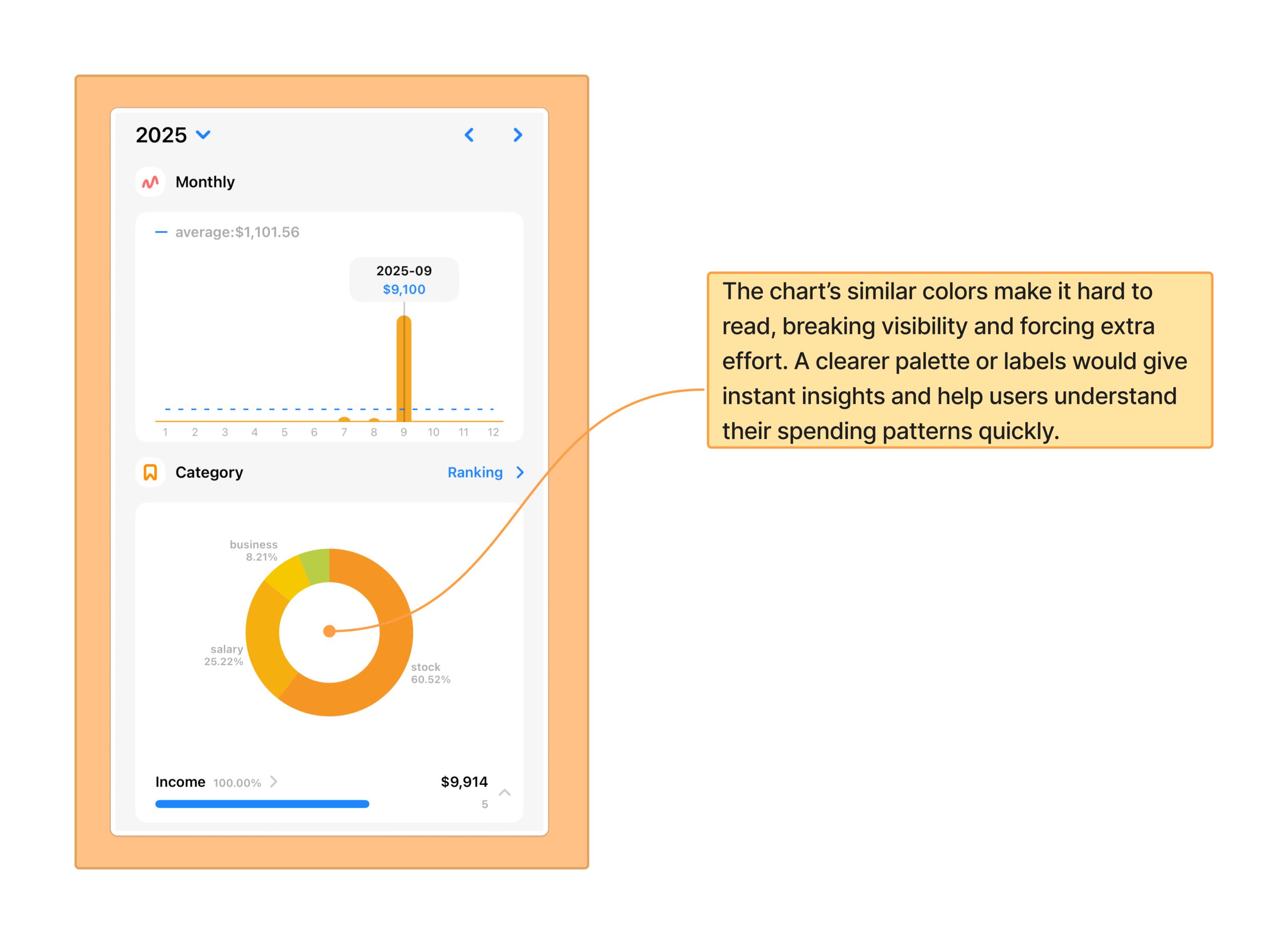
Later in the day, when the user checks their charts, they expect quick insights at a glance. But the graphs use colors that are too similar, making categories difficult to distinguish. Instead of instant clarity, the user must work harder to interpret the information. This breaks visibilityand weakens feedback, forcing users to spend extra time deciphering results. Worse, it undermines the chart’s behavioral goal which is to influence better spending habits by making patterns obvious. According to Norman, good design should bridge the gulf of evaluation, allowing users to quickly interpret whether their goals are being met. A clearer palette or secondary labels would solve this by making insights immediate and intuitive.
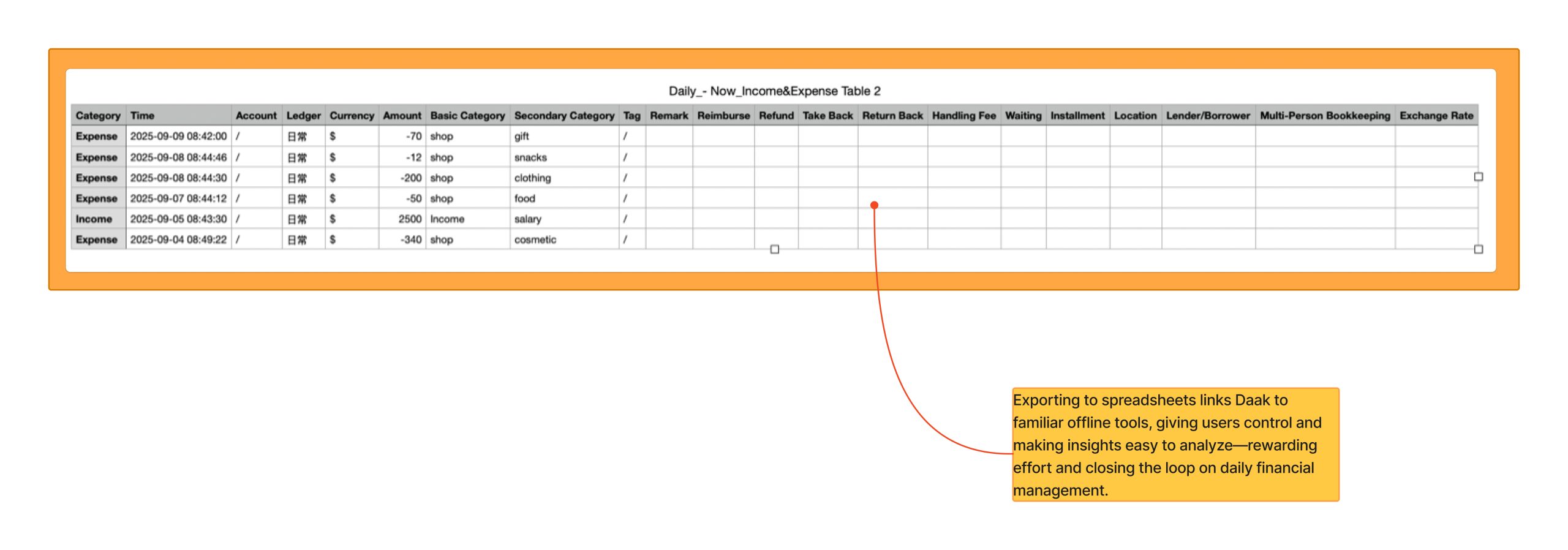
At the end of the day, the user decides to export their data. Exporting into a spreadsheet-style format gives meticulous users a clear sense of ownership and control over their information. The feature reflects good mapping because it connects directly to workflows people already use outside the app. In Norman’s terms, it matches the user’s mental model: spreadsheets are familiar tools for reviewing and analyzing data. By linking in-app entries to familiar offline tools, Daak reduces friction and reinforces positive behavior. It rewards users’ effort by making their data more portable and useful, effectively closing the loop on daily financial management.
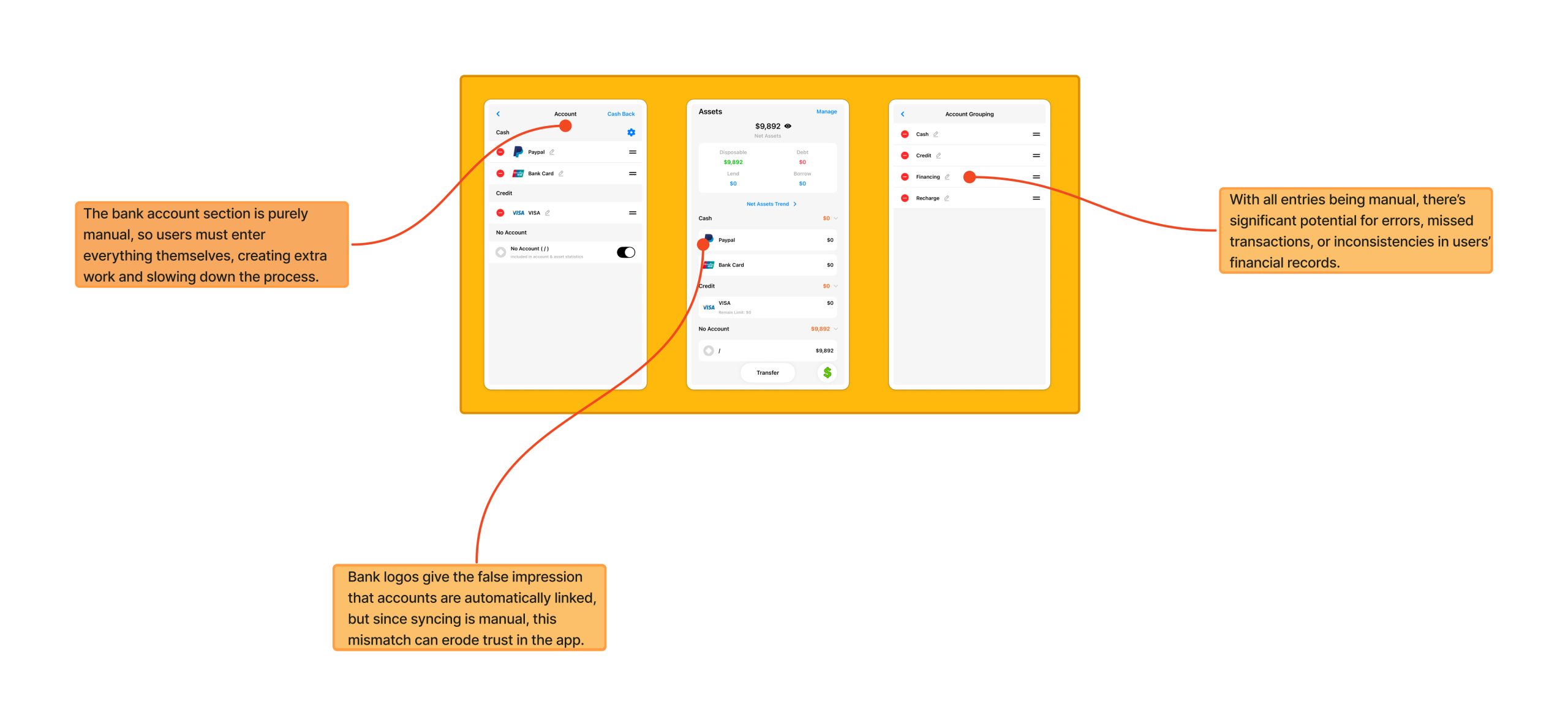
But the promise of automation remains incomplete. The presence of a bank account section suggests syncing, but it is purely manual. This creates a mismatch between the system image, what the interface suggests and the user’s conceptual model which is towards expecting automated syncing. Norman emphasizes that such mismatches can erode trust, as users feel the system misleads them.
Solution
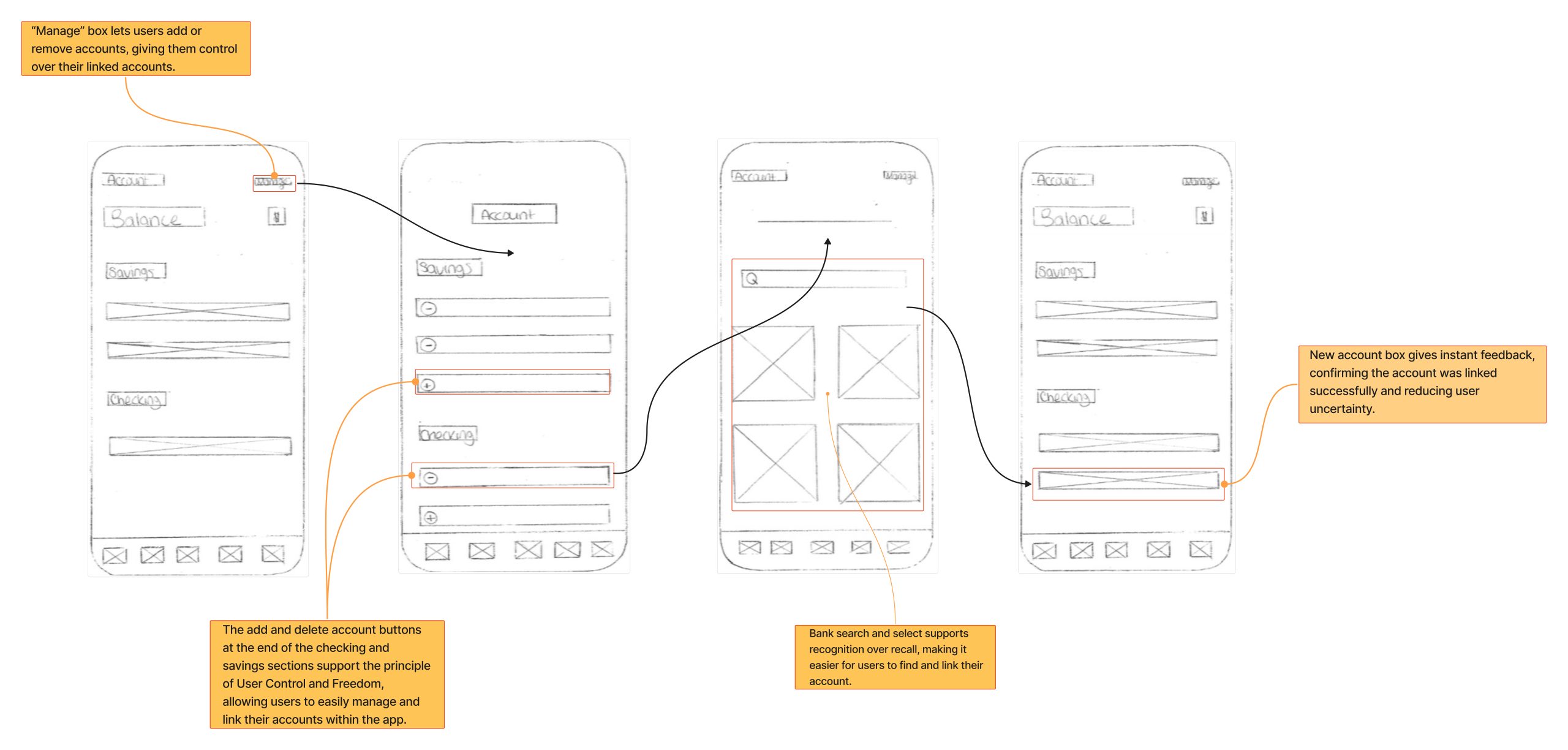
An effective solution is to integrate directly with banks for automatic transaction importing. In my mock-up, this takes the form of a dedicated Accounts subpage where users can view live data from their linked accounts. From here, selecting Manage leads to an Edit screen for adding or deleting accounts, while choosing a specific account opens a secure Link flow for syncing. This approach is like paying off two debts with one payment. First it eliminates the friction of manual entry that was mentioned earlier, while also resolving the mismatch between user expectations and the system’s current behavior. By narrowing the gulf of execution and strengthening trust through automation, the app demonstrates that it is doing the heavy lifting on the user’s behalf.
Conclusion
In the end, Daak demonstrates how small touches can transform user experience. Emojis and categories provide emotional engagement, visibility, and control. Exporting reinforces ownership and deepens habits. Yet the app struggles with manual entry, weak chart visibility, and mismatched bank integration. Through Norman’s lens, we see how Daak succeeds at closing the gulf of evaluation but often fails at closing the gulf of execution. Good design should make tasks both understandable and natural. If Daak reduces friction, improves visibility, and aligns its system image with user expectations, it could transform positive first impressions into long-term, consistent use.