
What is Depop?:
Depop is a second-hand website/app, primarily used for selling clothing and accessories. Tags are a highly key part of the app, as most bona fide Depop sellers are very adamant about categorizing pieces by fashion styles. This is nothing new within the fashion industry; however, the advent of social media has led to people creating their own unique styles.
The App:
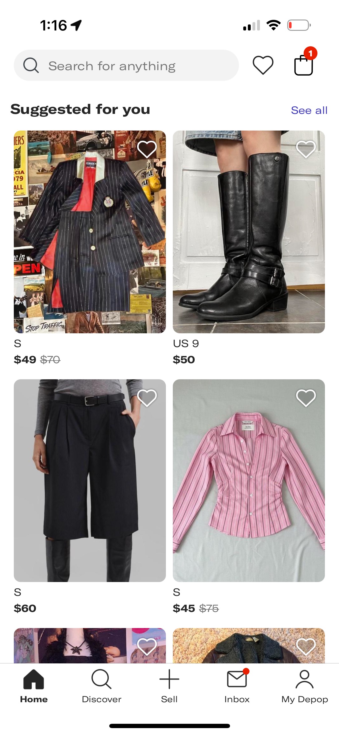
Depop is primarily used as a mobile app, making it easy for users to buy and sell. On the opening page of the app, or the ‘home’ page, you are greeted with ‘suggested’ items based on your usage of the app thus far. The suggested tab is an excellent example of discoverability and feedback. The ‘liking’ of items gives the app direct feedback to the system, which in response refines the ‘suggested’ feed, giving the users a better opportunity to discover. The algorithm effectively takes users’ likes and presents them in a way that makes it easy for them to discover new items. As the user, you’re in a continuous execution-evaluation loop.
You scroll, see an item, like it (the execution phase), and the app responds by showing you more things like it (the feedback and evaluation phase). This cycle is what makes the app feel so intuitive. It’s a seamless experience where you don’t have to think too hard about next steps because the app is consistently guiding you.However, despite these successes, ‘styles’ being another important premise of the app, appears to be unlocatable. This is where I would like to make some adjustments.
The Website:
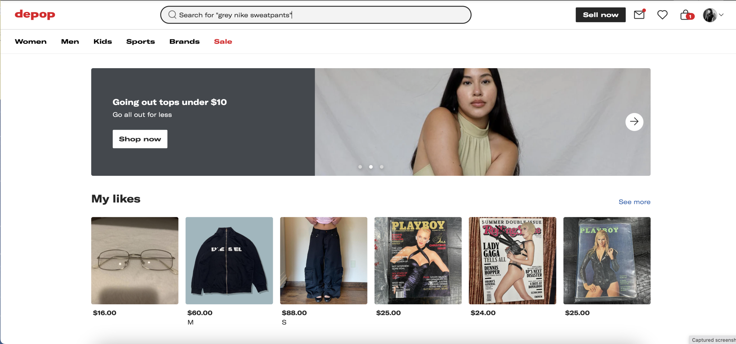
The website’s landing page consists of four major categories: my likes, suggested for you, recently viewed, and shop by style. Personally, I feel that showing the likes at the forefront of the page is not entirely helpful to me, making it a poor conceptual model. My idea of a well-executed conceptual model provides users with a clear understanding of how the system works. When I go on any e-commerce site, I’m accustomed to seeing new/suggested items that the company wants me to browse. By showing me likes first, Depop is offering me a different type of model that doesn’t necessarily align with my expectations. This creates a disconnect between me and the website, something that Don Norman would call the gulf of execution. I, the user, must then determine the following action to take that will enable me to achieve my goal (finding something new to buy). Likes are something that should be easily accessible, yes, but the ‘suggested’ tab makes more sense to be at the forefront if the objective is for people to purchase more.
What I think would be the best solution for the website:
The landing page for the Depop website should be similar to the app’s, with suggestions for you first. In addition to this, having a ‘filter’ drop-down option, including a search bar, would be a good use of mapping and constraints. Mapping is the relationship between a control and its effect. A drop-down button with a “Filter” label and a search bar has a natural, intuitive mapping to the action. The constraints play a key role in this by allowing the user to see a curated list based on the users desires, as opposed to an overwhelming number of items. The helps to eliminate confusion and make the shopping process much more efficient.
Citations:
Norman, D. A. (2013). The design of everyday things. MIT Press.
Truong, J. (2025, September 11). What is Depop? how to start buying and selling fast. Hidemyacc. https://hidemyacc.com/what-is-depop