Discogs is a music database and trading platform beloved by vinyl collectors. Its iOS app enables users to search, organize, and purchase records anytime, anywhere. Though adapted from an older web interface to align with modern user habits, the app still carries a distinct sense of its operational logic’s “vintage feel.” As a platform that doesn’t restrict users from listing items regardless of authenticity, piracy status, or even inconsistent condition, I can certainly see its shortcomings in interaction design。
Browse Records
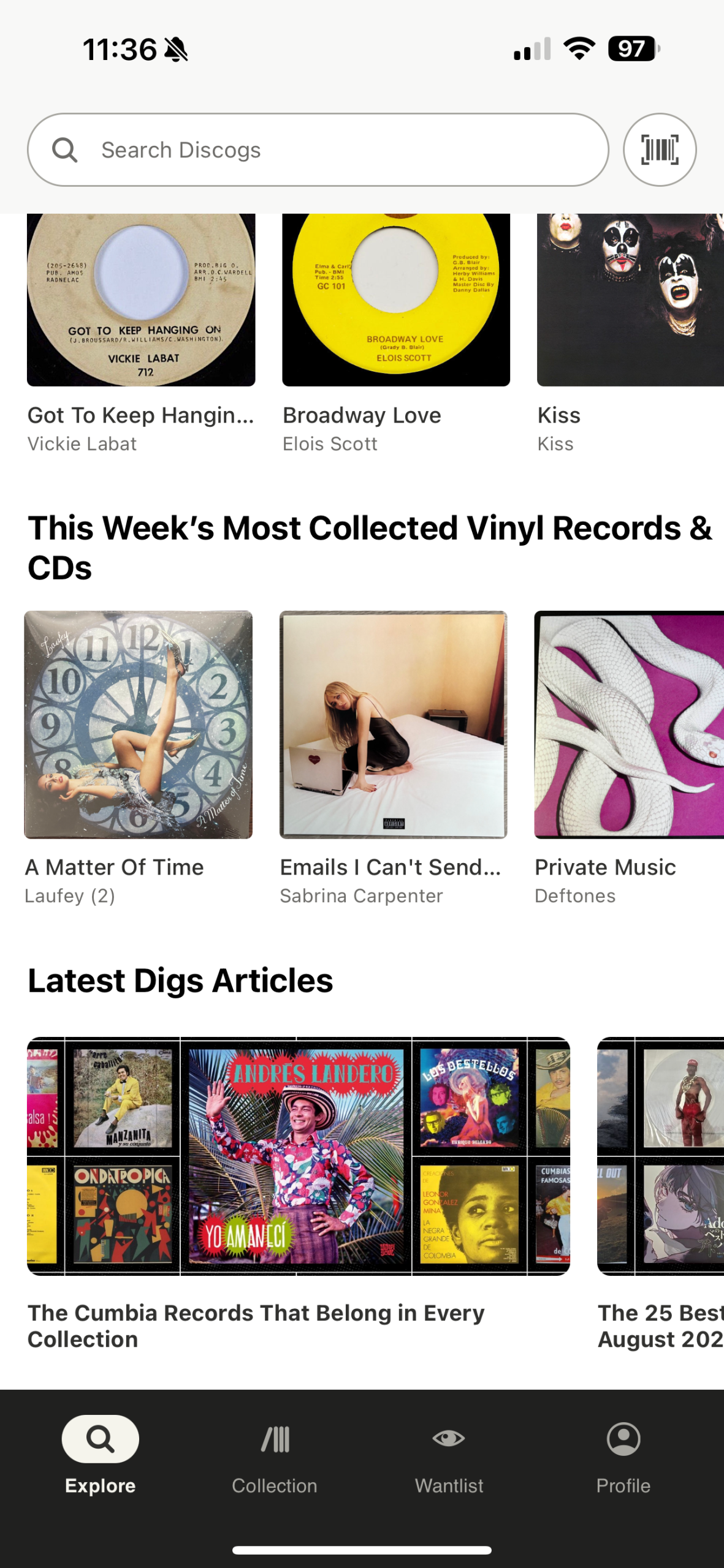
After completing registration, you’ll be taken directly to the app’s main interface. Here, the most popular records are categorized into three sections and displayed in three rows—mirroring the experience of most shopping apps. This mapping adapted from the conceptual model commonly adopted by shopping app users, offering a sense of reassurance and familiarity. Users can clearly see current market trends and popularity levels for record transactions. The display of popular albums provides instant visibility and enables seller users to receive immediate feedback upon opening the app, allowing them to stay informed about current market trends.
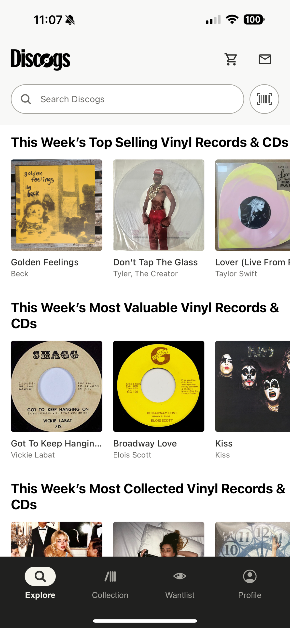
However, if you try scrolling down to find more products like other shopping apps, an execution gulf emerges: the app’s homepage only offers the three display sections I mentioned earlier. As a record trading platform, it neither provides recommendations nor endlessly loops products for users to browse without end. If users start feeling confused right after opening the app, Signifier’s absence might lead them to suspect their Wi-Fi signal is weak. This design approach may also serve as a constraint, aiming to steer users toward products currently trending in the market and those officially recommended—better aligning with the needs of core record enthusiasts. This design compromises the browsing experience for the average user, this design makes users not able to “just take a look”.
Buy Records
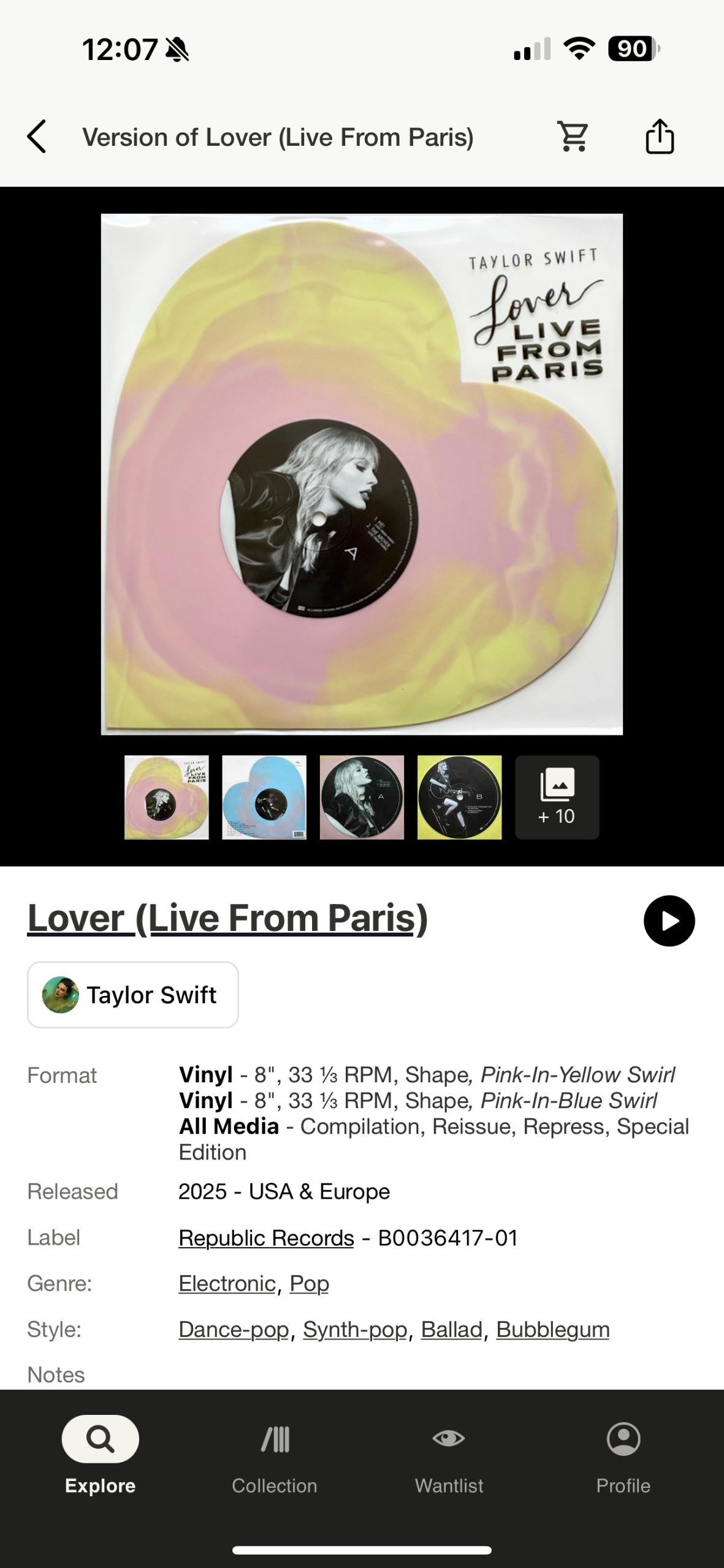
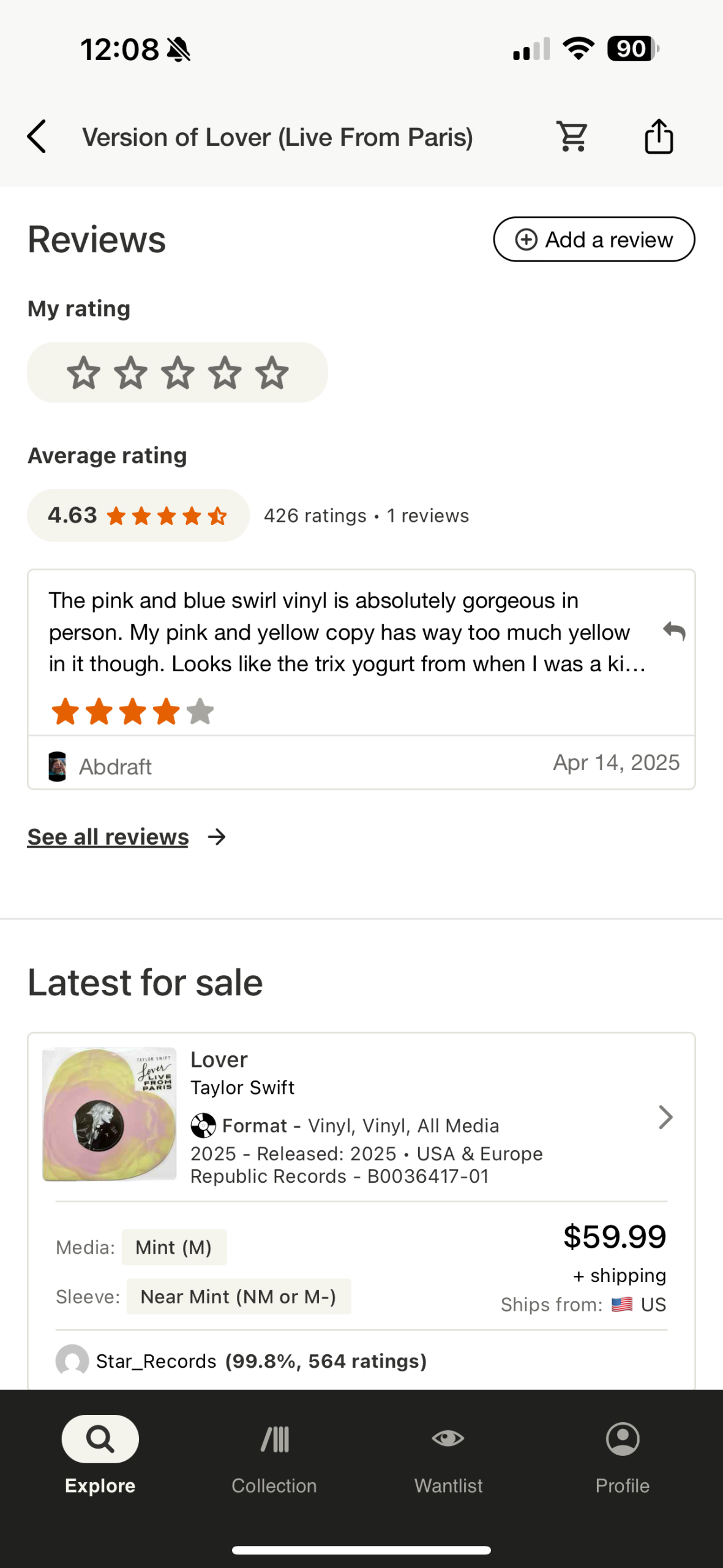
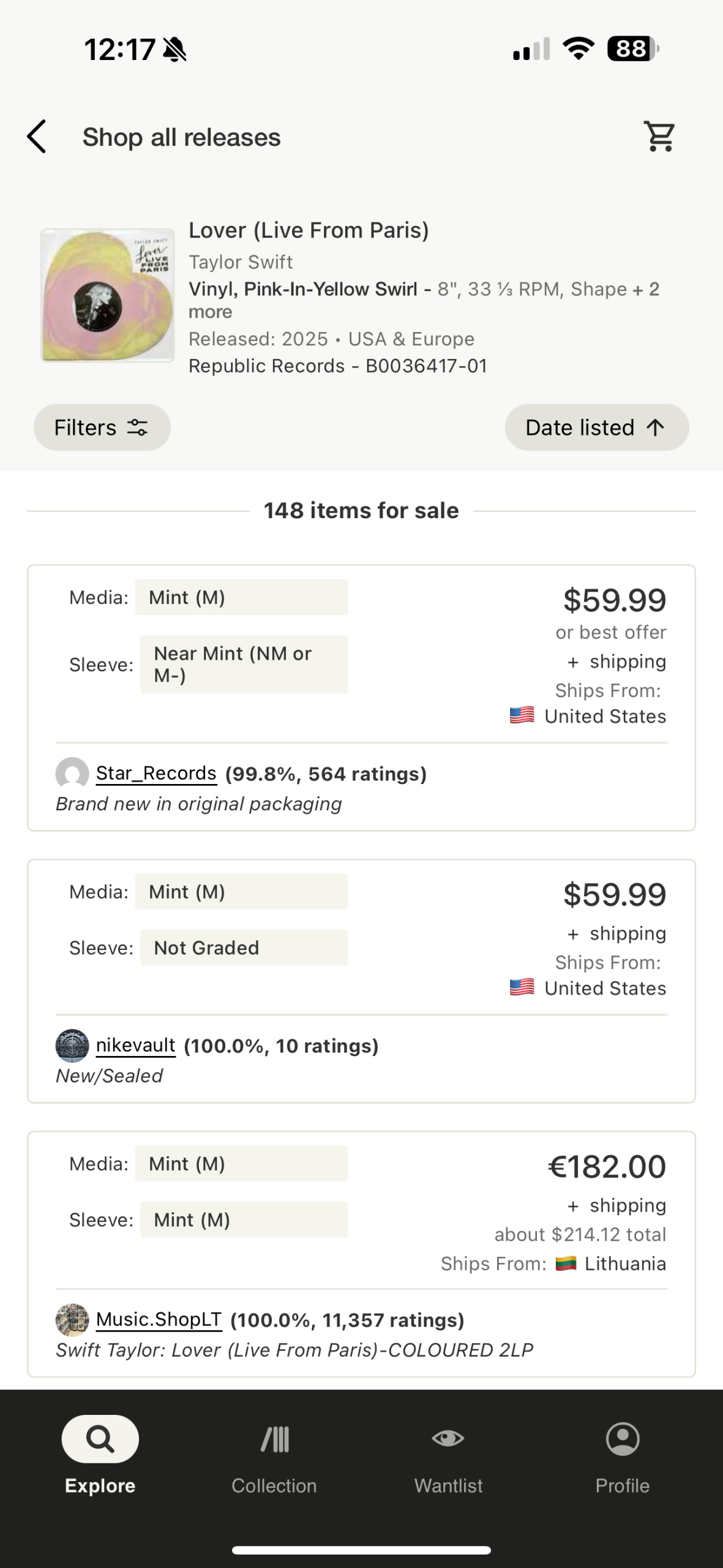
When it comes to purchasing items, clicking any named record on the homepage will take you directly to its detailed product page. At the top, you’ll find comprehensive product information including its place of manufacture, edition, catalog number, and more. Here, Discogs follows the principle of visibility, presenting all information transparently and completely to users, ensuring transparency and fairness. The shopping section is one of Discogs’ most confusing design elements. If you continue scrolling down, you’ll see market trends and selling prices, ensuring both sellers and buyers have access to the same information.
Typically, users expect shopping platforms to function more like clicking on a product, browsing, and confirming the purchase—a mindset that requires minimal thought. Clicking “Shop for this version” doesn’t redirect users to a checkout page like traditional shopping platforms. Instead, Discogs takes you to a secondary marketplace interface. Here, you can meticulously compare listings from different sellers—their prices, condition ratings, and even locations vary. The platform doesn’t select a “Quick Buy” option for you (unlike platforms like StockX), instead placing full decision-making power in the user’s hands. The quality of the user’s shopping experience depends entirely on their analytical and discernment skills. This represents a bias in app design regarding user freedom. Discogs offers users extensive comparison and selection options without aggressively pushing purchases. However, this also increases cognitive load, making the experience challenging for many casual users and even average users. Discogs’ design emphasizes user empowerment but overlooks the learning curve for newcomers, resulting in an experience that leans more toward an expert system than one that’s user-friendly.
In short, the Discogs iOS app functions more as an archive designed for vinyl enthusiasts than as a shopping platform for the general record-buying public. Its design philosophy prioritizes full and detailed purchase information with maximum transparency, while granting users complete control over their choices. However, this also increases cognitive load, making the overall experience confusing for new users.