Fable is the modern way to discover, track, and talk about the world’s best stories across books and TV shows. (Source: Fable Website)
Introduction
Fable is a multipurpose app – it’s not just an e-book reader, but also a space to connect with like-minded people. On top of that, it doubles as a tracker for both reading and TV shows. The concept is solid, but the execution gets messy at times. In this article, I’m going to nitpick some of those flaws. To do that, I ran a Cognitive Walkthrough and a Heuristic Evaluation of the app, which helped uncover where the design feels intuitive and where it starts to get in its own way.
The Book Reading Flow
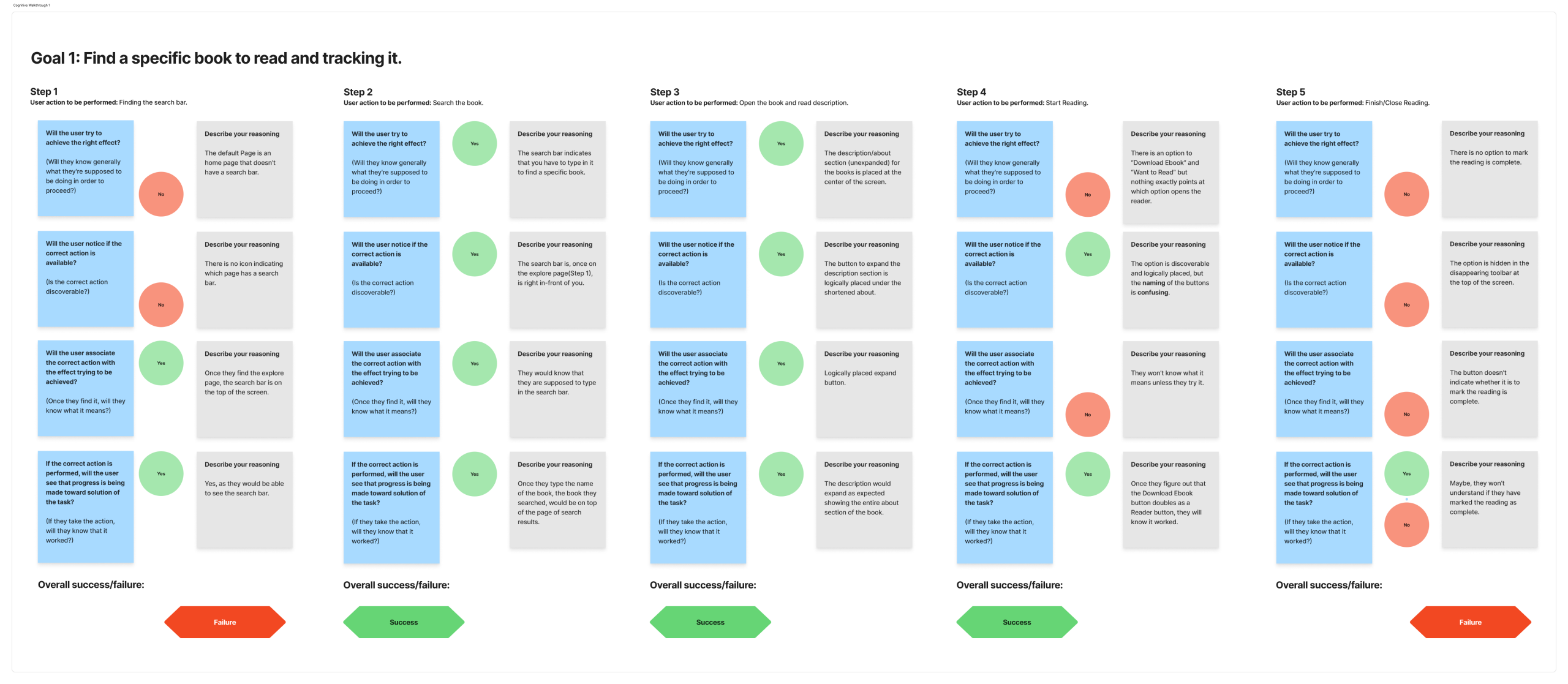
The first task I looked at was finding and reading a book.
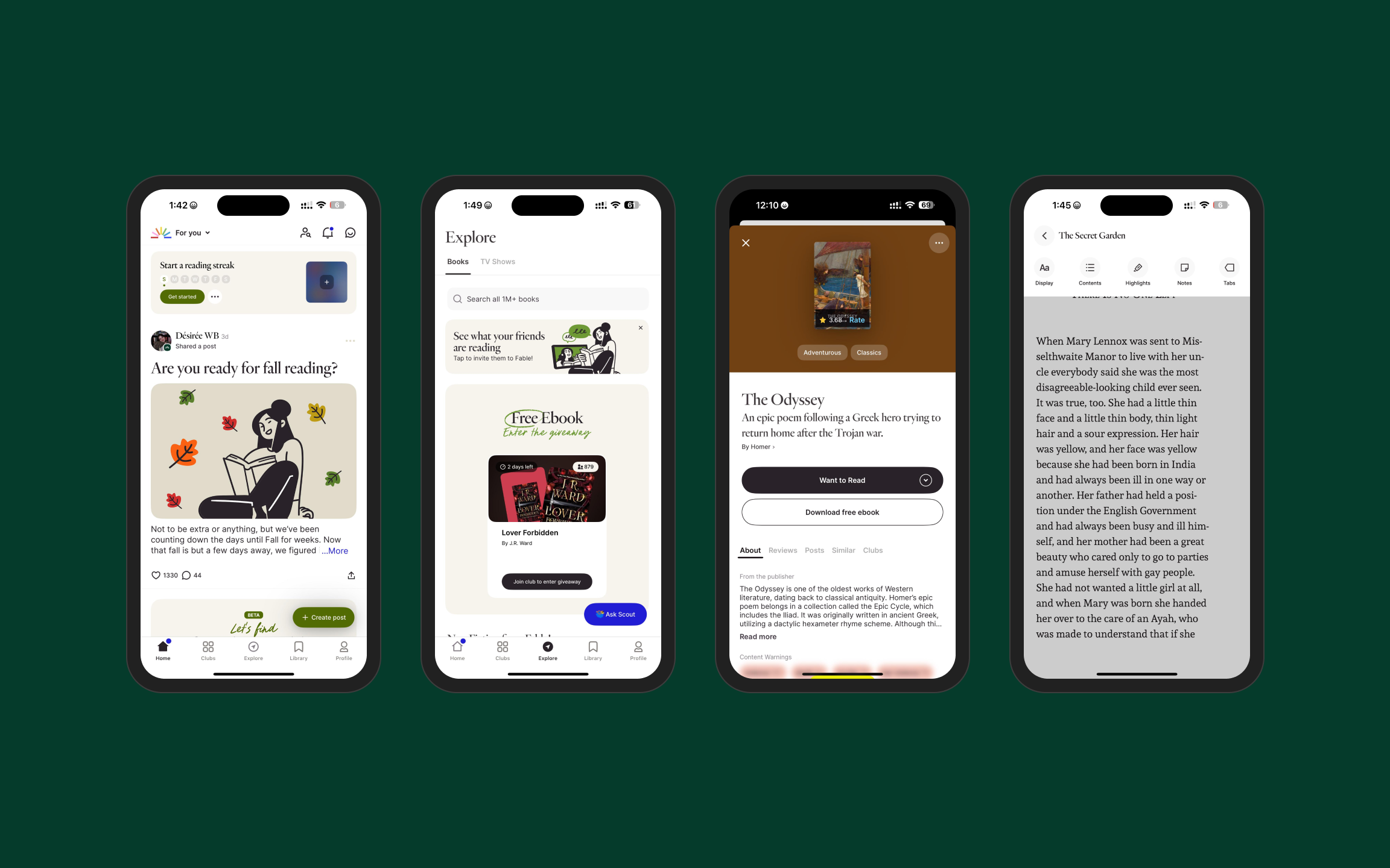
- Finding the search bar
On the homepage, there’s no search bar or even an icon to indicate it exists. You only see it once you move to the explore page. This is a discoverability issue. As Don Norman points out in The Design of Everyday Things, good design should make possible actions visible without extra effort. - Starting to read
On a book page, you get two options: “Want to Read” and “Download Book“. Neither makes it clear which one actually opens the book. This is both a mapping and signifier problem. The labels should directly reflect the action. - Finishing a book
There isn’t a straightforward way to mark a book as finished. The option is hidden, and even when you find it, there’s no clear feedback. Norman emphasizes feedback as essential – users need confirmation that their action was completed. Here, the loop feels unfinished.
To its credit, searching (once on the explore page) and expanding book descriptions work smoothly. Those are examples of natural mapping where the design matches user expectations.
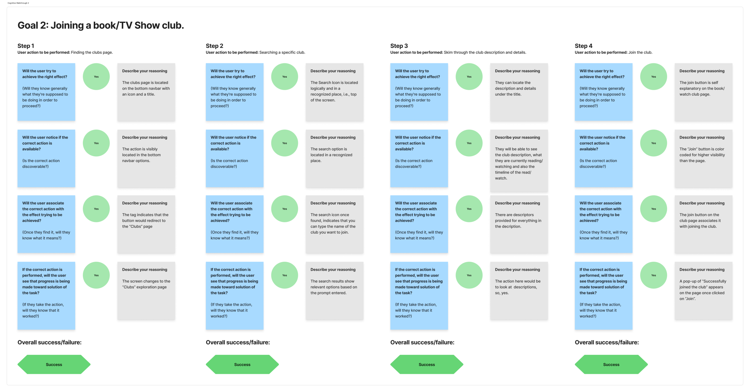
The Club Flow
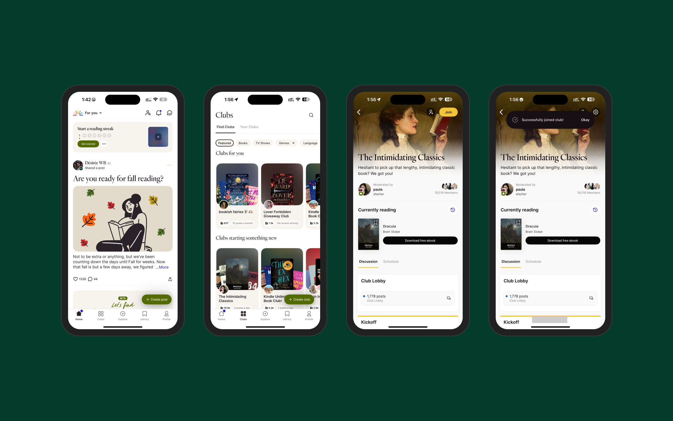
Each step – finding the clubs page, searching, checking descriptions, and joining – felt clear. Signifiers were obvious, actions mapped to results, and the app gave immediate feedback. This reflects Norman’s idea of bridging the “Gulf of Execution and Evaluation”: users know what to do, and the app confirms when it’s done.
Interestingly, the club flow feels more polished than the reading flow, even though both are the main focus of the app.
Cognitive Walkthrough
Heuristic Evaluation
Using Nielsen’s heuristics added more detail to the analysis:
- Consistency and Standards
Users expect a search bar on the homepage. Hiding it to the explore page breaks that expectation. - Help and Documentation
When trying to buy a book, the app only shows that they can’t sell e-books on the app itself, having a redirect to the website would make it a lot more helpful. - Discoverability of Features
Reader tools (font size, notes, highlights) are hidden. Without walkthroughs or onboarding, they’re easy to miss.
Some areas worked well:
- Icons matched real-world metaphors (home, bookmark).
- Swiping to turn pages was intuitive.
- Progress indicators at the bottom of the reader gave clear system status.
These align with Norman’s idea of using knowledge from the world – the interface communicates what the user needs, instead of relying on memory.
Detailed Heuristic Evaluation:
| Sr. No | Heuristic/Feature being Evaluated | Where does the incident occur? | Possible user impact/benefit | Which heuristics were violated/supported (number + name), and why | Severity Rating (1-4) | Screenshots |
| 1 | App Icons | Launch/Home pages | User is easily able to navigate the app. | 6. Recognition rather than recall – The app icons are recognizable and this user type wont necessarily need to read the tags 8. Minimal Design and Aesthetics – The app follows clean information and doesn’t overload the user with unnecessary icons (Only provided where needed) 2. Match between system and real world – App icons like home, search, clubs and library are represented by their physical counterparts in icon form (or related) Eg. Home is represented by and actual home icon and Library is represented by a bookmark | 0 |  |
| 2 | There is no way to understand where to find books or TV Shows. | Home Page | User may waste time to find what he actually wants. | 6. Recognition rather than recall | 3 |   |
| 3 | Confusing to understand which option leads to reading the book. | Specific Book Page | User Confusion | 4. Consistency and Standards – Options for reading and adding to reading list not clearly defined. | 1 |  |
| 4 | Purchasing E-books from Fable | Book Page | User doesn’t know from where to purchase their e-book (from Fable) – No in-app purchase available | Violated: 10. Help and Documentation – No Help Documentation present to purchase a book directly from Fable – which some may prefer. Supported: 9. Recognize, Diagnose and Recover from errors – Clear description of the error saying that they cannot sell the books in-app and also acknowledging the fact that it is annoying. | 3 |  |
| 5 | Book Reader | Reader Screen | User is easily able to navigate the book. | 6. Recognition Rather than recall – Users are able to swipe like turning a book’s page. | 0 |  |
| 6 | Book Reader | Reader Screen | User understands their progress in pages in each chapter. | 1. Visibility of system status – The bottom of the page clearly indicates how many pages are left to finish a chapter. | 0 |  |
| 7 | Book Reader – In-Built Features | Reader Screen | User is unable to locate the features such as font size/notes/etc | 10. Help and Documentation – It is difficult to understand/locate the in-built reader functions as there is no tutorial to using it. 2. Match between system and real world | 2 |  |
| 8 | FAQ/Ask a Question | Settings Page | User is able to find answers to his problems (if already answered) or could easily ask a question if it hasn’t been previously asked. | 10. Help and Documentation – Proper help and documentation features required to figuring out the app is present. | 0 |   |
Linking Back to DOET
Most of the issues I noticed connect directly to Don Norman’s principles in The Design of Everyday Things. The hidden search bar is a clear discoverability problem, the unclear button labels point to weak signifiers and mapping, and the lack of a proper way to finish reading shows missing feedback.
On the other hand, the book club flow works well because it applies these same principles consistently – everything is visible, the actions map to the results and the system acknowledges what you’ve done.
Recommendations
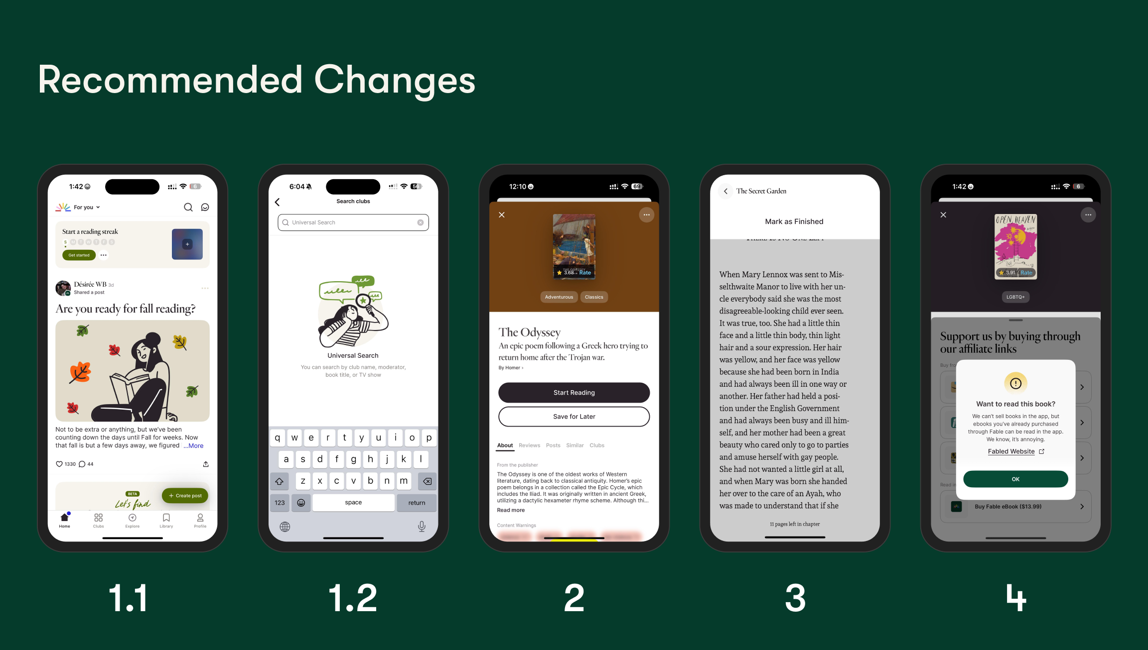
- Add a visible search bar or icon on the home/default page.
- Rename book page buttons to “Start Reading” and “Save for Later.” – For Intuitive Understanding
- Provide a clear “Mark as Finished” button with confirmation at the end of readings.
- Provide purchase redirects (for their own e-book store) instead of only showing errors.
- Use walkthroughs or onboarding to reader tools.
Final Thoughts
Fable has a really interesting idea – bringing together reading, tracking, and community in one place. But when you actually use it, the experience isn’t consistent. The club flow feels smooth and clear, while the reading flow makes you work harder than you should. (after nitpicking)
Most of the issues come down to basics: not being able to find things easily, unclear button labels, or missing feedback when you finish a task. These are the kind of small details that add up and decide whether people use an app or not.
The good part is that these aren’t impossible problems to fix. Fable already shows that it can design intuitive flows (the clubs prove that). The next step is to carry that same clarity into the reading side as well.
Sometimes it’s these small usability details that end up shaping how people actually feel about the app.