INTRO
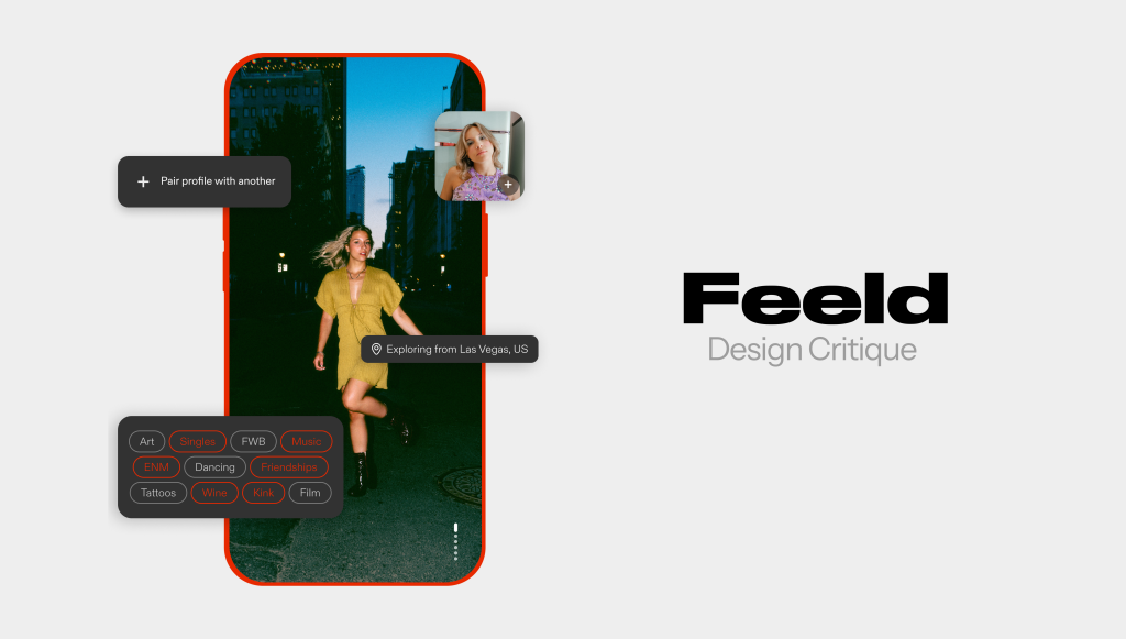
Feeld is a dating and social discovery app designed for people interested in exploring alternative relationship models, including ethical non-monogamy, polyamory, and kink. Unlike traditional dating apps, it emphasizes openness, inclusivity, and curiosity, allowing singles and couples to connect with others who share similar values around relationships and intimacy.
Due to the nature of the app and the time I had for this critique, I could not test the experience of the app’s unique value proposition of finding matches and connecting with others. However, given the explicit difference as a dating app towards alternative relationship models (compared to similar “traditional” apps catering towards more heteronormative norms), the onboarding process was interesting and definitely something to focus on.
ONBOARDING
Above is the general flow of the onboarding process. There are a few things done well and few done poorly.
- BAD DESIGN
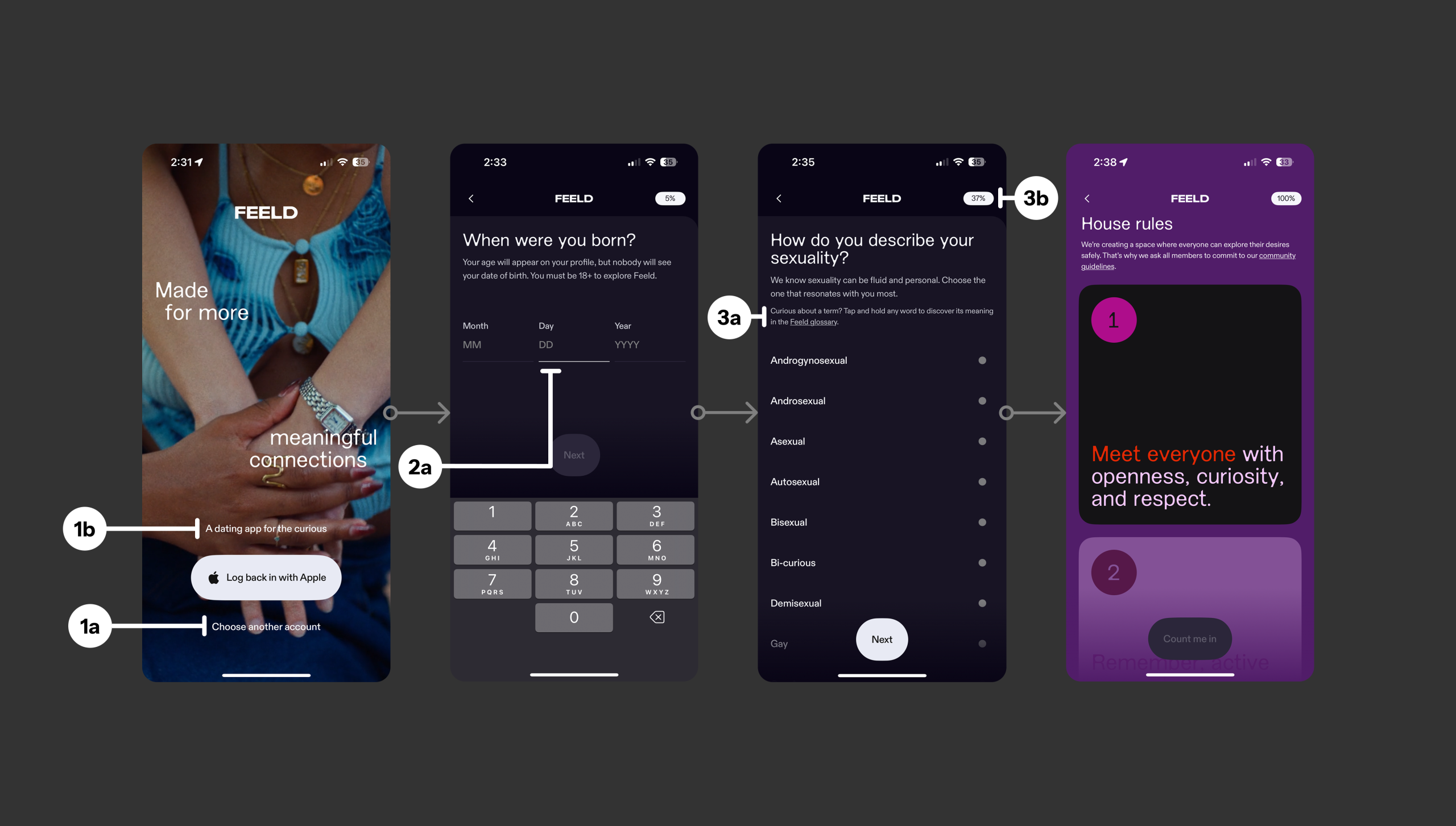
Right off the bat on the very first page of the flow, there is an apparent issue with discoverability due to a poor signifier. The rounded button is highly contrasted and visible to the user which screams “I am a button”, but way less obvious is the secondary CTA (“Choose another account”) (1a). Not only is there no similar treatment done to indicate that this is a button, the caption text above the main button (“A dating app…”) has the same treatment but is NOT clickable (1b). Confusing. Adding a similar button/visual treatment to the secondary CTA with a secondary brand color may be more useful or even just removing the caption text would suffice. I’m not convinced the caption text is entirely needed on this page. - GOOD DESIGN
The immediate page following the first splash/log-in state is a DOB form. This page on the other hand, ironically, is extremely clear. The user is given high visibility on what needs to be completed along with progress of the onboarding flow (contrasted percentage indicator on the top right). The current active form box gets highlighted underneath as the user clicks on it which is a clear signifier to the user that they are on the intended input (2a). As an American, the MONTH/DAY/YEAR mapping is intuitive, but as this app has European users, I am curious if this page changes based on location to fit the convention those countries use (i.e. DAY/MONTH/YEAR). - GOOD DESIGN
Shifting focus a little bit towards Jakob Nielson, I found this as a great example of the Heuristic #10: Help and Documentation. Users who are merely interested and have downloaded the app for exploration may not always be fully aware of all terms and definitions within alternative relationship models and thus the app provides a step towards educating the user at a page that throws quite a few sexuality terms towards their way (3a).
(Small Bad Design: Note the high contrasted percentage indicator is still present on the top right corner which is great for visibility, but having a mere number can be confusing as the user can’t really gauge how much is left distinctly (3b). If the percentages went
“0%-20%-40%-…” the pattern is predictable to the user, but going from “0%-5%-37%-…” can be confusing. A visual indicator of the start and end points with a progress bar may lend for an easier way to digest how far a user is within the onboarding process. - GOOD DESIGN
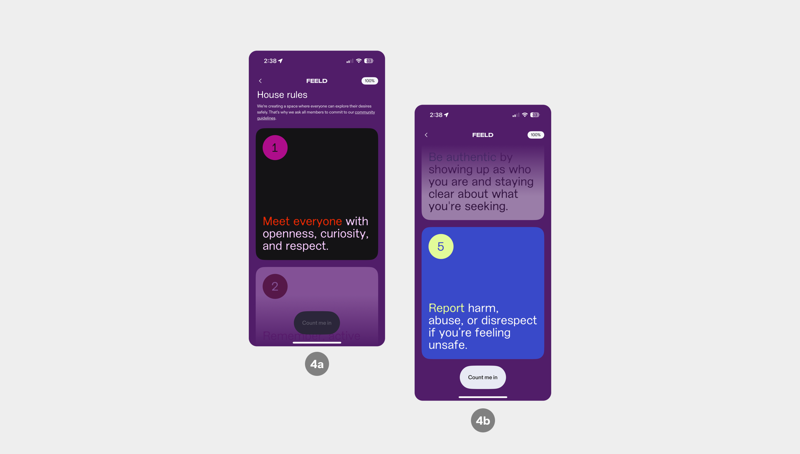
(See Below) The app advertises itself for openness in types of relationships, particularly with an avenue towards sexual relationships. Thus it is incredibly important to have every user understand the community guidelines. As an interaction standpoint, there is an affordance for the user to scroll vertically to see the next card (the signifier here being the slight visual of the next card with a gradient to indicate more is present below (4a)). Taking this a step further into Jenny Davis’s POV (How Artifacts Afford), this would shine as a demand. The user can not move forward (the button to move forward is disabled) until the user has moved through all five cards displaying the “house rules” for the app (4b).
MAIN PAGE
Despite my limited time, it would be remiss without at least talking about the main interface.
- GOOD / BAD DESIGN
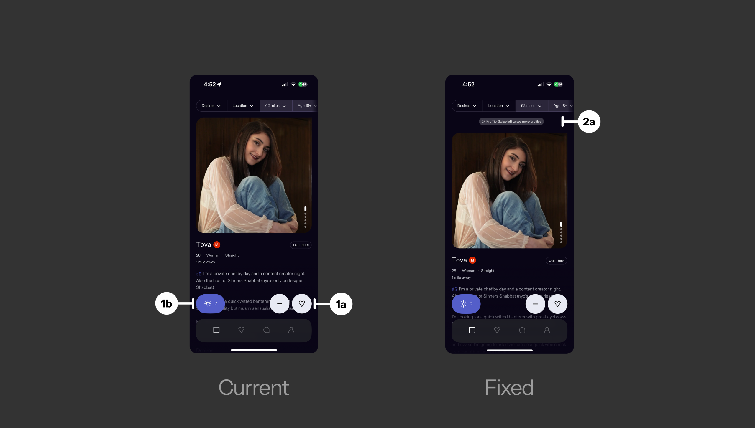
Taking a very bird’s eye view of the app home page, the interaction to like a profile or to dislike a profile is extremely clear. It uses familiar icons (a heart to like, a minus to dislike) to draw on Knowledge in the world, making the intended action immediately understandable. The cues are already there (1a).
On the other hand, the interaction of a “Ping” or this app’s version of an elevated “like” (similar to Tinder’s Superlike or Hinge’s Rose) uses an icon that, at first glance, seems very unfamiliar (1b). Unless you go through the app tour, the icon does not immediately indicate what this button will do or can do. This would be closer to Don Norman’s definition of Knowledge in the head. A user would need to use it repeatedly to understand/recognize its use the next time they come across it in the app. I wouldn’t call this “bad design” per say, but when taking a look at other implementations of this feature, this sun icon seems weaker as an indicator for its purpose (rose icon for Hinge, or star icon for Tinder). - BAD DESIGN
There is no signifier, thus no discoverability, that indicates you can swipe right to see more profiles. Once a user lands on a profile after signing up, it is clear they can scroll vertically to see more information on the profile, but scrolling horizontally to see more profiles is not indicated whatsoever. Adding some sort of notification to a first time user that they can swipe right to see more profiles may be useful to build that specific interaction knowledge for the user, or some UI element to visually show a horizontal scroll is possible could work as well (2a)
CONCLUSION
Feeld shows strong commitment to inclusivity and education, with clear moments in onboarding and familiar icons that leverage users’ prior knowledge. However, inconsistencies in discoverability, unclear CTAs, and less intuitive features like the “Ping” limit usability. Improving visibility, mapping, and signifiers would make the app more intuitive while supporting its unique community values.