Finch is a self-care app that works like a digital Tamagotchi. It blends nostalgic virtual pets with wellness routines. Users nurture a virtual pet bird by completing wellness tasks, check-ins, and reflections. As the Finch grows, so does the user’s sense of progress in their self-care journey. By following the app’s flow, from creating your “birb” to using the home screen and tracking your tasks, we can evaluate how Finch’s design resonates with users and where it stumbles.
Creating the Finch
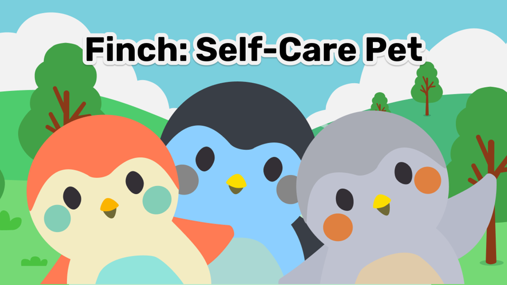
Finch begins with the act of creating and naming a small digital bird, or “birb” as they like to call it, a design choice that immediately builds a strong conceptual model. Users understand that caring for themselves will be mirrored in caring for the pet, drawing on cultural constraints established by Tamagotchis and other virtual pets. This metaphor is highly effective: even without instructions, most people know that feeding, nurturing, and attention will help the creature thrive. Yet, the onboarding also reveals a tension. The app presents numerous customization options: colors, traits, and naming, all at once. While also having a self-assessment of one’s self-care and mental health status. While engaging, this overwhelms users whose primary goal is to “start self-care quickly.” The design violates progressive disclosure, which recommends revealing complexity gradually. A more user-centered approach would allow people to first meet their Finch and only later explore customization, lowering initial cognitive load.
Daily Check-Ins
Once the Finch is created, users are encouraged to complete small tasks such as their daily goals, mood check-ins, gratitude journaling, or short stretches. These interactions demonstrate the principle of feedback at its best. Completing a task results in immediate visible responses: the Finch gains energy, performs joyful animations, or displays messages such as “Your Finch feels calmer.” This clear cause-and-effect relationship narrows the Gulf of Evaluation by showing that user actions matter. Yet this mapping is not always consistent. Journaling entries, for example, sometimes fail to trigger animations, leaving users unsure whether their input was recorded. Because Norman stresses that mapping between action and system response must be reliable, Finch would benefit from standardizing its feedback so that every completed task prompts a perceivable response.
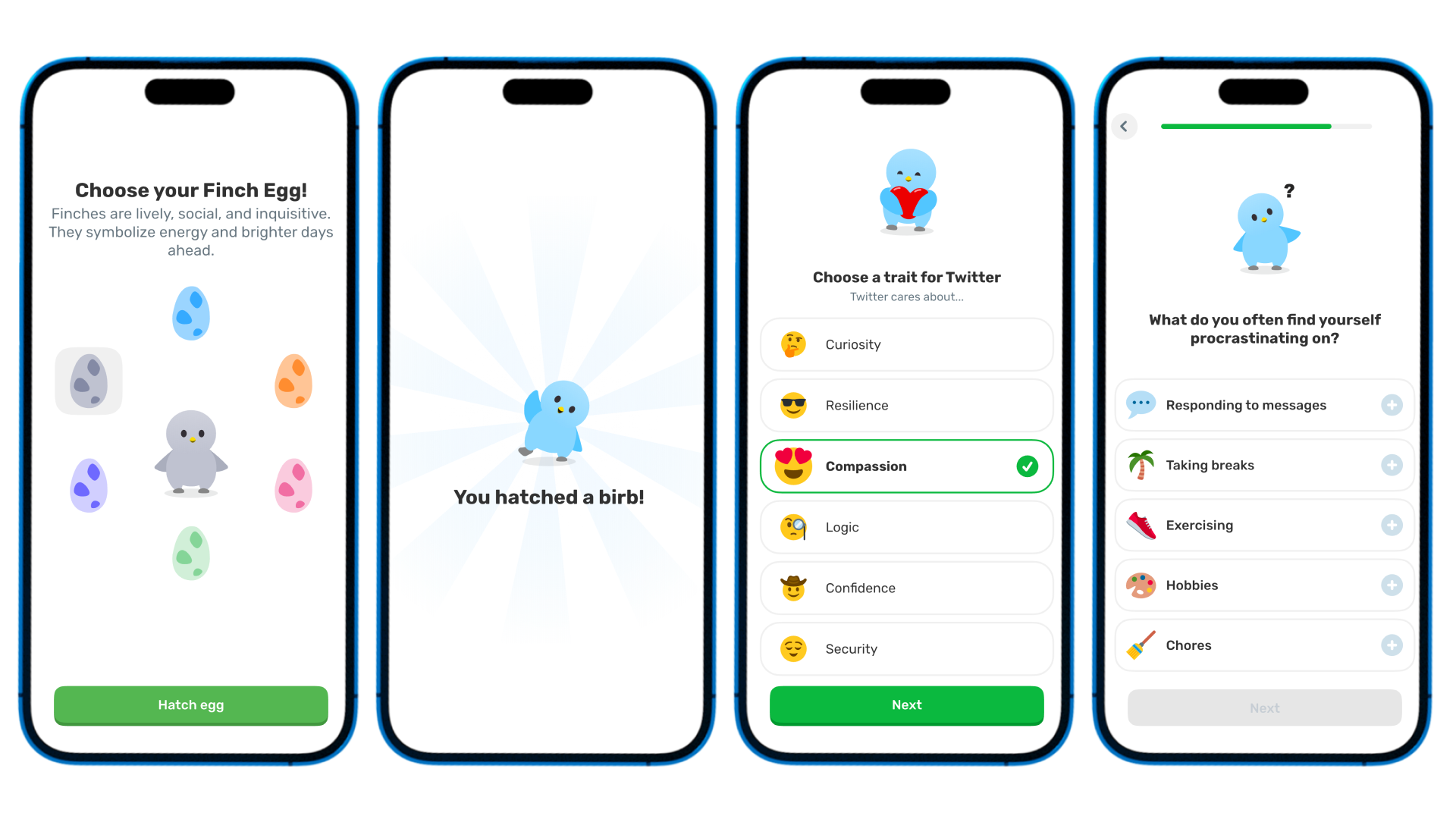
Navigating the Home Screen
The home page serves as the central hub, but here the design begins to falter. Alongside the checklist of core tasks, users encounter shops, guided “journeys,” community spaces, and frequent prompts for premium upgrades. While each button has clear signifiers, the overall layout undermines natural mapping. A user arriving with the intention to “log my mood” may struggle to locate the correct action among multiple competing options, widening the Gulf of Execution. Because the system lacks a clear hierarchy, essential self-care actions visually compete with secondary features. A redesigned home page that elevates the daily checklist and tucks secondary options into a collapsible menu would align more closely with Norman’s principle of simplifying the path between intention and execution.
Mood Tracking
Finch’s mood tracking highlights both the usefulness and the limits of constraints. By offering predefined emotion categories, the app ensures consistency and makes check-ins efficient. Constraints here function as Norman describes: they guide action and prevent user error. However, by restricting expression to rigid categories, the design risks frustrating users whose feelings don’t fit neatly into the provided options. For someone feeling “restless but hopeful,” the existing constraints flatten the experience. When constraints restrict more than they guide, they become barriers. A stronger design would combine structured presets with optional free-text or emotional sliders, balancing efficiency with flexibility.
Affordances and Access
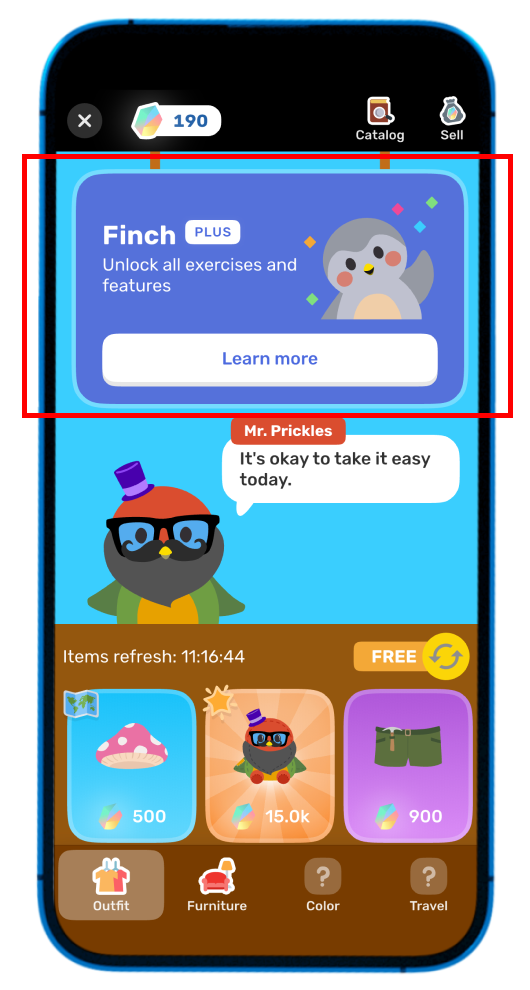
Finally, the app’s monetization strategy highlights what Jenny L. Davis, in How Artifacts Afford, calls the politics of affordances. While Finch positions itself as a tool for wellness, many of its most supportive features, like extended reflections and guided journeys, are locked behind a premium paywall. For users unable to afford upgrades, the app affords only partial care. In effect, the design distributes access unequally, making wellness contingent on the ability to pay. Norman’s framework reminds us that affordances should align with user goals; Davis extends this by showing that affordances are shaped by context and power. A more equitable model would keep core wellness tasks, like mood logging, reflections, and check-ins, free, while monetizing cosmetic features such as outfits or environments. This shift would preserve the integrity of the app’s purpose while ensuring sustainability.
Conclusion
By drawing on the familiar Tamagotchi metaphor, Finch succeeds in establishing a compelling conceptual model. Its task system leverages visible affordances and strong feedback to encourage daily use, and its playful design brings joy to self-care. At the same time, the cluttered homepage undermines natural mapping, rigid mood categories turn constraints into limitations, and paywalls reveal the politics of affordances. Applying Norman’s principles, especially progressive disclosure and simplified execution paths, alongside Davis’s critical lens of equitable design, Finch could more fully realize its goal of making self-care accessible, playful, and sustainable.