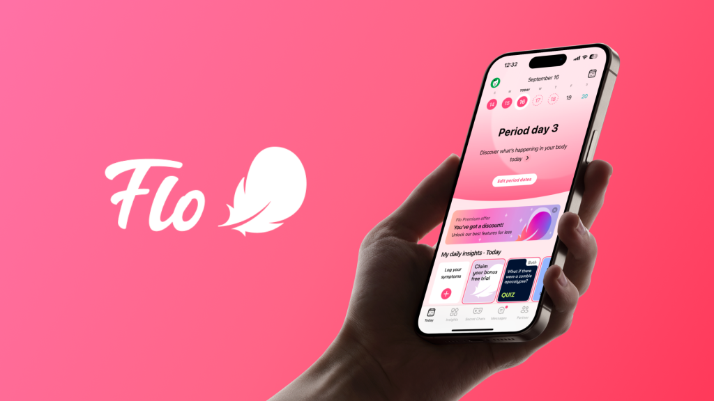
Flo is a menstrual cycle–tracking app that helps users monitor periods, ovulation, or pregnancy. It also offers resources on menstruation, pregnancy, mental-health and sexual wellness, along with symptom logging. This critique reviews Flo through concepts from Design of Everyday Things and How Artifacts Afford, focusing on the experience of a user tracking their period.
Onboarding
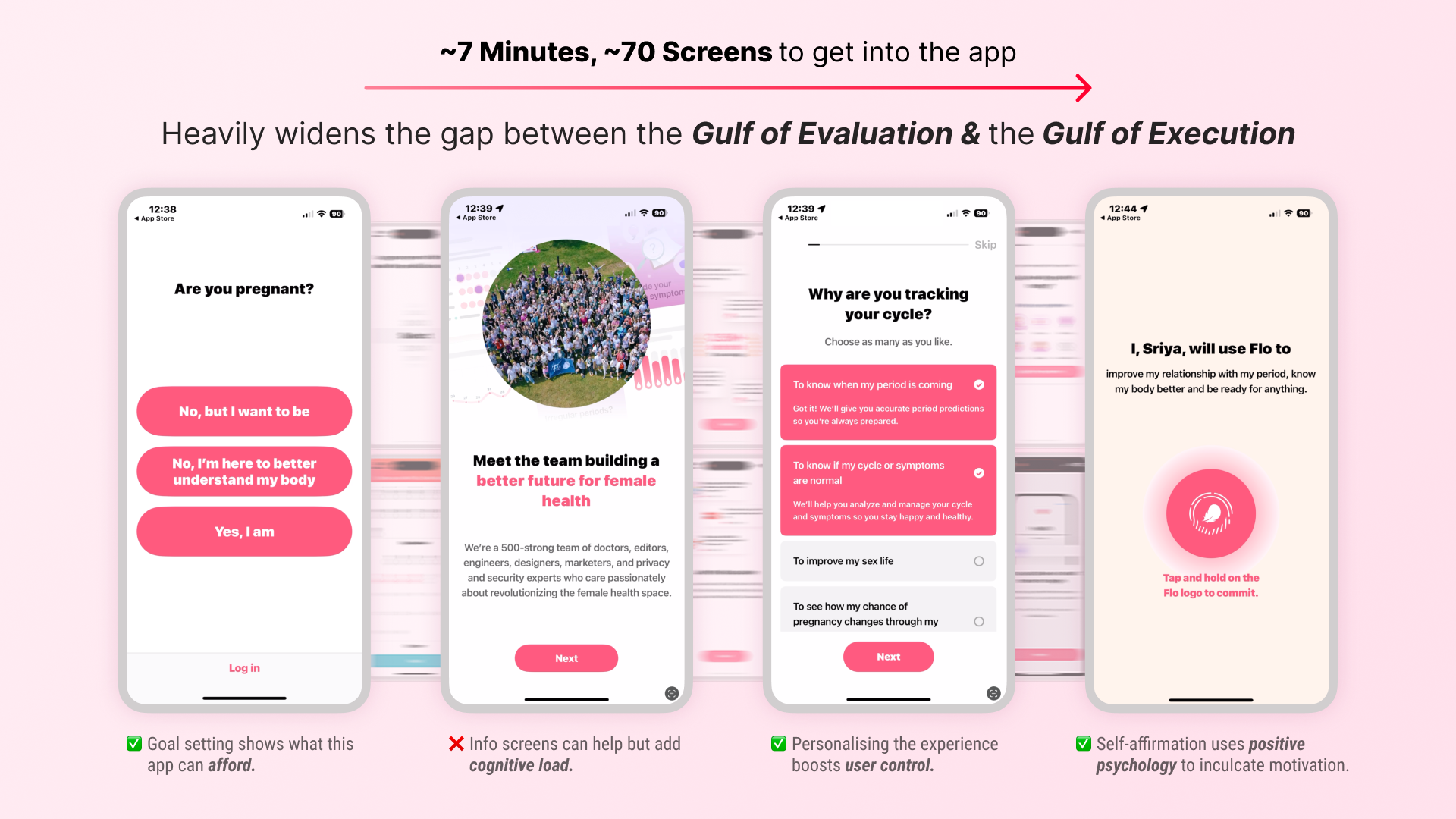
Launching the app for the first time and setting it up for oneself is in fact an arduous process. It consists of a huge questionnaire with infographics and takes around ~7 minutes with around ~70 different screens to get into the app. Although it does focus on setting your goals within the app and learns information about you to customise your experience to the fullest, it heavily widens the gap between the Gulf of Evaluation & Gulf of Execution. It makes it difficult for users to understand how their inputs are being translated into outcomes within the app, and also makes them impatient.
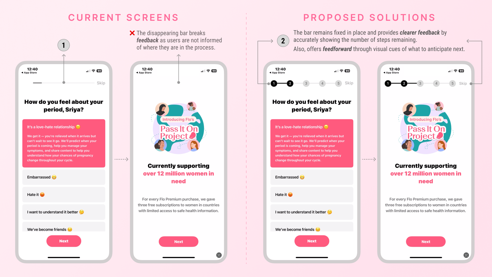
Moreover, the bar on top (1) that indicates your position is unclear and barely shows any increment due to the massive number of screens. It also keeps disappearing when the relevant infographics for the question popup. This not only hampers feedback & feedforward for the user’s actions but also takes the user out of the loop, making them confused and uninformed about where they are and how much is left.
I would add clear steps and streamline onboarding to a maximum of five screens (2) for better feedback and feedforward, shifting additional learning and information to later in the user journey to reduce cognitive load.
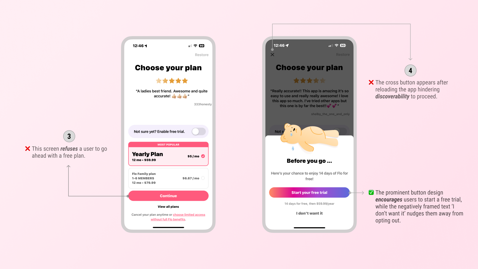
When the user finally gets to the end, they encounter a screen (3) which asks them to pick a plan and upgrade. However, there is no option here to go ahead with the free plan. The app refuses you to continue with a free plan when you reach this screen. However, on closing the app and reloading it, a tiny ‘close’ button appears on the far top left (4).
What I would do differently here is although it makes sense to discourage the user to pick a free plan from the product’s perspective, I wouldn’t hide it. Hiding it would hinder discoverability leading to users churning altogether.
The Home Screen
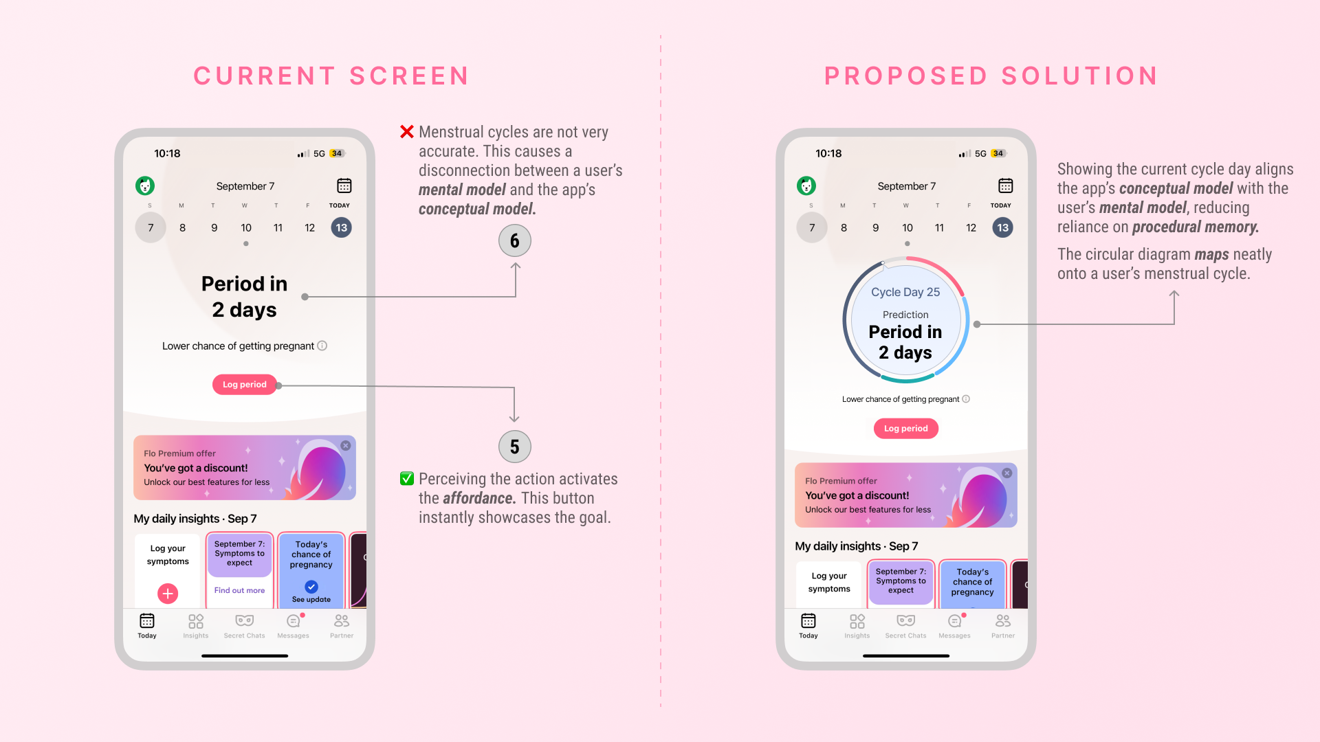
On the home screen, users first see the action they chose to track during onboarding — in this case, their period. As soon as a user sees this screen, they see a countdown to their next period or the day of their period depending on where they are in their cycle. This instantly showcases the goal, the countdown & logging (5) of the period affords tracking your period easily, it’s very intuitive.
Although, tapping into a user’s mental model, the whole idea of making tracking periods easier is because of how unpredictable it is, it’s very rare for your period to arrive on a set day every month, it mostly lies in a range. (6) Trying to remember how many days has it been since your last period kicks in your procedural memory, making it difficult to remember and calculate it every cycle. Which is why, I think it’s imperative we also include the day of the cycle and where you are at your current one, this would align the app’s conceptual model with a user’s mental model. In the solution, the circular diagram can easily be mapped with a user’s menstrual cycle.
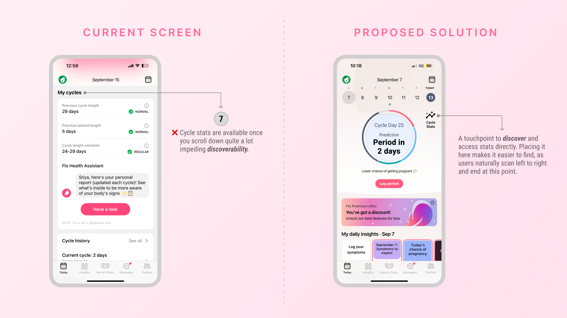
For a user who is primarily using the app to track their cycle, it should be an extremely seamless experience to locate any kind of cycle stats. In the current app, you’ll have to scroll down through a lot of informative resources and then get to the stats (7). This impedes discoverability of viewing you cycle-related information with ease. Adding a touchpoint to access stats directly alongside the main cycle information solves this.
The Calendar Screen
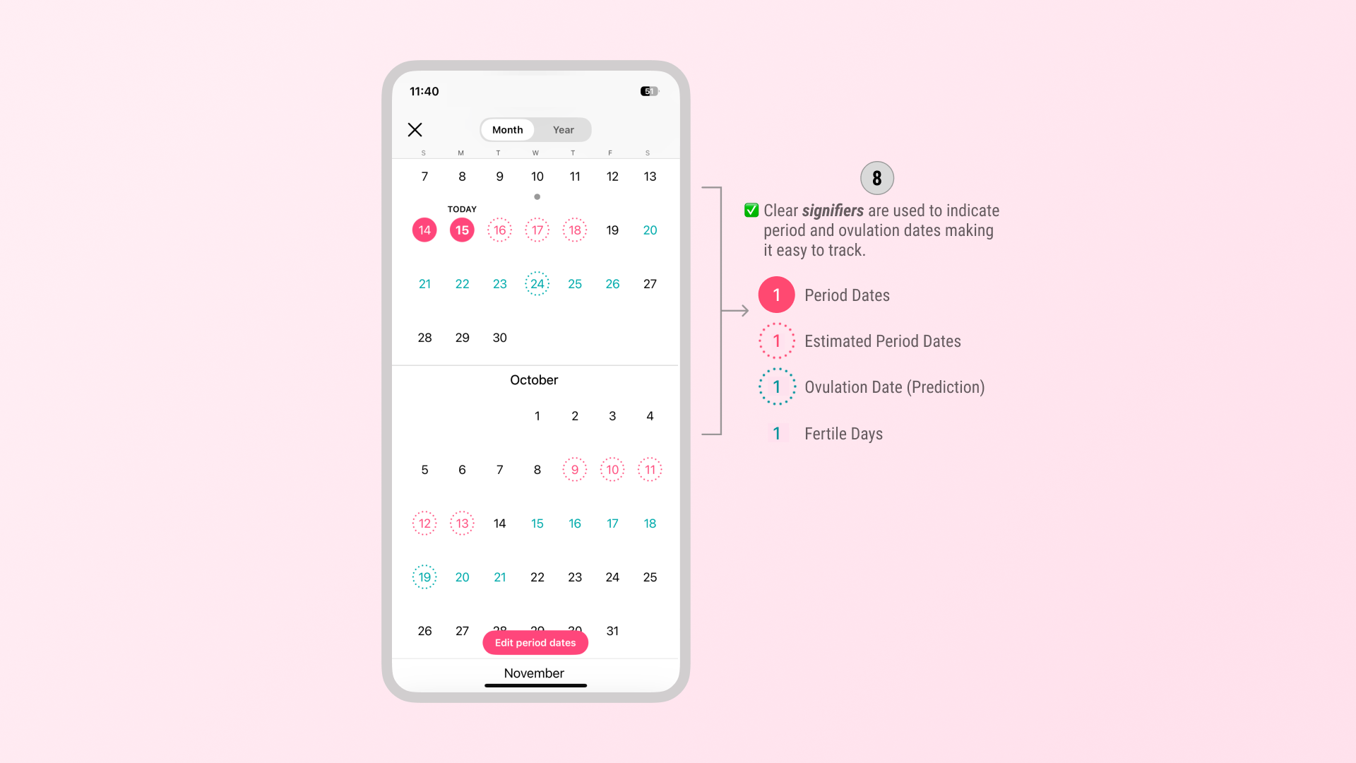
When you click on the ‘Calendar’ icon on the top right of the home page, it opens a calendar of your period and ovulation dates every month (8). This method of indicating period and ovulation dates functions as a clear signifier, making them easy to spot and track at a glance. This design is also inclusive, as the use of pink and blue ensures easy distinction for colour-blind users.
The Invite Partner Feature
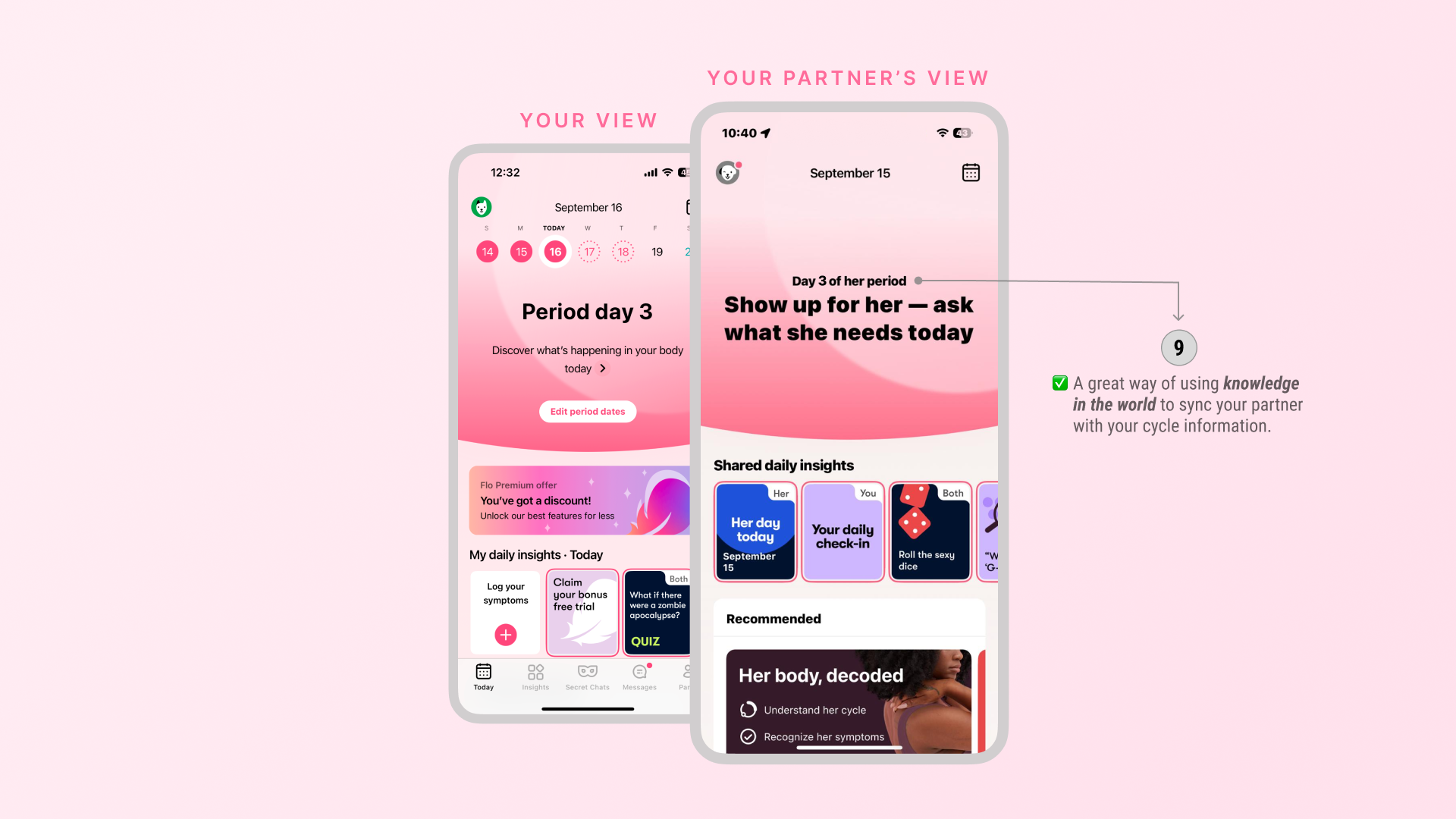
Flo has a ‘Flo for Partners’ feature where you can share your period and ovulation predictions with your partner (9). With this, your partner wouldn’t have to remember your cycle dates, this is a great way of incorporating knowledge in the world as it is readily available for your partner to access your cycle without him having to remember it.
Conclusion
Flo makes period-tracking straightforward and convenient. It uses intuitive signifiers that make it easy for any user to discover and decipher what the app affords. However, the app often overwhelms users by showcasing too many features upfront, many of which are paywalled. This not only increases cognitive load but can also discourage users from exploring these features later. By improving visibility, prioritizing primary actions, and reducing cognitive load, Flo could create a smoother and more engaging experience.