Hume AI is a text-to-speech (TTS) product whose primary selling point is its advanced emotional intelligence (EI). Emotion is, after all, the most powerful tool of voice—amplifying meaning, tone, and impact in text. Since achieving natural-sounding TTS has become largely a solved problem, the differences between products in basic voice quality are shrinking (or just vanishing to the human ear). As a result, EI is emerging as the key differentiator. Hume AI, one of the early movers in this space, aims to win the competition by pushing the boundaries of emotional output and expressiveness.
On Hume AI, users can choose from predesigned voice templates, design custom voices, or even clone their own. Its TTS engine generates expressive speech from text with control over emotion and style, while the Empathic Voice Interface (EVI) enables real-time speech or text-to-speech with contextual awareness, adjusting tone, pitch and rhythm accordingly. Additional features like Expression Measurement analyze emotions across voice and speech, further expanding the platform’s versatility. This platform provides both turn-based and streaming voice interaction modes, enabling adaptability across diverse real industry use cases.
Just as most desktop platforms, the hero section on Hume AI serves as the debut stage—showing potential users a sophisticated, emotionally intelligent voice AI.
The main advantage of the hero section is that it is instantly discoverable. The design effectively bridges the Gulf of Execution—the gap between a user’s intention and the actions the system makes apparent—by offering interactive voice demos. Users can interact with the product directly and experience its capabilities without having to read about them, which reduces friction and fosters trust. This practical method reduces users’ dependence on mental knowledge or past learning by guiding them with the help of perceptible cues and interactive elements. By enabling users to immediately perceive and interpret the outcomes of their actions, the instant audio output bridges the Gulf of Evaluation by providing clear and instructive feedback.
The layout strikes a smart balance, showcasing the value proposition and key features without overwhelming the user, which aligns with HCD’s goal of creating understandable and usable products. Furthermore, the naming of voices—using concise tags like “Warm narrator” instead of detailed personas—is a clever design choice. It encourages users to project their own approximate models or “inner-brain stereotypes,” making an arbitrary choice feel meaningful and reducing cognitive load.
Here is the detailed critique as follows:
Text-to-Speech: Where Good Intentions Create Friction
The text-to-speech module contains several well-intentioned features that, upon closer inspection, create usability issues by violating user expectations and creating a sense of lost control.
- The Overwriting Text Issue: The system automatically creates sample text that corresponds to the voice’s persona when a user chooses a new voice. Despite its apparent usefulness, this action erases any previously written text by the user. An excellent illustration of a design that disregards user initiative is this one. When a user’s work is lost due to a memory lapse, the system’s action results in a situation where they feel frustrated rather than in control. Instead of merely asking or recommending the new text, this interaction requires the user to accept it.
- Poor Mapping and Increased Cognitive Load: A clear conceptual model of the relationship between voice selection and text generation is not established by the current layout, which places the voice selection frame over the edit box. This results in poor mapping and increased cognitive load. Because the spatial relationship between the control (voice menu) and its effect (text box content) is masked, this results in poor natural mapping. Because the user must recall their prior text while navigating the overlay, this arrangement strains their severely limited short-term memory (STM).
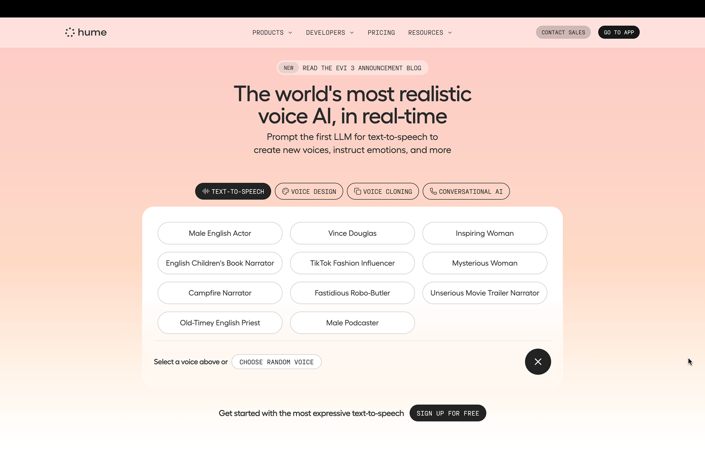
Refined Solution: To solve these problems, the voice selection element ought to be positioned above the editing box, resulting in a distinct spatial and hierarchical natural mapping. With a single “apply” button, the system could simply recommend new text rather than erasing user input. This respects the user’s agency by changing the interaction from a coercive demand to a helpful request. Putting the five most popular voices on display with the option to enlarge the list makes use of global knowledge to streamline selection while preserving the ability to delve deeper.
Voice Design: The Challenge of High Thresholds and Hidden Information
The voice design feature, while powerful, contains interaction flaws that could be improved by making information more transparent and using effective constraints to guide users.
- Absence of Transparent Feedback: Users must infer the effect of the “auto-enhance prompt” toggle since it doesn’t provide any visible feedback and the prompt box’s text stays the same. Because users are unable to see or understand what the system has done, this results in a sizable Gulf of Evaluation. The improved prompt would be transparently displayed in a better design, giving users the quick and insightful feedback they need to create a precise conceptual model.
- High Threshold for Novices: For new users who lack the experience to know what important points to include, prompt writing for voice design is a high-threshold task that can be a knowledge-based error waiting to happen. At the moment, the interface permits free-form text but does little to promote efficient prompting.
Refined Solution: The design should use visualization components, such as sliders for attributes like pitch and pace, to lower this threshold. This would turn an arbitrary task into a meaningful one by adding physical constraints that direct users toward important design requirements. The system reduces the user’s cognitive load by introducing knowledge into the world through the manipulation and visibility of voice design attributes. There is currently a lost opportunity because the “retry” option regenerates all voices without enabling prompt edits. Users would learn and the iterative design principle of “fail frequently, fail fast” would be supported if they could iterate on their prompt within the same workflow.
Voice Cloning: Ambiguous Signifiers and Lack of Forcing Functions
The voice cloning feature suffers from ambiguous signifiers and a lack of clear guidance, which can lead to user error and frustration.
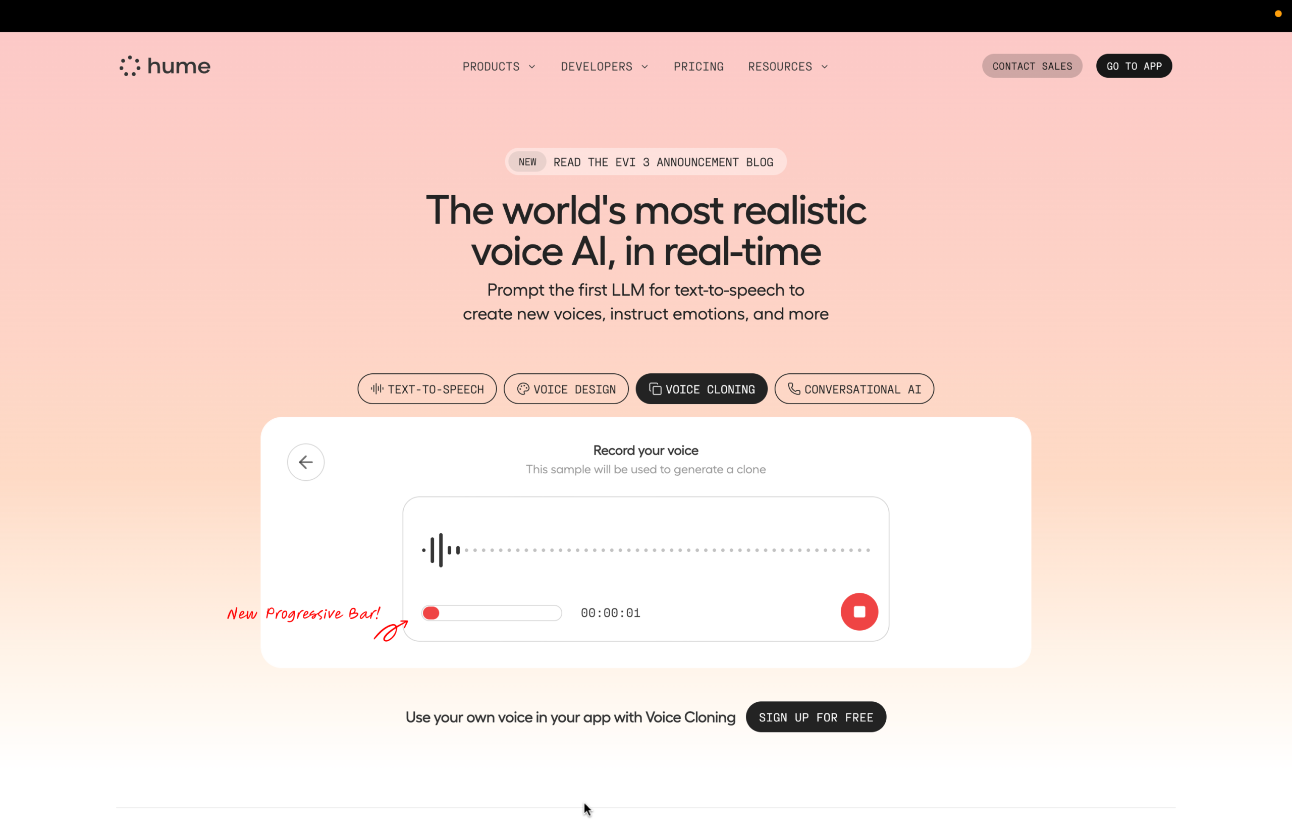
- Absence of Prerequisite Information: Although it is important, the 10-second recording requirement is not made clear up front. Users are forced into a cycle of trial and error because the system is unable to provide this information. The record button’s color change serves as a subtle signifier, but the resulting check icon is unclear and doesn’t make it obvious that there is a clickable next step. When a user misinterprets the icon as a status message instead of a button, it can result in a description-similarity slip.
- Lack of a Forcing Function: If a user doesn’t speak for the full duration, the cloning effect may be poor, but the system doesn’t prevent this. This is a situation where a gentle forcing function, like a lock-in, could be beneficial.
Refined Solution: To visually convey the 10-second requirement, add a progressive bar. This serves as a constant indicator of progress and a clear signifier. This small addition ensures that users are aware of the constraint before they start by putting important information into the world. Additionally, the check icon needs to be redesigned to make clicking easier, maybe by combining it with words like “Next” or “Create Clone.” Its function as a signifier would be reinforced, and it would more successfully lead the user through the Seven Stages of Action. To avoid a common slip and guarantee a better result, the system could also incorporate a soft lock-in by turning off the “next” button until the 10-second minimum is reached.