
Adobe Lightroom is one of the most popular photo editing apps among professional photographers and enthusiasts. The platform gains one of its biggest advantages from being a cross-platform application, supported on various categories of devices, including desktops, laptops, tablets, and smartphones. This critique’s focus will be on its iOS version, examining the app’s library page.
Introduction:
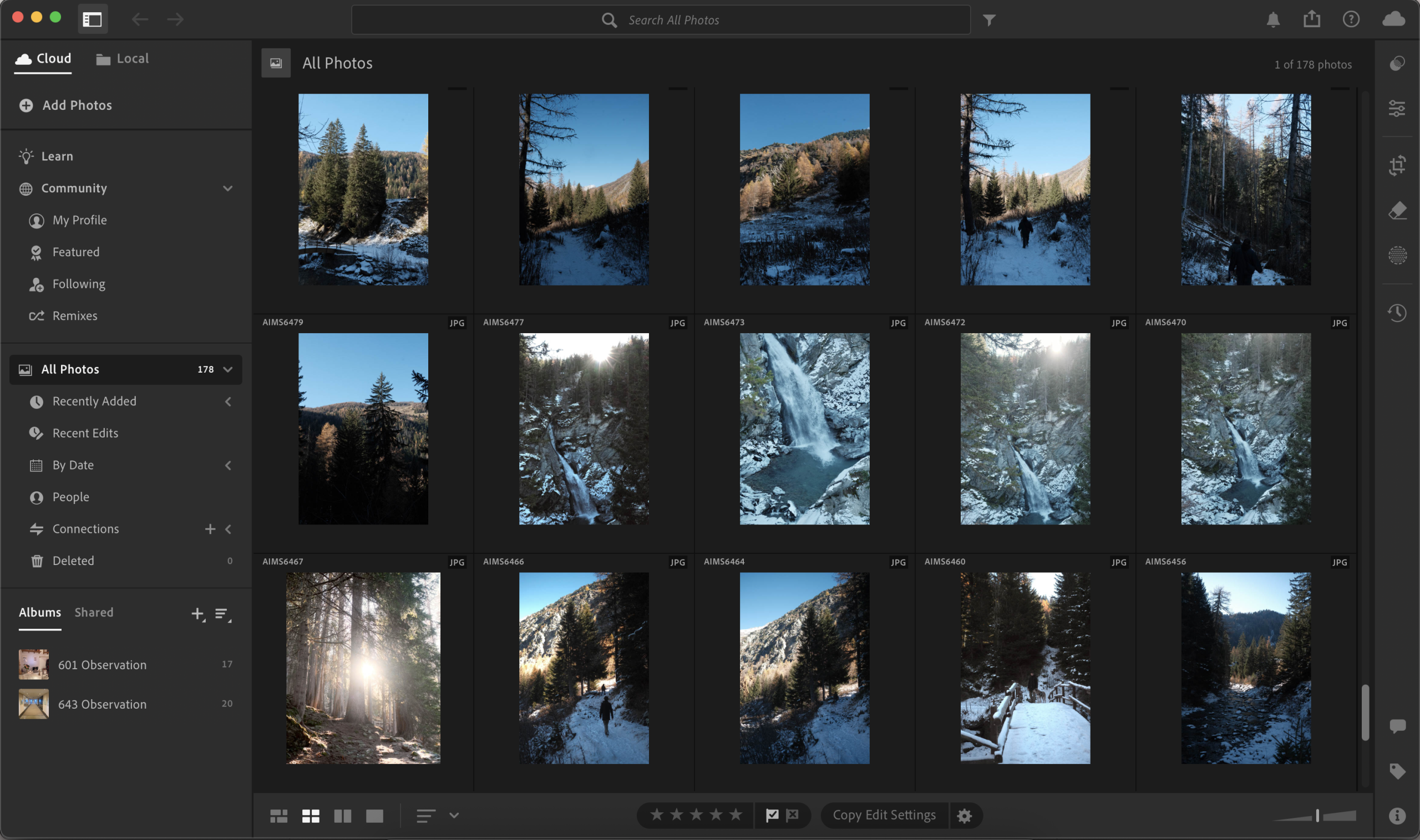
The iOS app draws inspiration from the same design principles of its desktop version (Figs. 1 and 2), with a few tweaks that bring it up to the front of the best image editing application currently available on iOS devices.
First Impressions:
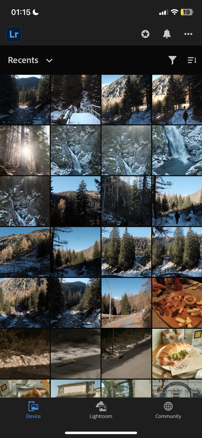
After accessing the service, by following a pretty standard log-in process, the app opens up to its standard view (Library). Here, the user encounters a familiar structure, similar to what they would find in the desktop version of the app or in the default iOS Photos application. The design plays with the user’s conceptual model, giving them a familiar architecture that will feel intuitive, reducing the cognitive load required by the user when using an app for the first time. The grid style layout holds the most real estate on the screen, and the user can easily understand that the grid affords scrolling, just like in other similar applications.
A Strong Example of Usability:
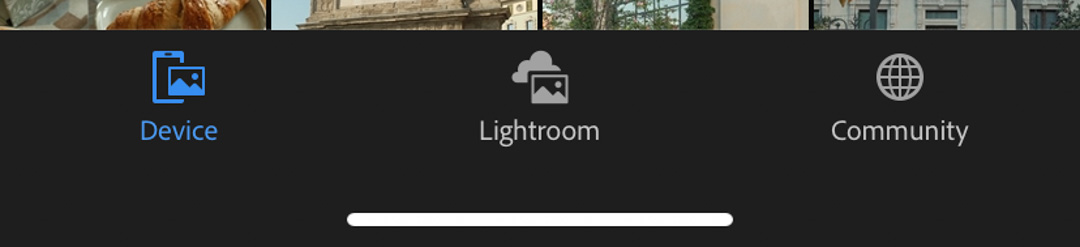
The grid is bordered by toolbars at the top and bottom of the screen. The bottom toolbar is very streamlined and clearly communicates to the user its affordances by using signifiers in the form of buttons, labeled respectively “device”, “lightroom”, and “community.” Together with the icons shown in Fig. 3, it’s fairly intuitive for the user to understand that these buttons signify a change of page. Adobe decided to place these page-changing buttons at the bottom of its screen, just like other popular applications, i.e., Instagram, Spotify, Pinterest, and many more. Thanks to this placement that mimics the mentioned applications, the app promotes good discoverability of all its pages, facilitating usability. This well-designed bottom toolbar is unfortunately paired with a less-than-ideal top toolbar.
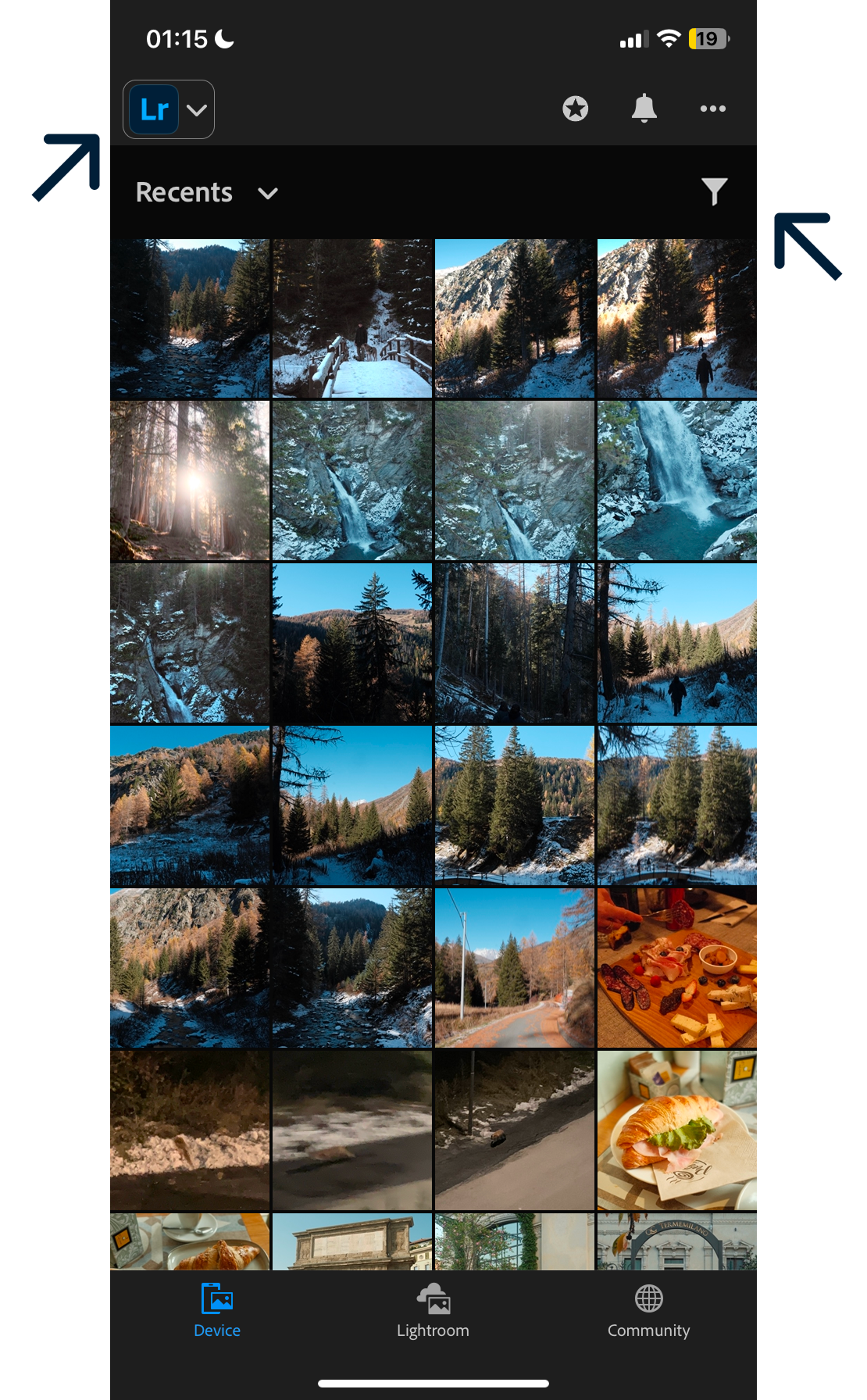
A Confusing Design Choice:
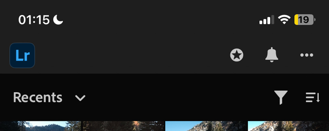
The top toolbar, on the other hand, has a more confusing button mapping. Some of them feel superfluous and improperly designed. As you can see in Fig. 4, the layout is fairly simple. The top toolbar on the ‘Device’ page is divided into two sections: the top portion, containing the logo and icons, and the bottom portion, which includes the Recents button and additional controls. Looking at the logo in the top section, the icon does not seem to afford any interaction. However, upon tapping it, the user will discover that this icon is actually a button, which opens a pop-up with pretty important app settings. This design is clearly flawed, as there are no clear signifiers showing the user the affordance of the logo. I will offer a solution to this design in the next section. On the right side, you can find three icons that clearly signify their purpose. The first one is a star that, upon a tap interaction, prompts a pop-up with information about the premium version of the app. The second and third icons are, respectively, a bell and three dots. These icons trigger the knowledge in the head of the user, allowing them to know that they will display information about notifications and “other settings” respectively.
Controls & Features:
Moving onto the bottom section of the top toolbar, the user will find more buttons with which to interact. The “Recents” button has a signifier in the form of a downward-pointing arrow, creating the correct expectation of a list popping up upon interaction. On the right side, the funnel icon triggers the knowledge in the head of the user, allowing the understanding that, upon interaction, the button will allow the user to change filtering settings. The other icon is a very clever design. Three lines of increasing length adjacent to an arrow pointing down. At first glance, it can seem confusing, as this is a very intricate design that is not present in any other apps. However, upon interaction, the user will trigger a change in the icon, as well as in the library’s view. After the interaction, the icon will flip vertically, showcasing the three lines, now in decreasing length, and an arrow pointing up. When the arrow is pointing down, the library affords an upward finger motion scrolling, while the opposite occurs when the arrow is pointing up. Even though this is a clever customization feature, I argue that this is a perfect example of feature creep. This is somewhat of a pointless feature to add, as the users are likely to adapt to whatever scrolling direction the application will afford, easily.
Solutions:
To address the design flaw previously mentioned with the logo icon, I will add signifiers to clarify the affordance of the icon to the user. I propose a very simple but effective solution (Fig. 5). A minimal, downward-pointing arrow next to the icon, with a stroke encompassing them, will create a strong signifier to the users who will now recognize the icon’s affordance of tapping. This simple redesign goes a long way in creating a signifier for the user, who will not miss this important section of the app. Lastly, I removed the cleverly designed scroll motion icon, as it is ultimately superfluous.
Conclusion:
Adobe has done a great job transferring the user experience of Lightroom’s desktop application into a mobile version. With minor refinements to the library page, it could easily become one of the most intuitive and usable Adobe interfaces.