The NJ Transit Mobile App is an application designed to be a one-stop shop for people traveling via the New Jersey Transit system, whether on train, light rail, or bus. It gives users the ability to buy tickets, plan trips, receive alerts, and more.
The Good: A straightforward ticket purchasing flow
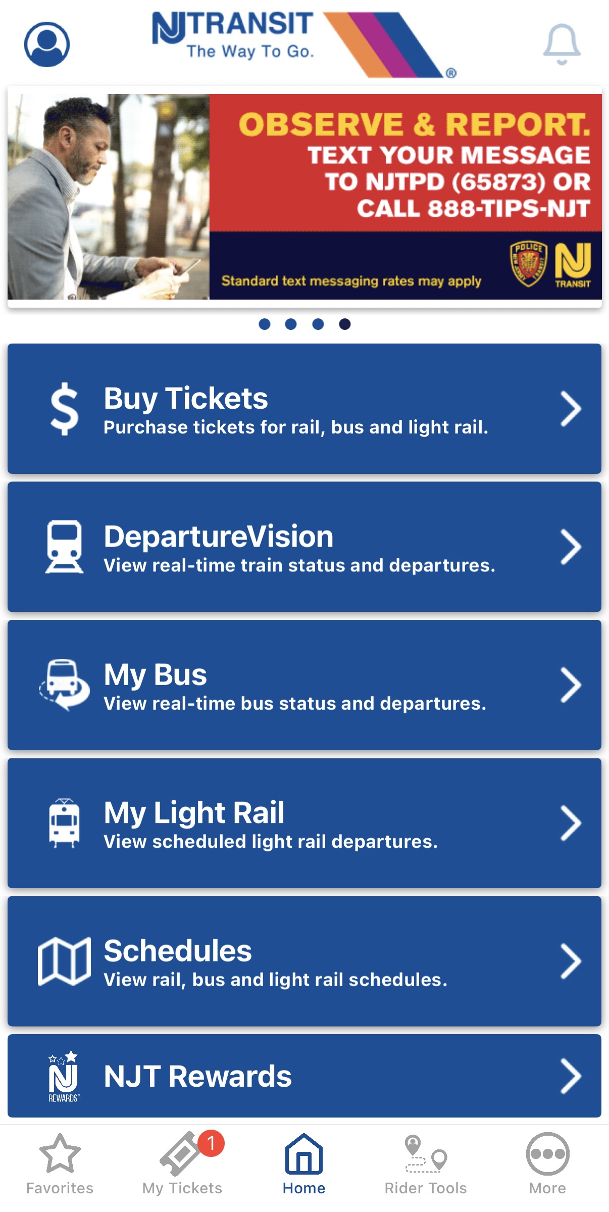
For seasoned users of the app, it’s an easy process to buy a ticket. The entrance into the flow is very discoverable, as upon opening the app and landing on the home page, “Buy Tickets” is the first option.
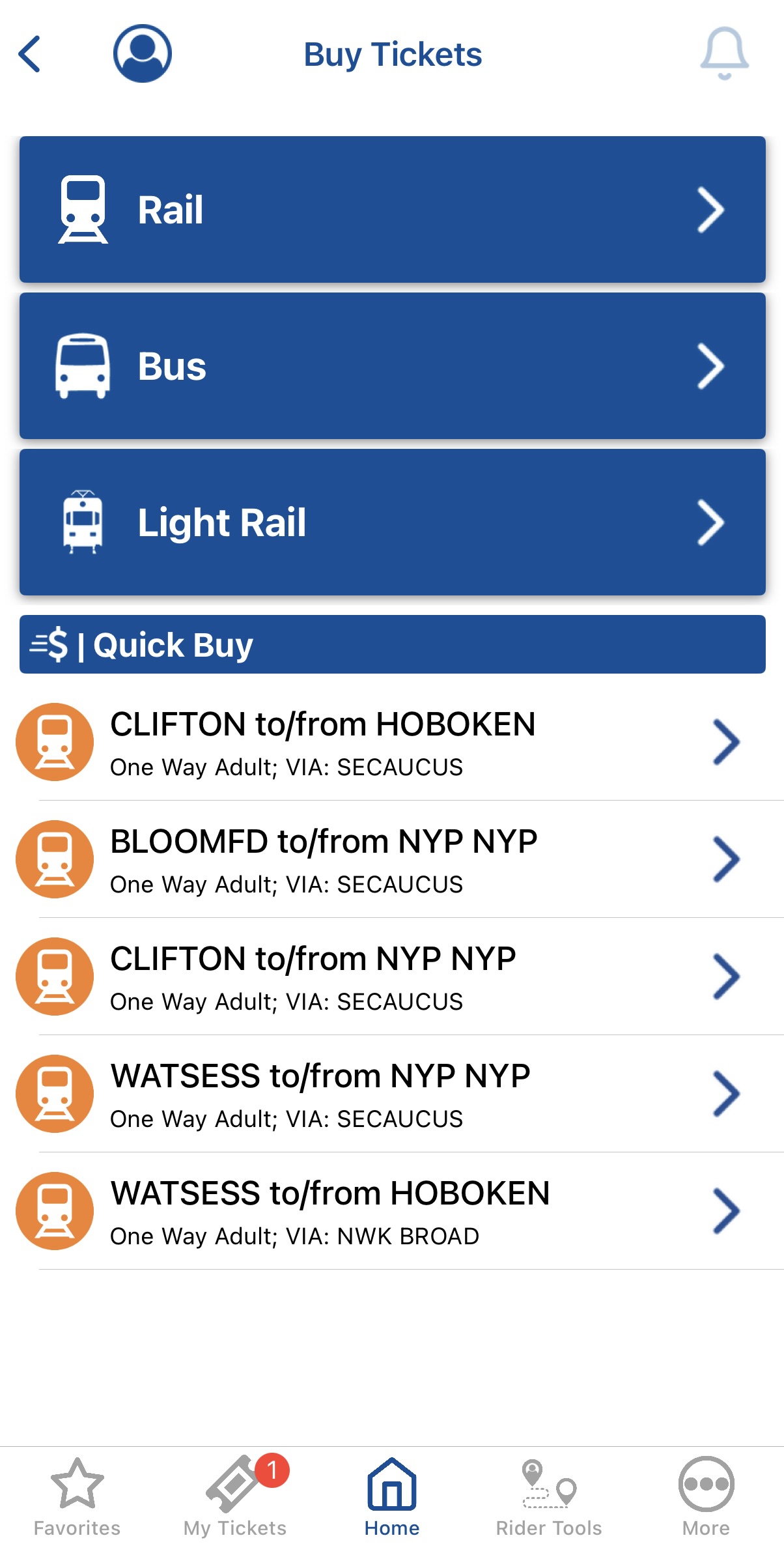
From there, the user lands on a page with three options for the types of tickets they can buy. Mapping via an option labeled with both text and icon allows them to continue into the correct flow, based on their preferred mode of transport.
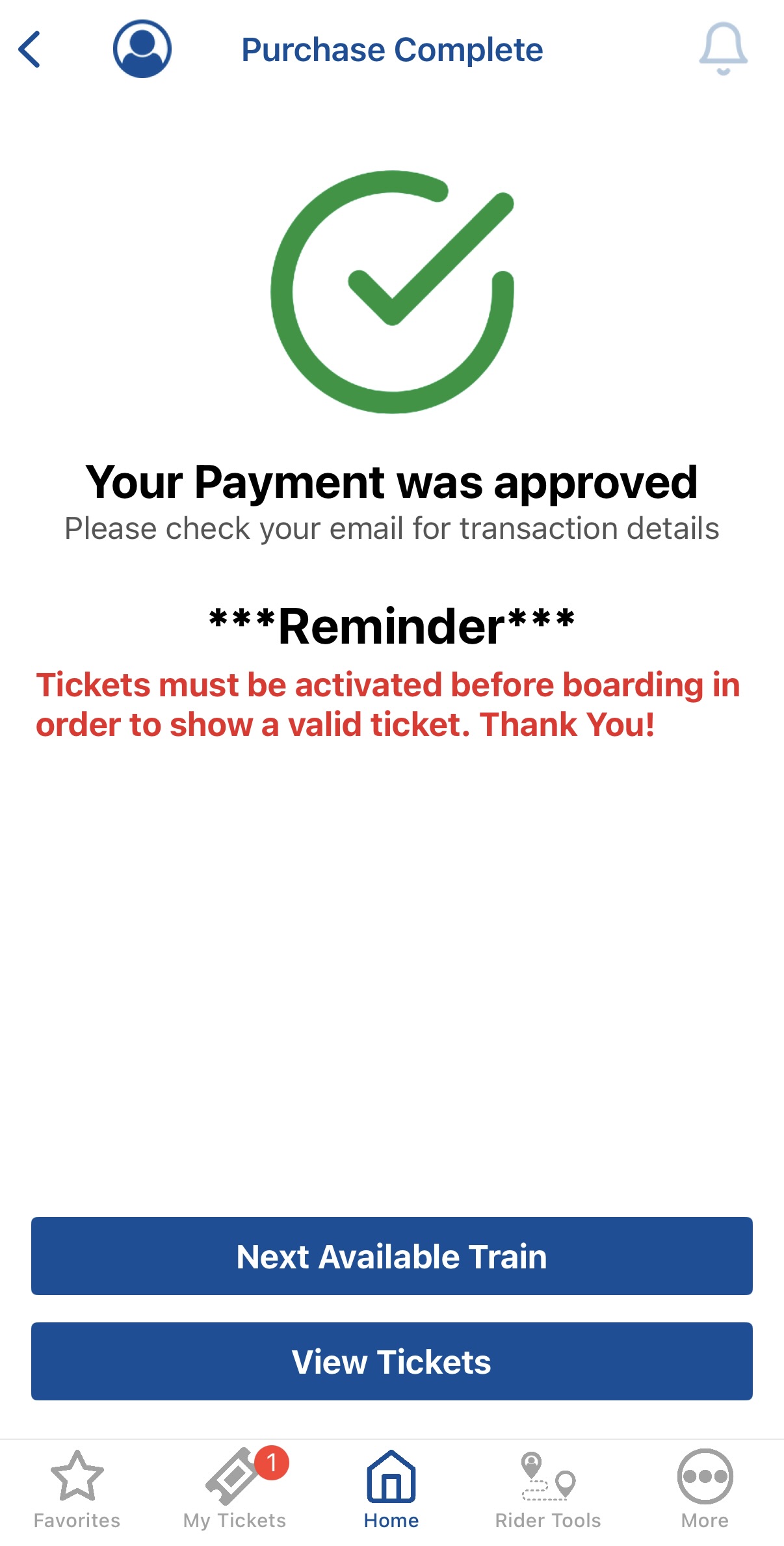
As long as the user knows their origin and destination, they are able to easily choose and buy a ticket. On successful purchase of the ticket, the user is met with clear feedback: a screen that has a large, green checkmark and a bold success message.
Overall, this flow helps users overcome both the gulfs of execution and evaluation. With discoverable and well-mapped buttons and content, the user can know how to proceed with each step and see if they made the correct action.
The Bad: A confusing navigation bar
Say a user wants to take other actions beyond purchasing a ticket. They may refer to the navigation bar on the bottom of the screen to explore their options. Based on the feedback given by the color of the icon, the user can easily tell which page they’re on and which page they may want to navigate to next.

However, the user may start to question: which page should I even navigate to? The “Favorites” and “My Tickets” navigation are easy enough to figure out – but what would even be in “Home”, “Rider Tools”, or even “More”? The “Buy Tickets” flow seems like it could be a rider tool, but it was under the “Home” option. “Service Advisories” seems important, but it isn’t in the home page, it’s in the “Rider Tools” page. The “More” option just takes the user to the user settings page, which is already navigable via the button that appears on the top left corner of every page. Thus, the user may find themselves stuck in the gulf of execution, as the discoverability needs to be improved.
To fix this problem, the navigation bar options should map better to the different actions and information that can be found in the app. For instance, “Favorites” and “My Tickets” could remain, with “My Tickets” taking in the ticket purchasing flow from the home page, but the three other options could be more intuitively named:
- “Trip Planner”: Dedicates space to the “Trip Planner” feature
- “Ride Info”: Contains schedules and scheduled departure times
- “Alerts”: Contains service alerts, advisories, and system statuses
The Ugly: An ineffective route planner
An app feature called “Trip Planner” attempts to help users to plan their routes using NJ Transit services, but it falls short of maintaining a good conceptual model of a navigational system.
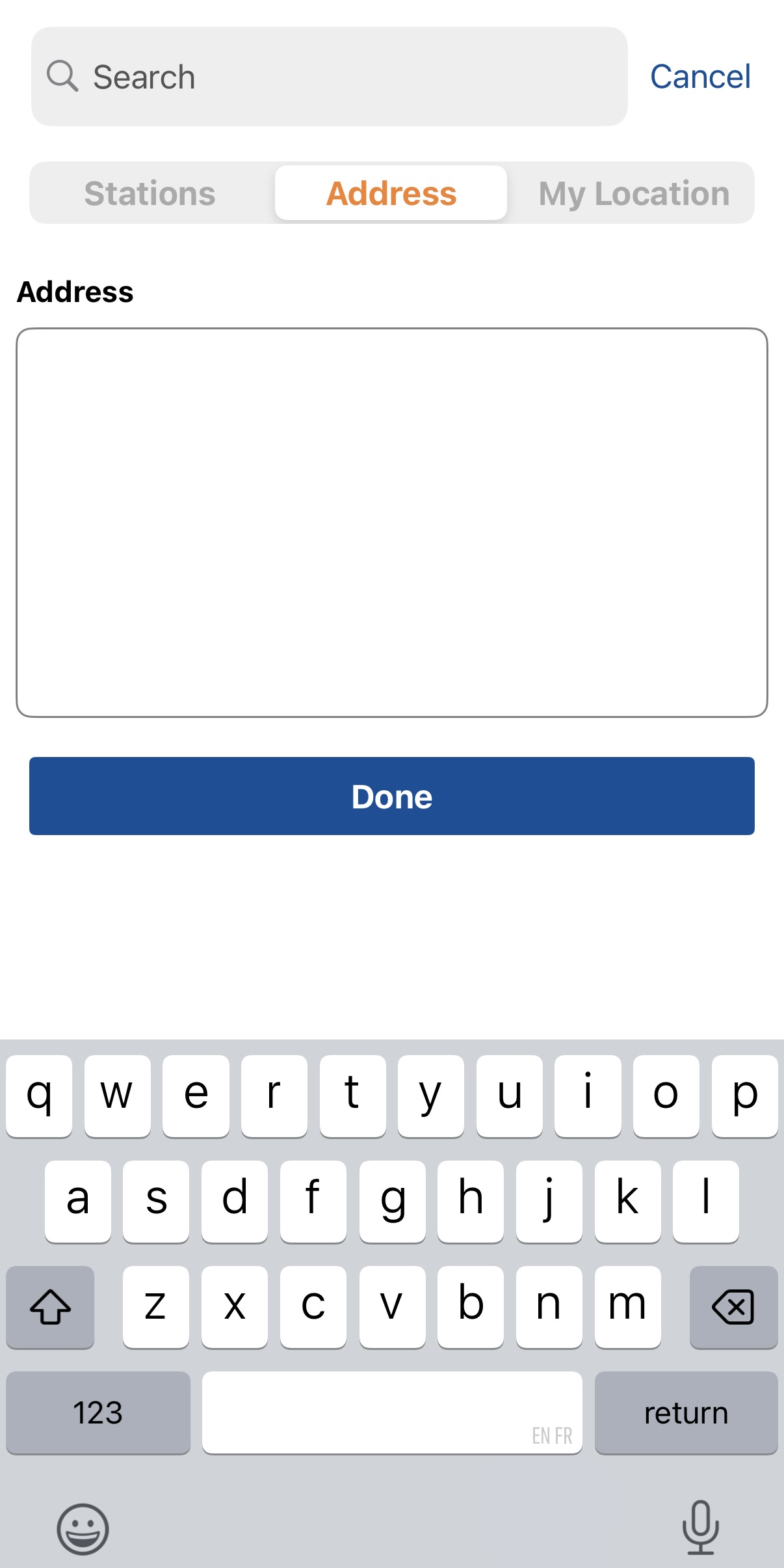
When testing the app with my own address as the origin, I came across two options. I could enter the address into a text box that provides no feedback of if I’m entering it correctly or a constraint that limits my address input. Or, I could choose “My Location”, which also provides no feedback on whether or not it knows my location. Frustrated, I simply used an existing station from the list.
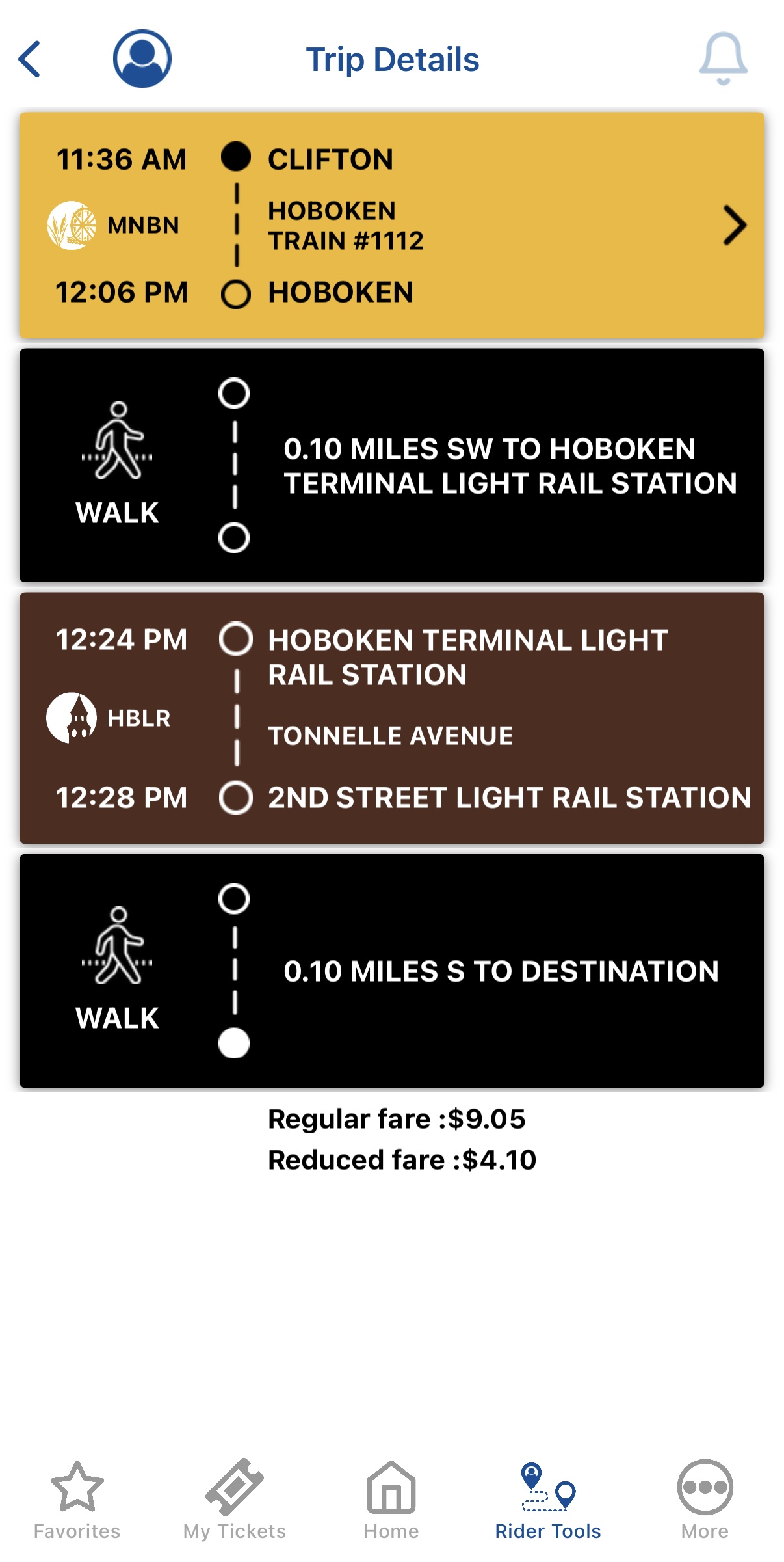
Once I plugged in my destination, I was able to get minimal route information. This information requires some knowledge of direction or location, so users could be prone to be making knowledge-based mistakes when following the directions.
To fix the problem of this feature, there should be more feedback via error or success messaging and a way to constrain address input. There should also be a map that provides more visual information to the user and thus more feedback, such as highlighted routes, a compass, and landmarks. Through this, the conceptual model of “Trip Planner” would match the mental model of a useful navigational system.