By Madison Magnani
Landing Page
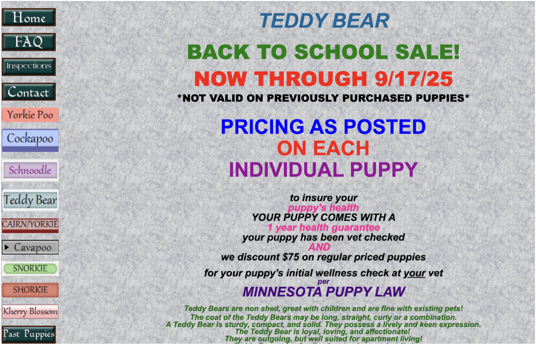
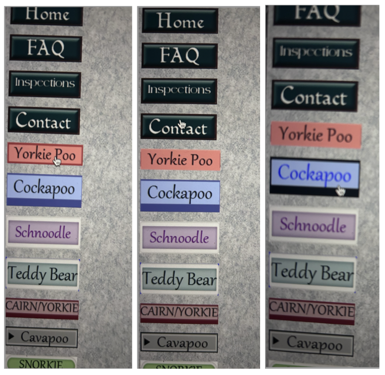
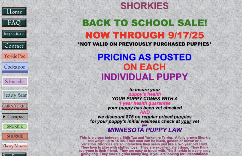
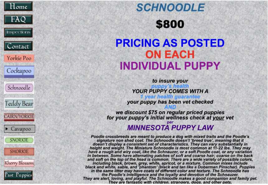
Bright colors, clashing fonts, and navigation that felt like a guessing game turned this Pepups puppy site into more of a scavenger hunt than a helpful resource. Reading Don Norman’s Design of Everyday Things made it click why it felt so off. He talks about the classic stove knob problem, when you don’t know which knob turns on which burner. This website gave me the same energy. The left-hand menu looked like a rainbow exploded, but the buttons had no logic in their order, colors, or labels. It left me second-guessing: if I click “Teddy Bear,” am I about to see photos, prices, or just a random text page? Users shouldn’t have to play 20 questions just to figure out basic actions.
Standardization
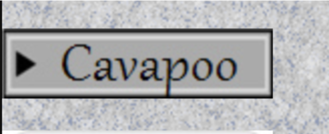
Norman points out in Chapter 4 that standardization saves people from constantly having to relearn the rules. This site clearly missed that memo. One menu uses a skinny font, the next switches to bold, hover states pop up here but not there, and then suddenly there’s a random play icon next to “Cavapoo.” Naturally, I thought it meant video, but nope, just meaningless decoration. Instead of guiding me, the design kept throwing curveballs and static into the mix.
Affordances
Affordances also suffer. Norman explains that affordances communicate what actions are possible, and visible ones make them clear. On this site, many buttons resembled decorative banners rather than functional links. Several did not respond to hover, no underline, no highlight, no signal that they could be clicked. Users are left unsure whether these elements are active or purely visual, which reflects a failure of perceived affordance.
Norman’s Six Principles
Norman’s six principles make it pretty clear where this site stumbles and how it could do better. The buttons look clickable, but nothing about their style actually signals interactivity, some consistent shapes or borders would fix that. Pricing info is hidden in plain sight with no signifiers; a simple underline or icon could make it obvious. Constraints? Basically nonexistent. “Contact” sits right next to breed categories, so it’s way too easy to misclick. Mapping is all over the place too, the colors and order feel totally random, so you can’t predict what’s coming next. Feedback is weak: click around and you’ll notice no header change, no breadcrumb trail, nothing to confirm you’re on the right page. And the biggest issue? The whole conceptual model is a mess. The site doesn’t know if it wants to be a store, a flyer, or a blog, which leaves users with no clear mental map of how to use it.
Conclusion
That said, the site does demonstrate some positive qualities. The background frame remains consistent across pages, which creates a minimal sense of stability. The site is also comprehensive, gathering most relevant information, from puppy health guarantees to sale dates and breed categories, in one place. Norman emphasizes that knowledge in the world reduces reliance on memory, and in this sense the site succeeds. Finally, visibility works in one area: the sale date is displayed prominently in bold red, making the urgency immediately clear. Unfortunately, that strength is diminished when the same intensity is applied to every other element, eliminating any hierarchy of importance.
Norman consistently stresses that design is about communication. This site failed to communicate effectively, leaving me confused and uncertain. The gulfs of execution and evaluation were wide: I could not easily determine what actions were possible or whether those actions worked. Clicking often felt like an uncertain attempt, with no clear confirmation of success.
In the end, good design reduces cognitive load by placing knowledge in the world rather than relying on memory or guesswork. This site required too much effort just to navigate, distracting from its actual purpose. By introducing standardization, clearer signifiers, and a consistent conceptual model, the site could become usable and straightforward. As it stands, it represents less the Design of Everyday Things and more the Design of Everyday Confusion.