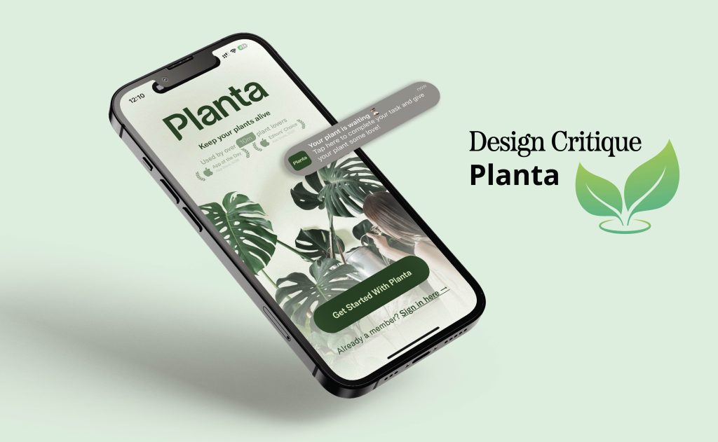
Picture having a caretaker who knows when your plant needs water, soil, or care when sick. That’s the essence Planta aimed to offer with schedules, reminders, guides, identification, and a light meter. This critique takes a beginner’s view, focusing on adding plants, reminders, and the homepage, using ideas from Don Norman and Jenny Davis.
Onboarding
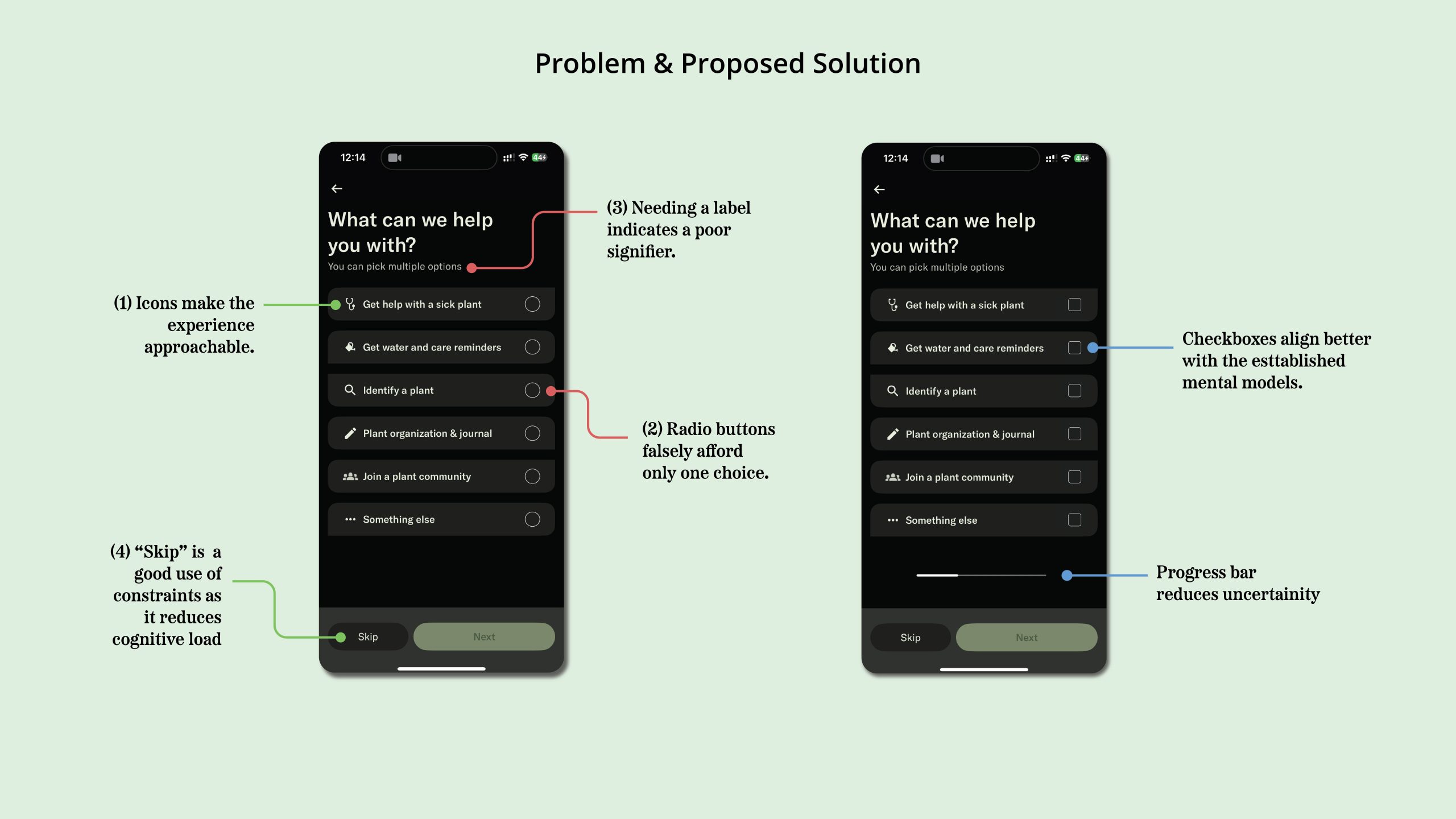
Planta’s onboarding is a straightforward nine-step process which helps design a personalized setup for beginners. The use of icons and simple images next to the given choices makes the experience approachable (1). However, radio buttons are used when multiple options can be selected, a poor signifier that falsely affords only one choice (2). The line “you can pick multiple options” tries to fix it, but using checkboxes on these steps would align better with the established mental models and remove the need for that label (3).
There is no feedback on where the user is in the process or how much is left, which creates a Gulf of Evaluation, making the whole process feel longer than it really is. A simple progress bar would reduce user uncertainty. At the end, the “skip” button, is a good use of constraints as it takes some pressure off and reduces the cognitive load at the very start(4).
Adding a Plant
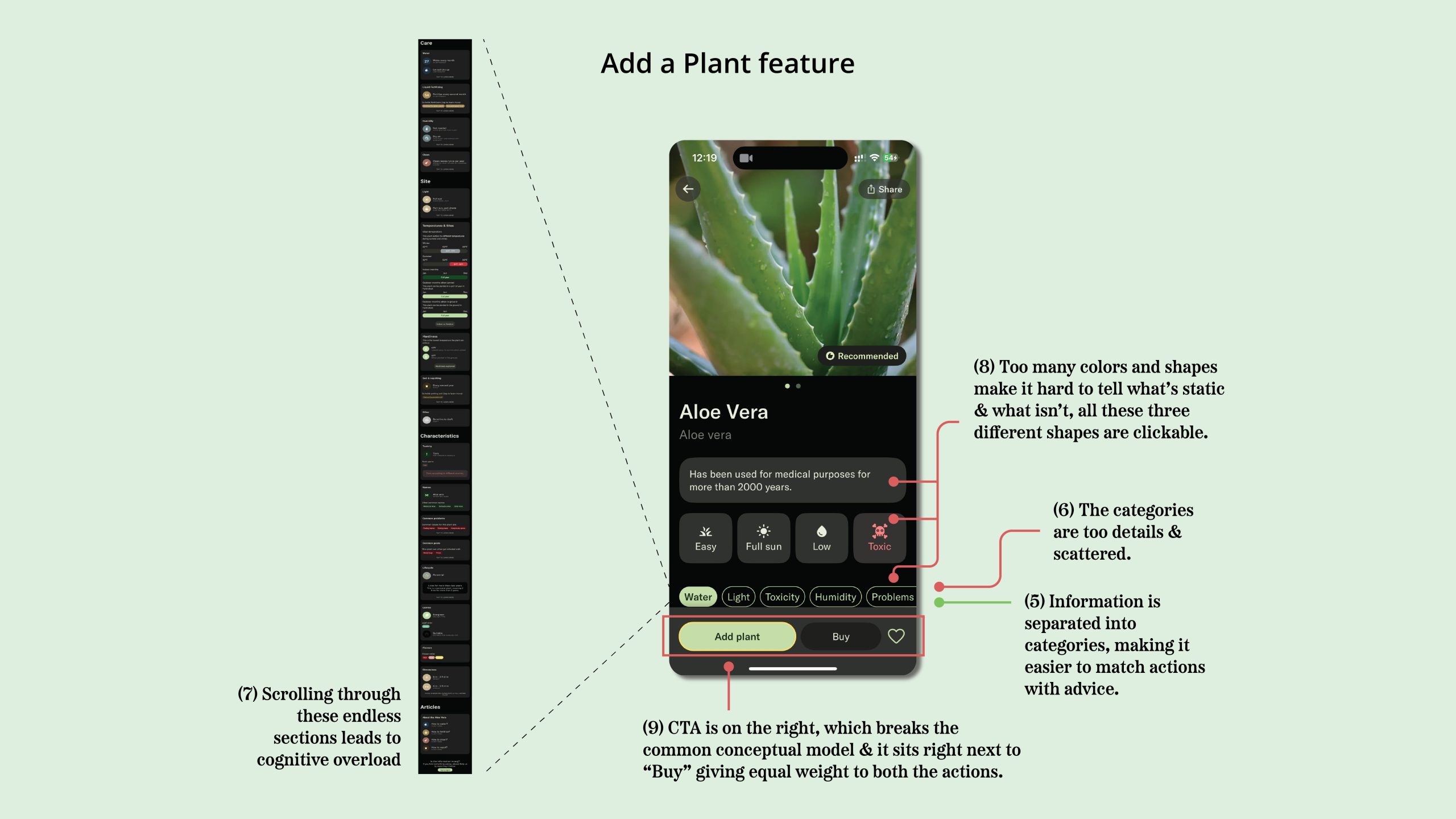
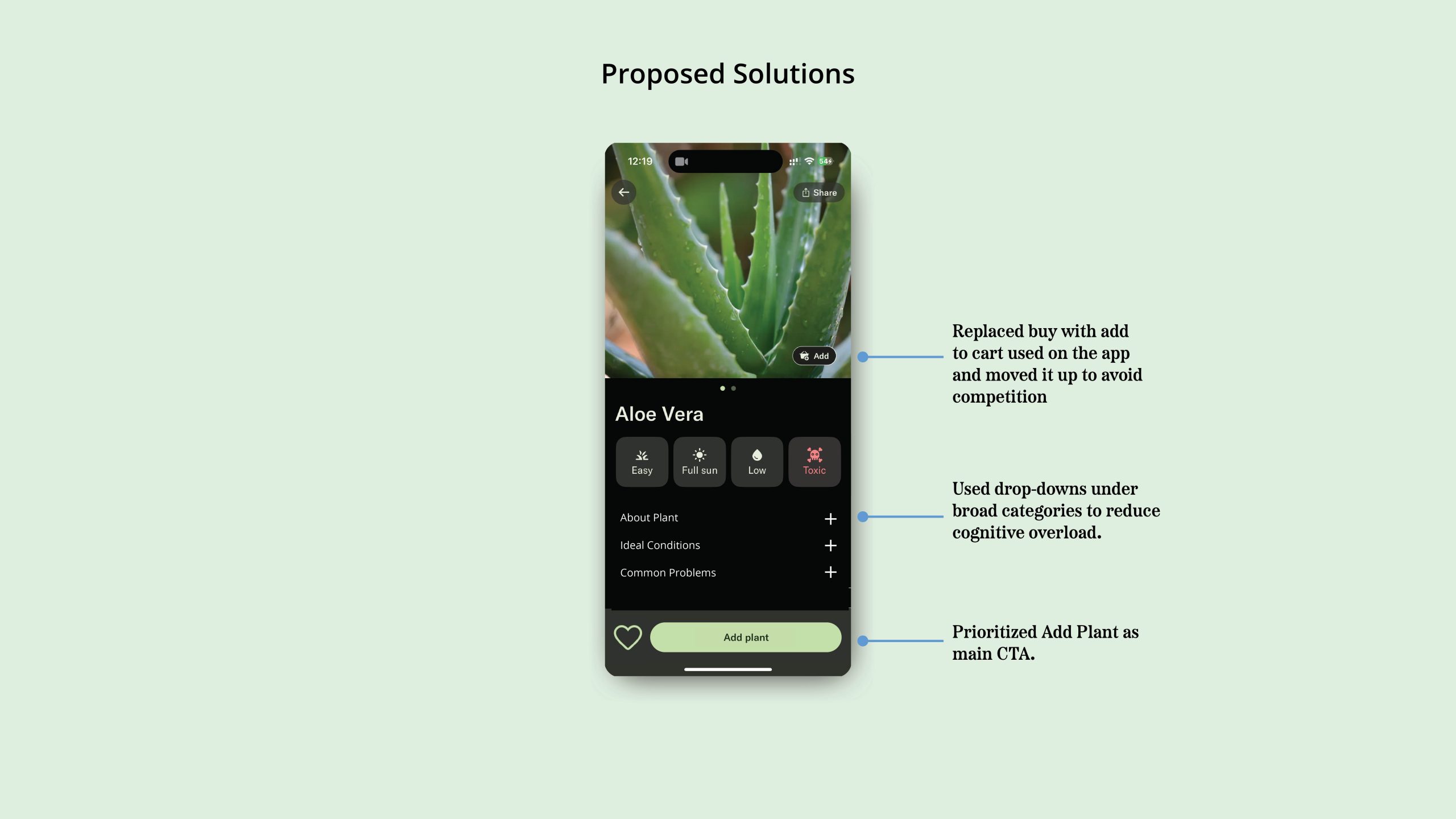
Once a plant is selected, the page has useful information and tips on how to care for it, which is especially helpful for beginners because they don’t have to rely on prior knowledge. This information is also separated into categories, which makes it easier to map the action with the advice(5). But these categories are too detailed(6), which creates cognitive overload as users scroll through the countless sections(7). Using progressive disclosure with drop down menus and grouping content under broader categories like ”About plant” or ”Ideal conditions” would let the user control on how much detail they want instead of throwing information at them.
There are too many different colors and shapes used in the design, making it more difficult to tell between what’s clickable and what’s not (8). Consistency would reduce that mental effort and help the user care for their plant instead of being overwhelmed by the interface.
At the bottom of the screen, the primary action “Add plant” is on the left, which can be confusing because a common conceptual model is that CTAs are on right the entire app. Also, it is right next to “Buy Plant,” which is a bad mapping since the two buttons feel like they carry the same weight, even though one is the primary task and the other is more of an extra option(9). A possible solution would be to prioritize “Add plant” visually and positionally as the main CTA, and moving the secondary actions into a separate area so they don’t compete for attention.
When the user clicks on “Add plant,” they expect their plant to be added, but instead they are asked to fill in more details like how far the plant is from a window or when it was last watered, widening the Gulf of Execution because they assume the task is complete but discover it requires extra steps(10). Although, one of these steps lets the user add a name and photo of their plant, which is a nice touch that creates an emotional connection(11). However, moving further the “Measure using light meter” option feels misleading because the user finds out it’s a premium feature after clicking on it(12); showing a lock icon or “Premium” label upfront would set clearer expectation.
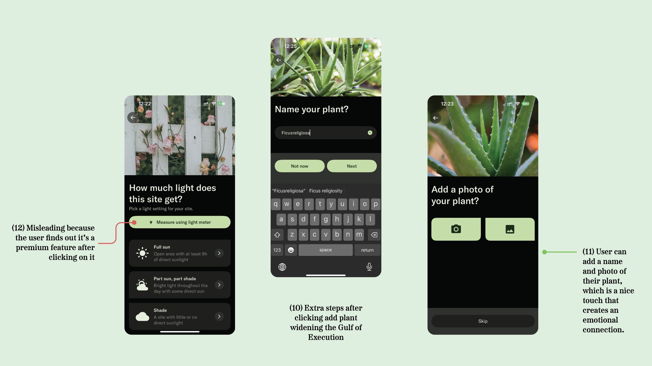
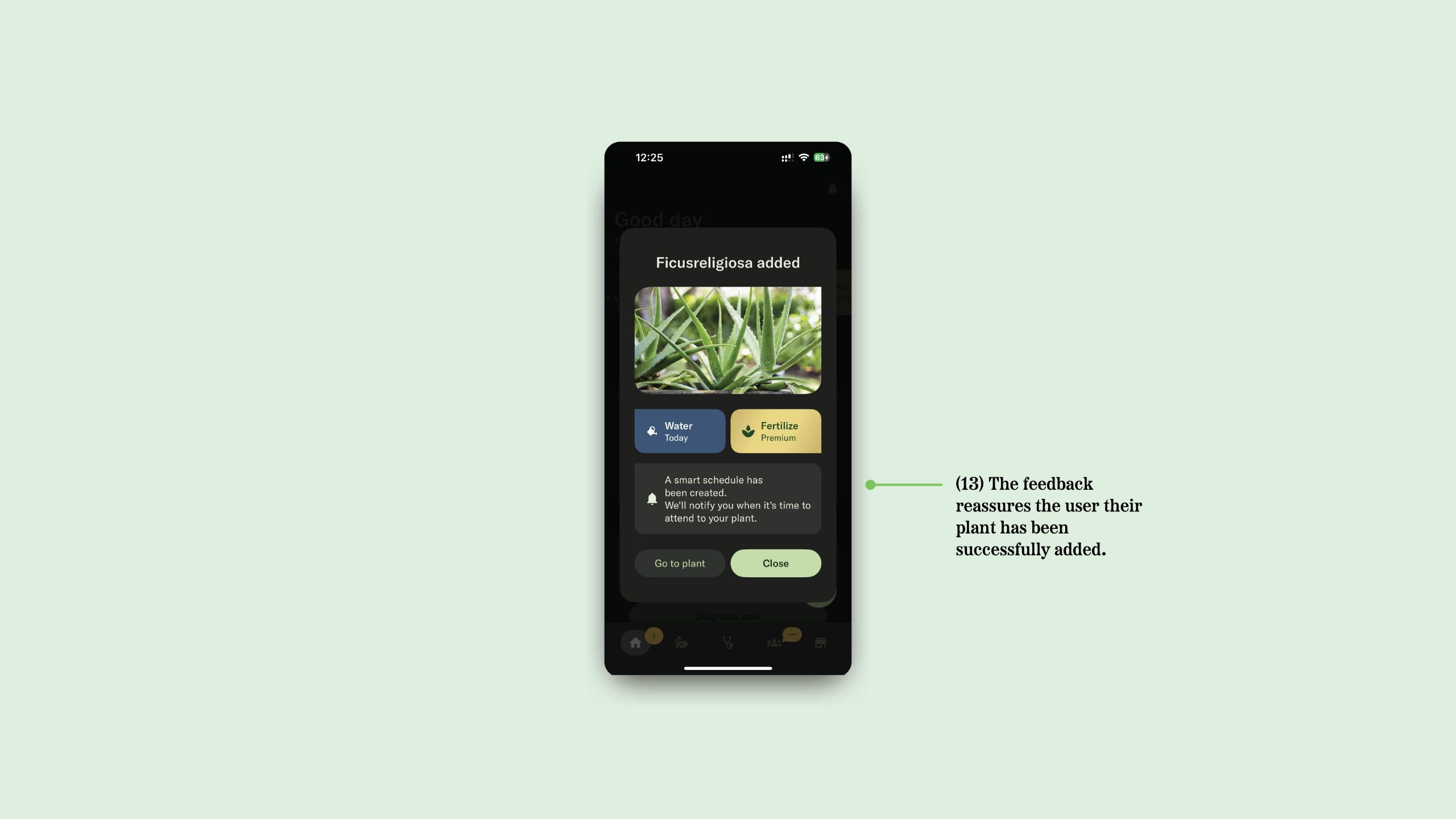
The flow ends more positively, with a progress screen and confirmation that give feedback and reassure the user their plant has been successfully added(13).
The Home Screen
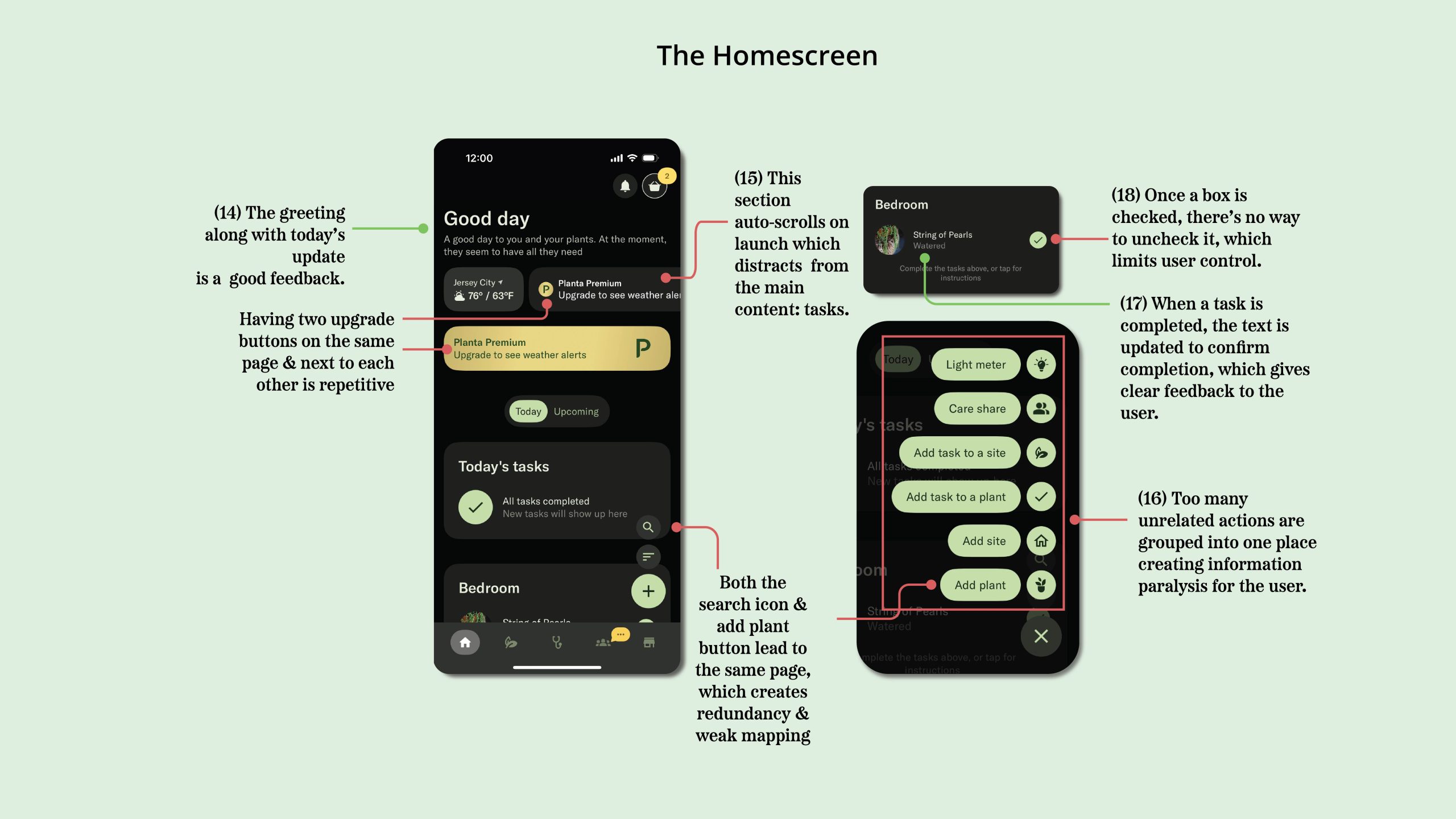
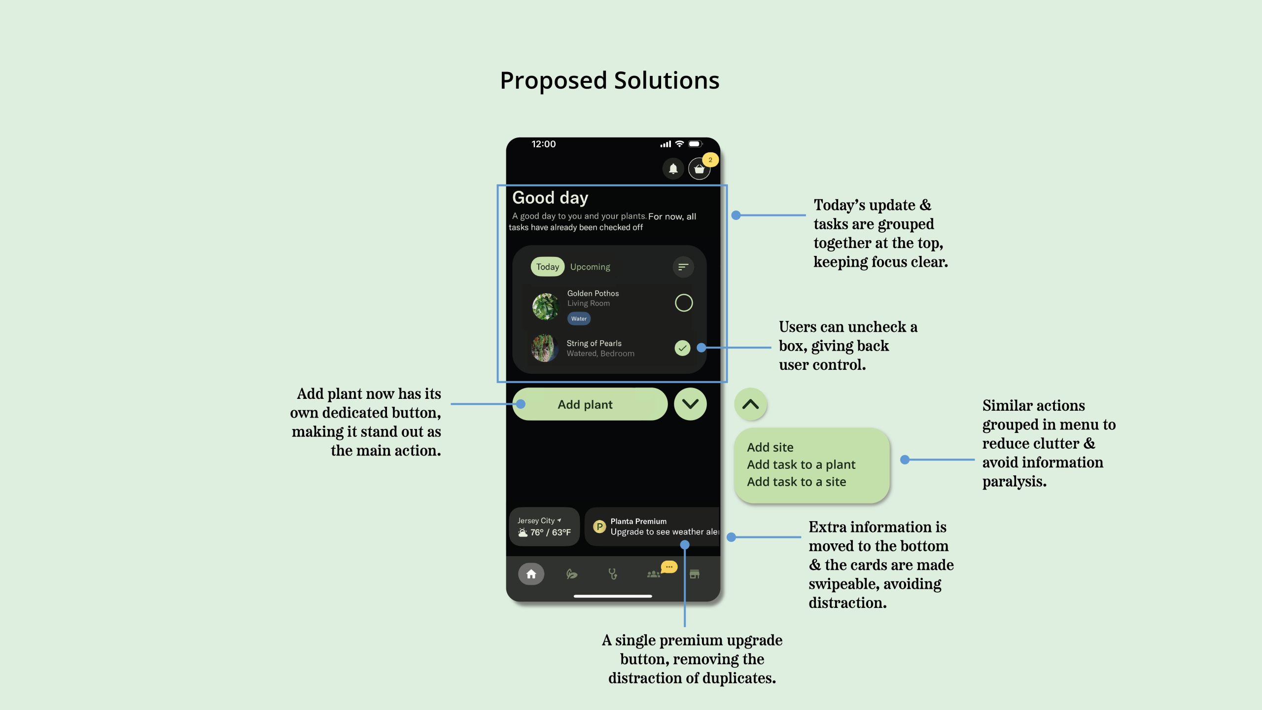
The homepage makes a good first impression with a short greeting and brief update on today’s tasks at the top, which is good feedback because it quickly tells the user what’s done and what’s still left(14). There are progress indicators, like ”Plant info 59% completed,” which add a sense of achievement and encourages further action.
The auto-scrolling section at the top distracts from the main content(15). Instead, the greeting message and today’s tasks can be grouped together at the top and this extra information could be placed at the bottom and made swipe able if the user wants to explore it. The “+” button at the bottom groups too many unrelated actions into one place creating information paralysis for user. It can overwhelm the user making it difficult for them make a decision(16). It would be clearer if “Add plant” had its own button and the other actions were moved into the menu.
Finally, once a task is marked as complete, it gives a clear update (17) but there is no way to undo it(18), breaking user control. Adding a simple “Undo” option would let users recover from mistakes easily.
Reminders
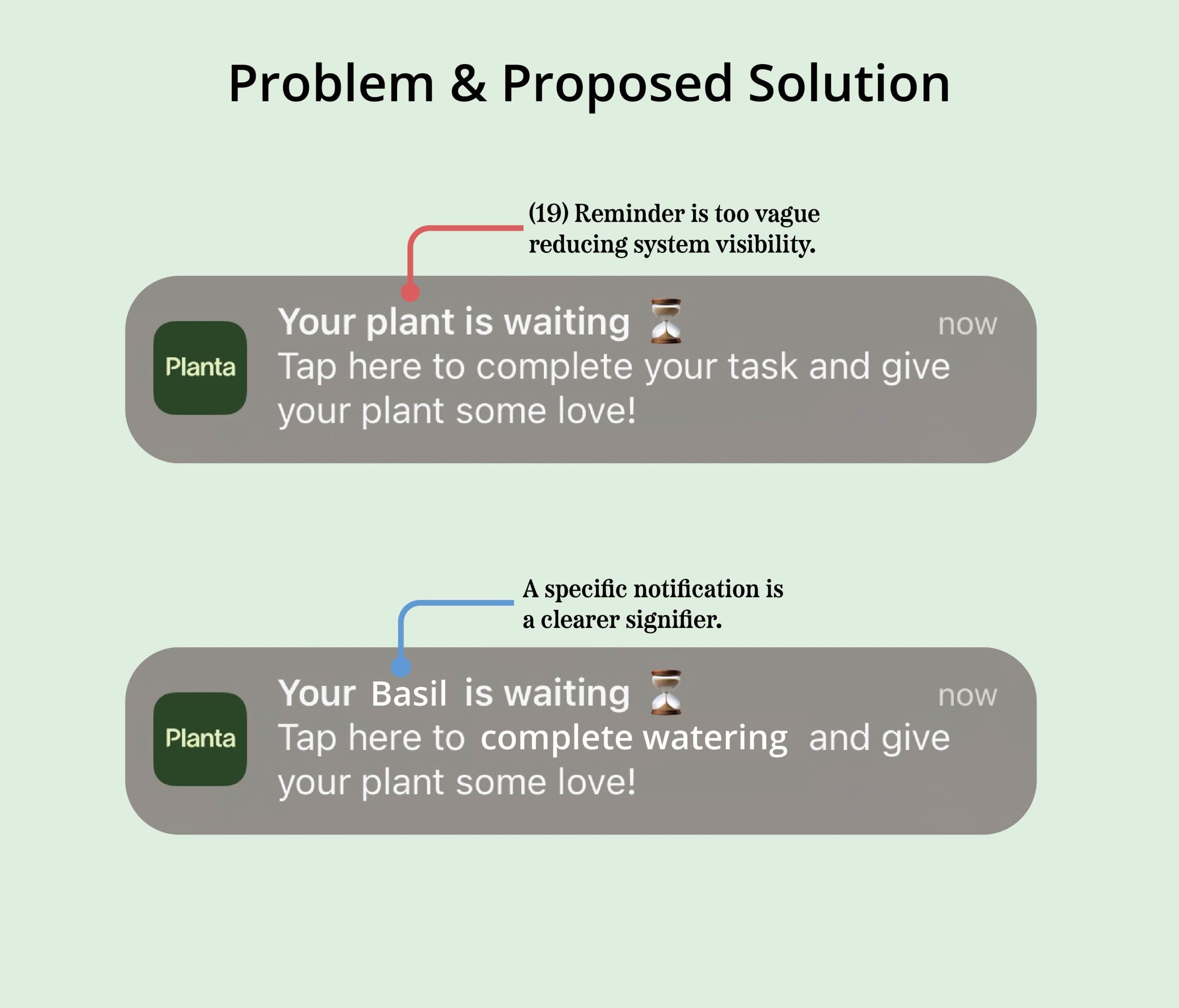
The reminder is one of the app’s strongest features because it encourages timely care, but it is too vague. When users have multiple plants added, a message like “Your plant is waiting” forces them to open the app to figure out which plant and what action is required. This reduces system visibility and adds needless effort(19). A more specific notification, such as “Water your ZZ Plant today”, would serve as a clearer signifier and let the user act immediately without extra steps.
Conclusion
Planta has a lot of features like helpful information, personalization, and a plant marketplace, but despite this it is frequently used as a reminder tool to water plants. The extra steps, clutter, and information overload make it difficult for beginners to take full advantage of everything the app offers. If Norman were a Planta user, he’d probably say: “The app affords care, yes… but more often, it affords chaos.” With clearer signifiers, improved consistency, and discoverability, Planta could transform from being just a task nudger to a real partner in plant care.