Pokémon Trading Card Game Pocket (TCGP) is a free-to-play trading card mobile game. Unlike Pokémon’s previous game catering to experienced players, TCGP offers an approachable casual experience. The game features not only simplified and faster card battles, but also card collecting, where players can share and trade their cards with their friends and the community.
Using concepts from Don Norman’s The Design of Everyday Things, I will be critiquing the Opening Card Packs and Solo Battling experiences.
Opening Card Packs
No Need to Remember When
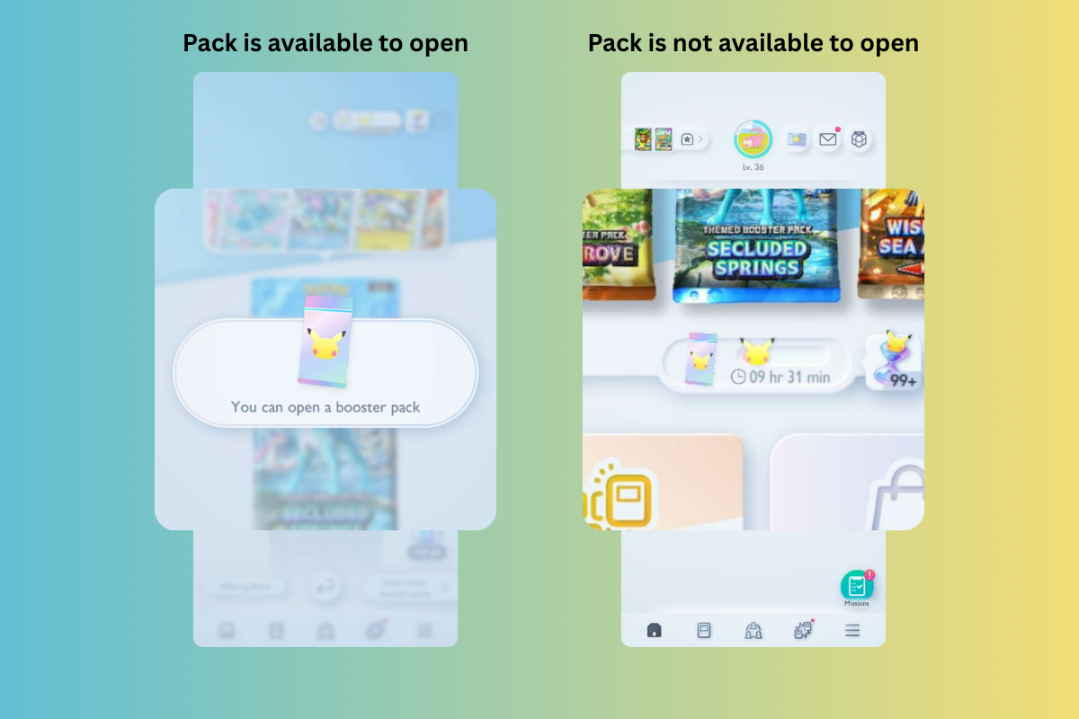
Players must wait twelve hours between opening new card packs. Instead of requiring players to remember this information, the game puts this knowledge in the world. When the timer is up, the game offers players push notification reminders and provides an immediate in-game notification upon opening the app. In addition, players are brought straight to the relevant screen, in the case they make a slip and tap away the notification. If it is not time yet, the game goes straight to the home screen and provides a timer in the middle of the screen. This signifies the anti-affordance of opening a pack and how much longer they need to wait.
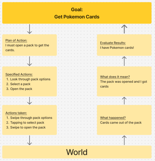
The Process
To obtain cards, the game considers a player’s conceptual model of how to obtain real Pokémon card packs at all seven stages of action, including “ripping” Pokémon packs to evoke a familiar experience. It also avoids a cultural constraint for those who may be unfamiliar to the hobby by providing visual signifiers (i.e. lines to guide gestures, text instructions after a few seconds), physical constraints (focusing to the top of the pack), and positive feedback (i.e. audio of the pack opening around, visual of cards coming out of the pack). These all work together to bridge the player’s gulfs of execution and evaluation.
Suggestion 1: Adding Feedback to Pack Selection
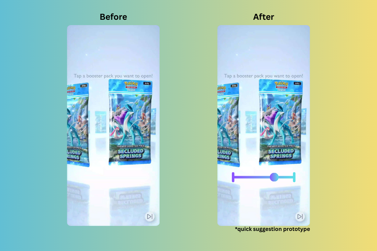
One thing that stands out to me is the lack of visual signifiers on the pack selection screen. It affords players the ability to tap, swipe through, and flip the packs. However, the latter two are not immediately discoverable. Additionally, players may perform an action slip of tapping to get through the sequence, which then locks a player in with that choice. There is no undo button. Players may also feel they need to memorize how many packs have passed, which may be confusing when all the packs look the same. I suggest either adding a scroll bar at the bottom that provides mapping and feedback for what pack they are looking at relative to the beginning.
Suggestion 2: Adding Signifiers for Card Interactions
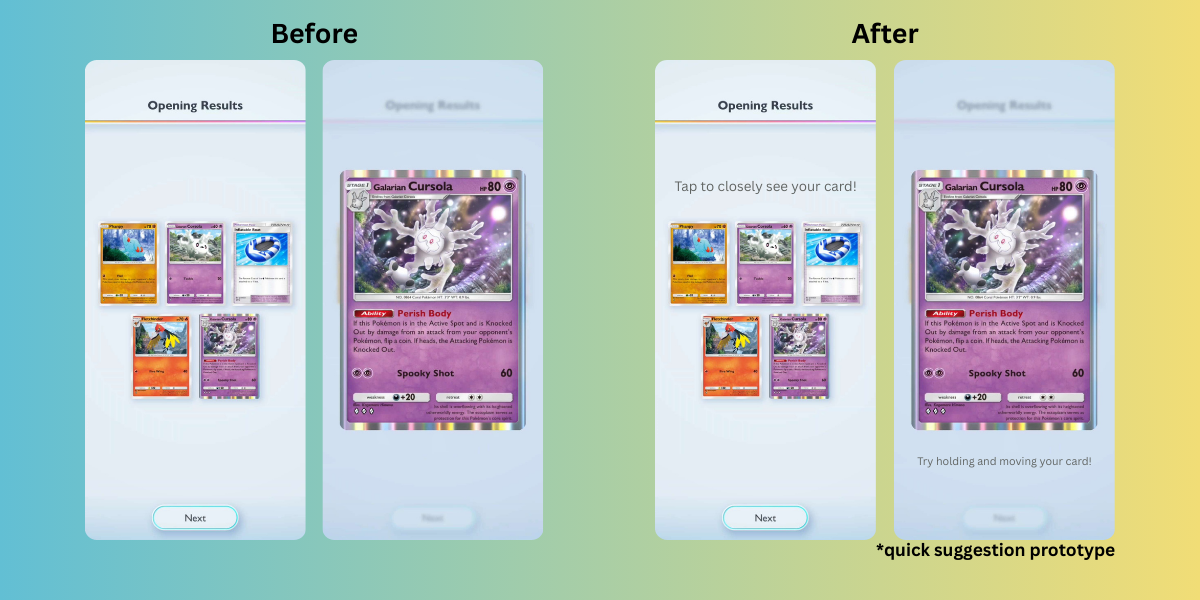
On the results page, players can afford to see closer card details. Not only is it not obvious, but also when you tap the card, it is not obvious that you can afford moving it around to see any special effects. I suggest adding signifiers, such as a text prompt or vector icon, that inform players on how to look closer and interact with the cards.
Solo Battles
Auto Battling
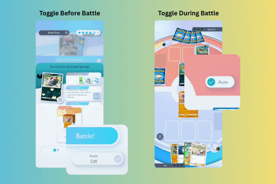
Winning battles come with rewards, but interestingly enough you don’t have to know the rules. The “auto” button that can be toggled on and off at any point before and during the battle signifying that players can participate or not. If players do want to actively participate, many aspects of the battle gameplay are discoverable.
In Battle
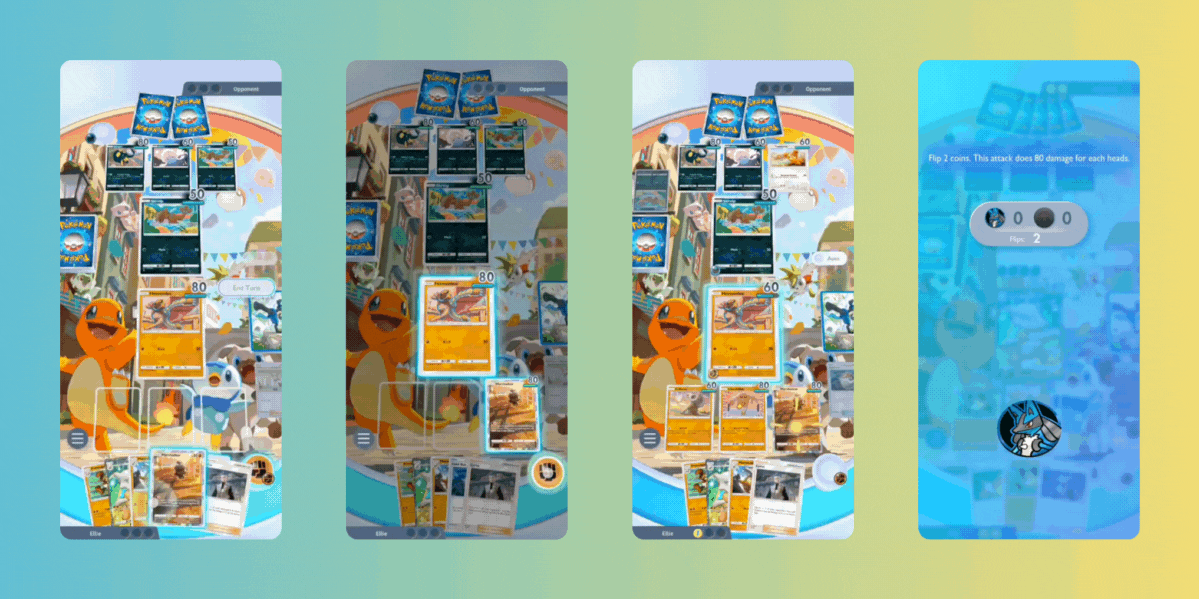
The interface utilizes mapping with the game pieces. Card options, fanned out in front of you as if in your hand, can be pulled out and upwards to be placed. Energy tokens are dragged to place on your card of choice, and you are given a coin to “flip.” These movements simulate how one would play card games in real life on a surface, matching their conceptual model. Usable components and their relationships to each other signified with pulsing lights and colors. Battles also utilizes logical constraints, as you cannot put a card anywhere that is greyed out and only within the spots that are available. If you do play it in the grey area, the game provides immediate feedback with a prompt on what to do.
Concede?
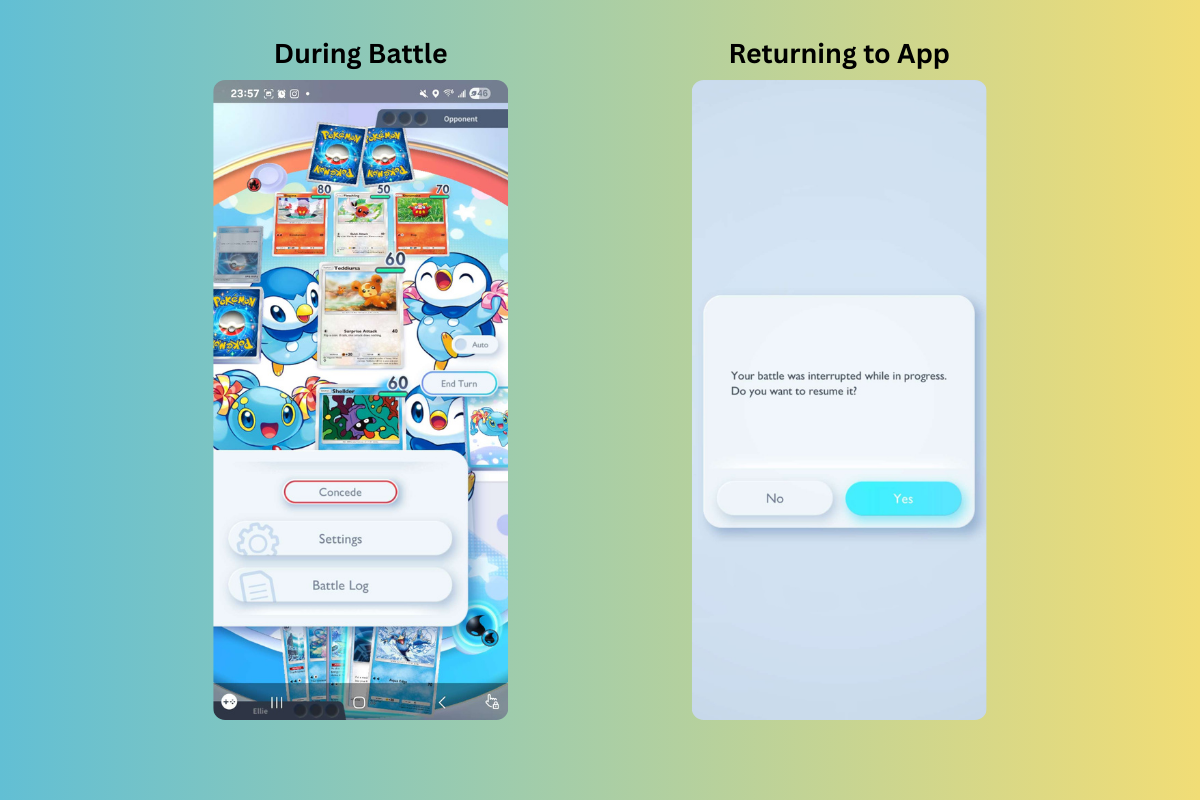
Being on an Android, there is a chance players may accidentally hit the < button when selecting cards. There are two lock-in forcing functions asking if the player means to concede a battle. In addition, with the nature of this app being on a mobile device, the player may become distracted and leave the game mid-battle. The battle is kept active even when the game is closed, and when the player returns, it will remind you that a battle is ongoing and offer to continue.
Precision is Not Needed
Over time, players may develop knowledge in the head of the simplified rules of how the game pieces interact with each other through creating semantic relationships, even if they are incorrect (i.e. relationship between cards) . Similar to what Norman mentions in his book, the game provides sufficient cues and knowledge in the world to help with the performance, but precision is not required. Just knowing where the pieces go is “just good enough” to get you through the battle.
Suggestion: Leave Weakness/Advantage On Screen
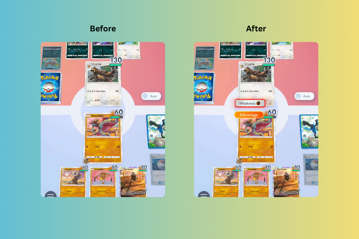
Something that is useful to know is when a Pokémon is weak to another. Currently, this information appears for only second after a new card is placed in the middle. I suggest instead of it disappearing, leaving this information on the screen so players can continue to rely on knowledge being in the world.
Conclusion
Overall, I believe Pokémon TCGP has put a lot of effort in matching a players’ conceptual models of real-life equivalent experiences with providing signifiers, constraints, and feedback. Though I do make suggestions to provide more information to the player, many mechanics of the game are discoverable and easy to pick up to accomplish card collecting or participating in solo battles.