Procreate is known by digital artists worldwide. Its low one-time only cost, as well as a lack of subscription service, makes it a popular choice among users who simply want to create digital art on the go. It’s often used for drawing illustrations, designing logos, creating custom brushes, and even animating!
1. The Right-Hand Interface
Procreate has settings that support left-handed users by allowing them to switch the location of its pen sidebar from the left to the right side of the screen (See Figures 1 and 2). It improves mapping, making it more intuitive for left-handed users to draw while simultaneously changing their pen sidebar settings with their right hand.
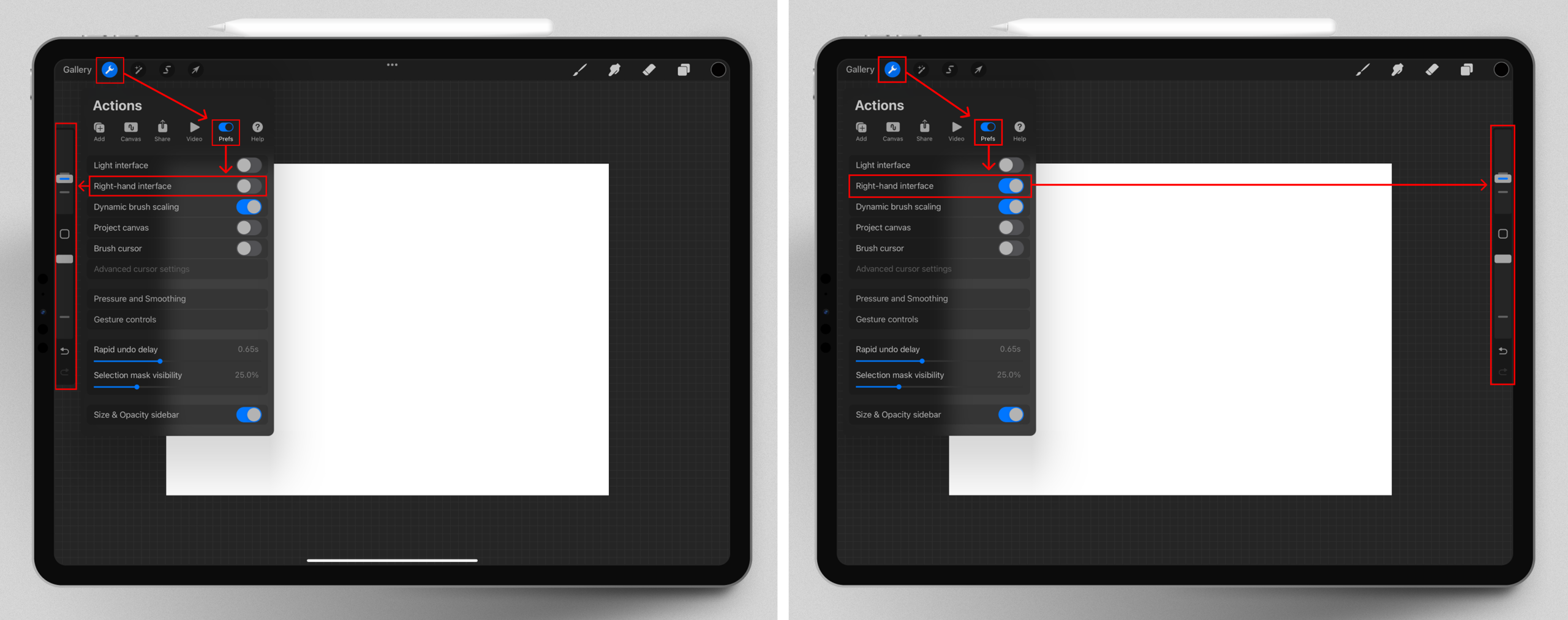
When looking for the setting to change the sidebar’s location, users will find the wrench icon easily in the top bar, as it’s a clear signifier that follows cultural conventions. Multiple applications use tool-like icons to indicate the location of their settings. Then, users with knowledge of the technological world will find the “Prefs” menu, which is universally known as “Preferences”. However, the mapping of the next option, labelled the “Right-hand interface”, leaves a gap in the gulf of execution. There’s a mismatch between Procreate’s label and the user’s mental model since, when left-handed users search for a setting designed for their needs, they expect to see it contain the term “Left”. This is because they are thinking about their mental model, their left-hand. Procreate, though, has named it “Right-hand interface” instead, because it moves the sidebar from the left to the right side. Engineers see this as logical, but from a human-centred design perspective, left-handed users will see that label and skip over it, believing it wasn’t built for their needs. Thankfully, this setting constrains the user by being the only one to mention a right or left side and leading them to eventually try that setting. The toggle also provides immediate feedback by moving the sidebar from left to right.
Solution
Renaming the setting to “Left-hand mode” would match users’ mental models (See Figure 3). It would improve Procreate’s human-centred design by making the setting discoverable and would support a more activity-centred design by letting the activity of the left-handed user decide the design and structure of the product. By naming the setting around the left-handed user’s perspective and activity, Procreate would reduce confusion while promoting usability.
2. The Brush Libraries: Pinning Artistic Tools
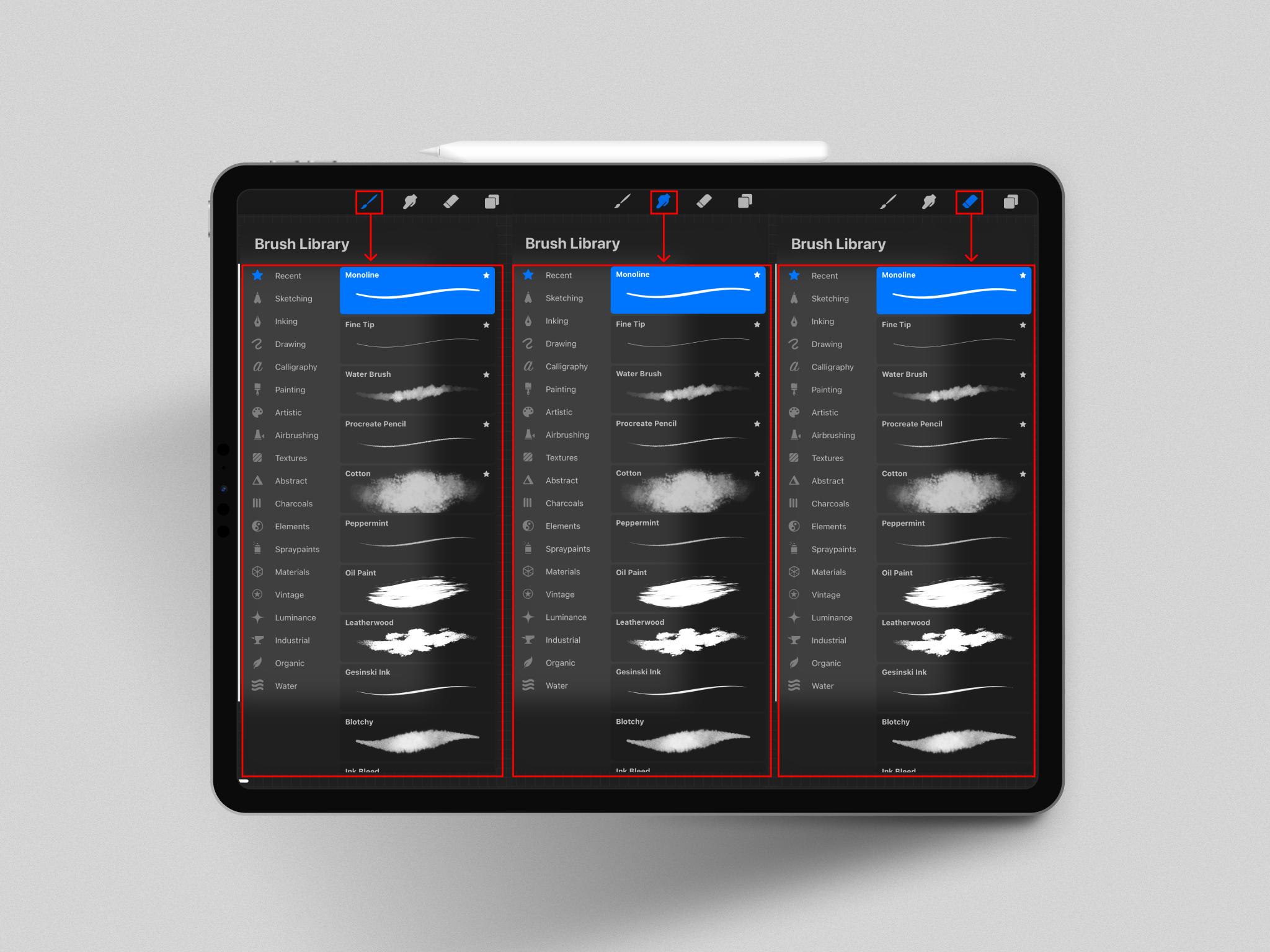
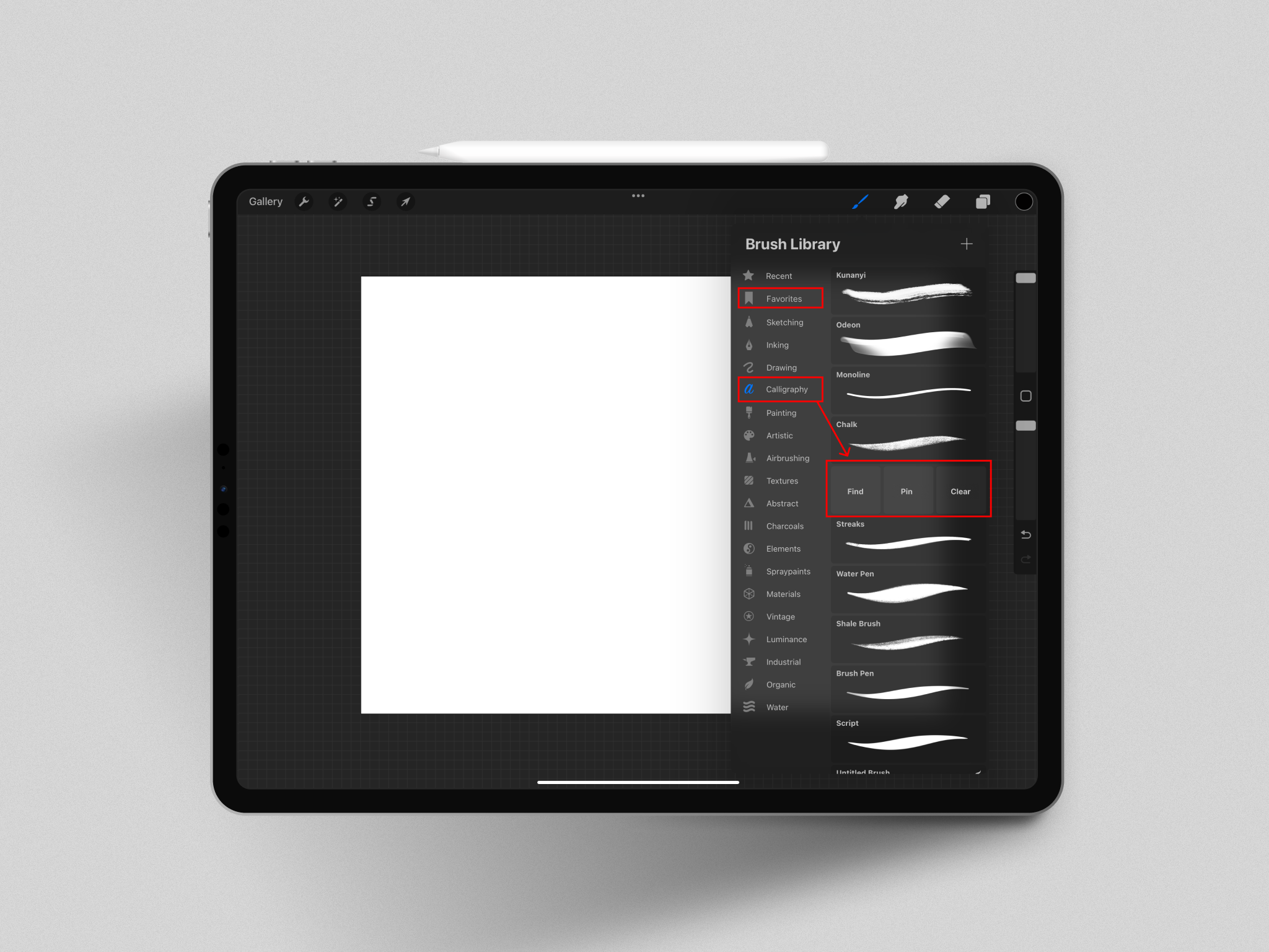
Procreate’s brush, smudge, and eraser icons are easily discoverable due to cultural conventions, as their symbols are common practice in artistic applications. Each button also provides immediate feedback when selected, with identical menus appearing for each icon. This creates consistency as users can switch between each symbol quickly, knowing exactly where to find the textures they need (See Figure 4).
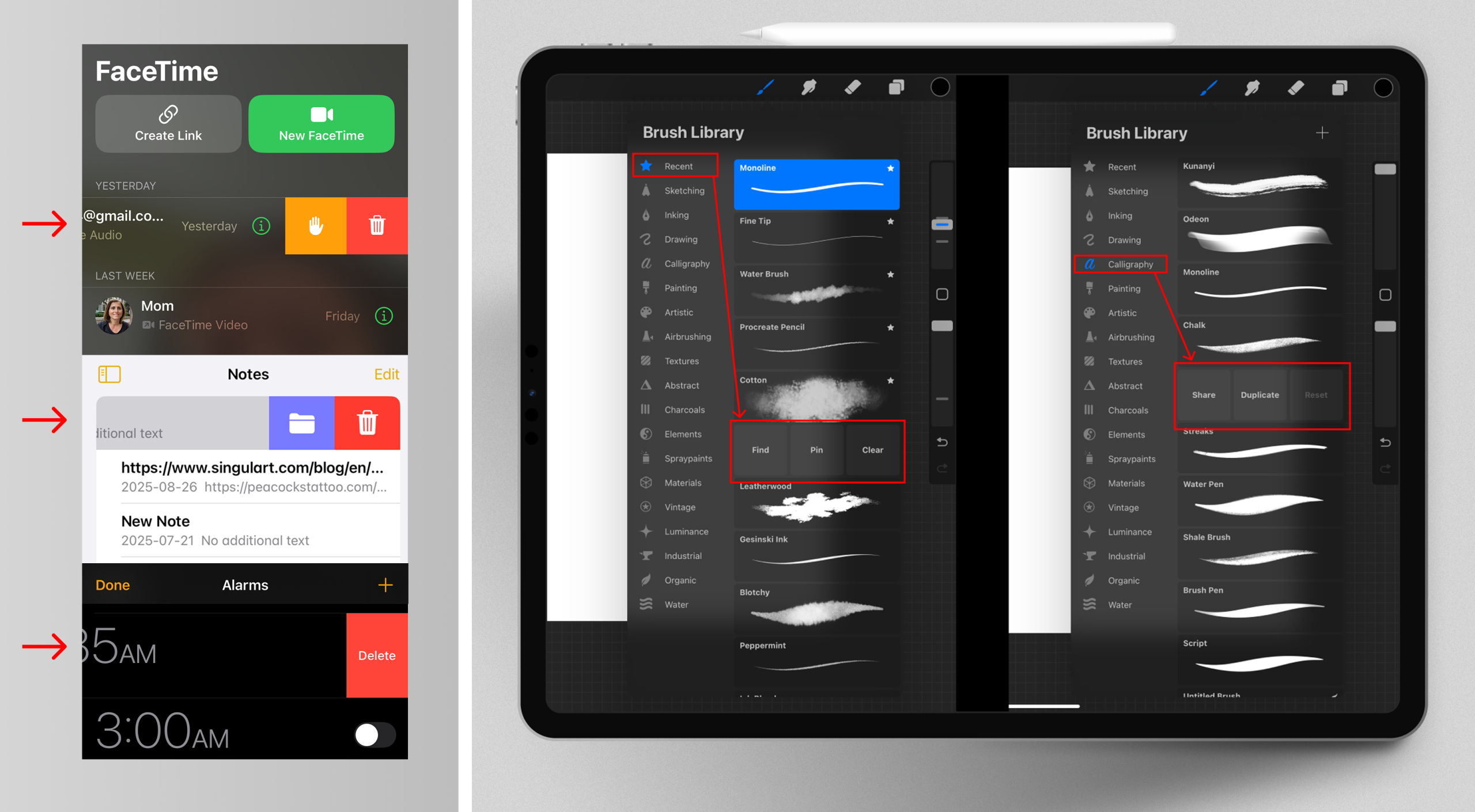
Procreate allows users to “Pin” their favorite textures in the recents section. When users swipe left on a texture, the button “Pin” appears. A star then appears at the top right of the texture as feedback to let users know that the pinning action was completed. The “Pin” button isn’t immediately visible and relies on users’ knowledge in the head. Many applications, especially Apple products, use a similar type of swiping to reveal options. Therefore, these are discoverable buttons that users subconsciously find through habit and prior knowledge. The “Pin” option, though, is only available in Procreate’s recent section. If the user swipes left on a texture anywhere else, no pinning options exist (See Figures 5 and 6). This inconsistency ruptures the natural mapping that the user has become accustomed to, since the same gesture (swiping left) now creates a different outcome. It then requires users to be reflective and actively return to their recent section, scroll, and then reselect the same texture to finally pin it. Additionally, if users want to see what textures they recently used, they must consciously scroll past their pinned textures every time to find them.
Solution
Adding a dedicated favorites section would make sure that the pinned and recent textures don’t get mixed together in the same location. Another solution would be to add a pinning option to every location, whether it’s in the recents or not (See Figure 7). This restores consistency and allows users to no longer consciously have to navigate back to the recents section every time they want to pin a new texture. It would allow users to rely on their behavioral level, instead of their reflective level of processing, as swiping left will now always provide a “Pin” option. Ultimately, this decreases the amount of frustration users may experience within the application.
3. The Automated Saving Feature
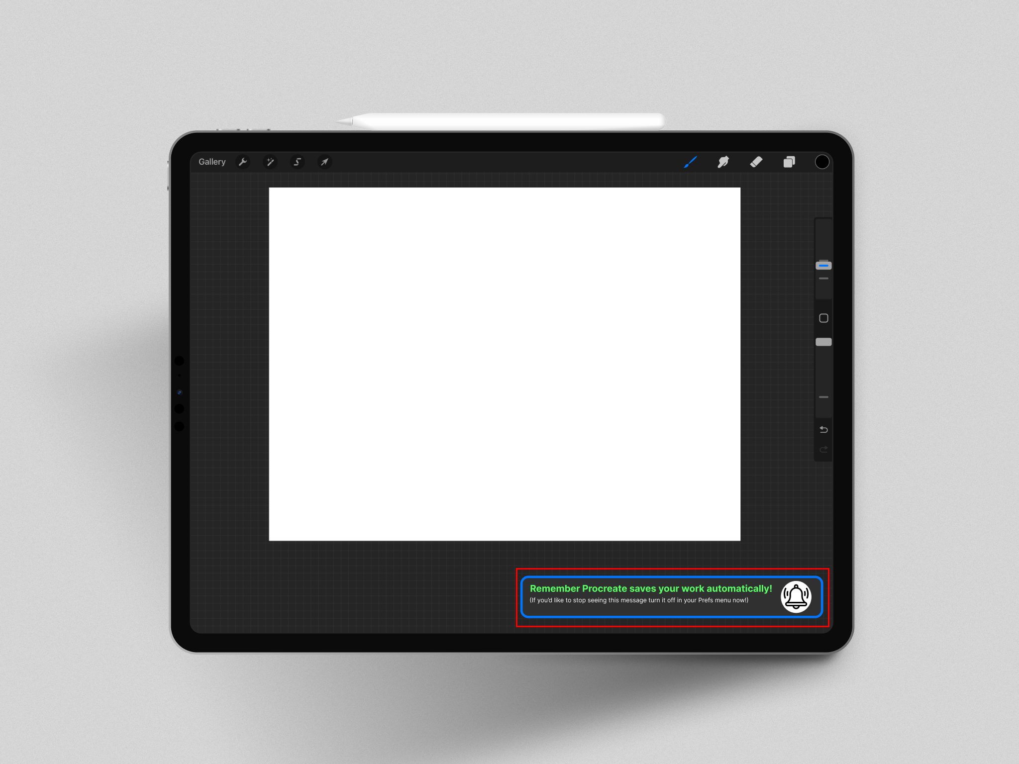
Procreate has no “save” button. Instead, it automatically saves drawings without needing the user to execute the action. This helps artists avoid memory-lapse slips and relieves users from forgetting to perform the saving action. Even though it’s useful, Procreate has no feedback system to alert artists of this feature. This broadens the gulf of evaluation and creates a gap in the users understanding of the application since this feature is invisible. Without feedback, users may be led down false paths and make knowledge-based mistakes. This can happen as users may assume Procreate works similarly to other applications that they’ve used in the past. Users can mistakenly think that Procreate, just like Microsoft or Adobe products, has a save button located within the top left of its interface (See Figure 8). This leads them to follow signifiers from previously learned behaviors. It can then become hard for users to detect their mistake, as they might not realize the conditions of the situation have now been altered.
Solution
The implementation of feedback, like a message, could help users who are unfamiliar with Procreate’s autosave feature. The message could appear every 30 minutes, stating “Remember Procreate saves your work automatically! (If you’d like to stop seeing this message, turn it off in your Prefs now!)” (See Figure 9). This would provide feedback that would avoid knowledge-based mistakes and would notify them that their work was indeed saved.
Works Cited
Interface—Procreate Handbook. (n.d.). Procreate Help Center. Retrieved September 9, 2025, from https://help.procreate.com/procreate/handbook/interface-gestures/interface
Norman, D.A. (2013). The Design of Everyday Things. The MIT Press.
Procreate – Art is for Everyone. (n.d.). Procreate. Retrieved September 9, 2025, from https://procreate.com