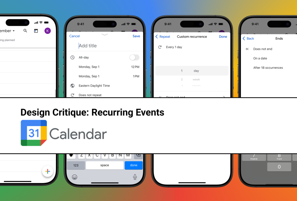
This critique will use the framework and concepts provided by Don Norman in “The Design of Everyday Things” to follow a user who plans to create a recurring meeting in their Google Calendar iOS App. To set the stage, let’s start with a beautiful (and obviously fictional) day where they have nothing scheduled…
User Goal: “I need to add a meeting to my calendar that occurs each month for 8 months.”
Step 1: “I need to add…”
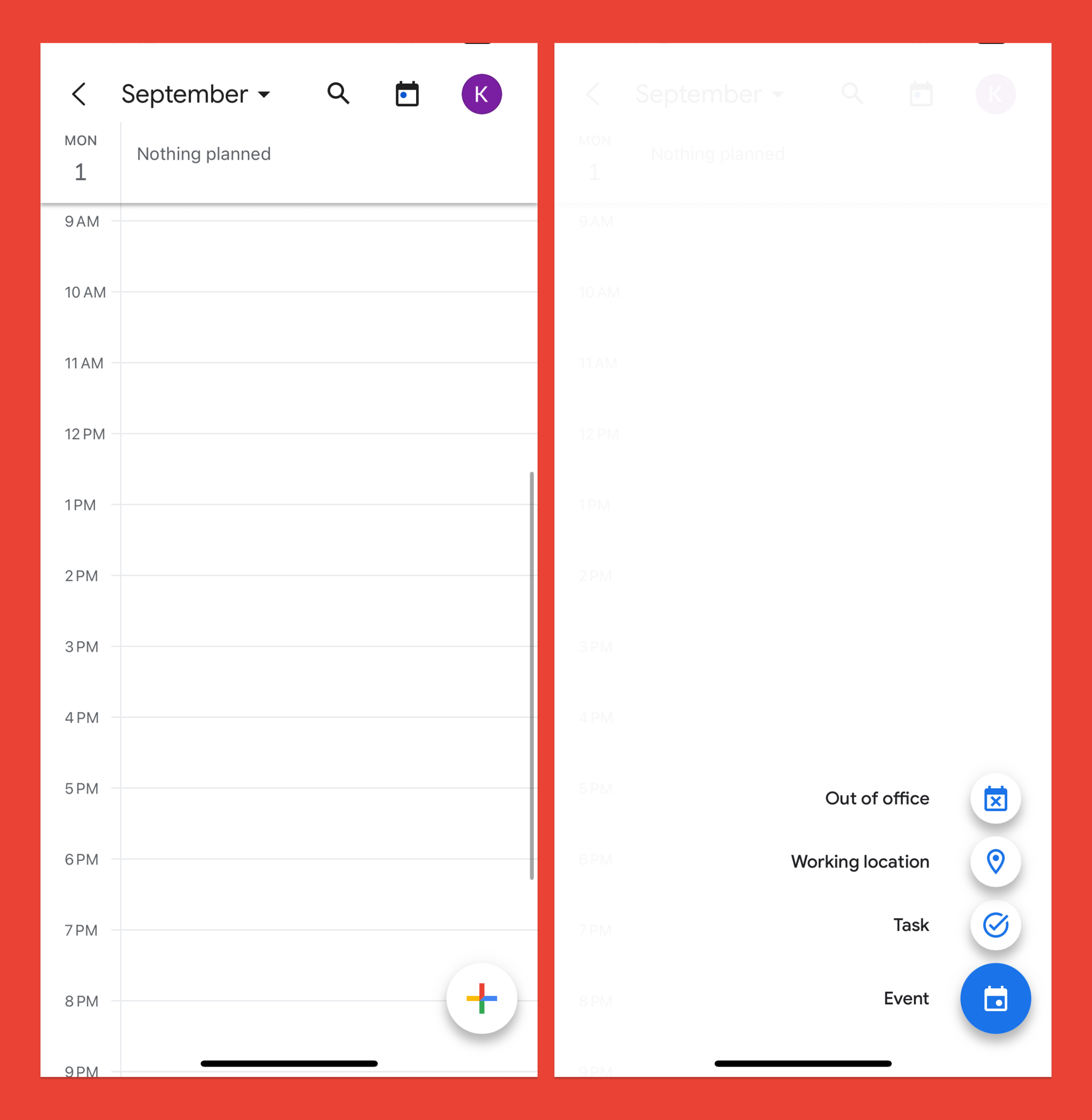
The user’s first step within the app would be to add a new item to their calendar. This action is easily discoverable through the prominent add button. The entire screen affords pressing, and the location of where to press is clearly signified by the shaded button and the “+” icon.
However, the specific item type the user wants to add (in this case, an event type) is not immediately visible – a trade-off the app makes to prioritize a less cluttered interface. To account for this the app has a constrained set of initial options that leads the user towards the add button, and from there the expanded menu provides immediate feedback that quickly assures the user that they are heading in the right direction.
Step 2: “…a meeting to my calendar…”
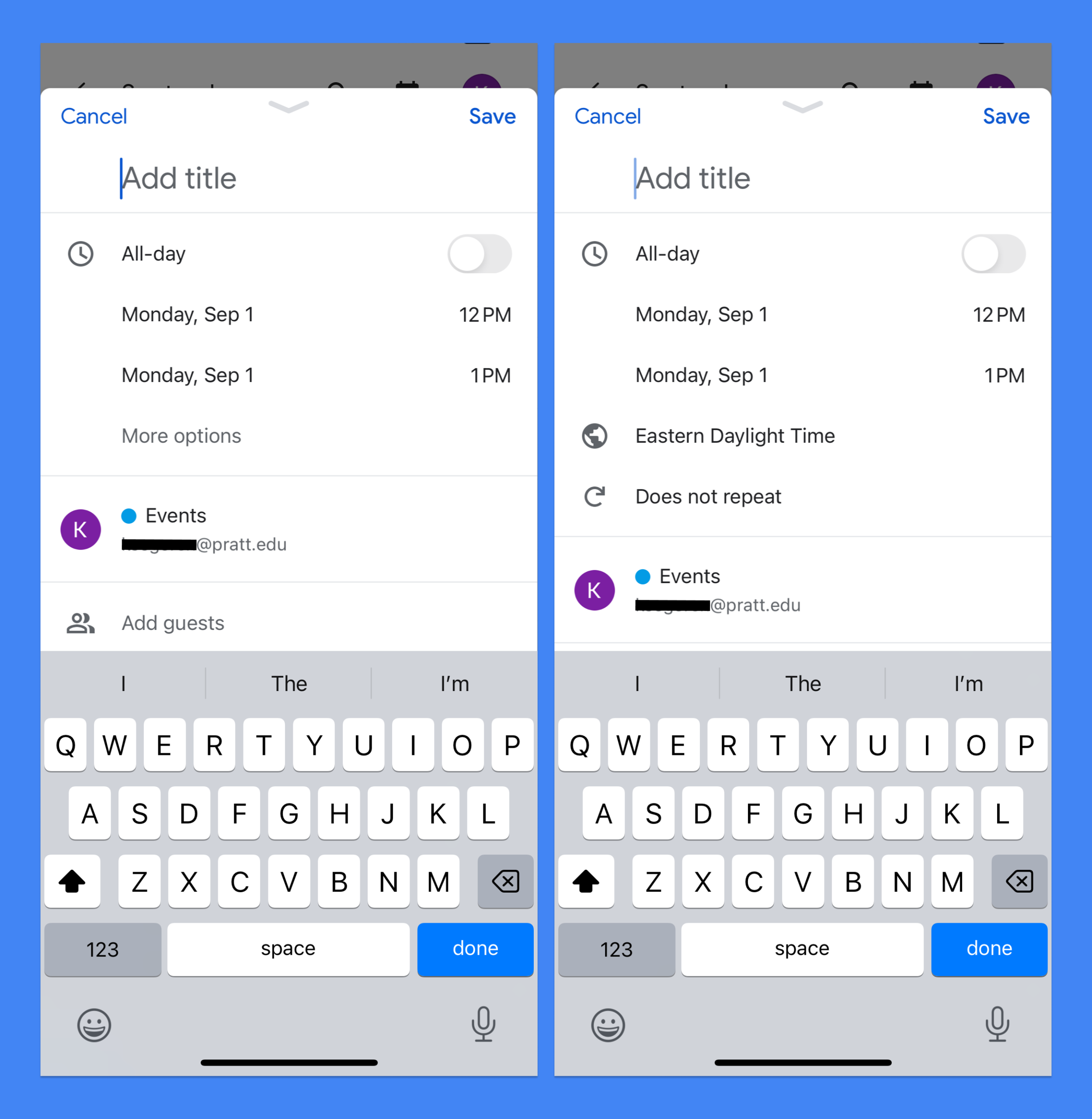
The user will then reach the event creation screen, which immediately upon opening affords typing through the automatic presence of the keyboard. The action is further signified by the active cursor and placeholder text in the title input field.
The user needs their event to repeat, but this action is not currently visible. If they were a frequent Google Calendar user, they might rely on ‘knowledge in the head’ to know that the next step is located in the “More options” menu. But the app accounts for new users and provides sufficient ‘knowledge in the world’ by meaningfully grouping elements. This provides context clues and guides the user towards their intended action by positioning their goal action (repeating the event) in close proximity to other time-based actions.
Step 3: “ …that occurs each month…”
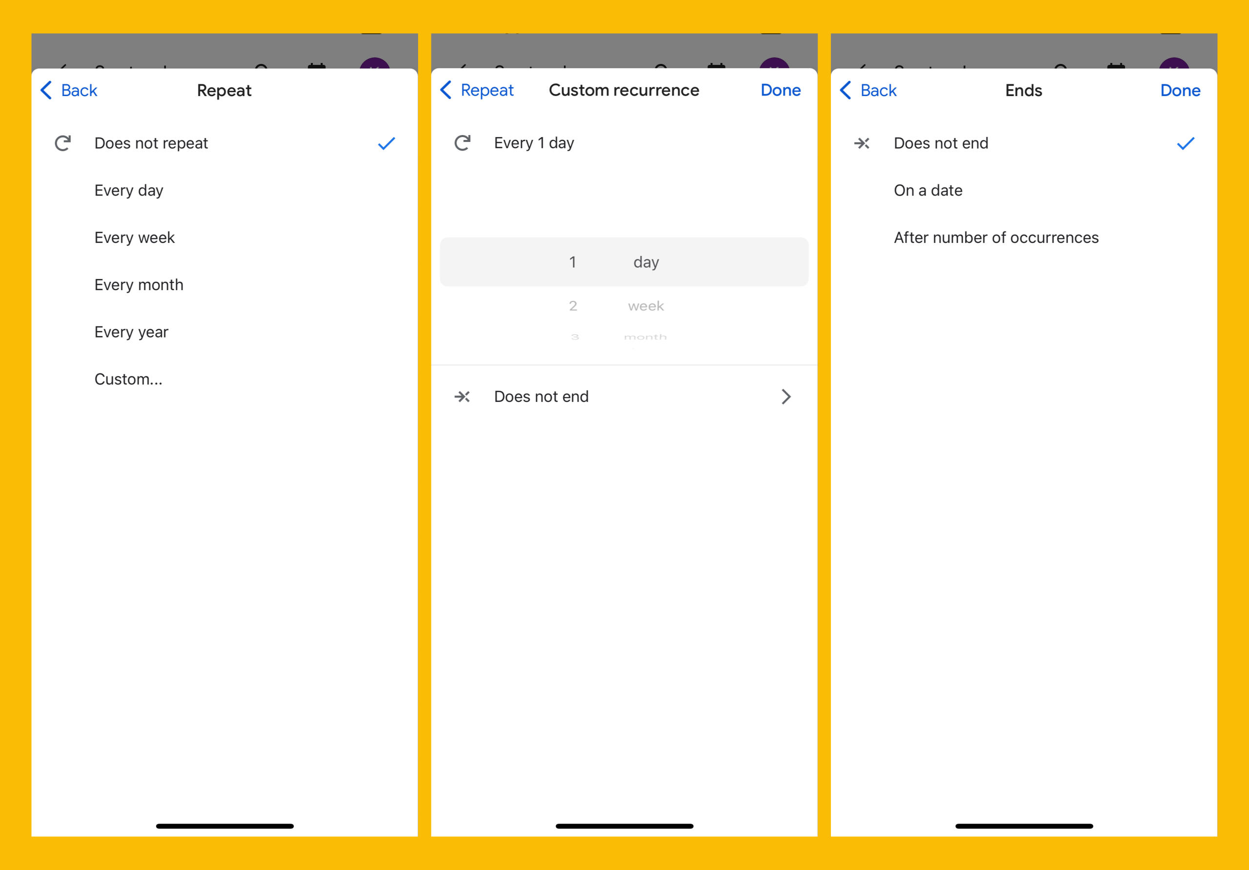
Google Calendar provides effective constraints to guide the user towards selecting an appropriate interval (day, month, year) through the finite scroll sections which map naturally to a user’s mental model by increasing in duration the further they scroll.
The app also provides great feedback during the selection process by automatically updating the heading. This shows the user the result of their actions in real time so they can evaluate their progress.
Step 4: “…for 8 months.”
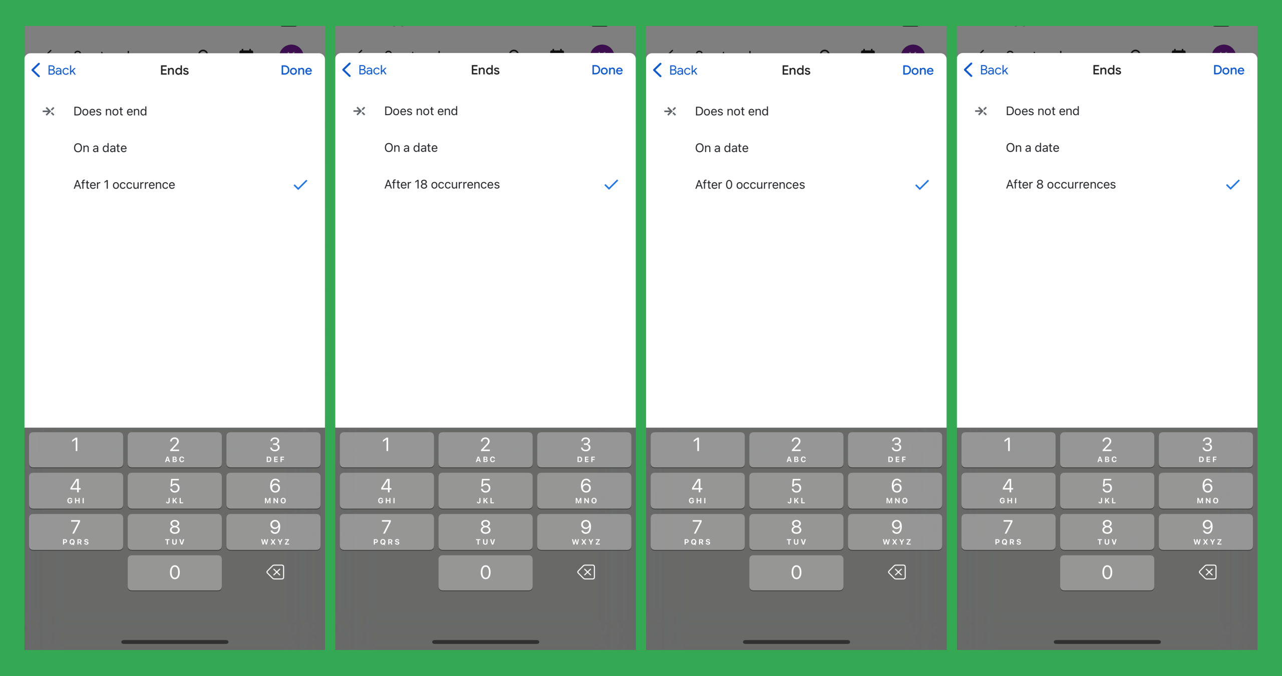
The main issue I found in the app was that the system status is not clear when attempting to input the number of event occurrences. The presence of the open keypad affords inputting a value, however, unknown to the user is that the “1” is active and already automatically inputted. This results in a slip where the user makes a knowledge-based mistake and they simply input their desired value, eg. 8, but their result is 18. This gulf of execution causes confusion and frustration for the user who has to clear both their entry (8) as well as the entry the app auto-filled (1), before revealing an empty starting point (0), from which the user has to start their task again and type in 8.
The design error lies in the lack of a signifier to alert the user that “1” is already inputted and that any manual entry will follow. But luckily due to the immediate feedback the app provides in response to typing the user can quickly evaluate the error and course correct. In this case I believe an interface update is warranted, and to avoid this situation I would recommend that the input field, in this case the “1” is either auto-filled to “0” or is turned into an empty placeholder “_”, so that when the user is provided with the keypad they need only input their goal number and nothing more.
Conclusion
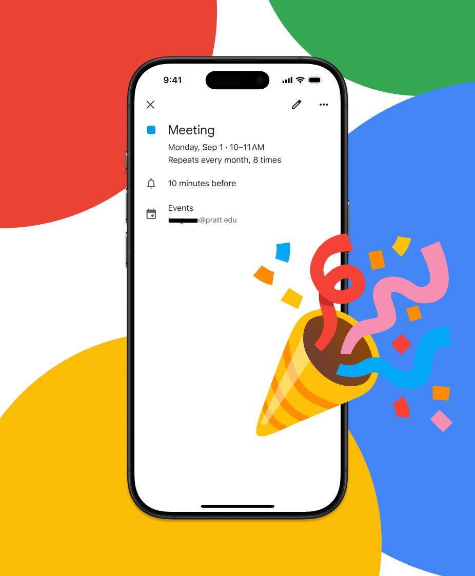
The Google Calendar iOS app is very well designed, however when looking specifically at the recurring event type there are opportunities for improvement regarding the discoverability of some key steps, and in improving signifiers for inputting occurrences. But overall, when viewed through Don Norman’s framework the app succeeds in various ways including how the task sequence (steps 1-4) closely matches how a user would express their goal (“I need to add … a meeting to my calendar … that occurs each month … for 8 months.”) and through its frequent use of clear feedback to assist users in getting back on track, even when minor slips occur.