Shuffles is an app from Pinterest, the inspiration board-making platform, allowing users to “remix” their Pinterest boards into fun, expressive collages and content. As a Pinterest fan for years, I was excited to review the app. Pinterest is a really helpful tool to help collect visual inspiration for projects, whether for weddings, creative advertising campaigns, or redecorating an apartment.
Our User
For this review, I’ll take the perspective of a user looking to decorate a new apartment in the city. Let’s call our user Katie. Katie is moving in with her partner Anna into a new apartment.
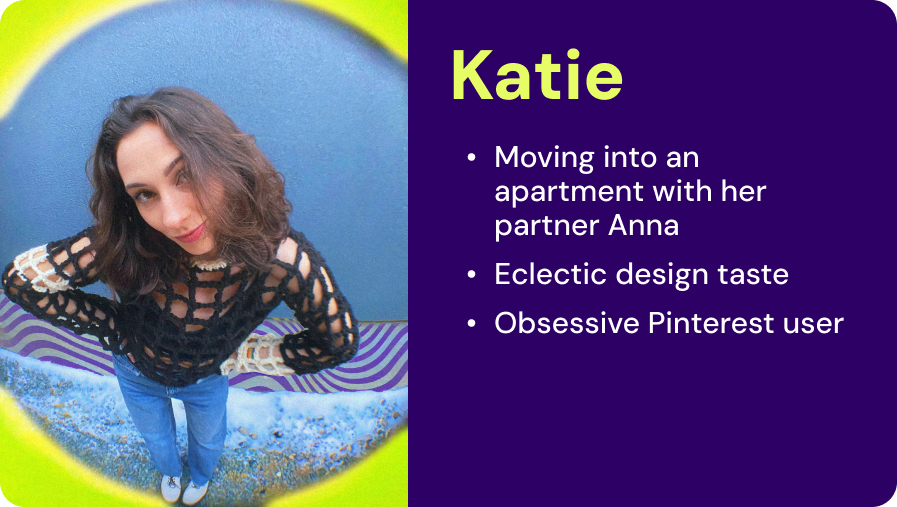
Katie wants to be able to agree with Anna on the decor for their apartment. She’s an avid Pinterest user, mostly using it for shopping inspiration but she’s heard that Shuffles is a good app for making and sharing moodboards.
Katie’s goals are:
- Create her account and get set up (onboarding).
- Find items she’s pinned and add them to a moodboard.
- Share the board with Anna.
- Decorate!
Connecting Katie’s Pinterest Profile to Shuffles
Users must have an existing Pinterest account. This is a constraint that creates simplicity and helps the user establish a conceptual model for the app. Don Norman describes the conceptual model as “an explanation, usually highly simplified, of how something works” (p.25). Shuffles isn’t really a separate platform from Pinterest, it’s a remixing machine for users’ Pins (content they’ve “pinned,” or saved on Pinterest). On starting the app, Shuffles opens with a video introduction to the app that says just that.
That’s why after the video, Katie’s expecting to see her pinned content front and center, with a prompt to remix them into boards. Especially as an avid Pinterest, she’s expecting the interface to look similar to the Pinterest interface. But she’s faced with an empty profile.
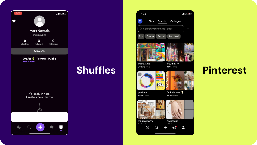
Of course, to maybe a Pinterest brand employee, this seems obvious. This is a Shuffles profile, Katie hasn’t made any Shuffles yet! But this violates a convention or standard that a Pinterest user is used to. They’re used to seeing their boards front and center. Boards are a bit like hoards of gold, users have invested time into creating them and accumulating the content therein. It feels a bit like being robbed not having them. Norman explains how conventions help users achieve their goals without having to relearn new processes all the time. “Consistency in design is virtuous. It means that lessons learned with one system transfer readily to others” (p.149).
Katie Follows the Shuffles Tutorial
Of course, learning new things is part of downloading a new app. The tutorial as a feature is an app designer’s attempt at helping the user with discoverability and understanding. From Norman, “Discoverability: Is it possible to even figure out what actions are possible and where and how to perform them? Understanding: What does it all mean? How is the product supposed to be used? What do all the different controls and settings mean?” (p.3). A tutorial is supposed to outline what’s possible and how to achieve your goals on the app.
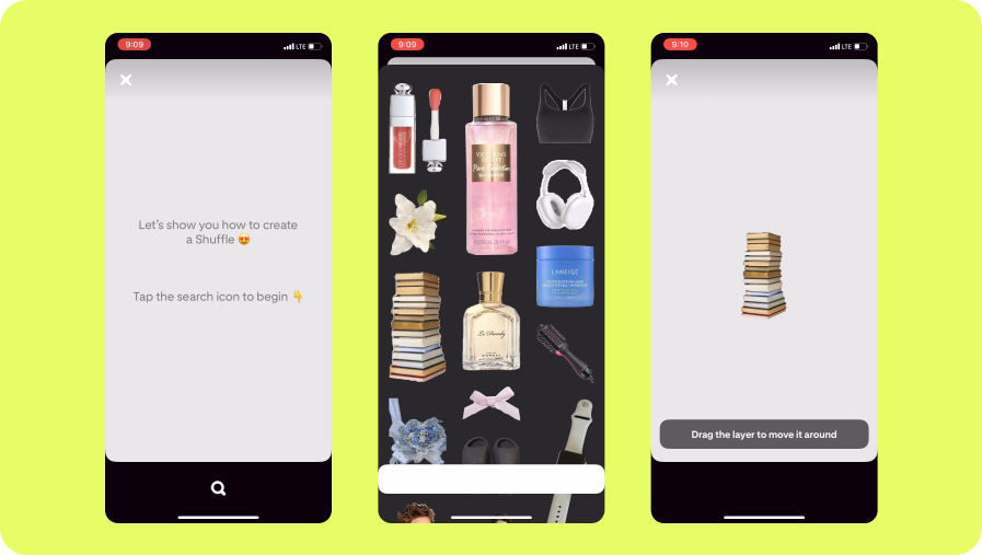
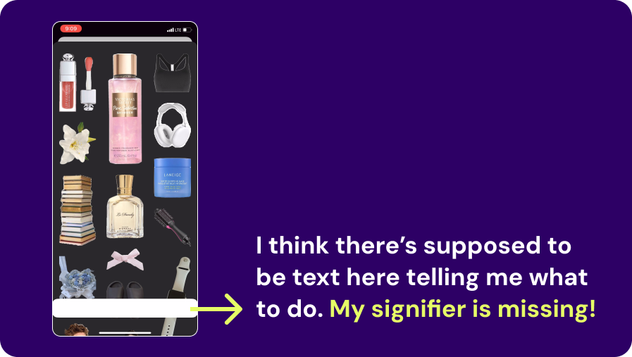
Unfortunately, Katie is a Dark mode user on her phone. And Shuffles isn’t really Dark Mode compatible. But Katie doesn’t know that, so some of the instructions in the tutorial are invisible. This means key signifiers, “perceptible signals of what can be done,” the directions are literally invisible. Dark mode is key for Katie, since her eyes are more sensitive to light. Norman says “There is no such thing as the average person,” and to “consider the special problems of the aged and infirm, the handicapped, the blind or near blind…” (p.243). Leaving out Dark mode users, no matter the reason for using it, is leaving out a wide swath of users.
But more importantly for Katie, at no point in the tutorial does it tell her how she can use her own pins. But she persists and makes the a Shuffle nonetheless. She finishes the tutorial and immediately deletes it since the app has her publish it publicly as default.
Finding Pinned Items and Adding to a Board
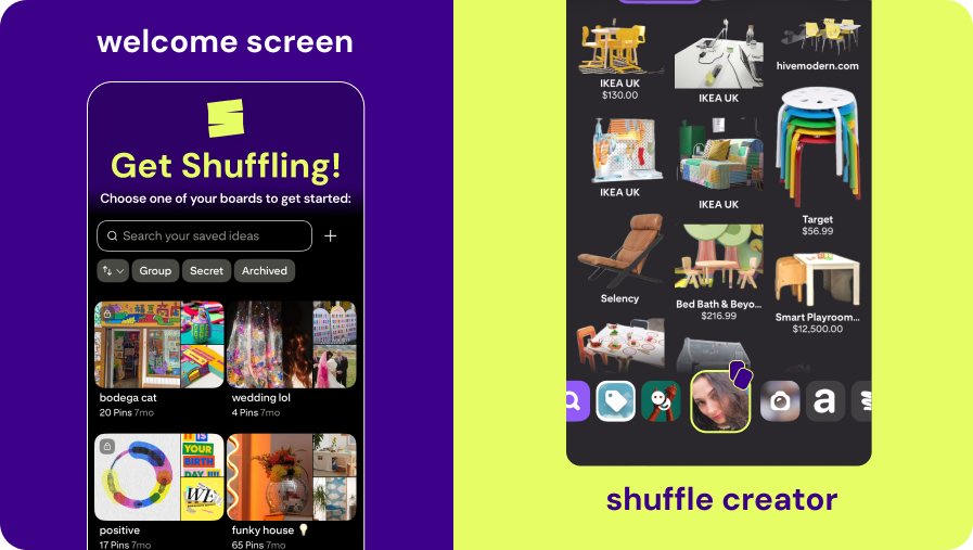
Katie decides maybe she just needs to explore a bit. The opening video explained the affordances or what’s possible. Even if the signifiers aren’t there, she can figure it out. She is standing on the edge of the Gulf of Execution, looking out into the void. Norman explains the concept of the Gulf of Execution and the Gulf of Evaluation as how users “try to figure out how it operates” (Execution) and “figure out what happened” (Evaluation) , which can be broken down further into the seven stages of the action cycle (p.38-41). The seven stages are: form the goal, plan the action, specify the action sequence, perform the action sequence, perceive, interpret, and compare (p.41). For Katie, she knows she just needs to find her personal boards, which means finding the right tab, section or button that leads her there. She opens up the shuffle creator and toggles through the different tabs at the bottom of the creator. Then, finally, she finds it!
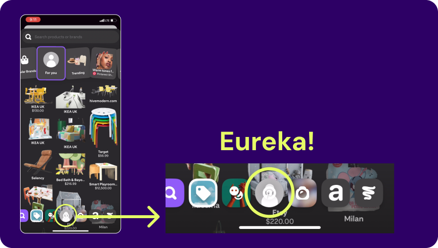
Finally, she gets to see her Pinterest boards! Specifically she’s been looking for her board “home is where the art is,” where she’s been saving pins to show Anna. She thinks though, wow, they really really hid that button. It feels like that button for her boards should be way more prominent.
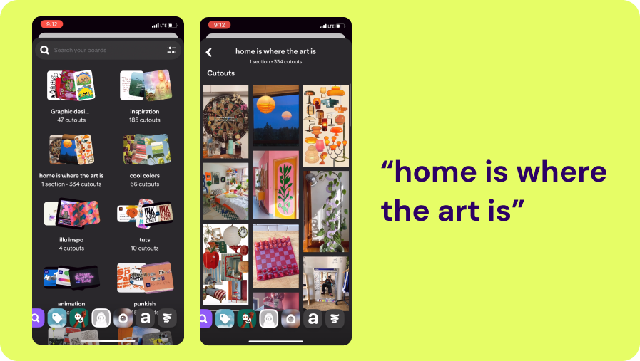
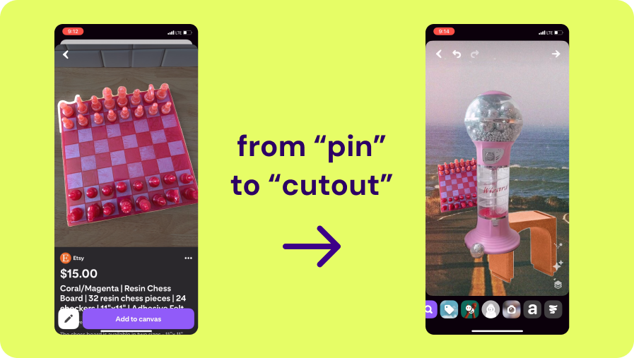
But again, she’s confused by a violation of conventions. While she’s used to the content in her boards being called “pins,” Shuffles calls them “cutouts.” It sort of makes sense, since the content will be cutout for the board, but the inconsistency confuses her a bit. It makes a bit more sense when she opens up one of her “cutouts” and the app proceeds to indeed cut it out for her.
Finally, the promise of the app comes true. Katie is able to create her moodboard. Here we see some good design, finally, with the “cutout” animation. We see an excellent and elegant example of feedback. Feedback is “communicating the results of an action” (p.23). Katie knows the app is cutting out her image because she sees a white tracing animation around the image. It’s letting her know she’s getting what she wants.
Happily Ever After?
In the end, Katie is able to cross those gulfs. She finishes her board, sets it to private (she doesn’t need anyone seeing her creation), and sends it to her beloved.
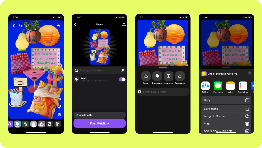
“Hey babe, whaddya think???”
Anna thinks maybe the martini shaped cat tree is a bit much but she loves everything else.
My Designer Thoughts
Honestly, I’m happy for Katie, but I would definitely change some things, but I want to focus on my main gripe. Getting to my precious, precious boards.
- Home Screen: Immediately serve the user their Pinterest boards, or serve up example boards from other users if they don’t already have their own (unlikely but possible).
- Shuffle Creator: Make the user’s boards in the tabs much more prominent than the other options. It’s not enough to center the button, make it larger, call it out with a brand color outline, and add some iconography to make it clearer. Also, I was bothered by the overlay of the buttons on top of the cutouts, so I added a shadow gradient underneath. I also made it a scrollable bar to make up for the space taken up by enlarging the user board button.