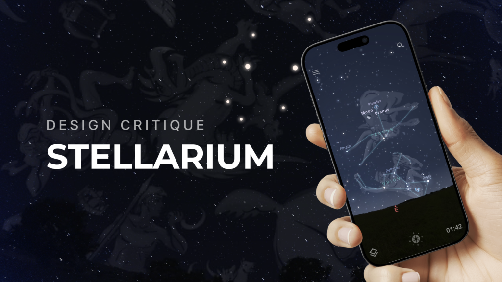
Stellarium is a mobile planetarium app that allows users to explore the night sky in real time. By pointing their device upward, they can identify stars, planets, and constellations through a realistic visualization. The experience feels immersive and inspiring, but certain design choices introduce challenges around discoverability and ease of use, particularly for beginners.
Onboarding and visibility
When first opening Stellarium, the user is greeted with a star-filled sky that shifts as the phone moves. This immediate interaction is an effective use of natural mapping: device orientation corresponds directly to sky movement, aligning with user expectations.
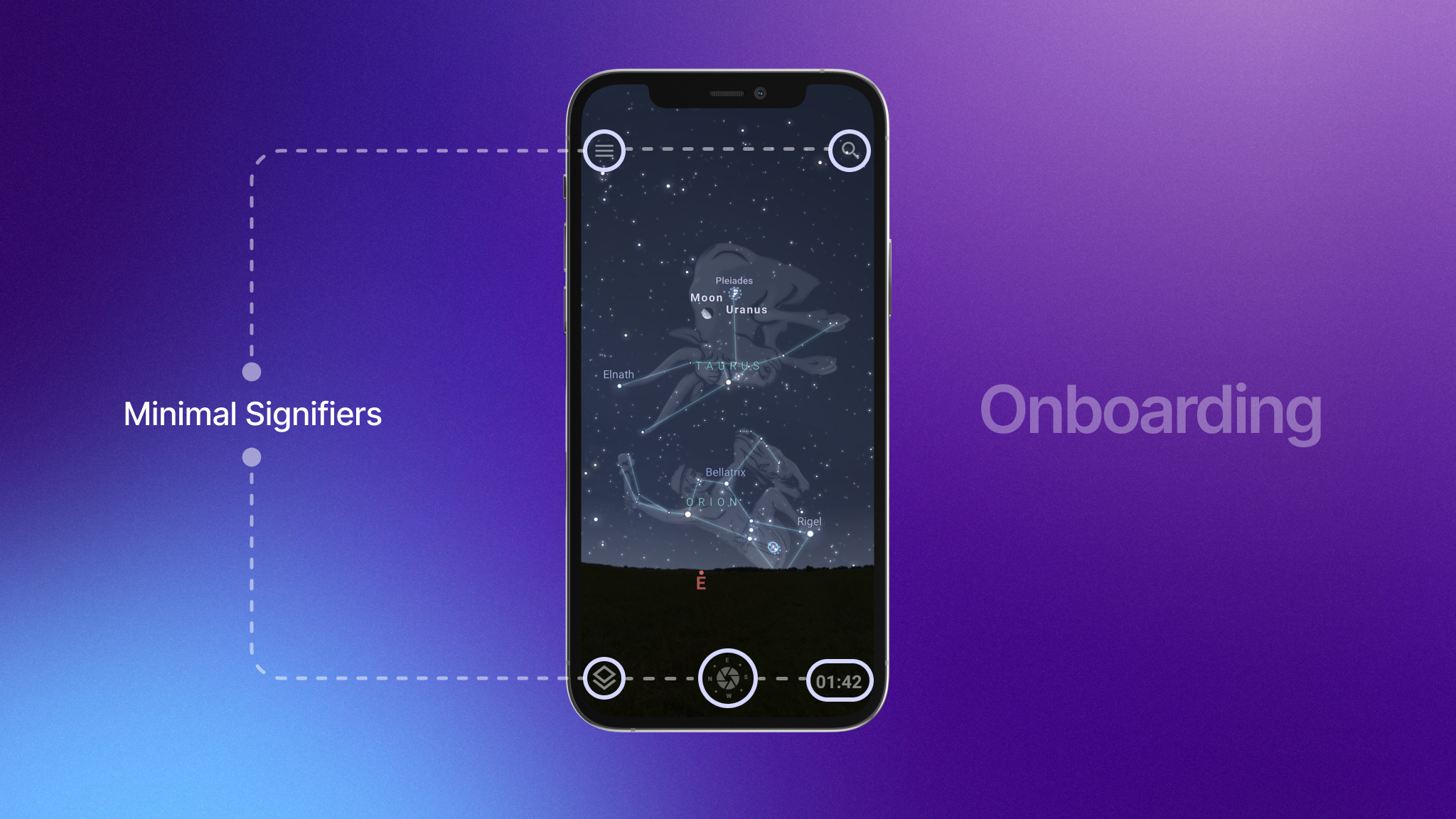
The onboarding process lacks clarity and requires a noticeable learning curve for new users. There are minimal signifiers guiding how to access menus, search for objects, or adjust time. The small corner icons serve these functions but blend into the busy starfield, creating a gulf of execution. A beginner who simply wants to explore a particular constellation or locate a planet in the sky may struggle to figure out where to begin.
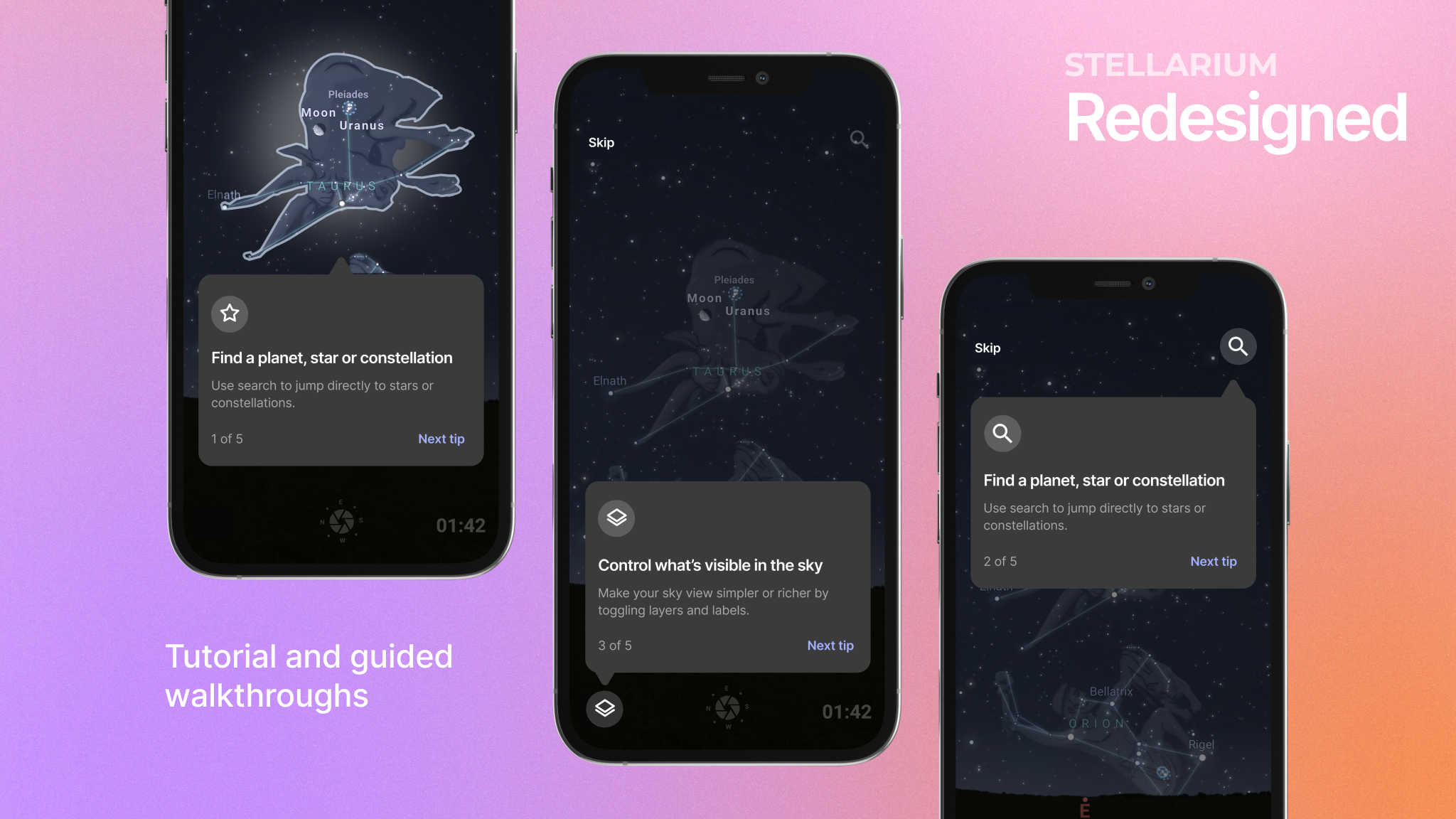
Recommendation: A more intuitive solution to this would be a short interactive tutorial on first launch. The app could highlight the menu with a subtle pulse, prompt the user to open it, and show where to find key tools. The search icon might include a hint like “Find planets or constellations here.” The tutorial could then glow a major constellation, asking the user to click on it to reveal more details, with an option to replay the tutorial guide later as well.
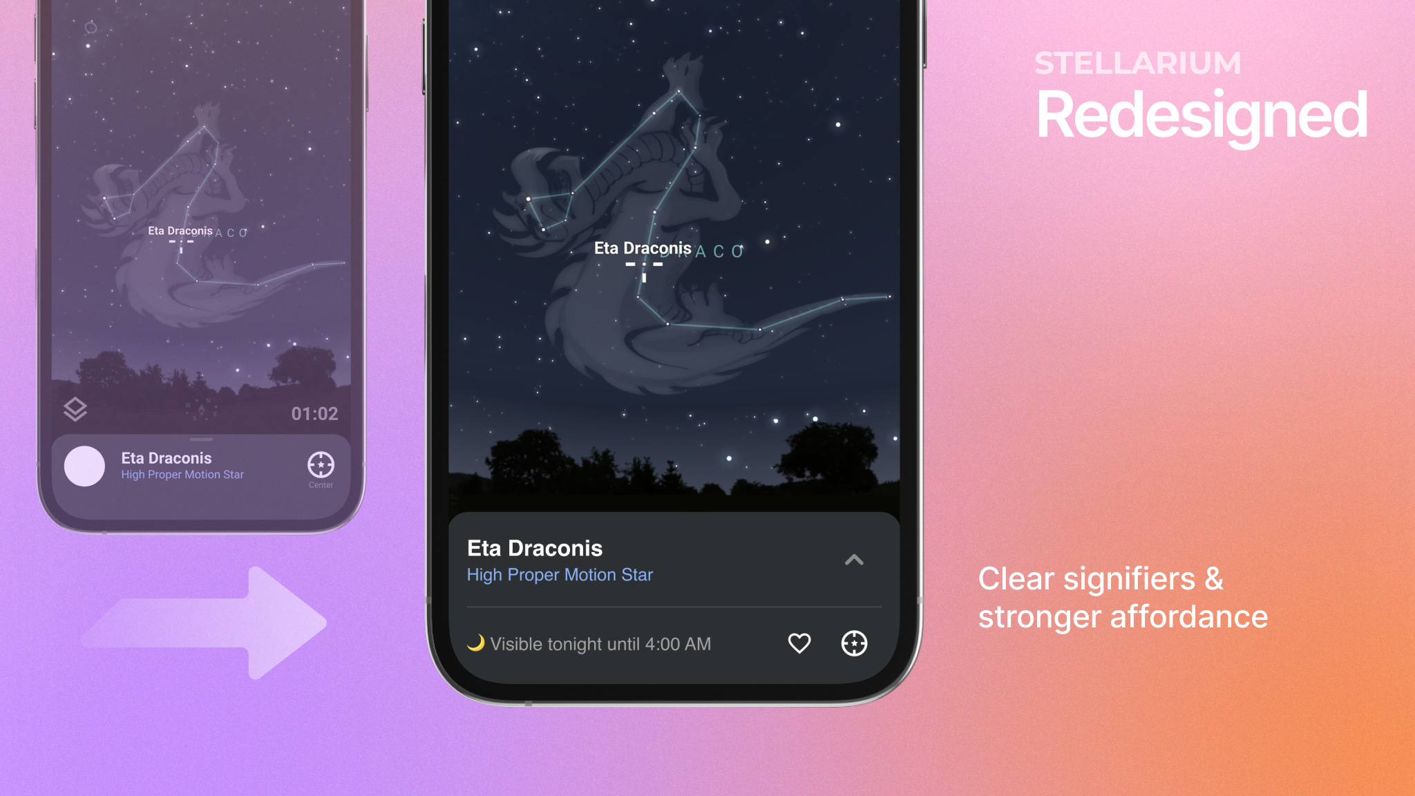
Feedback in object selection
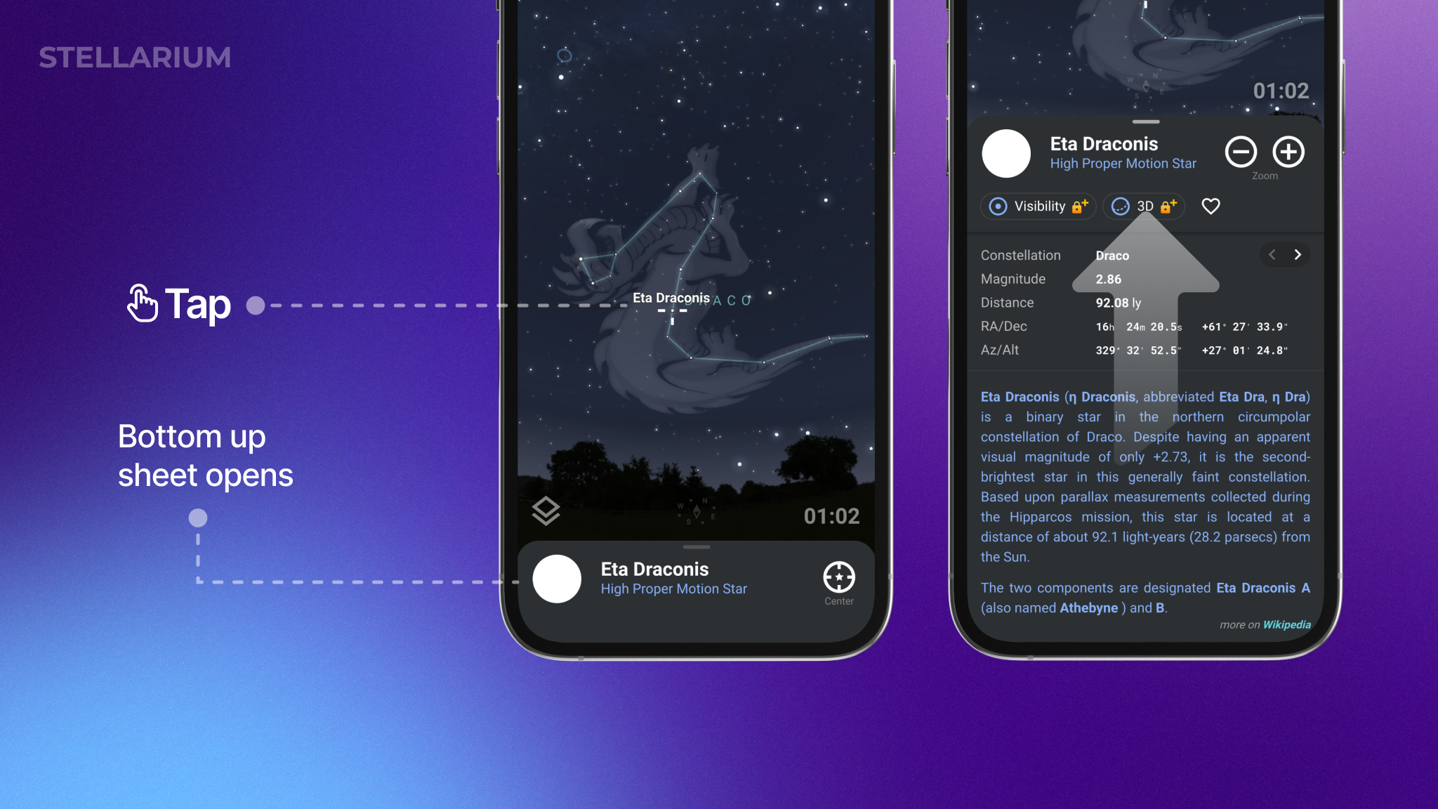
When a user taps on a star, planet, or constellation, the app displays a bottom-up sheet with the object’s name and category. This provides immediate confirmation, but it is unclear whether the sheet can be swiped upward to reveal more information. The absence of a strong signifier makes the interaction unintuitive, leaving many users unaware that detailed data exists beyond the collapsed state.
This creates a gulf of execution. The user’s goal is straightforward: they want to learn more about the object they selected. Yet the interface requires them to recall a common mobile convention (swipe up to expand) rather than showing it explicitly. In Norman’s terms, the design relies too heavily on knowledge in the head rather than offering knowledge in the world.
Recommendation:
Add clear cues on the collapsed bottom-up sheet, like an upward arrow or a micro animation that shows the panel moving up on first use. Adding a quick fact, such as “Visible tonight until 4:00 AM” not only gives users useful information right away but also acts as a sneak peek that more details are available if they expand the card. This also helps ease the cognitive load for beginners, who might otherwise feel overwhelmed when they suddenly come across the dense technical data.
Natural mapping in navigation
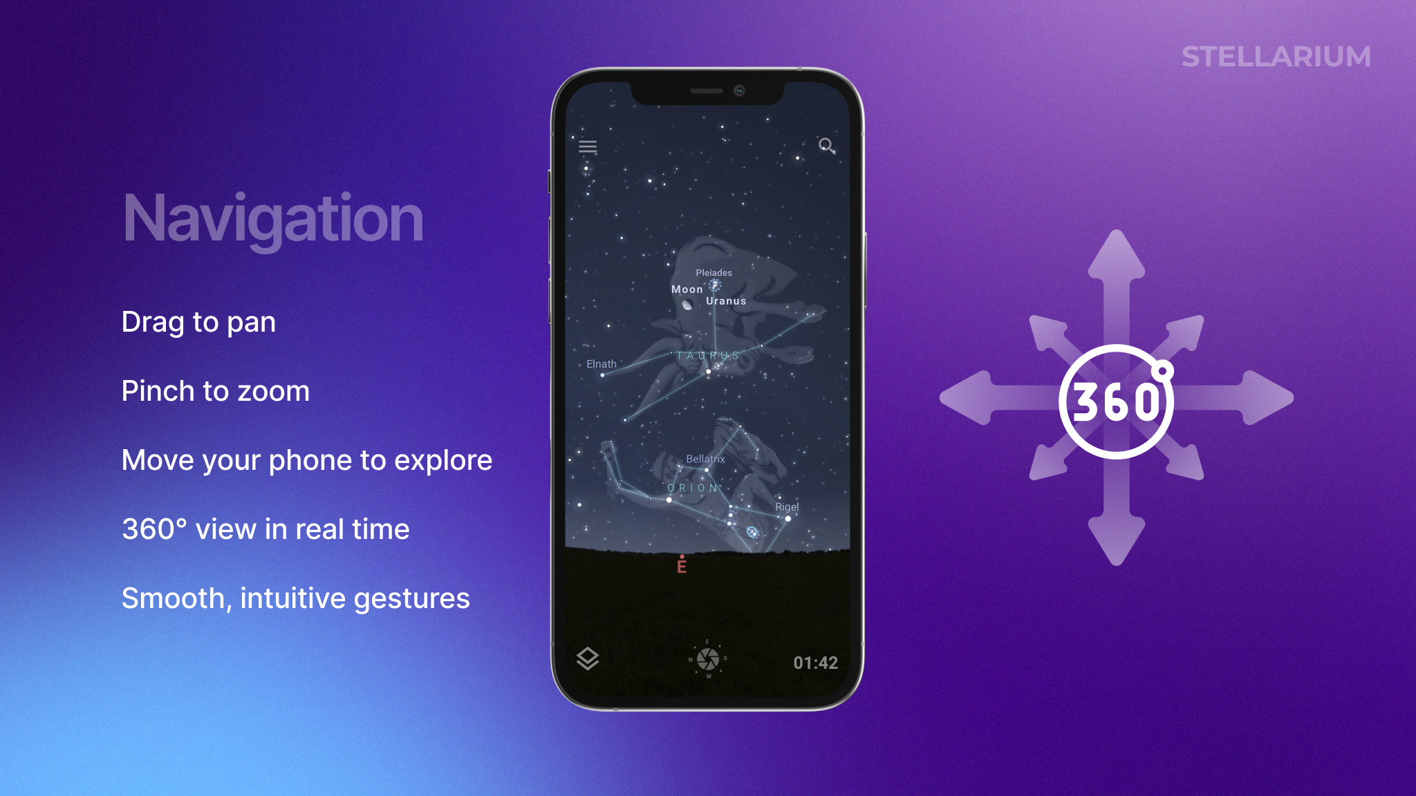
One of Stellarium’s strongest qualities is how naturally it lets users explore. Dragging to pan and pinching to zoom feel smooth and familiar, echoing gestures from other mobile apps. More importantly, the app uses natural mapping, where moving the phone itself mirrors the movement of the sky. This creates an immersive 360° experience that feels intuitive even for first-time users.
This is the true aha moment of the app: as you tilt the phone and the sky shifts with you, constellations and their mythical illustrations come to life across the screen. Seeing the star patterns appear as you move the phone feels magical and memorable, turning the sky into a visual way to learn.
Exploring through time
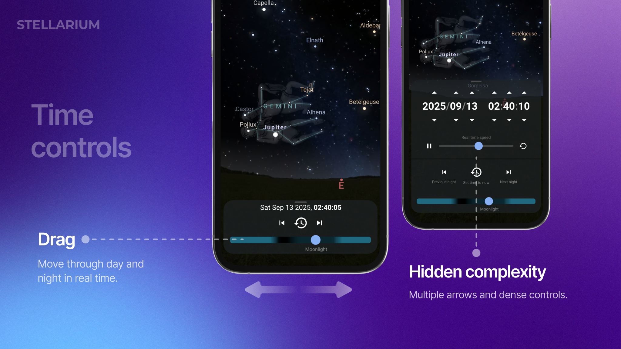
One of the app’s most engaging features is the time slider. As users drag it, the sky updates in real time: constellations rotate, stars shift, and day seamlessly turns into night. This immediate feedback makes the sky feel alive.
The problem begins with visibility. The date-time label does not clearly indicate that it can be tapped, so many users remain unaware of the expanded controls behind it. When tapped, the panel reveals both the slider and a dense date-time picker with arrow buttons. This creates two issues: first, discoverability, since users may never know the picker exists. Second, complexity, as the arrow-heavy interface contrasts with the smooth, intuitive slider, leaving it unclear which control should be primary.
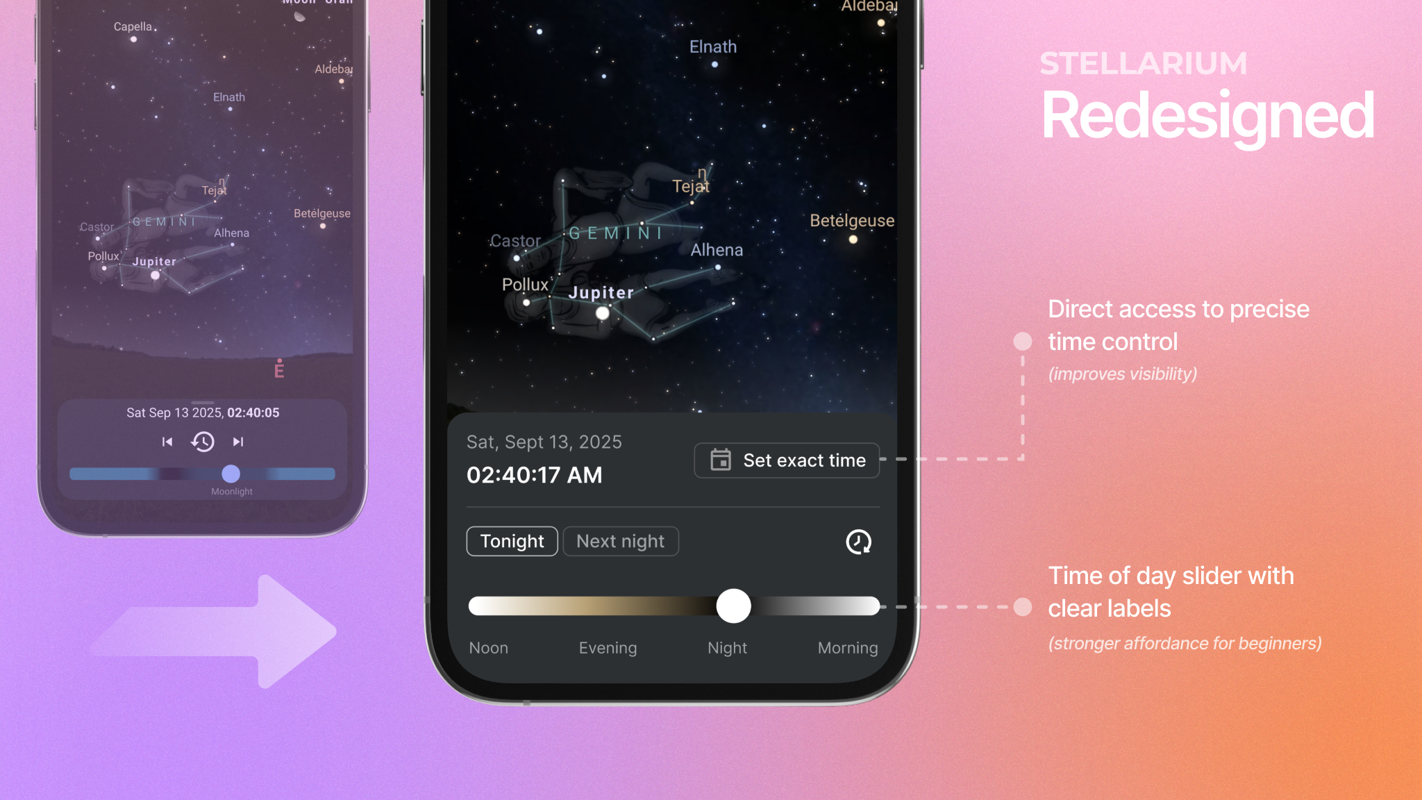
Recommendation: Add a clear signifier to the date-time label, such as a caret or calendar icon, along with microcopy like “Set exact time.” Simplify the expanded view by keeping the slider as the main control and replacing the arrow-based picker with a friendlier date and time selector. Presets like Tonight or Next night could reduce cognitive load while still giving precision when needed.
Conclusion
Stellarium stands out because it makes the night sky feel alive in your hands. Tilting the phone and watching constellations move across the screen is an experience that’s both magical and educational. At the same time, small gaps in signifiers and overly complex controls remind us how easy it is for beauty to get in the way of clarity. With clearer cues, simpler time settings, and a bit more guidance for beginners, the app could keep its wonder while becoming much easier to use.