Strava is a popular iOS mobile application that enables athletes to record and post their workouts, such as running, hiking, and swimming, and connect with a community of people who share a passion for fitness. Users will use their phones and/or smartwatches to track their activities, post the exercise on Strava, and receive back various data, including their speed, time, location/path, and elevation. When evaluating the user interface and experience of Strava, we will reflect on concepts discussed by Don Norman in “The Design of Everyday Things.”
Record Workout Feature
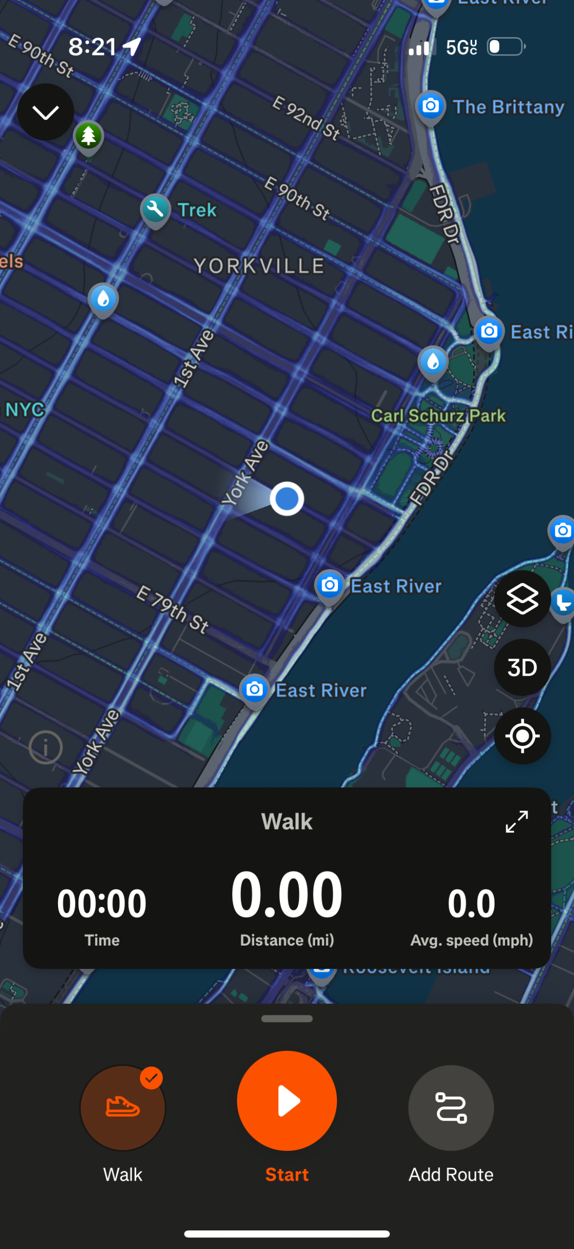
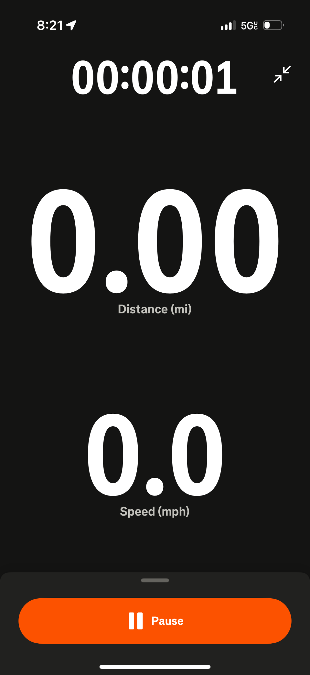
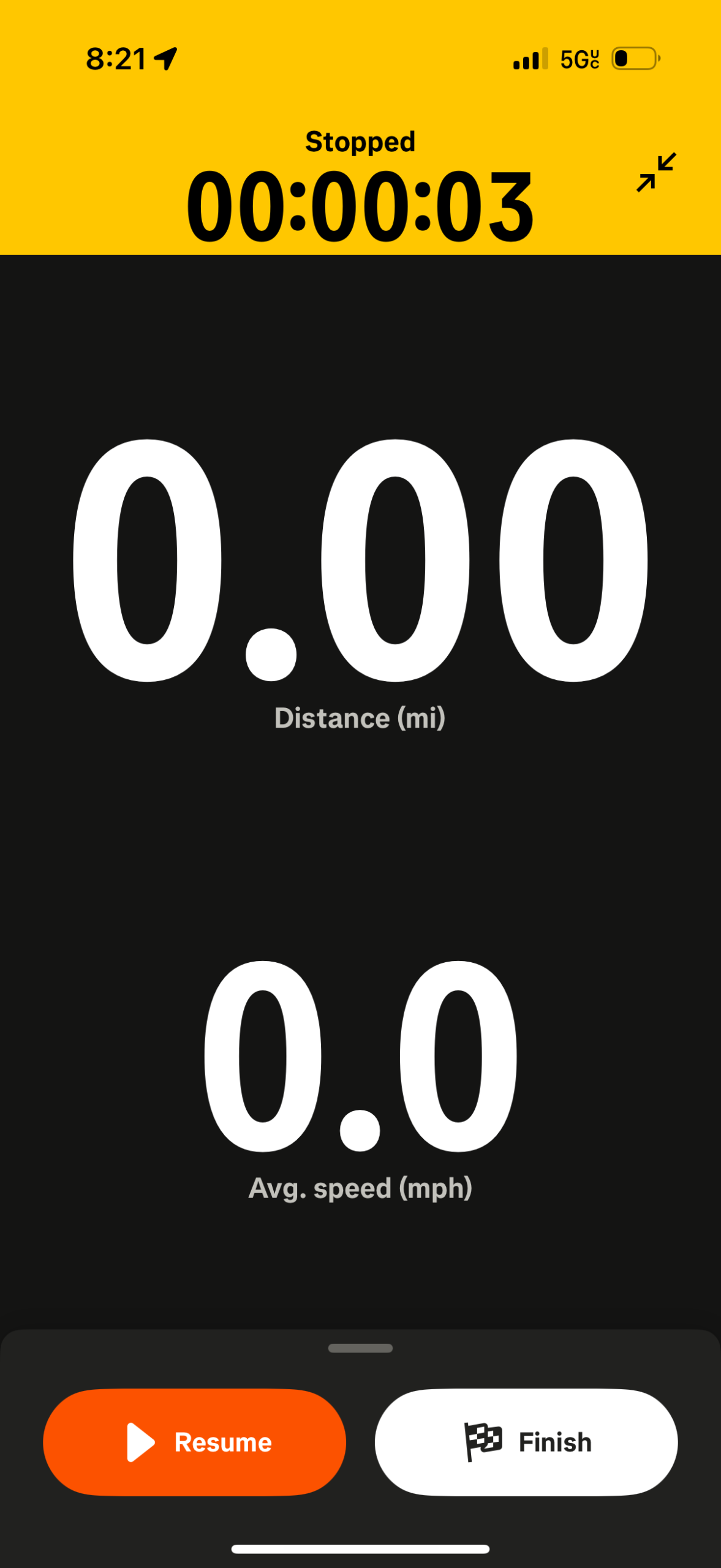
From left to right: Figure 1, Figure 2, Figure 3, Figure 4.
When users first open the app, they are introduced to the homepage (Figure 1). When a user selects the Record Option, they are directed to the next screen (Figure 2). The large, clearly visible, circular “Start” button offers an affordance to the user to tap it. When a user taps the “Start” button, they are directed to a third screen (Figure 3) that displays their current live activity, distance, and speed. When a user would “Pause” their activity, they would be shown the option (Figure 4) to “Resume” or “Finish.” These icons are good uses of signifiers– the icons beside and under the words “Start” “Pause” “Resume” and “Finish” all clearly signal their functions with bright orange backgrounds. When a user selects the “Start” or “Pause” button there is also immediate visual feedback like a timer starting/stopping, and the screen changing color/interface. This attribute is an example of good design because the buttons are tappable, provide instant feedback, are universally recognized, and discoverable, which grants users confidence when using the record activity feature.
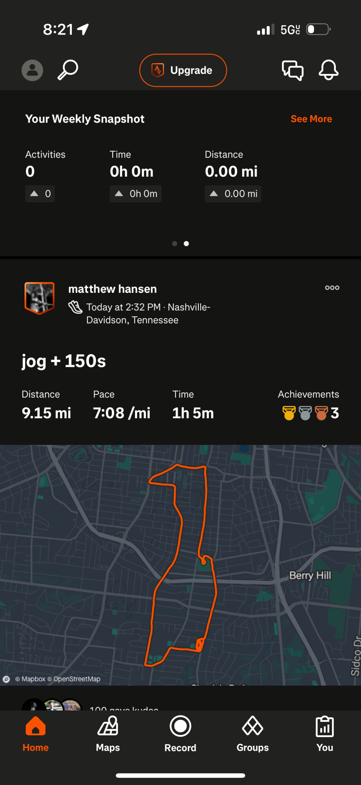
Social Feed and “Kudos,”
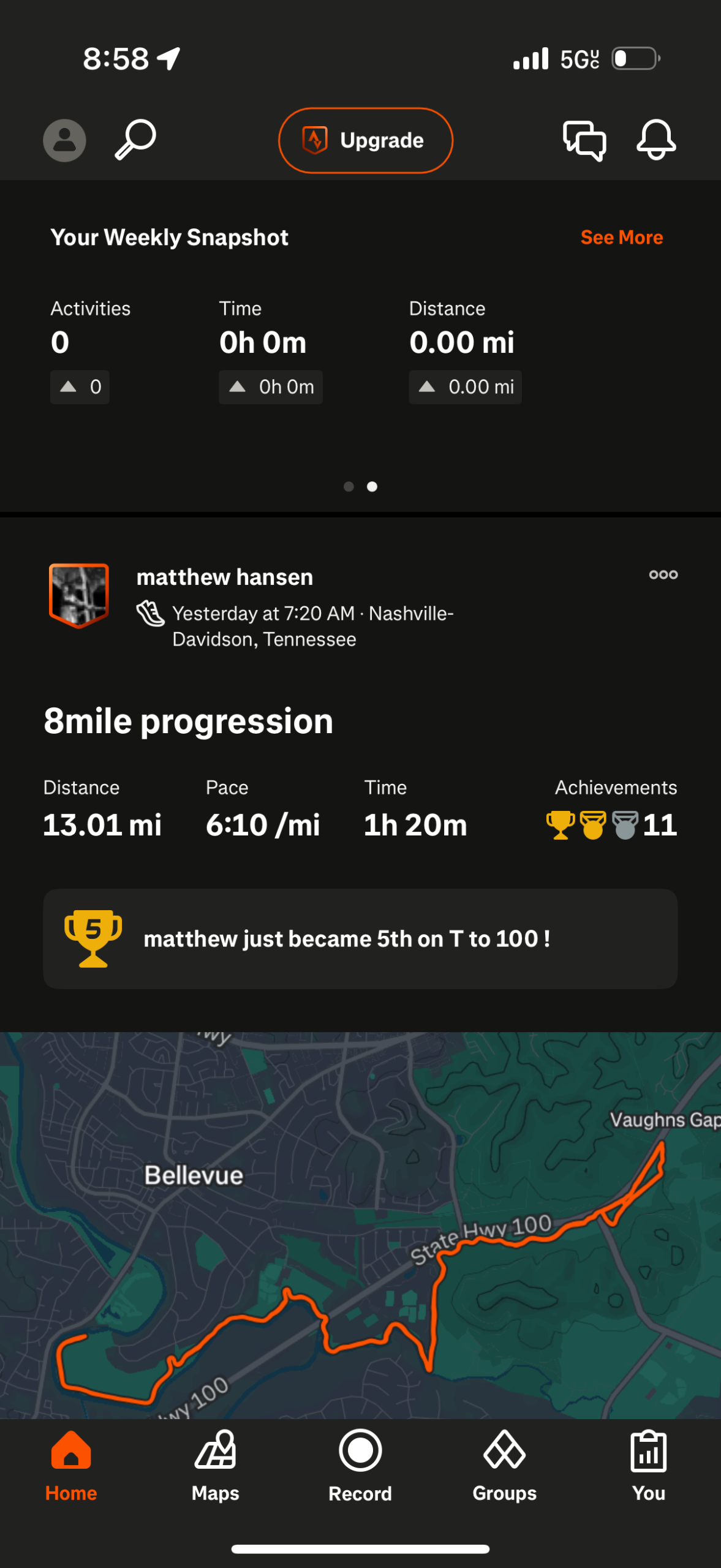
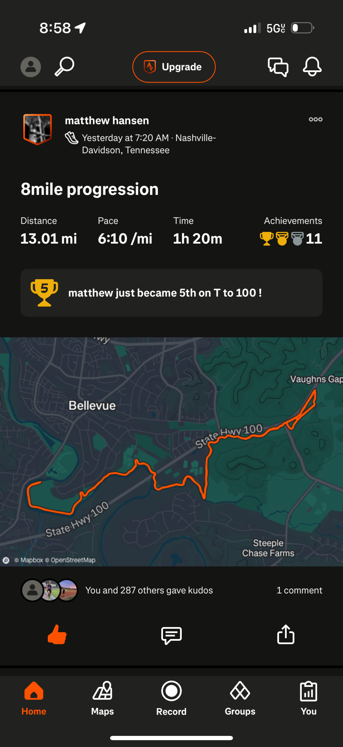
From left to right: Figure 1, Figure 2
When users first enter the mobile application, they view the Strava homepage which displays the most recent post from an athlete they follow (Figure 1). Users can scroll down on this social feed (Figure 2) to view all new posts. On each post, users can view the person’s name, user icon, title of their workout, distance, pace, time, achievements, location of workout, and who responded to the post with “Kudos,” (a Strava term for “like,”) or comments. When the user interacts with the “Thumbs up,” or “Kudos,” icon, this reflects instant feedback and natural mapping because it directly and clearly results in the icon filling in, and the like count going up- a direct visual change. This action maps to the expected outcome a user can expect- a good example of intuitive interface behavior. While the “Thumbs Up,” icon reflects learned conventions from other popular social media platforms, the concept of “Kudos,” is not immediately explained when users first use Strava. This can increase the gulf of evaluation because the user may be unsure what this function does, and what the social meaning is. A suggestion would be to include a tip on what a “Kudo” means in Strava when a user is taking a tour of the application for the first time.
Personal & Post-Activity Summary
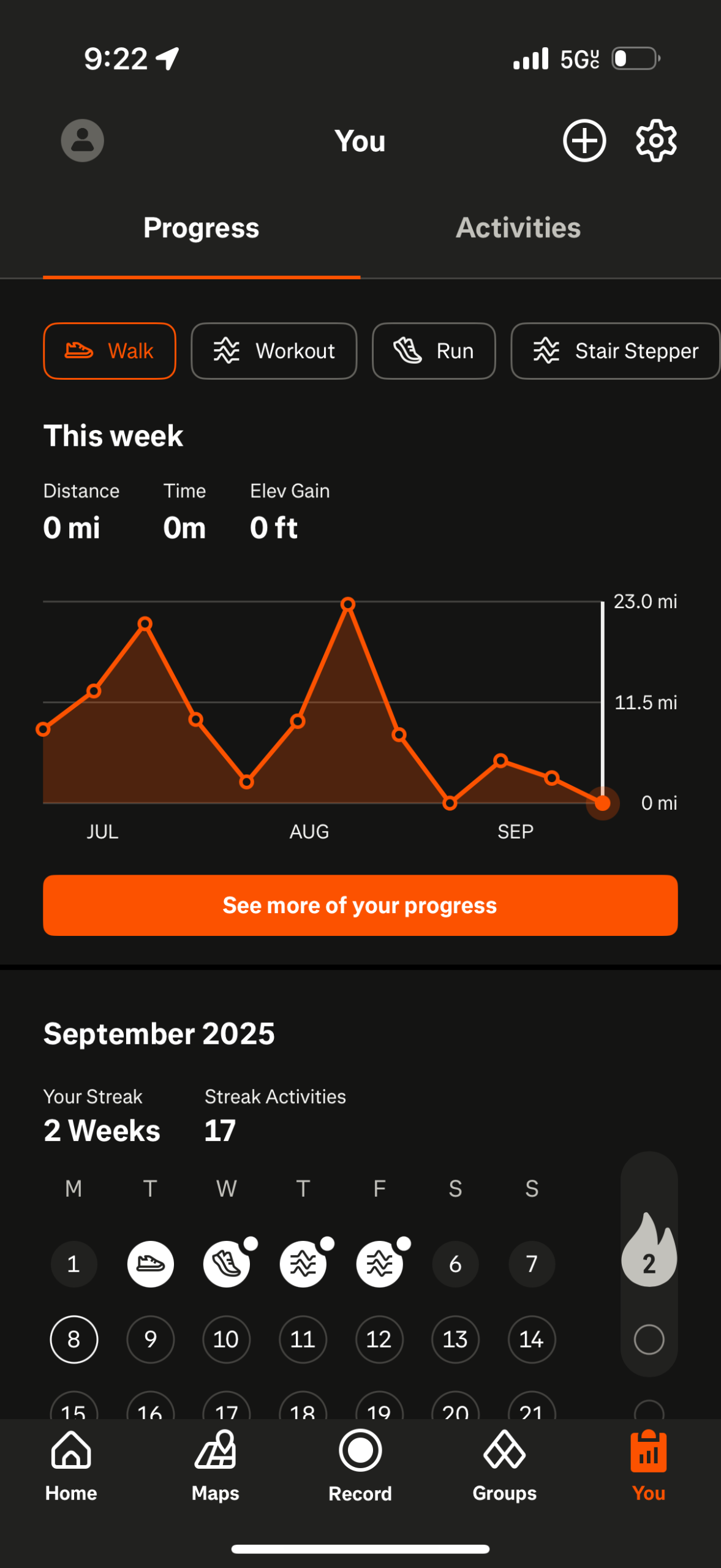
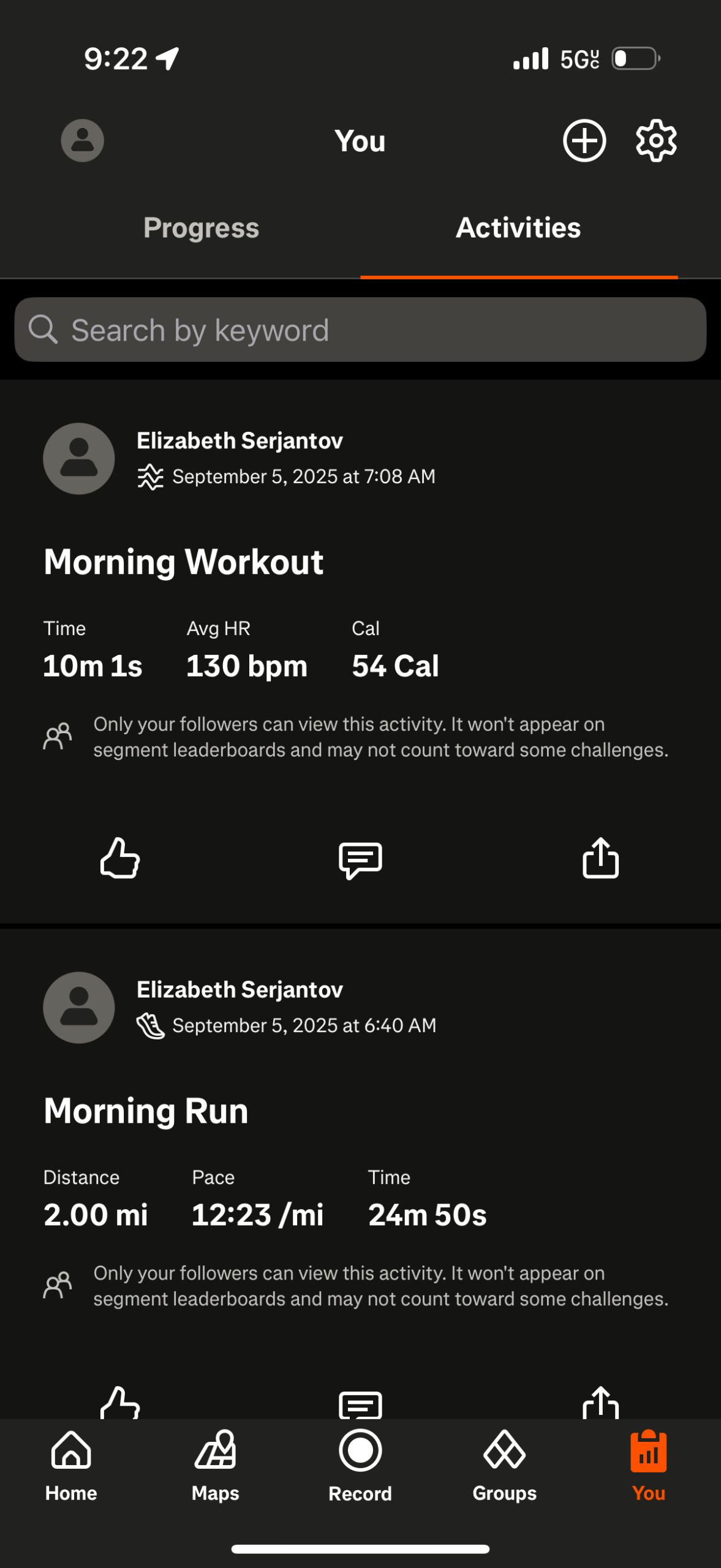
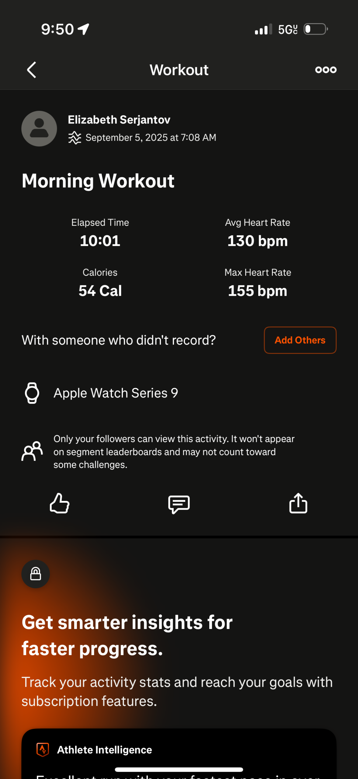
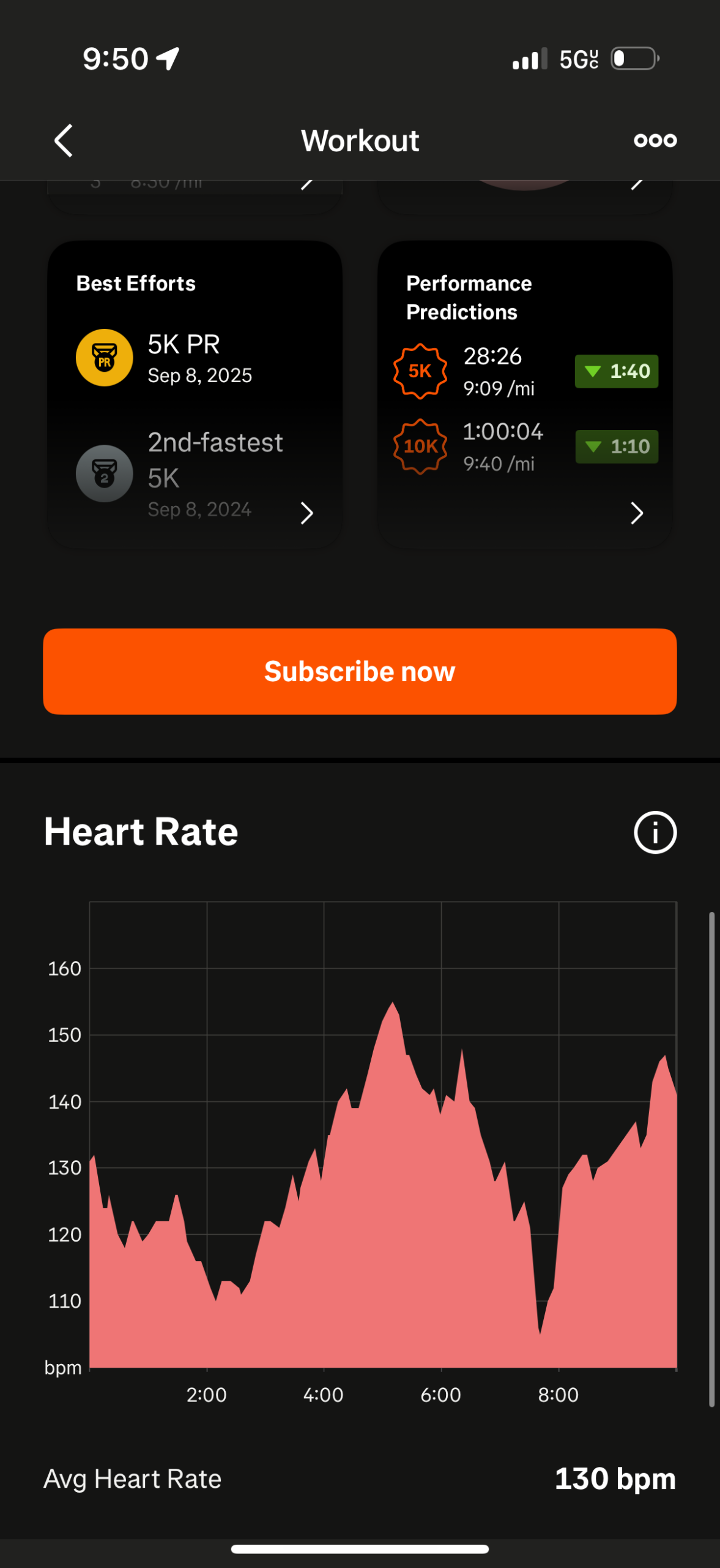
From left to right: Figure 1, Figure 2, Figure 3, Figure 4.
When the user interacts with the lower navigation menu and press on the “You,” or Clipboard Icon, they are taken to a Progress screen (Figure 1). The graph and calendar trackers are a good example of visual feedback. When the user navigates to the Activities section (Figure 2), and presses on one recent activity (Figure 3), Strava does an excellent job at providing the user with a detailed a summary that aligns with the user’s mental model of what they expect to learn from their workout, and relying on Knowledge in the World with visual elements like Trophies for Personal Bests/Best Efforts and Heart Rate graphs (Figure 4). The trophies and personal best charts are exceptional use of gamification elements that provide positive emotions towards users. One way this interface could improve however, is by including a logical and clear next step for users that is discoverable, like including a “analyze,” or “share with friends,” button, to minimize a user’s uncertainty of what to do next.
Conclusion
Strava’s digital interface is a satisfactory example of exceptional user interface and experience design through it’s clear and descriptive feedback, universally recognized, responsive icons, and understanding what the user hopes to receive when recording and analyzing their activities.