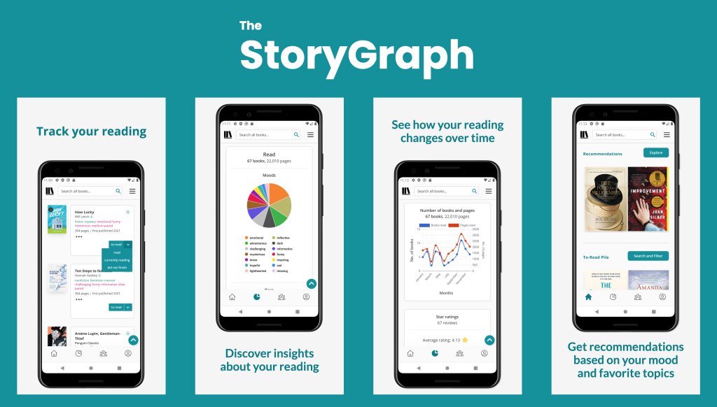
The StoryGraph is a web-based book cataloging platform created by Nadia Odunayo in 2019 that serves as an alternative to Amazon’s Goodreads. Users can log their reading progress, set challenges, and view statistics, among other social features.
The Navigation Bar
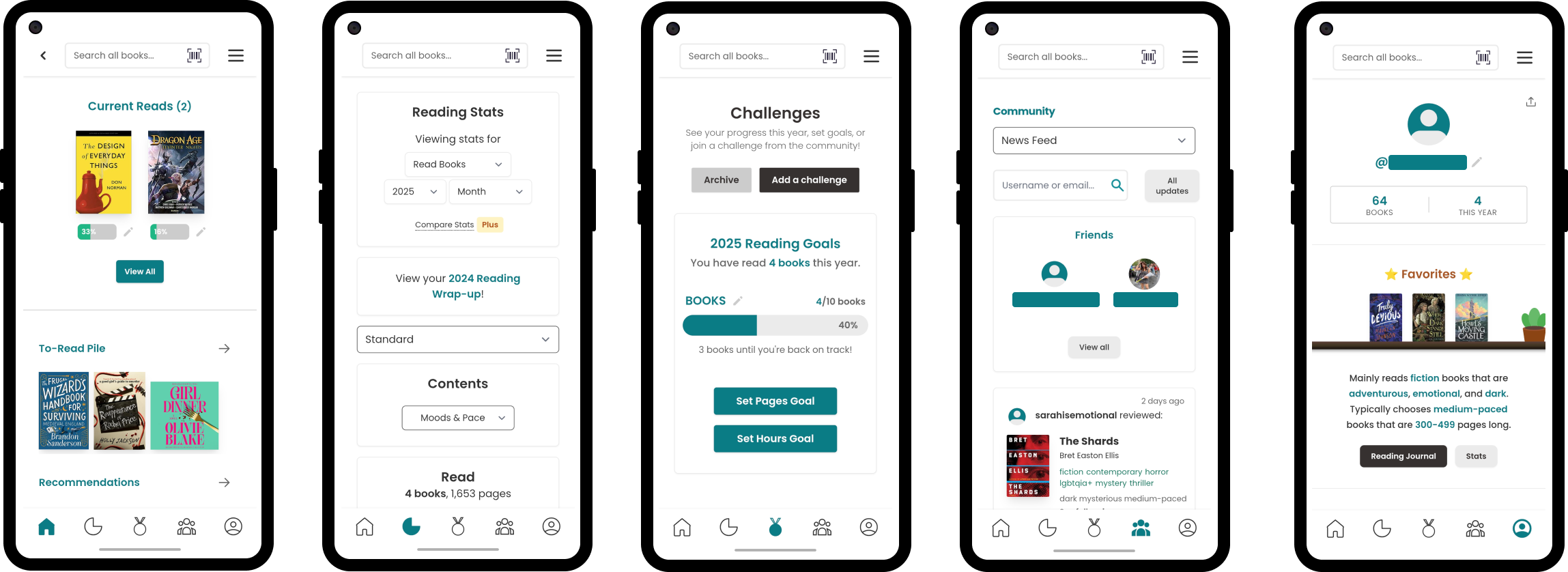
The global navigation bar includes five icons that signify different pages on the application: Home, Reading Stats, Challenges, Community, and Profile. The icons afford tapping to navigate, while the visual iconography acts as signifiers to clarify their function. For example, a house icon clearly signifies “Home.” The navigation bar utilizes a mix of Knowledge in the World (signifiers) and Knowledge in the Head (memory of other applications with navigation bars) to provide users with an easily understandable navigation system that even new users should successfully navigate. This design choice is especially important considering that StoryGraph has some unique features represented in the navigation bar (“Reading Stats” and “Challenges”) that users may not have encountered in other applications. The navigation bar also provides users with useful feedback as active icons fill in when selected.
The Profile Page
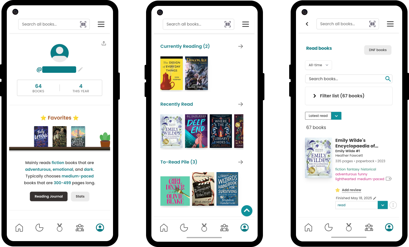
The user profile page is where StoryGraph has some difficulty with its conceptual model, creating friction with users’ mental model. As a book cataloging platform, it is understandable that users may want to peruse all of their previously read books. To view previously read books, users must go to Profile → scroll → select “Recently Read.” This path flow is represented in the three images of Figure 2. This design choice by StoryGraph creates a Gulf of Execution: users intending to locate all their books may not realize that this is the correct path, since the signifier (“Recently Read”) does not accurately describe the content of that page. Once clicked, the page title changes to “Read Books,” which aligns better with the user’s goal. This discrepancy highlights the poor initial mapping and signifier choice.
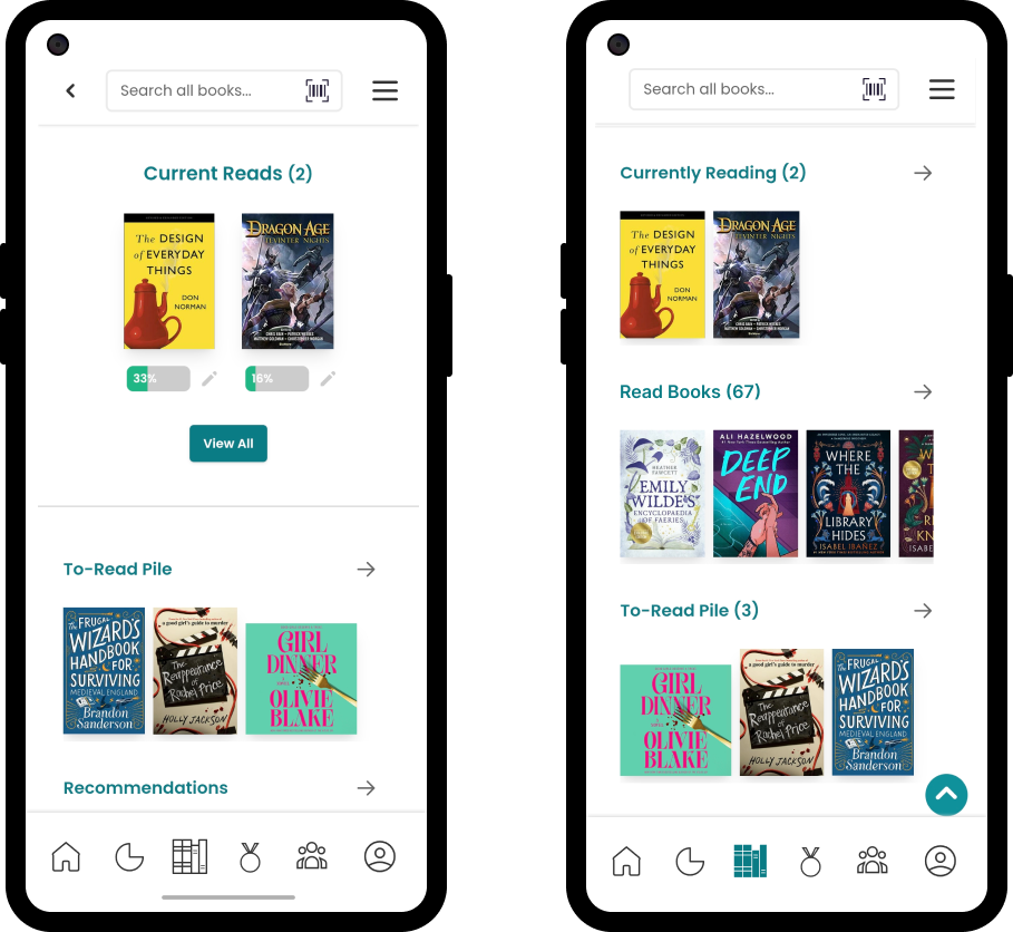
An easy way to address this issue would be to rename the menu option to “Read Books” to strengthen the signifier and address the Gulf of Execution. However, some users may still feel unsatisfied with StoryGraph’s conceptual model when comparing it to their mental model of what a book cataloging app should be (possibly influenced by their previous experience with Goodreads). Goodreads provides users with an easy way to access their books from their navigation bar. Having such an important feature easily accessible from the global navigation would align with users’ mental models of a cataloging app, further reduce the Gulf of Execution, provide a more direct mapping to user goals, and improve discoverability. Figure 3 presents a mockup of an alternative design to address these issues, introducing the new navigation icon and renamed signifier.
Book Ratings and Reviews
Users may also use an app like StoryGraph to find recommendations for new books to read. One way they may decide which book they would like to purchase is with the ratings books have (often on a scale of 0-5 stars). Currently, average ratings are hidden by default, reflecting StoryGraph’s design philosophy (avoiding bias). However, many users expect ratings to be visible at a glance when browsing books, demonstrating another gap between the conceptual model and the user’s mental model. This mismatch widens the Gulf of Evaluation, as users cannot easily assess the community’s reception of a book. Moreover, if you have read a book and given it a star rating yourself, your rating is displayed at the top of the book detail page. However, the link titled “See review” only shows the users’ review, not community reviews. This design choice presents a misleading signifier and poor mapping, potentially leading to the user’s mistake of believing no other reviews exist.
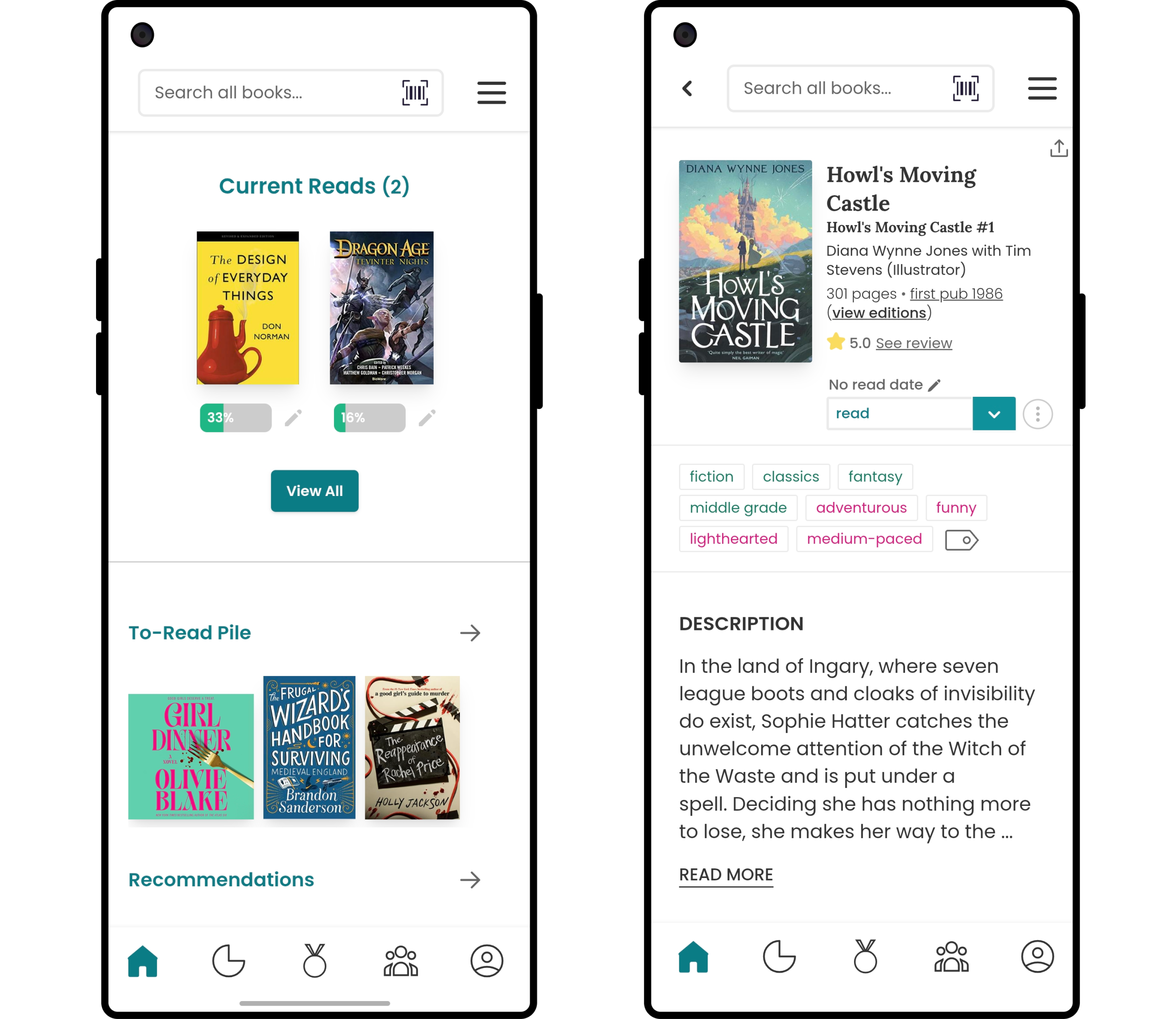
To solve this mental model gap and avoid mistakes, I believe that book ratings should be visible even when just glancing at the book in a list or on your home page, as shown in Figure 5. However, to take into consideration StoryGraph’s vision, an option could still be provided in the settings that allows users to toggle the ratings off (Figure 7). Additionally, I would still alter the way ratings and reviews are presented when you view the detail page of the book, providing the average rating at the top with the other book information for ease of discoverability, while still including your personal rating and the option to view/edit it, as presented in Figure 6.
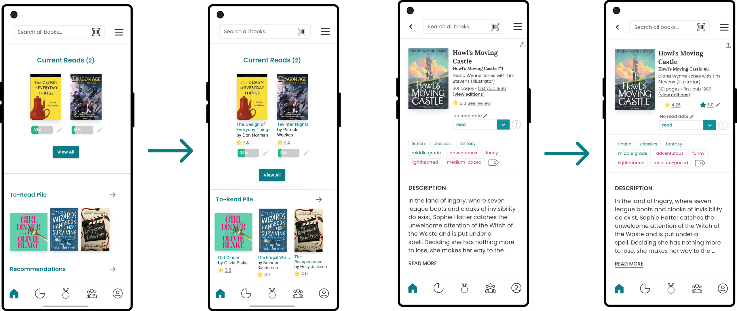
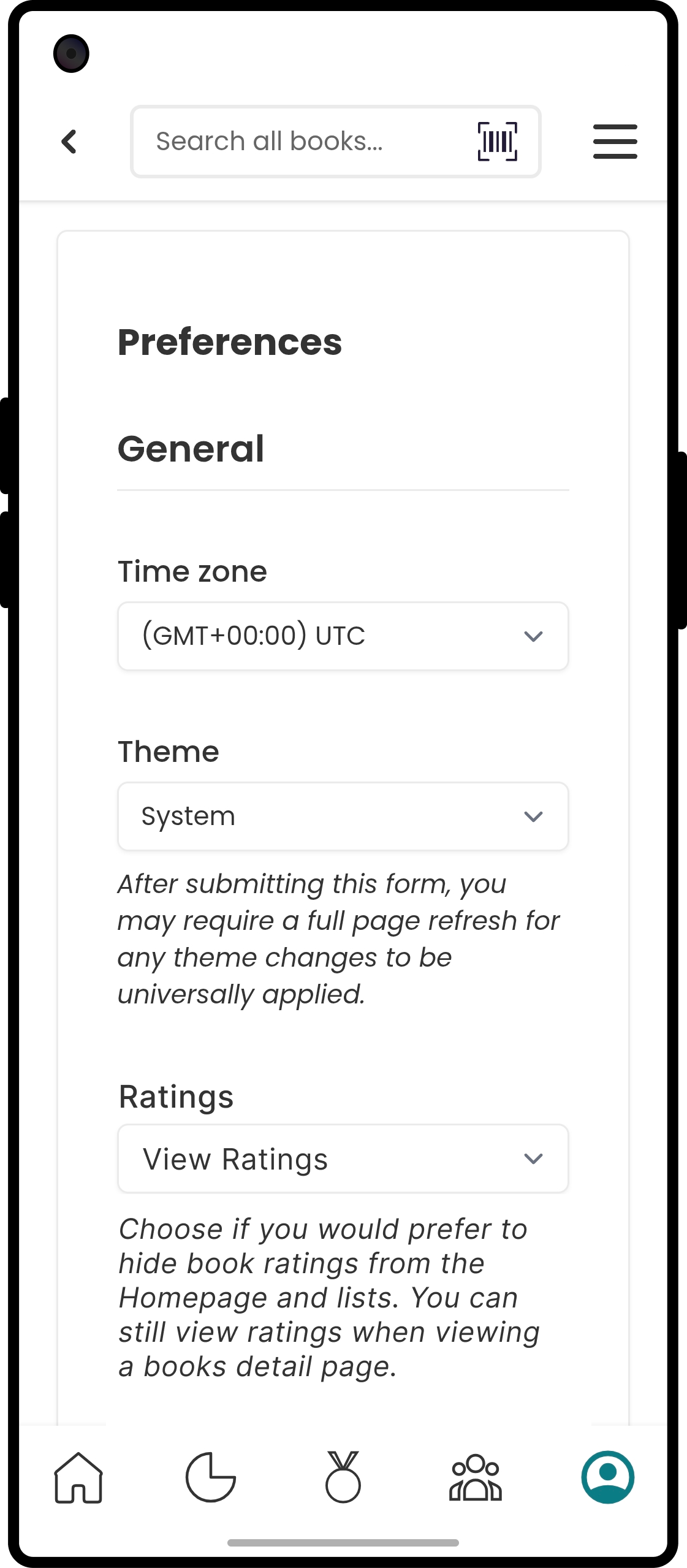
Figure 7: Design Mockup of a new option to toggle the visibility of ratings on or off.
Conclusion
StoryGraph provides a well-developed alternative to Goodreads, presenting users with many features that have been lacking from previous book cataloging applications. Their small team of three are dedicated to improving StoryGraph, taking feedback and suggestions from their users and implementing them as soon as they are able to. Although there is definitely room for improvement for StoryGraph to bridge the gap between their conceptual model and users’ mental model, reducing the Gulf of Execution and Evaluation, as well as improving signifiers and discoverability, the progress the team has made since the launch of StoryGraph in 2019 has been exemplary.