Wise is a money transfer platform that lets users send funds abroad, receive international payments, check exchange rates, and pay bills globally. In this critique, I examine the experience of a user who depends on a personal Wise account to exchange money with her sister studying and working overseas. My analysis draws on Don Norman’s Design of Everyday Things and Jenny Davis’s How Artifacts Afford to evaluate how the app’s design supports, or complicates, everyday cross-border transactions.
Onboarding and Registration
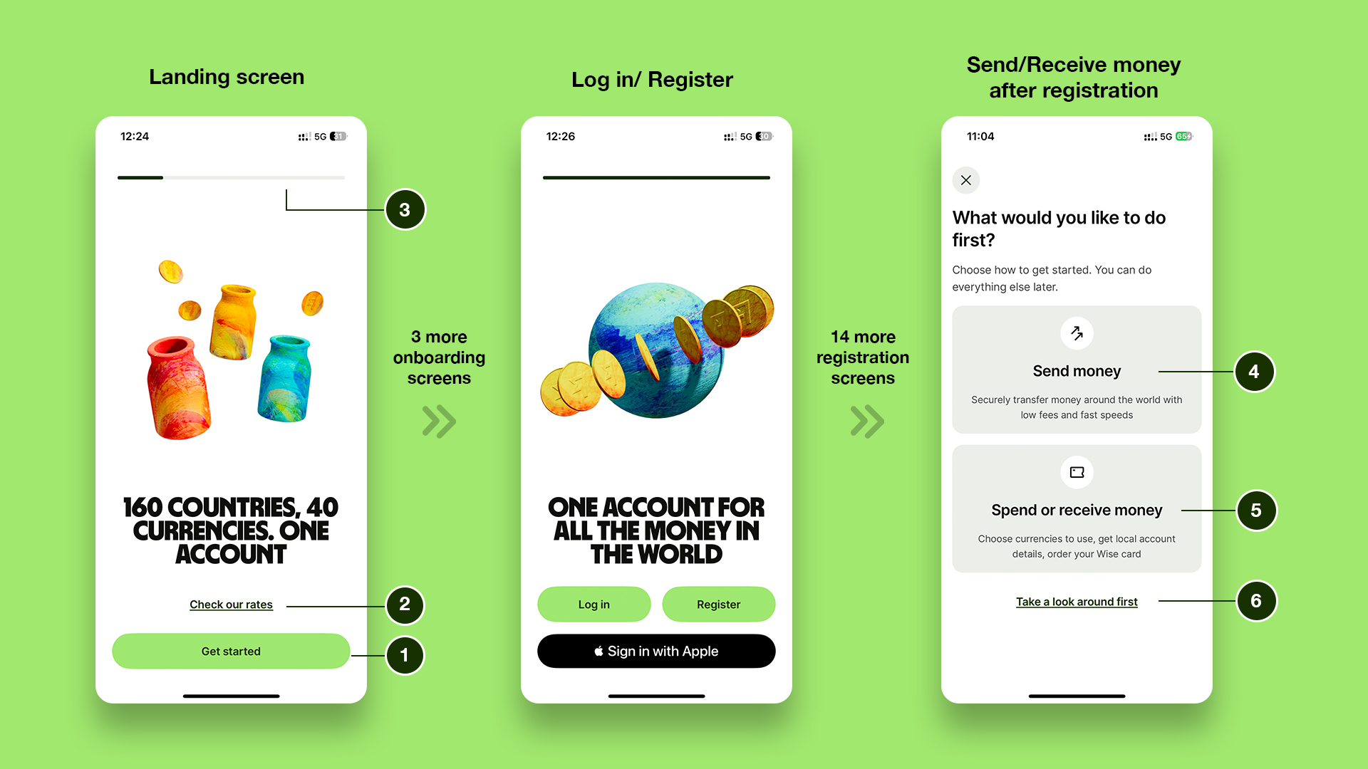
On opening the app, the user encounters five onboarding screens that introduce its primary functions while shaping a clear conceptual model in the user’s mind. At any point, the user can bypass this flow using the persistent “Get started” (1) button, which enables quick registration. The onboarding screens also maintain a strong visual hierarchy: vibrant animations draw attention and encourage the user to stay, “Get started” (1) allows a fast-track option to skip onboarding, and the secondary “Check our rates” (2) button allows immediate access to rates—helping prevent drop-offs if the user simply wants to see that information upfront. While five screens may seem extensive, the colorful animations are engaging enough to compel the user to continue. A consistent progress signifier (3) at the top communicates how far the user has come.
The onboarding process is followed by a 15-step registration flow. However, the lack of clear mapping and visibility of system status leaves the user uncertain about how far along they are in the process or how many steps remain before logging in. According to Norman, effective mapping allows the user to understand the relationship between their actions and outcomes, while visibility ensures that the system communicates its current state. This experience could be improved by incorporating progress indicators and consolidating or combining registration steps to reduce cognitive load.
Once registration is completed, the app fails to provide explicit feedback to confirm the registration. Instead, the app immediately displays the send/receive money (4)(5) screen, encouraging the user to make their first transaction. Introducing a clear confirmation screen—such as “All set”—before displaying the transaction interface would improve visibility of system status and create a more reassuring and seamless user experience.
“Take a look around” (6) allows the user to explore the app without pressure, sliding in the ask for an immediate transaction to be perceived more like a request than a demand. By supporting user control and reducing perceived demands, the feature aligns with Norman’s principle of accommodating different user goals.
Send Money
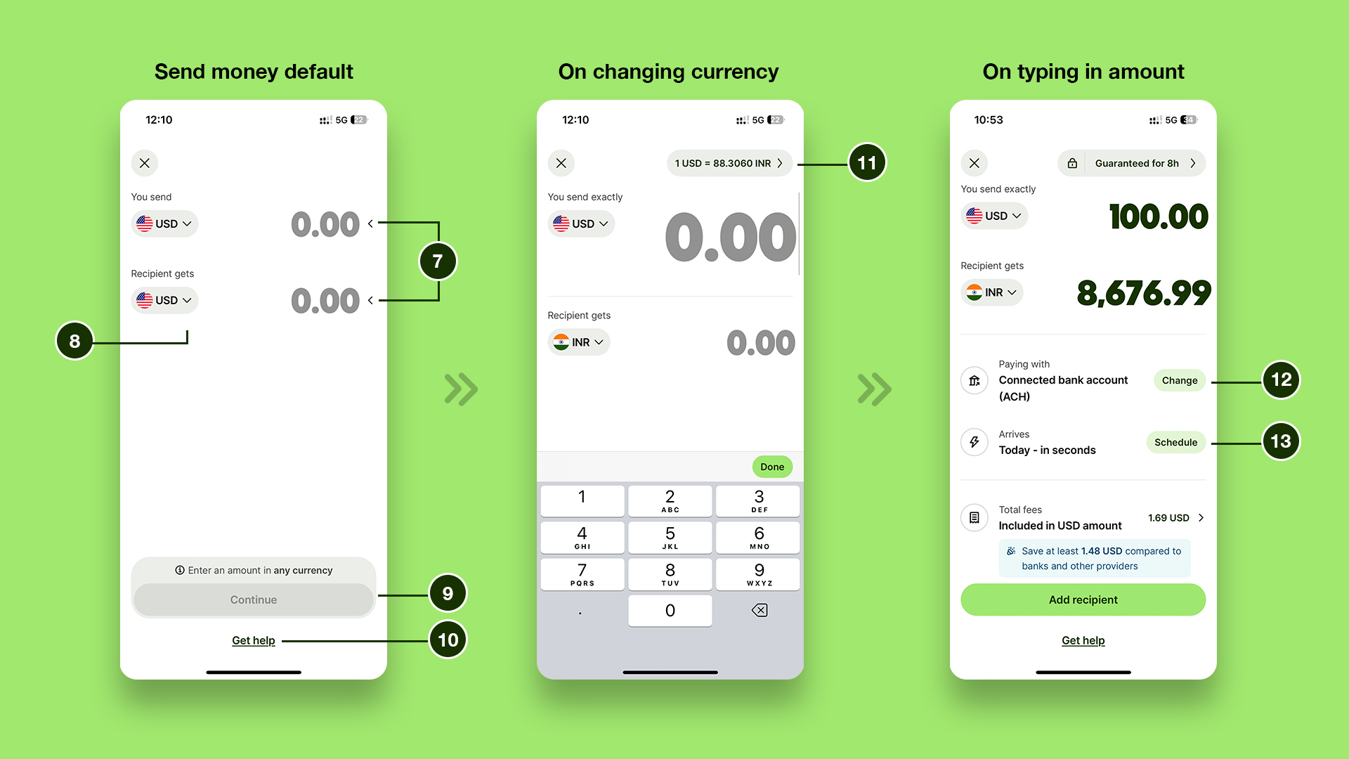
On the default send money screen, the animated signifier “<” (7) next to the value field communicates the system’s status, requesting the user to enter a number in either of the two fields. The conventional currency dropdown (8) reduces reliance on knowledge in the head, allowing the user to switch currencies with ease. Together, these elements establish a strong conceptual model, helping the user map actions to outcomes.
“Continue” (9) is disabled until a value is entered, serving as a constraint that prevents action-based slips, while the persistent “Get Help” (10) button ensures the system supports error prevention and exploration.
When the user changes the currency type using the dropdown, the corresponding exchange rate (11) appears in the top-right corner, providing instant feedback and preventing the user from falling into the gulf of evaluation while trying to determine the rate. The exchange rate (11) itself also functions as a button that affords comparing Wise’s rates with competitors, but its low visibility as an actionable element discourages the user from exploring this feature, subtly benefiting the business. Entering a value in either field instantly updates the other, reinforcing feedback, strengthening mapping, and enhancing user control over the interaction.
Once amounts are entered, the system allows the user to select a preferred payment method (12) while also displaying the transaction time and scheduling (13) options. By making these details visible, the system reduces cognitive load and supports recognition over recall, ensuring the user does not have to think unnecessarily about next steps. Finally, the absence of visual distractions reinforces the app’s credibility at the reflective level of processing, which is particularly important in the context of financial transactions, where trust and seriousness are critical to the user experience.
Home Screens
New User
As we discussed before, once registration is complete, the user is presented with two possible paths:
- Selecting “Send Money” (4) or “Spend or Receive money” (5) – This option allows the user to achieve their goal directly, effectively bridging the gulf of execution. It aligns with their primary intent of transferring or receiving money abroad.
- Selecting “Take a look around” (6) – This path, in contrast, creates friction, as the user falls into the gulf of execution and lands on the home screen.
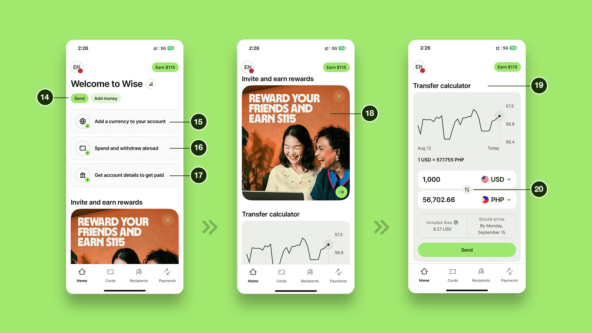
The home screen presents features such as “Add a currency” (15), “Spend and withdraw abroad” (16), and “Get account details to get paid” (17) prominently at the center of the screen, while the key feature “Send” (14) is not very well emphasized. By presenting too many options up front, the interface risks overwhelming or confusing the user. Some may disengage with these features entirely, while others may be uncertain about how they affect the overall experience. In both cases, the excess of competing signifiers undermines discoverability and reduces overall usability.
A preliminary user task is checking exchange rates before making a transfer, and the user does not yet know that rates are available on the Send Money screen itself. The “Transfer Calculator” (19), which displays exchange rates, requires scrolling past promotional content like “Invite and earn rewards” (18), discouraging the user from accessing it. This poor mapping challenges the user’s visual dexterity, introduces unnecessary scrolling, and decreases efficiency.
The invert (20) button within the calculator is an example of good design: it leverages knowledge in the world through a familiar icon, making its affordance immediately clear. As Norman emphasizes, good design ensures that appropriate actions are visible, and the user knows what to do.
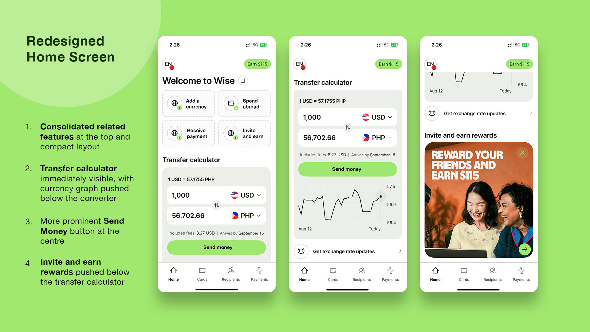
Consolidating related features such as “Add money” and “Add a currency” would reduce clutter and the number of competing signifiers, making the interface less confusing. Placing the Transfer Calculator within the first fold and pairing it with a more prominent “Send Money” button at the center would improve visibility and align the interface with the user’s conceptual model.
Another option would be to place the “Send money” button at the center of the primary navigation as a fifth feature. This layout was already explored in a previous version of the Wise app, but the team appears to have moved away from it, likely to reduce navigation clutter and to avoid having the send button remain visually dominant across all screens.
Returning User (After Adding Currencies or Money)
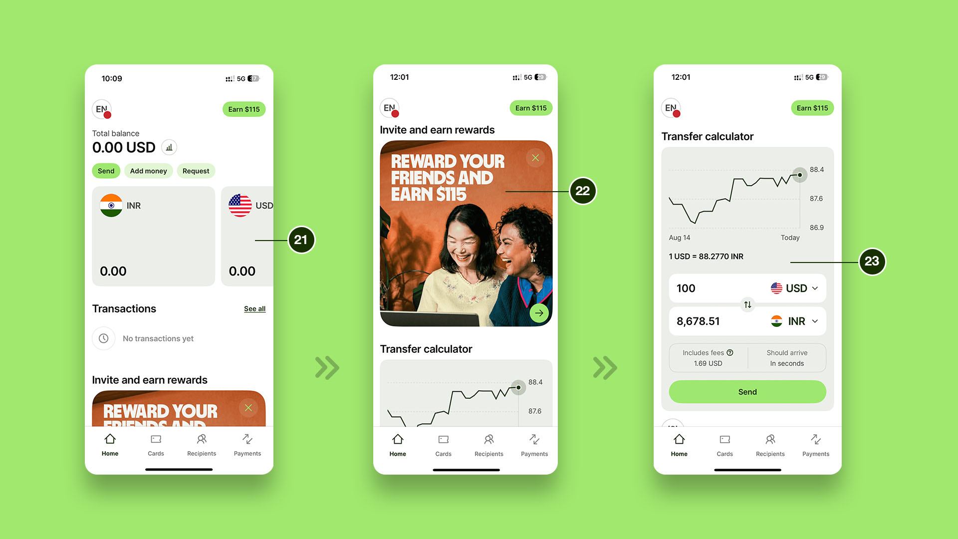
For returning users, the home screen displays currency cards (21) that act as effective signifiers, suggesting horizontal scrolling to reveal more cards and supporting efficient navigation. This design provides a clear affordance for browsing across accounts and is easy to interpret.
However, these cards dominate the screen space, and again the “Transfer Calculator” (23) is placed below promotional content like “Invite and Earn” (22). Rebalancing the layout to prioritize primary features over promotional or secondary features would enhance discoverability, reduce the gulf of execution, and support the user’s mental model.
Conclusion
The Wise iOS app succeeds in communicating a sense of intelligence and trustworthiness through its design, distinguishing itself from other financial apps. Its minimalist, monochrome interface, smart color accents, and subtle animations, while avoiding unnecessary visual distractions, establish a clean and accessible aesthetic. Hierarchical use of typography, through variations in weight and size, reinforces the app’s structured approach. The placement of primary navigation at the bottom of the screen follows established usability conventions, ensuring efficient navigation for routine tasks.
At the same time, the abundance of features risks overwhelming first-time or less tech-savvy users. Despite this, the Wise app demonstrates thoughtful application of design psychology and Norman’s principles to create a crisp experience. With refinement in feature prioritization and visibility, it has the potential to balance its breadth of offerings with even greater clarity and ease of use.