
Wordle is a web-based word game in which players have six attempts to guess a five-letter word, receiving feedback through colored tiles that indicate correct letters and their placement. The New York Times Games publishes a single puzzle daily, available on both its website and NYT Games mobile app.
In this post, I apply concepts from Don Norman’s (2013) The Design of Everyday Things to critique a sample of elements within the design of the Wordle digital interface (website); terminology from the book is highlighted.
Title Screen
Upon loading the Wordle website, users are presented with a title screen featuring (from top to bottom) the Wordle logo, an abbreviated description of the game, one to three vertically aligned buttons (displayed depending on login and subscription status), followed by the puzzle’s date, serial number, and editor. Together, these elements form the system image of the Wordle title screen.
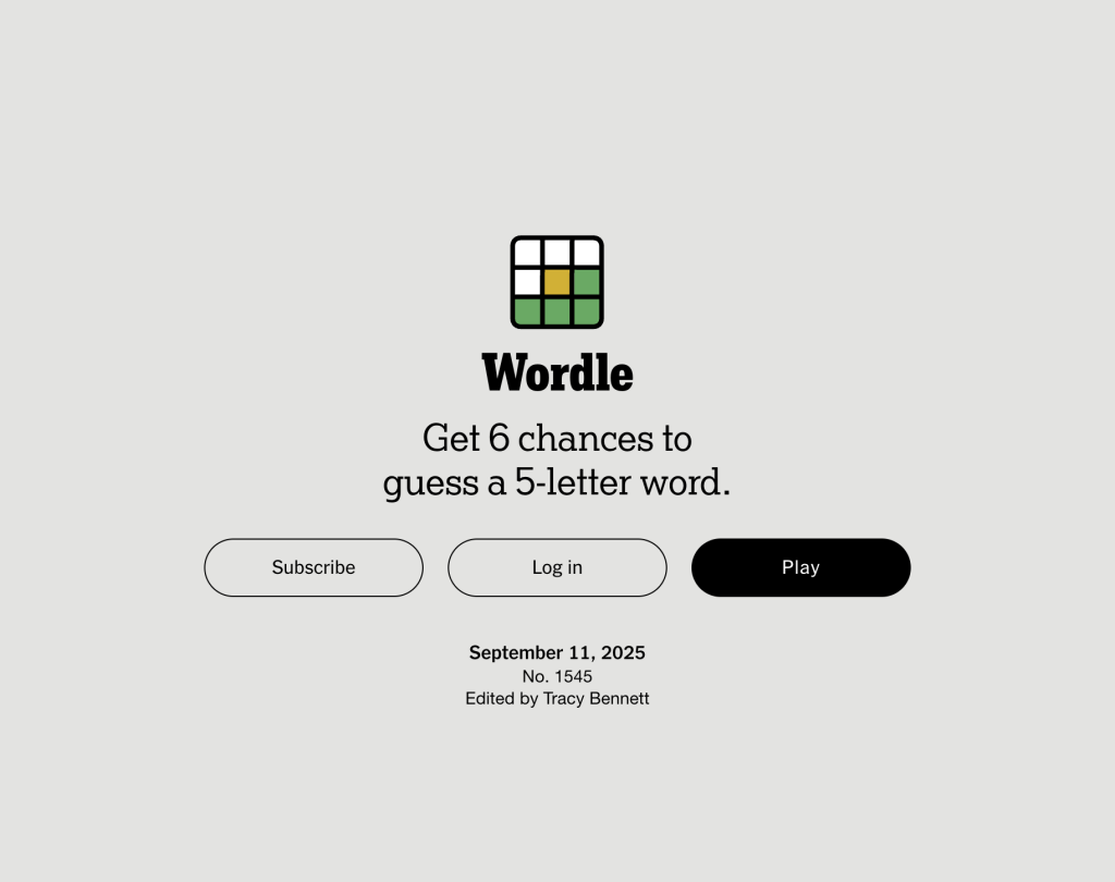
This system image supports the development of users’ conceptual models of Wordle through the guiding statement “Get 6 chances to guess a 5-letter word” alongside other signifiers — particularly the Play button (more on this momentarily!). The conceptual model users adopt then guides them to understand that Wordle is, in fact, a word game, even if they were previously unaware.
Users who are both not logged in and not subscribed to The New York Times Games are presented with signifiers (i.e., buttons containing text) for the maximum number of affordances possible from the title screen:
- Subscribe (affords subscription)
- Log in (affords logging in)
- Play (affords gameplay)
These text-based signifiers physically constrain the number of possible actions for each user condition, enabling precision in that (a) users who are logged in but not subscribed are only shown the Subscribe and Play buttons and can, therefore, either subscribe or play the game, while (b) users who are subscribed are only shown the Play button and can, therefore, only ‘choose’ to play the game.
Regardless of physical constraints, the Play button maintains excellent discoverability due to its bold appearance and contrast against both the background and any adjacent buttons. This emphatic button, moreover, succeeds in supporting users through the goal formation and execution stages of action. That is, a user intending to play Wordle is likely to identify and engage the Play button as a means to gameplay.
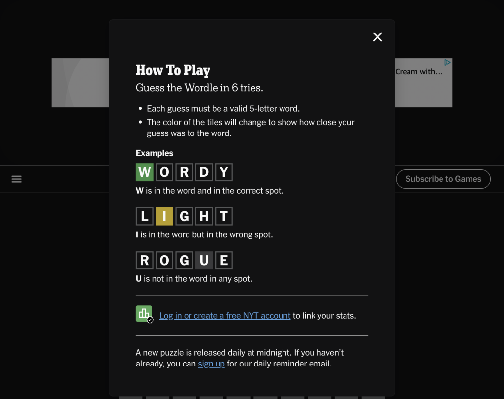
Opening Dialog
Upon selecting the Play button from within the title screen, users who have not logged in are presented with an overlaid dialog describing “How to Play.” In this context, the interface accounts for users who may have never played Wordle before, further supporting users’ conceptual models of the game via knowledge in the world.
In contrast, knowledge in the head is required to understand that one must click the X button located in the top-right corner of the dialog to initiate gameplay; this understanding is dependent on knowledge of cultural constraints and conventions where the letter-turned-symbol X is routinely used to remove windows, dialogs, or popup messages from a screen.
The Lightbulb Icon and Its Constituents
Once the overlaid dialog is closed, a pop-up tip appears directly below the lightbulb icon on the leftmost of the right side of the menu bar. The pop-up explains that if users are looking for a hint, they can “go to today’s Wordle Review article.”
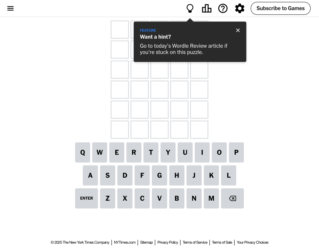
There are two key issues with this feature:
- The only signifier that clicking on the lightbulb affords access to the referenced article is the tail of the speech bubble and its placement below the icon. While this mapping is serviceable, being directly below the button the message pertains to, without the appropriate mental model, users may understand the message as a generally helpful statement but feel lost on finding the specific article.
- When the lightbulb icon is clicked, users are brought to a new tab containing the Wordle Review Article corresponding to that day’s puzzle. This may be confusing for users, especially if they closed the pop-up and did not consolidate the message into their long-term memory (i.e., bring knowledge that was once in the world into their heads). Moreover, consistency is betrayed in that other buttons that link out to a new webpage are displayed alongside an icon of an arrow pointing diagonally up and to the right — another signifier derived from cultural constraints.
I propose the following changes to improve users’ experiences with the lightbulb icon and pop-up tip:
- The text within the pop-up should be edited to improve its effectiveness as a signifier; adding a simple “Click here to…” before the rest of the main message would go a long way in mapping the pop-up’s relationship to the icon, as well as the icon’s functional use.
- To improve consistency, minimize the need for memorization, and support the lightbulb icon’s role as a signifier affording linking to an external site, an icon of an arrow pointing diagonally up and to the right should be added strategically alongside the lightbulb.
Gameplay
Wordle’s gameplay necessitates interaction across all seven stages of action — as do most digital interfaces — while simultaneously serving as a representation of the cycle.
When attempting to solve the five-letter word of any given puzzle, players receive in-game feedback through colored tiles indicating correct letters and their placement:
- Green signifies the letter is in the word and in the right position;
- Yellow signifies the letter is in the word but in the wrong position;
- Gray signifies the letter is not in the word at all.
Once a guess is entered, the tiles within the 6×5 grid change color accordingly. This transformation presents as an animation, providing immediate feedback to the user that they have successfully submitted their guess. Moreover, color feedback exhibited within each letter tile naturally maps to the keys within the on-screen keyboard, supporting understandability and, therefore, successful gameplay.
Color feedback creates in-game semantic constraints and, as players work from guess to guess, logical constraints, requiring evaluation of (a) situated meaning and (b) logical relationships between the functional layout of letters to form five-letter words and solve a given puzzle. Thus, much of users’ conscious experience playing Wordle is spent repeatedly bridging the gulf of evaluation.
Conclusion
Overall, the Wordle website exemplifies good design:
- For the most part, users can easily discover content and functionality;
- The conceptual model of the interface supports users’ ability to understand the system and how they are meant to interact with it.
Reference
Norman, D. (2013). The Design of Everyday Things (Revised and Expanded Edition). Basic Books.