
Amazon Kindle is an app that allows readers access to a variety of digital content, including options such as books, magazines, and even newspapers. With syncing across devices, users are able to pick up where they just were on any device as long as the account remains the same. However, the home page has sections that can be improved upon in order to enhance the user experience.
Main Section
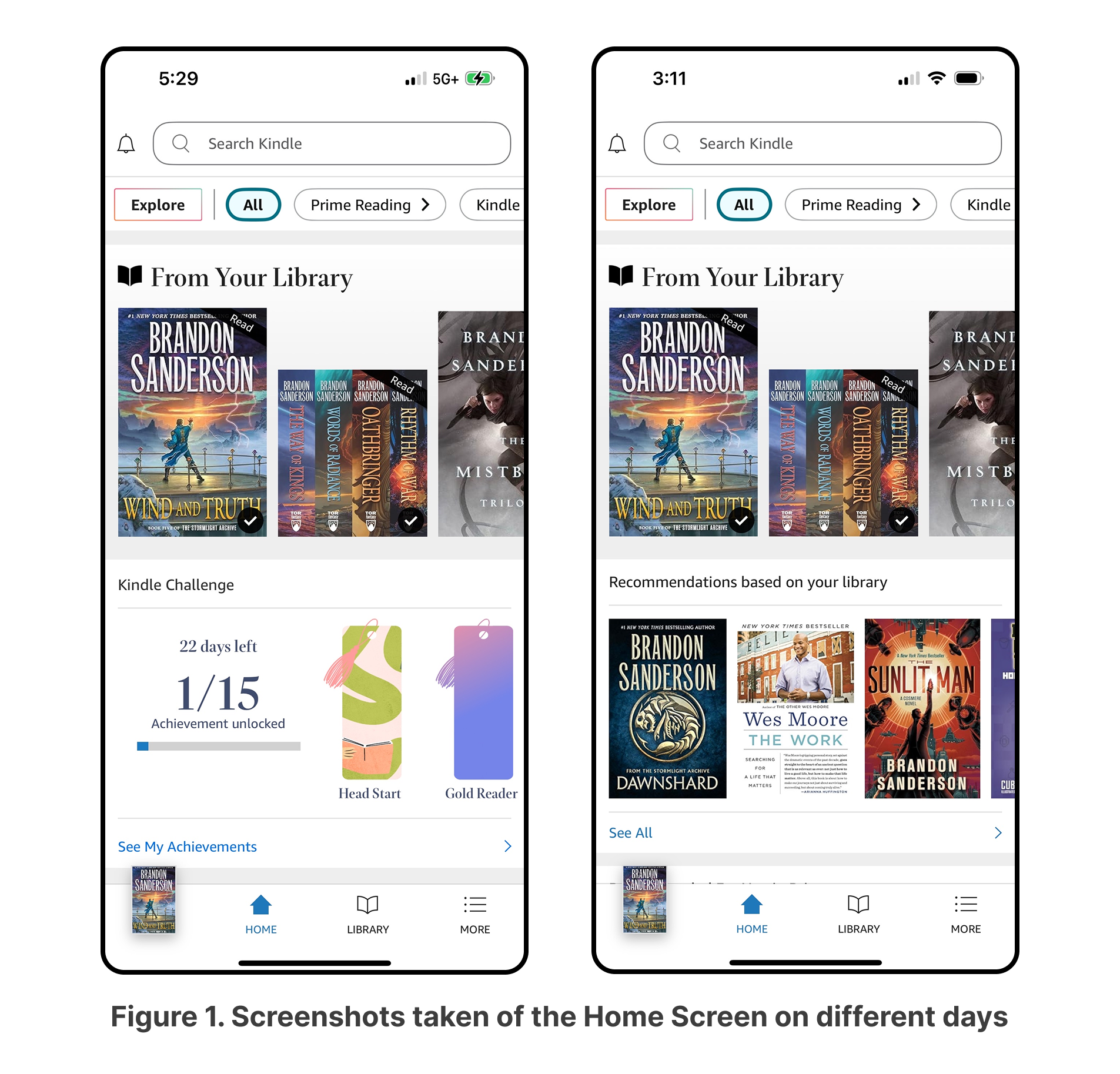
When users open the Kindle app, the first screen they are taken to is the Home screen, which displays carousels of books from their library and recommendations based on the library. However, the screen also contains 12 other content sections, including promotional sections such as “Recommendations for You in Prime”, “Quick Reads for You”, and “Kindle Challenge.” This makes the page increasingly cluttered, creating a gulf of execution for users who simply want to access and read their books. On top of this, besides the first section of “From your Library,” the ordering of each section actually changed between days, preventing users from building any mental models of the organization ( Figure 1 ). However, the first section of “From Your Library” does reflect the last book the user opened which can help keep the user informed.
Navigation Bar
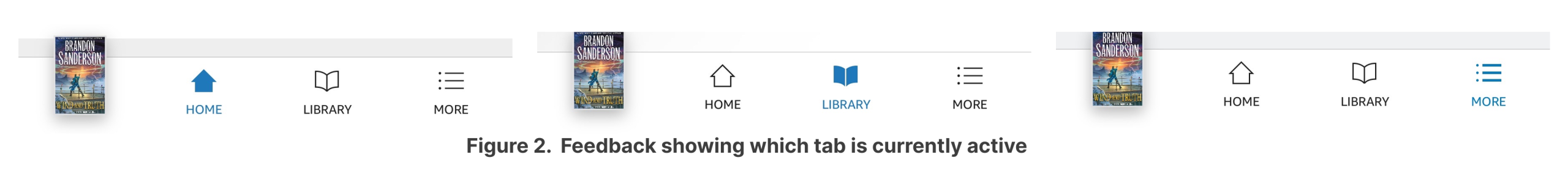
Next, the bottom navigation bar does not follow Norman’s principle of natural mapping. The home icon is not the first icon in the list despite many users having developed a mental model that places the home icon first. Instead, the first icon is a shortcut to the last book the user was reading. While it may be argued that having a shortcut to the current book as the first option is beneficial due to frequent use, the placement of the home icon messes up the conceptual model most users have for having home first. As a result, the placement of the home icon creates frequent slips as users attempting to return to the Home screen often accidentally open their current book, leading to navigation errors and frustration.
Despite the lack of natural mapping, the icons in the navigation bar are still clearly labelled. For users who may not have the mental model from above, this labeling does increase the visibility and assists users in locating where they need to be. Even new users can use the knowledge in the world to correctly interpret each icon. Adding to that, when a navigation icon is selected, the icons become inverted and change color, providing immediate feedback to the user.
Filtering
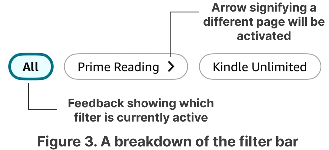
The home page also affords filtering by providing users with selectable options under the search bar. Pill-shaped buttons act as signifiers, showing possible filters for the user. When a user selects a pill, it becomes highlighted, providing immediate feedback to let users know which filter has been applied. Additionally, an arrow icon is shown next to select options, acting as a signifier that selecting that option will navigate the user to a different page, instead of applying the filter on the same page.
Solutions
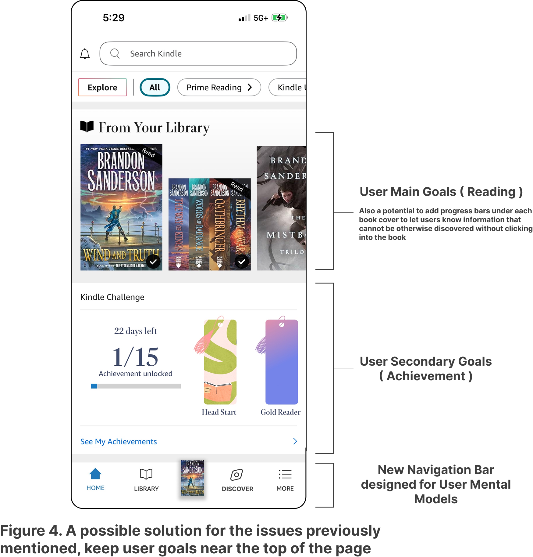
The best effective redesign for the problems listed would focus on simplifying the Home page and reordering navigation options. Excess sections on the Home page would be moved to a Discover tab, something many users are already familiar with from other apps. This takes advantage of the user’s knowledge in the world and narrows the gulf of execution by making the path to reading more direct. With this change, the home page would primarily serve as a reading space instead of the promotional space it currently is. This would also help bridge the gulf of evaluation as users would not need to sort through multiple competing sections and can immediately focus on their reading and progress.
Alternatively, if Amazon decides to keep everything on the Home page, another option would be to keep more important options such as “Kindle Challenges” near the top and keep the arrangement of the page static. A mix of both options can also be viable if recommendations on the Home page were narrower and lacked as many sections as it currently did.
With the addition of the Discover tab, the navigation bar can be reordered as Home, Library, Current Book, Discover, and More. Doing so will help reduce slips by aligning with user mental models from other apps and ensure that the primary user goals of reading are prioritized, while still leaving room for secondary objectives.
Conclusion
Overall, the Amazon Kindle app provides users with convenient access to a wide variety of digital content. However, the current design choice places Amazon’s business interests before the user’s goals, resulting in a cluttered Home page. A redesign that separates promotional content into a dedicated tab while reordering the navigation bar to help user mental models would realign the app with its primary purpose of providing a seamless reading experience for all users.