By Sylvia Xinquan Xu/ December 15, 2025 / News
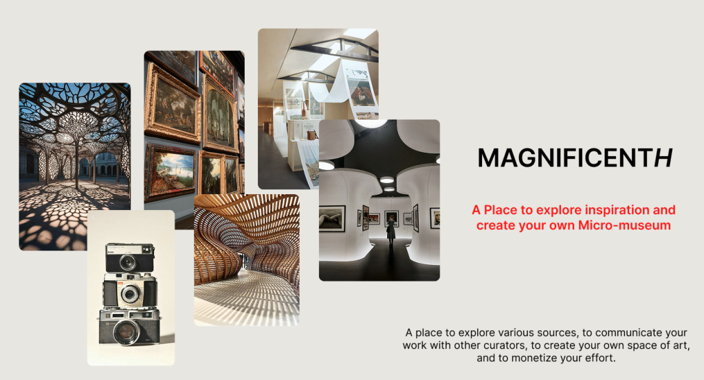
Magnificent H is a platform built with passion to collaborate with artists, history lovers, museums, and brand owners to showcase their ideas, love, and enthusiasm in art through the form of creating a micro-museum. Based on the great effort from the developers, by using the method of moderated testing, we have collected a few suggestions to make the platform easier to navigate, better to walk through, and more interesting to explore.
Project Overview
Project: MagnificentH (Desktop)
Timeline:
Goals: Observing users behavior & understanding of the MagnificentH ‘s terminology
Scope: Conduct 8 Remote Moderated Usability Tests
User Profile: Hobbyists & Travel Enthusiasts
Timeframe: 9-10 weeks (October 23rd-December 11 2025)
Role: User Researcher & UX Designer
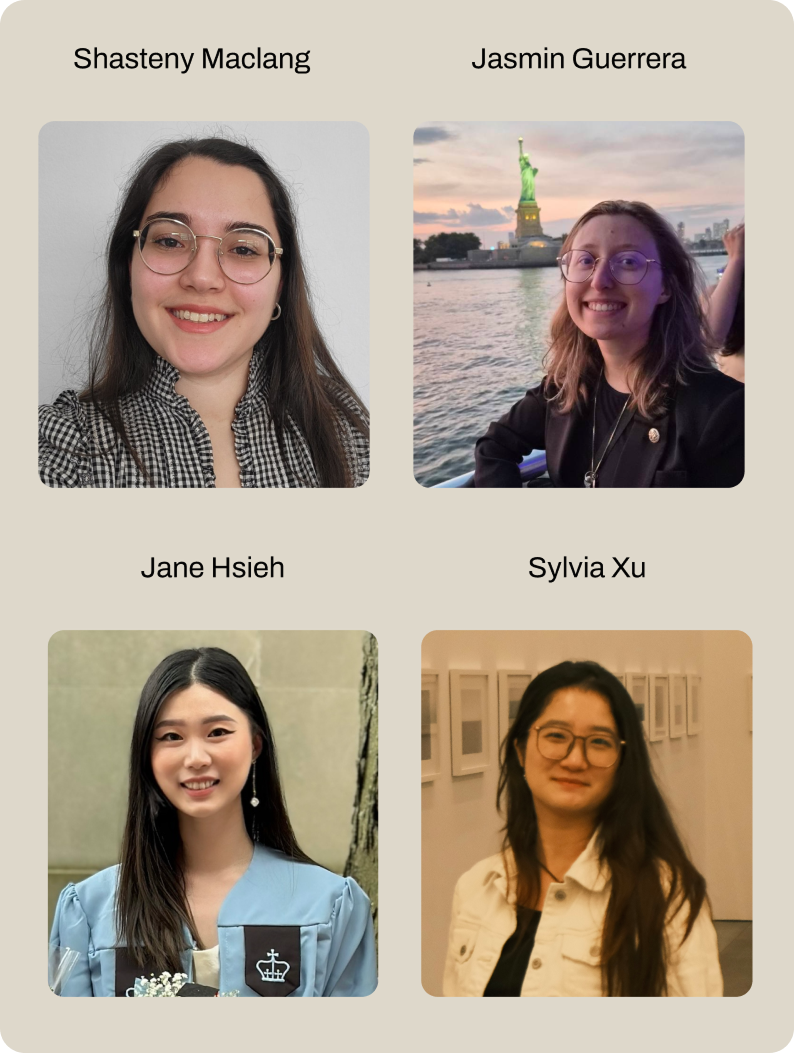
Team: Jasmin Rose Guerrera, Jane Hsieh, Sylvia Xu & Shasteny Maclang
Tools: Miro, Figma & Private Panel
Problem: Is the website convey the developers’ idea clear enough?
Being the platform contributing to hobbyists who have interest in topics such as history, photography, or architecture, or the travel and culture enthusiasts who wants to tell their own story, MagnificentH wants to crate a community where the users can find the resources, share and monetizing their work, and being protected from the massive usage in AI. However, as it is in the early developing stages, the developers were eager to see if their idea is clear enough for any potential users, whether the website layout is interesting enough, and if the context is easy to understand? In all. is the website tell a great story for the users about what they can do, and what they can get.
Can users infer what a micro-museum is?
—- Anna Johansson
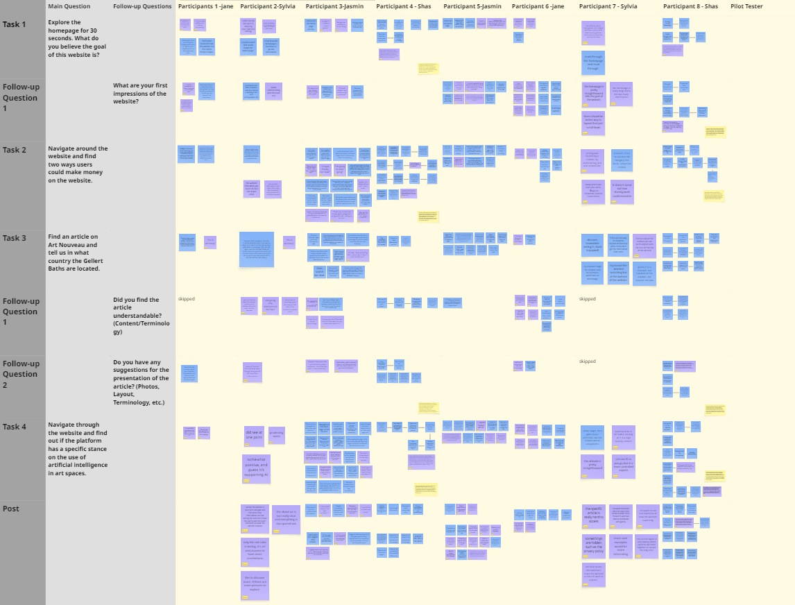
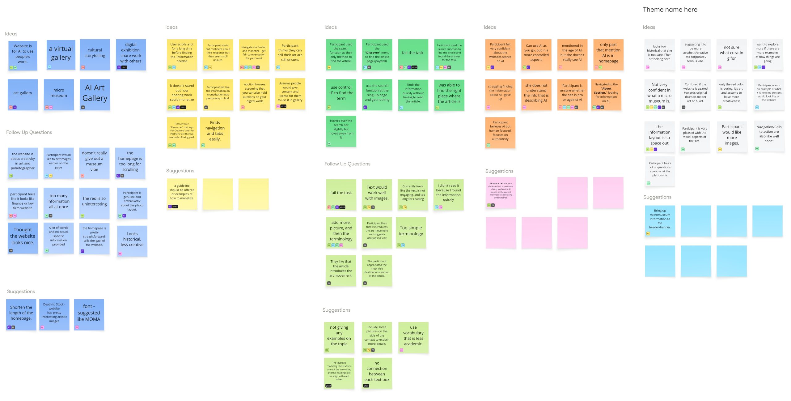
In order to give the client a clear answer with supported feedback from the users, with the designed screener questions,the team conducted an eight-person Remote Moderated Usability Study of MagnificentH’s website to gather data, feedback, and offer suggestions for client’s future refinement of the website.
Fundamental designs for making a successful remote user testing
Our steps to create the tasks
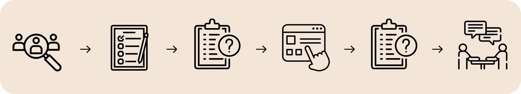
1. Client Meeting & Set the Goal
The client was genuinely concerned about whether the website indicate the idea of “micro-museum”, and is the website attracting enough to potential users. At the same time, she wants to know if the website has any usability issues while navigating through.
2. Screener Questions & Tasks
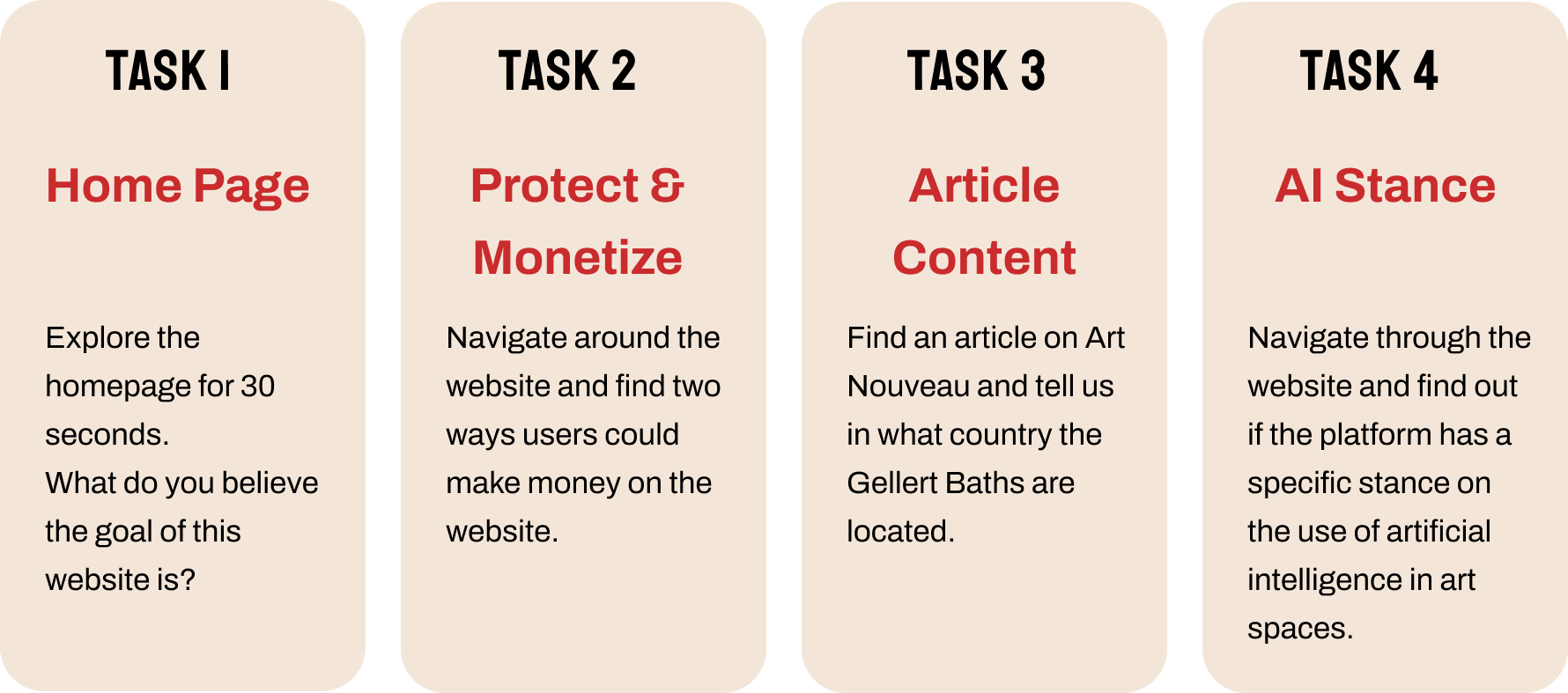
Based on the goal setted, the screener questions are made to filter the suitable potential user targets, and to ensure participants were qualified for the study: Hobbyists, Artists, Historians, Photographers, Content Creators, Travel & Culture Enthusiasts. Four tasks were set up for the testers to finish in order to see the details in responding to gather feedback to client.
3. Recruitment & Gather Data
By using Private Panel, the team recruited eight testers who are validate from the screener questions. After online remote interview session with each of them, the team use analysis their movement and thinking process during the test, collected interesting quotes, used all these data as the starting information for offering suggestions.
4. Analysis to Offer Suggestions
In order to find out which major findings were mentioned by the most of the participants, we analysis the collected data by separating the data into questions and suggestions. As a result, we compile the results into four major findings and create suggestions.
Four tasks for the users to explore the platform
User profile: Art and history lovers and potential content creators
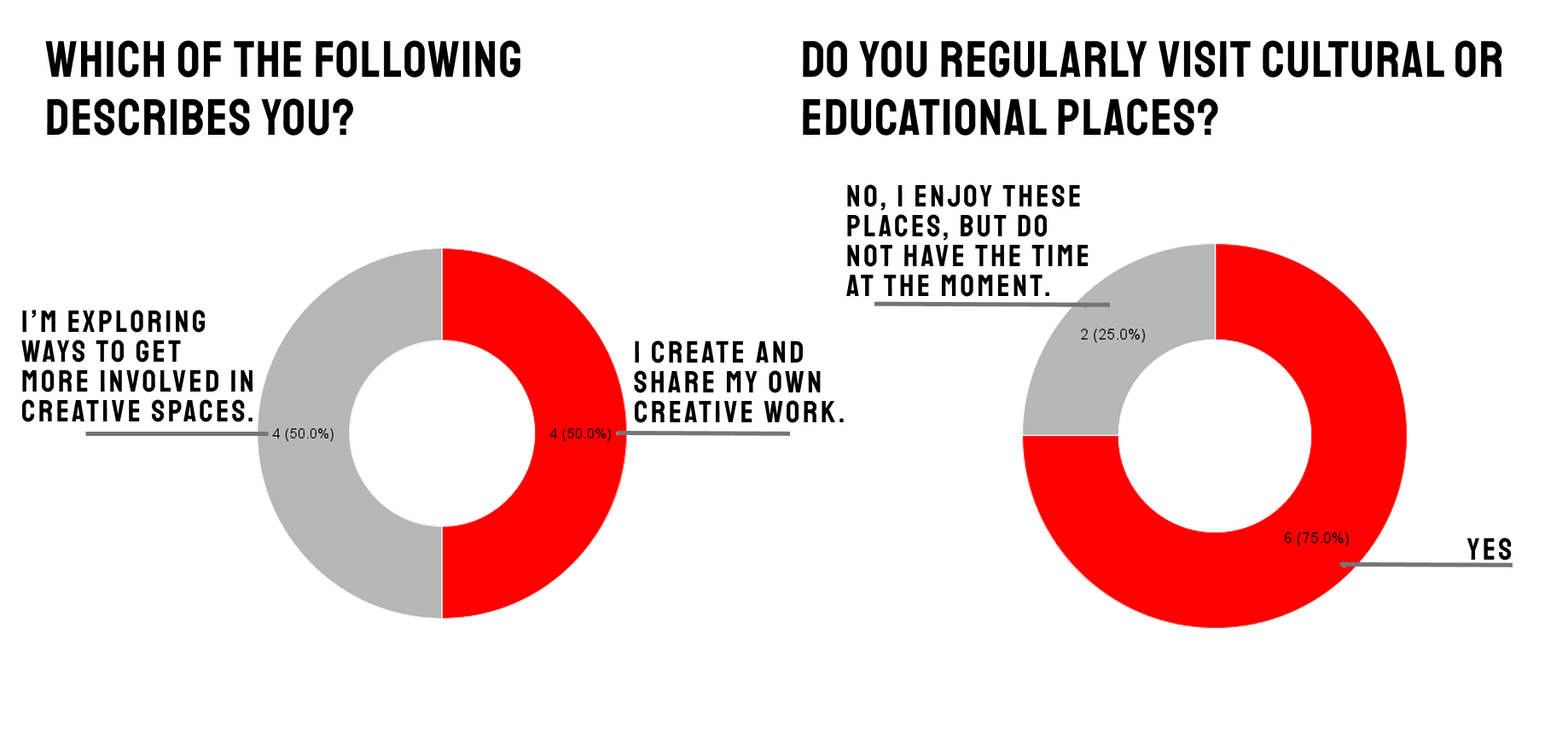
Identification
- Half of the participants have some place to share their creative work, the other half are trying to explore a way to involved in creative spaces
- 6 participants regularly visit cultural or educational places, the other two indicated they don’t have time to visit actual places.
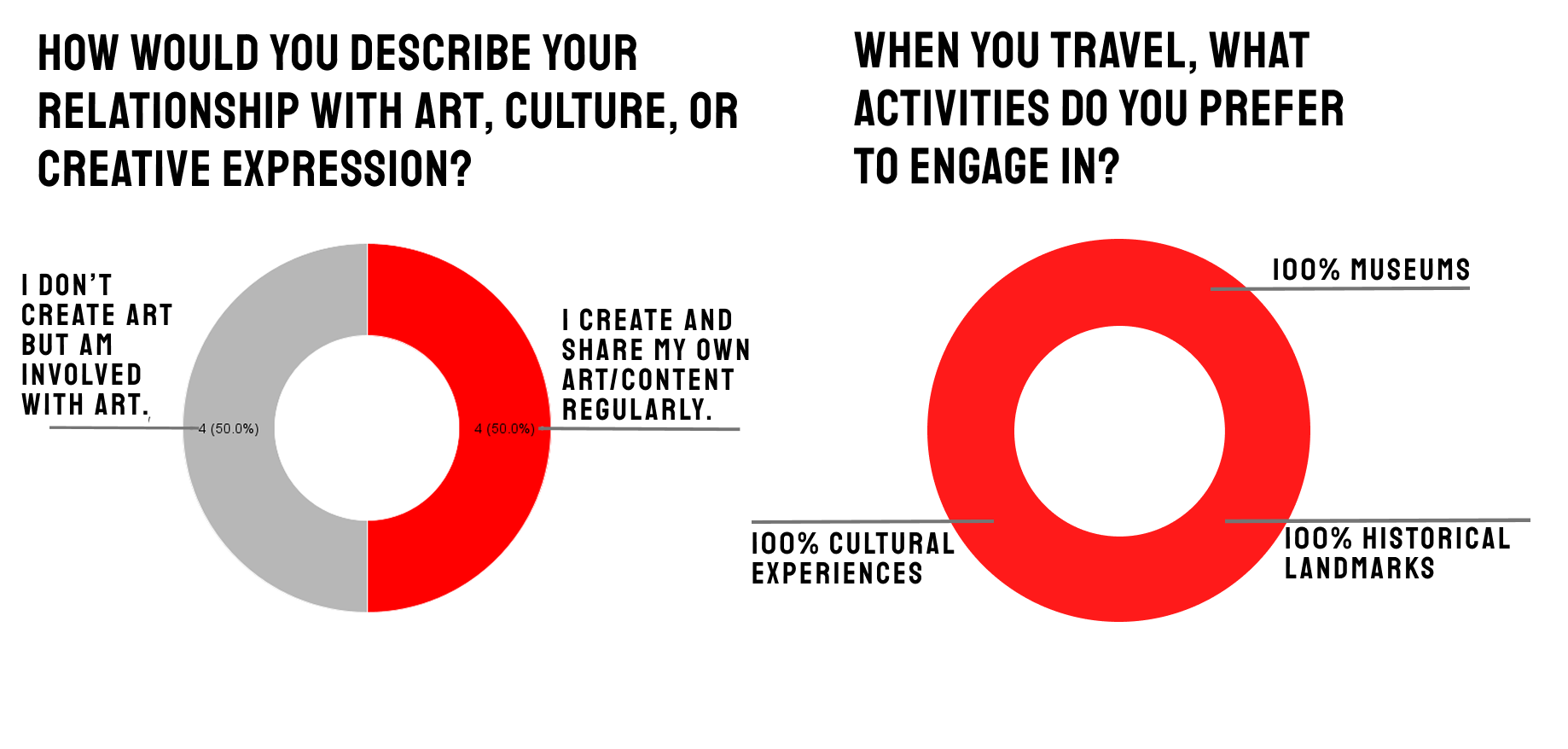
User Creativity
- Half of the participants create and share their content, the other half don’t create, but involved with art.
- Museums, cultural experiences and historical landmarks were mentioned for the participants to engage in while traveling.
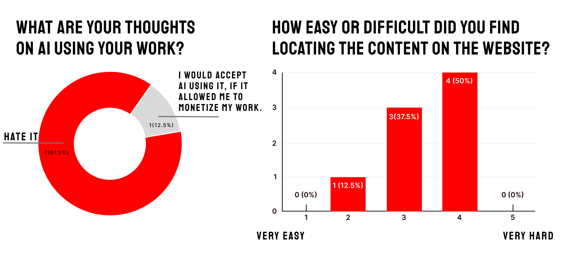
AI Stance & Navigation Difficulty
- 7 participants hate the use of AI in their own creative work
- Half of the participants find the website a little bit difficult to locate the content on the website, none found the website very easy or very hard to locate the information.
Valuable comments and suggestions to improve the platform for future users
1. Homepage Reconstruction: Communicating the idea of a “micro-museum” through hierarchy and imagery
Findings
- Unclear of the website’s story
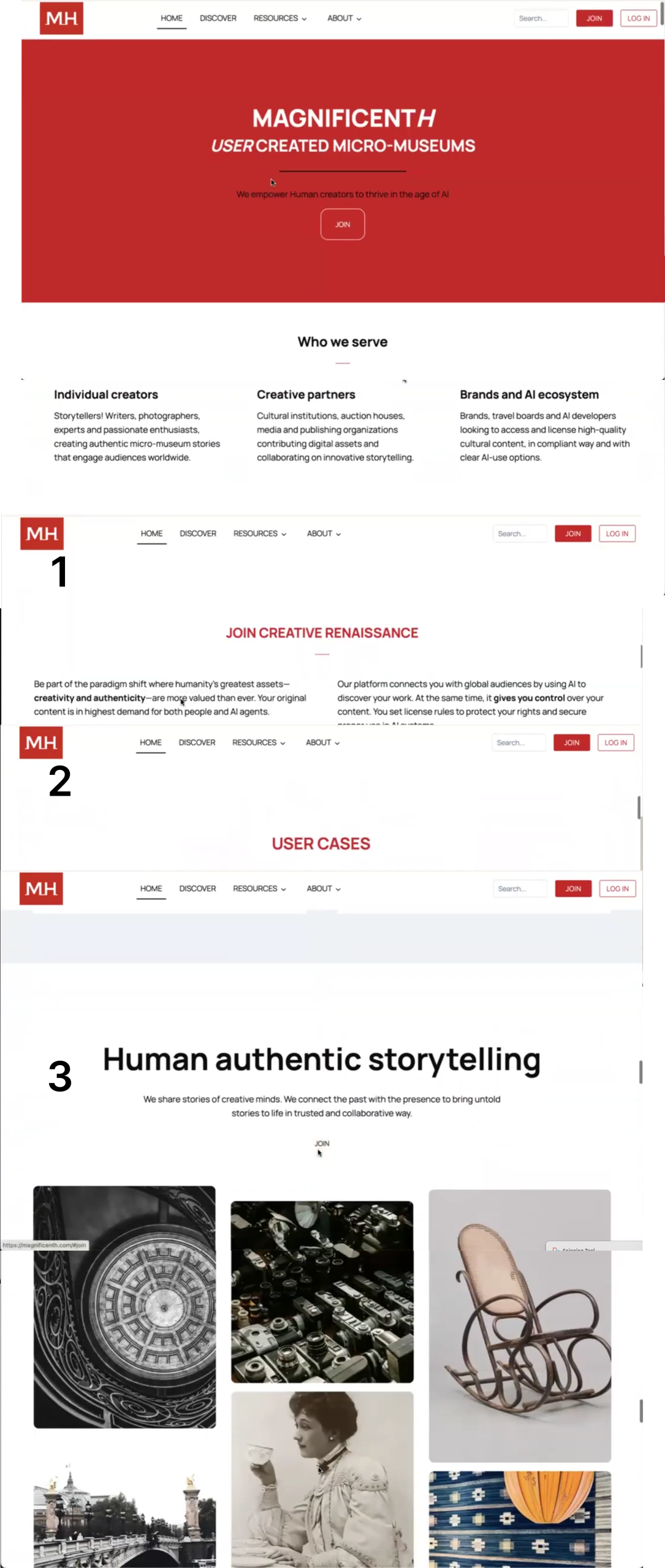
- A lot of the participants (1,2,3,7,8) commented the cover with bare red, is not telling the story about the website, they can hardly get the idea of what they can do from seeing this header parts, one participant mentioned that if she’s a regular user, would feel uninterested in exploring the website when she sees this.
- Storytelling is not attracting
- The content layout is overlong to scroll down, this would make confusion for the users trying to find useful information about the story of the website, they are not confident about what they can do while going through this long homepage.
Solutions
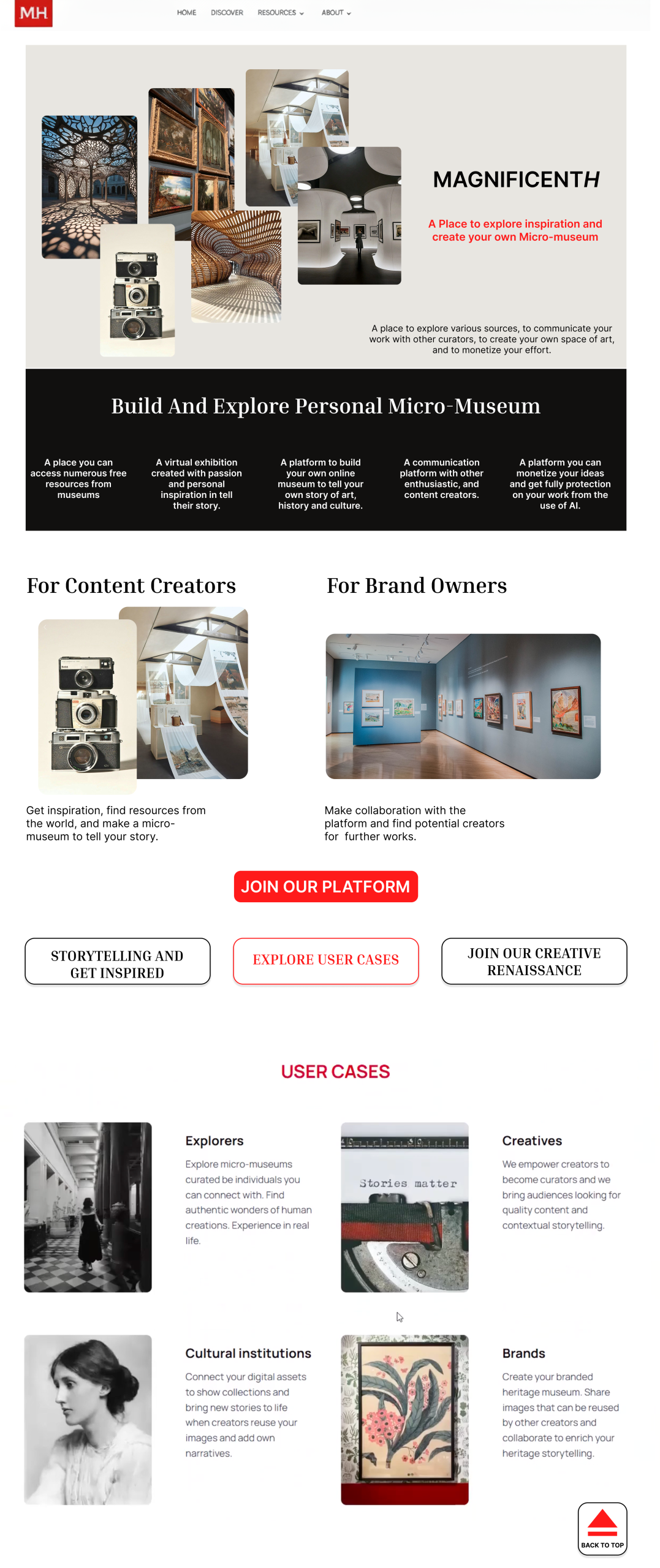
- Header Section
- Multiple imagery to show the gallery idea related with art, photo, and history.
- A short tagline to emphasize the stance of the website.
- A section for “creators” and “brand owners to find specific information.
- Recreate the storytelling flow
- The fist part is the clickable button what could direct the user to the specific part of the homepage, such as clicking the user cases, the page will jump to the part where the user cases are, so they could see the examples, images, and then start to explore the website with some understanding of what they can do with the website.
- At the bottom of each section, there could be a “back to top” button which by clicking, can lead the user jump back to this three headings, which get rid of the long scroll while keeping the flow of gathering information more smoothly,
2. Making Space and Simplifying: Clarify the role of artificial intelligence (AI)
Findings
- Confusing Messaging
- Most of the participants were unsure of AI Stance of the website, which indicates that the context related with AI is not address detailed and clear.
- Do not understand opt-in AI implementation.
- Lack of Information Hub
- Users had trouble locating information on AI, some of them spent lot of time navigate through the website details in order to find the information.
- Participants were frustrated when information was not clear.
Solutions
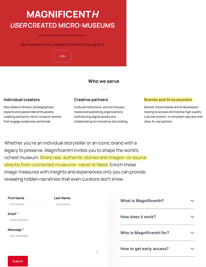
- A specific FAQ section
- The specific section is a powerful tool to highlight important topics and information, which make the information stand out for the users to locate the information.
- Detailed explanation under “About” navigation
- This change allows users to find information about artificial intelligence when the users glancing at the navigation options.
- The About page has been redesigned to include a large header that specifies MagnificentH’s core value regarding AI, presenting the information in a simplified and direct way
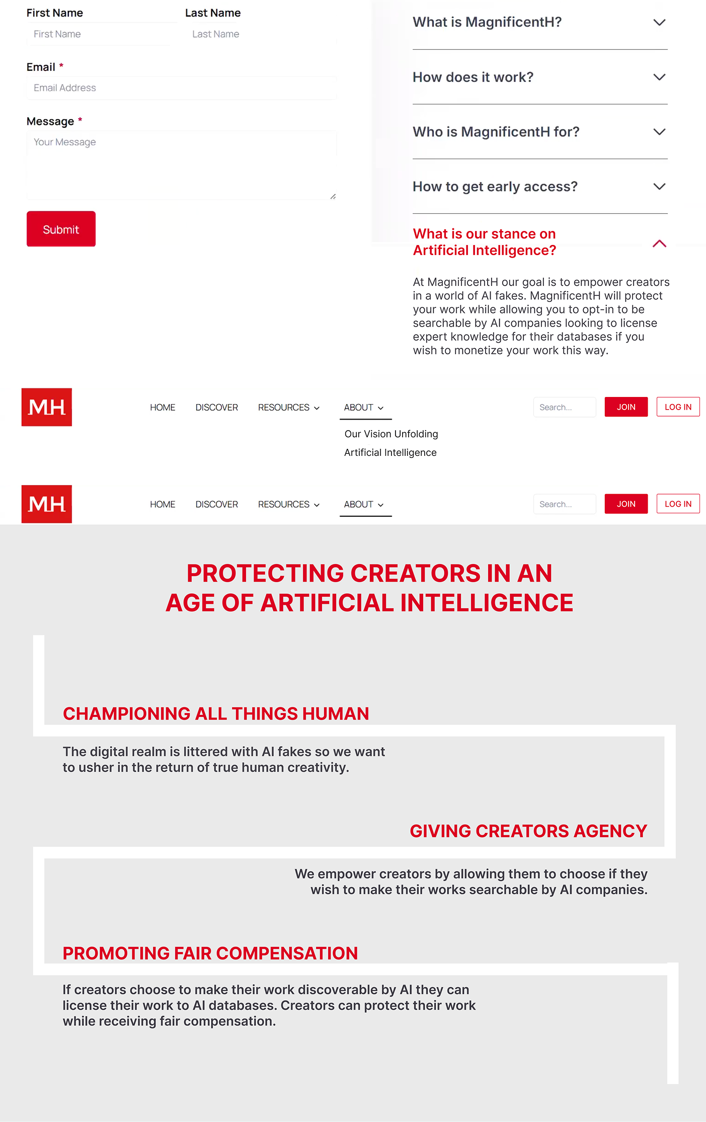
3. “Protect and Monetize” Web Page: Eliminate the compensation confusion
Findings
- Uncertain Responses
- Is the website a place for auction, or selling individual’s art to AI, or licensing creators’ arts and content.
- Overwhelmed Users
- There are too many pieces of text, and the layout could make confusion as the users were not sure where to start their reading sequence.
- Unclear on the Monetization Process
- Many users do not know where to begin, as there is no clear headings.
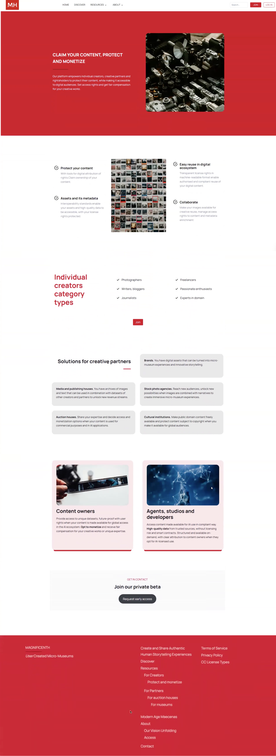
Solutions
- Certain sections and pieces of text were removed or reshuffled
- “Protect your content,” the “Easy reuse in digital ecosystem,” the “Assets and its metadata,” the “Collaborate,” the “Content owners,” and the “Agents, studios and developers” sections were removed because the moderated remote testing revealed that these sections were providing the most confusion among participants.
- These sections were replaced instead with two different step-by-step instructional processes.
- Each step includes a photo and a small description to help future users or companies understand how they can get paid or use media within this website.
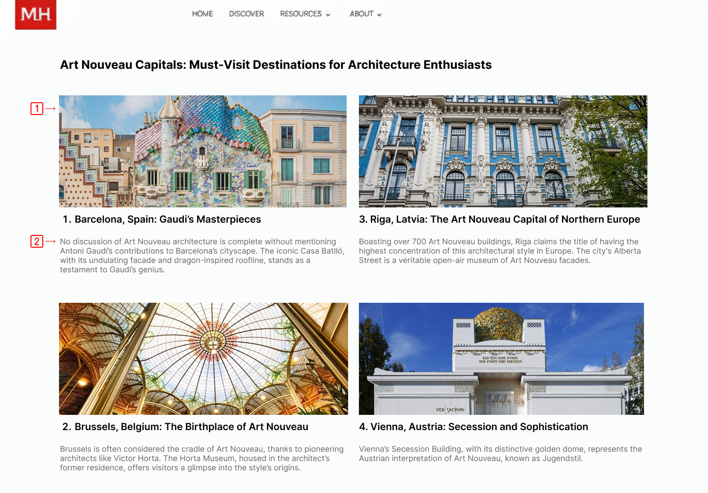
4. Visual Engagement: Improve Article Reading Flows
Findings
- Lacked Supporting Images
- Need images to help the users better visualize the content as they read.
- Text-Heavy
- Harder for users to stay engaged when they are reading through the content.
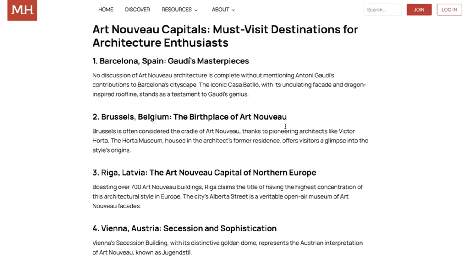
Solutions
- Images
- Adding visuals to break up the content for each architectural style will support comprehension and increase engagement.
- Improving the visual hierarchy
- Gray text for secondary or supporting information.
“I want to explore more [of] what micro-museums [are] and […] collaborate with others!”
—- By Participant
Client Feedback Reflections: What the team get, and What we can make it better.
Client’s Feedback
The client find the whole findings and suggested solutions really revealed a lot of the insights from the potential users, which also give her some understanding of how to make the website with better usability. She was also curious about how did the team recruit those fitted users, and wanted to create more usability testing to get as many feedback as possible.
Reflections
- The communication with the client need to be more accurate.
- As MagnificentH is a still ongoing website, we were really much appreciated that the client kept the website unchanged until the team finished all the tests with the participants. But the team failed to mention the time for making redesigns, this was not considered as the team was making communications with the client.
- For recruitment, also have backups
- There was a time when the team waiting and reschedule the meeting with the participants, but this could be avoid by adding more sections at the beginning.