
Project Overview
NYCTourism.com is the digital front door to one of the most visited cities in the world. But behind the scale and excitement of New York City tourism, the city’s tourism website struggled with a surprisingly common issue: people couldn’t find what they needed. Visitors weren’t sure where to begin planning a trip, and small business owners – who depend on the city’s tourism economy – couldn’t figure out how to partner with NYC Tourism at all.
Our team of four UX researchers and designers set out to untangle this. Over course of the semester, we conducted interviews, card sorts, tree tests, and usability evaluations with a breadth of users to rebuild the website’s information architecture from the ground up.
As the Information Architect and UX Researcher, I worked in tandem with my team to restructure the site’s core navigation, clarified pathways for both user groups, and translated complex research findings into simple, intuitive structural solutions
Project Context
NYC Tourism had a clear ambition: Create a dual-audience platform that empowers visitors to explore the city and helps business owners grow through exposure.
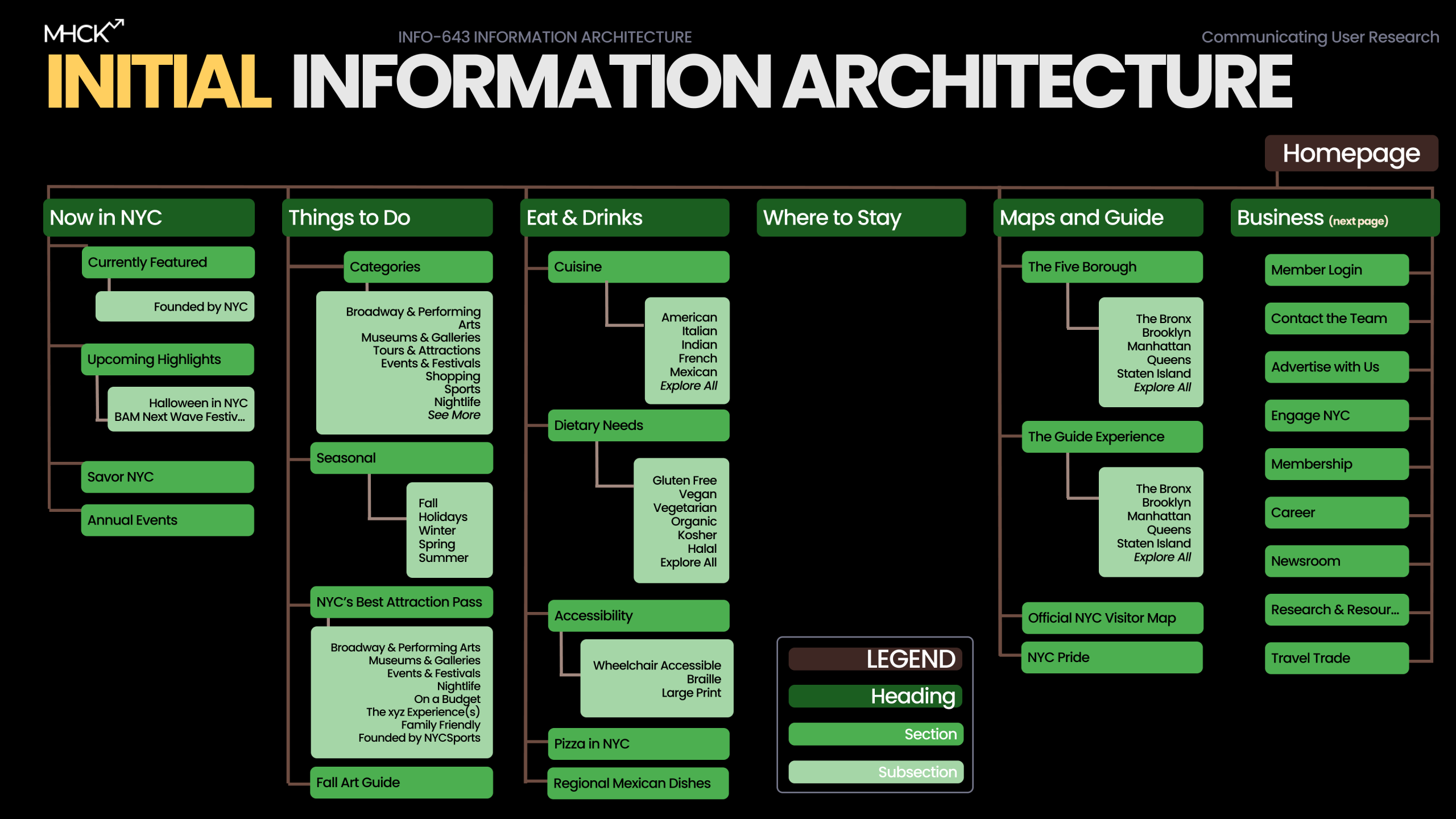
However, in practice, the site was sending mixed signals. Navigation labels were unclear, pathways were buried, and the site essentially changed personalities depending on which part of it you landed on. In one section, visitors were funneled through trip-planning tools; in another, business owners were left guessing how to get featured or where to begin.
Our task was not just to “clean up the navigation,” but to design a structure that evoked the essence of NYC: energetic, discoverable, welcoming, and effortless.
Personal Goals
With a marketing background and expertise in analytics and communication, I entered this project excited to deepen my skills in information architecture and structural UX design. Through data, I wanted to deconstruct this large-scale, multifaceted website to organize content suitable for multiple audiences.
This project became a hands-on playground for mastering IA methods: card sorting, tree testing, journey mapping, and restructuring complex sitemaps into simple, human-centered pathways.
Personal Contributions
Working in a collaborative team allowed us to divide and conquer the vast research scope. While we all contributed to the strategy, I took a lead role in the structural validation phase – specifically designing the card sort and tree test studies to diagnose why users were getting lost. I also spearheaded the synthesis of our “Business” persona, Taylor Simone, ensuring our final design decisions were rooted in her specific frustrations regarding ROI and efficiency. This role allowed me to blend research, logic, and creativity – ultimately producing a IA system that felt clearer, cleaner, and more aligned with user mental models.
Research Process
To ensure our insights were grounded yet actionable, we implemented a mixed-methods approach:
- Semi-structured interviews (4 participants) – capturing motivations and mental models
- Card sort (9 participants) – revealing how users naturally group content
- Tree test (6 participants) – validating whether our revised hierarchy solved confusion
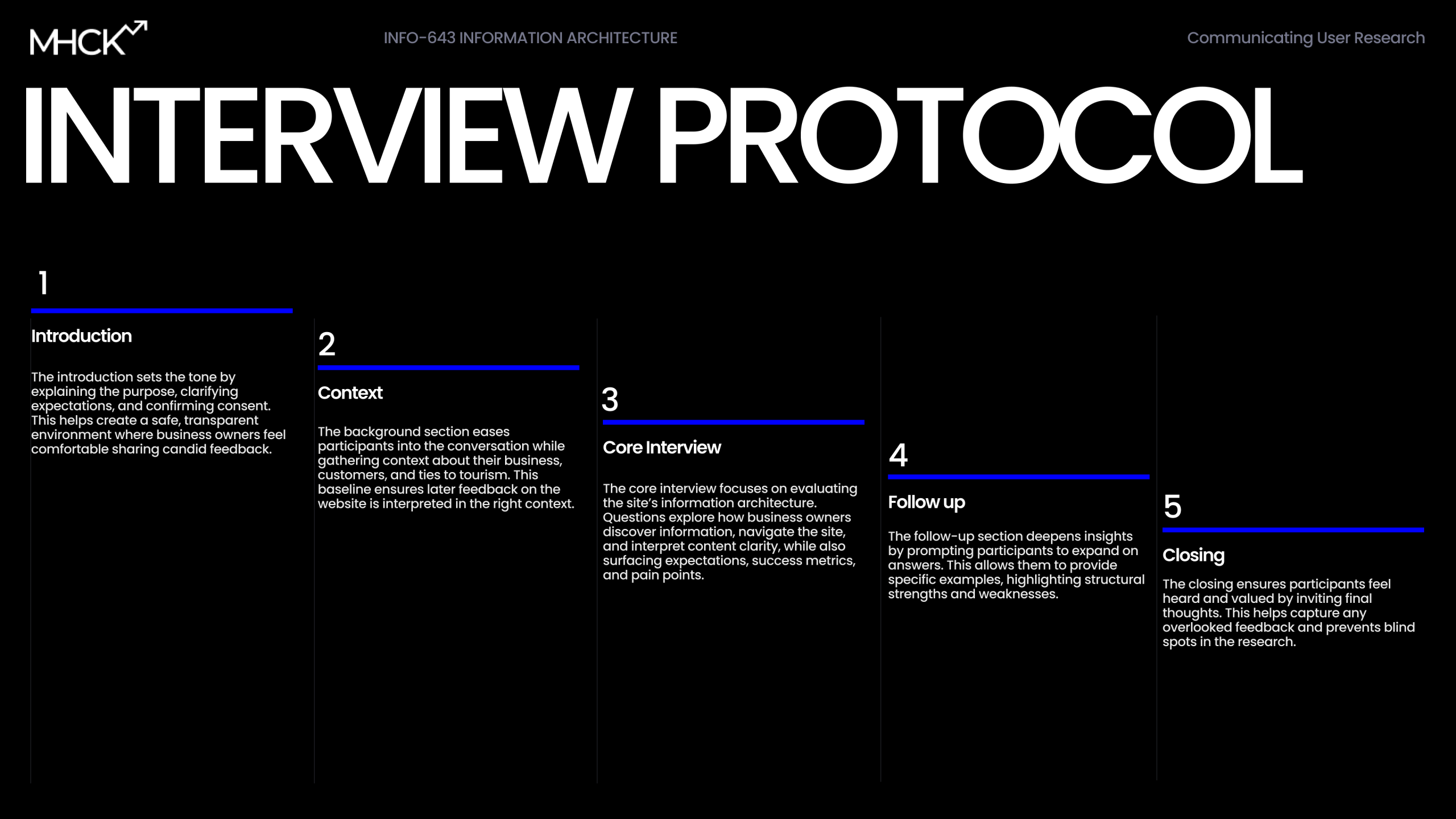
Interview – Meeting the People Behind the Pain Points
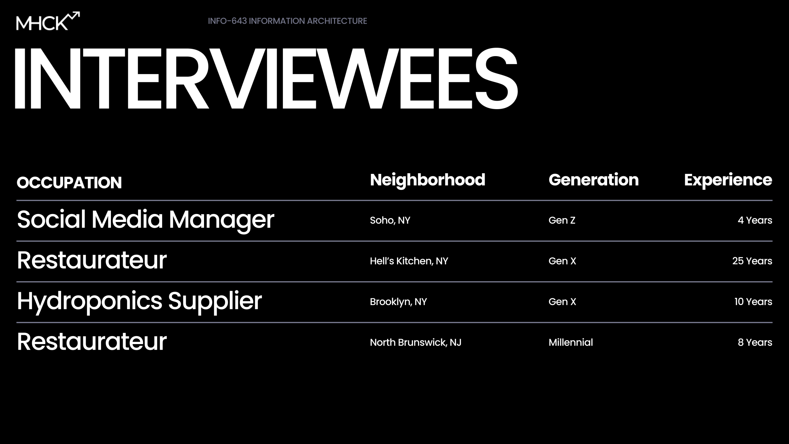
Our team established a robust mixed-method approach to ensure our redesign wasn’t just aesthetic, but structural. We conducted semi-structured interviews with four participants across different industries and generational groups. From restaurant managers to hydroponics suppliers, their pain points were surprisingly unified.
The interview protocol was designed to be conversational-yet-rigorous, moving from context questions (“How do you usually promote your business?”) to a core evaluation of the current site’s IA. We designed this interview to capture any overlooked feedback and prevents
blind spots in the research.
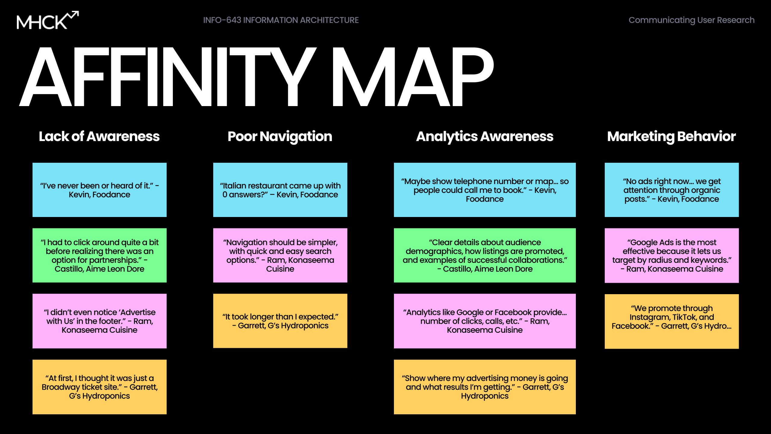
Affinity Mapping – Making Sense of the Chaos
During the synthesis phase, we utilized Affinity Mapping to cluster our observations. The results were stark as these themes emerged:
- Users wanted clearer category boundaries.
- Accessibility needed its own home, not hidden in subpages.
- “About Us” and business information blended together unintentionally.
- The homepage didn’t act like a starting point.
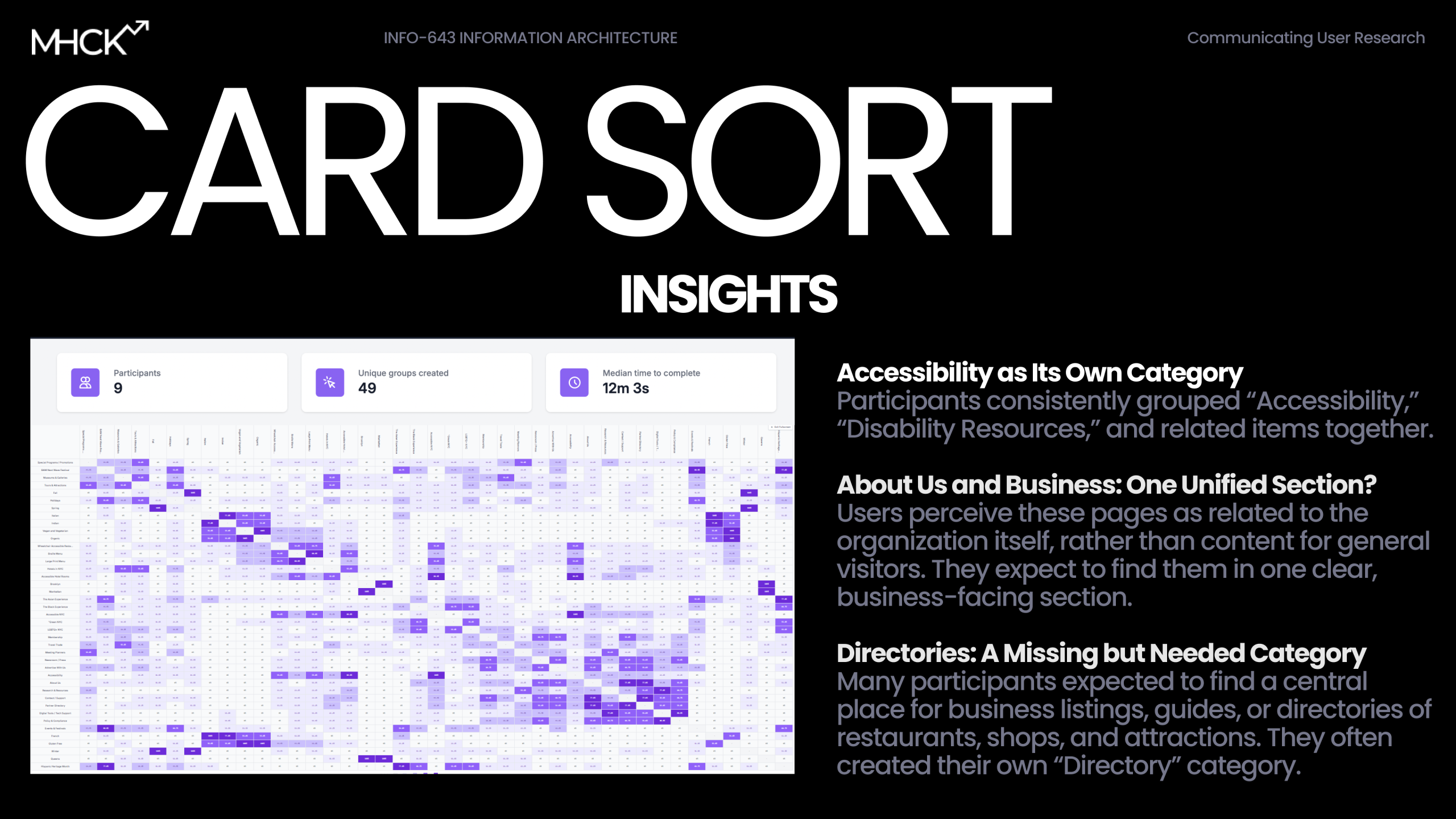
Card Sorting – Through the User’s Eyes
Nine participants reorganized the website’s content in a card sort. Their choices revealed where mental models aligned as well as where the website was drifting off course. The big takeaways were consistent with the affinity mapping:
- Accessibility was consistently grouped as its own major category.
- Users wanted Business and About Us clearly separated.
- Some labels (like “Press Kits”) had almost no shared understanding.
Tree Testing – Does the New Structure Work?
We tested our proposed structure with 6 participants completing 10 tasks. The results showed exemplary results, particularly for tasks like business-owner research, planning a trip, and finding resources like guides and tools. The remaining trouble spots helped us refine labels and positioning.
- Activity: Users navigated a text-only version of the site hierarchy to find specific items.
- Reflection: While the success score was 60%, specific labels failed. “Press Kits” was unclear, and “Trademarks” appeared in multiple places, causing confusion.
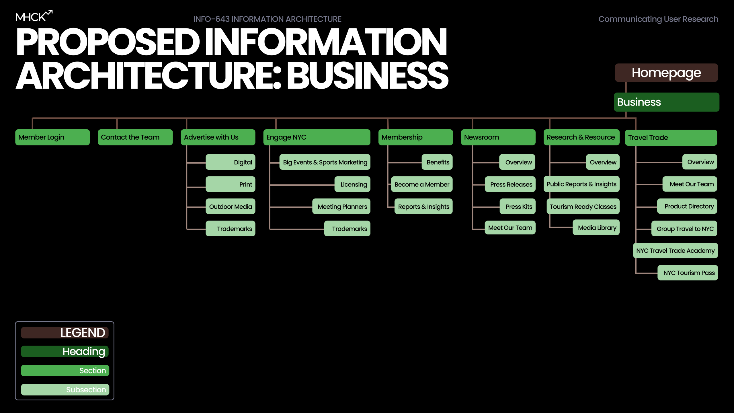
- Reaction: We consolidated these overlapping sections into a single, clearly labeled section titled “Research & Resources,” containing subpages for Public Reports and Media Library.
User-Backed Insights
- Ambiguous Navigation: In our card sort, users consistently confused the “About Us” and “Business” sections. They perceived both as organizational information rather than distinct user pathways, expecting them to be one unified section.
- Labeling Failures: Our tree test revealed a 40% failure rate on certain tasks. Users struggled with unclear labels like “Press Kits” and found duplicate “Trademarks” links confusing.
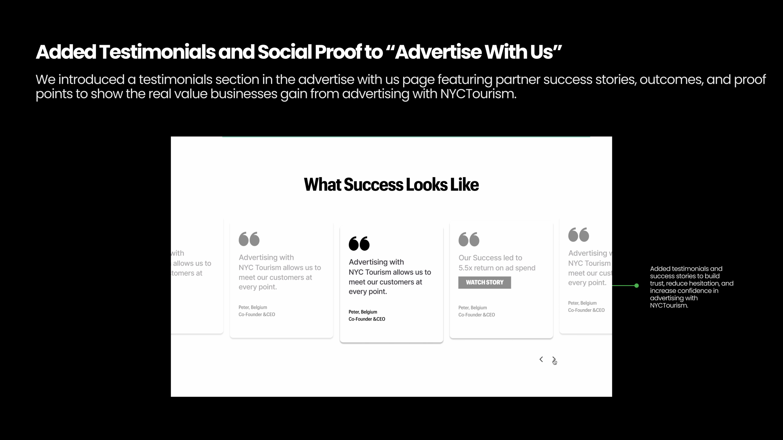
- The “Gamble” Factor: Business owners felt the site lacked transparency. Without clear analytics or success stories, they were hesitant to engage. As noticed in our affinity map, users stated, “Show where my advertising money is going”.
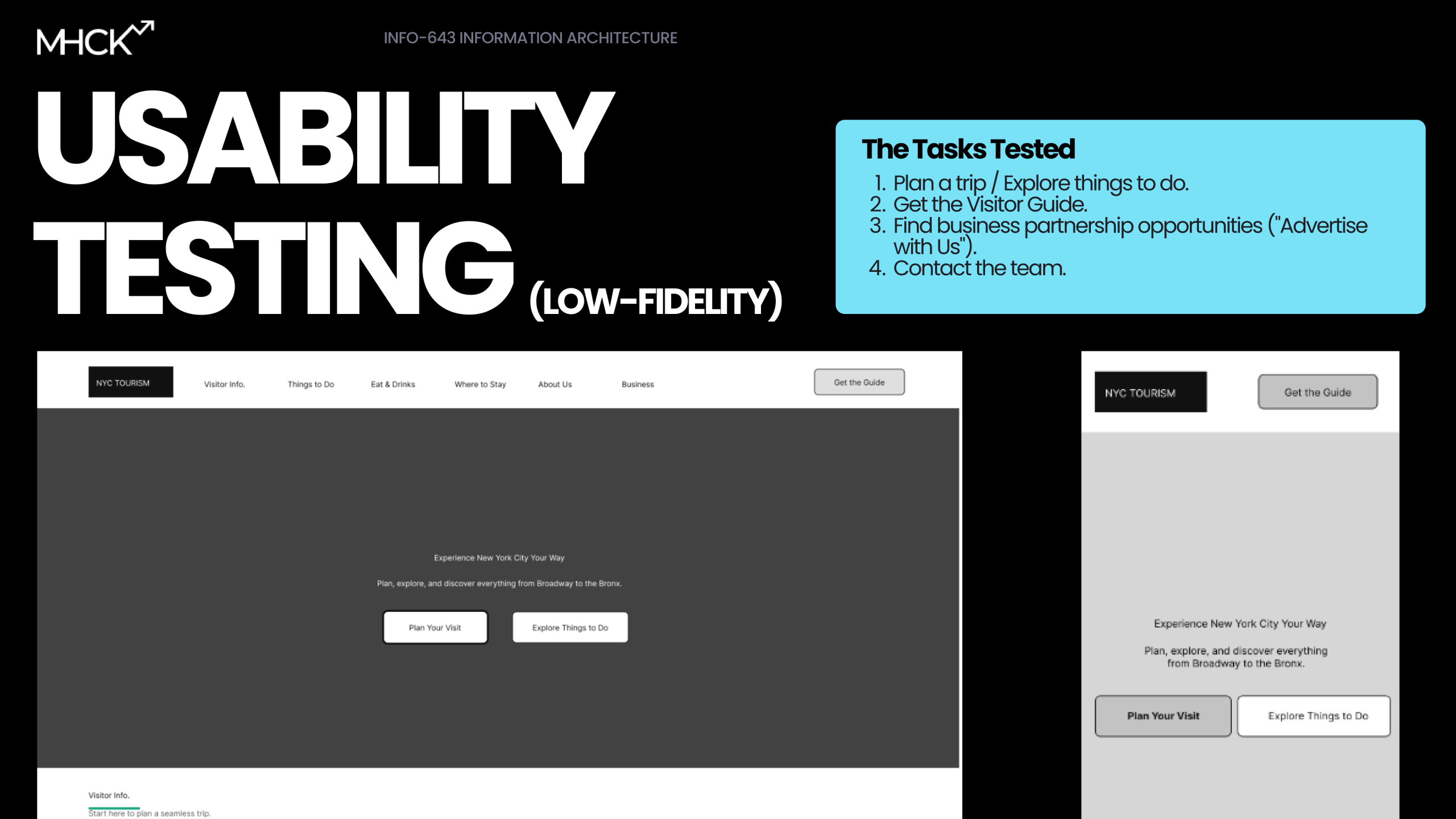


Low-Fidelity Wireframe Testing
Following the restructuring of the site’s Information Architecture, our team moved into the validation phase by creating and testing low-fidelity wireframes with 9 users. Our primary goal was to assess whether the separation of “Business” and “Visitor” pathways effectively reduced confusion. The testing session proved pivotal to a significant friction point we hadn’t anticipated:
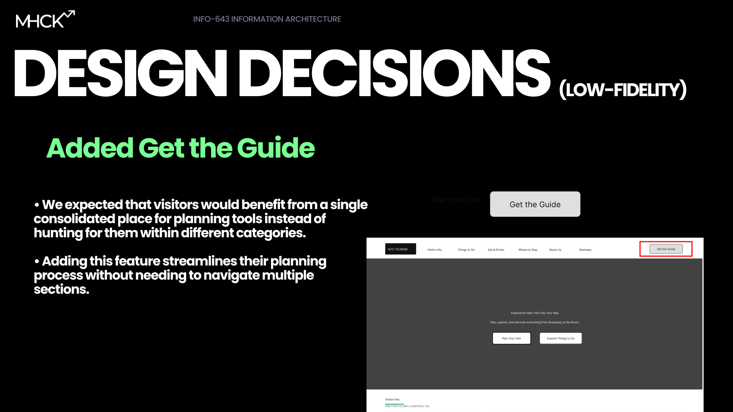
- “Get the Guide” (which we designed as a helpful shortcut) actually competed with the “Plan Your Visit” CTA, causing decision paralysis for users who didn’t know which path to choose first.
- Our inclusion of a detailed itinerary calendar was premature; users rejected the day-by-day planning tool, preferring to explore broad categories and maps before committing to a schedule.
- The structural changes for business owners were a major success; participants easily located the “Advertise with Us” and “Contact” sections (tasks that had previously resulted in high failure rates) confirming that our dedicated business navigation was the right direction.
Design Solutions
Restructuring the Navigation
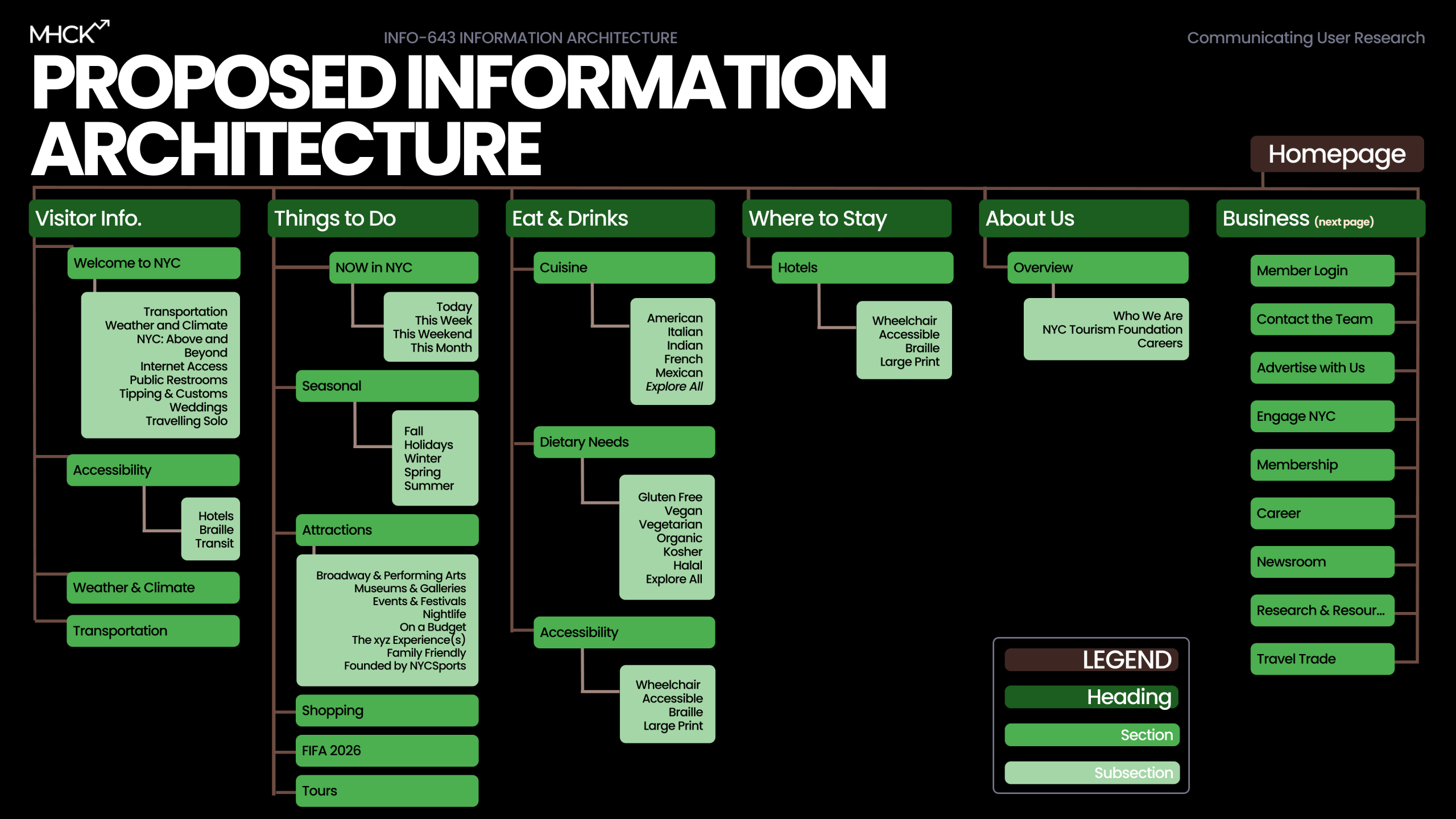
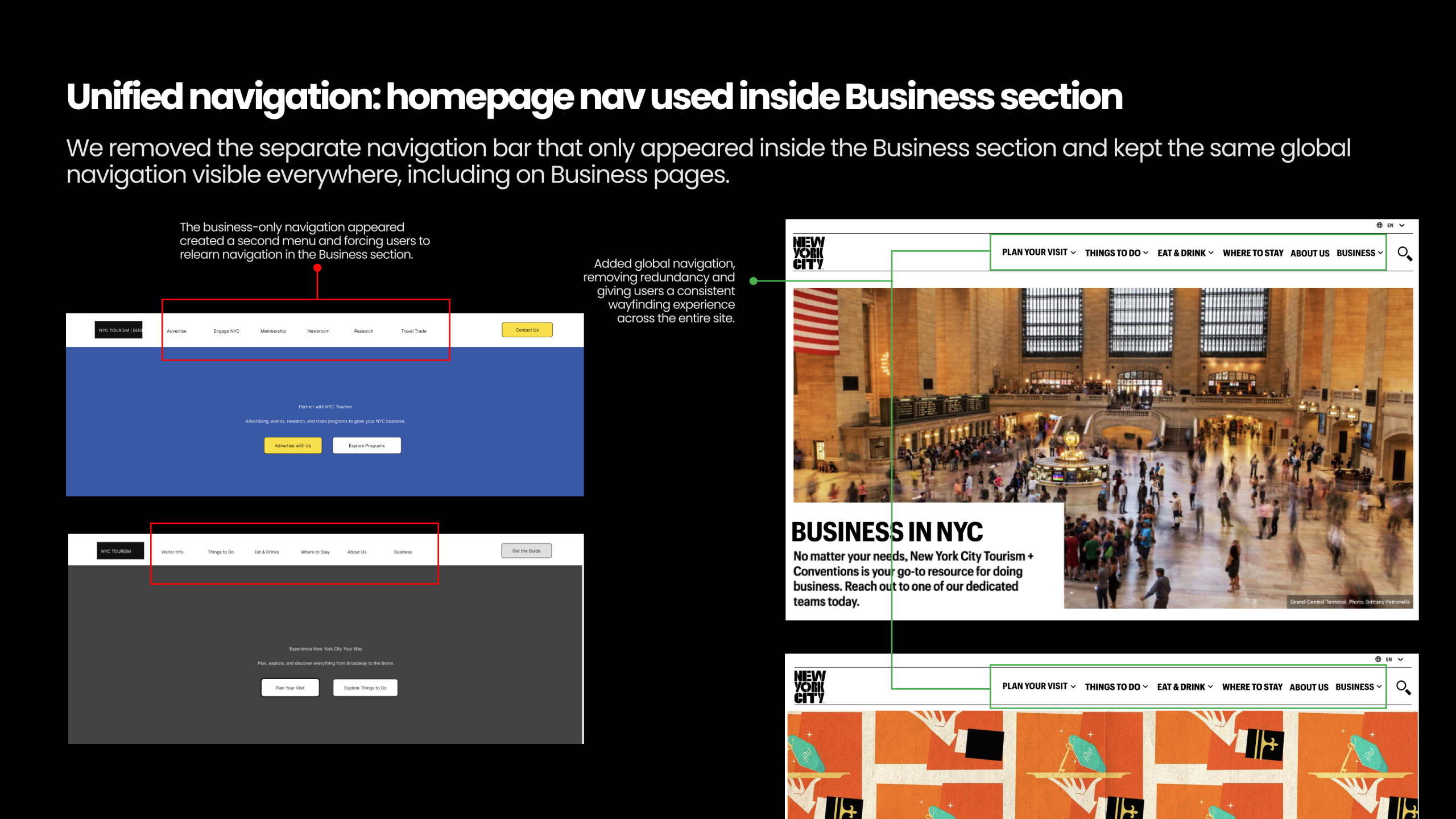
My primary focus was solving the “About Us” vs. “Business” confusion and conceptualizing a framework to organize this new navigation. We decided to split the global navigation, creating a dedicated “Business” primary nav item separate from “About Us”. This was a major decision to give business owners a direct entry point. Inside this section, we consolidated the confusing “Press Kits” and overlapping report sections into a single, clearly labeled “Research & Resources” hub.
Designing for Trust
Drawing from our persona, Taylor Simone – a data-driven business owner – I advocated for a solution that provided social proof. A simple call-to-action wouldn’t suffice to warrant businesses to “Advertise with Us”; we had to prove it worked. We designed a standalone Business landing page that featured a testimonials section with specific success metrics, such as “5.5x return on ad spend”. This directly addressed the user insight that advertising felt like a “gamble”, especially to a foreign platform.
Optimizing the Visitor Journey
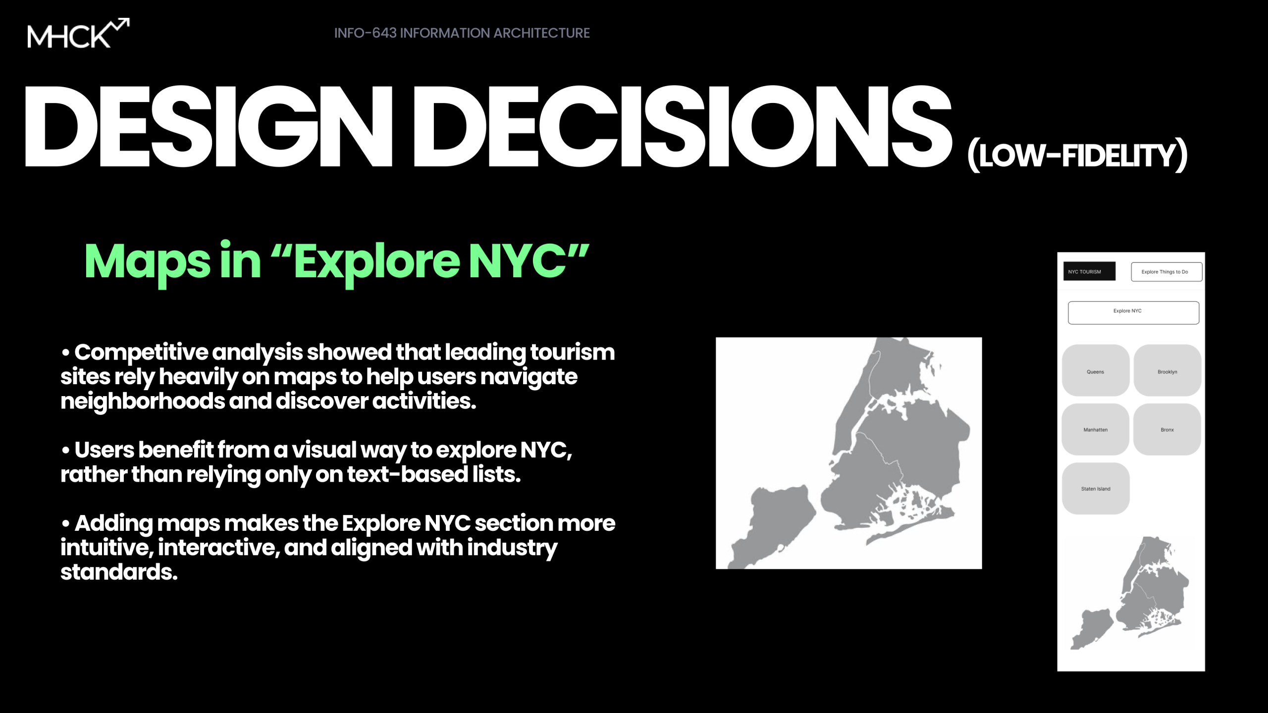
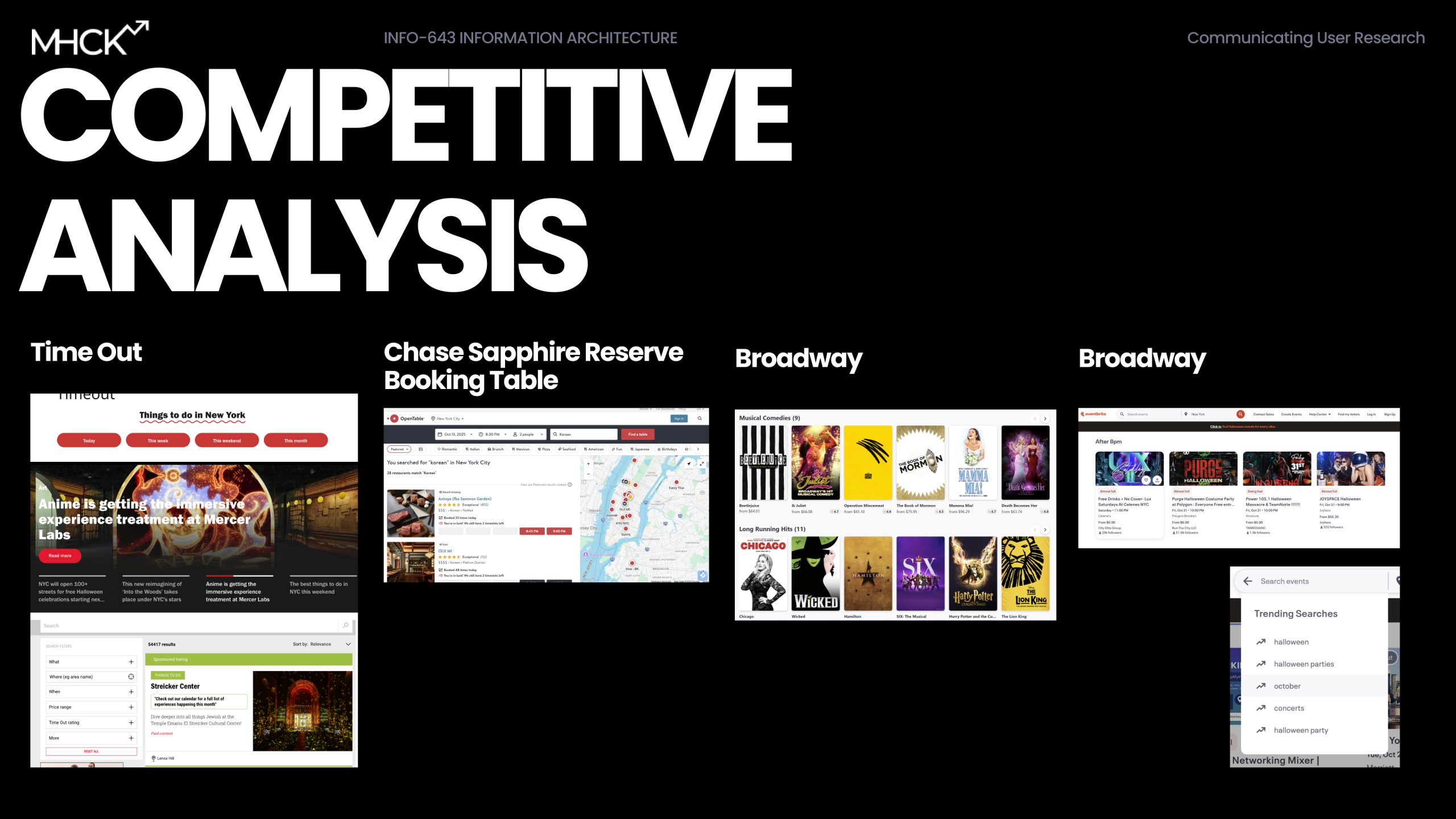
For the visitor side, we realized that forcing users to “Plan” before they “Explore” was a friction point. In our low-fidelity testing, users found the “Get the Guide” CTA competitive with “Plan Your Visit”. To fix this redundancy, we reorganized the homepage to prioritize exploration first (via. trending searches, interactive maps taken inspiration from Competitive Analysis) and moved the “Get the Guide” tool to a lower, more appropriate point in the user journey.
The Final Pitch
We consolidated our work into a high-fidelity prototype that showcased separate, optimized flows for visitors and businesses. When we presented the redesigned “Get the Guide” feature – which we transformed from a static PDF download into an interactive, personalized planning tool – the reaction was enthusiastic. One user feedback point captured it perfectly: “Wait, I LOVE this!! It does all the thinking for me”.
Conclusion
We concluded the project with clear pathways to improvement. By separating the user intents (Business vs. Visitor), we resolved the core conflict of the site. If we were to continue, our next steps would be to validate the new “Research & Resources” section with quick usability walkthroughs to ensure the label changes effectively solved the confusion found in our tree tests. Ultimately, this project taught me that Information Architecture extends beyond organizing links – it’s about understanding the psychological “gamble” users take when clicking a link and providing the clarity they need to trust the destination.
Click here for the desktop wireframe, here for mobile wireframe, and here for the slide deck.