The College Access Consortium of New York (CACNY) is a mission-driven organization committed to advancing college and career access for underrepresented youth and communities. Founded in 1989, CACNY unites many organizations and education professionals across New York City and has become one of the most prominent players in the college access space.
CACNY’s Need
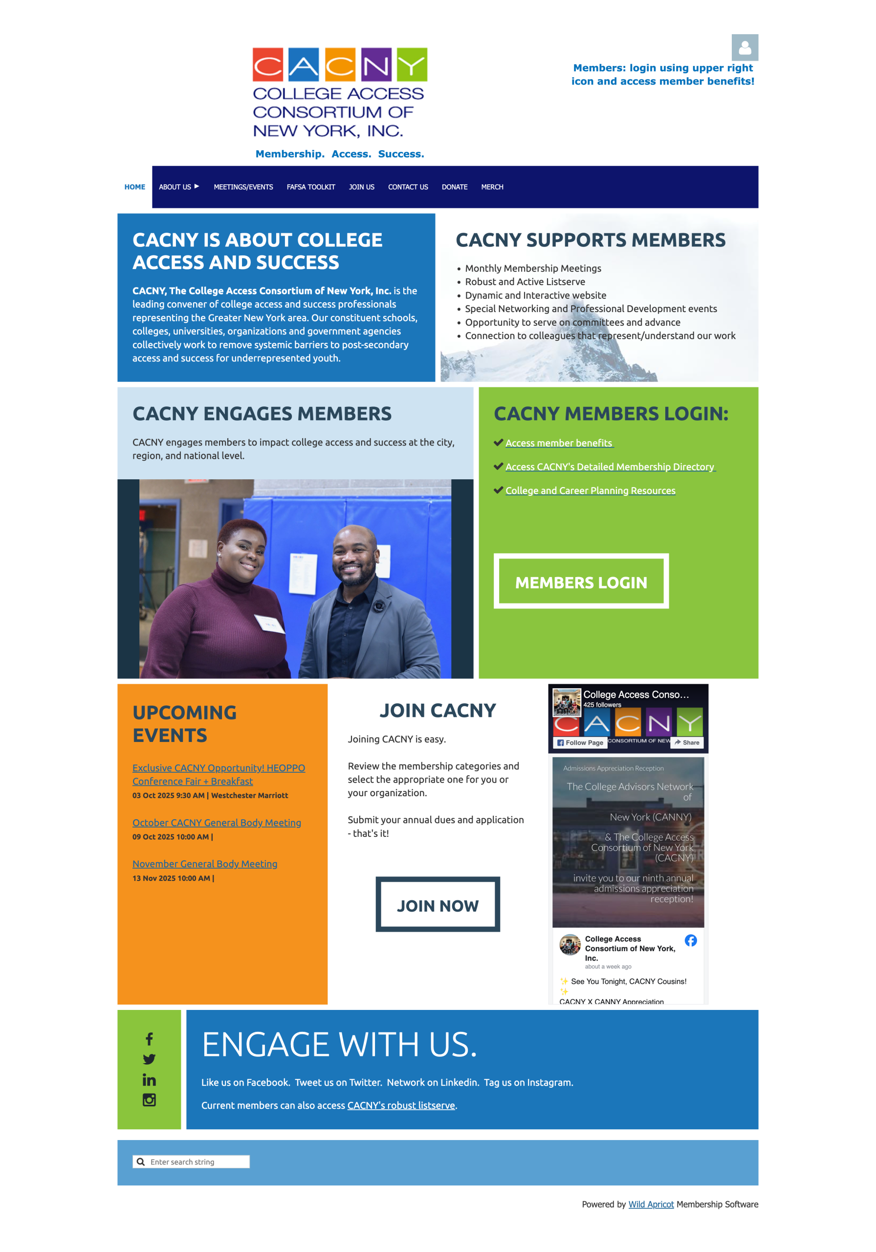
CACNY’s website, currently built on WildApricot, does not represent the fun and vigorous energy that the organization brings to NYC, nor does it meet all the needs of its supportive members. As CACNY grows, there is a need to evolve the platform into one that supports its goals of connection, community, and resource sharing.
“CACNY’s website looks like they’re still starting out. They have been around so many years, decades now, that it should not look like this.”
Project Goals
The CACNY x Pratt collaboration started in September 2025. It aimed to identify potential challenges faced by members while using the CACNY website and suggest strategic design improvements to enhance the overall user experience of the website.
Evolving the website from a basic registration portal into a central hub for any information related to college access.
Showcasing key resources, including scholarships, jobs, and student programs.
Highlighting CACNY’s advocacy work and partnerships.
Creating a website that feels engaging, organized, and reflective of CACNY’s identity (authentic, community-driven spirit).
Our Process
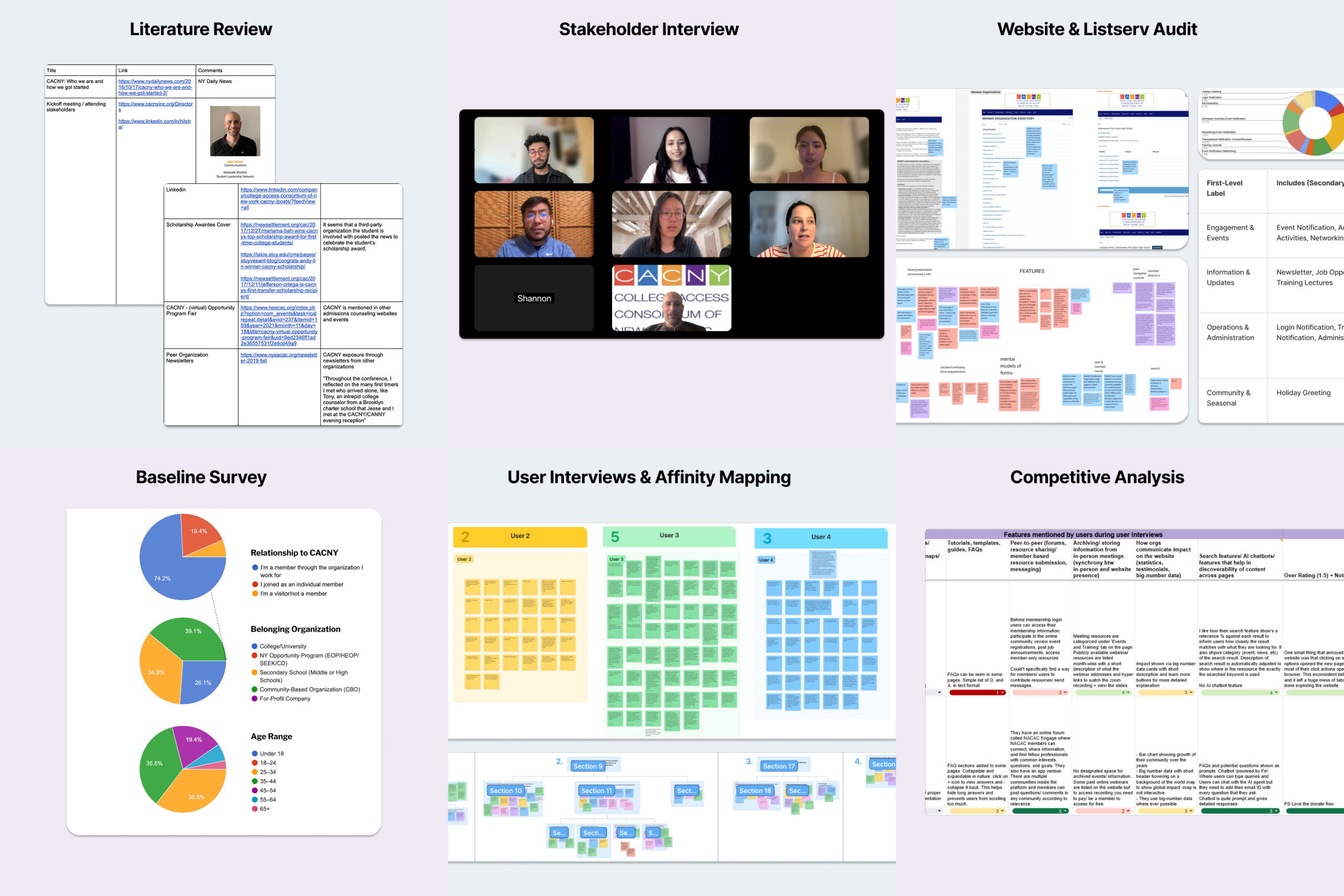
Phase 1: Research
We refined our understanding of CACNY’s ecosystem, pinpointed the challenges faced by CACNY Website’s users, and gathered best practices from the industry using various methods:
Key Insight #1: The Website failed to reflect CACNY’s impact and identity
Members felt the website does not quite encapsulate the impact of CACNY’s capabilities and offerings to the community which can stunt growth and prevent audience members from seeing their true reliability.
“I think one of the thing about CACNY is that impactfulness of the ‘family feel’ and seeing pictures of members on the website. If you don’t see yourself as one of them, you may not think that ‘this is the group for me.’”
Homepage appears as an underwhelming landing page with outdated images, no clear impact, and no visibility to CACNY’s work.
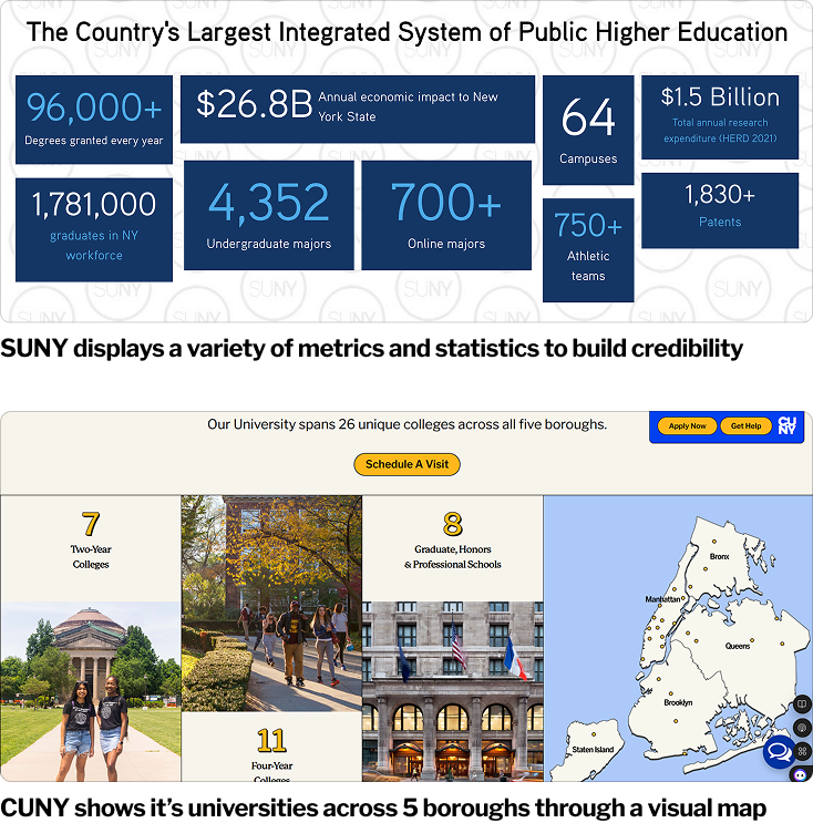
We learned from competitors that showcasing impact through testimonials, big numbers data, and infographics inspires visitors to be a part of the community and contribute to the work being done by the organization.
Key Insight #2: Critical features were invisible or hard to find
Members shared that poor organization and the invisibility of features and resources caused them to underutilize the website. They rated the ‘discoverability of resources’ an average of 2.9/5 during the baseline survey.
“They have a calendar view? I wasn’t aware of that.”
“For the members, I see that there is like a discussion forum that I didn’t know was on there”
“There’s so much on the website but no one would ever know because they don’t know how to navigate.”
Non-members are not aware of the benefits CACNY has to offer since many of their features are hidden behind login and are not mentioned anywhere else on the website.
Key Insight #3: Members value CACNY for its community, but the website doesn’t effectively support connections
CACNY has the opportunity to better reflect the power and potential of its vibrant community on the website, highlighting its collective impact and inspiring deeper connections in the college access space.
“This [website] should be the hub of where I get college access for New York City. There’s no other place in New York City that can be the hub for college access. CACNY is that.”
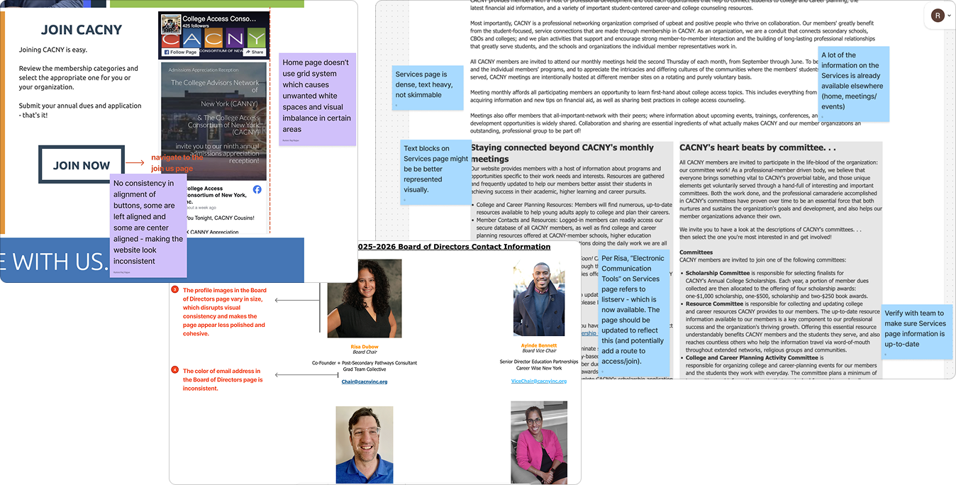
Pages that do facilitate connection are poorly designed with dense blocks of information, making them hard to navigate and use.
Key Insight #4: Visual design and information hierarchy felt dense and hard to understand
Members emphasized these usability challenges during interviews, noting that the website appears dense, text-heavy, and not visually engaging.
The website suffers from inconsistent visual design and layout. Members rated the visual aesthetics of the website poorly during the survey, giving it an average of 2.9/5
Key Insight #5: An established overreliance on CACNY’s Listserv rendered it ineffective for resource sharing and retrieval
The listserv, rather than the website, serves as the main channel for viewing information and resources. Despite its value, the listserv experience can be a struggle since it has a lot of information and can feel messy.
“…the listserv could be a beautiful or sometimes a torturous thing, depending on how you receive.”
The way they share the information is great. I think sometimes it gets a lot…when I open my emails, I’m just trying to make sense of everything. It’s hard to open all of them… Trying to keep track of all that stuff in your inbox is really difficult.”
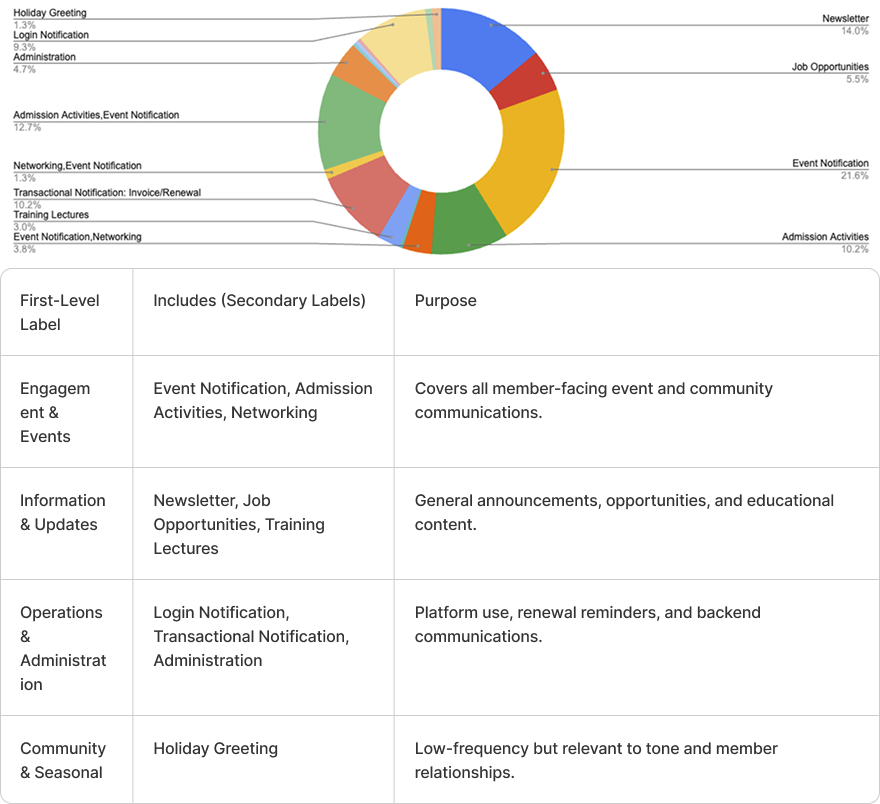
We audited 236 emails based on their subjects to determine the type of information shared via the Listserv. We realized that a significant amount of this information can be streamlined on the website, reducing Listserv traffic.
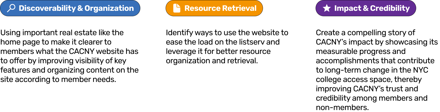
Proposed Implementation Strategy
Mirror the organization’s identity as a consortium with a website that functions as a central hub for community engagement and resource access.
We plan on implementing this strategy using the following tactical approach:
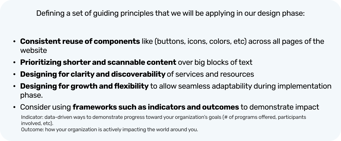
We also set some guiding principles to follow during the design phase:
Phase 2: Initial Concept Design And Usability Testing
We designed Initial concepts (mid-fidelity designs) and tested them with users to get their feedback.
What Worked Well
Usability testing validated the main structural changes, confirming that users liked the resource library, filtering and search functionality, and the inclusion of an events archive. Users also appreciated the simple and clean representation of information.
Area of Improvement #1: Clearer Cues
Members need clearer cues to navigate the site and narrow in on the content and features they need.
Clearer labeling & visibility of buttons/features
More granular filtering
Previews and overviews to build a mental model
“I want to see tags about the event type on the card itself. Or if the event is meant for counsellors, students, etc.”
“Make it known that this [profile icon] is where I can find my information” 4/7 members overlooked the profile icon in the top nav.
“Dividing up the resources into counselor resources, student resources would be helpful.”
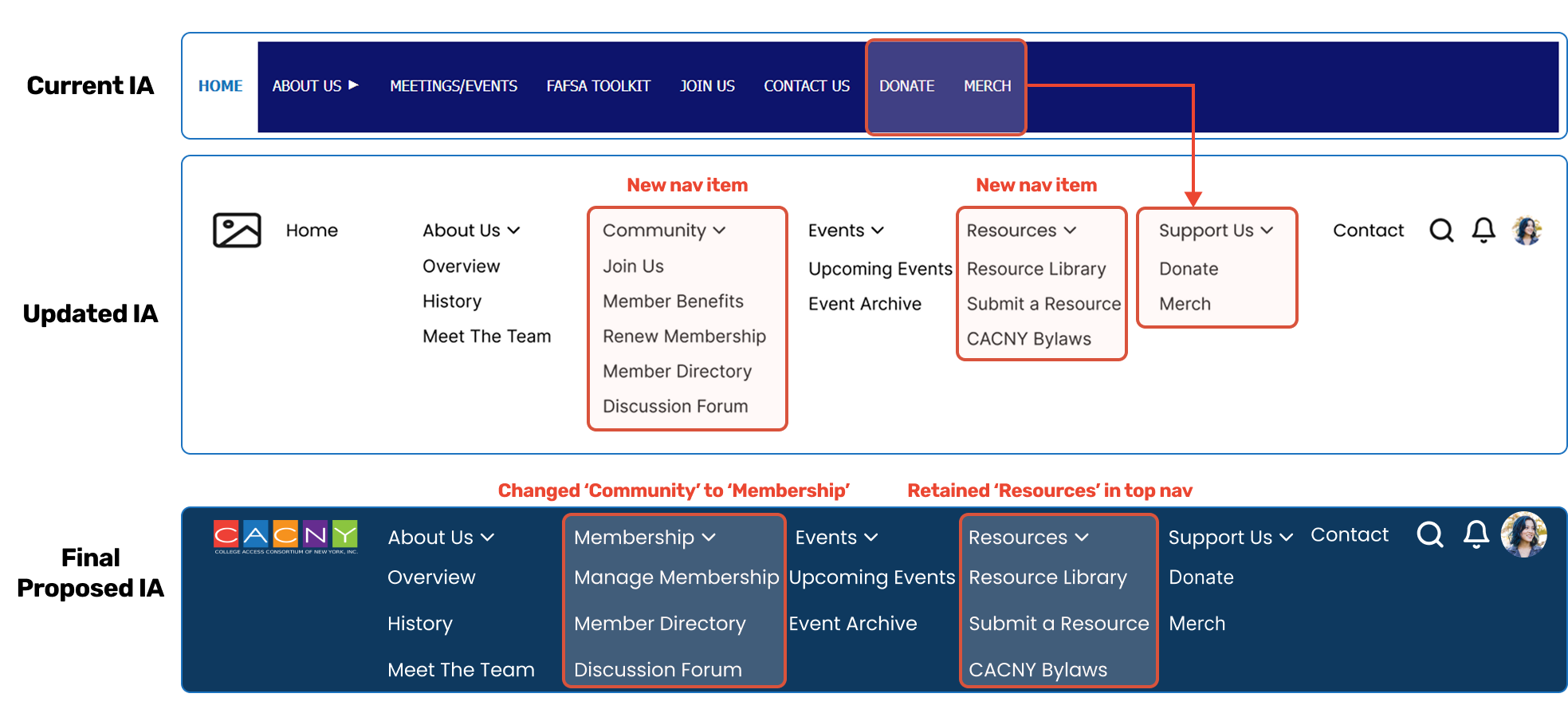
Area of Improvement #2: ‘Community’ Clarity
Participants felt the “Community” tab label did not accurately capture all the functions available within it.
“I wouldn’t expect manage membership to exist under “Community”. To me, that’s directory and discussion forum.“
Area of Improvement #3: Connection & Privacy
To strengthen the CACNY website’s function as a community hub and facilitate connection, members are seeking richer details on profiles…
…but balanced with privacy expectations.
“I expected to see social media links and website on the organization profile to learn more about them. And a summary about themselves that they’ve written”.
“I think I would’ve expected to see a box in my profile to add LinkedIn and social media for my public profile.“
“There should be privacy settings and the ability to choose what is shared vs. hidden in [your profile on] the directory. I wouldn’t want people to see my personal address.”
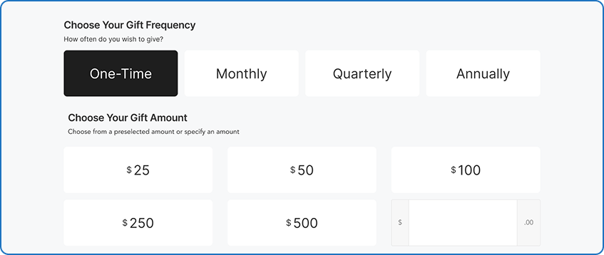
Area of Improvement #4: Donations
Members value transparency and control when donating; they felt showing impact data was critical and expect the option to choose how funds are used.
“I’d expect to see a dropdown to choose where money is going to, like a scholarship fund, sponsoring a member, etc.“
Phase 3: Final Concept Design
Translating the insights from the usability testing, we created our final concept design, catering to the needs of both non-members and members.
Non-member view:
Member view:
Key Design Decisions
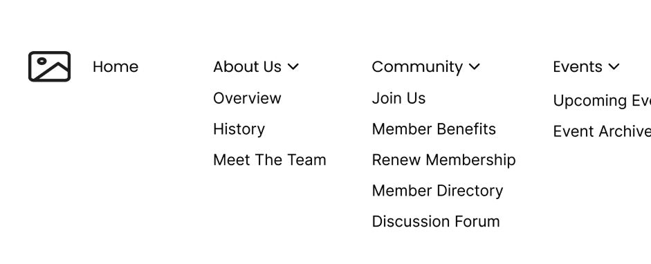
Design Decision #1: Updating the information architecture and renaming ‘Community’ to ‘Membership’
Grouping ‘Donate’ and ‘Merch’ under ‘Support Us‘
Introducing a new section for ‘Resources‘
Introducing a new section for member-specific features. Initially, this section was called ‘Community’. However, the label was changed from “Community” to “Membership” to align with participant expectations for where membership-related items should reside
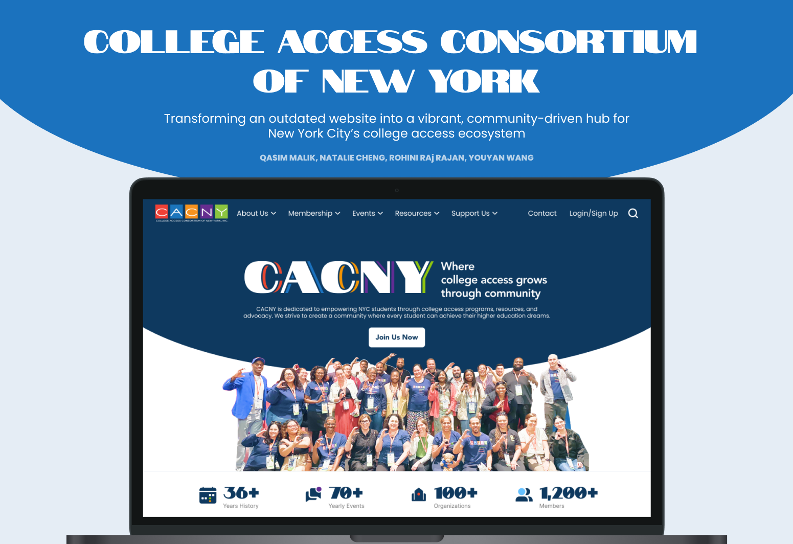
Design Decision #2: A Home Page that reflects CACNY’s energy
The Home page now uses upfront impact metrics and high-level service overviews (clickable cards) to increase the discoverability of features and essential information, improving visibility. We also used CACNY’s brand colors to bring out their vibrant and energetic presence more clearly.
The Home page now uses upfront impact metrics and high-level service overviews (clickable cards) to increase the discoverability of features and essential information, improving visibility. We also used CACNY’s brand colors to bring out their vibrant and energetic presence more clearly.
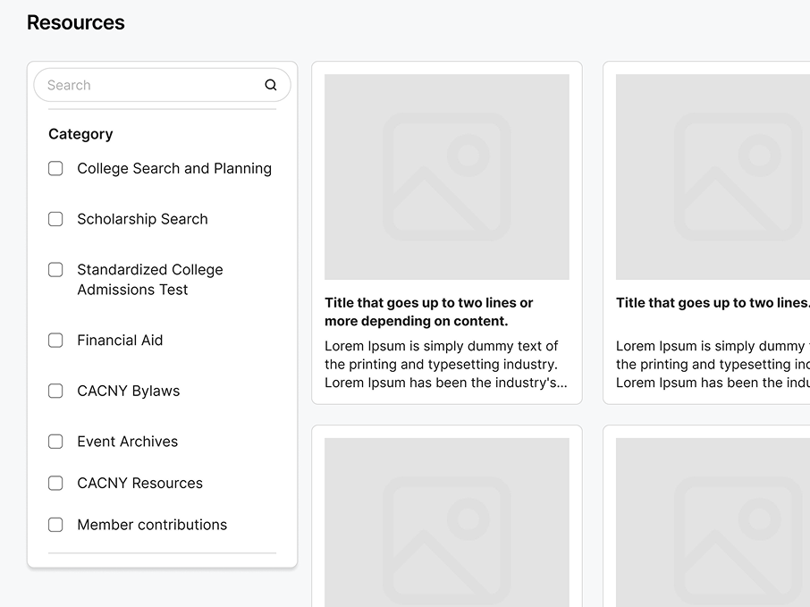
Design Decision #3: Designing a Resource Library that reflects CACNY’s identity as a ‘Resource Hub’ for the college access space.
Within the Resource Page, we introduced:
Clear categorization of resources
Granular filtering options (Filter by category, audience type)
Used color-coded tags for skimmability
‘Viewable but Inaccessible’ previews for non-members
Option for members to contribute to CACNY’s resource pool using the ‘Submit a Resource’ option
Design Decision #4: Reimagining events and information archiving
We made an all-inclusive events page with a convenient ‘Events Archive’ section to reduce overreliance on CACNY’s Listserv, which is currently dominated by Event Notifications (21.6% of all emails shared via Listserv)
Filtering and search allow members to find exactly what they need
Quick add to calendar function
Tags make content skimmable
“Viewable, but inaccessible” design – prospective members get a glimpse of impactful events CACNY holds, improving credibility and giving non-members a better idea of everything that happens at CACNY
Incorporating the event archive in the resource library strengthens the site’s function as a hub for resource sharing across the field
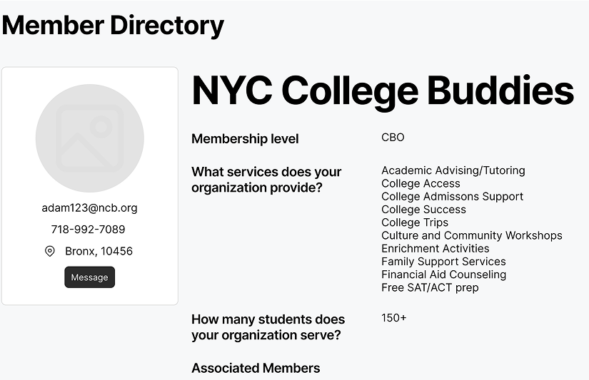
Design Decision #5: Enabling connections and strengthening community via Member Directory
A unified directory for both individuals and organizations includes:
Bios, associated members, and optional social media links facilitate community connection
Robust filtering options (Filter by ‘services offered’) facilitate helping members connect with other members and organizations that offer the type of resources and assistance they could benefit from
Locked view with log-in prompt provides a clear cue for non-members & funnels them to registration
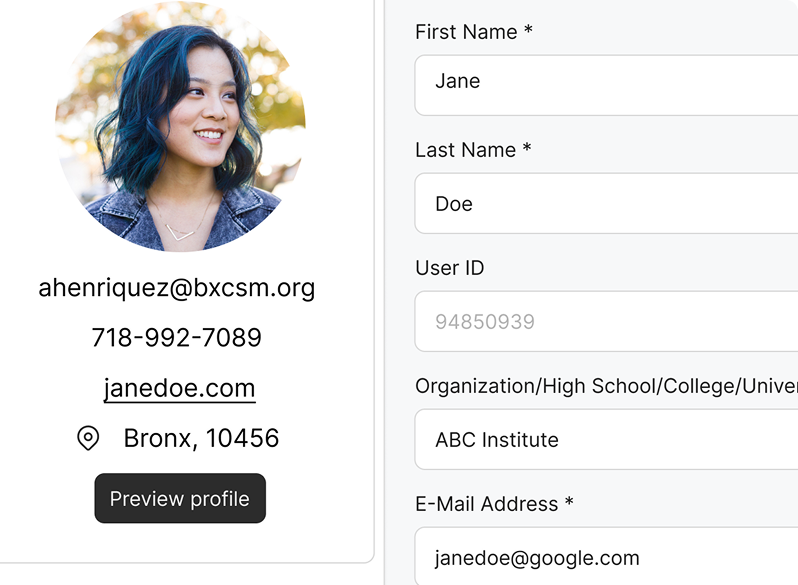
Design Decision #6: Improved control over membership management and privacy settings
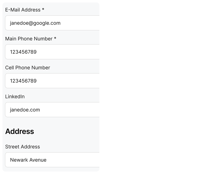
Users can now adjust the visibility of information such as Address, Phone number, Email, etc, ensuring flexibility in data privacy
Admins can also remove members who are part of the membership plan, making it convenient to manage memberships
Design Decision #7: Building transparency and credibility through Donations
Upfront impact information (metrics, resources funded) builds credibility and incentivizes contribution
Metrics also build trust by transparently showing members where their money is going
Allowing donors to allocate funds to specific campaigns caters to their desire for transparency and targeted impact
Gratitude wall for donors
Design Decision #8: Low-friction pathway to becoming a member
Clear ‘Join now’ CTAs across the website to gently nudge non-members to join CACNY
Member benefits are shown up front in the ‘Join Us’ page in the form of visual and digestible cards to emphasize the value of CACNY membership
Membership prices are shown up front rather than in the application form
Accessible help with questions related to complicated membership rules via FAQ
The Impact We Made
Through our redesign, we were able to improve the accessibility of all the features and services offered by CACNY
Achieved 90-100% task success across all primary user flows.
Improved first-click accuracy for finding key pages like past events, uploading resources, member directory. This indicated that users found our labels clear and intuitive.
Delivered high-value assets to clients, such as:
Design guidelines document
Competitive analysis data
Platform analysis for finding a suitable environment to host the new website
Clickable prototype and Figma files with reusable assets
Reflections
Through this project, we learned:
How to design within the client’s constraints
How to build trust with clients and maintain transparency during the project
Importance of assigning individual roles within a team to streamline accountability
Supporting clients through the next stage of the project by providing supporting documents and next steps.
Aligning final deliverables to the client’s knowledge level to help them make the most of this collaboration