Group members:
Darija Vasileva, Shaelyn Chen, Tommy Tian
App name: ShopChef
What is ShopChef: ShopChef is an app that combines chefs’ livestreaming sessions of teaching you how to mix certain ingredients and functions of food purchase apps that creates a solution for people who have some favor of cook but don’t know how to cook certain types of food to learn about how they should cook, what ingredients they should prepare, and then checkout and get the ingredients they want.
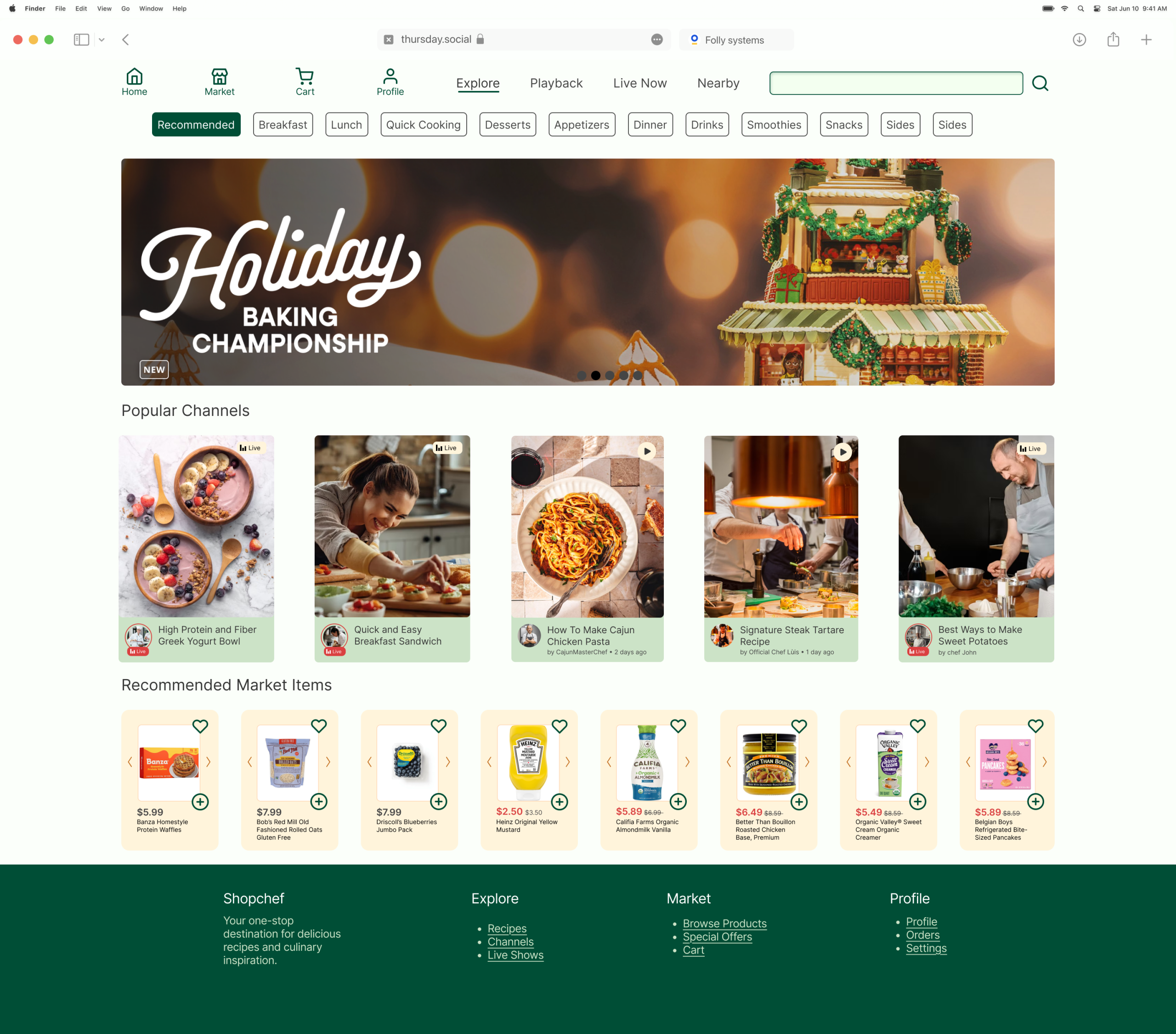
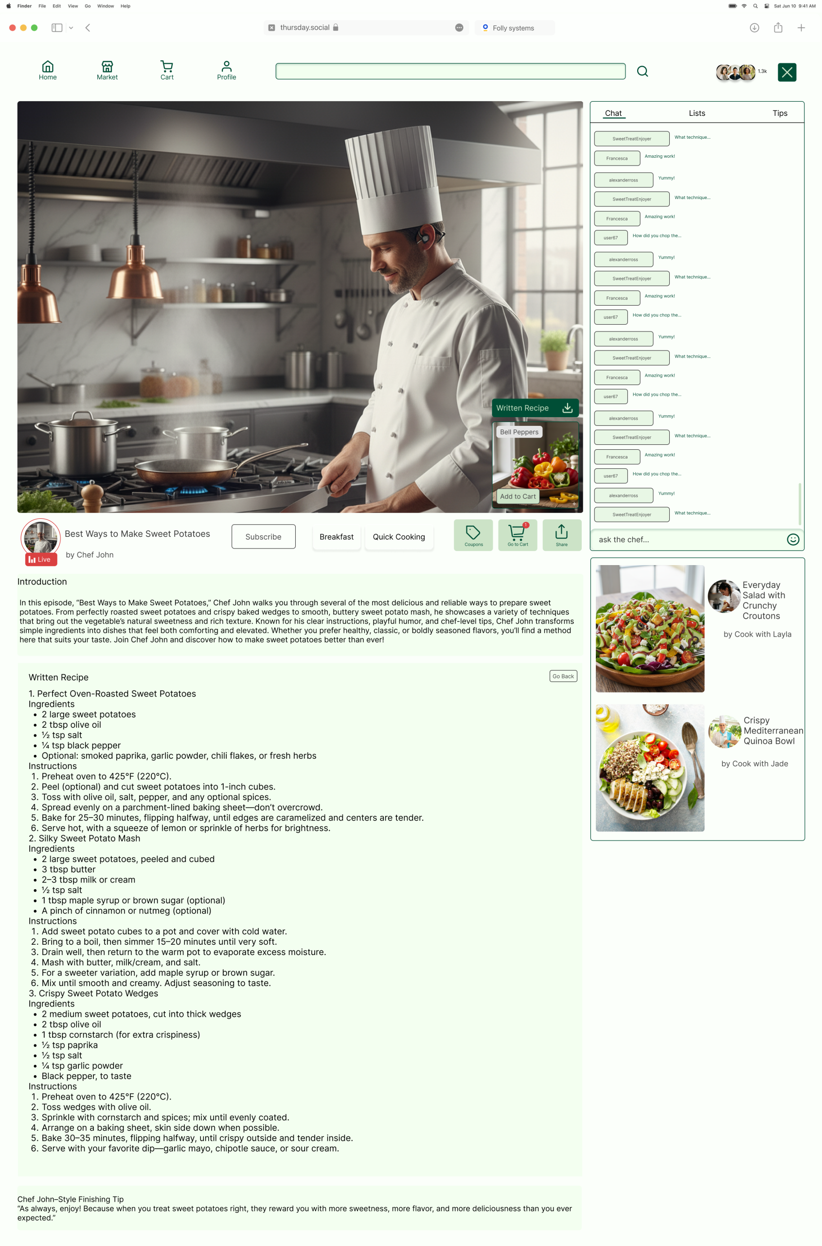
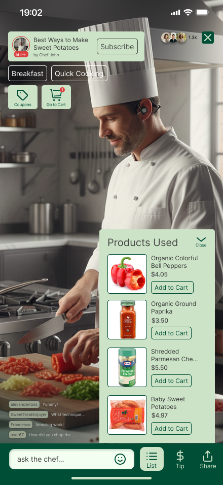
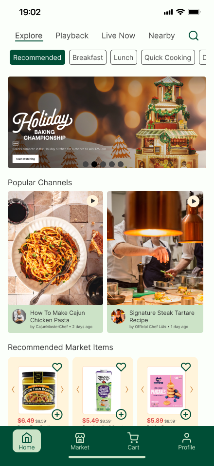
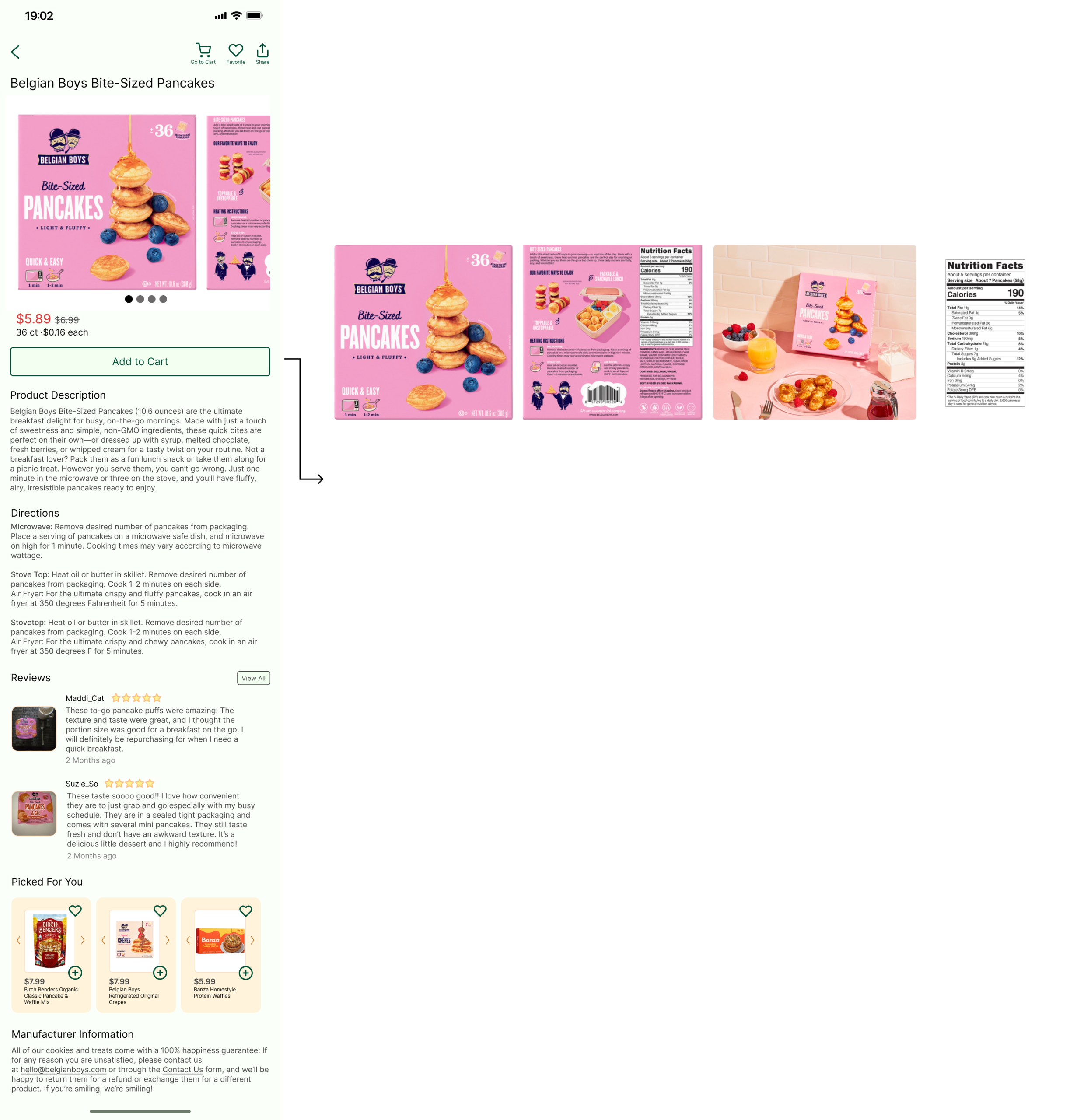
Here are some of the screenshots we have already designed:
What was our problem?
What was the problem? Describe the overall situation and the overarching problem you were trying to solve. Describe your individual role on the project. Identify some concrete challenges that stood in your way.
The problem was how should the profile page be like, for example, should it only contain commonly-seen easy functions like create usernames and passwords, or should it be like an “archive” for your account, for example, you can not only change your personal information if you want, but you can also keep a record of all kinds of account information, like what coupons you have used or what you have purchased before.
I was responsible for deciding what kind of profile our group want, and I need to persuade my group why the type I chose aligns with the purpose of our app, and to persuade them, I need to find evidences such as: does our competitors design their interfaces and functions as I proposed, and do their solutions work out?
So, the challenges are clear: find out the competitors, define the way they designed their profile pages, and analyze how those profile pages work, and explain the advantages to my group.
How was the process and solution?
What was your process? Explain your overall approach to solving the problem, including what you did, why you did it, and you learned from each step.
It’s important here to not only show your overall approach to design, but also your decision-making process and your design rationale.
Thus, every included deliverable must be accompanied by a brief reflection on its value to your design process: what did you take away from this method? How did it influence subsequent decisions? Please be as specific as possible in this reflection. Just saying “this helped us better understand our users” is not sufficient; instead, explain how it helped you (e.g., identify specific insights that were incorporated into the final design).
What was your solution? Show the end result of your process and explain how it solves the problem articulated in the beginning. Explain and highlight major decisions.
Do not just provide a link to your final prototype. Contextualize your prototype by highlighting specific design decisions and/or interface elements that you chose specifically to address a challenge, meet a need, etc.
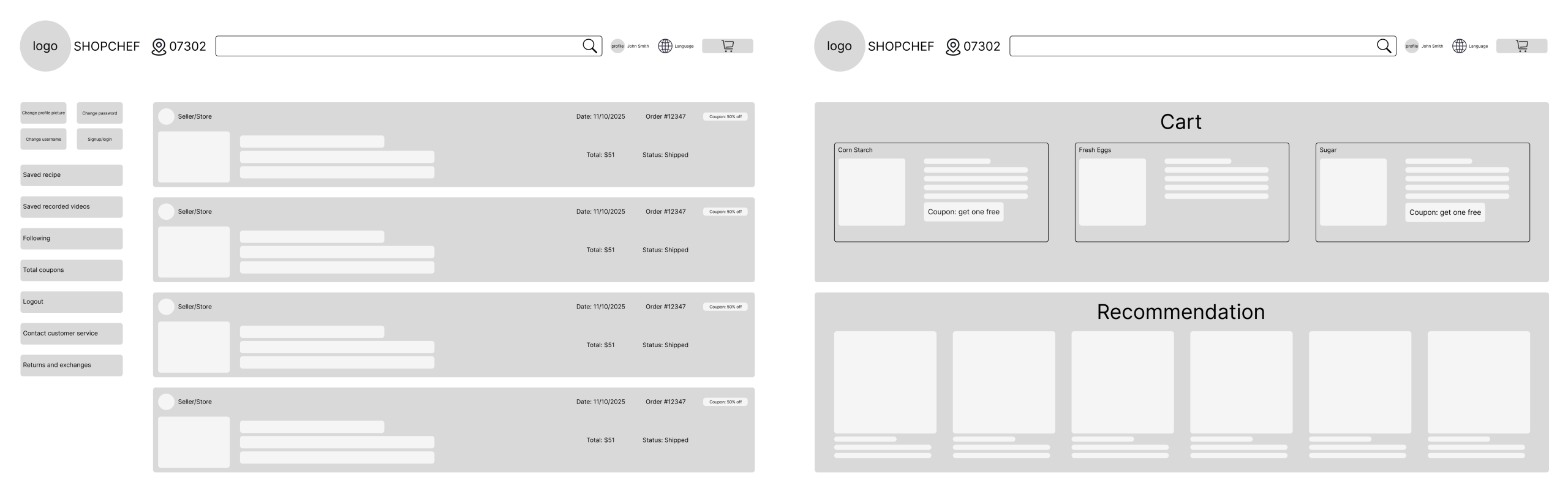
I suggested a competitor called Yami, which is an Asian online grocery purchasing app, and here is a screenshot of it’s profile page:
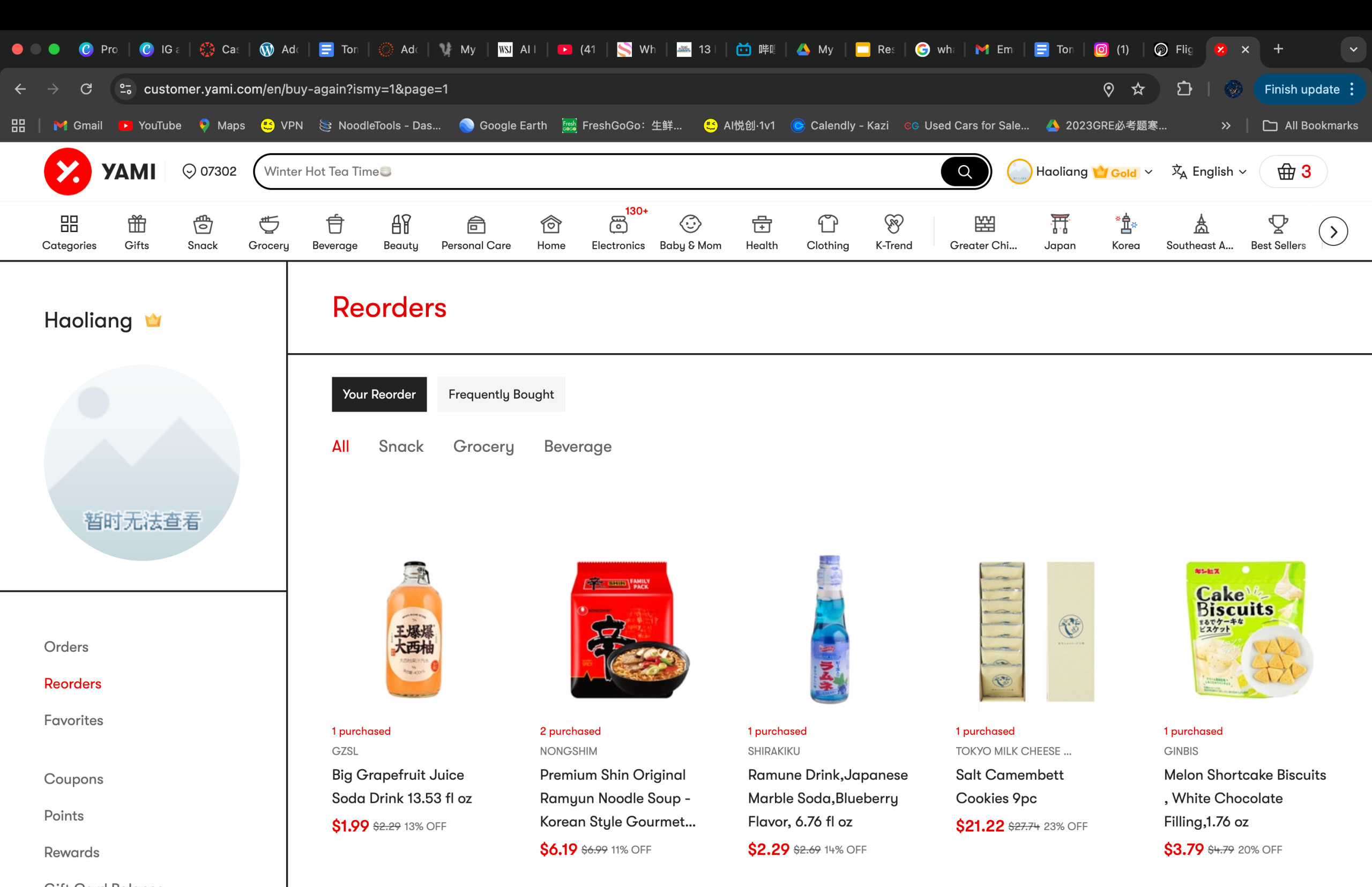
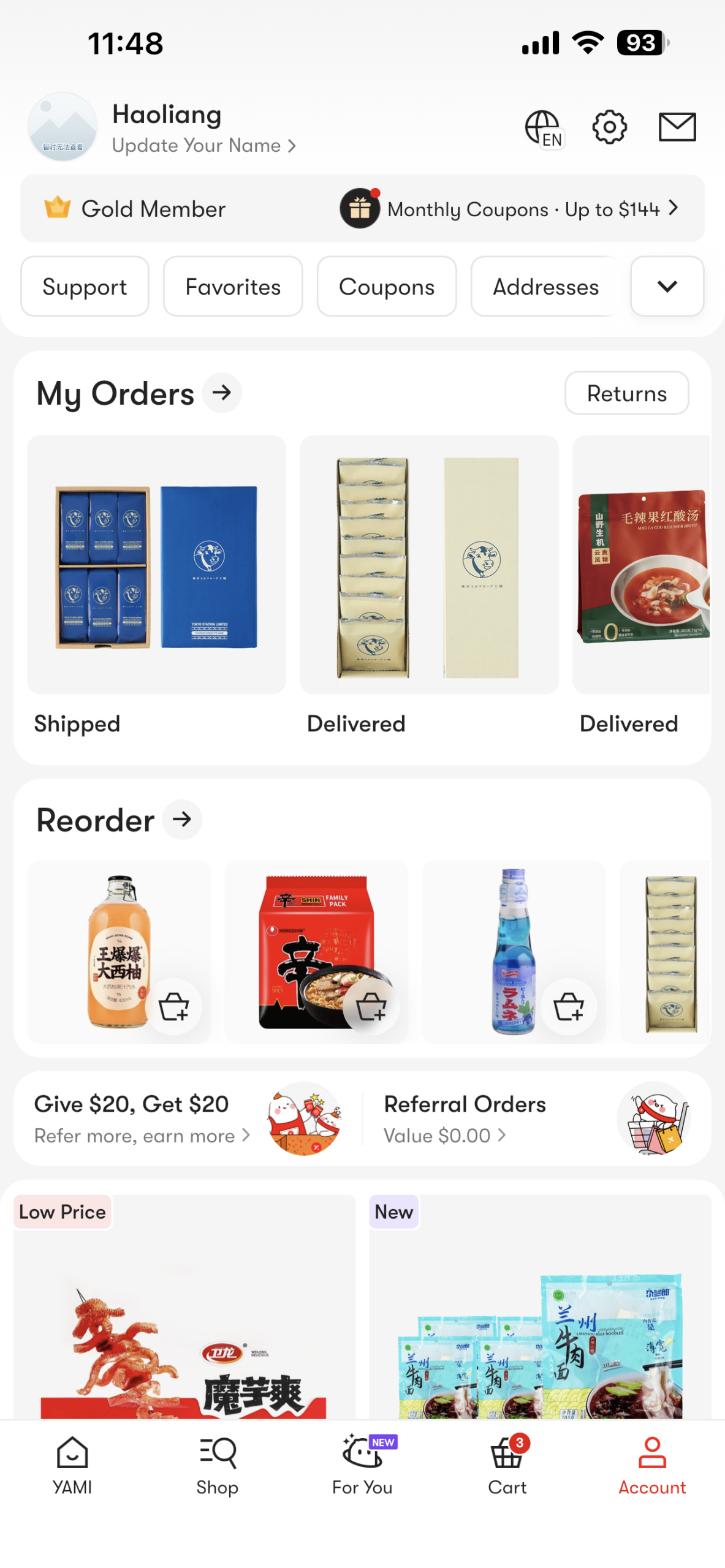
As you can see, the profile of Yami not only contains your username and contact info, it’s rather like a full archive of your account information, it saves your address, your previous orders, your coupons, your favorites, and so on. The reason I chose this app during my competitor research is because this app is one of the largest Asian online grocery market app in the United States, which have millions of users in total, and an app with such a large amount of users mean it’s widely welcomed, and since it is widely welcomed, there must be some function in it that makes people feel satisfactory.
Fortunately, in our group, Shaelyn is also Chinese and she uses Yami to purchase food a lot just like me! Both of us are familiar with the functions the profile section have, and we are all satisfied with how we can track the full record of our account in that single section – it’s very convenient. I firstly talked with Shaelyn and she agreed with me that she also thinks it would be better to make our app’s profile page serve as an archive which can track the complete record of our account.
After getting the support from Shaelyn, I told Dariya about this, too. Dariya took a look at Yami and found out it is really convenient to control everything inthe profile section, and when she was doing her research she also found out that a lot of apps are doing like this in their profile sections too, because giving users more access to their profile and have more control of their own data has already been a trend of UI/UX design in recent years, which we both agree. So, I got support from all of my groupmates and we decided to design our app’s profile section like this, too.
We then began designing the profile section, however, we cannot let our design to completely copy Yami, our app is still different so our profile CAN still borrow ideas from Yami but we have to have our own ideas and connect it to our own app so it actually WORKS.
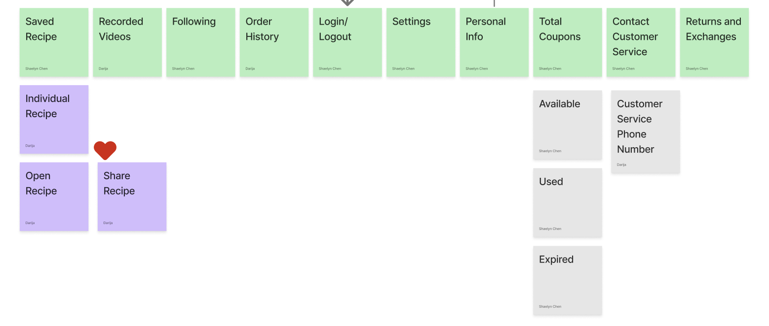
We designed the information architecture first because we need to ensure we know what the structure of our app is going to be: we will have the livestreaming session, but we designed a feature that allows users to save the recipes promoted by chefs and watch saved recorded videos even after the livestreaming sessions; what’s more, we also allow users to keep a record on which chefs they followed, and what coupons do you have or have used. We also kept essential functions like settings, like customer service, settings, changing your personal info and login/logout.
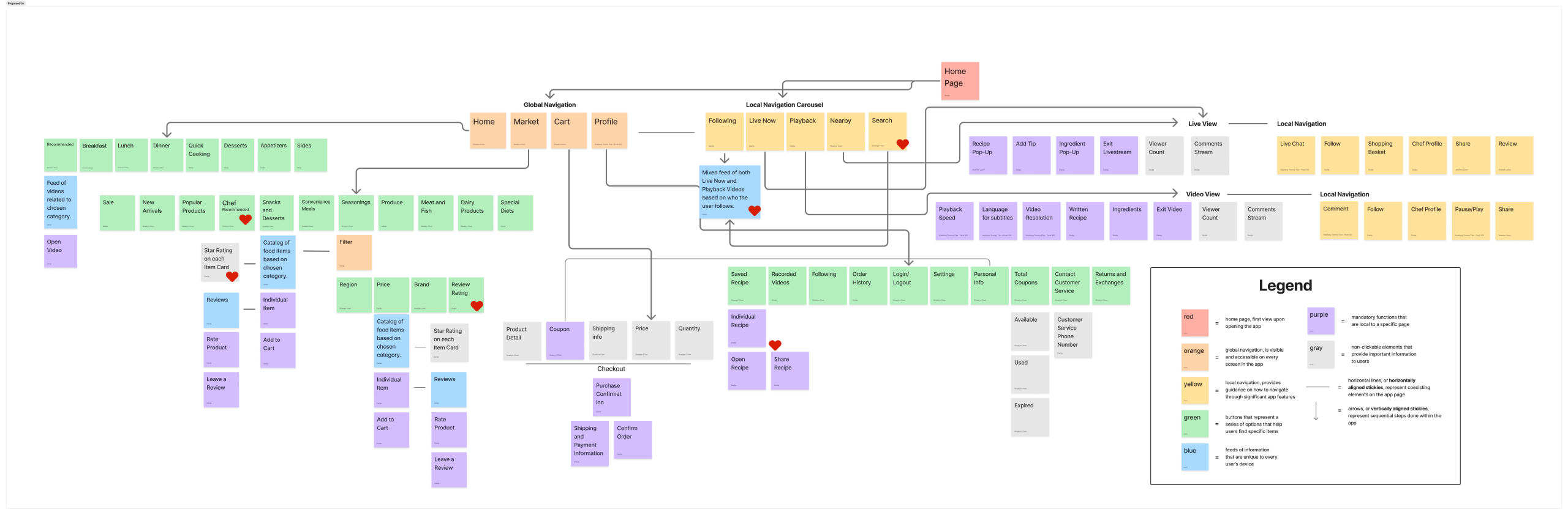
We now have the IA ready, and because I came up with using Yami as a competitor and both of the other groupmates have agreed with me, I was responsible for designing the profile section and the cart.
The reason I was also responsible for designing the cart is due to arrangement of workload, that each person should do at least 2 sections, so besides profile I choose cart, since cart and profile are the end of our task flow and I decide to finish up the conclusion parts for my team!
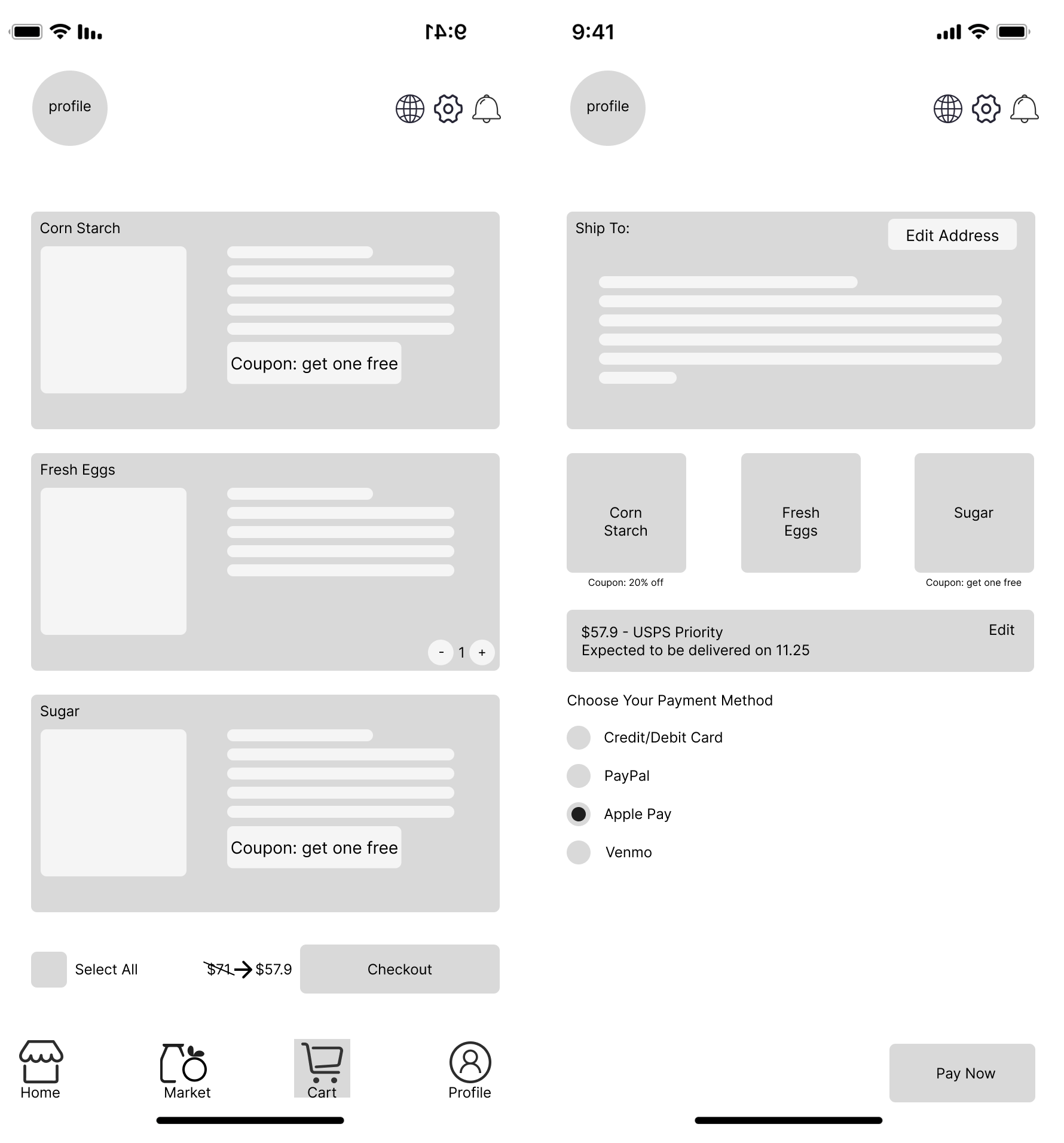
For cart, it is easy to design, since its basic logic is select the items you want to pay, enter your address, select the payment method, and you are all set, and the design of the low-fidelity prototype is pretty straightforward:
Now we move onto the low-fidelity prototypes of profile:
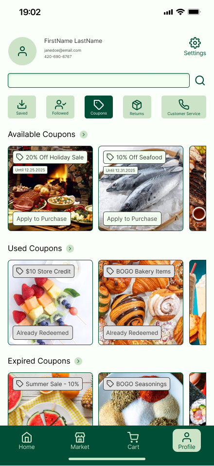
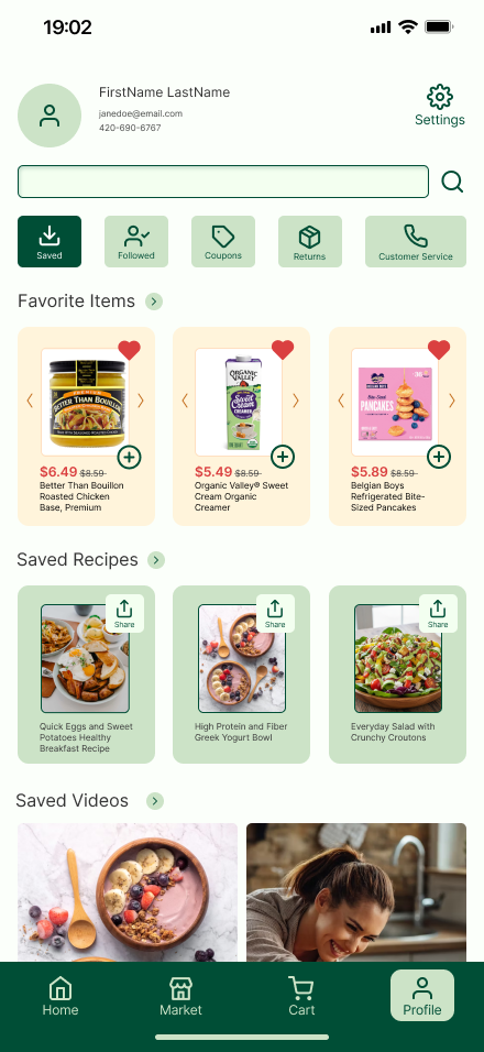
Below is the first version of profile: You have a profile picture, and then you have tabs like customer service and saved recipes. Our group focused primary on saved recipes, saved videos, and available coupons as part of our task flow. When you first click profile, I want it to give users some recommendations, like what are on sale that you might feel interested. So on the recommendation page, we have your past orders and on sale.
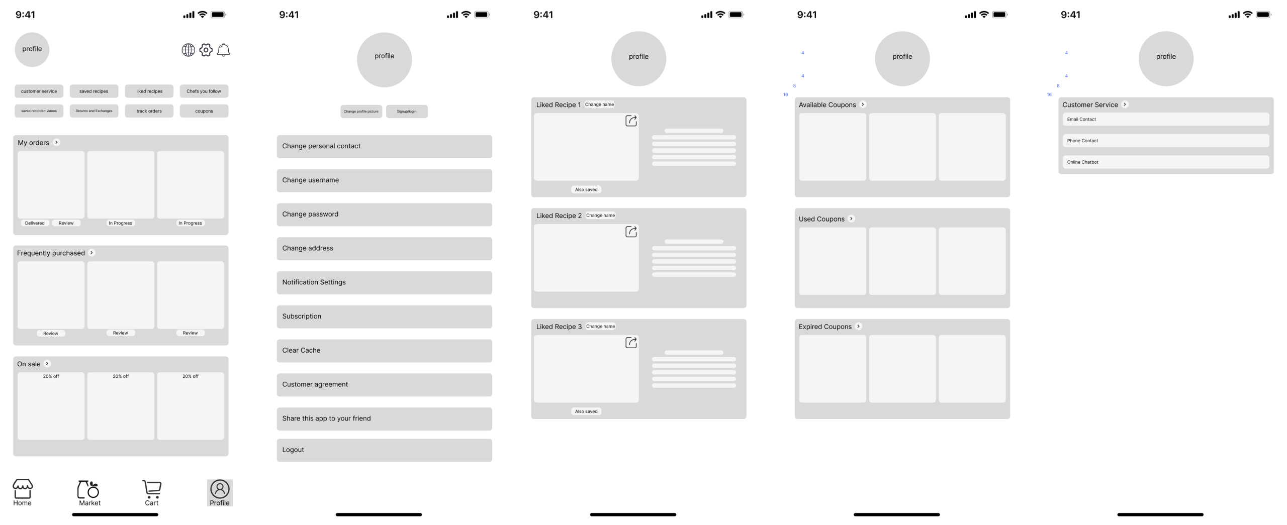
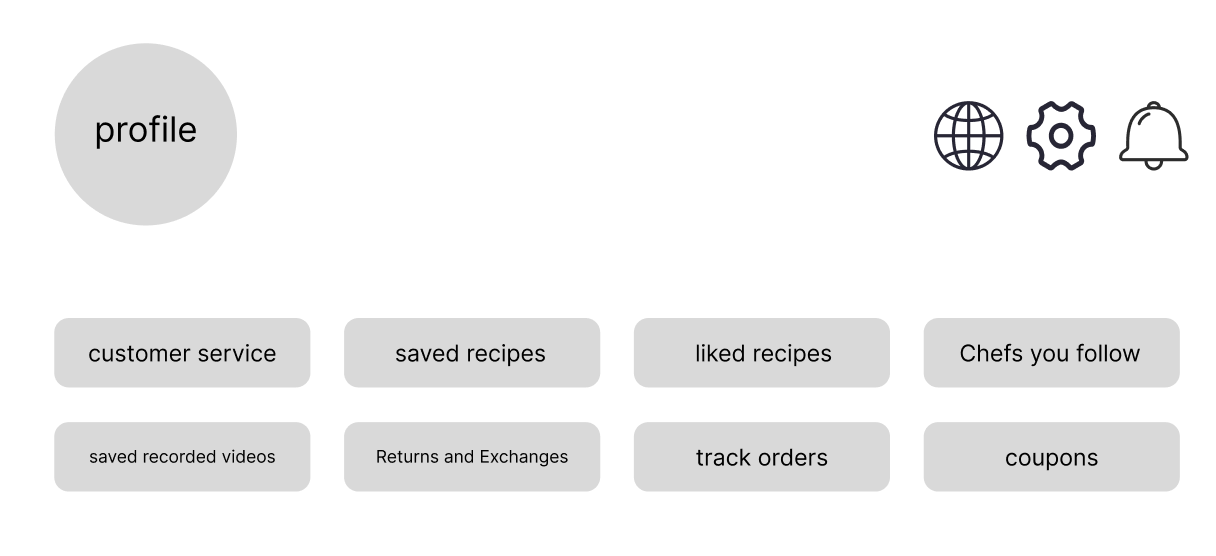
Then, based on what our group’s focus is on, I decided to keep only the recommendation page, the saved videos page, the saved recipes page, and the available coupons page.
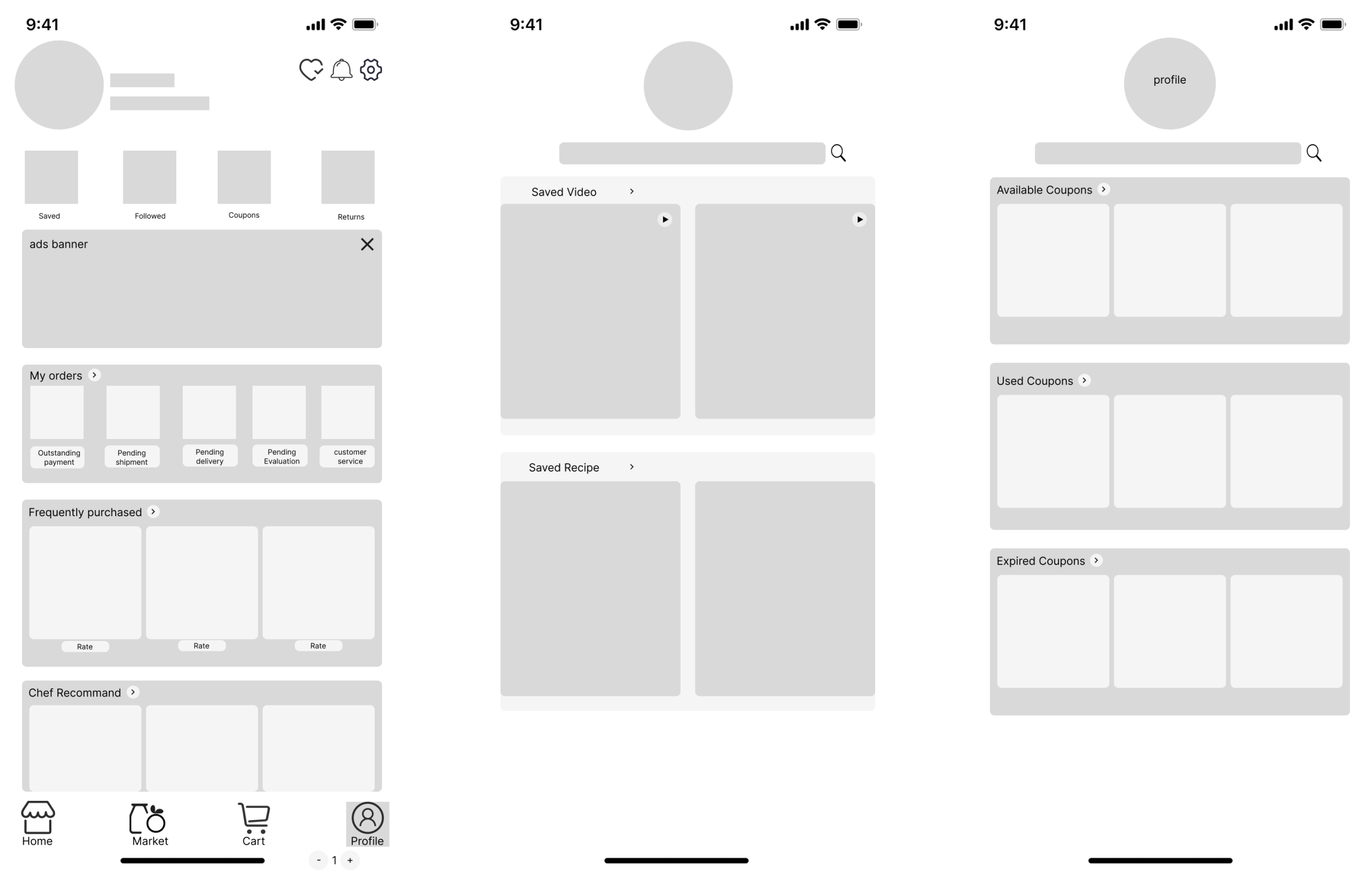
I was also responsible for designing the desktop version, basically it still have the same structure, but because of its wider screen, you can display multiple contents in one page without folding them away.
Now it’s time for the final prototype, or the result.
Here is our group’s design guide:
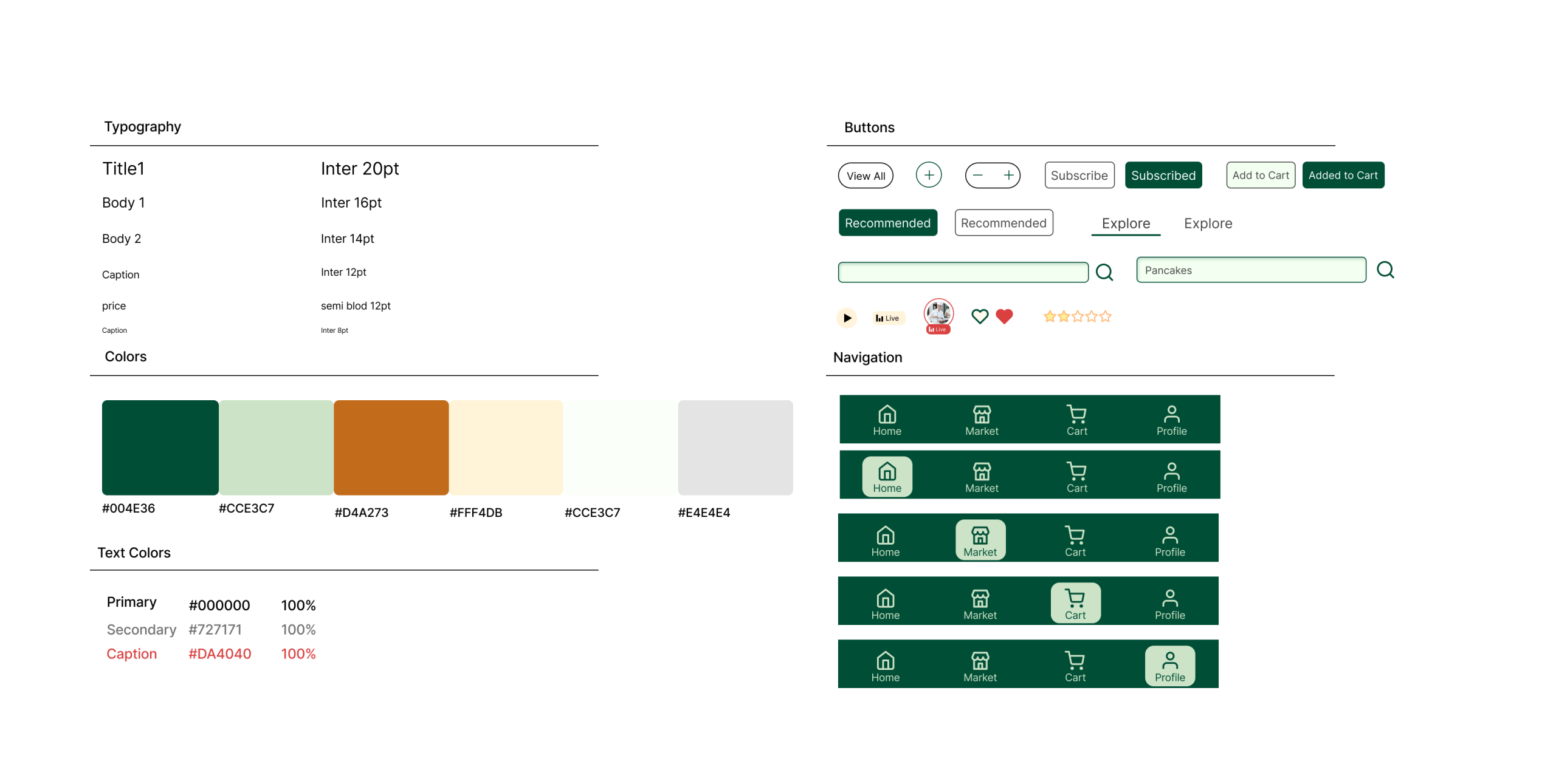
Time to give the low-fidelity versions color and graphic designs!
For the cart session, I decided to add “…more for free shipping” function, it’s very common in online grocery apps nowadays:
Under the checked items you will see available coupons.
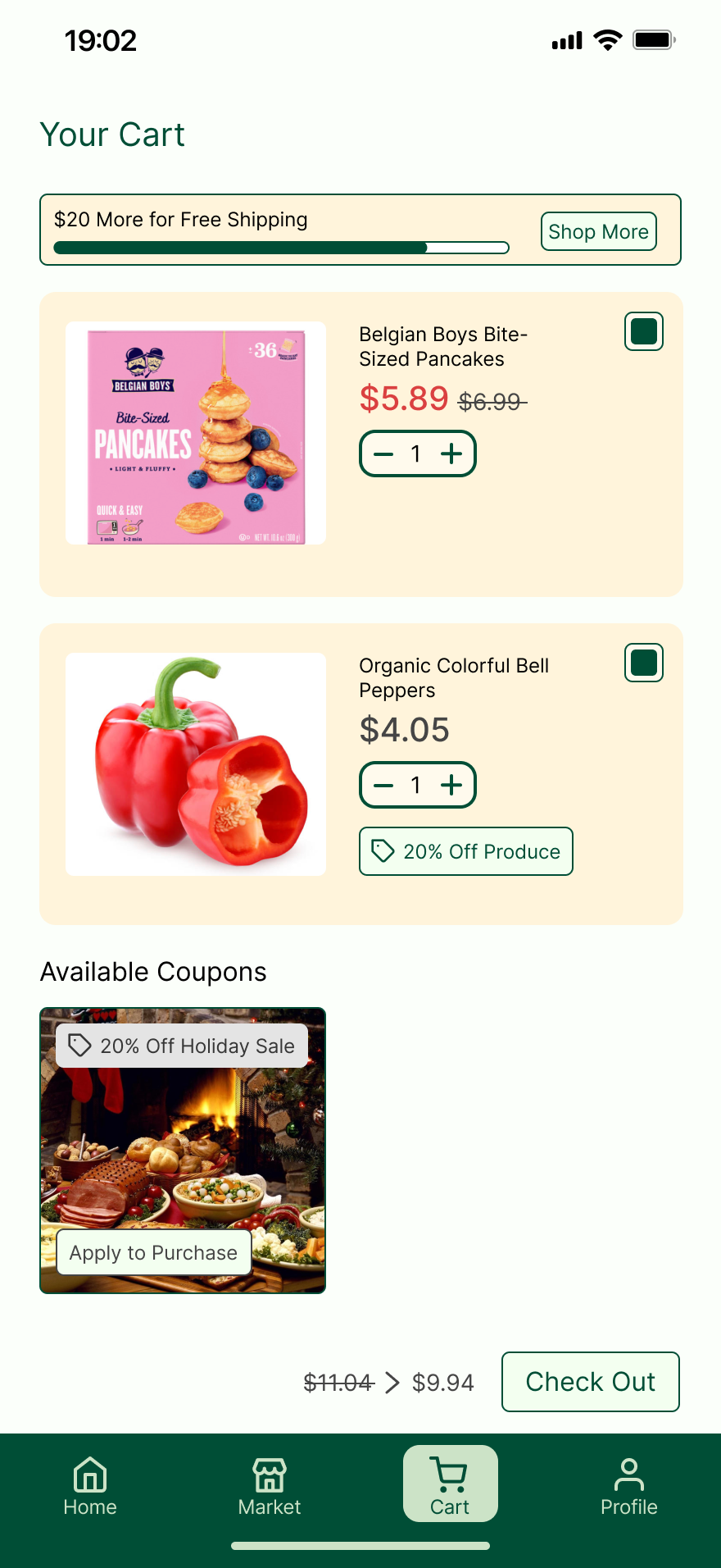
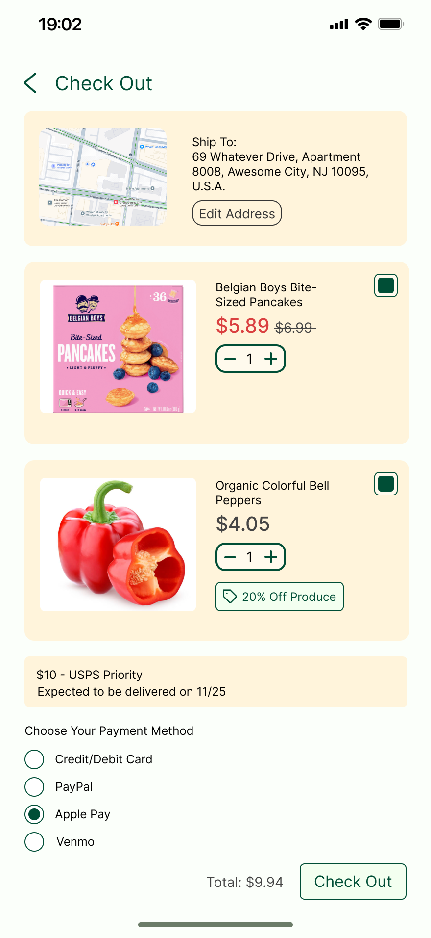
Then you click checkout, you may choose to edit your address if you think it is wrong, and then, select the shipping method and the payment method, and you are all set.
Here comes the profile page, I decided to add a search function so if you want to search for a specific setting, just type and search, and directly jump into that setting, this can be very efficiency if you know what you want to modify on your profile.
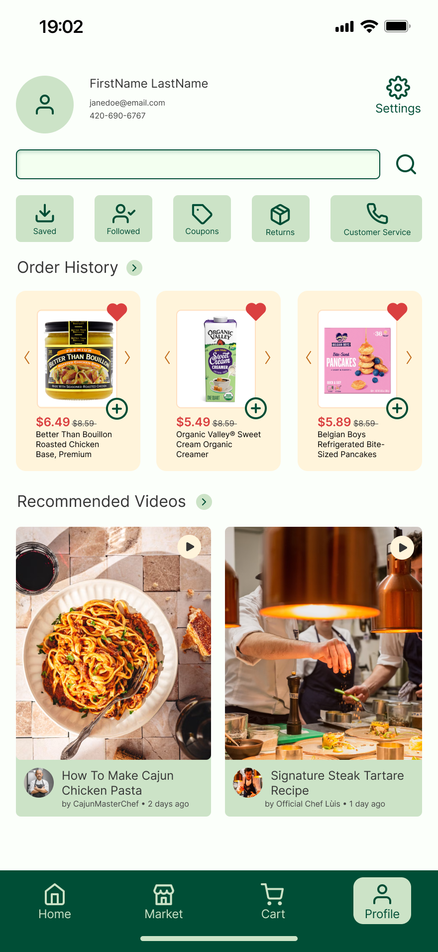
Click saved to see your saved recipes and saved videos! If you want to share your recipes to your friends just directly click the share button, I decide to include this function since it’s straightforward and convenient.
Click coupons to view your available coupons, used coupons, and expired coupons. The categorization is clear, and for available coupons, I labeled them green, for used and expired coupons (unavailable coupons) I labeled them grey, which creates a distinct difference between them and let customers distinguish.

Final Prototype Link: https://www.figma.com/design/pmtqY2jI3ykCUQNAWFTIhD/643-prototype?node-id=676-259&t=OCPDHNPFEOy5D4T5-1
Conclusion
What was the conclusion? Explain how the final product was delivered, describe its reaction, and identify some next steps.
Every good story needs an ending – what was the conclusion of your process? If you got feedback from the client, what was it? If you were to continue working on the project, what would you do next? Looking at the entire project, what were the major lessons or takeaways?
The conclusions are:
1. It is important to carefully compare and contrast your competitors, carefully analyze what do their features have in common with yours and how do those features succeed, however, when designing your app, do not copy everything, since your app is likely to be different from your competitors; use the features that have advantages and have your own ideas of how it will work properly.
2. It is okay to made modifications while you are proceeding with your designs, it is always a good thing to improve with new features that increase the efficiency for customers when they use the app; however, do not keep changing the design fundamentally, plan carefully before you actually start designing so you understand what you are actually designing.
3. Group work is always important and you have to persuade your groupmates to have the same thoughts with you wile making important decisions like how should we design the fundamental structure of the app; be sure to persuade them with evidence and analysis.
4. One feedback from the clients is our profile page does not look like a profile page, however, our explanation is, we did label the profile picture, the contact, and the customer service button clearly, what we did was just making it more accessible for your complete profile information.
5. In the future, we might make the app more complete, for example, adding more functions such as the customer service section so the app functions completely!