Team: Grace Ho, Isadora Oh, Jeffrey Yang
Role: AR Product Design
Timeline: 8 Weeks
Tools: Figma, HTML/CSS/JavaScript
Setting the Stage: The Invisibility Problem
Most of the world experiences sound as an immediate, invisible force. But what if we could give sound a physical, spatial presence? This project began with a simple yet profound question:
“How can we make sound universally legible, transcending technical jargon and the limitations of traditional hearing?”
The goal was to move beyond the decorative, bouncing bar graphs of old-school visualizers and create a tool that is genuinely intuitive, informative, and inclusive.
| Standard Visualizers | EchoSpace AR Experience |
| Too Technical: FFT analysis, spectrograms | Intuitive: Shape, motion, and spatial cues |
| Statix: Confined to a 2D screen | Dynamic: Real-time 3D models interacting with the environment |
| Inaccessible: Relies heavily on color/motion | Inclusive: Built-in colorblind and low-motion modes |
Decoding the Challenge: Giving Sound a Shape
Our core challenge wasn’t just to make something pretty; it was to establish a reliable, consistent visual language for an invisible phenomenon.
“How might we create a universally readable, calming AR experience that teaches users to ‘read’ the language of sound—pitch, volume, and rhythm—without cluttering their real-world view?”
This required balancing two seemingly opposing needs: deep, meaningful data translation and a minimal, non-intrusive user experience.
Initial Explorations: The Sketchbook Phase
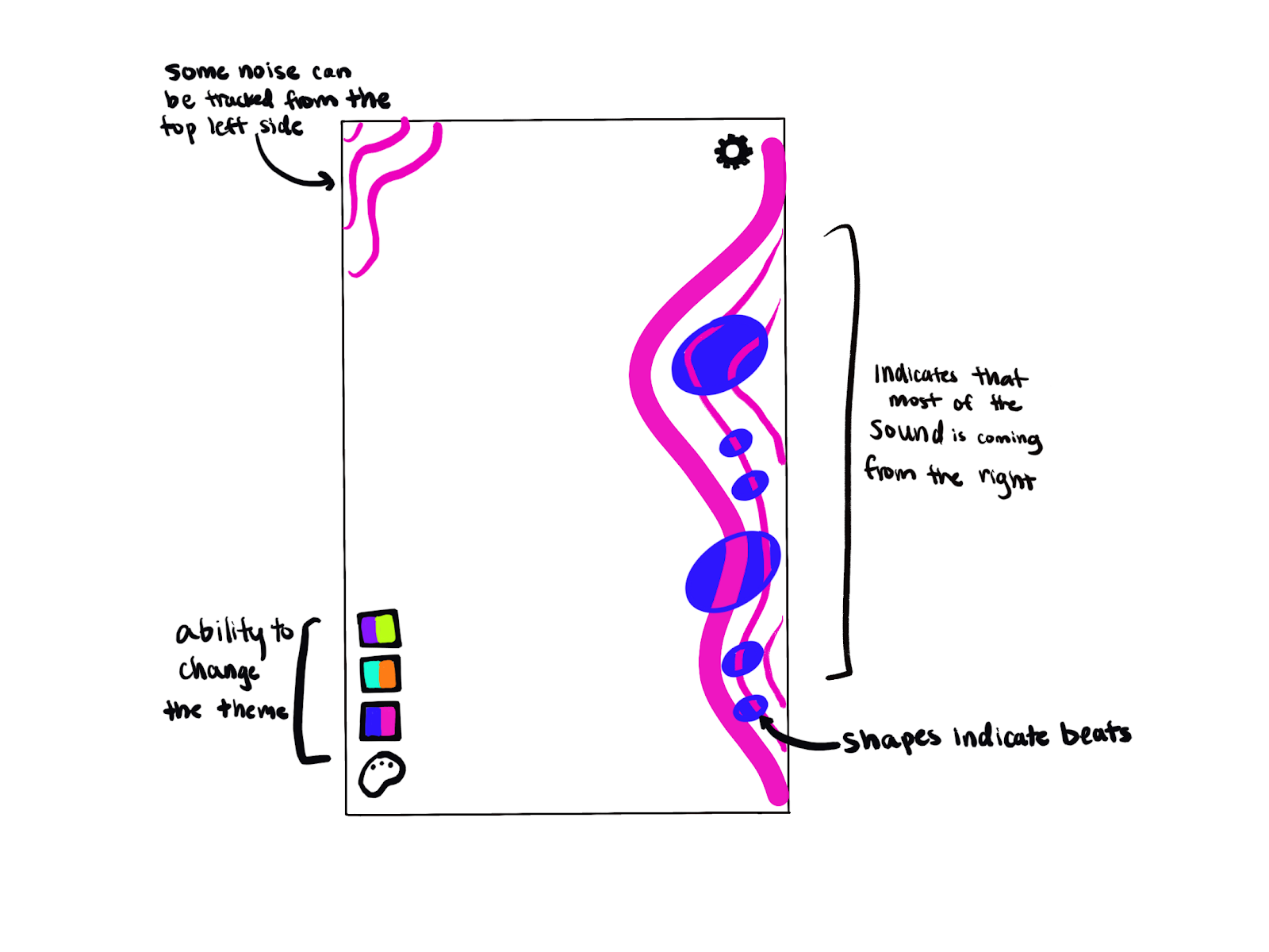
This is where the magic (and the mess!) begins. We leaned into abstract, particle-based forms to represent the transient nature of sound waves.
- Initial sketches explored how pitch could correspond to vertical height, volume to size/density, and rhythm/beat to a sudden pulse or ripple through the form.
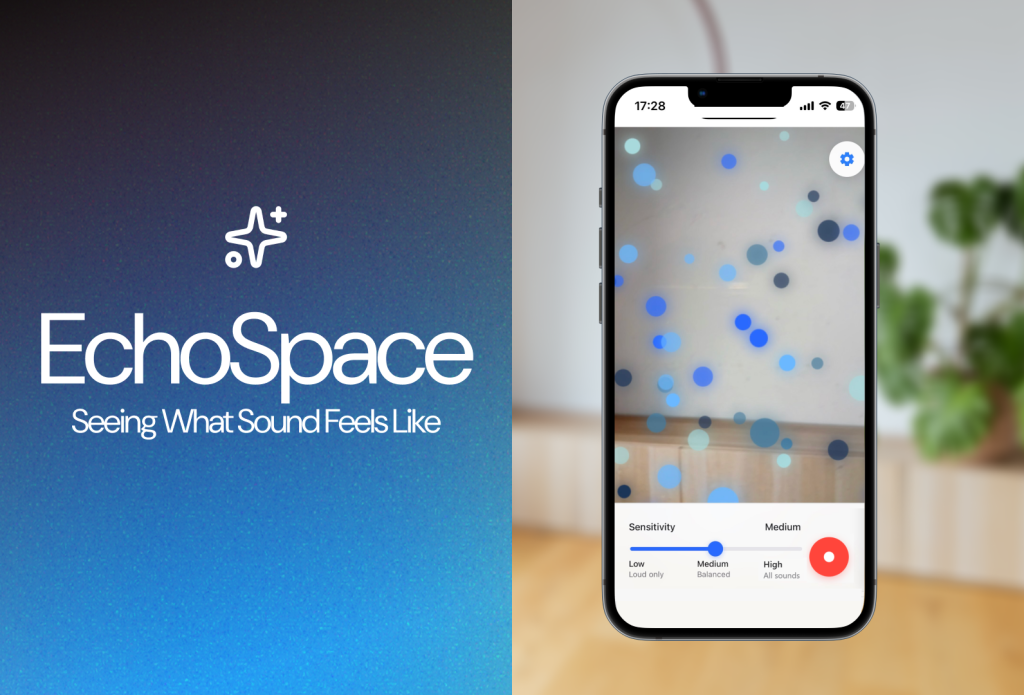
- We committed early to keeping the Heads-Up Display (HUD) minimal, pushing all interactive elements (settings, record button) to the absolute periphery of the screen. The center stage belongs to the sound visualization itself.
Initial Explorations: 1st Iteration Design
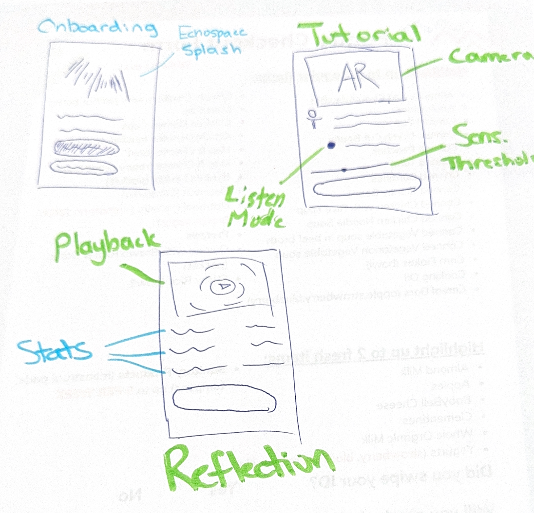
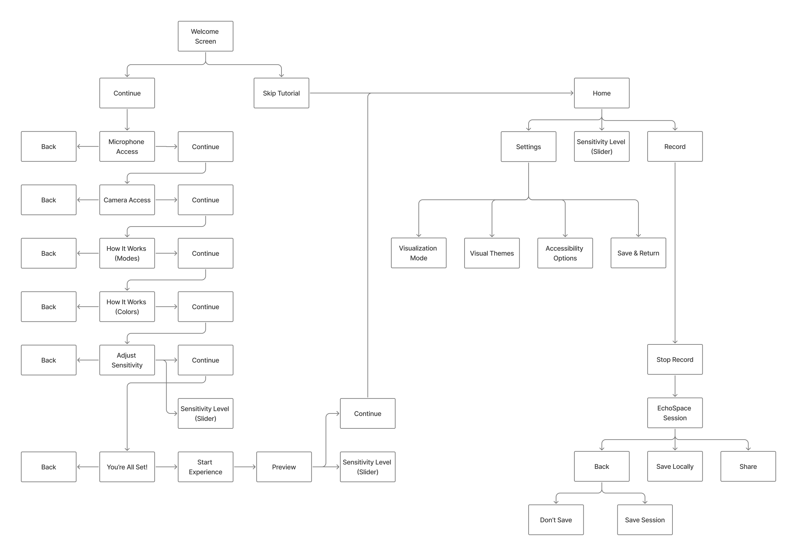
We built a simple, clear flow:
- Onboarding
- Live AR Session
- Review
We committed to a minimal UI, pushing elements to the edge of the screen to keep the AR space open and clean.


A Reality Check: Discovering the 1.0 Experience Blind Spots
After developing the 1st iteration prototype, we conducted moderated user tests with two users: SC and WL. This process confirmed the excitement around the concept but immediately exposed significant usability failures around feedback and clarity.
Key Insights & Pain Points
The tests revealed a critical “feedback gap” where the system failed to communicate its status, leading to user confusion and immediate drop-off.
| Design Flaw in 1st Iteration | User Feedback Summary | Action Items |
| No Microphone Feedback | W: “Hard to tell if the mic is actually on.” Expected “some kind of pulse or movement when I talk.” | Introduce a visible, real-time sound meter/pulse. |
| Silent Failure Modes | W: Interface didn’t explain why visuals weren’t responding (permissions, low volume, etc.). | Add contextual error messages and pre-text warnings. |
| Disorienting Scale | S: “Scale of the effect seems slightly off.” Wanted a smaller effect to allow more room for “travel.” | Calibrate the AR model to be smaller/less aggressive upon launch. |
| Mirroring Camera View | S: Found the mirrored camera “disorienting” as it wasn’t a true representation of the space. | Change default to non-mirrored, true AR view. |
| Onboarding Engagement | Sam skipped the tutorial; Wendy wanted to customize visuals during the tutorial. | Integrate interactive customization into the onboarding flow. |
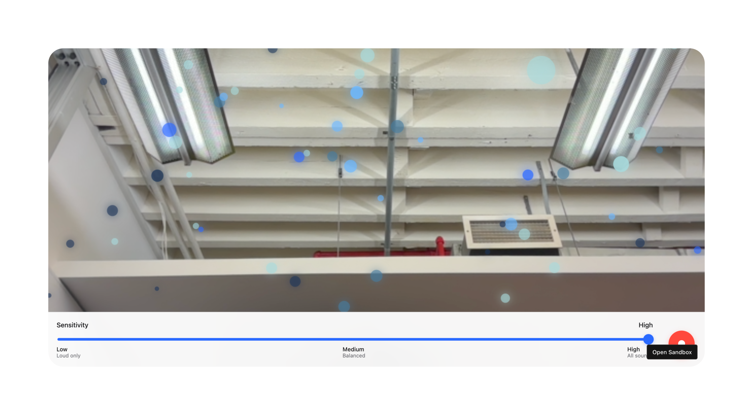
Iteration Two: Bridging the Feedback Gap and Calibrating Scale
The insights from testing were clear: users need instant, constant affirmation that the system is working before they can explore the deeper creative functionality. The 2nd iteration focused entirely on visibility, feedback, and scale correction.
Actionable Refinements in the 2.0 Design
We embraced the philosophy of “always be listening” and “always be transparent.”
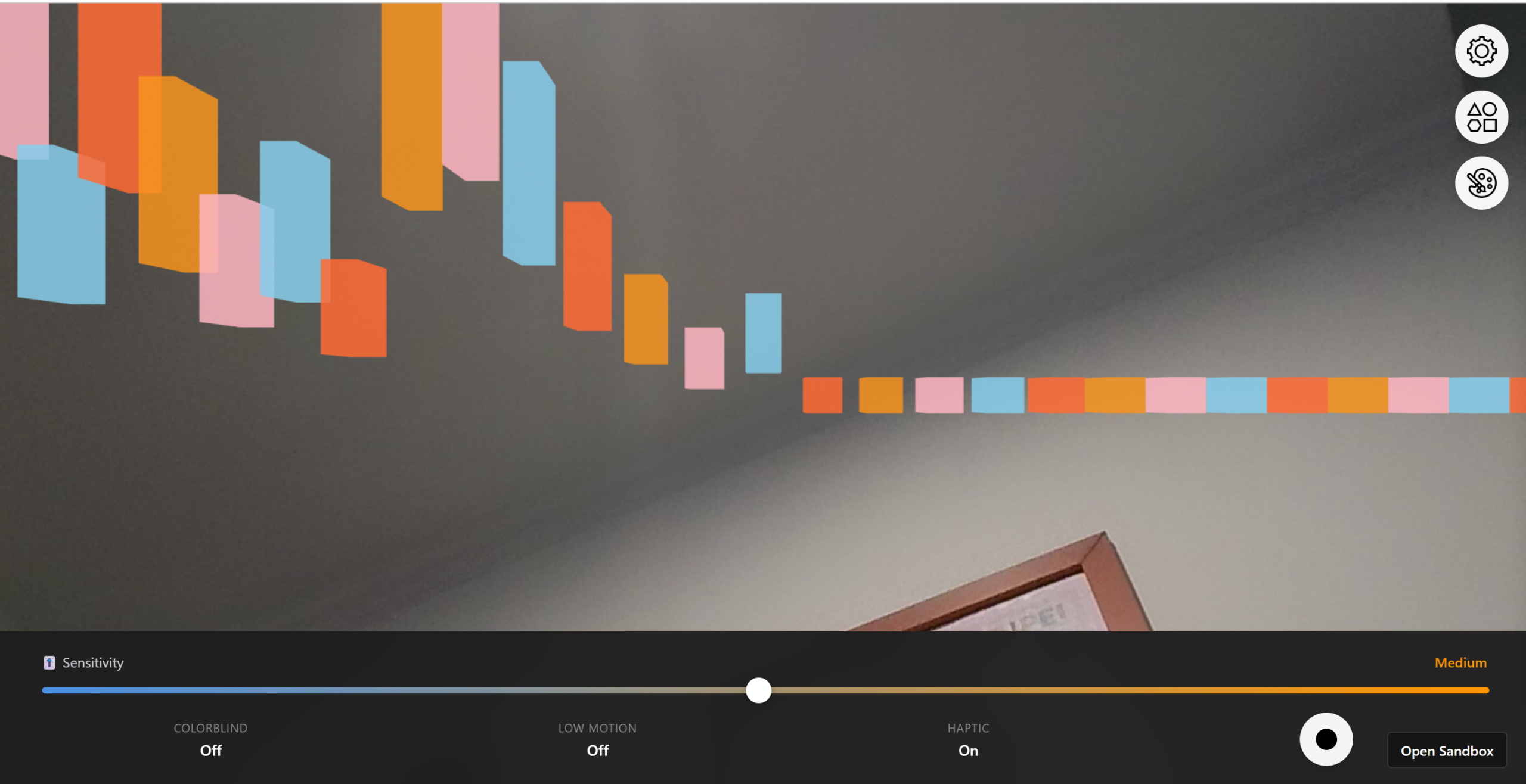
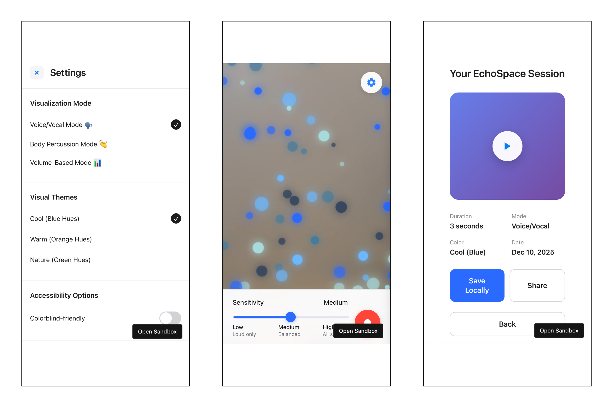
- The Visible Microphone Meter: We added a subtle, pulsing sound meter to the bottom edge of the screen. Even if no 3D visualization is active, this meter provides instant feedback that the app is listening and processing audio.
- Contextual Permissions Pre-Text: Before the AR view loads, we introduced a splash screen that clearly states: “EchoSpace needs camera and microphone access to transform sound into AR visuals. Please allow permissions.” This fixed Sam’s initial friction point.
- The Small Start: We adjusted the default AR visualization scale, so the effect begins smaller and more contained (closer to “a finger scale”), allowing users to observe its growth and movement across the environment more effectively. This reduced the initial feeling of being overwhelmed.
- “True View” Default: The camera feed was changed to a standard, non-mirrored view, eliminating the confusion Sam experienced and ensuring the AR visuals aligned exactly with the user’s real-world perception.
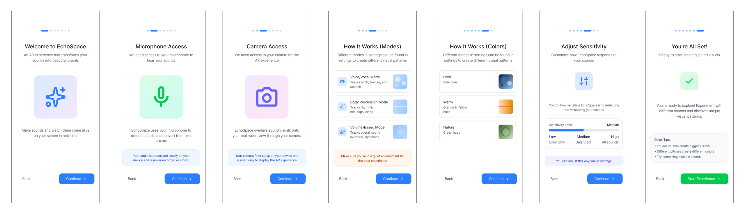
- Interactive Onboarding: The guided onboarding now includes a step where the user is prompted to change the visualization’s color and texture after they confirm the system is reacting to their voice. This immediately taps into the creative potential Wendy noted.
Architecting the User Flow: Comfort and Predictability
We knew an AR app could easily overwhelm users. Our 2nd iteration focused on predictability in an unfamiliar space. The updated interaction flow was designed to be linear and low-friction, moving the user smoothly from setup to live visualization.
- The Onboarding Script: This couldn’t just be a tutorial. It had to be a Guided Calibration. We tested prompts like “Clap your hands” (to calibrate for sharp transients) and “Speak a short sentence” (for pitch and volume range) to ensure the AR model reacted instantly and appropriately.
- Persistent Visual Anchors: We decided on a subtle, fixed ground plane visualization to ground the ephemeral visual models in the real environment, reducing AR motion sickness.
Visual Refinement: The Aesthetic of Calm
For our second iteration, we introduced smooth motion curves and soft, emissive lighting to maintain a calming, almost meditative atmosphere, even when visualizing intense music. This was crucial for our accessibility goal—it needs to be relaxing, not a source of sensory overload.
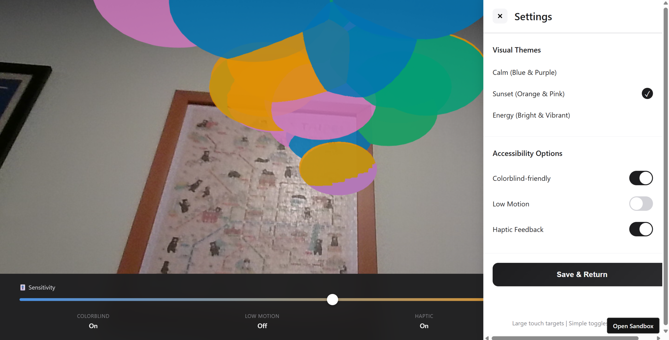
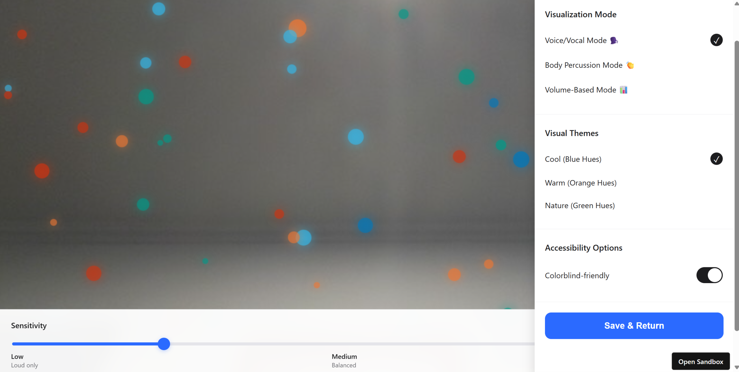
Designing for Everyone: An Inclusive Foundation
For an experience designed to make sound accessible, accessibility can’t be an afterthought. It must be foundational.
Inclusive Design Defaults: Beyond the Standard Checklist
We prioritized options for users who may be Deaf, hard-of-hearing, colorblind, or prone to motion sickness.
- Shape & Motion over Color: Our visualization’s primary data communication is through shape and kinetic motion, not color. Color is secondary (e.g., for ‘mood’ or ‘theme’).
- The Low-Motion Pledge: An optional mode that cuts out rapid or high-contrast pulsing effects, replacing them with slow, measured shifts in luminosity and shape transformation.
- High-Contrast & Colorblind Modes: Custom palettes were created and tested against various forms of colorblindness to ensure shape/size differences remained the dominant feature.
Final prototype
Impact and Future Soundscapes
EchoSpace isn’t just a visualization tool; it’s an empathy tool. By translating the invisible into the visible and tangible, it expands how people perceive and interact with the world around them.
The early response has highlighted its utility:
- For the Artist: A new lens for composition, seeing how their sounds occupy physical space.
- For the Educator: A powerful teaching aid to explain acoustics and music theory with physical examples.
- For the Everyday User: A meditative, calming AR experience that connects everyone, especially hard of hearing users, more deeply to their environment.
This project was a fantastic test of how technical tools (AR, real-time data processing) can be filtered through a user-first, human-centered lens to create an experience that is both delightful and deeply meaningful.