OpenLab City Tech is a platform for faculty and students to access their school work or any resources they may need while attending or working at the institution. This case study revolves around creating better accessibility for OpenLab City Tech’s Directory pages via desktop and mobile.
GOALS
Tasked with doing an accessibility audit of OpenLab City Tech’s Directory Pages (Courses, Projects, Clubs, Portfolios and Resources pages), our goal was to provide solutions to the visual design and accessibility issues we discovered within the audits conducted.
ACCESSIBILITY CHALLENGES
Accessibility challenges among the directory pages included problem areas within the main navigation, the hamburger menu and the filter forms. There were issues mostly when it came to the screen reader, VoiceOver function, focus indicators and tab order.
My Role
10 Audits, 3 User Flows and 3 Redesigns Later…
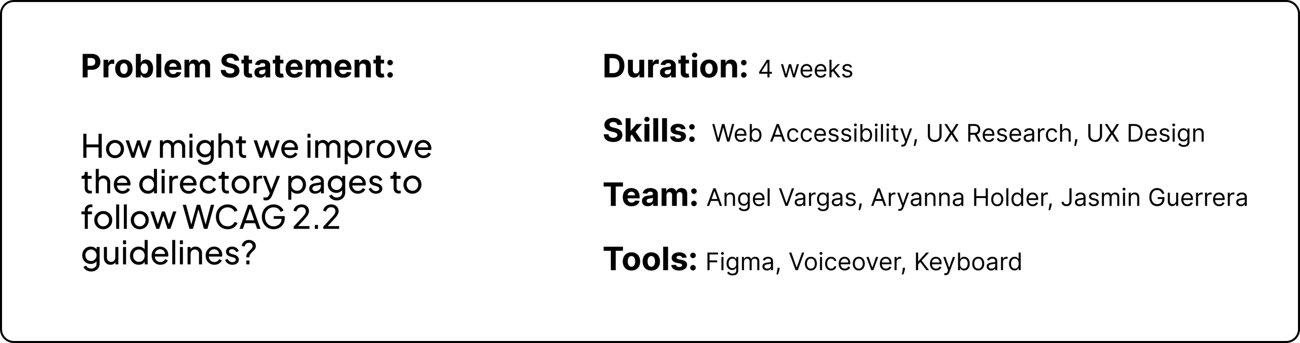
My role included doing an audit of the five directory pages with my team. These pages included the desktop and mobile versions of the Courses, Projects, Clubs, Portfolios and Resources pages, which then resulted in 10 final annotations. My role also included conducting secondary UX Research of users’ accessibility needs, whether it be researching information about City Tech students with disabilities or general assistive technology. The next step of my role was to analyze all WCAG 2.2 Guidelines to see which guidelines were not applicable, were met and not met. From these results, we were able to see what issues remained, and I was assigned finding 3, which involved the hamburger menu. I created all three user flows and then conducted a redesign of the hamburger menu, specifically regarding the desktop version, as the issue did not exist on mobile.
The Process
Researching More Accessible Ways to Empower the Recommendations Needed
1. Researching & Building the Persona
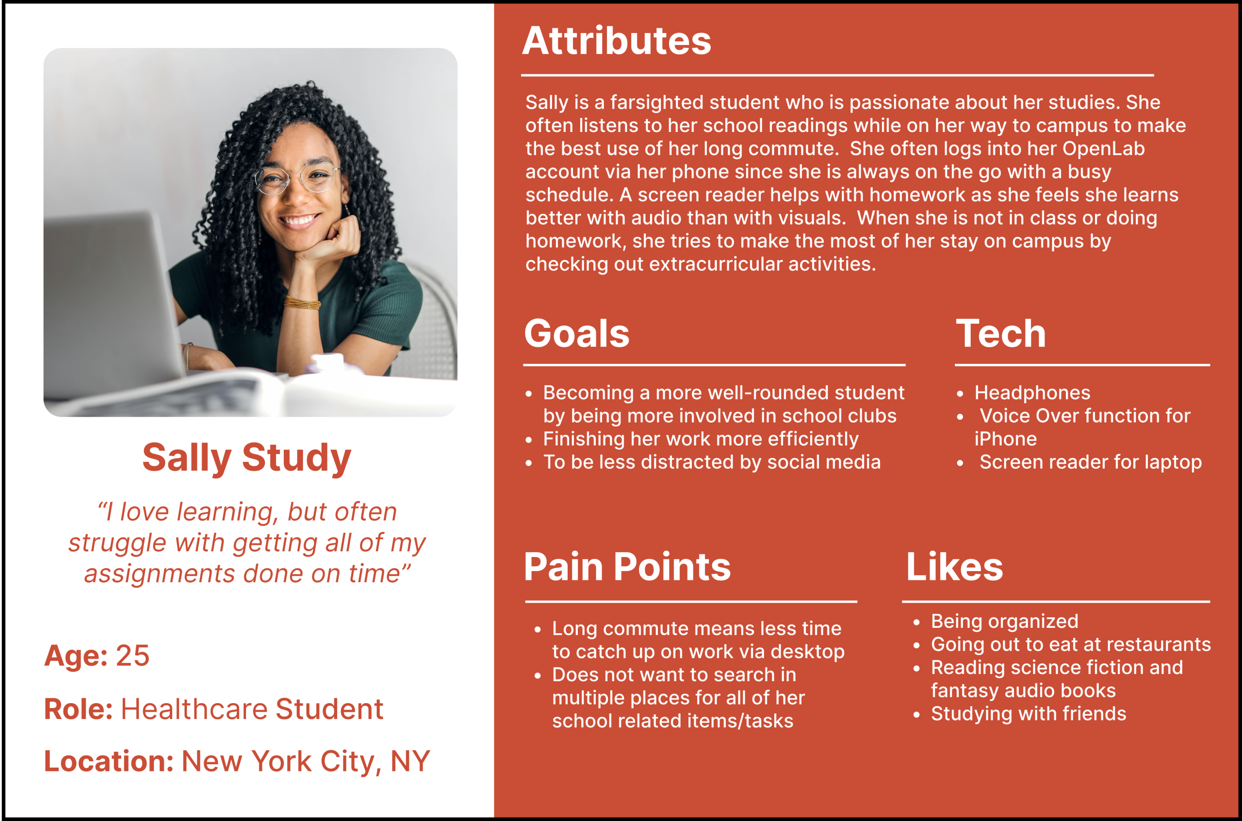
Research included the biggest disability groups among students in higher education, the top disability groups in CUNY, and diverse assistive technologies among users. This secondary research led to the construction of a persona named Sally Study.
2. Auditing & Revising OpenLab City Tech’s Website
10 audits were then done on the directory pages (desktop and mobile versions). The directory pages included the Courses, Projects, Clubs, Portfolios and Resources.
3. Listing the Key Findings
Analyzing WCAG 2.2 guidelines and summarizing the multiple key findings that were found on desktop and mobile. Of the issues found and listed in this section, only three were selected and then redesigned.
4. Findings, Solutions & Recommendations
Solutions include user flows to allow others to better understand users with disabilities’ point of view. While the recommendations consisted of 3 redesigns that were presented and suggested to OpenLab City Tech’s team.
Research
A Look at Neurodevelopmental Disabilities and Screen Readers
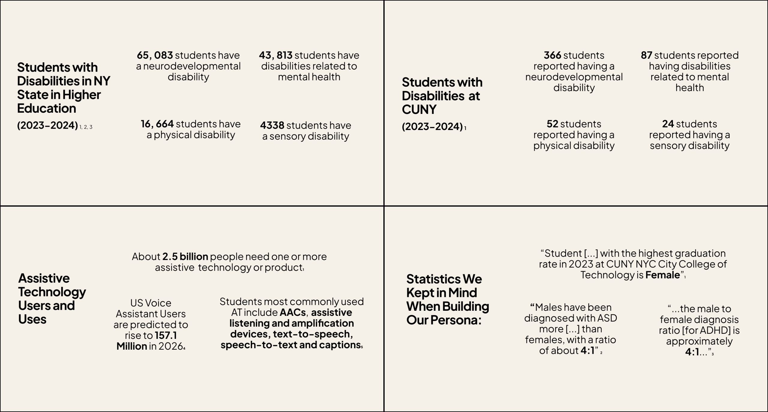
We first proceeded to conduct secondary research to get a better understanding of who uses OpenLab City Tech, as well as the type of assistive technology students typically interact with. Secondary research began by reviewing diverse statistics related to students’ disabilities in higher education in NY State, the four main disability categories within CUNY, which is who OpenLab City Tech serves, as well as additional research on assistive technology. We found that most students had some sort of neurodevelopmental disability, such as ASD or ADHD and that most students, even those without disabilities, had a preference for audio and using screen readers. After doing this initial round of research, we proceeded to create our persona while keeping in mind that women are typically underdiagnosed when it comes to neurodevelopmental disabilities.
Examples of Statistics That Were Presented…
Persona
Users who need more access!
How do busy students like Sally Study interact with their OpenLab City Tech student accounts?
Overall Key Findings
Auditing to Infinity and Beyond!
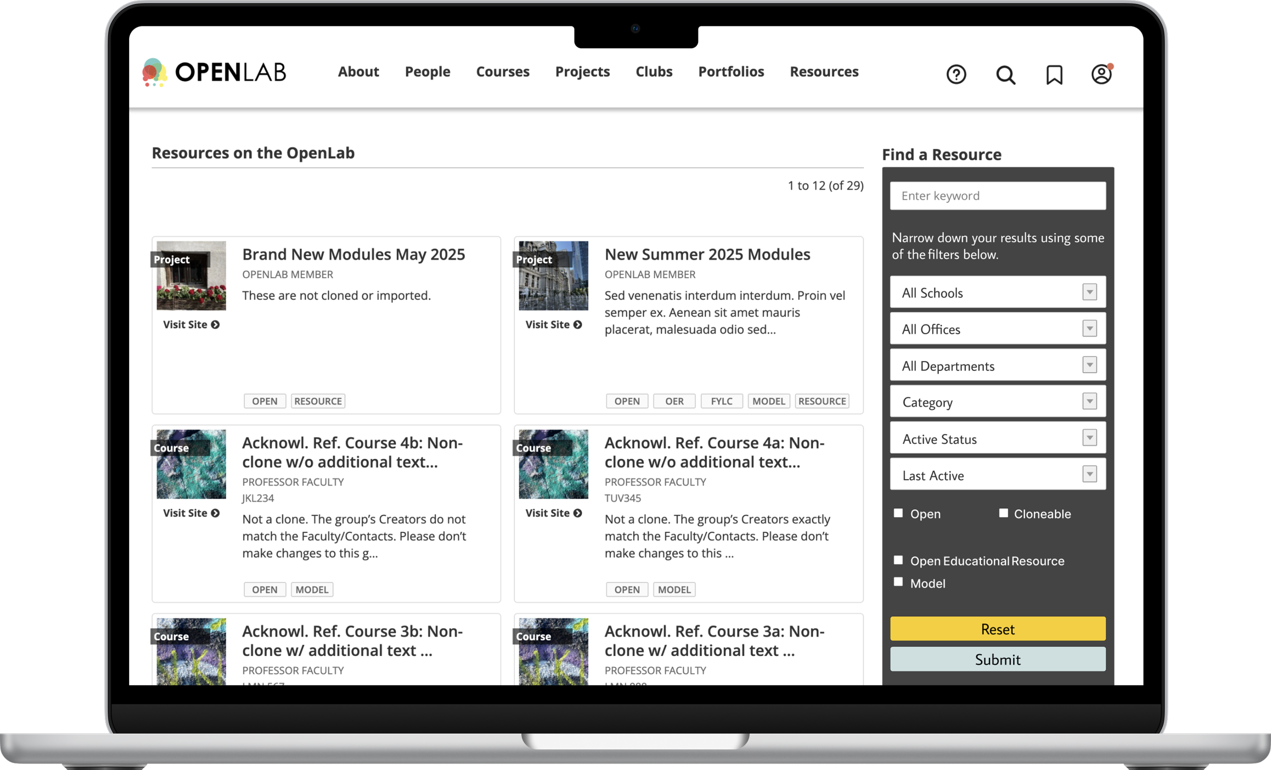
We began by auditing each directory page. OpenLab City Tech has 5 directory pages in total: Courses, Projects, Clubs, Portfolio, and Resources. Both Desktop and Mobile versions were analyzed, resulting in 10 annotations. The annotations analyze the tab order, screen reader, color contrast, focus indicators, semantic HTML and ARIA implementation. These were the main findings within desktop and mobile.
DESKTOP
- Unnecessary Hamburger Menu
- Non semantic HTML (Ex: “Open Button”)
- Some Images have no focus indicators
- Screen reader Filter Form errors (Ex: “All Schools All Schools”)
- Insufficient Color Contrast (Ex: Filter Form Box Color)
MOBILE
- Filter Form is Inaccessible with VoiceOver Function
- Focus Indicator Errors: Splits some tabs in two, focuses on items not located on screen, and focuses wrongly on certain areas
- Insufficient color contrast (Ex: Filter Form Box)
Findings, Solutions and Recommendations
Directing the Directory Pages to More Accessible Ways
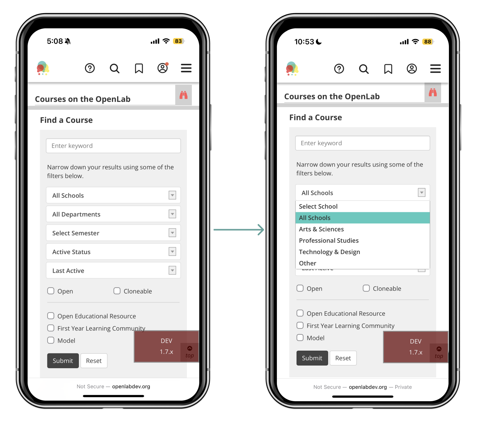
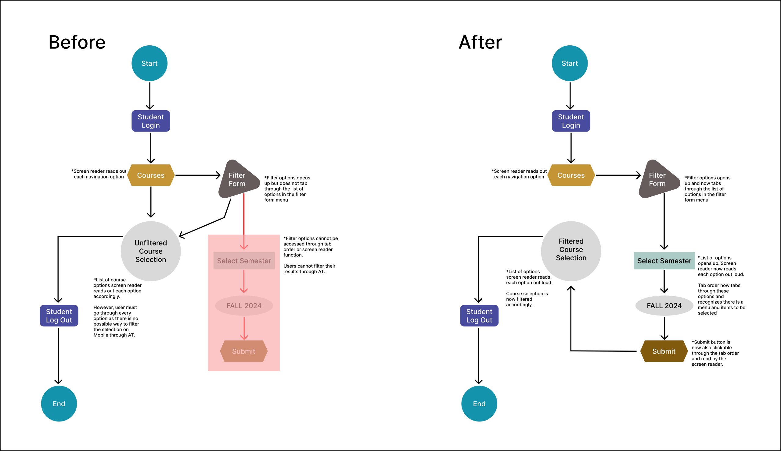
1. Filter Form VoiceOver Function Freeze Out
MOBILE – Tier 1
Finding
The filter form cannot be tabbed through using the VoiceOver function on mobile. This means users cannot fully interact with the filter form, whether it be physically or with audio. This is an issue as it violates WCAG 2.4.3 Focus Order since the options on the filter form are not focused on and skipped over completely. WCAG guideline 4.1.2 Name, Role, Value is also violated since items within the filter form are not read by VoiceOver function while on mobile, either. This is a Tier 1 error as it violates Level A WCAG guidelines and can be fixed simply by giving the filter form at least some form of focus order or audio.
Violates WCAG
- 2.4.3 Focus Order-Level A
- 4.1.2 Name, Role, Value-Level A
Solution
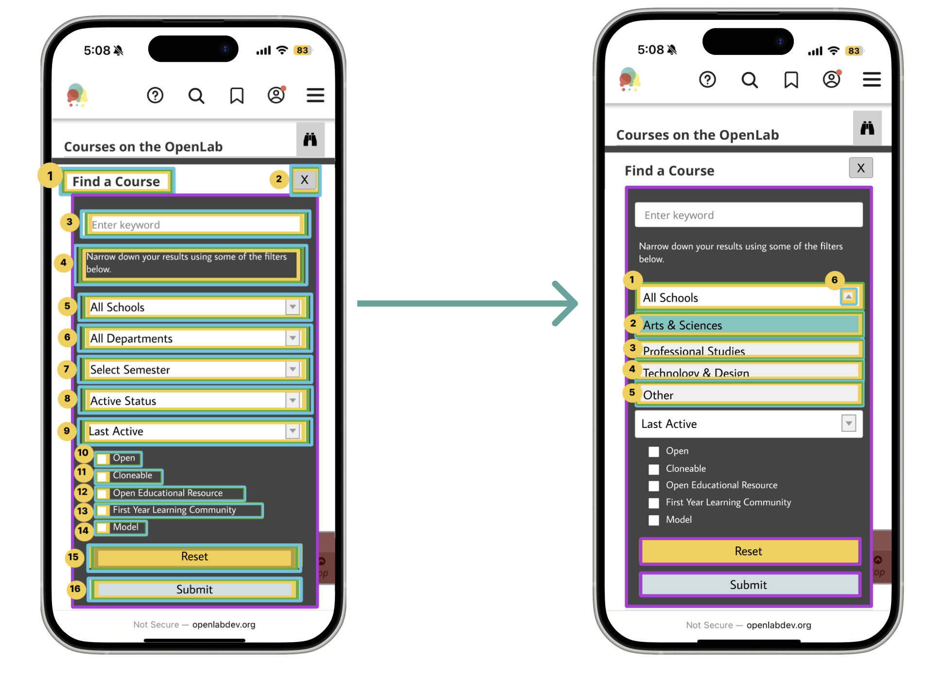
The filter form originally could not be tabbed through or read with the VoiceOver function. Therefore, users could not filter the web page to their needs via mobile. An example of this can be seen in the first user flow, as students would not be able to filter through their courses. The next image on the right reveals a solution where the filter form can now be tabbed through and read aloud, allowing students to filter their courses to their particular needs. This will now allow them to browse more quickly and have an easier time finding the specific items they need.
Recommendation
Our recommendations revolve around improving the color contrast of the filter form box to a darker shade of grey that now passes all WCAG guidelines. The color contrast has also been improved regarding the binocular icon, as it no longer has any shade of red. Instead, it is now black and grey. The reset and submit button have additionally undergone some color changes, resulting in a new shade of yellow and light blue grey.
Font size has also been slightly increased, with the check boxes being reorganized to flow one after the other, top to bottom, instead of being side by side. The menu has also been shortened, with options such as “Select Schools” and “All Schools” being eliminated from the possible list of options. This allows users to tab through fewer sections and promotes sections with the most use. An exit button was then added to prevent users from getting stuck within the filter form area.
Finally, since there was no tab order to begin with, a tab order and audio for the filter forms options were created. Therefore, users with accessibility needs or users who use the VoiceOver function can easily interact with the filter form and all of it’s possible functions.

2. Focus Indicators & Navigation Mishaps
MOBILE – Tier 2
Finding
Focus indicators do not fully or correctly surround certain components. While other elements, such as the Main Content and Admin Bar, are completely obscured from mobile view. Therefore, WCAG 2.4.7 Focus Visible is violated due to the fact that the focus is not always visible on screen. Additionally, 2.4.11 Focus Not Obscured is also broken since there are items that are located off-screen and are not clickable. This is a Tier 2 error due to the fact that both WCAG guidelines that were violated are Level AA.
Violates WCAG
- 2.4.7 Focus Visible-Level AA
- 2.4.11 Focus Not Obscured-Level AA
Solution
The first user flow demonstrates the problem since areas, such as the “Skip to Main Content” and “Skip to Admin Bar,” are located off-screen when on mobile. Users, therefore, cannot see the buttons whatsoever. This results in users who use the VoiceOver function exiting the website, thinking the tab order is most likely glitching or has frozen completely. The second user flow suggests moving up these two options in the tab order, as well as placing them in the top left of the screen so that users can not only see them but also use them when browsing OpenLab City Tech’s mobile version.

Recommendation
The recommendation for solving this error would be to place the obscured elements in the top left of the screen and to allow them to appear one by one. The option “Skip to main content” has also now been changed to the first option in the tab order, while “Skip to admin bar” is now the second option. Color contrast for these two options did not need to be altered, as it passed WCAG guidelines. The “Open” button was also removed only on the mobile version, as it did not provide any extra functionality to the website. It was also removed to prioritize the already very limited space on mobile.

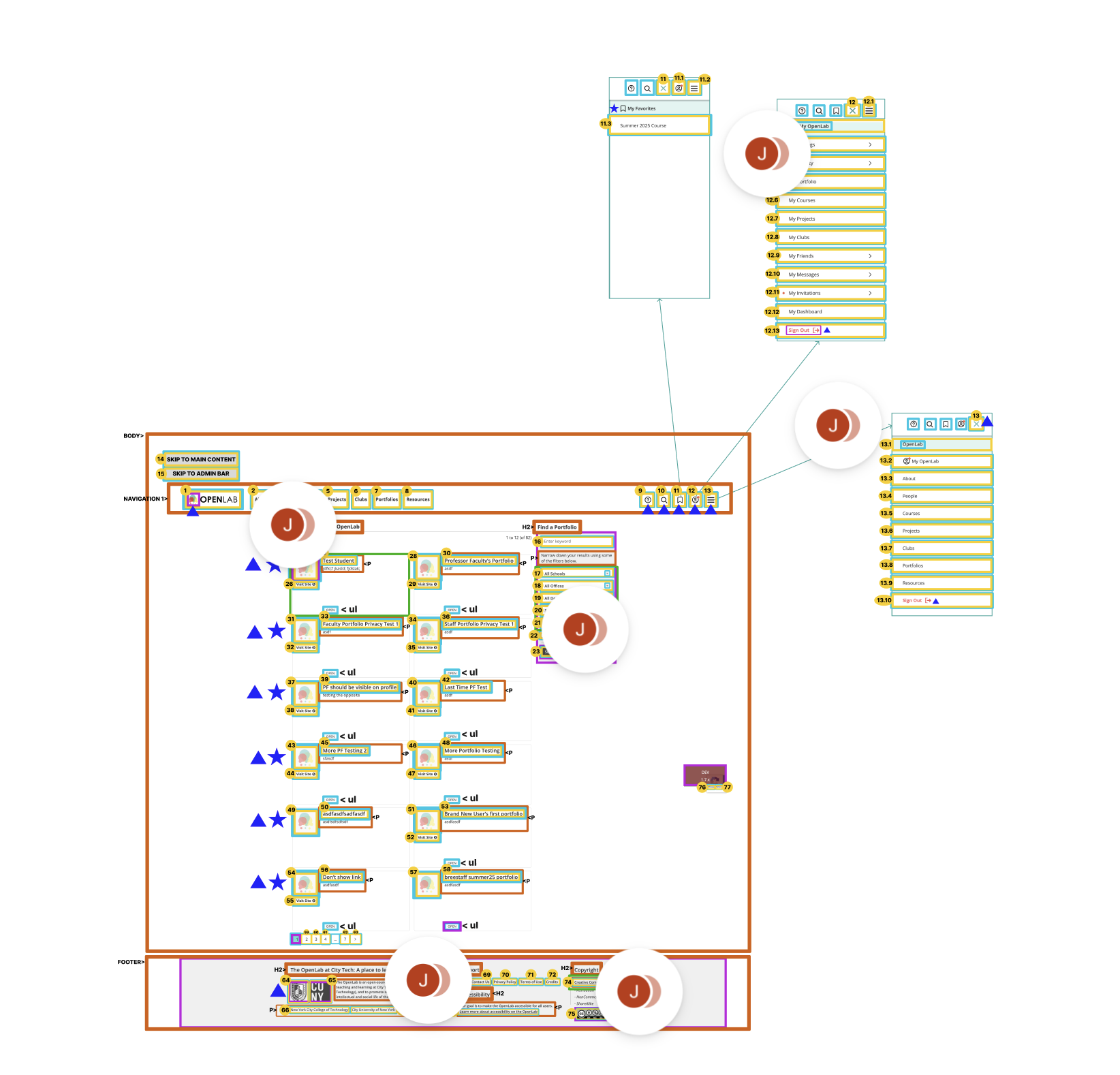
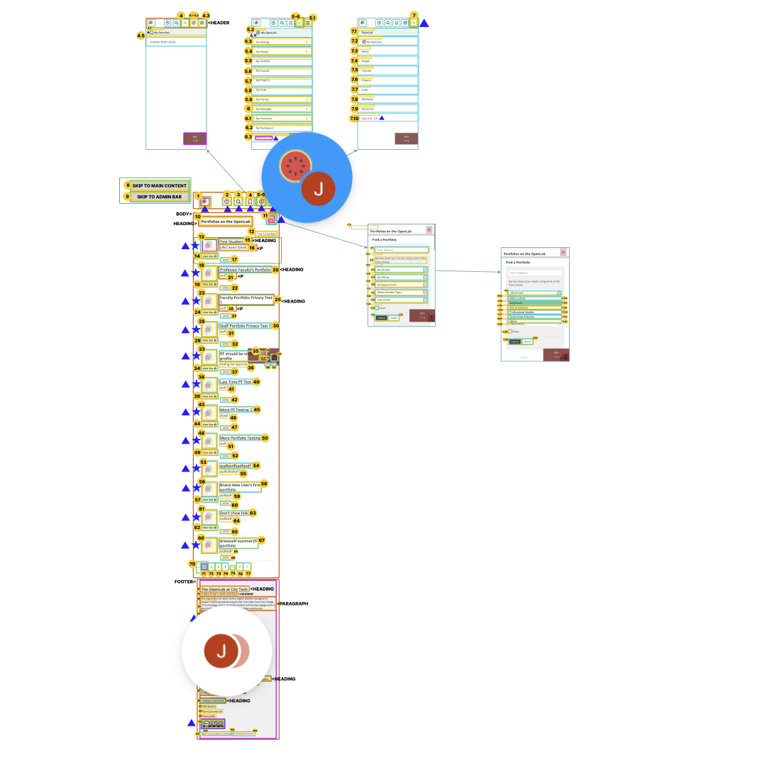
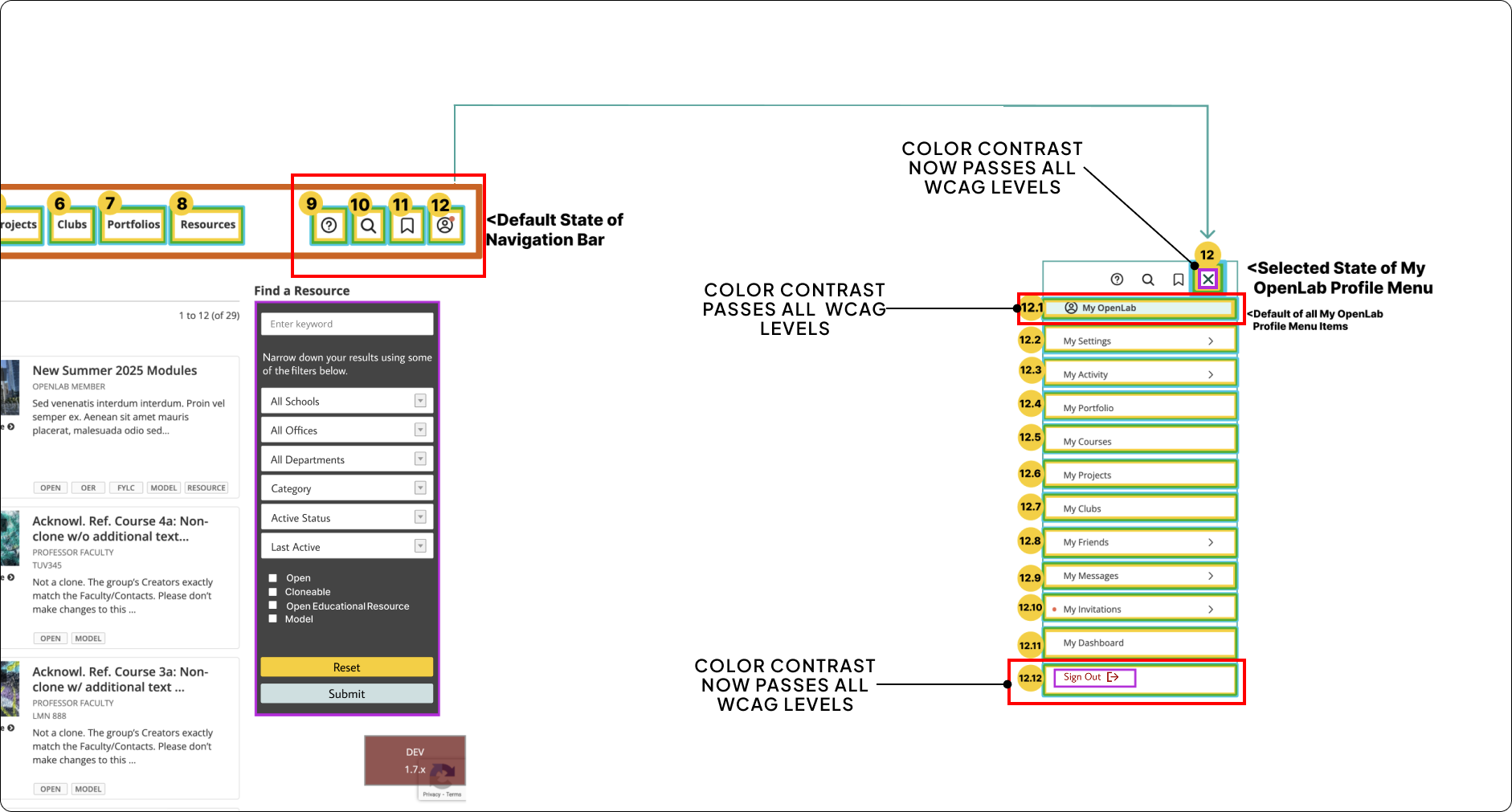
3. Duplication of Options in the Navigation Area & Hamburger Menu
DESKTOP – Tier 1
Finding
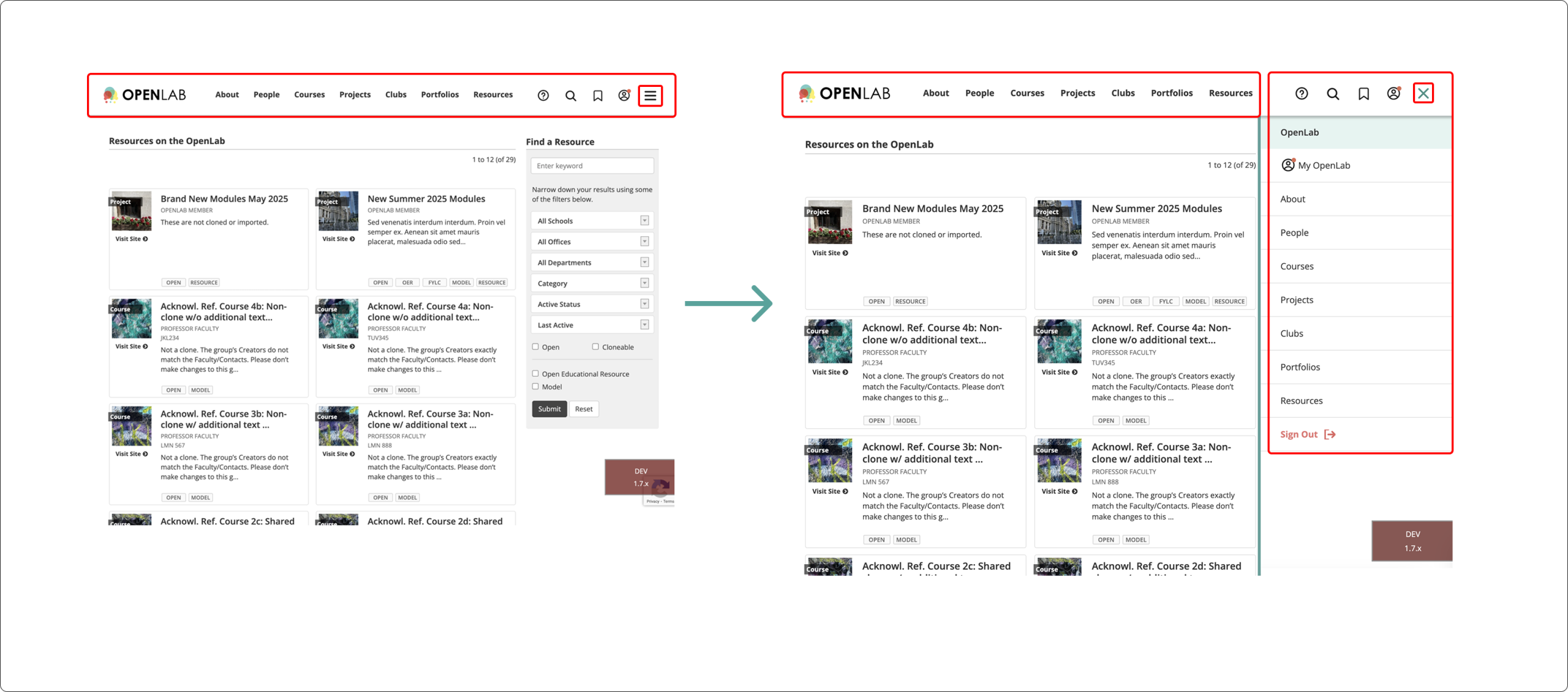
The main navigation area and hamburger menu provide the same options twice. They both provide an About, People, Courses, Projects, Clubs, Portfolios and Resources options. WCAG guidelines do not prohibit the same options from being available twice on a website, however, the way they are portrayed within the web page is important. In this context, it violates WCAG guideline 1.3.1 Info & Relationships and WCAG 3.2.4 Consistent Identification, as both areas do not look as though they are related to each other. They are not identified in the same way either. Instead, one is immediately visible when the page loads and is horizontal. While the other is only visible after interacting with the hamburger menu and is vertical.
Violates WCAG
- 1.3.1 Info & Relationships-Level A
- 3.2.4 Consistent Identification-Level AA
Solution
The first image reveals what it is like for a user to go through each menu twice. Users who rely on the screen reader could easily end up disoriented, as they would finish going through the main navigation area and then hear the hamburger menu as a possible option. However, once they enter the hamburger menu, they would suddenly hear the same options that they previously heard in the navigation area. This can cause users to then be confused and feel as though they either made a mistake while tabbing through, or that the tab order is malfunctioning. This could cause users potential distress, and they may then log out without getting any of their tasks done. The second image shows a solution to this by simply removing the hamburger menu from the tab order altogether. Now the user can tab through without having to go through a second menu of identical options.
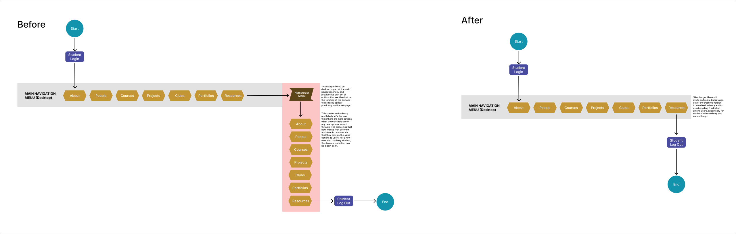
Recommendation
The recommendation to solve this issue is a simple one. The recommendation involves removing the hamburger menu altogether when it comes to the desktop version. This would allow users to interact with the website without having the same options repeated a second time. The red “sign out” button, as well as the green “X” icon, also now have slightly darker shades to pass all possible WCAG levels for color contrast, too. The “sign out” button is also now only located in the MyOpenLab menu, instead of also in the hamburger menu.

Reflections
What happens now?
The next step involves identifying the areas that need further development, as well as always asking new questions.
1. Diverse Programs & Project Differences
The experience was a challenging one, but one that was extremely rewarding. If we had had more time, we would have liked to do even more research than was already done. Specifically, when it comes to assistive technology and students’ interactions with it. Each program in higher education institutions has its own types of projects and evaluations (e.g., a science exam is not the same as a painting for an art class). It would have been interesting to get more diverse points of view from different students in different programs to be further informed about student life.
2. What about International Students With Disabilities?
International students are a part of almost any higher education institution. Therefore, is there a way to make them feel more included by developing the VoiceOver function for other languages or by developing better translations? Restructuring the tab order for different reading styles could have also been interesting. For instance, some countries do not read from left to right and instead read from right to left. Additionally, what if they use an assistive technology that isn’t yet used widely in the United States? How would that have been incorporated or accounted for within OpenLab City Tech?
3. More Issues Specific to One Directory Page
Our solutions focused on the errors we identified on every directory page. If we had had more time, we could have explored each page’s specific issues further. For example, some errors varied or were inconsistent, such as images without focus indicators only happening on certain pages. Another example is skipped tabs, like missing page numbers, which only occurred on one directory page.
Citations
Get more Information here!
2024 NY STATE Higher Education Students with Disabilities Data | NYSED Data Site. (n.d.). Retrieved December 8, 2025, from https://data.nysed.gov/highered-swd.php
Assistive Technology. (n.d.). Retrieved December 8, 2025, from https://www.sst4.org/AssistiveTechnology.aspx
Assistive Technology for Students with Disabilities. (n.d.). New York State Education Department. Retrieved December 8, 2025, from https://www.nysed.gov/special-education/assistive-technology-students-disabilities
Assistive Technology in Schools. (n.d.). American Speech-Language-Hearing Association; American Speech-Language-Hearing Association. Retrieved December 8, 2025, from https://www.asha.org/practice/assistive-technology-in-schools/?srsltid=AfmBOoqoRJCVAZxisNItrKbbD1J0zlbKk5aVJ_aZT20sLV7jc2PL50IC
Bhsdhi2024 CUNY NYC COLLEGE OF TECHNOLOGY Students with Disabilities Data | NYSED Data Site. (n.d.). Retrieved December 8, 2025, from https://data.nysed.gov/highered-swd.php?year=2024&instid=800000045393
CUNY New York City College of Technology | Data USA. (n.d.). Retrieved December 8, 2025, from https://datausa.io/profile/university/cuny-new-york-city-college-of-technology?redirect=true
Global report on assistive technology | UNICEF. (2022, May 25). https://www.unicef.org/reports/global-report-assistive-technology
Harrop, C., Tomaszewski, B., Putnam, O., Klein, C., Lamarche, E., & Klinger, L. (2024). Are the diagnostic rates of autistic females increasing? An examination of state‐wide trends.
How to Meet WCAG (Quickref Reference). (n.d.). Retrieved December 8, 2025, from https://www.w3.org/WAI/WCAG22/quickref/?versions=2.2¤tsidebar=%23col_customize&showtechniques=111%2C124%2C134%2C135%2C144%2C145%2C246%2C247%2C312%2C321%2C323%2C324%2C333#top
Journal of Child Psychology and Psychiatry, 65(7), 973–983. https://doi.org/10.1111/jcpp.13939
Leow, K. Q., Tonta, M. A., Lu, J., Coleman, H. A., & Parkington, H. C. (2024). Towards understanding sex differences in autism spectrum disorders. Brain Research, 1833, 148877. https://doi.org/10.1016/j.brainres.2024.148877
Martin, J. (2024). Why are females less likely to be diagnosed with ADHD in childhood than males? The Lancet Psychiatry, 11(4), 303–310. https://doi.org/10.1016/S2215-0366(24)00010-5
Nearly Half of Americans Will Use Voice Assistants by 2026—AltIndex. (n.d.). Retrieved December 8, 2025, from https://altindex.com/news/voice-assistantance-growth-america
Parhi, P., Karlson, A. K., & Bederson, B. B. (2006). Target size study for one-handed thumb use on small touchscreen devices. Proceedings of the 8th Conference on Human-Computer Interaction with Mobile Devices and Services, 203–210. https://doi.org/10.1145/1152215.1152260