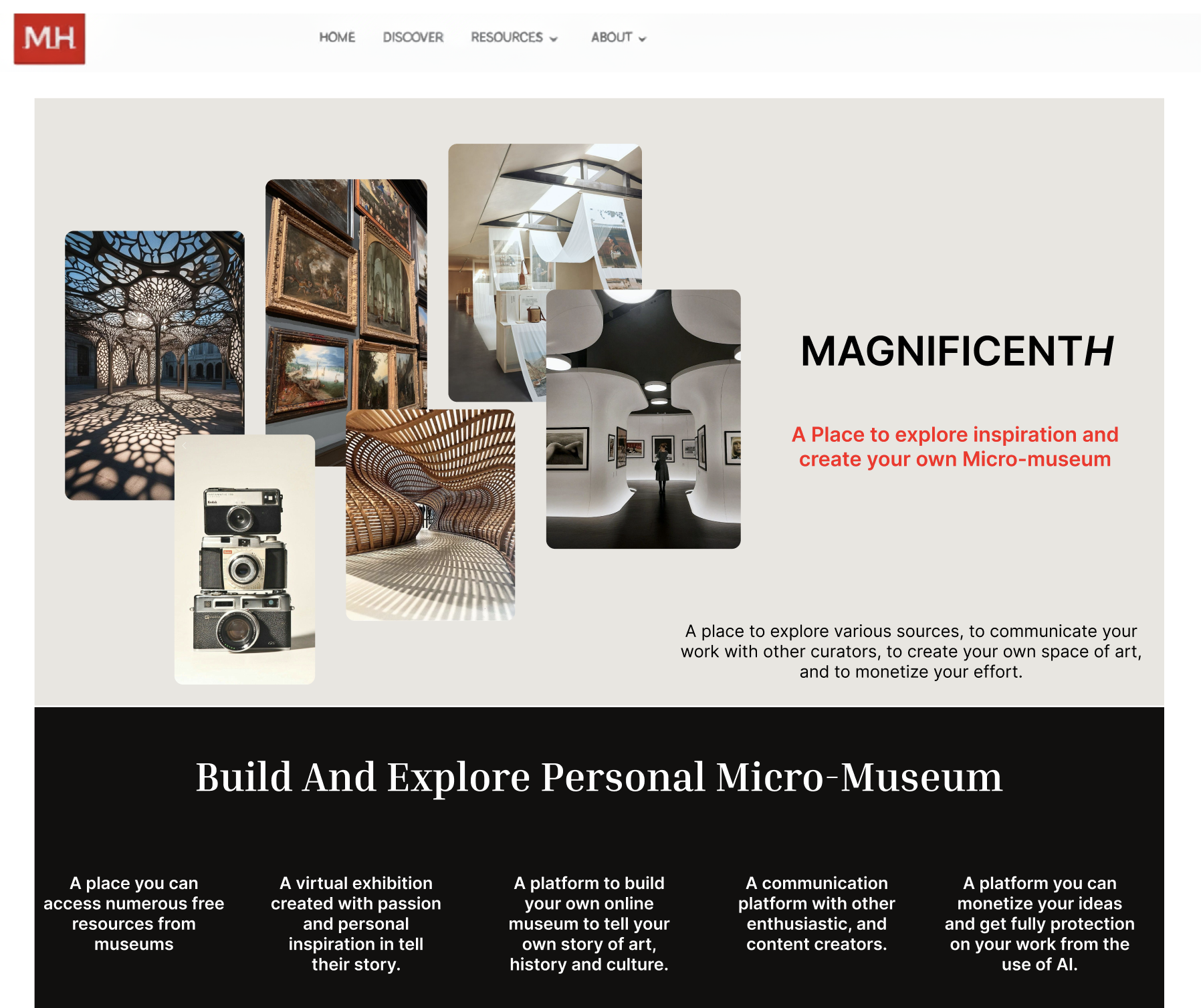
About MagnificentH: A Digital Display of Micro-Museums
MagnificentH offers a digital space to share and post users’ creations as its own micro-museum, while also allowing for monetization and agency over their work. Our goal is to improve the website’s usability regarding terminology and understandability by conducting multiple remote moderated usability tests. Usability issues were revealed through these tests on MagnificentH.com regarding clarity and more visualization. Potential solutions were provided.
MagnificentH Project Overview
Project:
Timeline:
Goal:
Team:
Role:
Tools:
MagnificentH (Desktop)
9-10 Weeks
Observing users behavior & understanding of the MagnificentH ‘s terminology
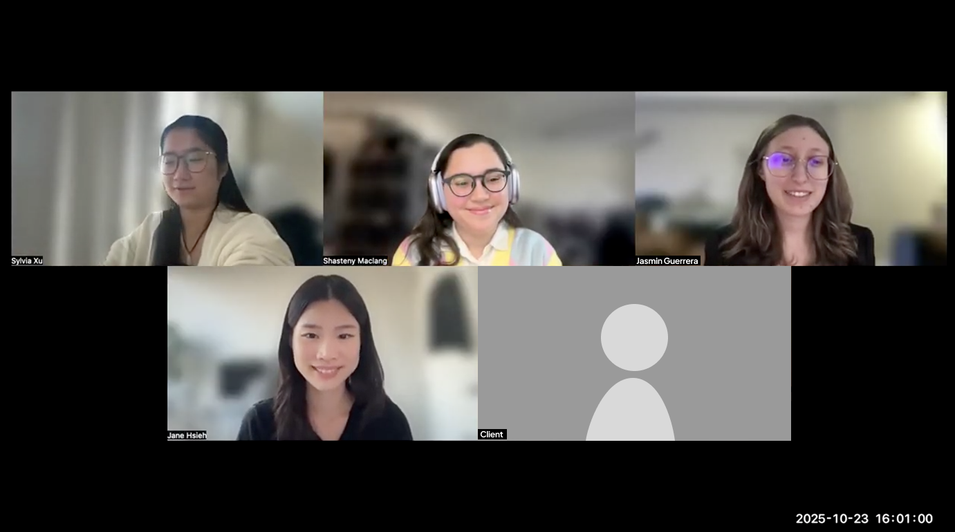
Jasmin Rose Guerrera, Jane Hsieh, Sylvia Xu & Shasteny Maclang
User Researcher & UX Designer
Miro, Figma & Private Panels
The Problem: I “think” I know what I can do, but how do I do it?
How might we observe users behavior and understanding of the website’s terminology when interacting with the MagnificentH website?
MagnificentH partnered with our team to research the website’s usability, specifically when it came to observing users’ understanding of the terminology. The product itself often had users questioning what the website’s limits and abilities were. Clarity and lack of visualization became the main issues within MagnificentH, as it is a new platform that cannot be completely compared to other products.
My Role as a Researcher and Designer of the “Protect & Monetize” Web Page
We conducted 8 remote moderated usability tests. I was a notetaker for 3 of these remote moderated usability tests and ran 2 moderated tests of my own. We then developed four recommendations. I developed the third redesign, which consisted of the “Protect and Monetize” web page.
Magnificent Methodology: The Making of Remote Moderated Usability Testing
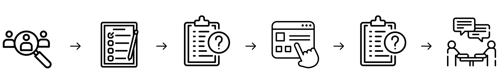
The Process of Taking 6 Steps Forward: Researching to Presenting Solutions
1. Client Kick Off: Meeting the Person Behind MagnificentH
Meeting Prep & Initial Thoughts on Art & AI
We prepared for the meeting by researching the client, the website and the project’s proposal so that we would be well informed about the product before communicating with the client. Our initial thoughts were that MagnificentH revolved around creating and posting artistic creations and that the website promoted AI in art spaces.
The Meet Up: AI Misinterpretation Realization
The client revealed that MagnificentH was indeed an artistic space for the creation of digital micro-museums. However, MagnificentH does not promote AI, but instead gives creators their agency back by choosing if they want to receive monetization from AI companies to acquire their work. This allowed us to realize there might already be a lack of clarification regarding AI information on the website that we needed to address.
2. Recruiting and Setting Up The Testing Game Plan for Supply & Demand
User Profiles & Screener for Hobbyists & Travel Enthusiasts
The client emphasized the need for users who could create content for the website and users who would interact with the content on MagnificentH. This led to targeting users like Hobbyists who would create and Travel Enthusiasts who would interact with the content. The screener was then developed with these profiles in mind. We were careful to include users who had these interests, but also had fewer opportunities to go out and visit physical museums. MagnificentH is digital; therefore, it provides more accessible ways for users to return and interact with the museum-type spaces they adore.
WHOOPS!: You can be involved with art without creating any art, too!
After sending out our screener, we also learned that many users are involved in artistic spaces even though they do not create any art. We adjusted our screener accordingly by adding the response “I do not create art but am heavily involved with art or cultural content.”
Tasks & Pilot Testing: Pay Wall Issues, can we really do task 3?
After creating 4 tasks that we would ask our participants, we conducted two pilot tests. Our concerns mostly revolved around Task 3: Article Content, as it required users to browse articles on MagnificentH. The website sadly displayed a pay wall if users clicked on an article. However, the search bar provided a way around this issue. Through pilot testing, we realized that if we said, “That pathway to the article is currently disabled, but there is another possible way to get there,” users were able to eventually find their way and complete this task.
4 tasks were developed around…
- The Home Page: To check users’ first impressions of terminology on the website
- The Protect & Monetize Page: Can users figure out how they can get paid?
- Article Content: How would they browse & interact with content on the website?
- AI Stance: Is Artificial Intelligence a dealbreaker?
Preparing a Moderated Script & Consent Form
A script and consent form were provided to allow users to be aware of their rights and how their participation within this study would potentially be used so that they could make an informed decision.
Pre & Post Questionnaire Around Thoughts on AI and Lasting Impressions
The Pre-Questionnaire is used to get to know our participants, such as their hobbies and social media use. This was done to see the difference between initial and final impressions.
The Post-Questionnaire revolved around seeing users’ final impressions after using MagnificentH. This was done so that we could gauge users’ interest and their opinions after interacting with the website.

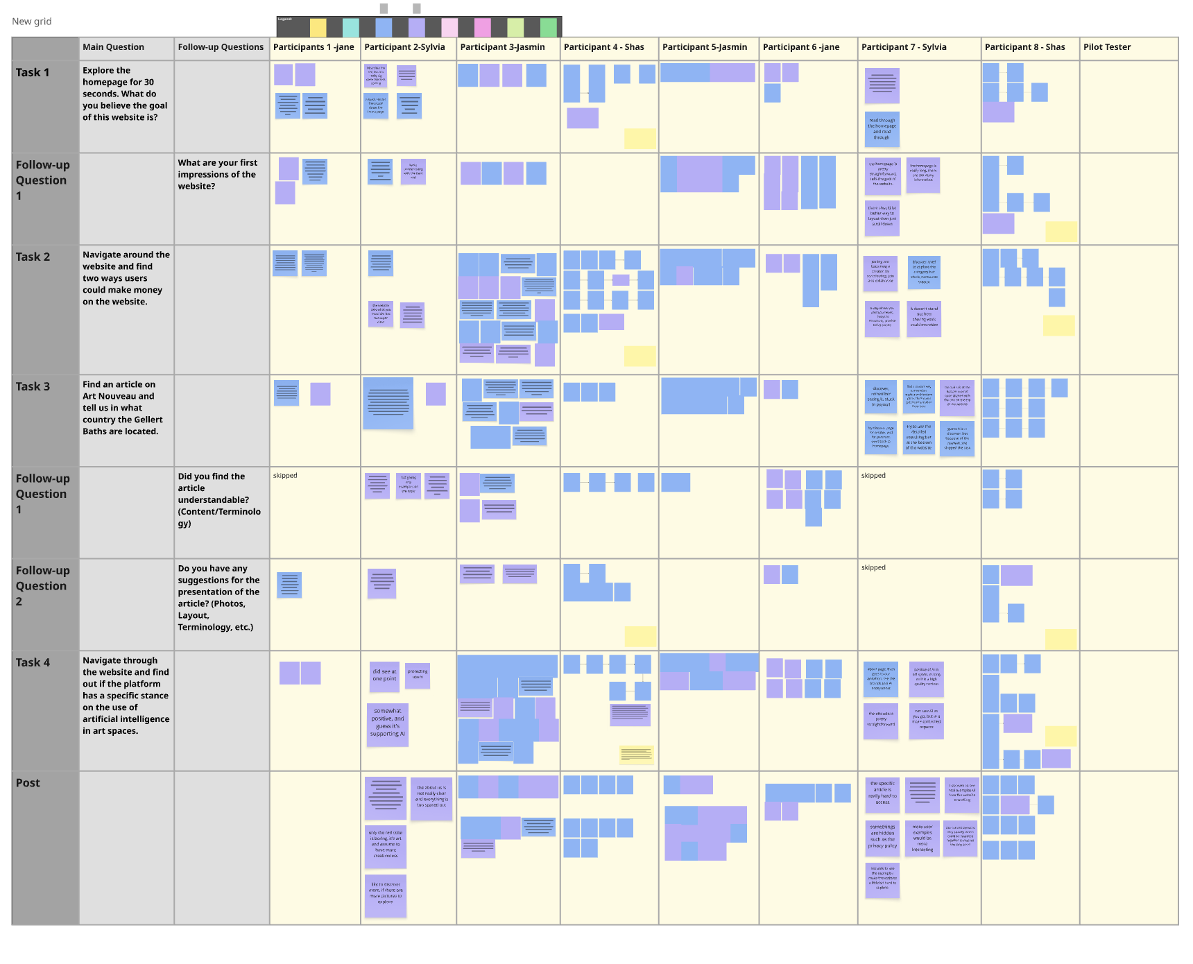
3. Conducting 8 Remote Moderated Usability Tests
Scheduling a Total of 8 Participants Through Private Panels & Zoom
Through Private Panels, we scheduled meeting times with those who passed the screener. We then conducted our usability tests remotely through Zoom. Often, we conducted these tests with two testers, where one moderated, and the other took notes. Each session was recorded and had transcripts. We learned transcripts were a useful tool, especially later on for quotes.

4. Collecting & Contextualizing the Data with Post-its!
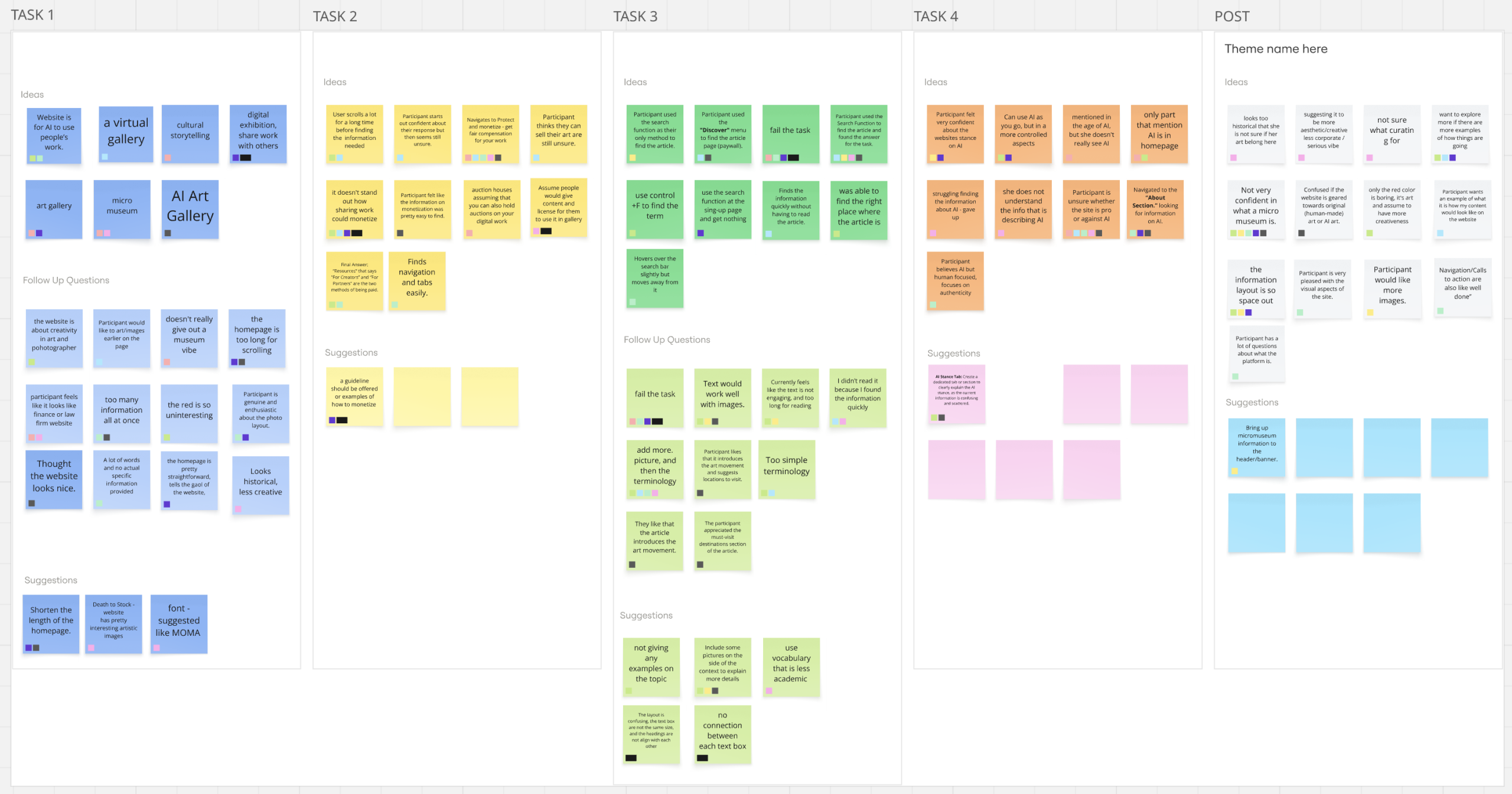
Using Miro, Post Its, and Affinity Mapping To get a Full Overview
As a team, we reviewed our notes, data and footage and created a Miro board where we collected and organized all of our results in order to identify the top issues found in MagnificentH. This strategy helped us realize which parts of the website needed our attention the most.
5. Redesigning & Preparing Solutions Despite Unforeseen Website Changes
Redesigning in Figma: Clarifying Terminology and giving Visual Context
Four redesigns were done in total. Each redesign was created on Figma by collecting screenshots from our recordings. The official website had gone through an update that now rendered its visuals unusable for the report, which is why we had to pivot to other methods. We learned that we needed to have better communication with our client to avoid the product from changing unexpectedly again.
6. Presenting 4 Final Solutions & A Final Client Meet Up
Receiving Client Comments Regarding AI & Usability Research
We then presented our results to the client by pulling quotes, providing visuals and providing clear explanations based on participant research. The client then proceeded to ask questions about research and how it was conducted. She also appreciated the interest in AI, due to AI currently being a hot topic in the art realm. We learned that the client did not know much about platforms like Private Panels, and provided her with more context.
A Total of 4 Tasks: Targeting the Home page, Monetization, Articles and AI
TASK 1
The Home Page
Explore the homepage for 30 seconds. What do you believe the goal of this website is?
TASK 2
Protect & Monetize
Navigate around the website and find two ways users could make money on the website.
TASK 3
Article Content
Find an article on Art Nouveau and tell us in what country the Gellert Baths are located.
TASK 4
AI Stance
Navigate through the website and find out if the platform has a specific stance on the use of artificial intelligence in art spaces.
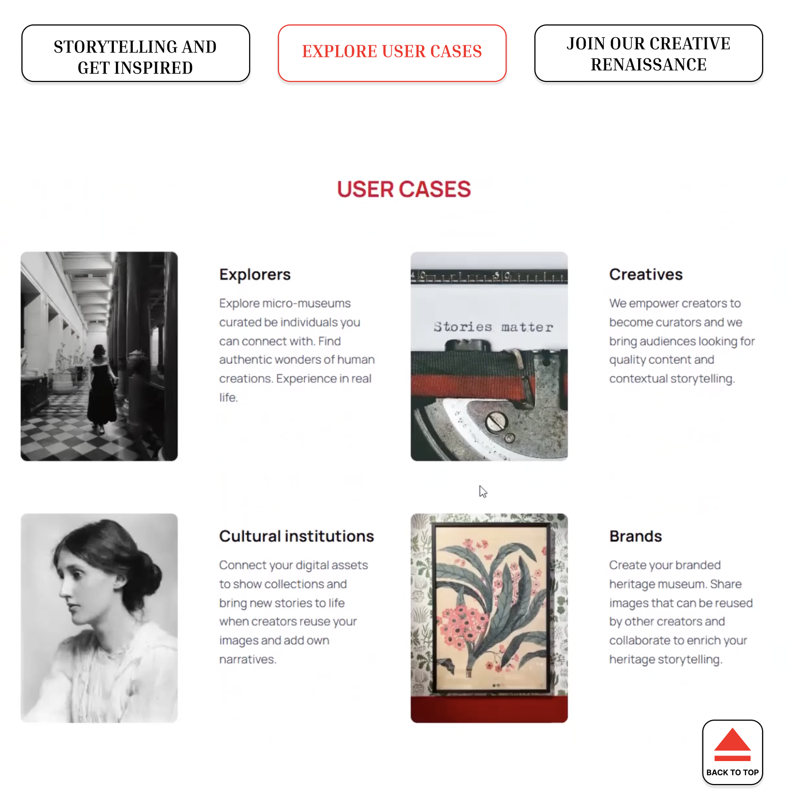
The Storytelling of Hobbyists and Travel Enthusiasts: What can they tell us?
Hobbyists (Supply) and Travel Enthusiasts (Demand)
In total, 8 participants were tested and recruited through a platform called Private Panels. The client discussed needing users who would be able to contribute to the supply & demand on MagnificentH. Users that could create and supply the website with their artistic material were just as important as users who had a natural interest in learning and browsing content on the website.
Hobbyists interested in providing…
- Historical Facts
- Photography
- Architectural Findings
- Artistic Creations
Travel Enthusiasts who enjoy…
- Learning
- Reading personal stories
- Visiting digital museums
- Are just looking for something new
Participant Screening & Sampling
- Ages ranged from 18-34 years old
- 87.5% of participants were women, while 12.5% were non-binary
- 50% of participants want to be part of an art space, while the other 50% are already creating their own creative work
- 75% regularly visit cultural or educational places, while 25% enjoy those spaces but have no time to visit
- 50% do not create any art but are involved in art spaces
- 50% share their own content regularly
- 100% of participants visit museums, historical landmarks, or seek out cultural experiences when travelling
Magnificent Results, but Let’s Give Users More Clarity!
What do Users Think of MagnificentH?: Micro-Museum Enthusiasm, More Photo Inspiration & Terminology Trouble
MagnificentH piqued many participants’ interest, with most expressing wanting to join once the website is fully up and running. They also found navigation easy as they could see all the possible web pages thanks to the top menu. Despite this enjoyment and ease of use, users did have trouble understanding parts of the website, such as the role of AI and monetization. Participants also expressed wanting to learn more with the aid of images.
Finding & Recommendation 1
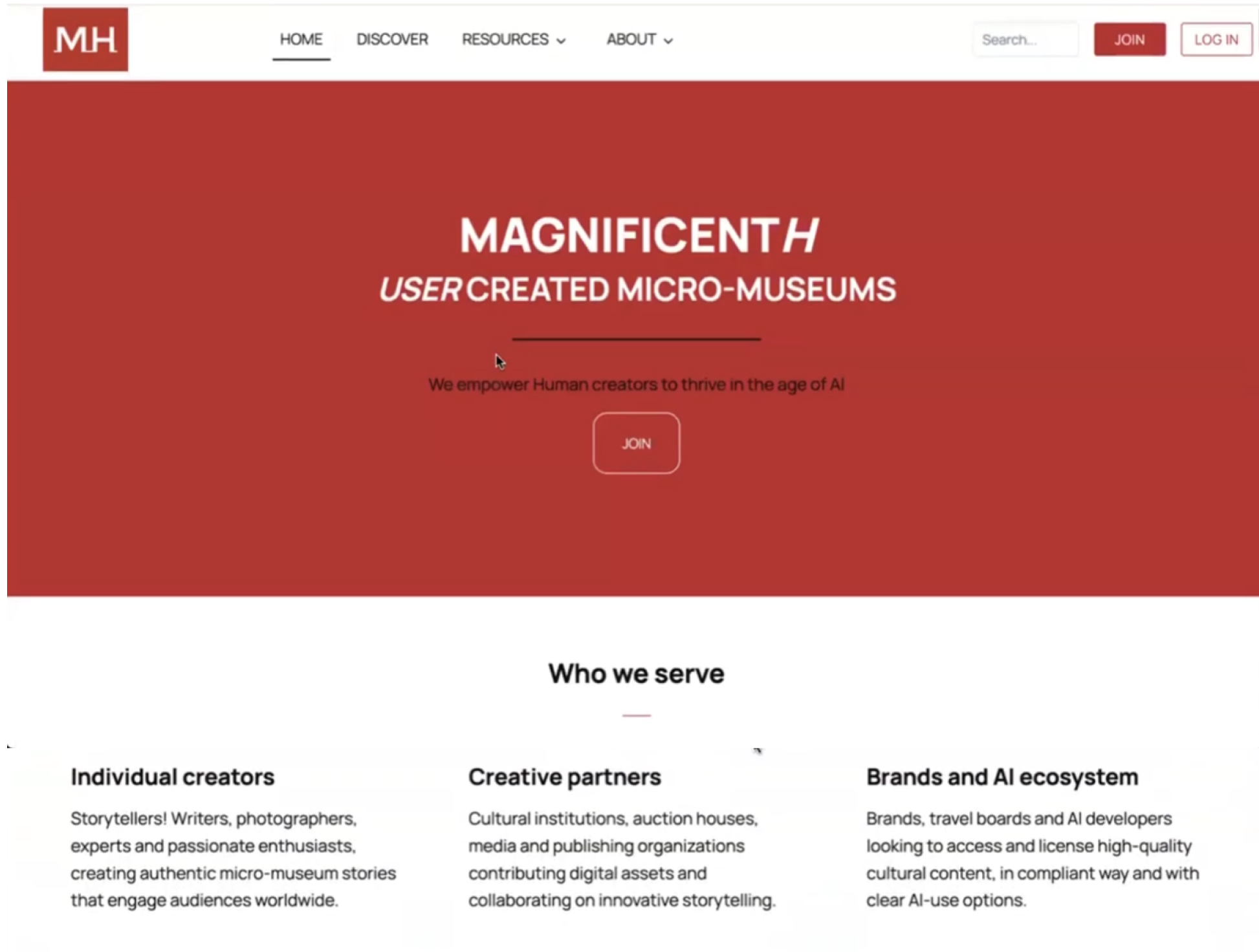
The Home Page: What are “Micro-Museums” again?
1) Home Page is Unclear About the Website’s Main Message
- The heading and the cover of the website do not fully convey the message of “micro-museums”
2) The Lengthy Storytelling of “Micro-Museums”
- Extensive scrolling is required to receive the full message
“I think at a glance, if it’s a micro-museum, I wish…that there is more, like, art, or more curation.”
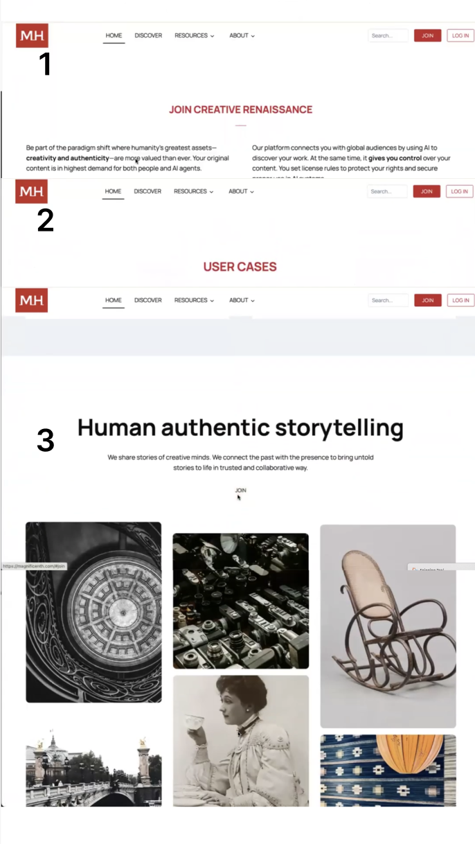
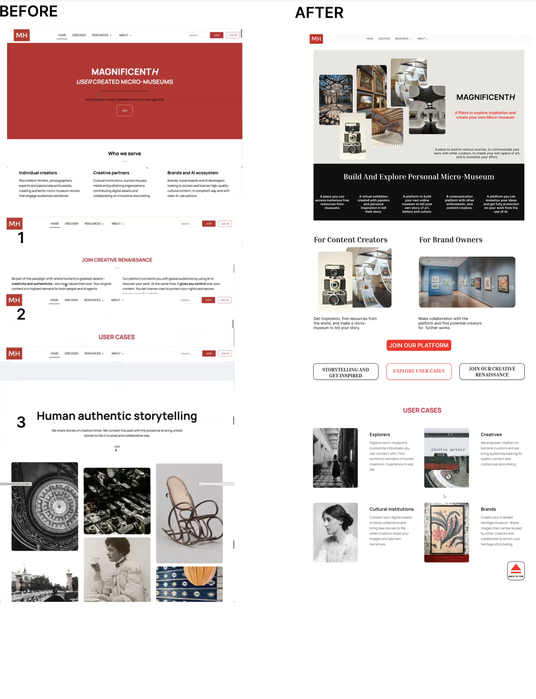
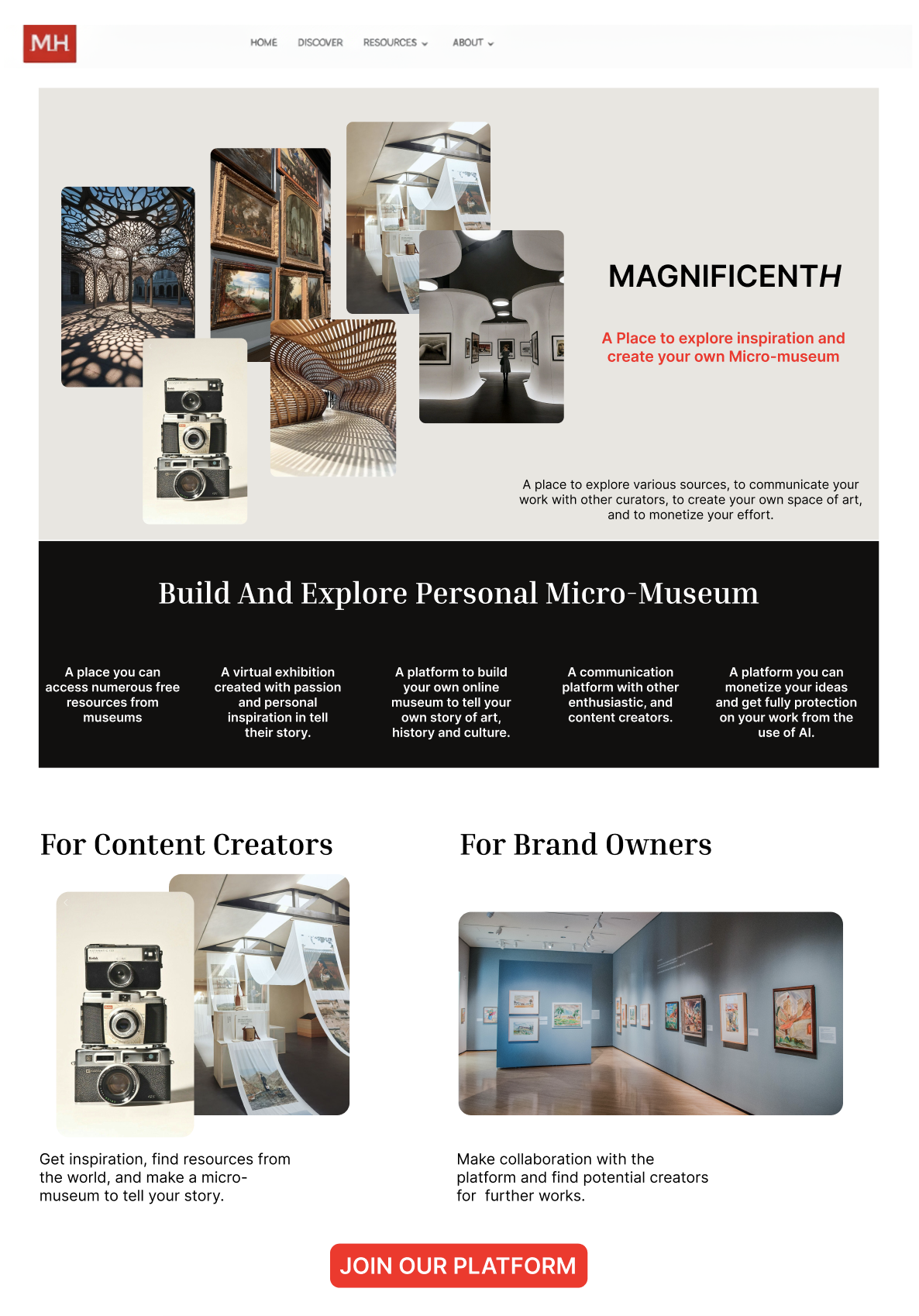
Rebuilding the Homepage’s Hierarchy and Imagery
1) More Imagery Within the Heading and Tagline
- Cluster of images conveys the concept of a museum
- A concise tagline reinforces the website’s message
- A specific section explains what a “micro-museum” is
jja
kcjls
2) Better Storytelling: Recreating the Hierarchy
A new flow begins with…
- Defining what a micro-museum is
- Clarifying who the platform serves
- Presenting user cases in a narrative sequence.
- “Back to Top” button creates less scrolling
Finding and Recommendation 2
Is that AI? On a Website About Art??
1) Confusing & Conflicting AI Messaging
- Unsure of MagnificentH’s stance on AI
- Lack of understanding in regards to opt-in AI implementation
2) Lack of AI Information Location
- Trouble locating information on AI
- Frustration when information was unclear
“…are they anti-AI? Or do they just, like, allow people to use AI?”
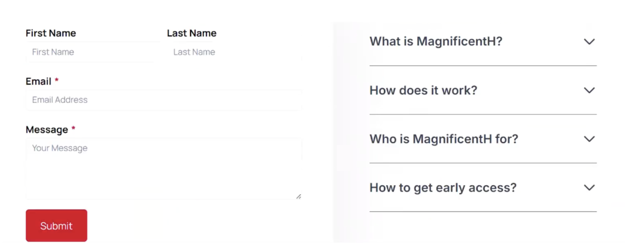
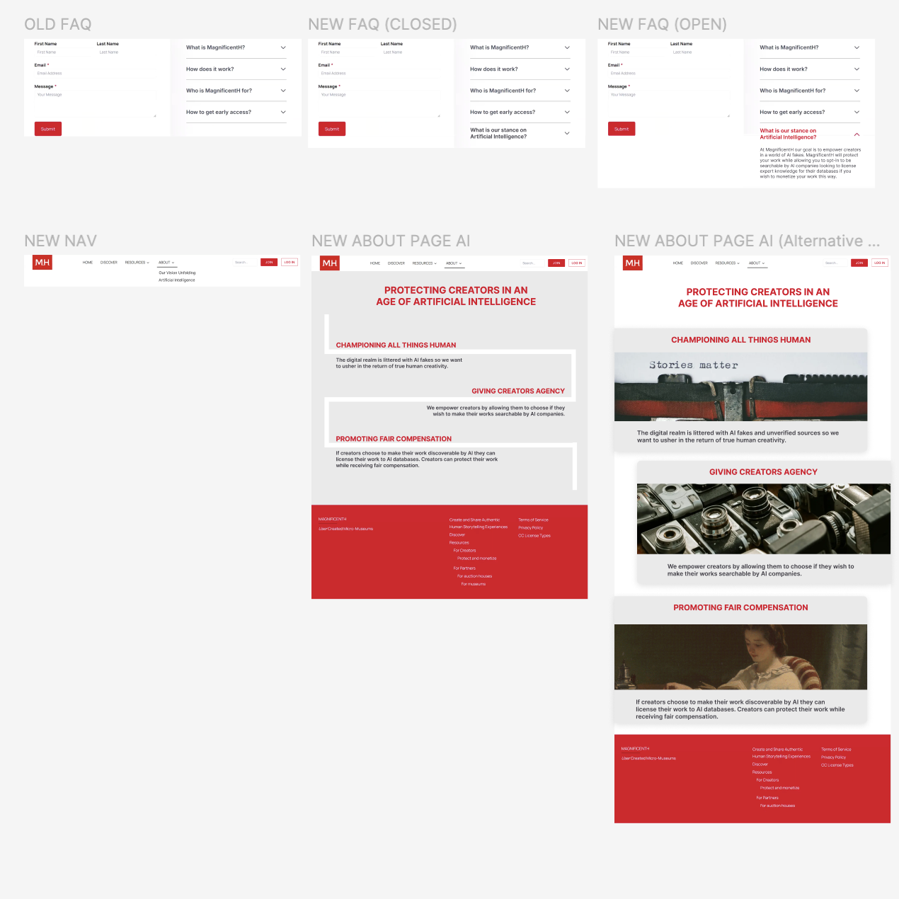
The Important Role of Artificial Intelligence: Giving More Context
1) Providing an FAQ for AI
- AI FAQ section highlights the topic
- Users naturally search for information in the FAQ
- Design follows the style of the FAQ section
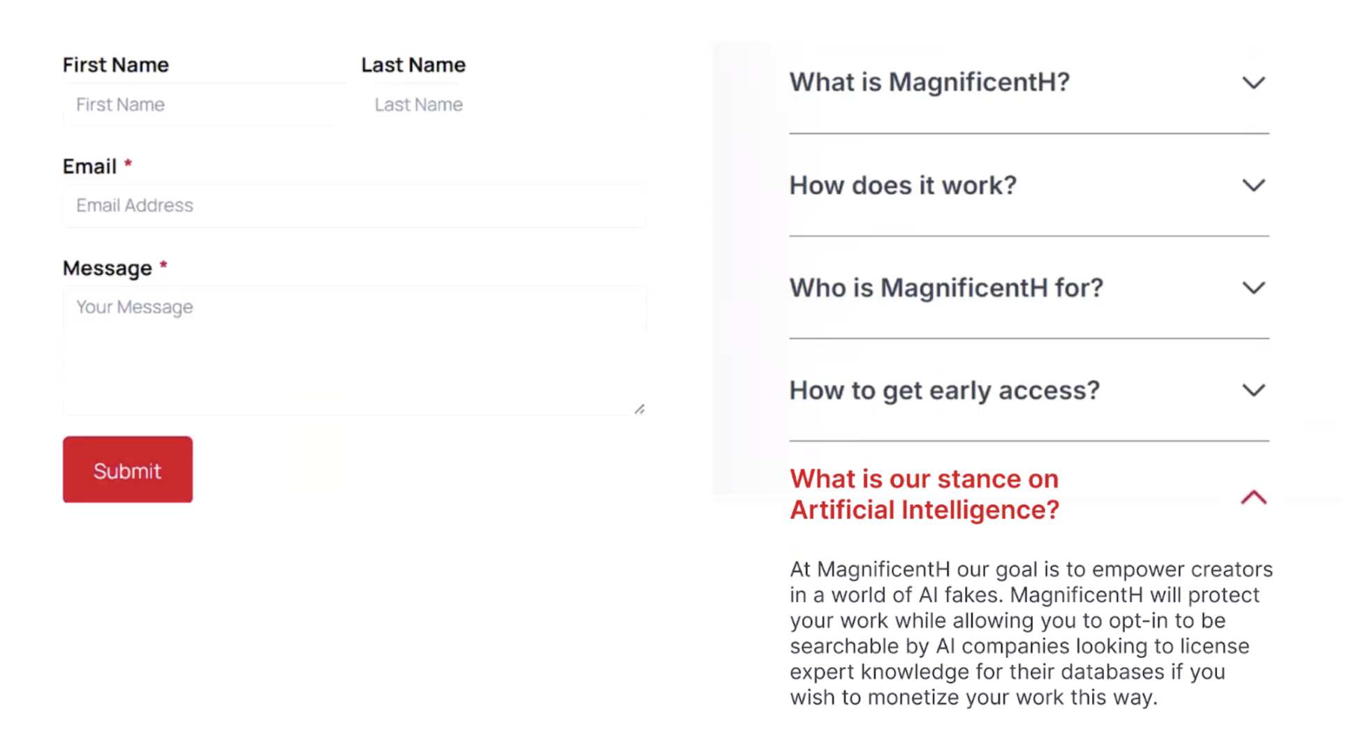
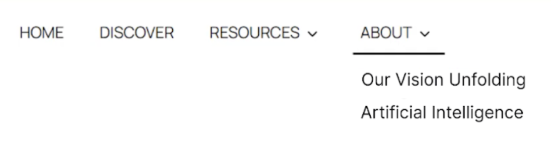
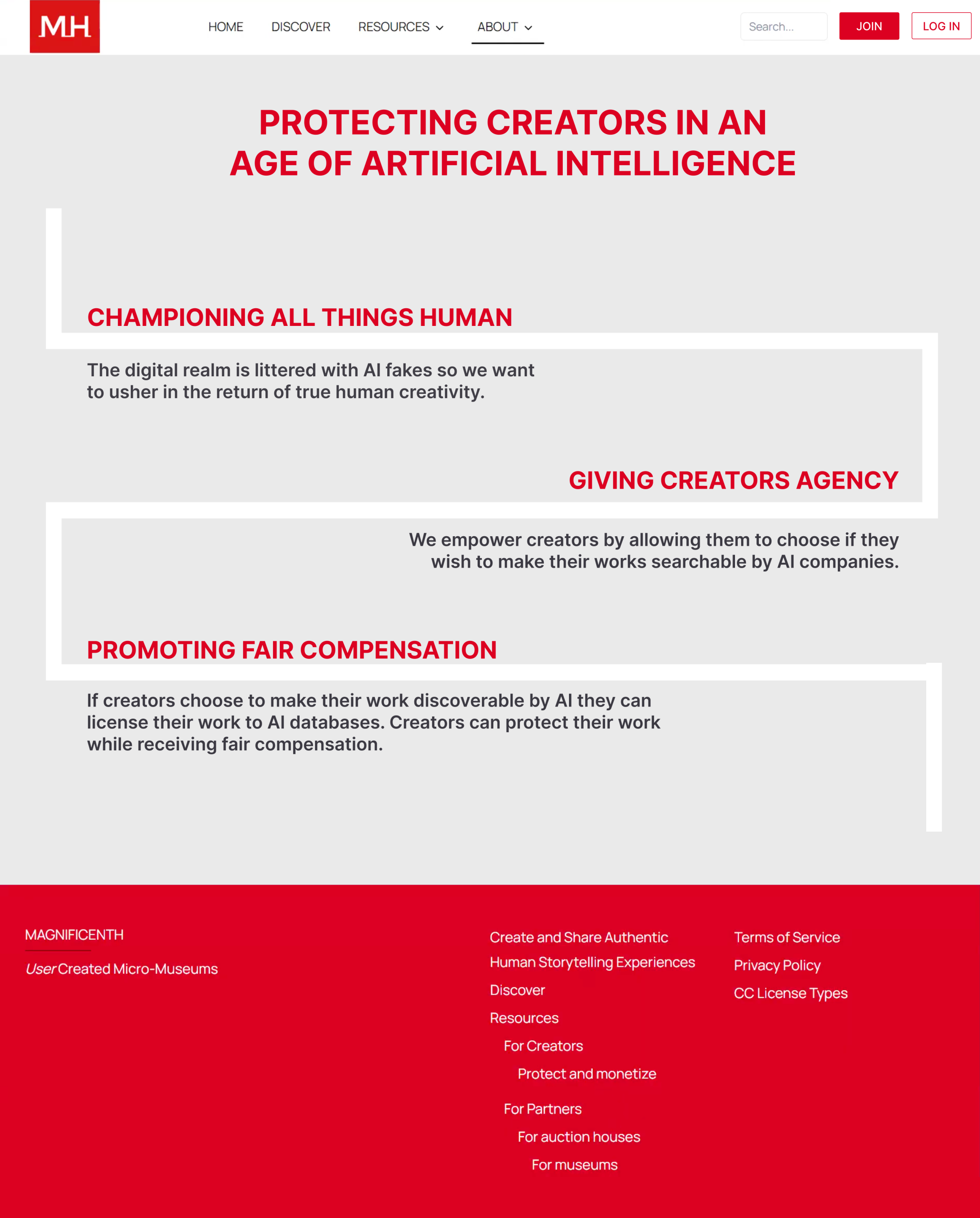
2) Giving AI its own Page Within MagnificentH
- Adding an “Artificial Intelligence” section in the About menu
- Adding a large header that specifies MagnificentH’s core value regarding AI
- Three subheadings provide more details on AI: championing humans, giving them agency, and promoting fair compensation.
Finding and Recommendation 3
Compensation Confusion & Uncertainty
1) Uncertain & Varied Monetization Responses
User thought they could make money by…
- Auctioning off their work on MagnificentH
- Selling their art to AI
- Licensing their art
2) Overwhelmed Users & Layout Confusion
- Too many pieces of text on one web page
- Not knowing where to start reading
3) Unclear About the Steps of the Monetization Process
- How does one start the monetization process?
- How can they get from point A to point B?
“I guess I can… maybe sell my art? …I don’t know,”
Creating Information Clarification to Receive Monetization
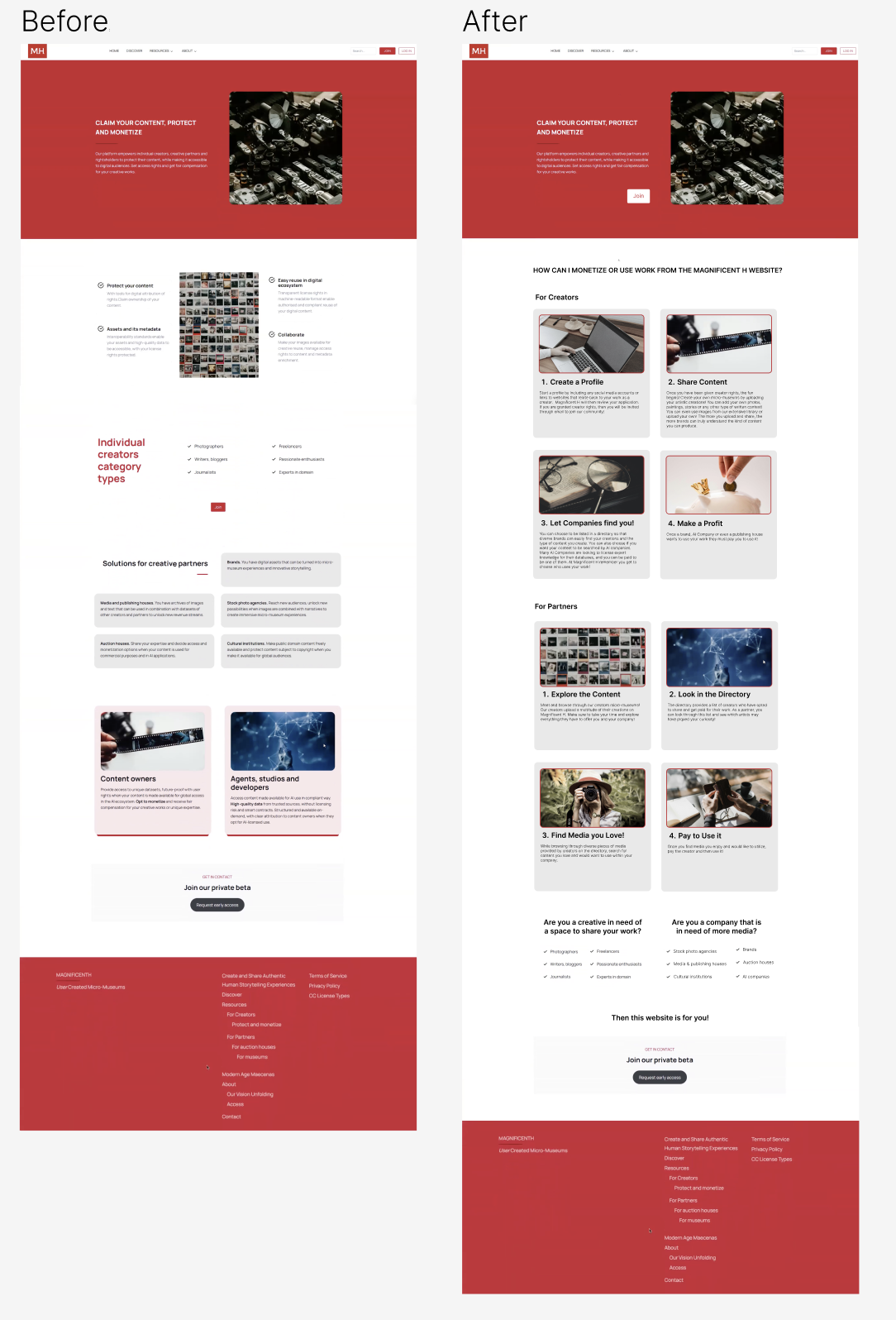
1) Removing & Replacing: Separate Sections For Creators & Partners Needed
To create more clarity in this part of the MagnificentH website, certain sections were removed because the moderated remote testing revealed that they provided more confusion than understanding.
Removing Sections to Create More Clarity
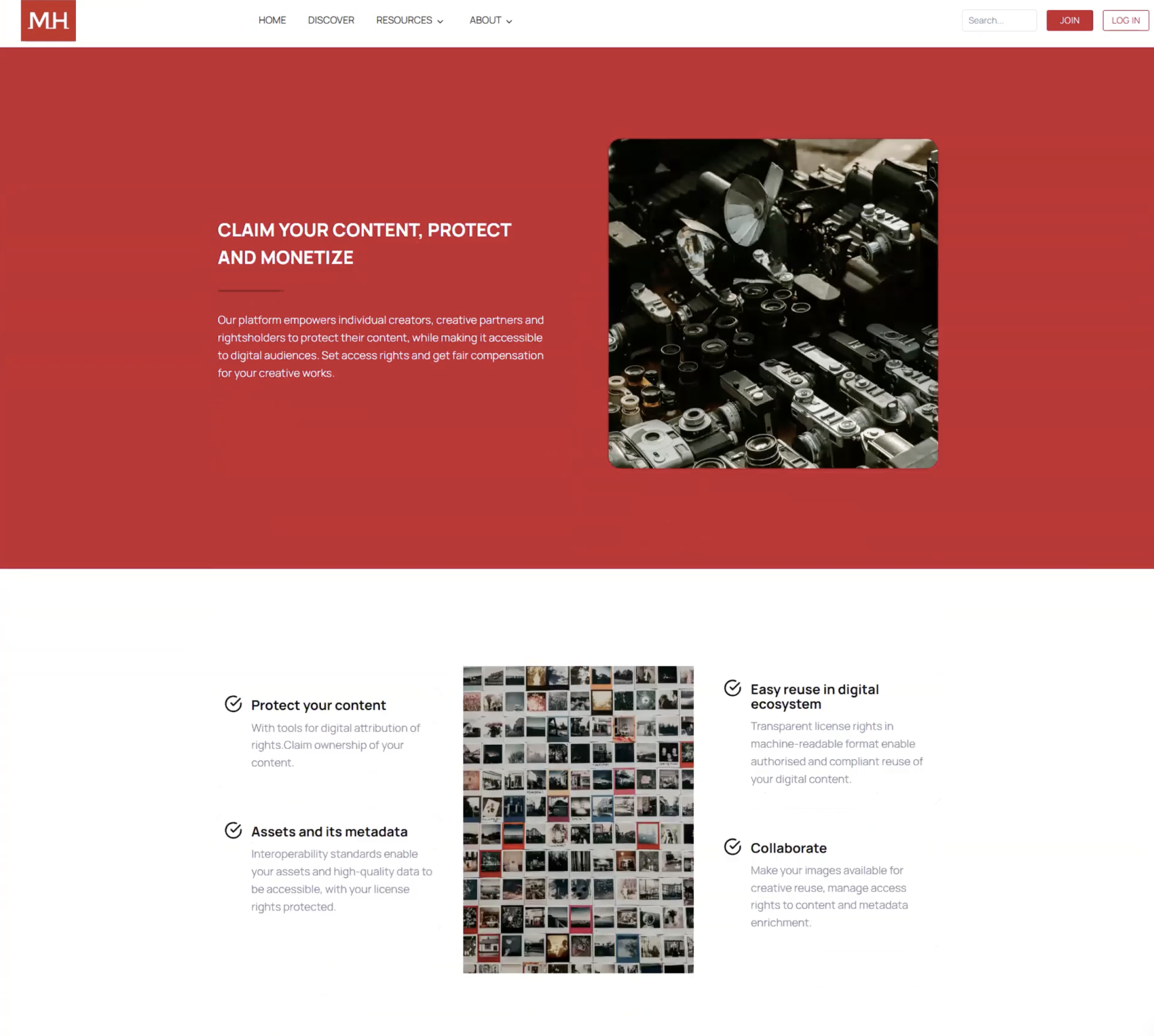
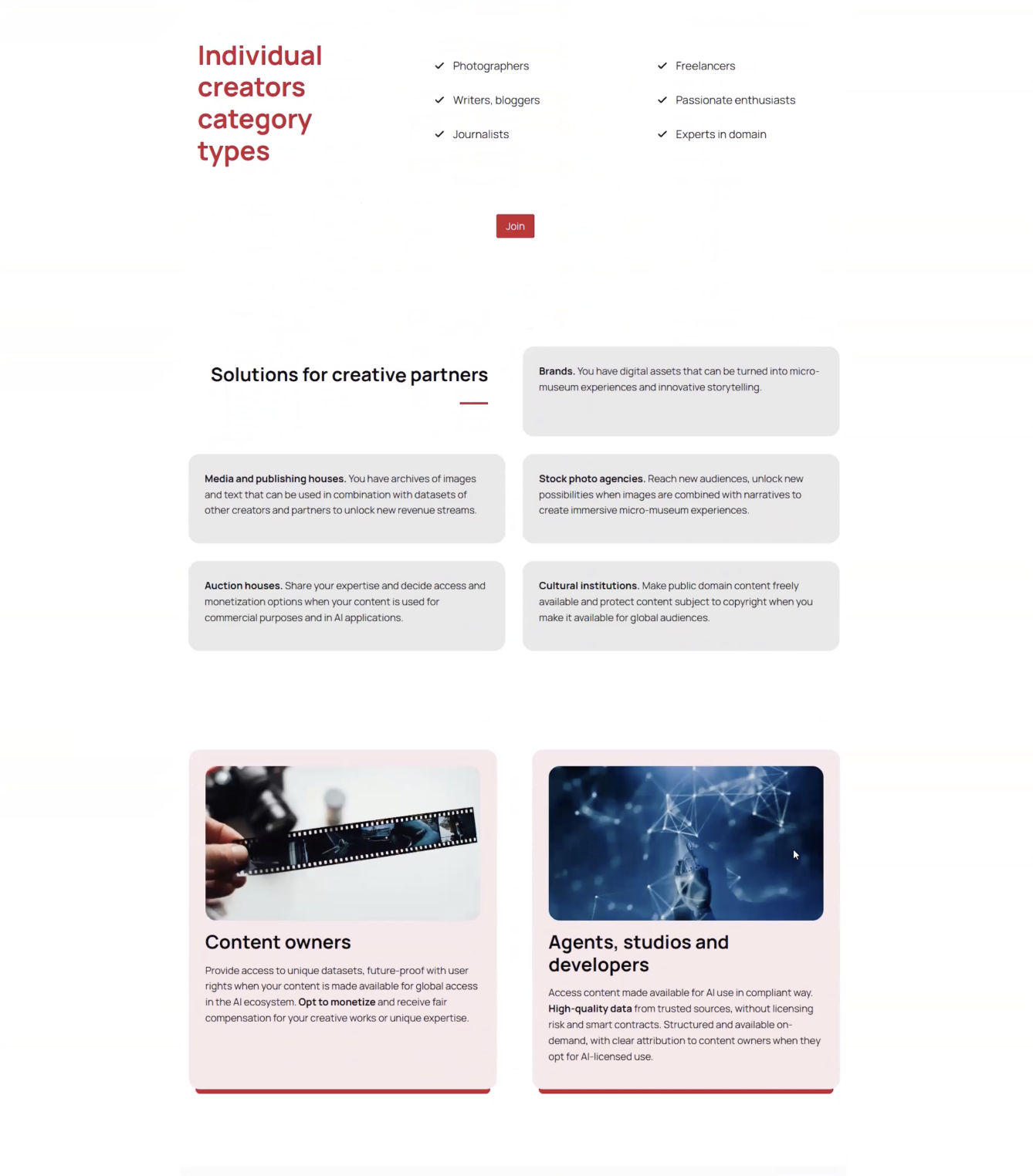
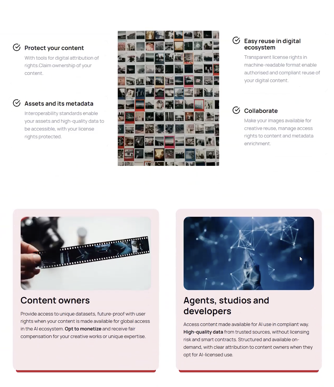
Name of each section that was removed…
- “Protect your content”
- “Easy reuse in digital ecosystem”
- “Assets and its metadata”
- “Collaborate”
- “Content owners”
- “Agents, studios and developers”
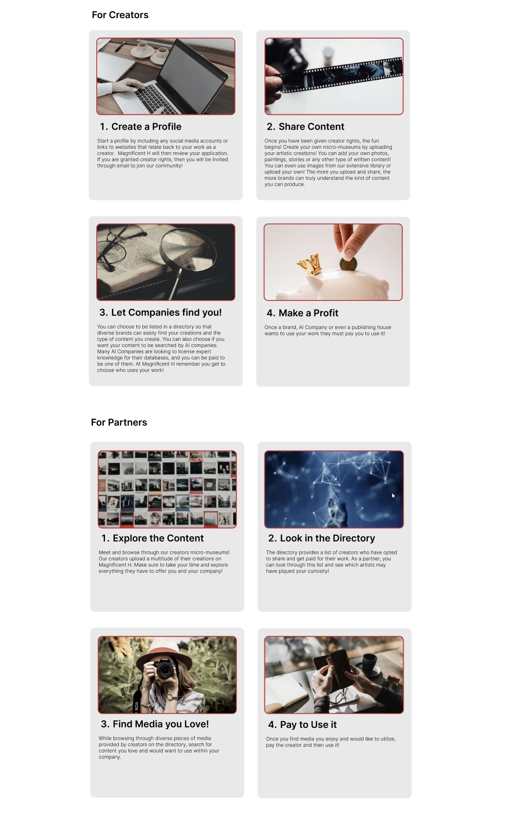
Replacing With Step By Step Instructions For Creators & Partners
Two different step-by-step instructional processes:
- A step-by-step process for creators
- A step-by-step process for partners
- Each step has a photo and a small description
- Grid format visually eases users into each step.
2) More Visual Resemblances Between Sections with the Same Purpose
Both sections are visually different, which results in user disorientation and layout confusion. Combining both sections and creating visual resemblances can help users visibly understand the content and where they are within the web page.
The Differences Between Two Sections with a Similar Purpose
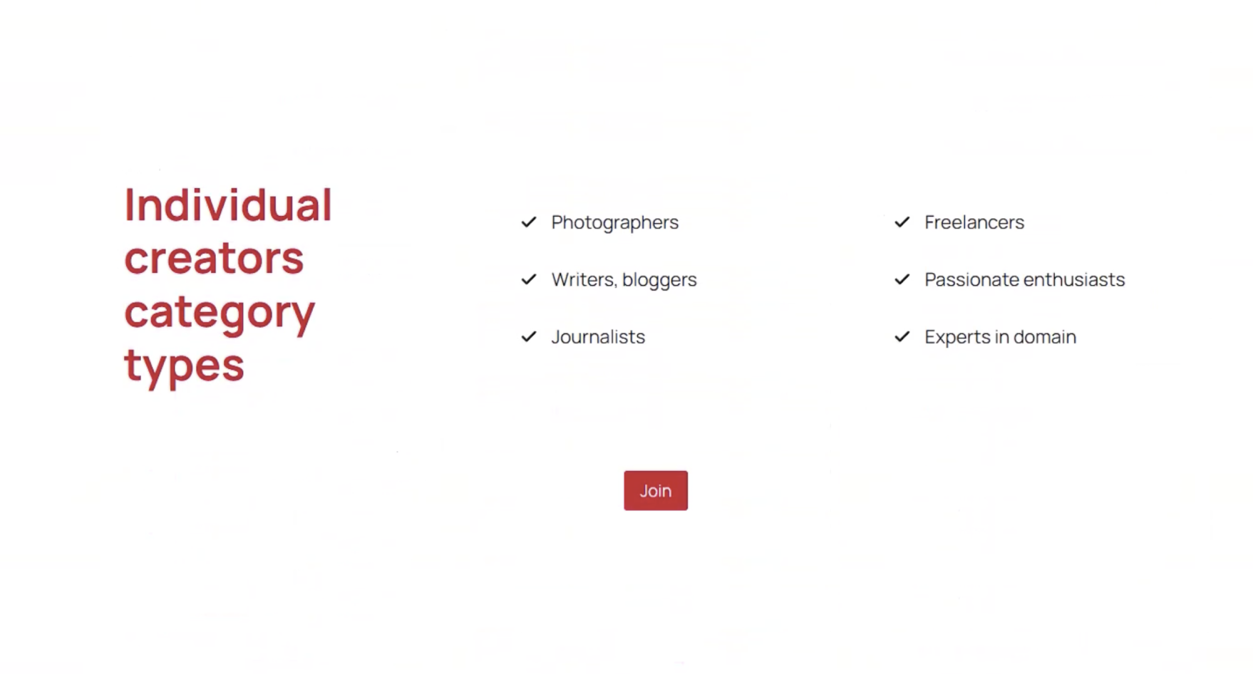
“Individual creators category types”
- Red title
- Examples of types of creators
- Each item has a check mark located on the left
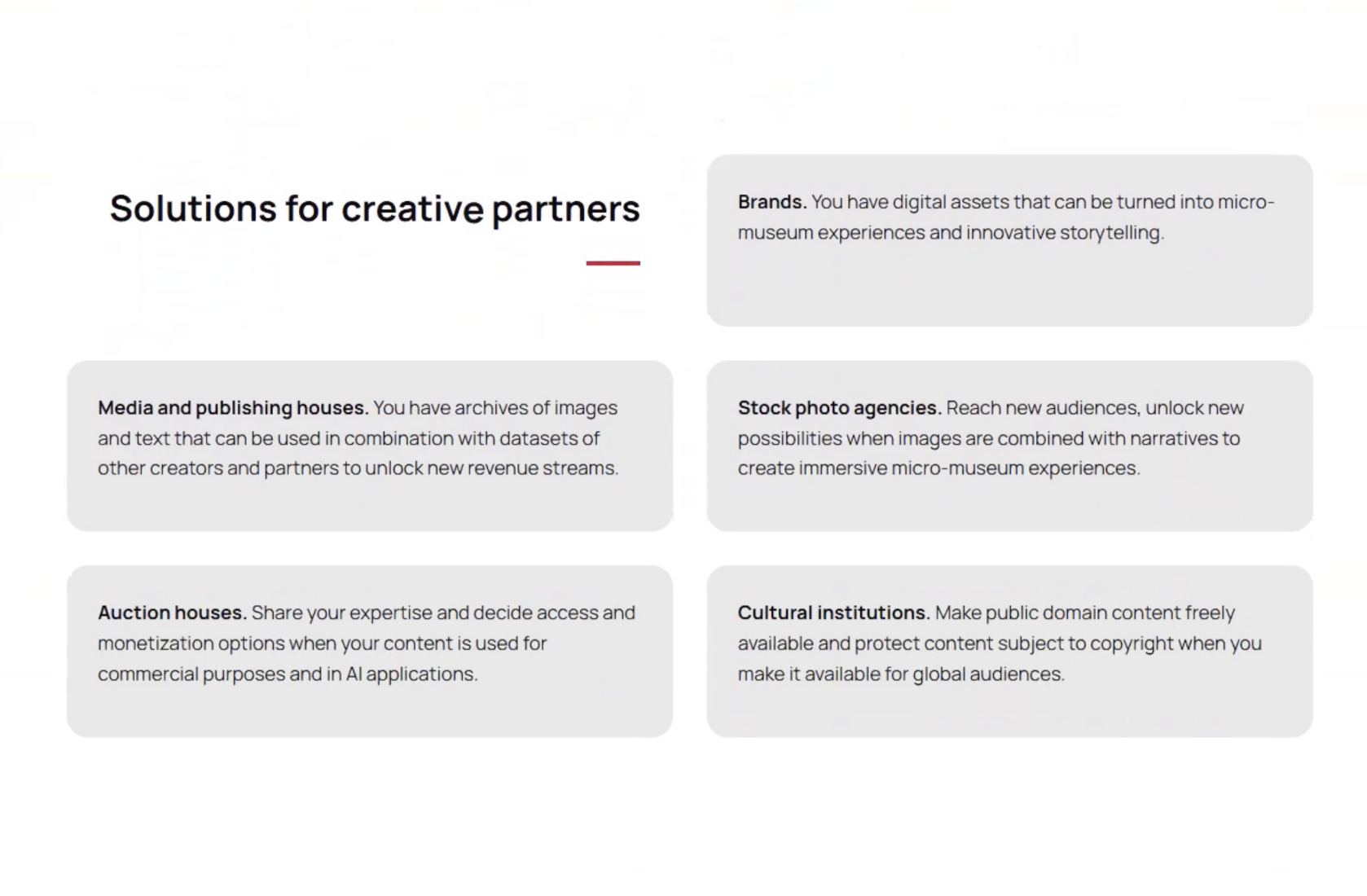
“Solutions for creative partners” sections.
- 5 Light grey boxes
- Examples of partners are bolded
- Descriptions under each example
p
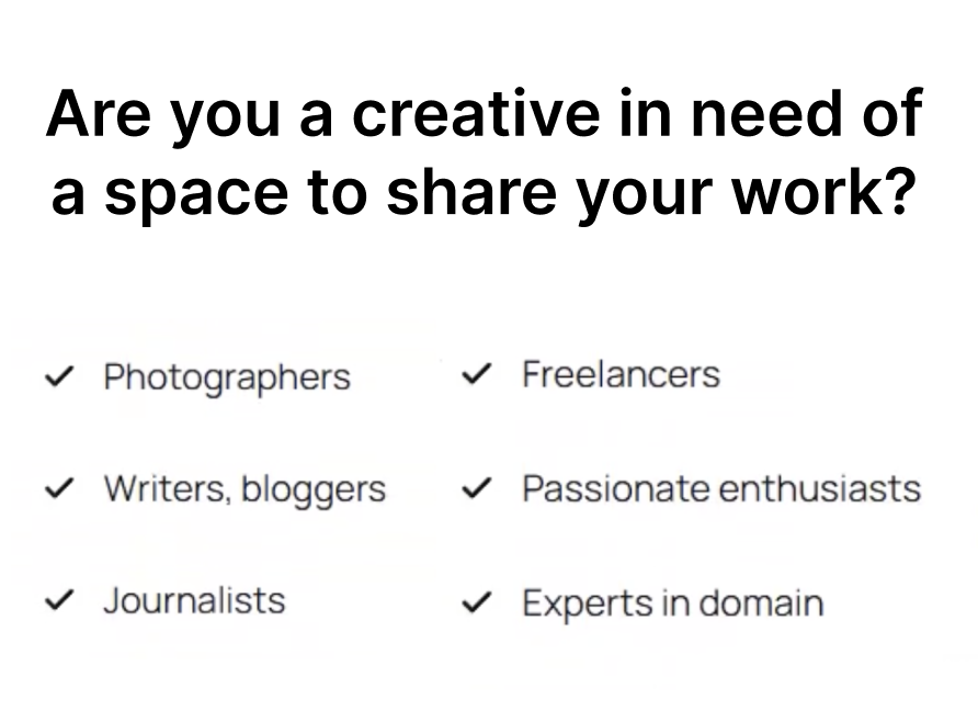
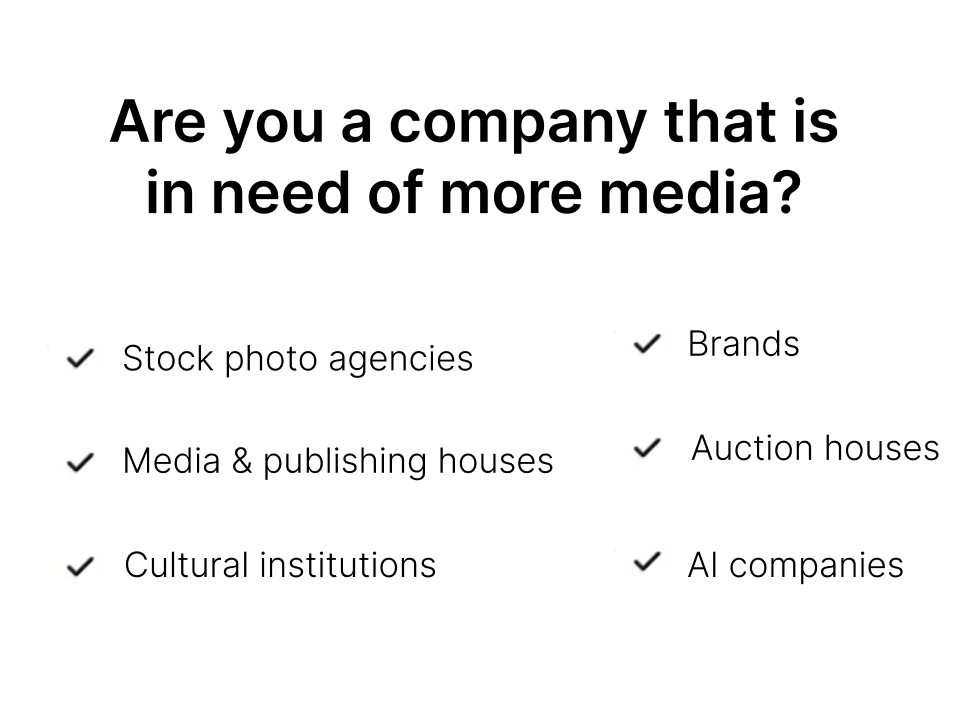
Visually Merging the Creator & Partner Examples
- New titles: “Are you a creative in need of a space to share your work?” and “Are you a company that is in need of more media?”
- Both are now listed in the same format, creating an easy-to-read format
- Consistent Identification: 6 checkmarks with 6 examples
Finding and Recommendation 4
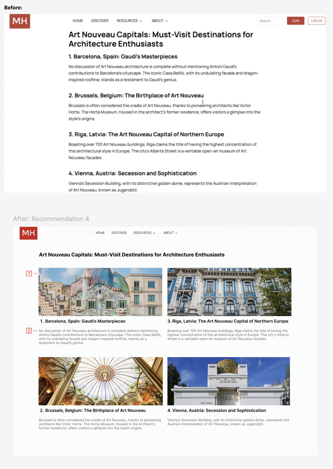
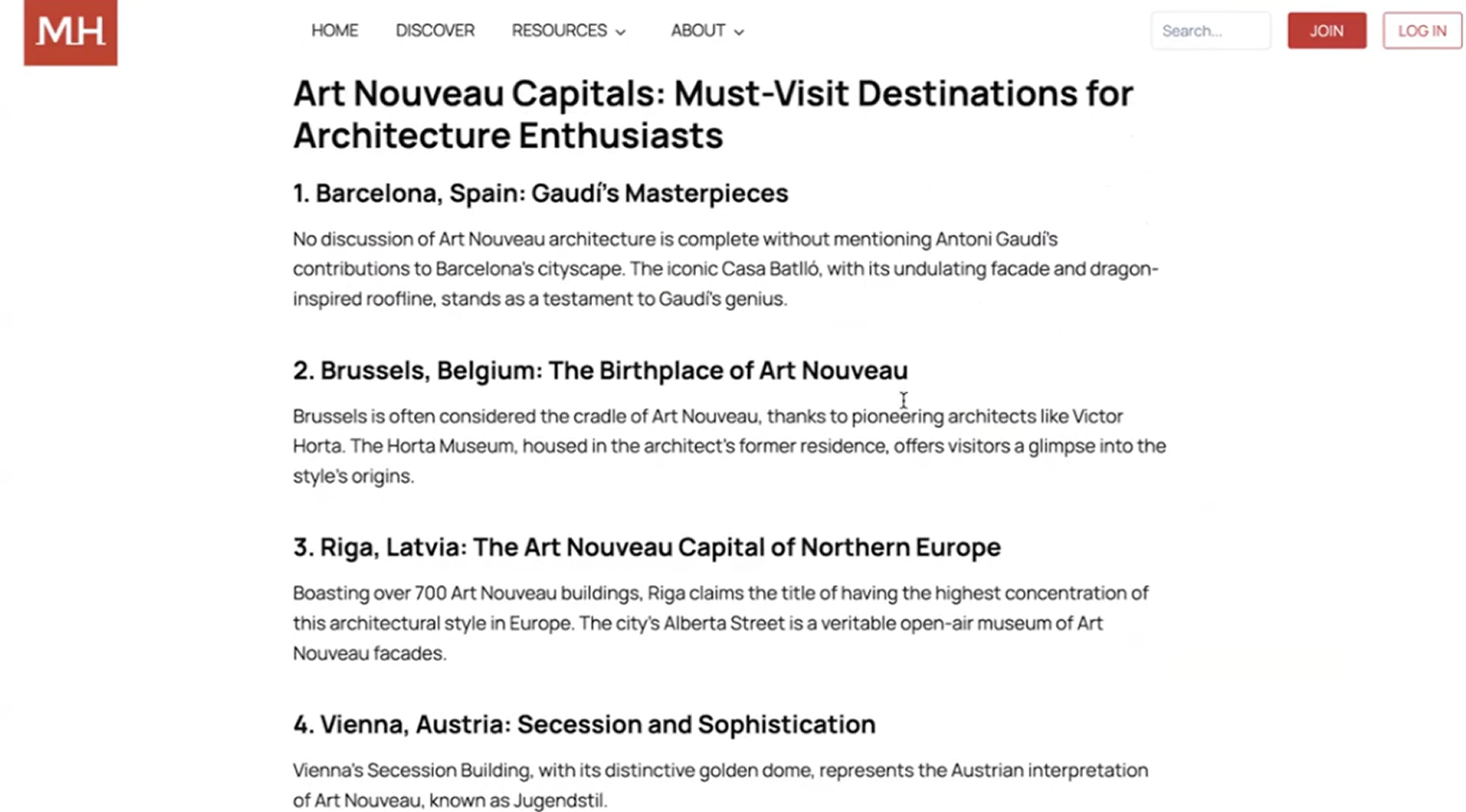
Articles: Reading, Learning, but… no Visualizing?
1) Articles are Informative, but we Need Images!
- Images are needed to help the users visualize the artistic concepts (Ex: Pictures representing Art Nouveau)
2) No Visuals = Text-Heavy Articles
- No images makes it harder for users to stay engaged when reading through the content.
“Maybe like some photos in case someone… is not familiar with it…”
Better Visualization for Articles on MagnificentH
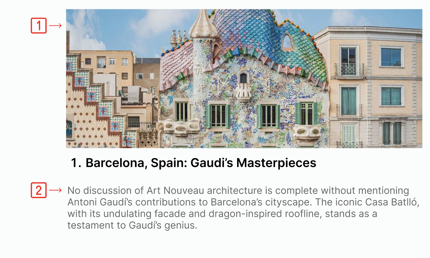
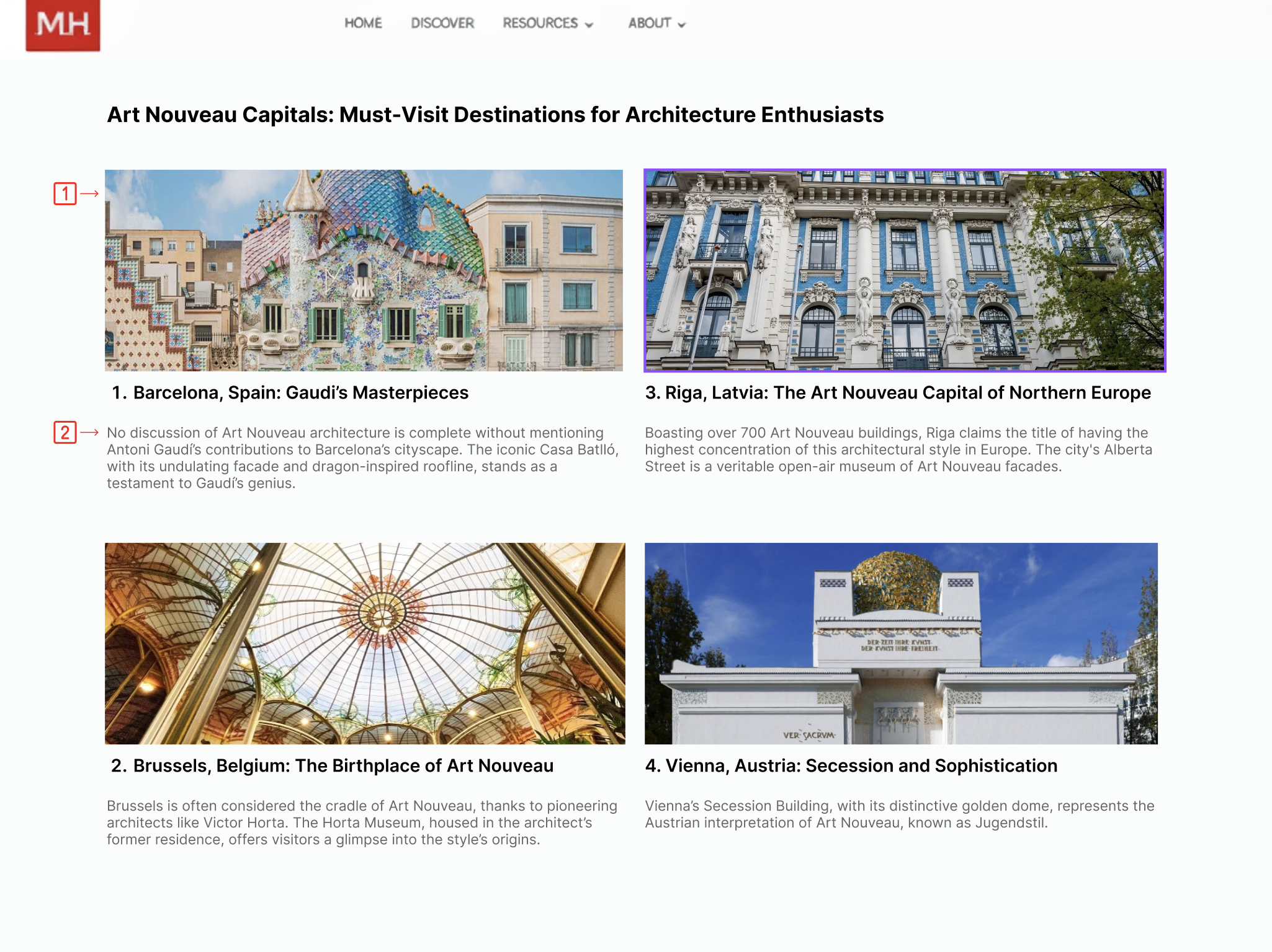
1) Images Please!
- Adding visuals breaks up the content for each concept
- Supports comprehension and increases engagement
2) Reshuffling Article Layout with Shades of Grey
- Grey text for secondary information
- Visually creates breathing room
- Color contrast meets accessibility standards: 4.5:1 contrast ratio
OH NO!: Pivoting in the Face of Unexpected Circumstances
Client Reaction to the Participants Recruited and AI
The client was appreciative of the results and had not previously considered the confusion users might make with AI on the MagnificentH website. She was also curious about our data and the participants who were screened. The client had many questions regarding how we screened and recruited the participants to collect this data, as she was not familiar with usability testing as a whole.
Future Testing on the First Impressions of AI on the Website
If we were to continue the project, we would screen a new round of users to test our redesigns with an extra focus on AI. We would like to see whether participants would now understand that they are regaining agency over their work from AI within MagnificentH. The role of AI in MagnificentH is a topic we feel will likely need further study to ensure creators feel comfortable while using the website and joining.
Reflections: Technological Twists & an Unreliable Tester
1. More Explicit Client Communication
After completing our moderated tests, we informed the client. However, the client took this as a sign that they could now completely revamp the website. This made creating our redesigns more difficult, and we had to dive into our recorded videos to get the original visuals. Explaining and reemphasizing to the client that they must not change their website whatsoever until the official report and presentation is a must to avoid this in the future.
2. Scheduling More Than the Amount of Participants Needed
For the most part, we easily found participants for our study. However, the last one was hard to obtain because participants cancelled at the last minute, and one user had to be disqualified for not reading or completing the tasks professionally. This allowed our team to realize that we were fortunate, and in the future, we must always book more appointments than necessary to account for unexpected events.
3. Transcript Back Ups
When conducting our very first moderated test, Zoom malfunctioned and did not record the session even though we had tested its functionality before hand. We had also decided to have transcripts. Therefore, even without a video, we realized transcripts were a necessary backup to have in case an error like this one were to occur again.
Want to Take a Closer Look?
Full Report Link:
https://docs.google.com/document/d/1sjuHVeoibehOzWBxIKxWlaOHgJJqCXKKdgB4H7nPaac/edit?usp=sharing