Project Overview:
Interacting With Young Adults: Understanding Navigation and Terminology on MagnificentH
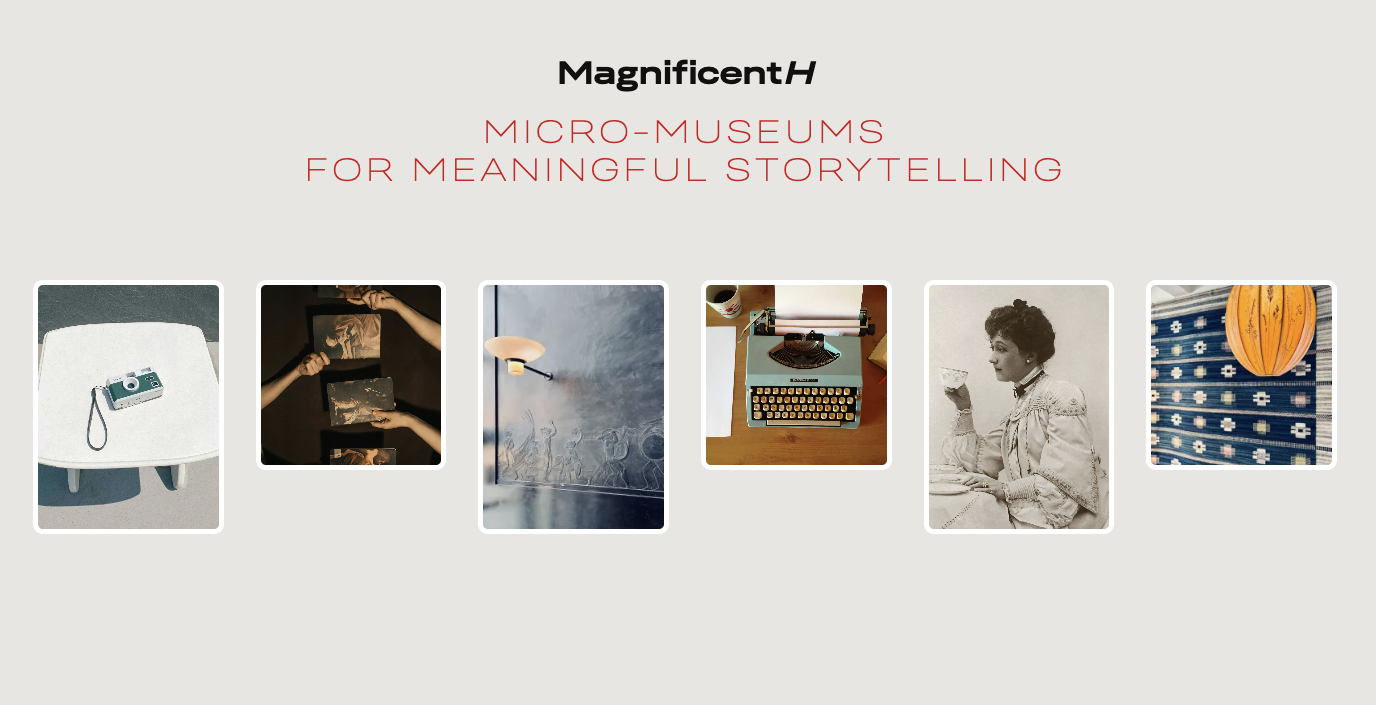
MagnificentH is a micro-museum platform contain knowledge and cultural storytelling, with the goal of bringing museums into a new digital era. The platform allows museums and creators to showcase visual content that exposes the public to art and history in an authentic way, offering an alternative way to avoid generated artificial intelligence media. The goal of this study was to identify usability issues that potential users, especially younger audiences such as young millennials and Gen Z in North America, may encounter when navigating the website, and to provide actionable recommendations to better communicate the platform’s mission.
Our Team / Project Timeline
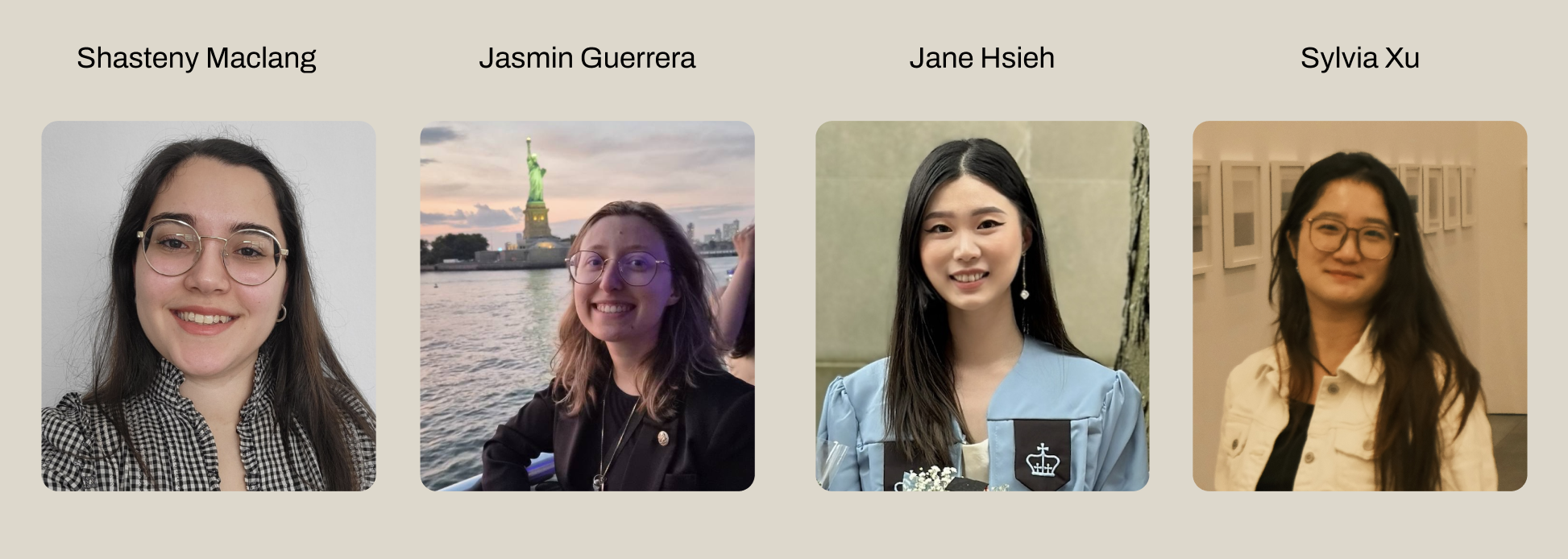
Our team is made up of four UX researchers from Pratt Institute: Shasteny Maclang, Jasmin Guerrera, Jane Hsieh, and Sylvia Xu. We bring expertise in user research and design strategy, and we collaborated closely with our clients to understand their needs and provide recommendations based on our research.
Problem Statement:
Would Users Understand and Engage With a Micro-Museum Platform?
Our client indicated that it was unclear whether users interested in art, history, photography, architecture, travel, and cultural storytelling could easily understand MagnificentH’s terminology and navigate the platform without usability barriers. We needed to address how to identify navigation and comprehension issues that might prevent users from engaging with or contributing to the site.
Methods Used to Address the Problem
Below are the methods used for this project.
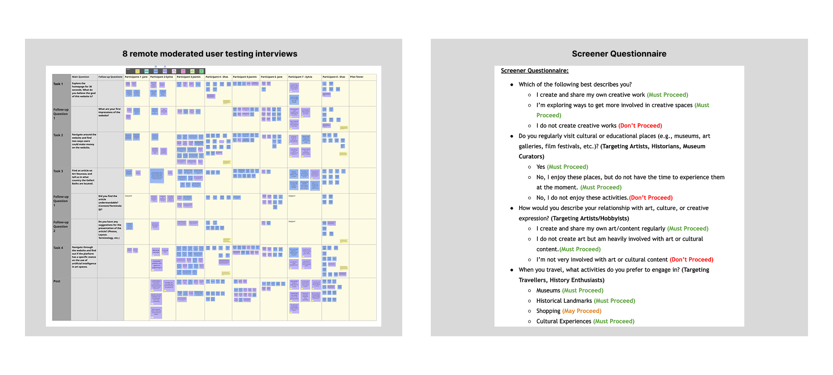
- Screener Questionnaire: Identified target user profiles and created a screener form to ensure participants were qualified for the study: In this study, we recruited young adults who are interested in art, history, photography, architecture, travel, and cultural storytelling.
- Remote Interviews: Conducted remote moderated usability testing with eight young adults aged 18–34.
Key Learning & Findings Based on Research
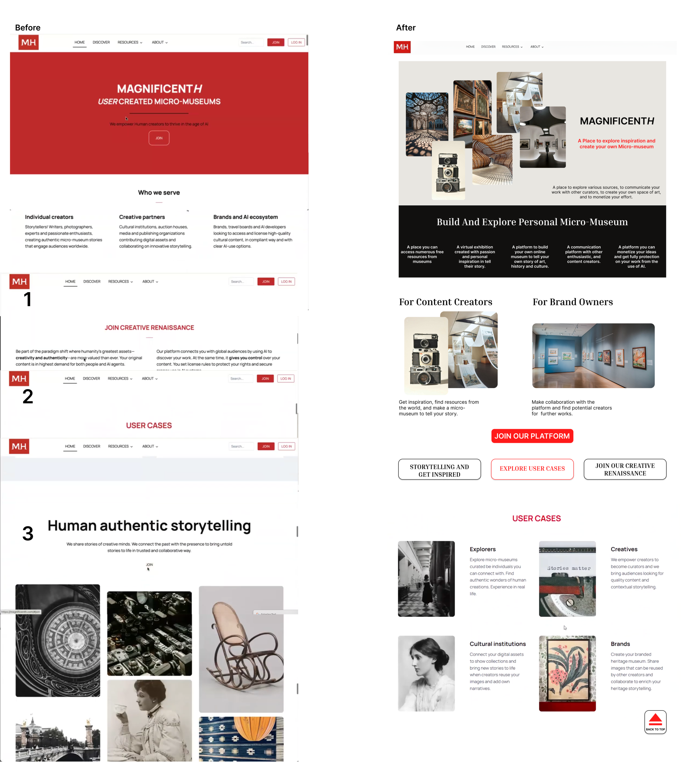
1. Homepage Reconstruction: Communicating the Concept of a “Micro-Museum” Through Hierarchy and Imagery
- Users responded positively to the concept of a digital museum space, but the homepage did not clearly express this identity through its visual hierarchy and imagery. While many participants found the homepage visually interesting, the page felt overwhelming to them.
2. Making Space and Simplifying: Defining the Role of AI
- Most participants were unsure about what the website was advocating regarding AI, which led to frustration. Given the importance of MagnificentH’s stance on artificial intelligence, making this information clear and accessible is essential.
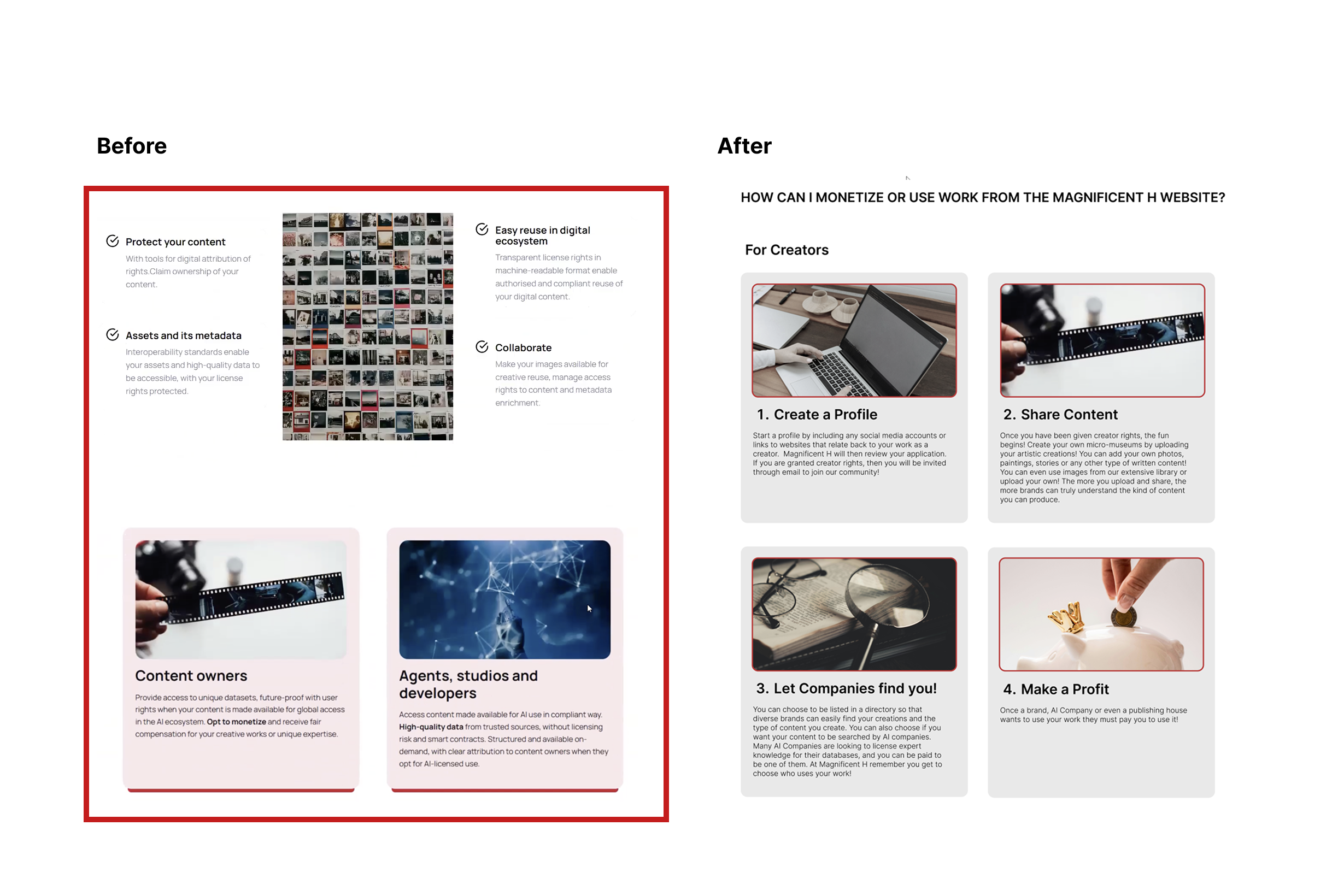
3. “Protect and Monetize” Web Page: Clarifying Compensation
- The current “Protect and Monetize” page lacks clarity, which makes it difficult for users to locate the information. The page feels overwhelming due to heavy text, confusing layout, and unclear monetization process.
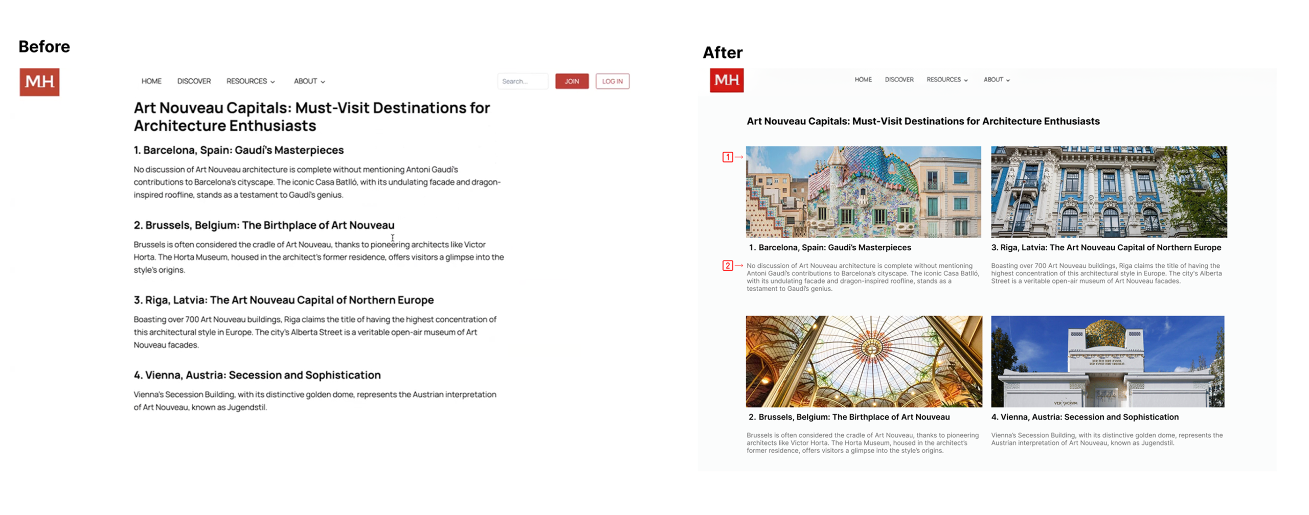
4. Visual Engagement: Improve Article Reading Flow
- Most participants mentioned the need for more supporting images to help them better visualize the content as they read through the article. Users also felt the article was too text-heavy, making it difficult to stay engaged.
Solution
1. Improving Homepage Hierarchy and Imagery for Clear Storytelling
- To establish a stronger identity as a digital museum space, the homepage was redesigned with more impactful visuals and imagery.
- Adding more imagery and tagline to improve the overall visual
- Using visual hierarchy to improve storytelling: The updated flow guides users to “Explore and Get Inspired,” which branches into two key user actions: “Exploration” and “Storytelling.”
2. Clarifying the role of artificial intelligence (AI)
- Usability testing showed that users naturally looked to the FAQ section and the “About” tab when searching for information about AI. Based on this behavior, we updated the FAQ to directly address MagnificentH’s stance on AI and added a subpage of AI under the “About” section. The redesigned content highlights MagnificentH’s core value of protecting creators, helping build trust by communicating its approach to AI.
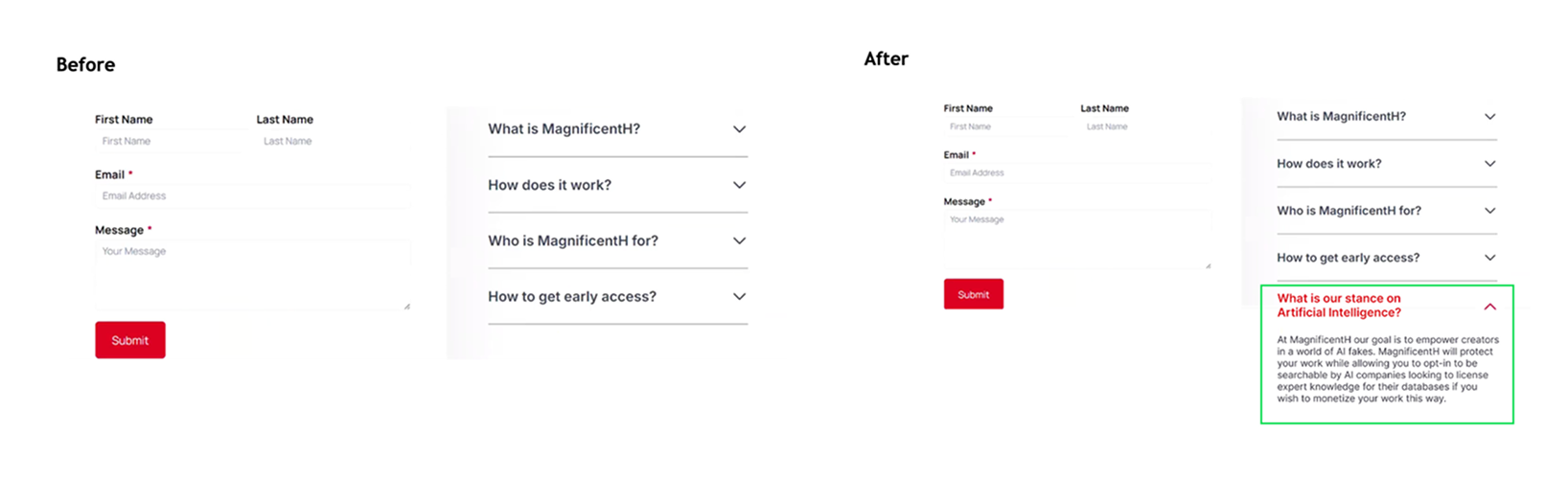
Above is the before and after version of the FAQ section

Above is the before and after version of the “About” tab
3. Clarifying Monetization Information
- To improve clarity in this section of the MagnificentH website, certain sections and blocks of text were removed or reorganized. We redesigned the monetization instructions into a clear, step-by-step process for creators, as moderated remote testing revealed this area caused the most confusion among participants.
4. Adding Images and Reducing Text-Heavy Visuals in the Articles
- The MagnificentH article page is lack supporting images with heavy text, making it harder for users to visualize the content and stay engaged.
- Adding visuals for each architectural style: we redesigned the page by inserting image such as the example of Casa Batlló in the Barcelona: Gaudí’s Masterpieces section, which would improve comprehension and engagement for users.
- Improving visual hierarchy by using lighter gray text for secondary information : This approach reduces text-heavy issue while maintaining accessibility standards.
Conclusion & Feedback
Solution Overview: MagnificentH is creating a digital space that encourages users to contribute and engage with cultural content. All participants in the study expressed strong interest in the website’s content and its potential to grow as a public platform. With our findings and recommendations, the site can communicate its story and value more clearly to users.
Impact & Client Feedback: We received positive feedback from our client during the final deliverable review and through email.
“Thank you girls, I am so impressed. This is amazing work you done. This is so valuable for me.”
– Anna, Founder of MagnificentH