Project Overview
Team: Hridya Nadappattel, Nikhil Shetty, Radhika Balaji, Zoë Zapata
Tools: Figma, Google Suite, Zoom, Optimal Workshop
Timeline: 3 months
Client: Mendocino County Safe Space Project (MCSSP)
Objective: Strengthen MCSSP’s digital presence by increasing visibility, accessibility, and engagement.
MCSSP is a queer/LGBTQIA2S+ safe space project focused on getting resources to the masses. They are dedicated to providing organisations with training on Cultural Humility and on how to make any space queer-supportive.
When we were introduced to the Mendocino County Safe Space Project through our professor Rachel Ginsberg, we were really excited to see how we could mould their site into something they were proud of. What we didn’t anticipate was how hard it would be to gather everything to make a cohesive site that would impact many queer lives.
Understanding how to help MCSSP
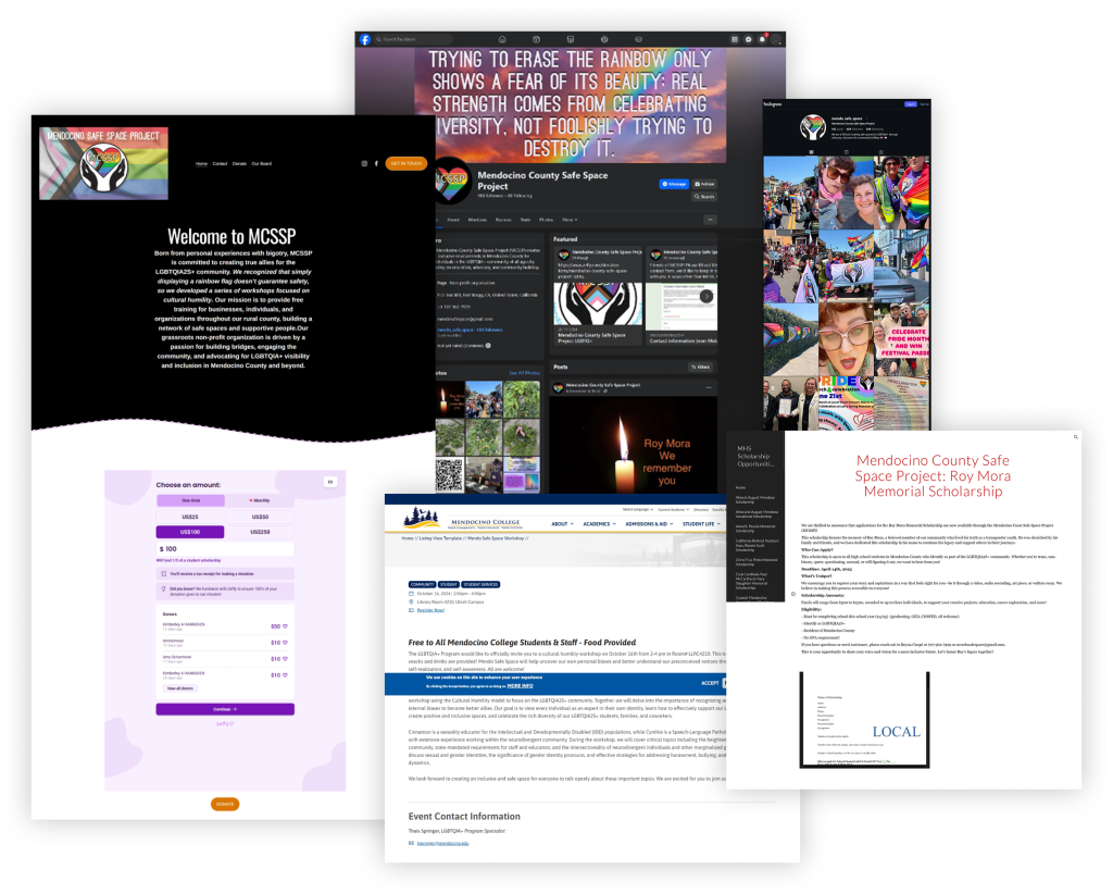
We first started by researching MCSSP’s digital footprint. What we found digging through were their:
- Official website
- Facebook and Instagram
- Local college workshop pages
- Donation portals
- Scholarship listings
- Professional profiles (Even Cynthia’s LinkedIn)
Going through this, we realised that their site had almost no content. Their social media presence lacked context, but had so many great resources and pictures about the community. Their scholarship existed on the internet, but could students discover it? The donation page lived on a third-party platform, which was pinned on their Facebook page.
But the gaps in their digital identity raised a much bigger question:
If this organization is providing essential support, where’s the story? To understand this, we met the client and discovered how much was hidden.
Cynthia gave us insight into meaningful stories and efforts, and they weren’t being highlighted by the current site and social media presence:
- A local safe space in a rural county
- A mentorship and scholarship provider
- A community education resource
- A point of connection for isolated queer youth
- A grassroots organization run with pure passion
Hence, we decided that MCSSP’s narrative deserved a louder voice.
Benchmarking What a Holistic Queer Resource Hub Should Be
We followed up with Cynthia to obtain any internal documents we could use to understand the organization better, and they provided us with grants, scholarship descriptions, workshop outlines, narratives, board write-ups, and community materials.
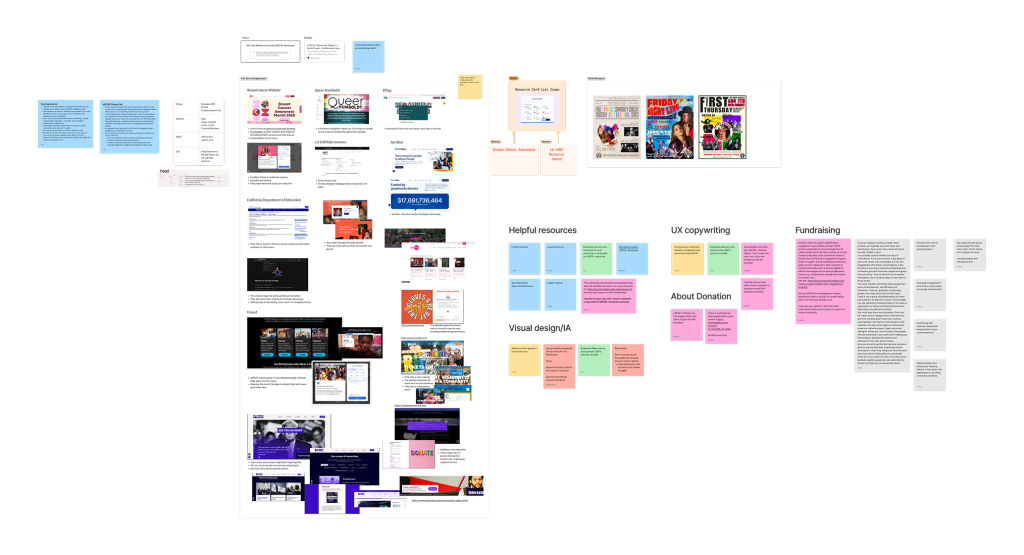
We also researched multiple national and local queer resource hubs and a lot of donation hubs to see how we could really shape the website.
We also asked to be connected with the queer folk at Mendocino to really get an idea of how queer life really was over there. This really filled in the gaps we were not able to uncover through desk research:
- The difficulty of finding queer-affirming doctors, therapists, and educators
- The heavy reliance on word-of-mouth
- The cultural isolation of rural queer youth
- The desire for a centralized, trustworthy resource
- The emotional significance of seeing yourself represented online
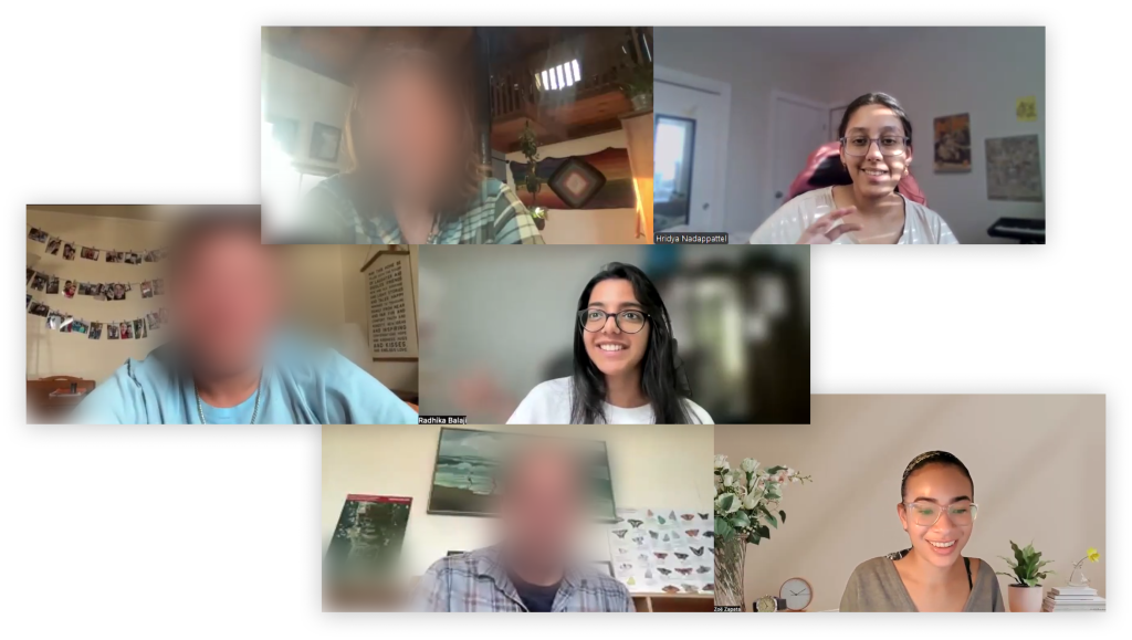
Going through everything we uncovered, it slowly became evident that, alongside making MCSSP a platform where queer voices are elevated, the site also had to work in people’s hands, not just on their desktops, making a mobile-first approach essential for real access.
Too Many Directions, One Big Realization
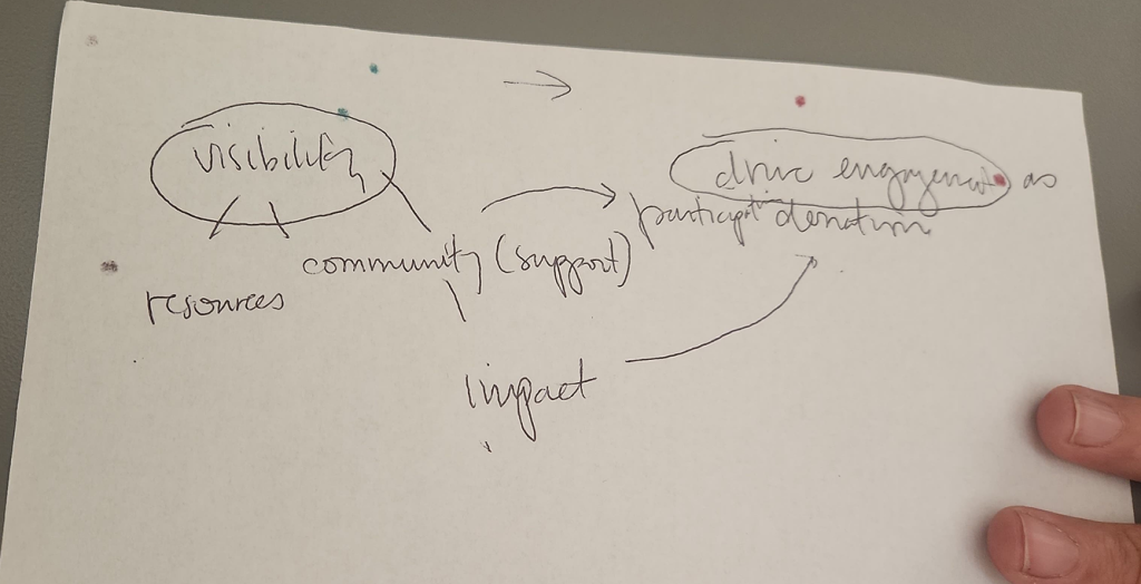
After compiling all of our research, we realized that we had SO much information, SO many needs, and SO many possible site structures that we felt paralyzed.
With a little help from our professor and each other, we finally found the thread that tied everything together (see image above).
Strategic Direction
Design a website that increases the visibility of MCSSP’s impact in Mendocino by surfacing resources and reflecting community presence, thus driving engagement through participation and donation.
With this figured out, we were finally ready to tackle the website
Creating the Information Architecture
With the strategic direction as our north star, we went into mapping out what resources could be required, where backed by what we found during all the research. Gradually, we created a collective map that held MCSSP’s entire story in a way any user could follow.
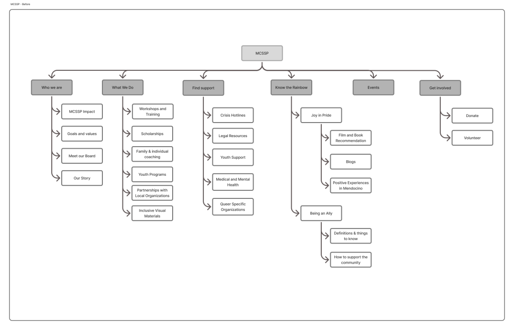
And with this blueprint came the next challenge: turning structure into screens.
Making a queer-friendly website with the best intentions
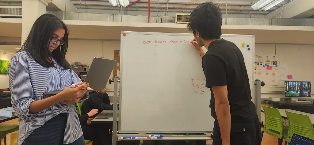
Once we started wireframing, things got rocky again. Everyone had their own interpretation of the structure, tone, and level of detail. Some pages were highly informational; others were conceptual or visual.
There was another critical nuance: the word “queer,” though reclaimed, can still be sensitive depending on the audience, age, and geography.
So we paused and created a list of questions for Cynthia:
- Tone
- Visual identity
- Audience expectations
- Language sensitivity
- Resource categorization
- And most importantly, how many resources would they have?
That meeting clarified everything. Cynthia gave us green lights, boundaries, and intentions that solidified our final direction.
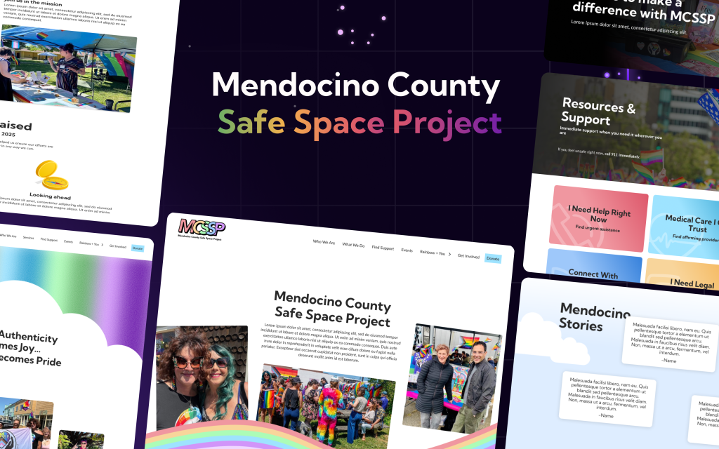
We finally created the site that addressed everything from research, client needs, what was available and what we saw out in the world. This was the moment when everything suddenly “clicked” visually. The structure made sense, the tone aligned with the community, and the resource pathways finally felt intuitive.
The new face of MCSSP
Brand Identity & Visual Language
We began by reimagining MCSSP’s visual identity.
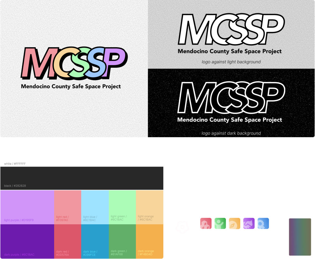
- A new logo designed to feel fun, retro, and colorful — reflecting pride, joy, and community with — knockout and monochrome versions
- A bold, unapologetic color palette, with palettes optimized for light and dark backgrounds to maintain contrast and accessibility
For typography, we chose Kumbh Sans for headings and Lato for body text, both rounded sans-serif typefaces that create a friendly, approachable feel while maintaining seriousness.
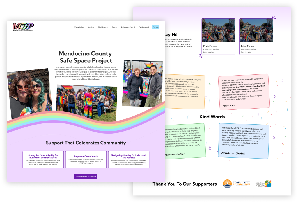
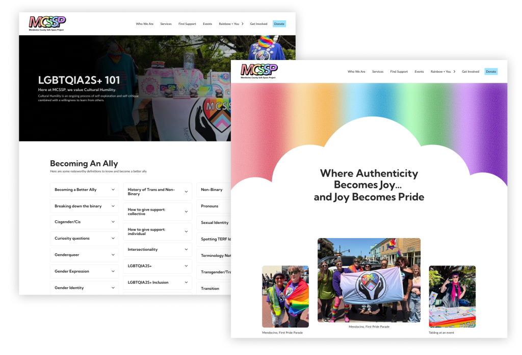
Home
The Home page is full of life focusing on:
- Vibrant colors that communicate pride and togetherness
- Community photography using real people
- Clear paths to services, events, and support
- Testimonials that reflect MCSSP’s connection to Mendocino County
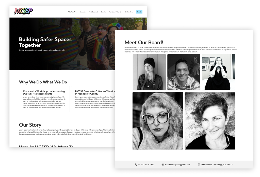
Who We Are
This page explains what MCSSP does and how they operate. It includes:
- A news section showing recent updates and community impact
- A mission statement paired with a community photo
- Six service areas MCSSP focuses on
- Operations and safety information
- Board member introductions
Resources & Support
This section prioritizes clarity and user care.
- Clear categories: Crisis, Medical, Mental Health, Community, Legal, and Queer Youth
- Personal language to support users through resource discovery
- Option for users to suggest resources
- Navigation that keeps all support options visible
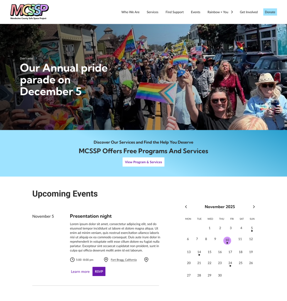
Events Calendar
An events calendar that shows everything happening around Mendocino County, not just MCSSP events, to encourage community connection.
Joy in Pride
This page functions as MCSSP’s personal journal and celebrates queer joy. It includes:
- Blogs and narratives
- LGBTQIA2S+ watch lists
- LGBTQIA2S+-friendly spaces tagged as Trained by MCSSP
- Mendocino stories
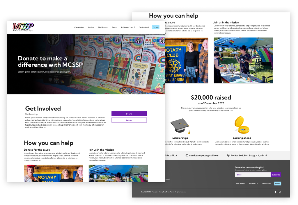
Get Involved
Focused on donation and volunteering.
- Two clear CTAs
- Clean, minimal layout
- Designed to convert visitors into supporters
Did our designs really make sense?
After a team review, we noticed that some of our navigation choices could mislead users. So we ran a tree test and shared it with every queer community, group chat, friend circle, and online space we knew and saw how:
- People struggled to find the scholarship
- Users got lost trying to locate free workshops
- Some categories were unclear
- Labels didn’t match mental models
- Key content was buried
All of these issues were blocking access to real support. To mitigate this, some of our more playful ideas had to be toned down so users would immediately understand where to go. (Trying to be “gay and fun” sometimes clashes with trying to be “clear and useful,” unfortunately.)
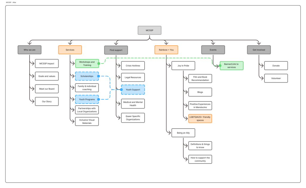
This revision became our final IA; solid, accessible, and intuitive.
Final Hi-Fi, Documentation, and Handoff
With the structure solved, we pushed through the final high fidelity designs.
We:
- Refined interactions
- Clarified hierarchy
- Standardized terminology
- Ensured accessibility
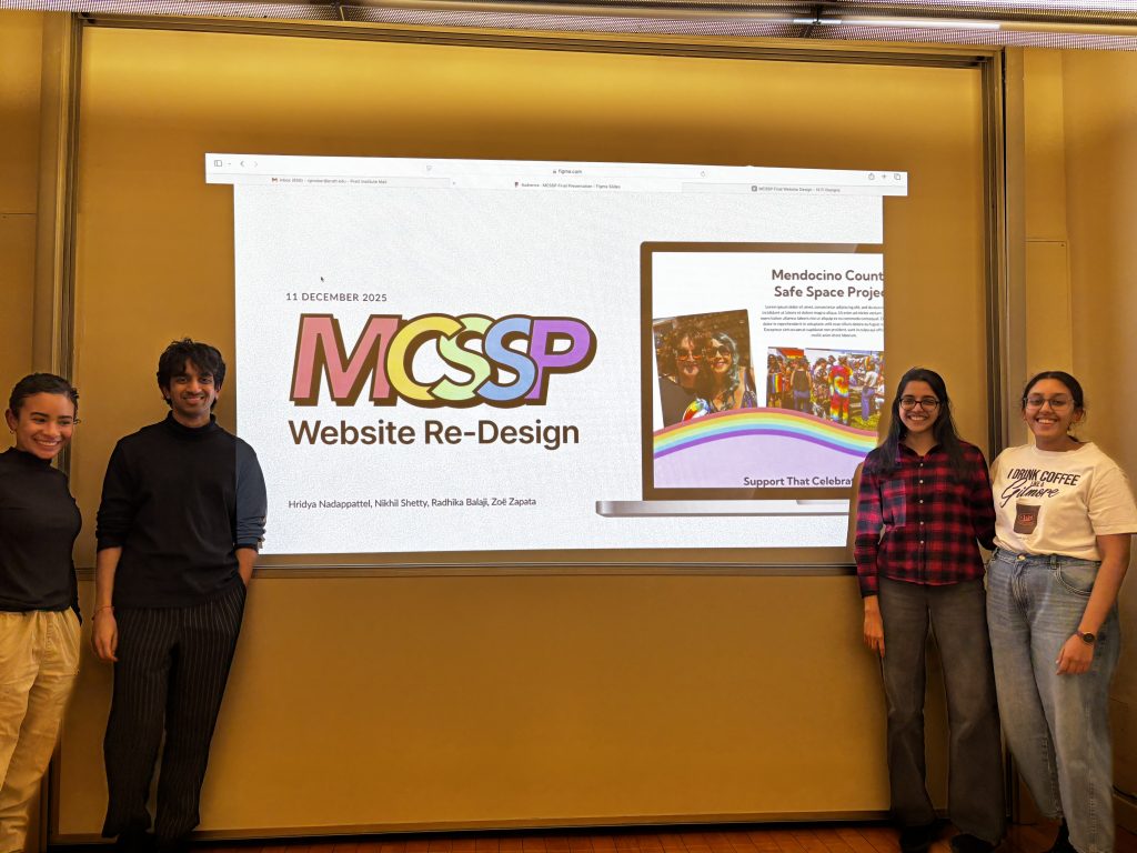
And then we presented everything to the MCSSP board.
Their reaction?
They were impressed—genuinely excited.
Cynthia and the board told us that they finally saw their mission clearly represented. They were already eager to build it out and asked us how we could go about implementing what we made.
We recommended four website creation platforms — Framer, WordPress, Webflow and Lovable — focusing on what the easiest and effective way to implement the website will be.
