Introduction
The problem we are trying to solve is making the NYC tourism website more applicable to residents who were planting roots in the city. Students and young professionals who have recently moved to New York might not consider the website as a resource for local discovery. We wanted to figure out ways for students to naturally explore and discover the local offerings in their new environment. Together we want users to create a sense of locality in their new city.
Along with my team, we were able to research and redesign the NYC tourism website to better suit those who are looking to create their local community in a new environment. Some of the obstacles we faced were based on:
- Current ideas around Tourism websites
- The current structure of the website content
- Competitor apps that allow for faster discovery
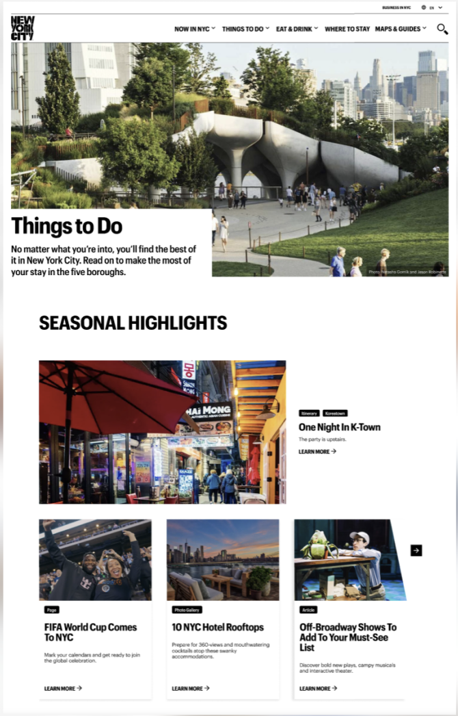
The current ideas around tourism websites emphasize the idea that users interacting with the site are only there for a short amount of time. The impacts of these assumptions has impacted the current design structure, and ultimately how users prioritize listings on the website against competitor planning apps.
Process
Our team facilitated research to better understand the key pain points for users when exploring for new restaurants and activities. Here is more information on the research process that led to our redesign.
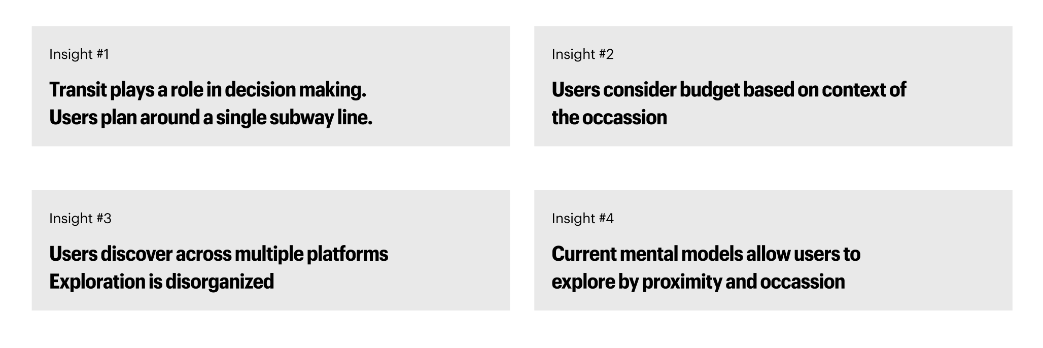
User Interviews
Our team interviewed six users, ages 20-28. All participants had moved to the New York City area within the last year. All users were unfamiliar with the city and used resources to plan and familiarize themselves with the city. Here were the main takeaways from the interviews:
User Personas
Upon reviewing the insights from our user interviews, we were able to create the basis of our personas. We found that we were able to put our users into three different persona categories. By identifying our users into these three buckets, we were able to determine that speed and accuracy were at the forefront of ur users’ needs. They wanted to find options quickly, and they wanted to make sure that the results were accurate to their needs. This directly influenced the cards tested in our card sorting tests in creating clear and concise labeling based on multiple contexts:

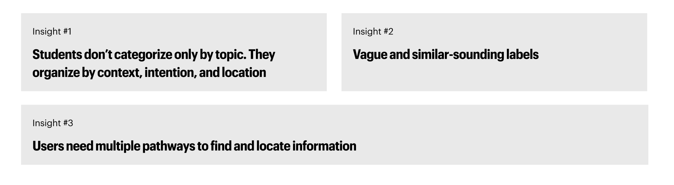
Card Sorting and Tree Testing
Our team conducted an open card sorting session with nine participants. Participants were asked to Group 57 content cards and name their own categories. Followed by tree testing with six participants to validate our new IA. Our goal was to understand how users mentally organize content and identify common clusters and ambiguous cards. This test would allow us to create our new IA (information Architecture) with more accuracy. Here are our findings:
Based on these findings, we created the following IA to create an easier experience for users. This IA creates multiple entry points for users to discover new restaurants and things to do beyond the city. We also elaborated on categorizations to allow users to find offerings based on location and groupings such as ‘cuisines’:

Usability Test & Mid-Fidelity Prototypes
Based on our new IA, our team conducted three usability tests on our low-fidelity prototype. Users were tasked to complete the following tasks:
- Explore things to do in Brooklyn and save to your wishlist
- Find a vegan, accessible restaurant in the Upper West Side and save it to your wishlist
- From your wishlist, find some things to do in the area and add those to the wishlist
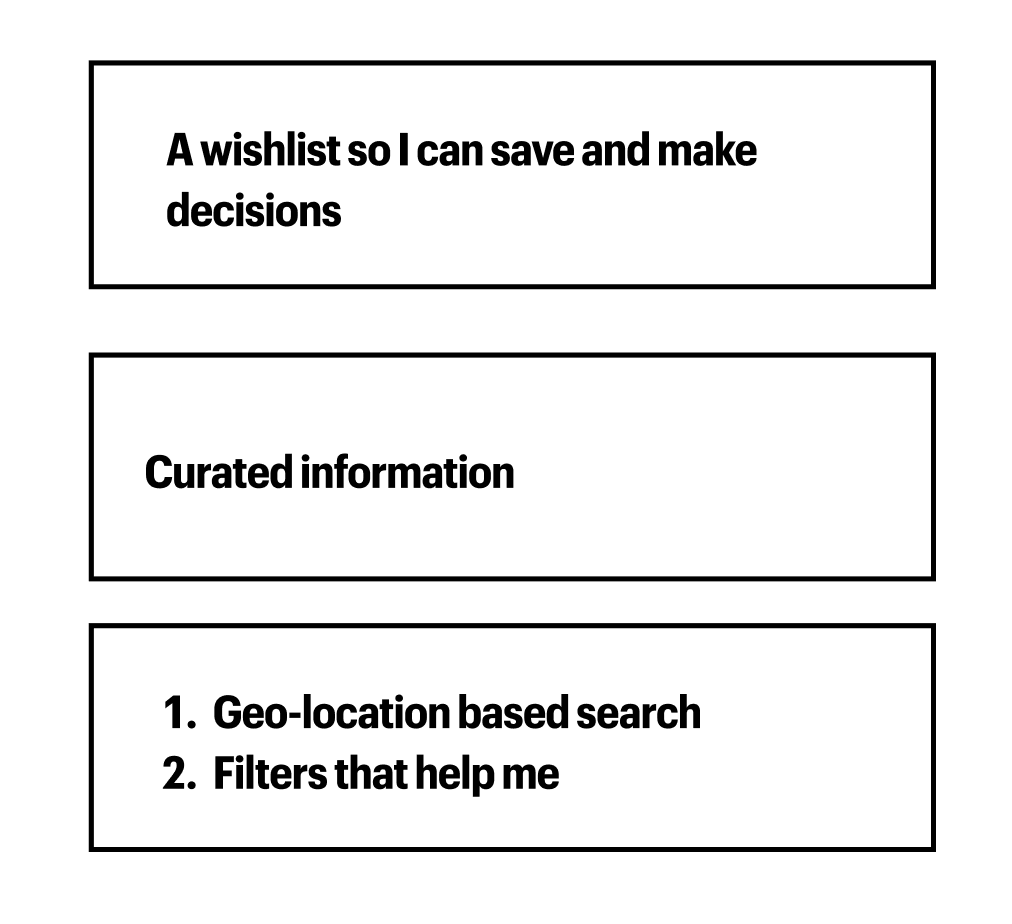
Here were our findings from the tests:

This information allowed us to come up with three features to improve upon in our high-fidelity prototype. This helped to create a scope for our team to improve upon our ideas:
Solutions & Final Prototype
Our team’s final prototype incorporated the following improvements, to allow users to better discover their new area:
- Redesign of Explore Pages
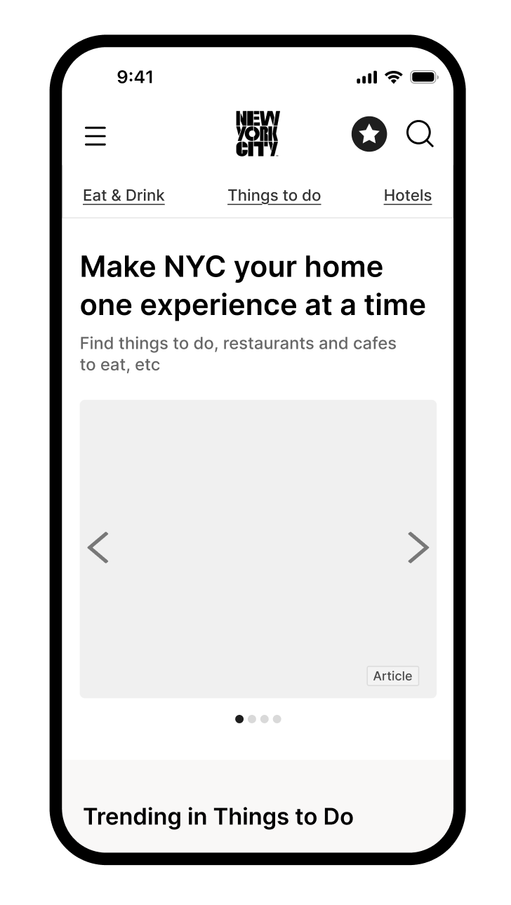
In order to improve the speed and efficiency that users found listings for restaurants, we made adjustments to the explore page formats and the navigation bar, incorporating our new IA. The old IA as shown above, prioritized content in order to lead users to specfic listings. Here was our redesign:
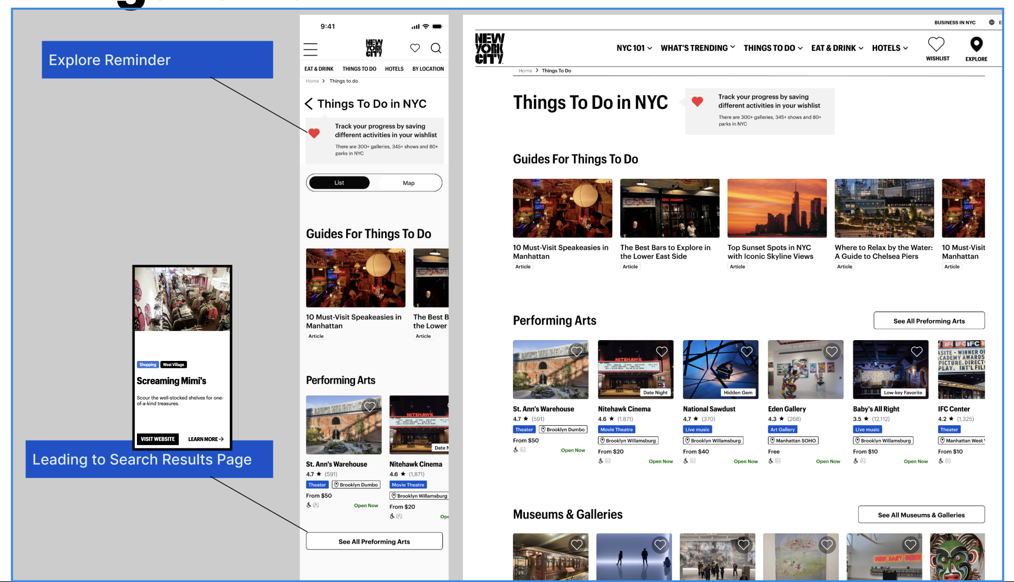
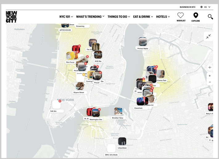
Our redesign allows users to toggle between a map and a list view. Since users are new to the area, a geo-locational feature can be helpful to orient the user as to where they are in relation to where they are.
2. Updated Item Cards and Product Description Pages
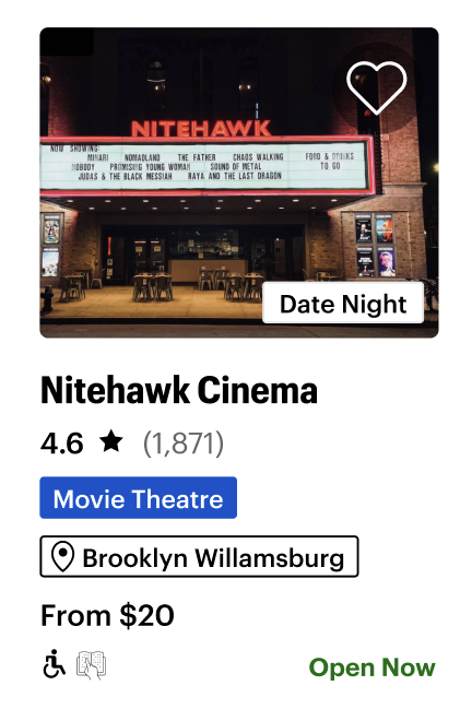
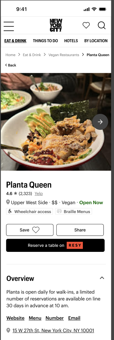
New item cards were created to allow users to better understand if the offering matches their needs for the occasion. Meta tags were added with further detail, and a wishlist icon was added to record for later viewing.
New product description pages were created to allow users to learn more about restaurants and events. With options to create reservations, links to reviews, and hours of operation listed. The Product descirption pages would also offer options for users to find listings that are similar. Users are now able to make decisions faster and with more accuracy.
3. Wishlist Function
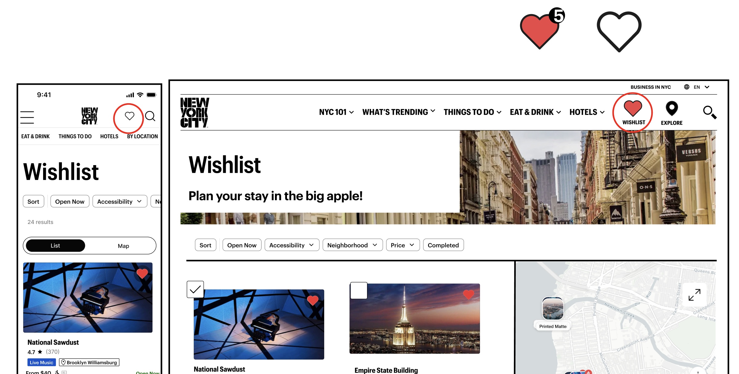
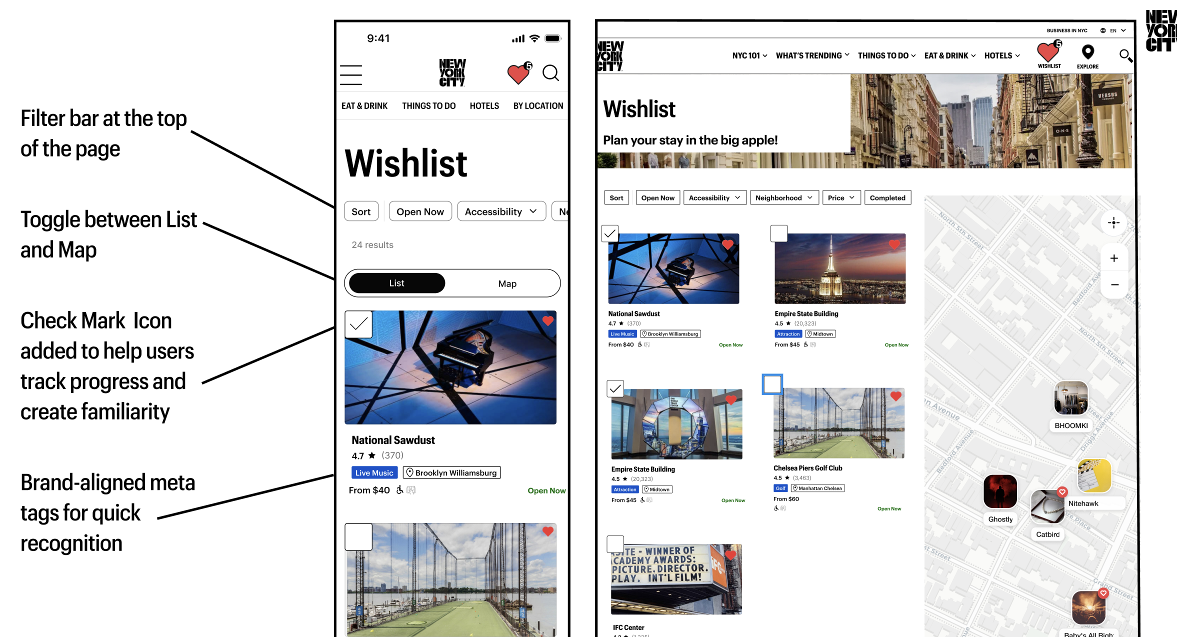
The wishlist icon leads to the wishlist page, which allows users to sort through offerings that have piqued their interests.
A checklist icon allows the user to denote what events and restaurants they have already been to. We want to allow users to create an index of their community and create memories in their new city.
Conclusion and Next Steps
As we think this redesign will create a more efficient process for users, further testing is needed to validate our redesign choices. Upon critique from a panel of industry experts, we would also like to further test our wishlist checkmark icon to understand the ways users prioritize information on the listing badges.
However, we believe that this website can become a center for information on listings that are special to New York. The implications of this redesign could help to provide more income to the local economy, and ultimately help to create a new home for users who are new to the big apple.