Role: Researcher, Project Management & UX Design Research
Project Duration: 4 Weeks
Device: Desktop & IOS
Introduction
The New York City Tourism Website was created in order to introduce visitors to the attractions New York City has to offer.
Our team conducted usability tests to understand how long-term residents could better utilize the website. Focusing specifically on new students who have moved to the city. They may be looking for ways to create community in an unfamiliar city.
Ultimately, we want to support the NYC Tourism Website’s goals of making a large city feel a little bit smaller.
Research Process
To better understand how users currently find new attractions. Here are the steps we took to improve the current website infrastructure:
- User Interviews
- User Personas
- Card Sorting and Tree Testing
User Interviews
We interviewed users who:
- were ages 20-28
- had moved to the New York City area within the last year
- considered themselves unfamiliar with the city and were more likely to use resources to plan
- Here were the main takeaways from the interviews:
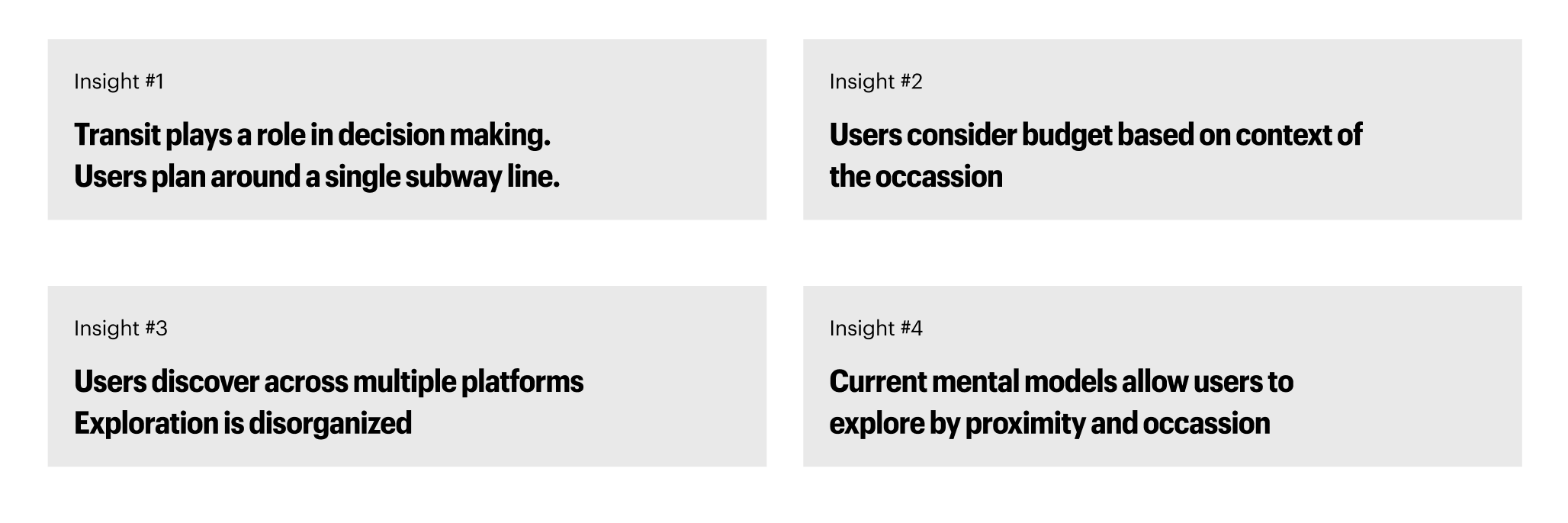
User Personas
Upon reviewing the insights from our user interviews, we were able to create three personas based on user intention:

Users ultimately wanted to find accurate listings in order to affirm their interests. Labels and metadata were important to users seeking guidance in their discovery.
Card Sorting and Tree Testing
- Our team conducted an open card sorting session with nine participants.
- Participants were asked to Group 57 content cards and name their own categories.
- Our goal was to understand how users mentally organize content and identify common clusters and ambiguous cards.
- Here are our findings:
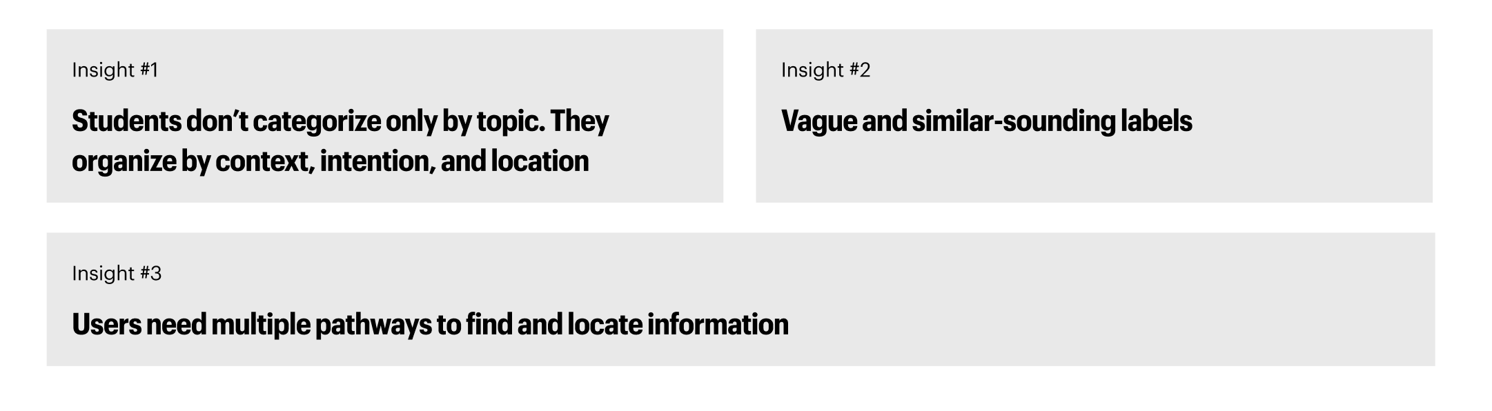
Based on these findings, we created the following IA to provide a more user-friendly experience.
This new information architecture:
- provides multiple entry points for users to discover
- Allow users to find offerings based on location and groupings such as ‘cuisines’

Usability Test & Mid-Fidelity Prototypes
Based on our new IA, our team conducted three usability tests on our low-fidelity prototype.
Users were tasked to complete the following tasks:
- Explore things to do in Brooklyn and save to your wishlist
- Find a vegan, accessible restaurant in the Upper West Side and save it to your wishlist
- From your wishlist, find some things to do in the area and add those to the wishlist
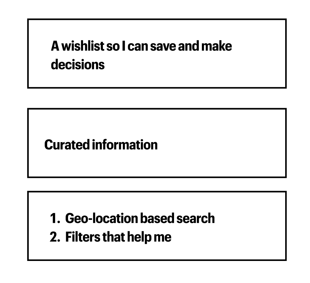
Here are our findings from the tests:

This information allowed us to identify three features to improve in our high-fidelity prototype:
Solutions & Final Prototype
Our team’s final prototype incorporated the following improvements to allow users to better discover their new area:
- Redesign of Explore Pages
To improve the speed and efficiency with which users find restaurant listings:
- We adjusted the explore page formats and the navigation bar to incorporate our new IA.
- The old IA, as shown above, prioritized content in order to lead users to specific listings.
Here was our redesign:
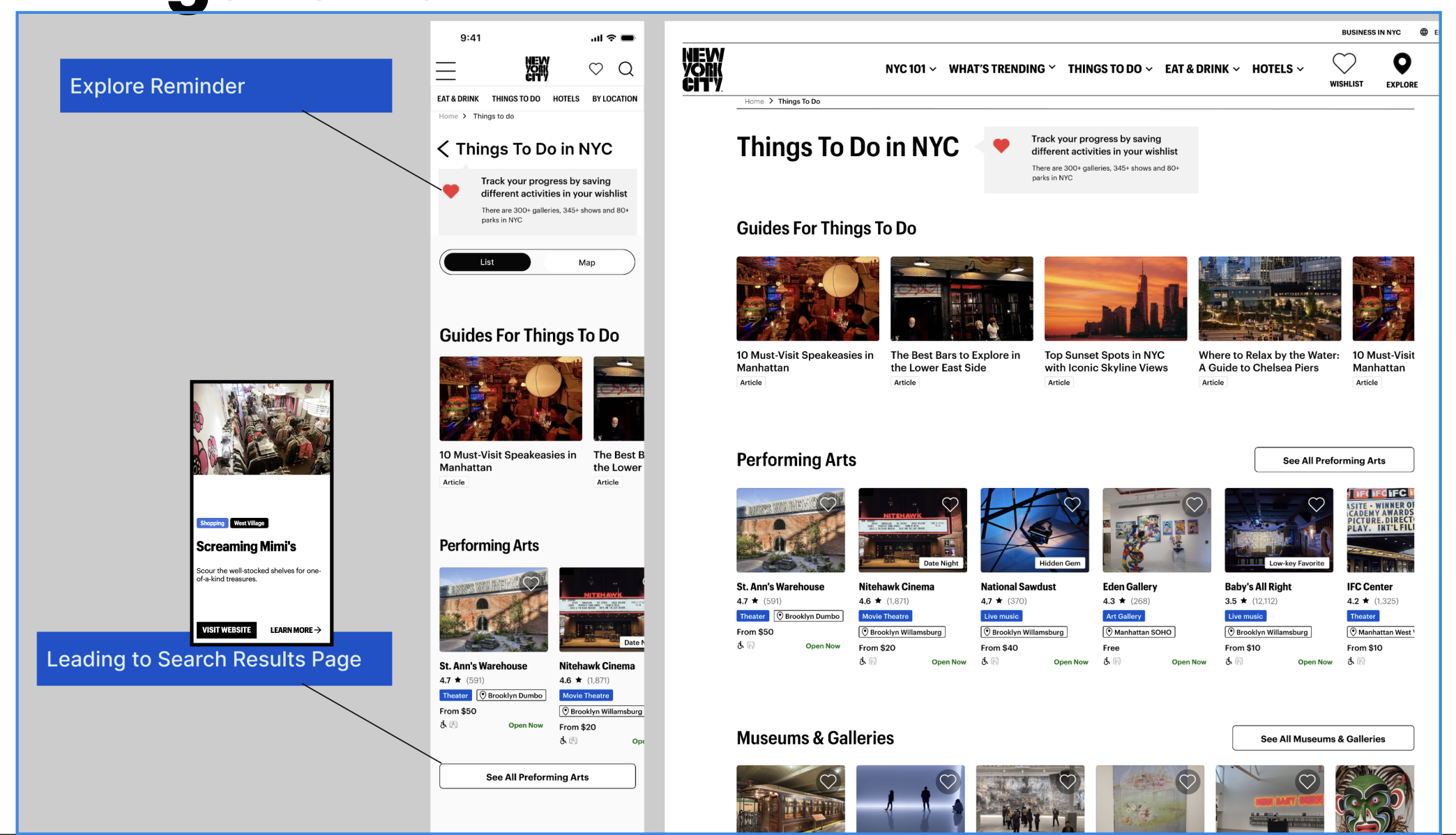
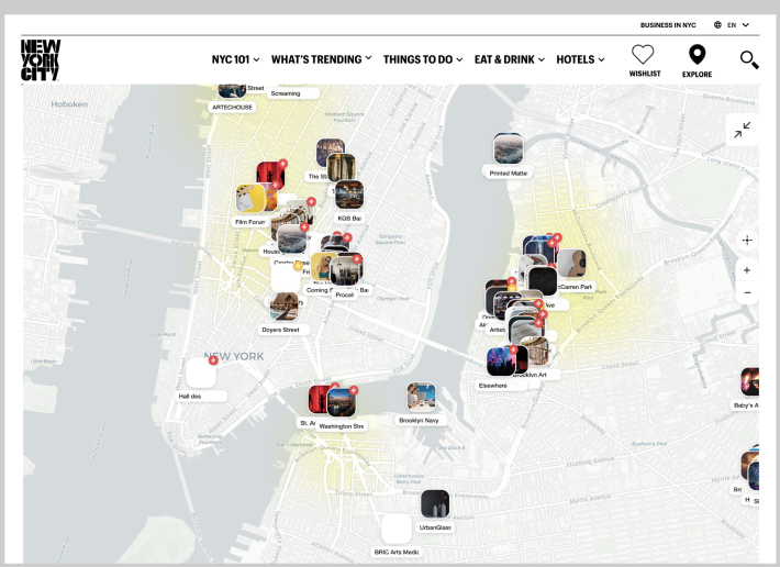
Our redesign allows users to toggle between a map and a list view. Since users are new to the area, a geolocation feature can help orient users to where they are.
2. Updated Item Cards and Product Description Pages
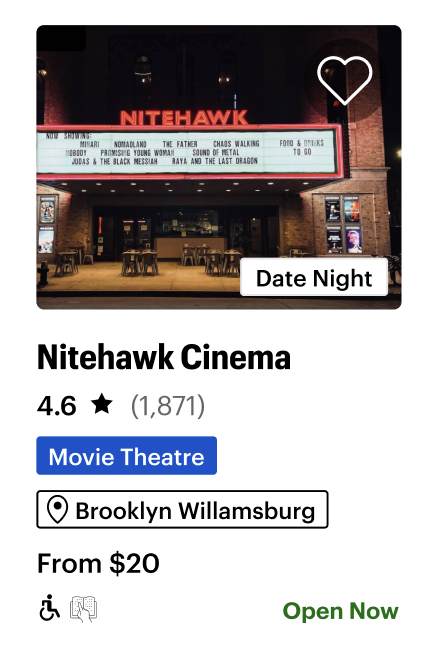
- New item cards were created to help users better understand whether the offering matches their needs for the occasion.
- Meta tags were added with further detail, and a wishlist icon was added to the record for later viewing.
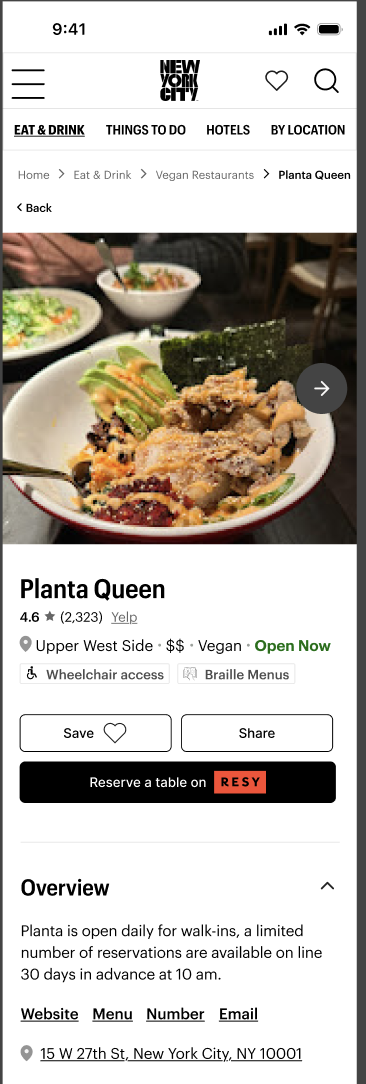
- New product description pages were created to allow users to learn more about restaurants and events.
- With options to create reservations, links to reviews, and hours of operation listed. The
- Product description pages would also offer options for users to find listings that are similar.
- Users can now make decisions faster and more accurately.
3. Wishlist Function
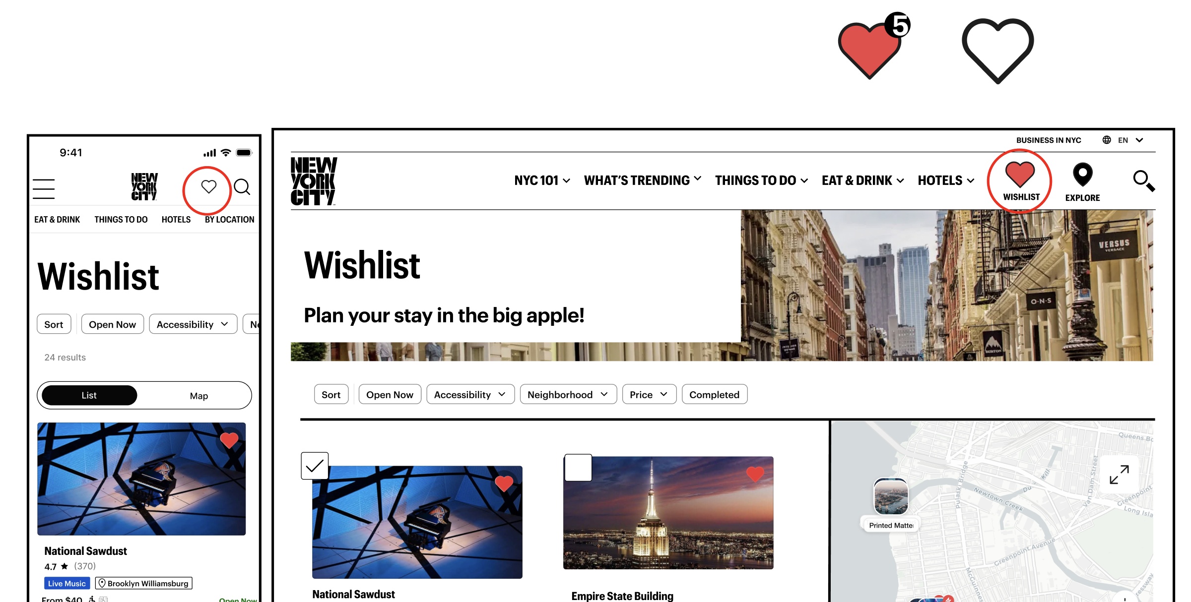
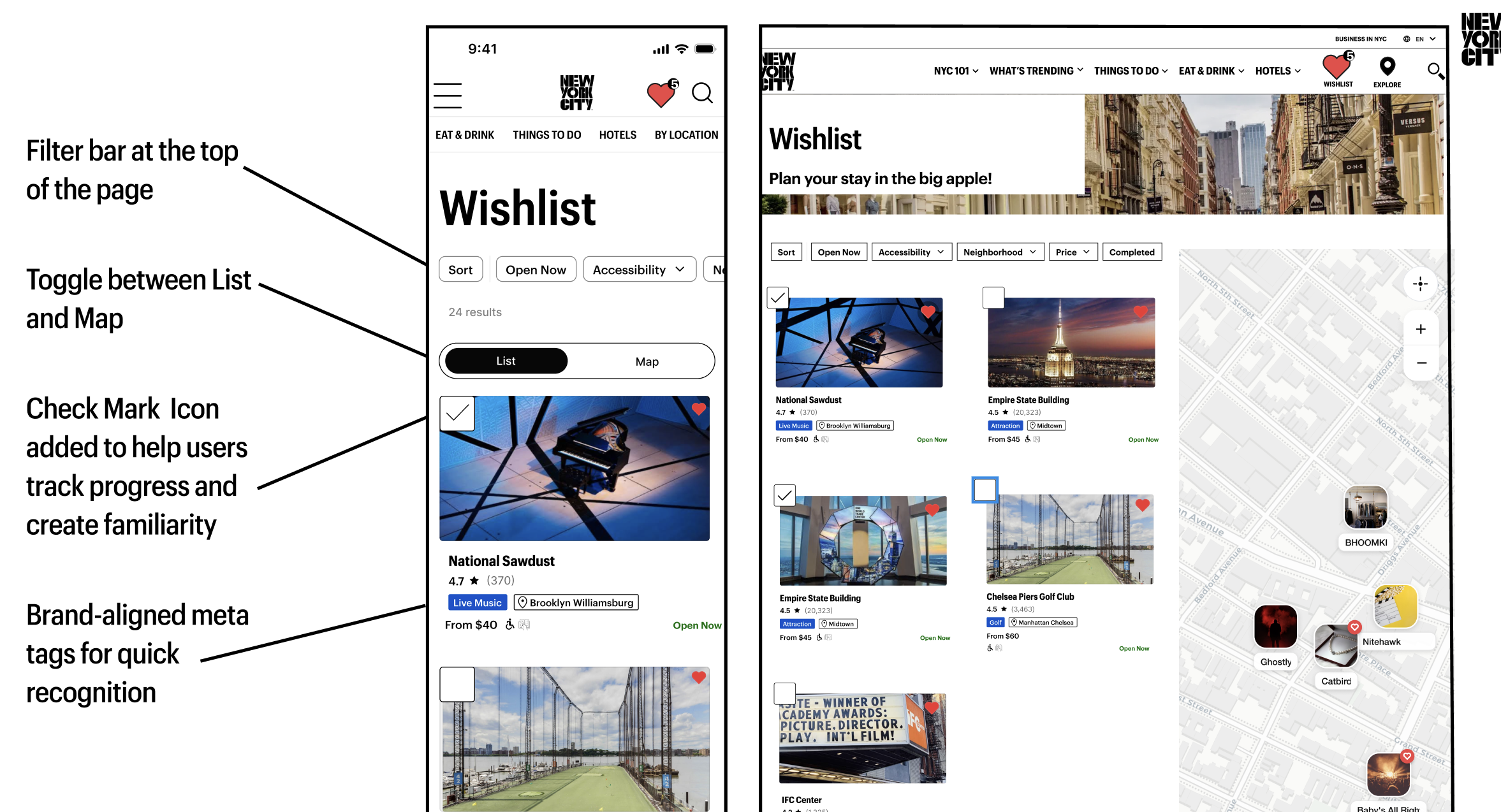
- The wishlist icon leads to the wishlist page, where users can sort through offerings that have piqued their interest.
- A checklist icon allows the user to denote what events and restaurants they have already been to.
- We want to allow users to create an index of their community and create memories in their new city.
Conclusion and Next Steps
While we believe this redesign will create a more efficient process for users, further testing is needed to validate our design choices. Following a critique from a panel of industry experts, we would also like to further test our wishlist checkmark icon to understand how users prioritize information on listing badges.
However, we believe this website can become a hub for information on listings that are unique to New York. The implications of this redesign could provide more income to the local economy and ultimately help create a new home for users who are new to the Big Apple.