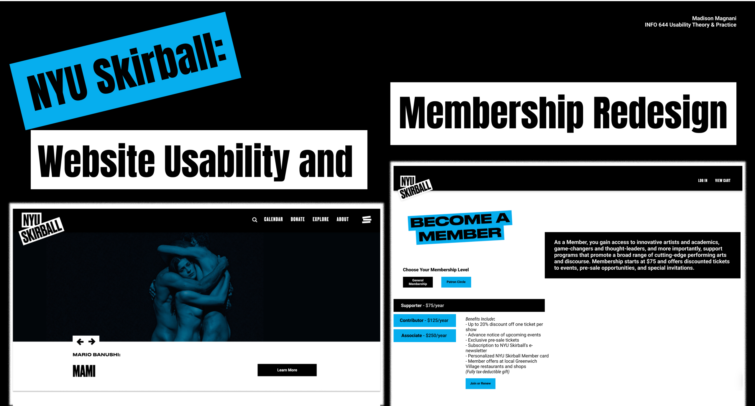
By Madison Magnani | INFO 644 | Usability Theory & Practice
Project Snapshot
Project: NYU Skirball Website Usability and Membership Redesign
Client: NYU Skirball Center for the Performing Arts
Timeline: 6 week research and design sprint
Role: UX Researcher and Designer
Brief Overview

Timeline: 6-week research and design sprint (academic + client-facing)
Our team recruited eight users for moderated remote usability testing to better understand where people felt confused, hesitant, or stuck while navigating Skirball’s ticketing flow, membership options, and donation pathways. While the site carried a strong and expressive brand, its information structure often led users into moments of uncertainty or dead ends. By watching users move through the experience in real time and pairing those observations with competitive analysis and rapid prototyping, we shaped four focused, research-backed recommendations rooted in how people actually behaved, not how we assumed they would.
This was not a project with a clean slate. We worked within an existing website that had evolved over time, accumulating usability issues around navigation, membership clarity, and the checkout flow. Documentation was limited, terminology shifted from page to page, and key concepts like membership and donation were often blended together in ways that left users unsure of what they were being asked to do.
With limited time and scope, redesigning the entire system wasn’t realistic. Instead, we chose a clear focal point. The work shifted toward identifying the most critical breakdowns in the experience and proposing focused, achievable improvements that could meaningfully reduce confusion for new users.
The goal was never to persuade or push users toward a decision, but to help them clearly understand what they were being asked to commit to.
Context & Constraints
Because of this, I centered my work on clarity, timing, and decision-making moments, rather than producing a complete or idealized set of design deliverables.
The Core Problem
Through early testing and observation, it became clear that new users struggled most with understanding how membership fit into the overall Skirball experience.
Key issues included:
- Difficulty locating membership information
- Membership tiers that felt confusing and hard to compare
- Uncertainty around whether membership was a donation, a recurring fee, or a one-time purchase
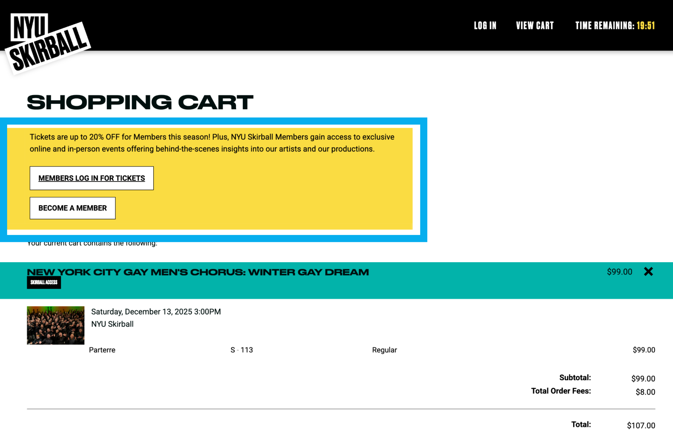
- Important membership benefits appearing too late in the checkout flow
- Navigation patterns that didn’t match user expectations
Together, these issues created hesitation during checkout and weakened users’ confidence at the exact moment they were being asked to commit. At its core, this project was about helping users feel confident enough to make a decision, rather than pressured into one.
How I Approached the Problem
Given the complexity of the system and the short timeline, I prioritized research methods that would surface honest, actionable insight quickly. Rather than creating personas or journey maps, I focused on moderated usability testing with new users so I could observe confusion, hesitation, and decision-making as it unfolded in real time.
These moments of hesitation showed up clearly in how users spoke while navigating the site:
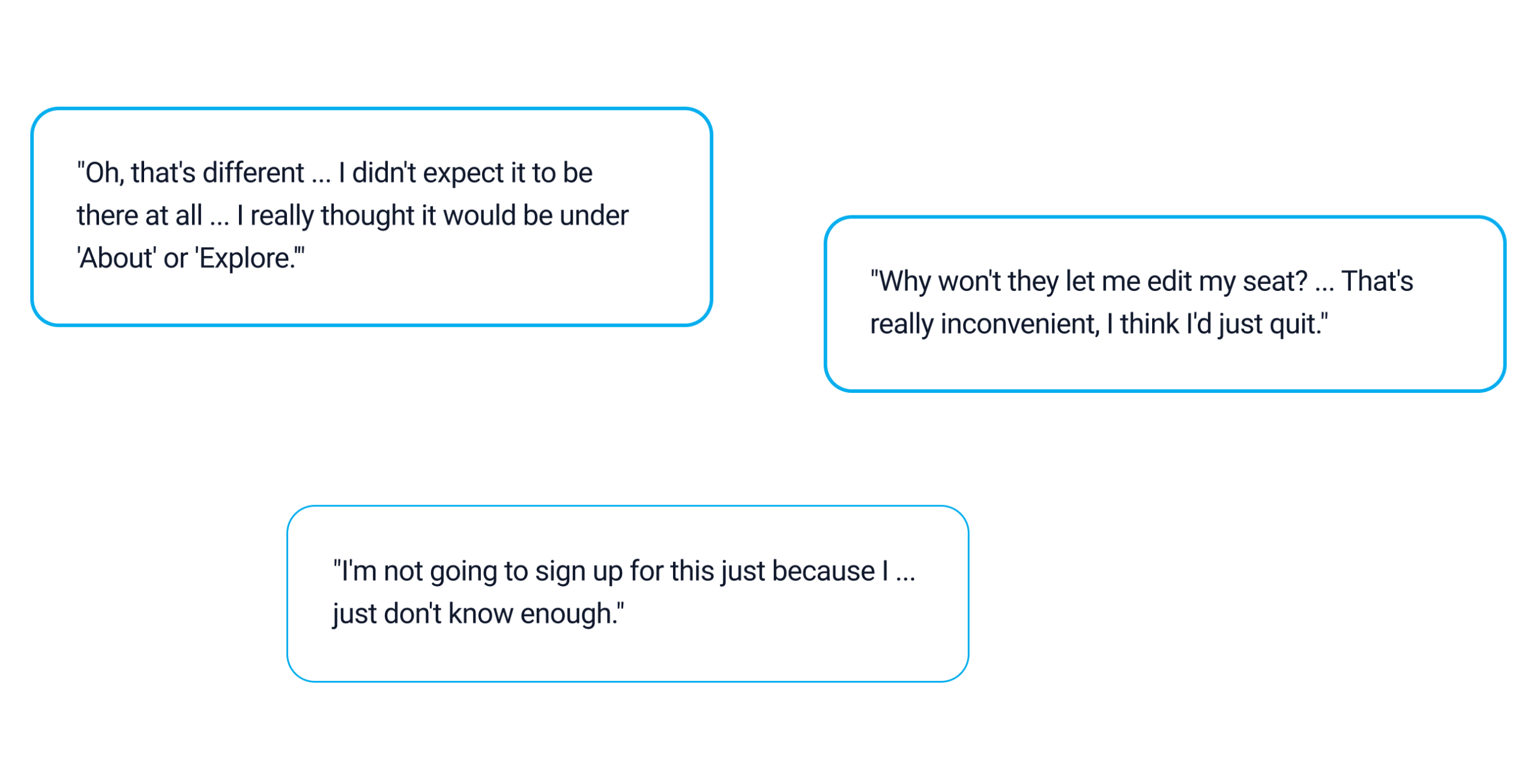
My goal was to notice the subtle moments where users paused, reread labels, asked clarifying questions, or second-guessed themselves, and then translate those moments into concrete design recommendations that respected the project’s scope and constraints. While most users were ultimately able to complete tasks, many experienced moments of friction along the way, especially around navigation and checkout.
Task completion didn’t always mean confidence.
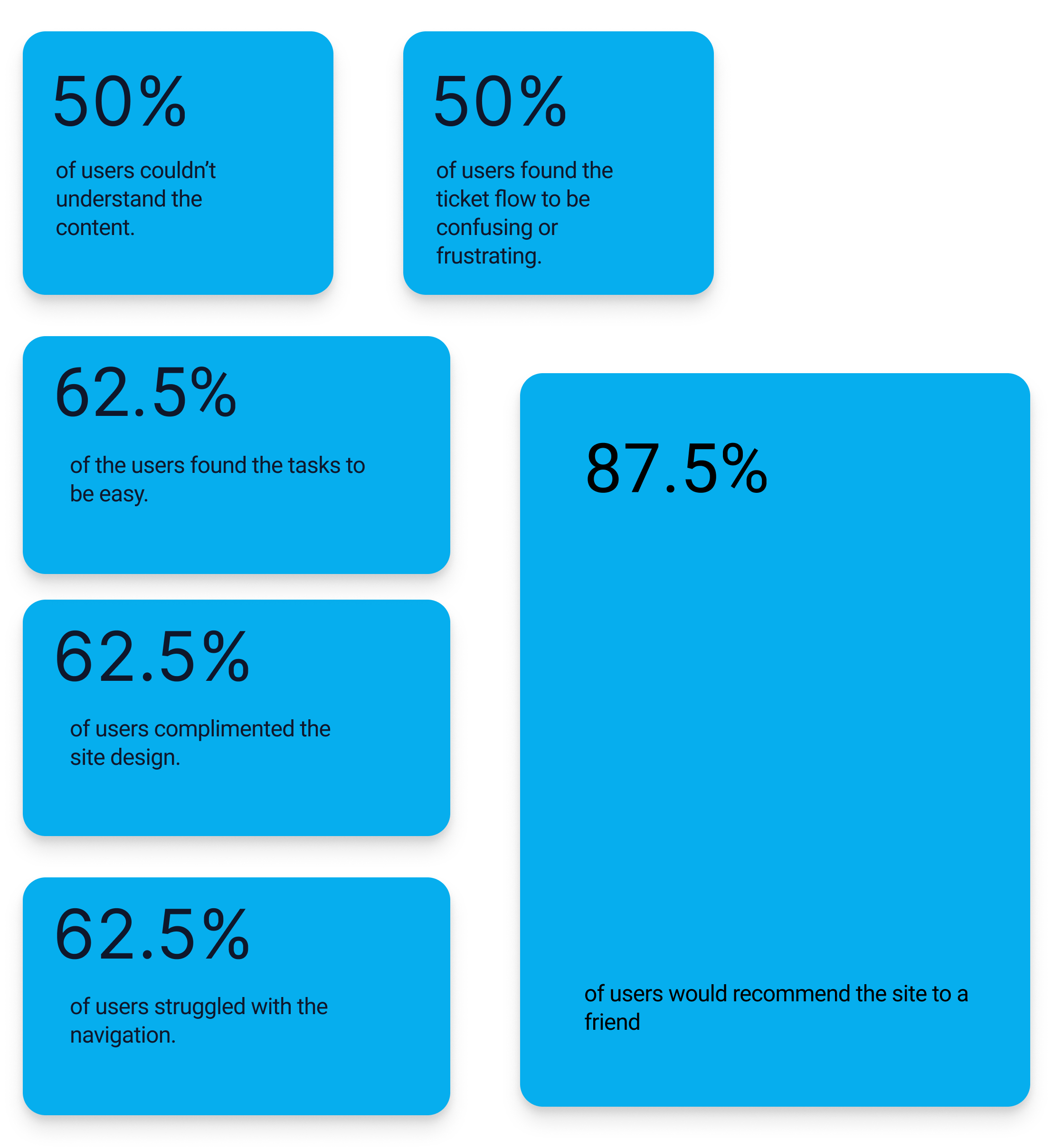
These signals helped me focus less on whether users finished tasks, and more on how they felt while making decisions.
Research in Practice
I played a central role in shaping both the research and synthesis for this project, with a focus on translating real user behavior into clear, actionable insights the client could use.
My contributions included:
- Recruiting participants through private panels aligned with the client’s ideal user criteria
- Leading one-on-one moderated usability testing sessions
- Observing additional sessions and documenting behavioral patterns
- Synthesizing findings across interviews to identify recurring themes
- Pivoting into competitive analysis following a client meeting, focusing on comparable cultural institutions such as The Armory
- Collaborating with my team outside of class to refine insights and prepare the final client presentation
A key part of this work involved watching how ideal users navigated the Skirball site in real time and translating those observations directly into feedback for the client. In several instances, recommendations discussed during meetings were reflected in updates to the live site shortly afterward. Seeing these changes implemented reinforced the value of timely, behavior-driven insights and collaborative, in-the-moment problem solving.
When Research Turned Into Real Change
A meaningful part of this project was seeing research move beyond recommendations and into action. As we shared findings during client meetings, several usability issues resonated immediately, particularly around navigation and membership visibility.
In multiple instances, insights grounded in observed user behavior were discussed in real time and then reflected in updates to the live NYU Skirball website shortly afterward. Seeing these changes implemented reinforced the value of sharing clear, specific insights rooted in how people actually navigate and decide, rather than abstract critique.
This experience was a reminder that small structural adjustments, when informed by real behavior, can meaningfully improve clarity without requiring a full redesign. It also reinforced my view of research as a collaborative, ongoing conversation, and showed how timely, human-centered feedback can influence real systems while they are still evolving.
What I Observed
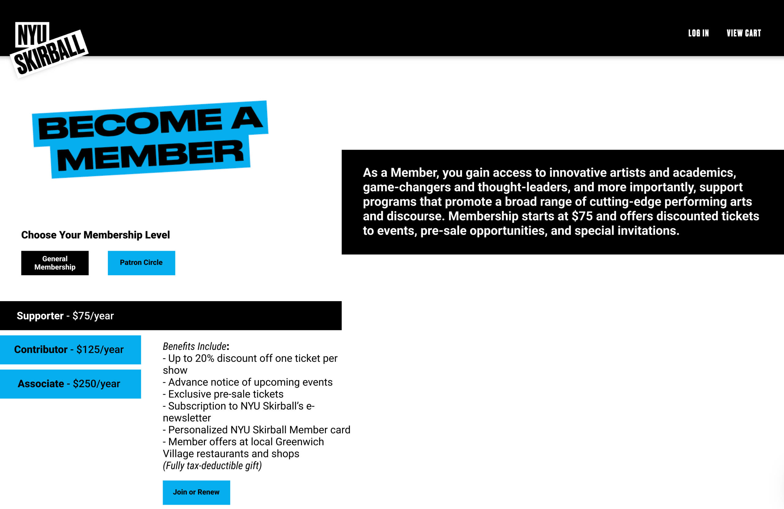
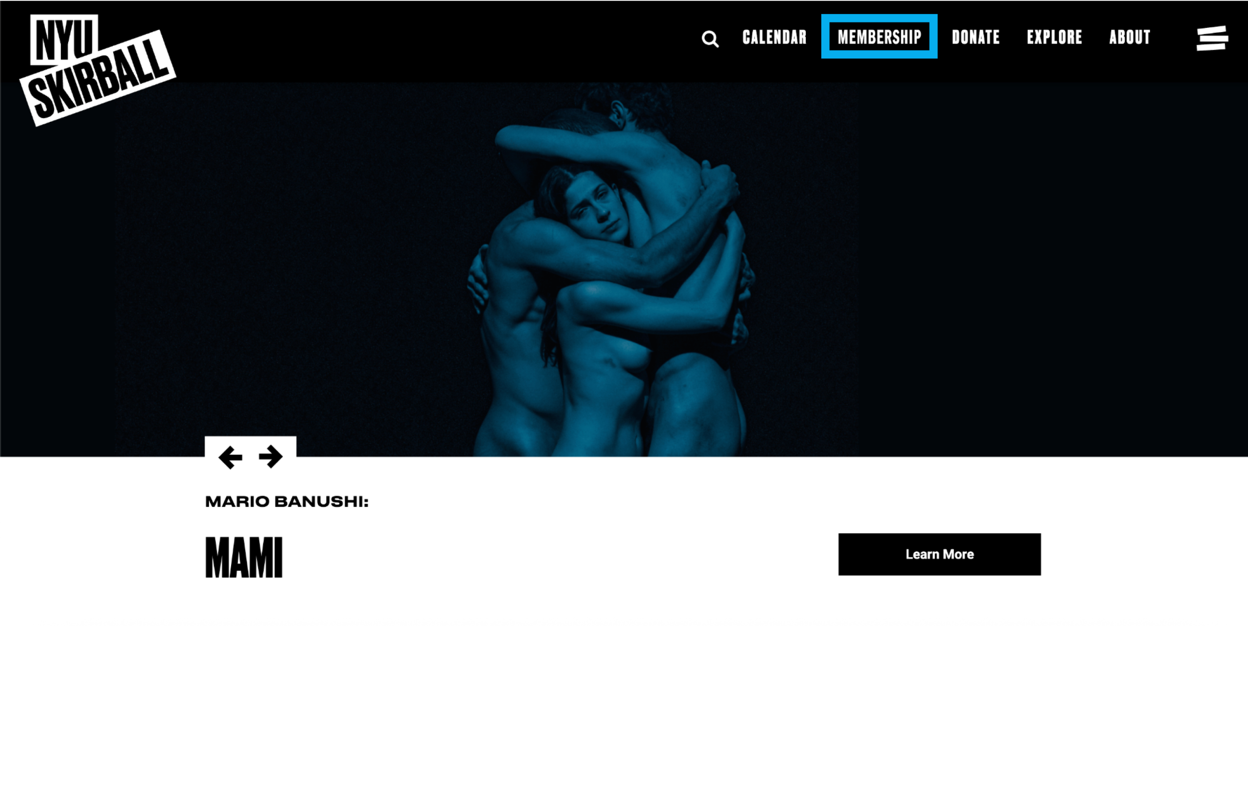
During testing, users consistently struggled to locate membership information within the existing navigation. Many assumed it would live under “Explore” or “About,” while others interpreted “Donate” and “Membership” as the same thing. This structure created uncertainty early in the journey, before users even reached checkout.
Key Insights
Insight 1: Membership vs. Donation Confusion
Users frequently conflated membership with donation, especially during checkout. When asked to make a decision, many hesitated or second-guessed themselves because they weren’t sure what kind of commitment they were making.
Insight 2: Navigation Didn’t Match Expectations
Users expected “Membership” to exist as a clear, standalone option in the main navigation. When it was nested under “Donate,” many missed it entirely or assumed it was not relevant to them.
Insight 3: Cognitive Overload During Tier Comparison
Users struggled to quickly compare membership tiers and understand benefits. Without clear visual hierarchy or scannability, the information felt overwhelming and frustrating.
Insight 4: Lack of Recovery Paths Reduced Confidence
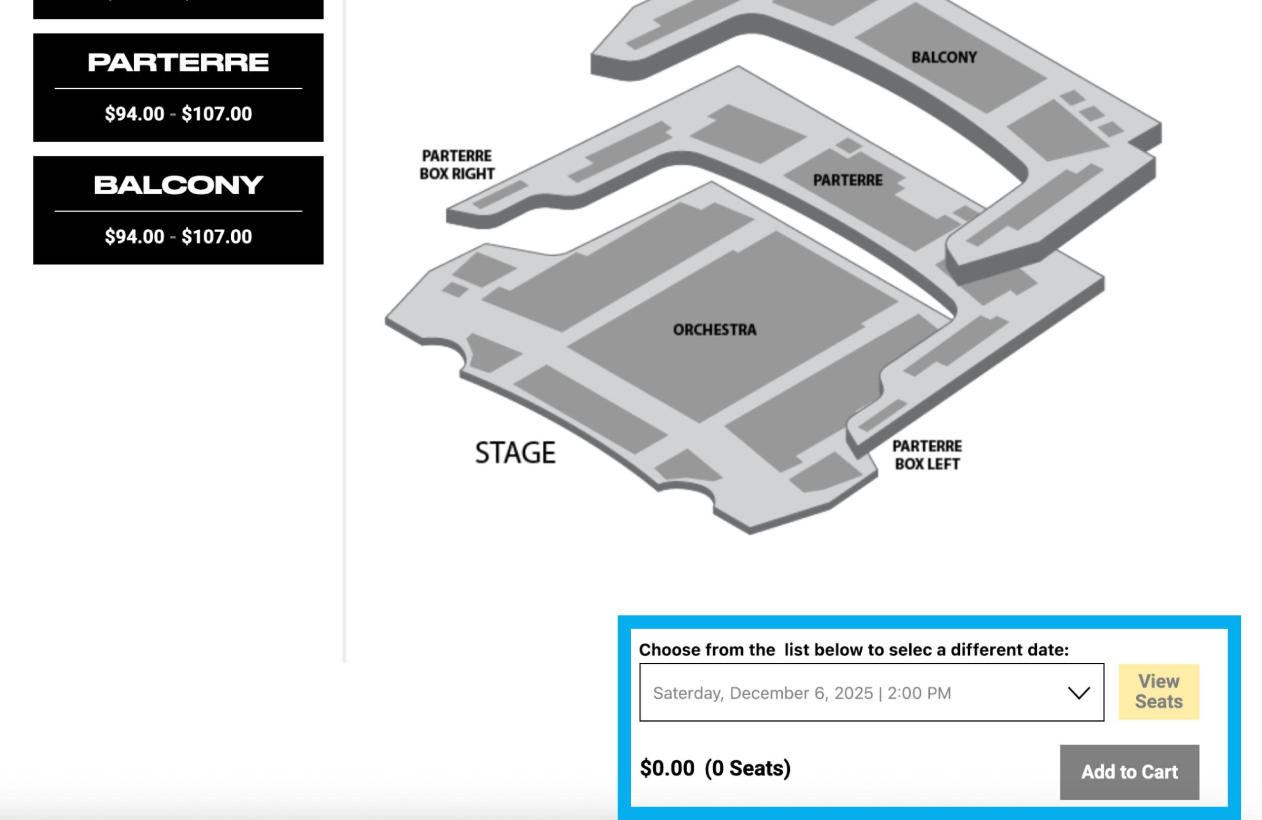
When users felt locked into a choice without clear feedback, such as during seat selection or membership prompts, they disengaged or attempted to backtrack rather than move forward.
Together, these insights pointed to a larger pattern: users didn’t need more options, they needed clearer guidance at moments of choice.
Design Decisions
Each design decision below prioritized clarity and confidence for the user over completeness.
Design Decision One: Clarifying Membership Tiers to Reduce Cognitive Load
Rather than introducing new concepts, I focused on simplifying the existing structure. I proposed reorganizing tiers into clearer categories with more descriptive language, informed by patterns observed in competitor research. This reduced cognitive load without expanding scope.
Design Decision Two: Surfacing Membership Value at the Moment of Decision
Instead of isolating membership on a single page, I recommended integrating concise explanations throughout the checkout flow. This allowed users to understand value at the moment they were deciding, not after.
Design Decision Three: Aligning Navigation with User Expectations
Based on repeated user confusion, I proposed adding “Membership” directly to the main navigation. This aligned more closely with user expectations and common patterns across cultural institutions.
Design Decision Four: Reducing Friction in Event Selection
Rather than redesigning the entire seat selection experience, I focused on repositioning the “Select Different Events” option closer to the primary action. This small shift better matched user scanning behavior and reduced frustration.
The goal wasn’t to convince users to commit, but to help them feel informed and supported when they chose to.
Collaboration
While this was a collaborative team project, I took ownership of user recruitment, interview moderation, research synthesis, competitive analysis, and translating insights into design recommendations. I worked closely with my teammates to iterate on ideas, challenge assumptions, and align our final recommendations with the client’s real constraints.
Impacts & Outcomes
Following our recommendations:
- Users were better able to find and understand membership options
- Confusion between membership and donation was reduced
- The checkout experience felt more transparent and forgiving
- The client responded positively to the clarity and feasibility of the changes
While results were primarily qualitative, users moved through decisions with more confidence and less hesitation.
What This Project Taught Me
This project reinforced that strong UX work often comes down to making thoughtful decisions under imperfect conditions. Instead of chasing an ideal process, I learned to treat hesitation as useful feedback and focus on small changes that meaningfully improve clarity.
When people understand what they are being asked to do, confidence follows naturally.
If I Took This Further
With more time, I would:
- Expand usability testing with a broader group of users to validate patterns observed in early sessions
- Track conversion and drop-off rates over time to better understand the impact of these changes
- Conduct accessibility-focused usability testing to ensure the experience works for a wider range of users
- Explore clearer visual ways to show how membership supports the Skirball community
Our testing timeline limited how many users we could recruit, so additional sessions would help confirm and refine these insights across a broader audience.