Overview
This project focused on auditing and redesigning the mobile and desktop versions of CUNY Open Lab’s directory pages. This involved applying WCAG 2.2 accessibility standard level AA to increase keyboard and screen reader compatibility across all five pages.
Problem Statement & Accessibility Challenges
Open Lab is an open education resource created by and for City Tech students, faculty, and staff. It uses open source software to support the community and collaboration at City Tech and beyond. The creators of Open Lab want to improve the accessibility of their website specifically, design improvements to items that prevent any confusion in the main nav, hamburger, search, and filter form on the directory pages. However they have limited funding and time to dedicate to redesigning the website. The question that remains is what are the urgent accessibility issues can be fixed in the short term with a limited budget?
Process and Findings
Directory Audits
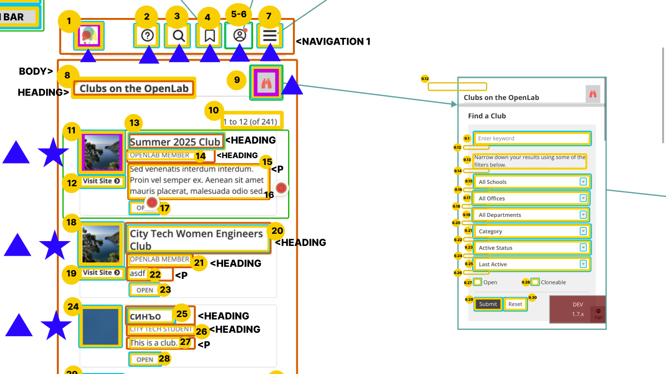
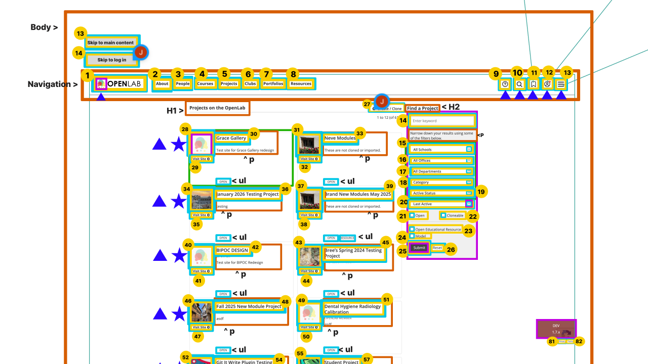
The first step to providing accessibility redesign recommendations was to audit all five directory pages Projects, Courses, Clubs, Portfolios, and Resources. I was responsible for auditing the projects and club pages. I assessed the tab order, screen readability, color contrast, focus fields, and HTML structure for both versions of the directory pages. We found that the different directory pages were structured almost exactly the same, with some difference in button icons. Therefore where one page failed WCAG guidelines they all failed.
Failed WCAG 2.2 Level AA Guidelines
Desktop Findings
- WCAG 3.2.4 Level AA – Non semantic HTML for certain items on certain pages
- WCAG 2.4.7 Level AA – Images having no focus indication on certain pages at certain times
- WCAG 1.3.5 Level AA – Screen reader Filter Form Duplication error
- WCAG 1.4.3 Level AA – Contrast – Insufficient Color Contrast
Mobile Findings
- WCAG 4.1.1 Level A – Filter Form is completely Inaccessible with VoiceOver Function
- WCAG 3.2.1 Level A – Focus Indicator Errors: Splits certain tabs in two, focuses on items not located on screen, focuses wrongly on certain areas
- WCAG 1.4.3 Level AA – Insufficient color contrast
Although the desktop had more unmet guidelines the mobile view was more inaccessible not even meeting level A WCAG guidelines. Through the auditing process I found that the mobile version of the directory pages was not screen reader compatible. Although the initial landing pages could be read and navigated, the filter form was completely in accessibility. Using the screen reader, users could select to open the form but the screen reader would continue to read the page behind the opened form. Only if a user could see to click into the form was it accessible. Even after entry the screen reader still reads the first item of every drop down menu option, regardless of being opened or not. Once in a selected menu it toggled back and forth between the drop down menu items and the form behind the open menu. There was also the issue of split focus because of how the screen reader was reading the website, where the items on the previous page had focus fields visible on a different page.
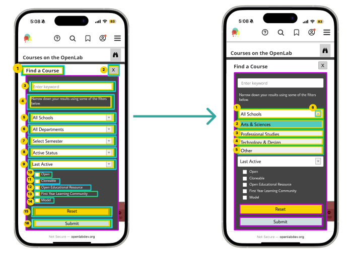
Solutions & Implementation Recommendations
My focus was on making the mobile filter form accessible by reorganizing the tab order, screen reader navigation, and improving the color contrast. These are the solutions I developed for mobile view.
Filter Form Redesign
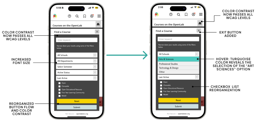
Tab Order Redesign
Reflection
Working with Open Labs I learned a lot about the world of IXD. Coming into this project as a librarian I had no idea of the amount of work that went into making websites accessible. From the very tedious auditing process to wireframe redesigns there are a lot of details that can’t be forgotten. Although the work is tedious it’s very important. Witnessing the failed screen reader navigation was jarring because of how long City Tech had this website running. I thought about the students and faculty who used Open Labs over the years, to whom the mobile version was completely inaccessible. This website contains a lot of urgent information for students as it’s where they can find jobs, internships, post portfolios, and learn about clubs on campus. Knowing the users at the end who would benefit from this work kept me motivated throughout the entire process. In creating the redesigns I learned that accessibility doesn’t compromise aesthetic. I found it helpful to have guidelines to reference and check my work with. When things didn’t pass it was like a fun puzzle and not a burden. Overall, through this project I learned how to let accessibility fuel my creativity as a designer and the urgency of this work.