Abstract
This project was assigned to my class as our final for the semester. Our client, OpenLab at City Tech, required a total redesign of their website/digital offerings, with an emphasis on inclusivity. Our class’ overall goal was to provide the OpenLab team with an accessibility-first redesign of their website. My team’s role specifically in this redesign was to tackle the website’s main directory pages. To better understand the end-users of the website, we conducted research and used those insights to craft a persona that we built our product around. Using the tools provided, we made some wireframes to showcase the best way(s) to make this website accessible and inclusive for all. We framed all our work around the following problem statement: How might we improve OpenLab’s directory to follow WCAG 2.2 guidelines?
Research & Persona Building
Who are we designing for?
The first stage of our research was a short interview with some members of the OpenLab team. We asked them about their use of the site and their understanding of how students use the site.. Unfortunately they were not able to provide any statistical data, they were able to tell us the following:
- Students, faculty, and administrative staff use the site
- Many students use the mobile version to check in on certain school items, but will use the desktop version to actually get work done on the site.
- Faculty and Admin are less likely to use the site on a regular basis (they are more likely to post things once at the beginning of a semester and only go back to make updates)
This information helped us build the foundation for our persona. Now we know that our persona would be a student since they are the main users of the site.
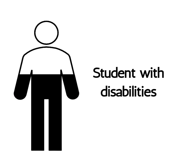
Making our Microcosm
For our second stage of research, we gathered statistics about our target audience: higher education students. Of that group, we narrowed it down a bit more to students with disabilities in New York State. At a high-level, here is what we found:
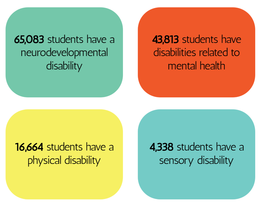
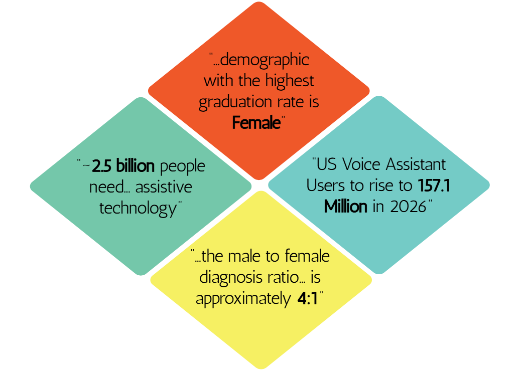
Narrowing down even further, we found the same stats for students with disabilities in CUNY schools, to more closely represent the students that the OpenLab @ CityTech work for and with every day.
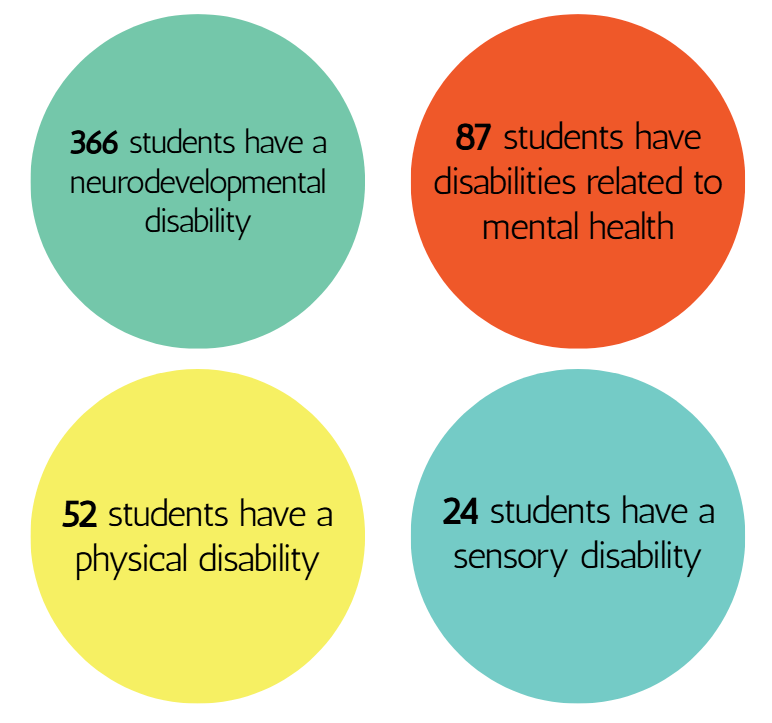
The students’ statistics from both NY State as a whole and CUNY followed the same trend. We knew that it is imperative to make our persona represent the disabled population at CUNY.
Further research led us to know that a growing number of people use assistive technology tools and software, whether disabled or not. Also (like many universities), we learned that across the CUNY system, the majority of graduates are female — the same population that is treated and diagnosed with both ADHD and ASD far less frequently than their male counterparts.
This helped us finalize the main attributes we wanted our persona to include:
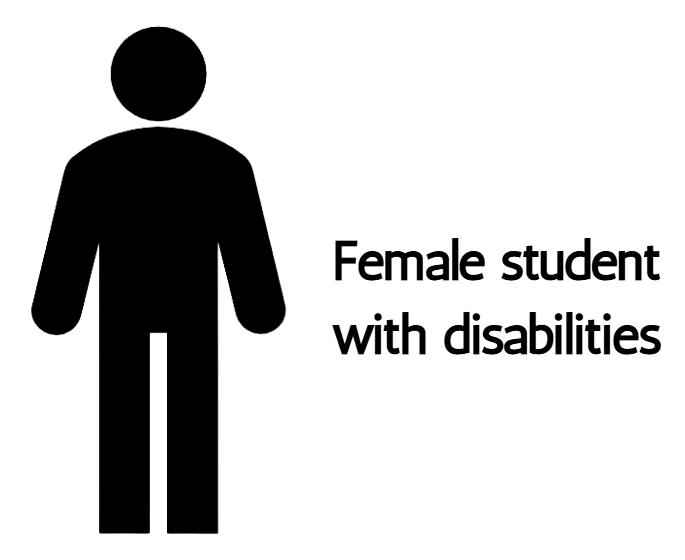
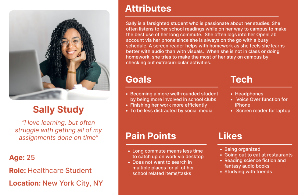
Thusly, Sally Study was born!
Identifying Issues & Adherence to Guidelines
WCAG 2.2 Guidelines molded our redesign of this site. Here’s how we broke it down section-by-section, noting where OpenLab passes, fails, and is not applicable.
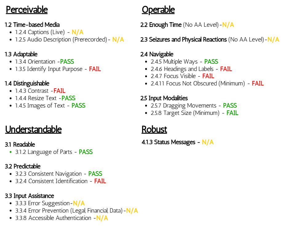
Testing this site against the guidelines led us to reach these overall issues:
Desktop
- Unnecessary Hamburger Menu
- Non semantic HTML for certain items on certain pages
- Images having no focus indication on certain pages at certain times
- Screen reader Filter Form Duplication error
- Insufficient Color Contrast
Mobile
- Filter Form: Completely Inaccessible with VoiceOver Function
- Focus Indicator Errors: Splits certain tabs in two, focuses on items not located on screen, focuses incorrectly on certain areas
- Insufficient color contrast
In order to make OpenLab suitable for Sally Study and her peers, we identified three main issues and curated ways to tackle them.
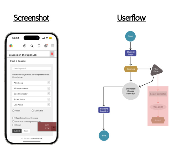
Issue 1: Filter Form Formatting [mobile]
On the mobile version of this site, navigating via VoiceOver completely skips over the form that allows users to filter searchable content. Items in the filter form are neither selected nor read aloud, meaning that a student that relies solely on VoiceOver would be forced to cycle through every single option to find what they are searching for unless they had an exact string and character match to enter into the search bar of the main navigation. Many students that use VoiceOver might not even know that they (should) have the ability to filter their search.
Currently, here is how the user can (almost) interact with the filter form:
With our redesign, not only did we address the main issue of the form not being accessible via VoiceOver, we also touched on other issues such as color contrast as well:
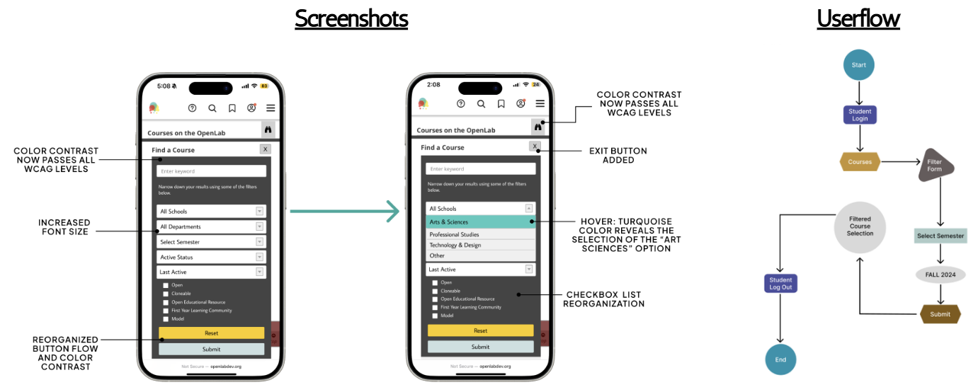
Now all users of this mobile site will be able to use the same functionality to find whichever course, resource, or club they are interested in.
Issue 2: Shifting The Focus (Indicators) [mobile]
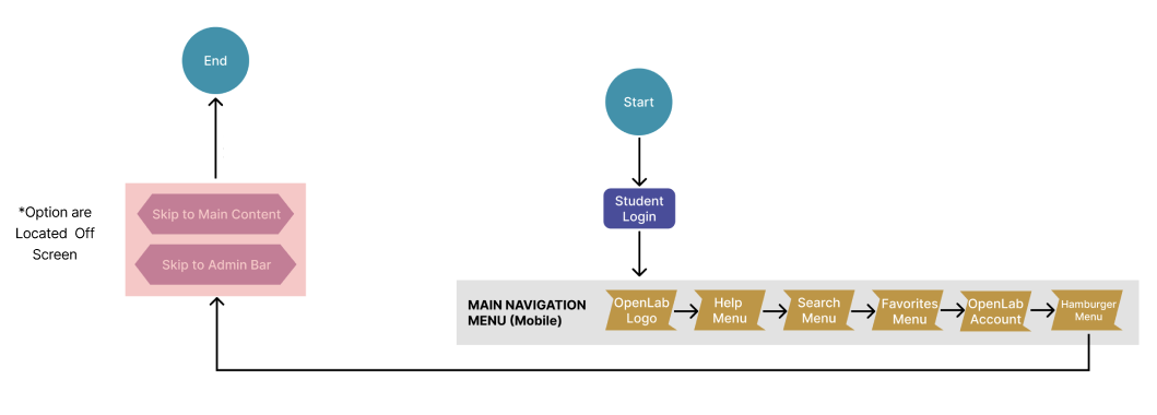
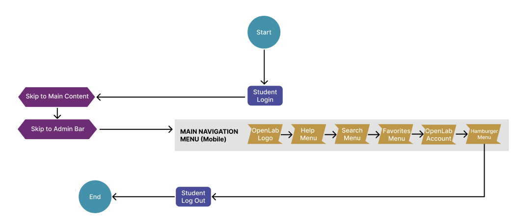
Also on the mobile version of this site, focus indicators are not as reliable for non-tactile navigation as they should be. It is not always clear what a VoiceOver user is selecting as some items are “hidden,” creating a staggered tab order that is difficult to follow. In some cases, there were options that appeared to live behind other items in the main navigation and others appeared partially or entirely off-screen.
Currently, this is how the tab order flows on the site:
Our redesign creates a clearer tab order and removes unnecessary items that were defunct in the original version. Again, we also addressed the color contrast issue:
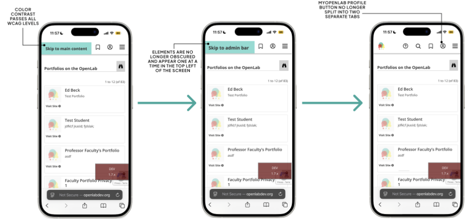
Now, the same options will be presented to all users in a top-down flow that follows how websites are designed for mobile use.
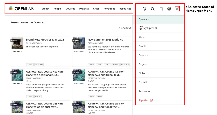
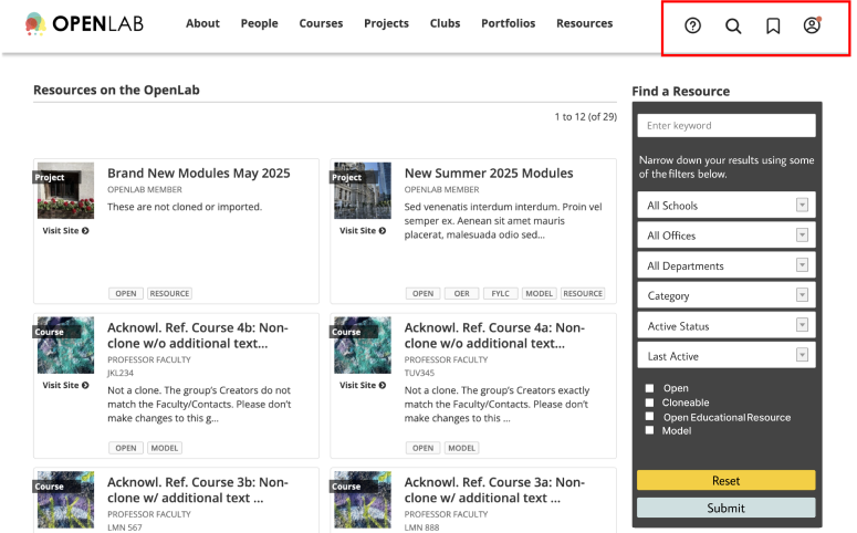
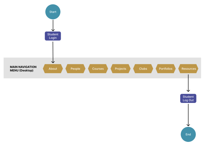
Issue 3: Deleting the Duplicates [desktop]
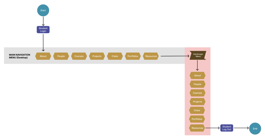
Switching over to the desktop version of the site, the main navigation menu is duplicated in two areas on the page – one horizontal and at the top of the page (where a user would expect to find it) and the other one is vertical and off to the right, much like its mobile counterpart. Despite them showing up in different ways, each menu serves the exact same purpose and all buttons lead the user to the same place.
Currently, this is how a user can navigate the site on desktop:
Our redesign was more of de-design as we took the route of simply removing the “hamburgered” menu. We provided the site with a cleaner look and feel, hoping to let students know all they need is a much more succinct list than previously suggested by the extra items. Also, as always, we corrected the color contrast issues found on this page as well.
Reflection
Personally, this project has had a lasting impact on me. I will admit that accessibility features on a website were not the first thing that crossed my mind whenever I used one. It shed light on what was previously a hidden struggle that many people face on a day-to-day basis. Professionally, I will continue to approach every project with an accessibility-first mindset. What is needed for some but works for all harms no one. Had I had more time and access, I would have loved to even further personalize the experiences for all the types of users that would use this site and go beyond the directory pages. It would have been great to create a truly well-rounded experience for everyone in the CUNY system.