
Context | Extending the Meal Experience Into Sleep Tracking
Inspired by Bryan Johnson’s longevity protocol, Superveggie began as a couple-owned meal delivery service in 2022 that offered ready-to-eat organic meals. This fall, Superveggie took a deliberate step forward by launching an MVP of sleep tracking feature in its original meal delivery app, attempting to broaden the scope of its services this autumn by adding a sleep tracking feature.
Motivated by the founder, Nick’s curiosity about the attitudes and behaviors of Superveggie’s users, we began our investigation, compiled a list of problems, and offered relevant and practical recommendations.
Timeline

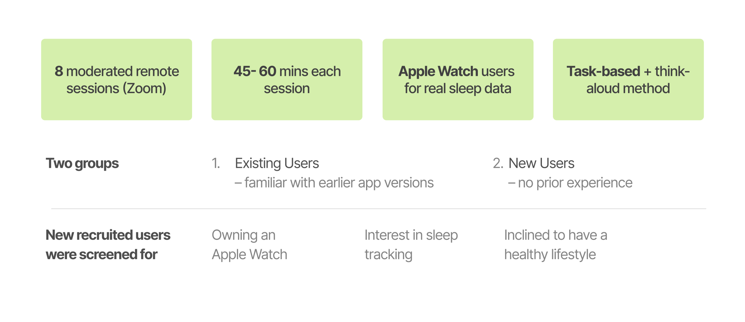
Research Methodology
Eight Apple Watch users participated in moderated remote usability tests to assess the Superveggie app’s Sleep and Meal Browsing features. Task-based flows, think-aloud feedback, and post-task interviews were all used in the 45–60 minute sessions to record users’ comprehension, expectations, and decision-making.
The study looked at how well users could navigate the app, understand sleep insights, and relate health information to practical actions by concentrating on the actual user experience.
Participant profile | Health-aware ones, but mostly approaching Superveggie with fresh eyes
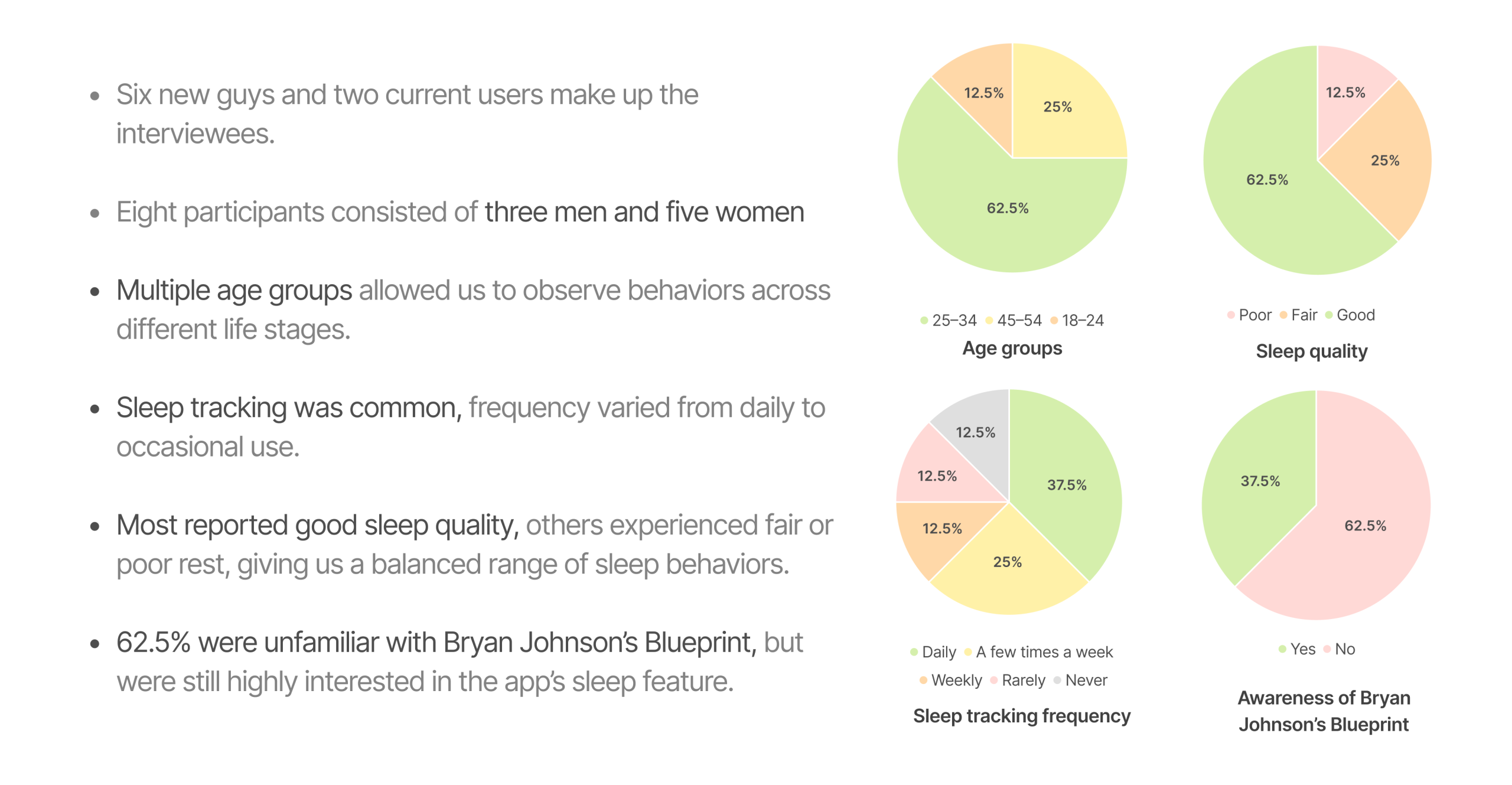
This study included 8 participants, primarily focused on new-user perspectives: 6 were first-time users, with 2 existing users included mainly for comparison. Together, they represented a range of age groups and sleep habits, helping highlight how new users’ expectations and pain points differ from established behaviors.
Most significantly, every interviewee is a health care provider, and they have already interacted with sleep tracking technology to some degree, particularly by using their iWatch as a health data monitor.
Problem statement

The usability evaluation of the Super Veggie app revealed several critical friction points across the Sleep Survey, Sleep Screen, and Meal browsing experiences. While users appreciated the app’s Blueprint-inspired vision and its promise of structured health optimization, they encountered usability challenges that affected comprehension, efficiency, and decision-making throughout the flow.
Here are 5 takeaways:
Finding #1
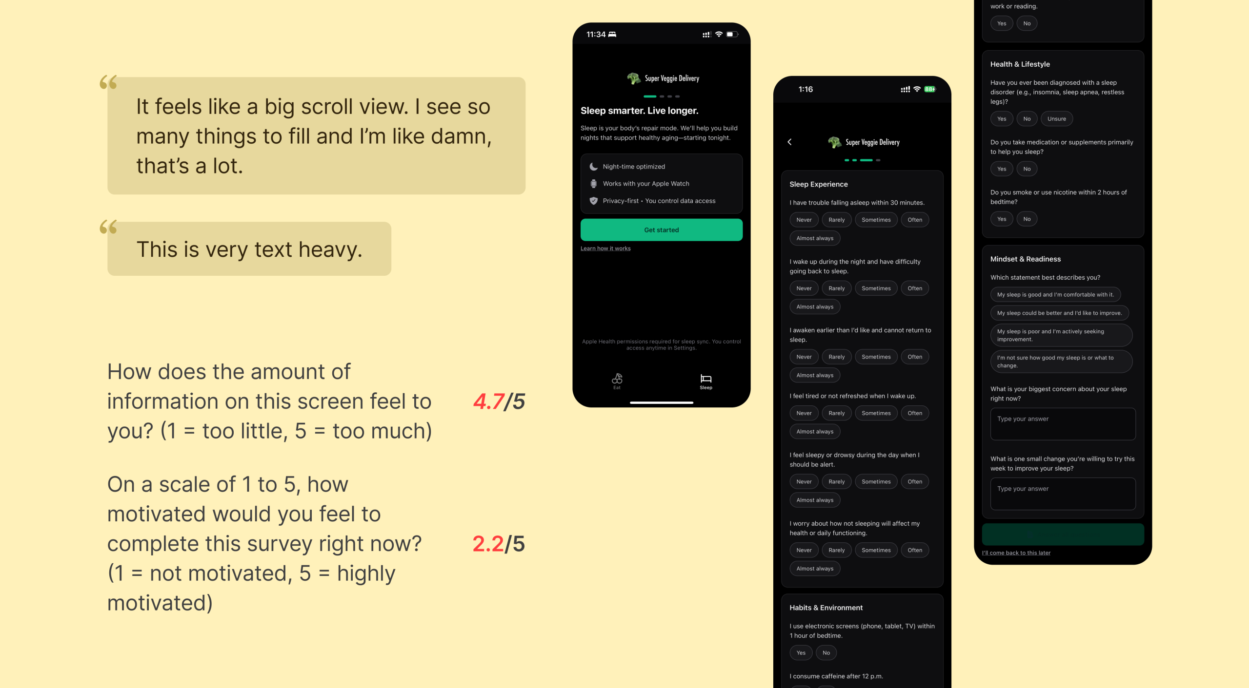
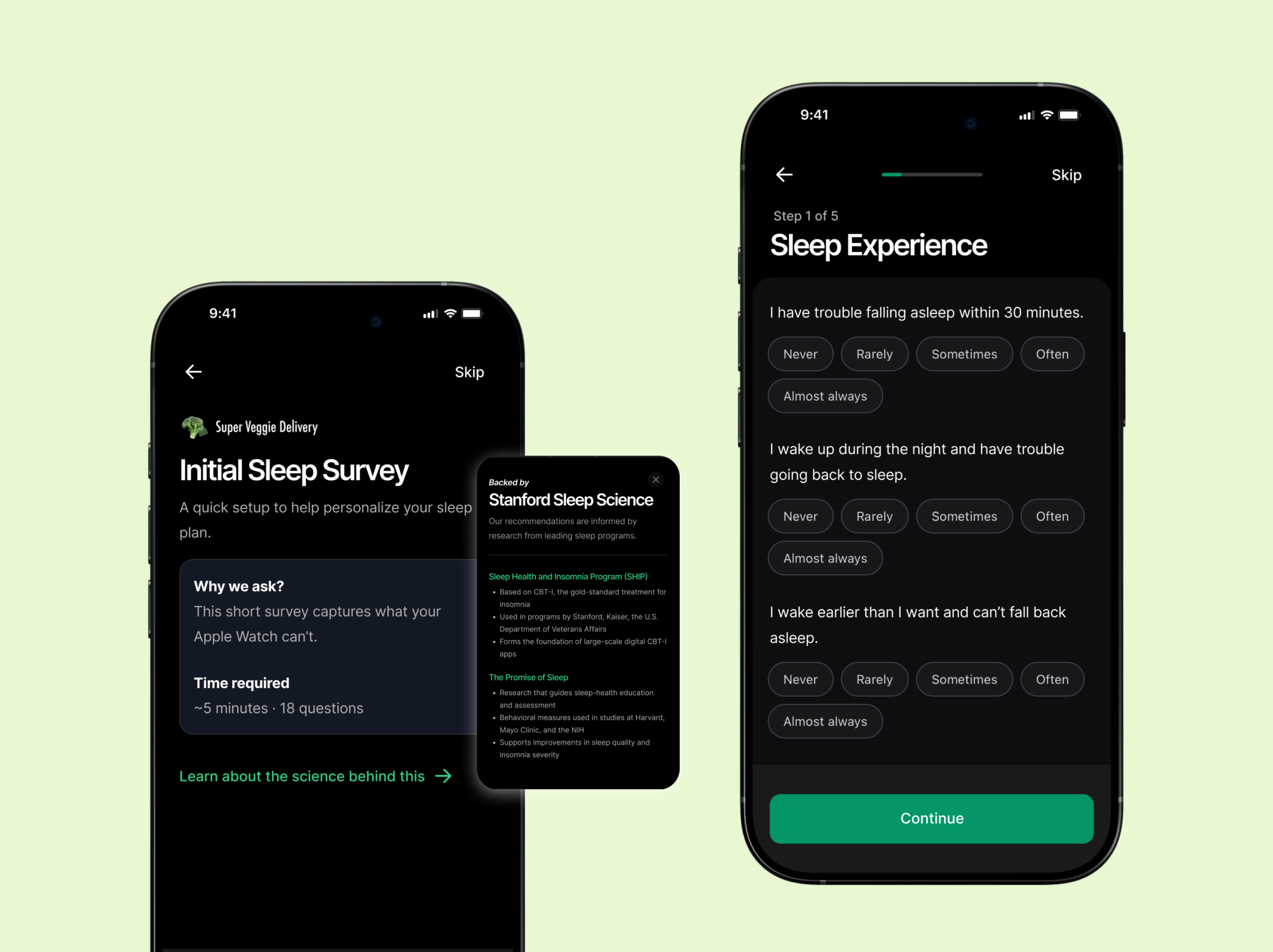
The survey is overwhelming and hard to complete
The current sleep survey feels cognitively heavy and discouraging due to multiple factors affecting user effort and motivation:
- Survey feels too long: Users felt overwhelmed by the number of questions presented on a single scrolling page, making the experience seem longer and more demanding than expected.
- Excessive open-ended questions: Users showed reluctance to type in answers, especially toward the end of the survey. The text fields interrupted the otherwise smooth, tap-based flow.
- Skip option placed at the bottom: The “I’ll come back to this later” option is only visible after scrolling to the very end, reducing discoverability and increasing the likelihood of user fatigue or drop-off.
Recommendation #1
Create a more user-friendly, low-friction survey experience
To address the issues above, the survey should be redesigned to reduce cognitive load, improve navigation, and match the quick interaction patterns preferred by users:
- Break survey into shorter segments: Use multi-step screens to reduce perceived length and give users a sense of progress.
- Minimize typing with structured inputs: Convert open-ended questions into MCQs, dropdowns, or quick-tap formats. Keep text fields optional and only when truly needed.
- Improve placement of skip and navigation actions: Add a visible Skip button at the top-right corner and use sticky Next/Submit buttons so users always know how to proceed without scrolling.
Finding #2
Sleep screen is hard to interpret due to lack of context and visual clarity
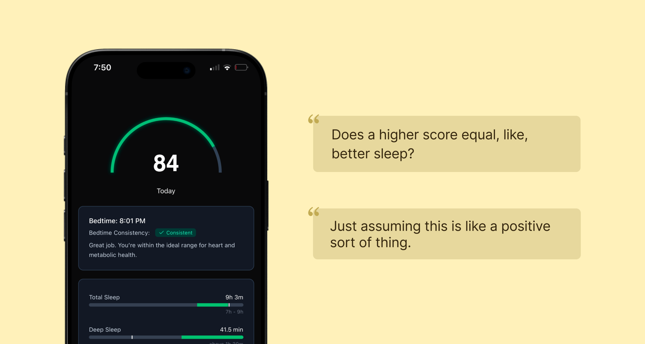
Users struggled to make sense of the Sleep Screen due to unclear meaning behind the sleep score, insufficient explanations of metrics, and visual elements that did not align with their mental models. The overall interpretation required prior knowledge that non-expert users did not have. Specific challenges include:
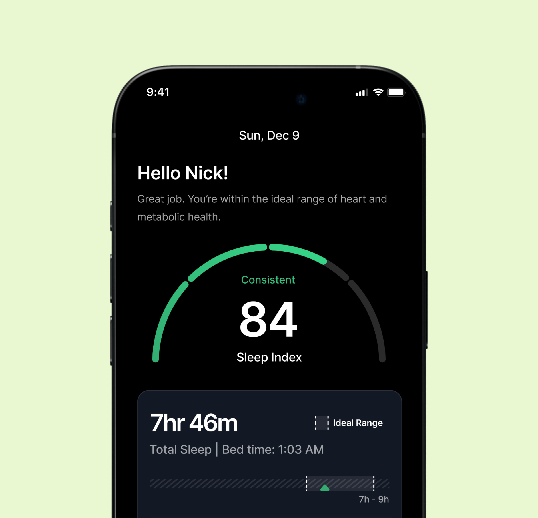
- Unclear understanding of the sleep score: Users did not understand what the score number (e.g., “84”) represented. Because no verbal context or guidance was shown, they were unsure if this was considered good, bad, or average. Several users reported that they missed the meaning of the score during onboarding.
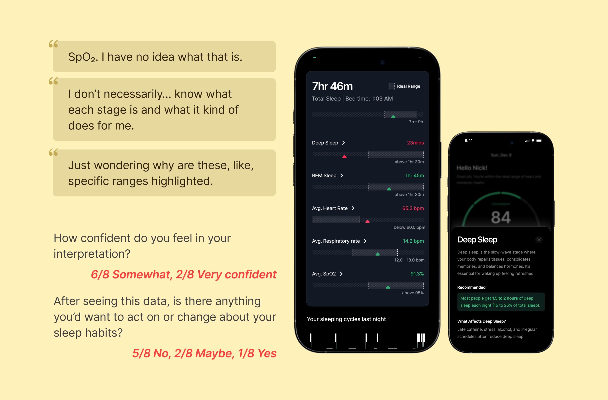
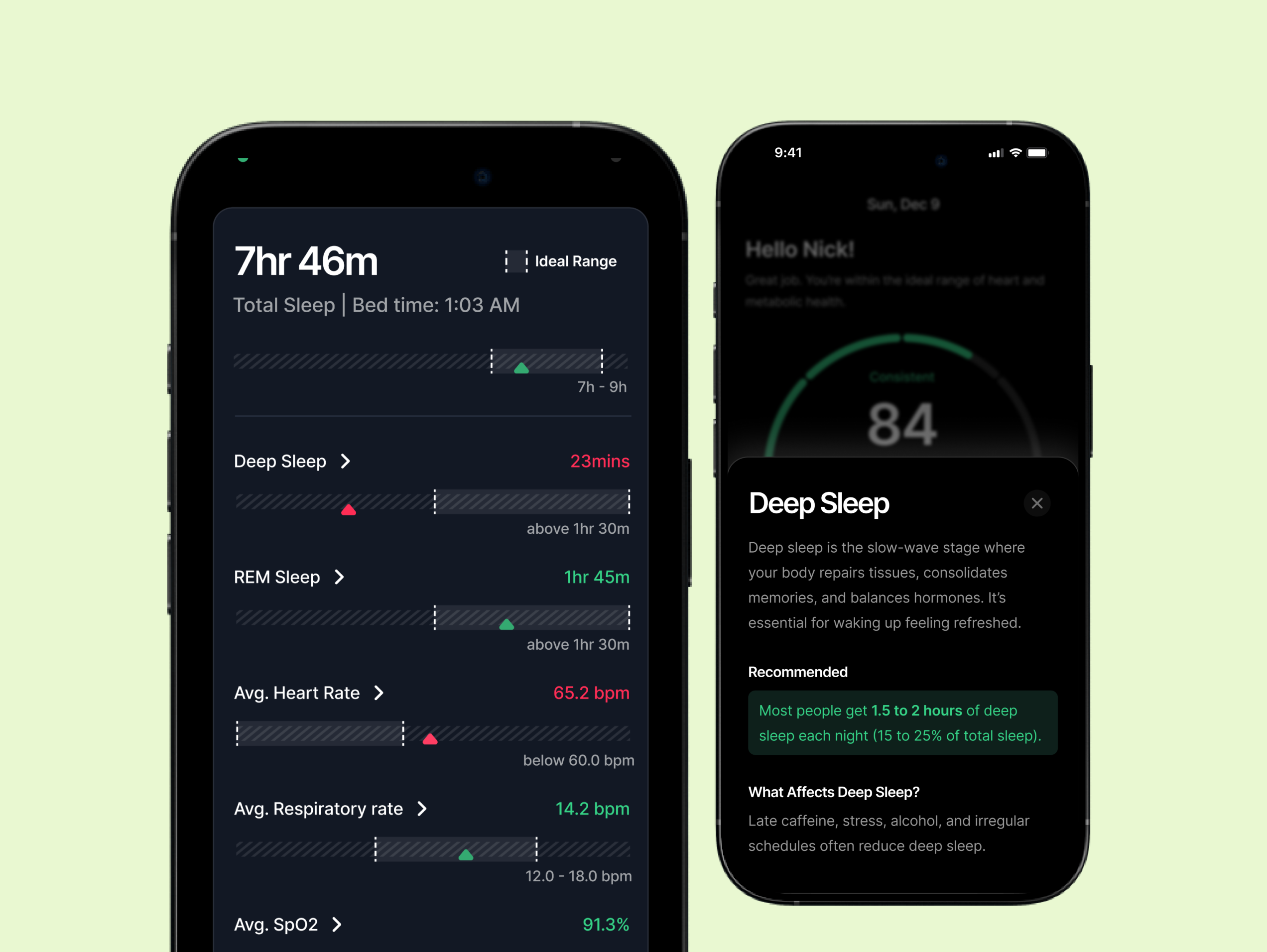
- Misunderstanding of individual sleep metrics: Non-expert users struggled with technical terms such as REM, Deep Sleep, SpO₂, and others. Users expected definitions or contextual tooltips but found none, leaving them uncertain about what each metric meant or why it mattered.
- Confusion around bar indicators (green vs. gray): Users assumed green bars represented their performance. They did not realize that green indicated the ideal range and the white vertical indicator represented where they stand, which led to incorrect self-assessment.
Recommendation #2
Improve interpretability and clarity through personalization, definitions, and visual refinements
To help users confidently understand their sleep results, the Sleep Screen should provide clearer explanations, guided context, and more intuitive visual elements. Addressing the sub-issues above will create a more supportive and actionable experience.
- Add a personalized message to support sleep score interpretation: A message such as “Hello Nick, Great job! Your sleep score improved from yesterday!” at the top of the screen can help users immediately understand whether their score is good or needs attention, while creating an emotional connection and reducing ambiguity.
- Add meanings and explanations for each metric: Each metric should include an arrow that opens a bottom sheet explaining what the metric means, why it matters, and optionally, tips to improve it. This helps non-experts understand and act on their data.
- Enhance visual clarity of bar indicators: The user’s actual sleep value and ideal range should be made visually distinct to prevent misinterpretation. Improved labeling, color cues, or subtle visual indicators can help clarify the meaning of the bars and make the data easier to interpret.
Finding #3
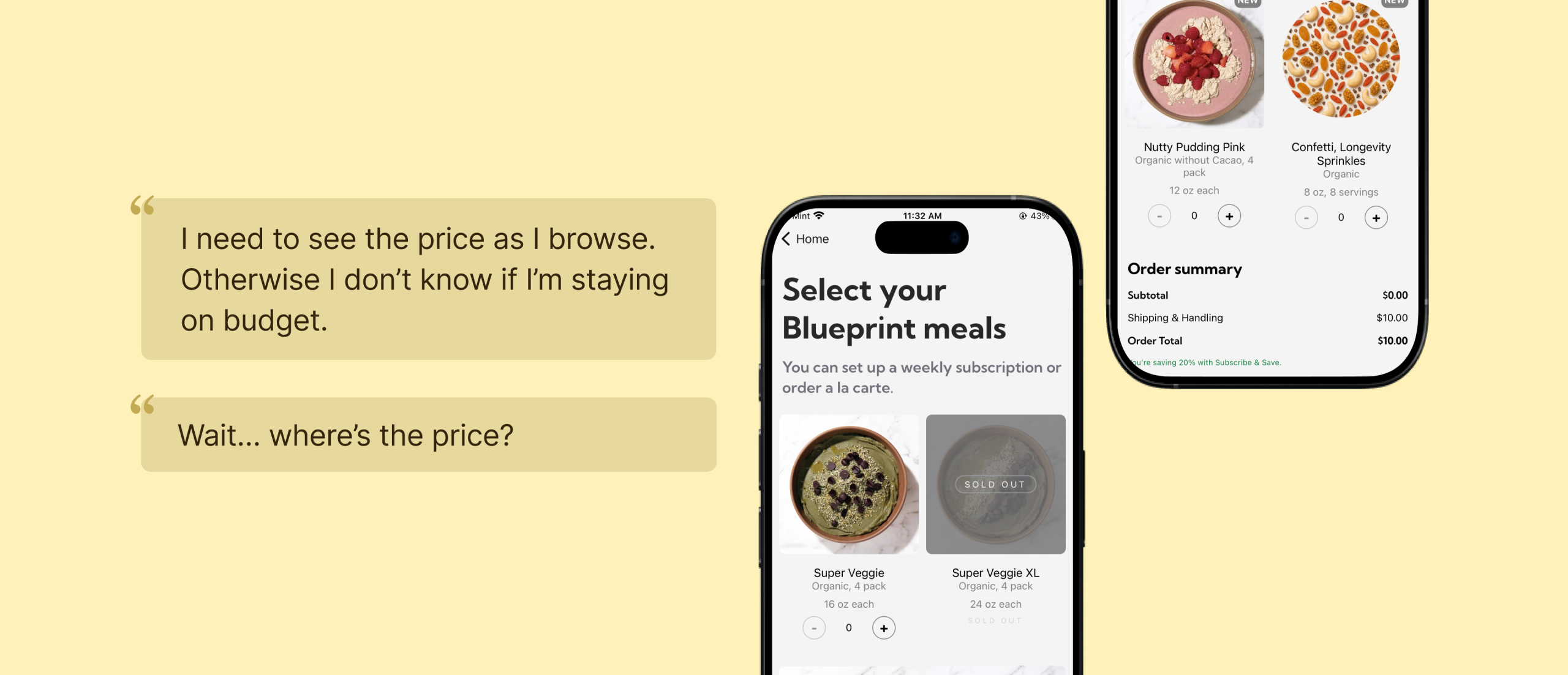
Checkout flow caused unnecessary back-and-forth navigation
- Pricing is hidden at the bottom in the list page: Prices and running totals are only visible at the bottom of the page. This lack of immediate cost awareness makes it difficult to gauge affordability, compare options, or feel secure moving toward checkout.
- Disruption when trying to continue to purchase: During testing, users expected to move forward with their selection directly from the meal details page, but instead had to backtrack to a previous screen to continue. This extra step disrupted their momentum. As a result, some users struggled to relocate the meal they had just viewed, lost their sense of direction, and became unsure about the next step, ultimately slowing down their path to purchase.
Recommendation #3
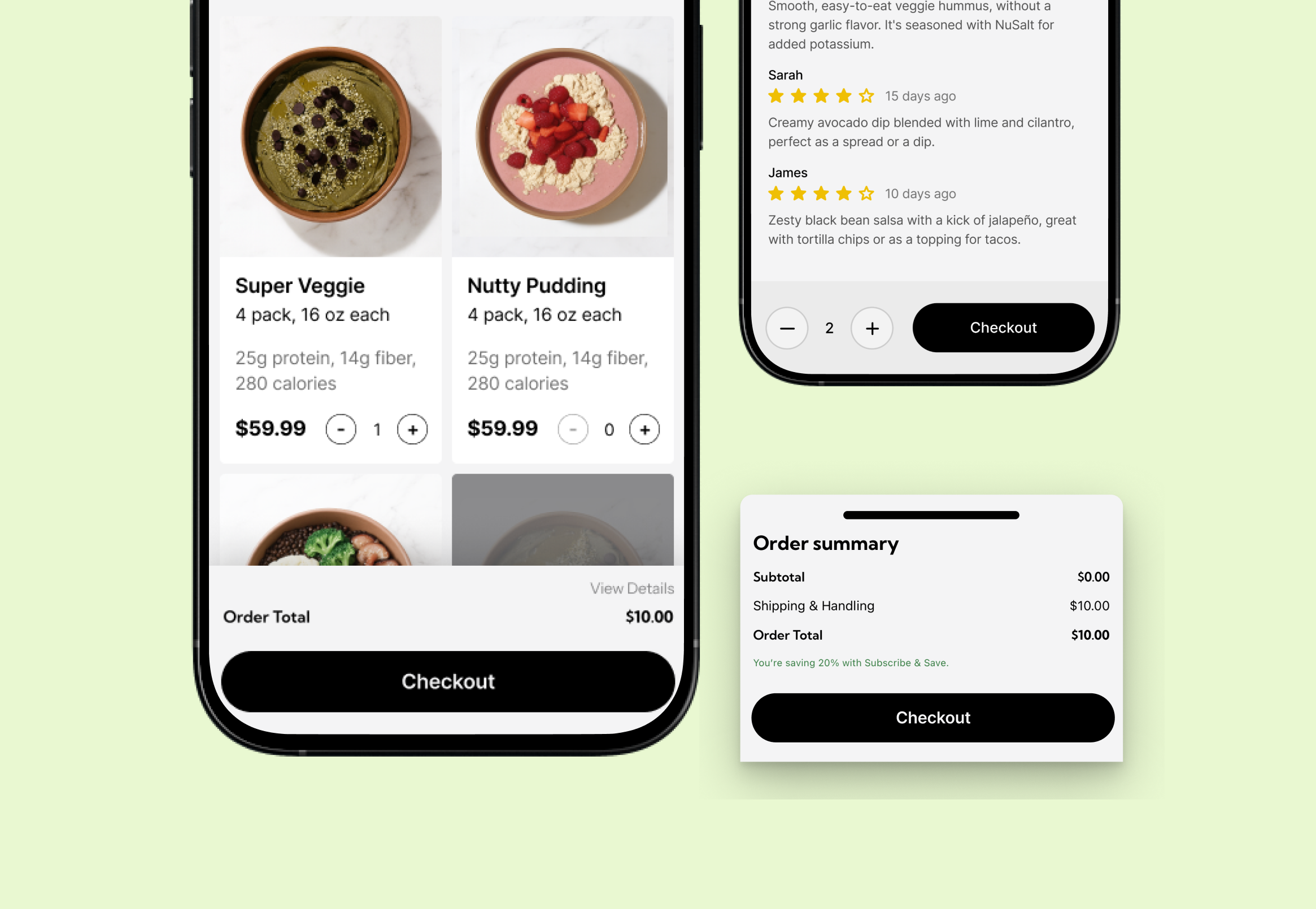
Making pricing and checkout actions visible for confident, seamless decisions
Giving users essential context at a glance helps them compare meals quickly and stay engaged in the selection flow.
- Add price to the product card: Showing per-meal price directly on each card lets users compare options without opening detail pages. This reduces effort and makes evaluation faster and more intuitive.
- Show order price in a fixed bottom section with an expandable detail view: A persistent bottom bar keeps users aware of their running total as they browse, eliminating the need to scroll. Expanding this bar reveals a full fee breakdown when needed, creating a clearer and more seamless checkout experience.
- Add a clearly labeled checkout action on the meal details page: Place a prominent, clearly labeled checkout or “Add to Cart” call-to-action at the bottom of the meal details screen. This allows users to continue seamlessly without backtracking, preserving their momentum and reducing confusion. A direct next step creates a smoother, more intuitive purchase flow.
Finding #4
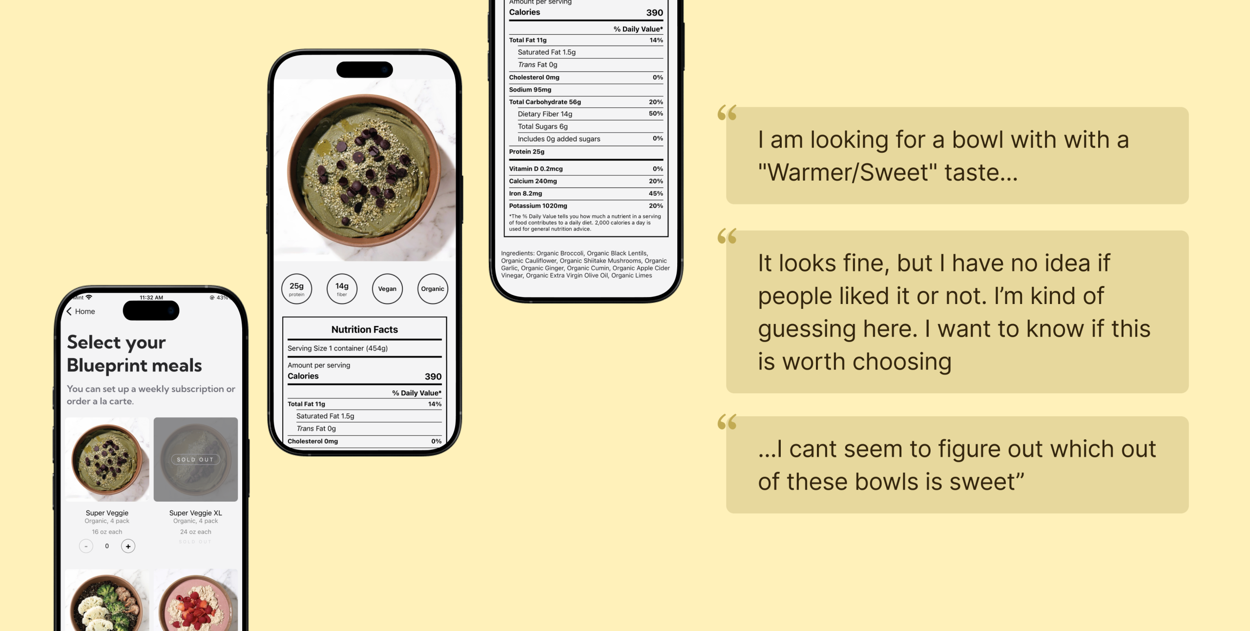
Lack of holistic meal context, as neither nutrition macros nor sensory expectations are clearly communicated throughout the selection journey.
- Nutrition macros for meal selection is only visible on the meal details page: 5 new users reported that nutrition values are a primary factor in their decision process. However, because this information only appears within the details page, users must repeatedly move in and out of individual meals to compare options. This constant back-and-forth interrupts their flow, slows evaluation, and discourages early exploration.
- Lack of sensory and taste-related information: Participants frequently struggled to understand the flavor or overall experience of each meal. With no description of how a dish tasted, users were left to rely only on the meal name, image and ingredient list, all of which often felt vague or misleading. This uncertainty made it hard for them to decide which option best matched their preferences, slowing their decision-making and reducing confidence in their choices.
Recommendation #4
Making Health and Taste Cues Visible at the Right Moments
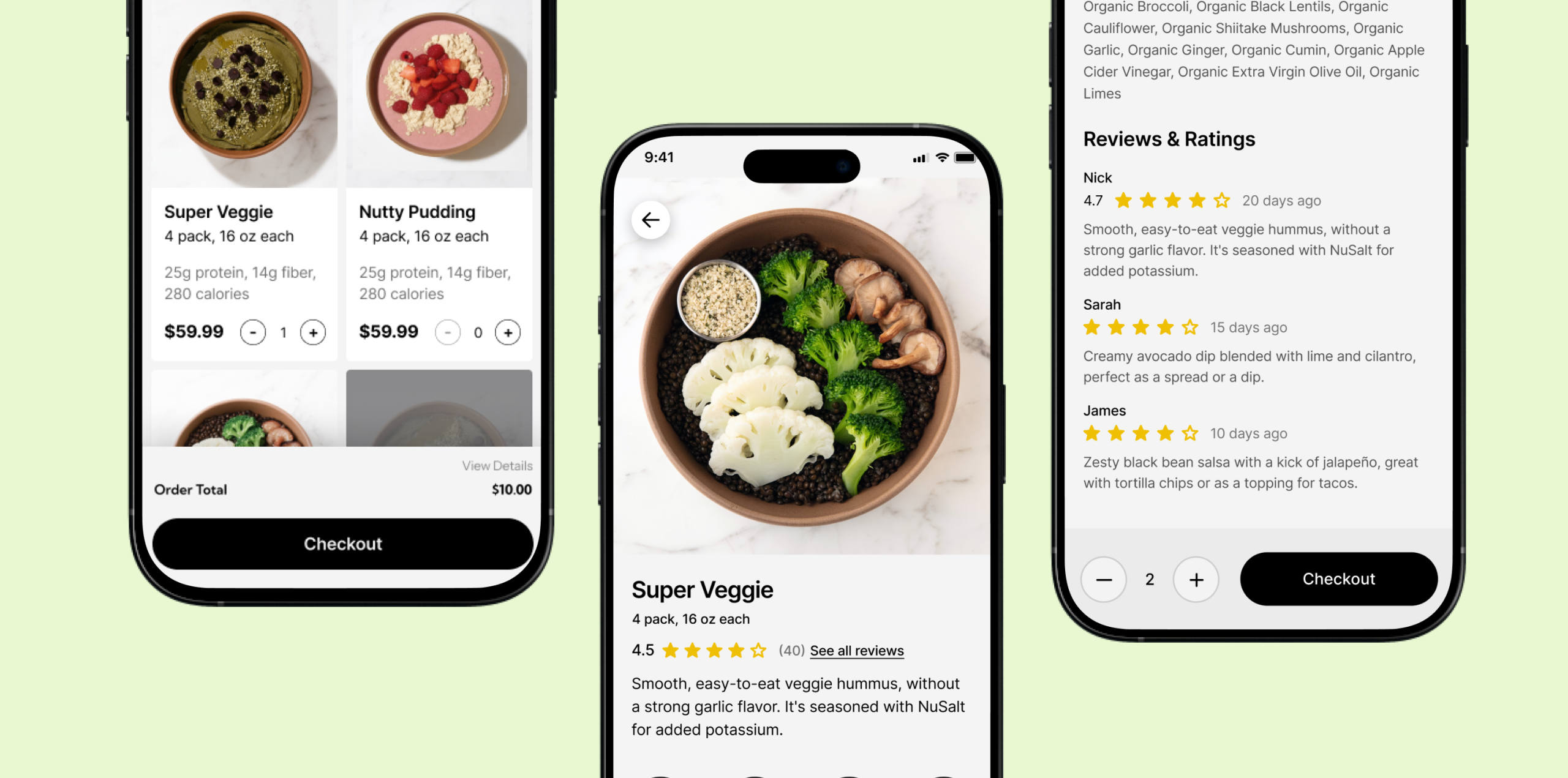
- Add nutrition macros to the product card: Surface nutrition macros and pricing on each product card so users can quickly compare meals at a glance. By showing protein, fiber, calories, and per-meal price upfront, the experience minimizes unnecessary taps and enables faster, more intuitive decision-making.
- Provide clear taste and sensory descriptions for each meal: Add a short, easy-to-skim description that explains the meal’s flavor profile, texture, spice level, and overall experience. Even a simple one-line taste profile can help users understand what to expect and compare meals more confidently. This additional context reduces hesitation and supports quicker, more informed decision-making.
Conclusion
This study highlighted several clear opportunities to strengthen the overall Sleep and Eat experience on Super Veggie. Across both features, users often hesitated or lost momentum when information felt unclear, incomplete, or hard to act on. These moments of friction made it difficult for them to interpret their data, understand what to choose, or know what to do next.
The recommendations developed throughout this report are designed to directly address these gaps. For Sleep, providing clearer explanations, reducing cognitive load in the onboarding flow, and presenting metrics in a way that feels connected and easier to follow will help users feel more supported and confident in understanding their results. Creating a more guided and visually coherent experience can reduce confusion and make the insights feel more actionable.
For Eat, improving taste descriptions, offering trustworthy quality cues like ratings and reviews, and giving users a simple way to continue their purchase from the meal details page will remove much of the uncertainty and extra effort observed during testing. These changes support quicker decision-making, stronger trust, and a smoother path from browsing to checkout.
Together, these recommendations aim to create a more intuitive and user-friendly experience across the product. By making information clearer, reducing unnecessary steps, and guiding users more naturally, Super Veggie can better meet user expectations and help them move through the experience with confidence and ease.
Reflection
Although sleep tracking itself is not new, the ecosystem around how sleep data is collected has become increasingly complex. Today, data can come from watches, rings, mattresses, and other wearables, each offering different metrics, levels of accuracy, and ways of interpreting results. Through user interviews, it became clear that this fragmented landscape strongly shapes how people understand, or struggle to understand, their sleep data. While our research scripts aimed to uncover participants’ setups and habits, the remote interview format limited our ability to fully observe these differences in practice. Unlike purely digital experiences such as music streaming, where inputs and outputs are relatively consistent, sleep tracking is deeply influenced by hardware choices, physical context, and personal routines.
In addition, users’ interpretations of sleep data and their expectations varied widely. Some participants intentionally avoided checking scores too often, preferring weekly reviews so their mood would not be affected, while others described their emotions as being strongly influenced by daily scores. This contrast highlights that sleep data is not emotionally neutral: for some users it is purely informational, while for others it carries significant psychological weight. The key learning is that a single, fixed way of presenting sleep metrics risks missing these differences. From a UX perspective, this reveals a problem of emotional calibration. Without adapting feedback frequency, tone, or emphasis to different user sensitivities, the experience may unintentionally create stress or disengagement rather than support. This suggests a need for more thoughtful, flexible ways of communicating sleep data that respect users’ emotional boundaries and personal relationships with their health information.