“Why aren’t business owners advertising to tourists on NYCTourism.com? It sees hundreds of thousands of hits a month!”
This was the question my team and I set out to answer when we began our Information Architecture redesign project for the official NYC Tourism website. The overarching goal of the project was to create a mutually beneficial platform where local NYC businesses could easily engage and advertise, and visitors could easily plan trips. The core problem was that the existing information architecture (IA) of NYCTourism.com failed to effectively serve its dual audience, specifically making it challenging for business owners to engage and understand the site’s value.
Our Process
Through semi-structured one-on-one qualitative interviews, quantitative IA validation methods (Card Sorting and Tree Testing), as well as moderated usability testing, we identified key pain points. These led us to develop a new architecture that prioritized clear entry points, social proof, and centralized planning tools, resulting in higher expected engagement for both businesses and tourists.
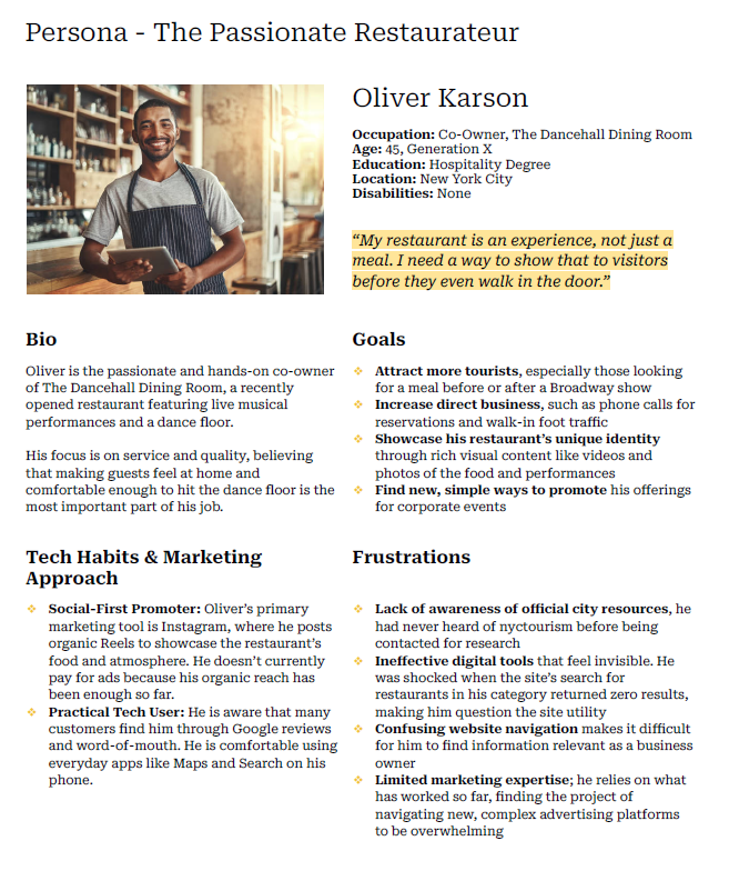
From our initial interviews with business owners, we learned these were the three most glaring issues:
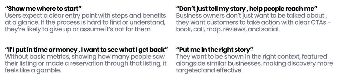
- Difficulty Finding Information: Business owners expressed frustration because information on how to feature their business was difficult to locate. For instance, users often missed the “Advertise with Us” link when it was “tucked away in the footer”. The site often felt like it was designed more for tourists than for business partners.
- Unclear Value Proposition and ROI: Participants required measurable return on investment (ROI) and analytics, comparing potential promotion on the site to platforms like Google and Facebook Ads. They needed data on audience reach, page views, and click-through rates. Without these metrics, time or money invested felt like a “gamble”.
- Inadequate Search Functionality: The existing search experience was a significant pain point because business owners expected robust tools allowing searching by specific items or locations. One restaurateur, upon searching the site for “Italian restaurant,” received 0 results, leading them to question the site’s utility.
Testing
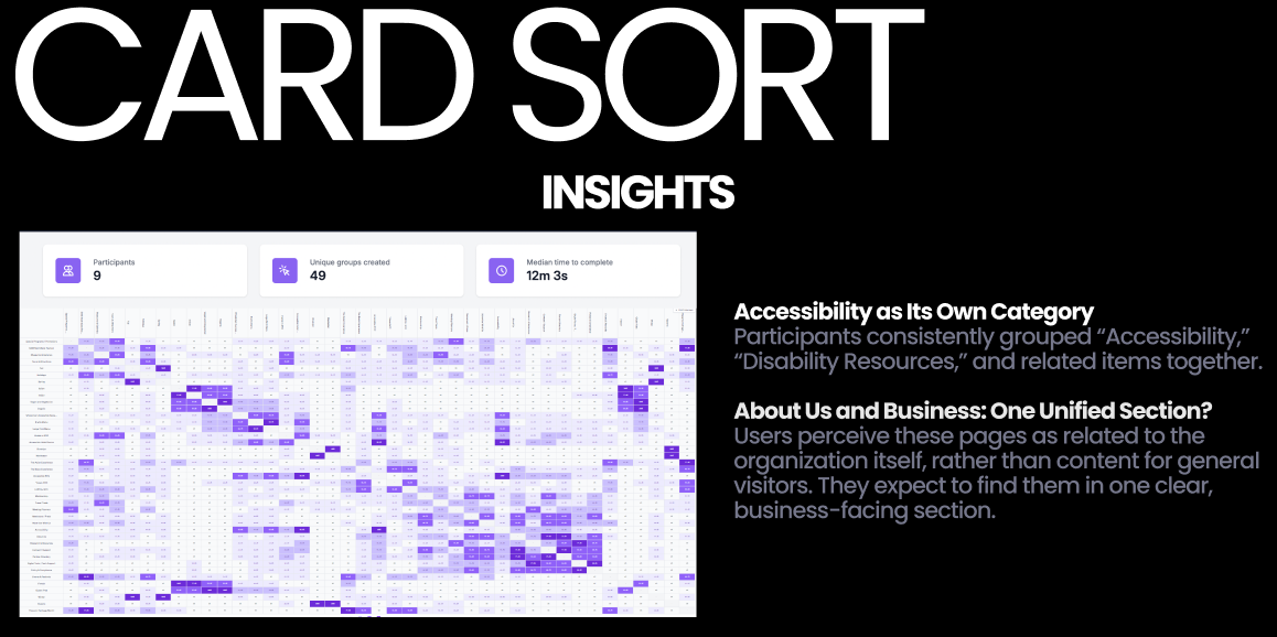
Takeaway: Participants consistently grouped “Accessibility” and related items together, perceiving them as pages related to the organization itself. They also frequently created a “Directory” category, signaling a missing category for centralized business listings.
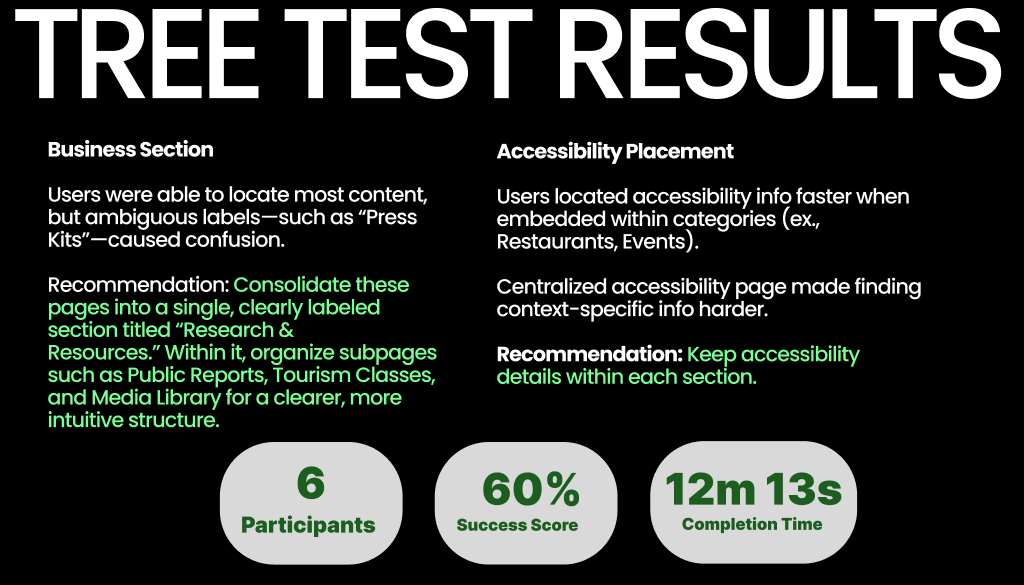
Tree Testing (6 participants): Conducted with six participants using 10 tasks to learn whether the proposed IA structure and labeling system made sense. This validated our structural changes before prototyping.
Takeaway: Ambiguous labels, such as “Press Kits,” caused confusion. This led to the specific recommendation to consolidate these overlapping pages into a single, clearly labeled section called “Research & Resources”.
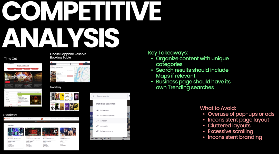
What Worked (Insights to Incorporate): Search results should include Maps if relevant, and the Business page should feature its own Trending searches. Leading sites organize content with unique, clear categories.
What Didn’t Work (Mistakes to Avoid): The initial site suffered from inconsistent page layout, specifically using different navigation bars for the business section and the visitor section, which needed to be unified.
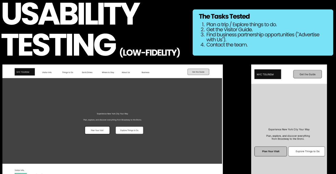
What Worked: Users quickly understood the new main navigation labels (“About Us” and “Business”), confirming the architectural clarity. They easily located the “Advertise with Us” section on both prototypes, validating the new prominence. The mobile hamburger menu was noted as “invaluable” for orientation.
What Didn’t Work (Friction Points): Redundant or unclear CTAs, such as having “Plan Your Visit,” “Visitor Info.,” and “Get the Guide,” created friction, forcing users to choose between nearly identical options. Critically, business users still “didn’t understand how the site helped them succeed,” highlighting the need for quantifiable proof of value.
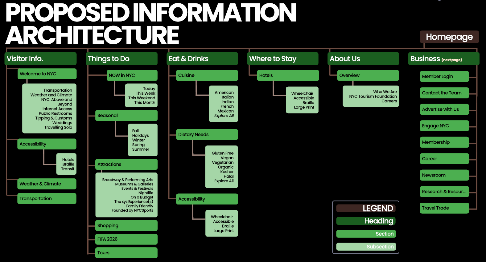
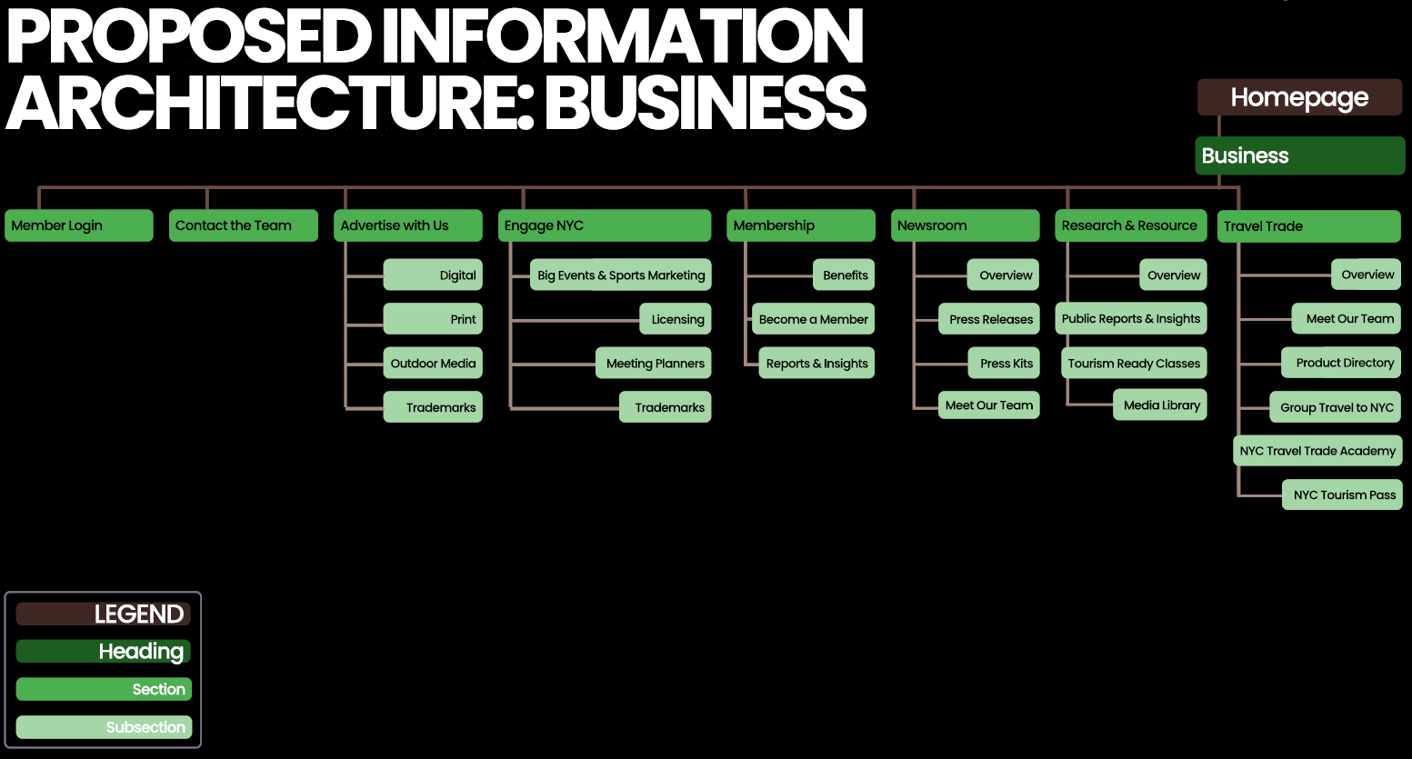
Proposed IA
Our Solution & Prototype
At the end of our testing and redesign process, the final design successfully translated research insights into a clear, actionable information architecture based on our test results. The anticipated impact is measured by focusing on engagement and trust:
- For Business Owners: We anticipate more clicks to business actions (Advertise, Engage) and a higher interaction with testimonials. The dedicated structure simplifies the process of finding partnership information, leading to more successful contact submissions.
- For Tourists: The reorganization and enhanced discovery tools are expected to result in faster access to key information and higher engagement with Explore tools, leading to a richer resource overall.
Our final high-fidelity prototype directly addressed the problems of obscurity and lack of trust by implementing several architectural and feature decisions:
- Elevating the Business Section
- Unifying and Streamlining Navigation
- Building Trust with Testimonials
- Improving Business Discoverability for Tourists
- Centralizing Planning Tools
These decisions work in concert to achieve the goal: the clearer IA leads to higher business engagement, which in turn results in a richer resource for tourists.
Click here for our final desktop prototype, and here for our final mobile prototype.
Conclusion and Next Steps
The project successfully addressed the site’s fundamental architectural flaws, shifting the perception of NYCTourism.com from a confusing tourist guide to a potential, valuable business partner platform. The final high-fidelity product was delivered as a compelling design story showcasing our thinking, decisions, and outcomes. We focused on creating a design that was robust, transparent, and mutually beneficial.
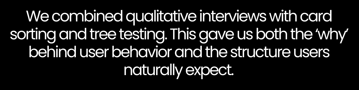
The major lesson learned is that for platforms relying on external partnerships, Information Architecture must be leveraged to build trust: if businesses cannot easily find the information they need or see the clear value in participating, they will not engage, regardless of how attractive the site is to tourists. This is why prioritizing transparency and dedicated entry points became the cornerstone of the redesign. Our overall approach was methodical, combining qualitative research to understand the “why” behind user behavior with quantitative testing to validate the structure users naturally expect.
Future Changes
If our team were to continue working on the project, we would implement the following additions after further IA wireframing and testing:
1. Business Dashboard: By developing a robust dashboard that provides business owners with key analytics (page views, click-through rates, etc.), they can measure success against their marketing objectives.
2. Support Rich Media Profiles: Enhance business profile pages to support the custom content business owners require, such as video and photo galleries, allowing them to showcase their businesses effectively. This would allow creative brands to “live naturally” on the site.
My Roles
My role on the project team was to understand the user perspective, encompassing Information Architecture design and User Research. I was responsible for planning and conducting individual user interviews with business owners, synthesizing those findings, and moderating usability sessions on the low-fidelity prototypes. Additionally, I edited deliverables for consistent tone and branding. Lastly, I kept our team focused and spirited throughout the process.
Timeline & Context
September – December 2025
As a student pursuing a Master of Science in Information Experience Design at Pratt Institute, this project was undertaken as part of our coursework for INFO 643: Information Architecture, taught by professor Johna Shi.