My Roles
UX Researcher, UX/UI Designer, Product Designer
Team
Jane Hsieh, Francois Yap, Jie Sun, Marianne Benyamin
Timeline
August – December 2025
Project Overview:
The Morgan Library & Museum: the Needs to Establish a Clear and Intuitive Information Architecture
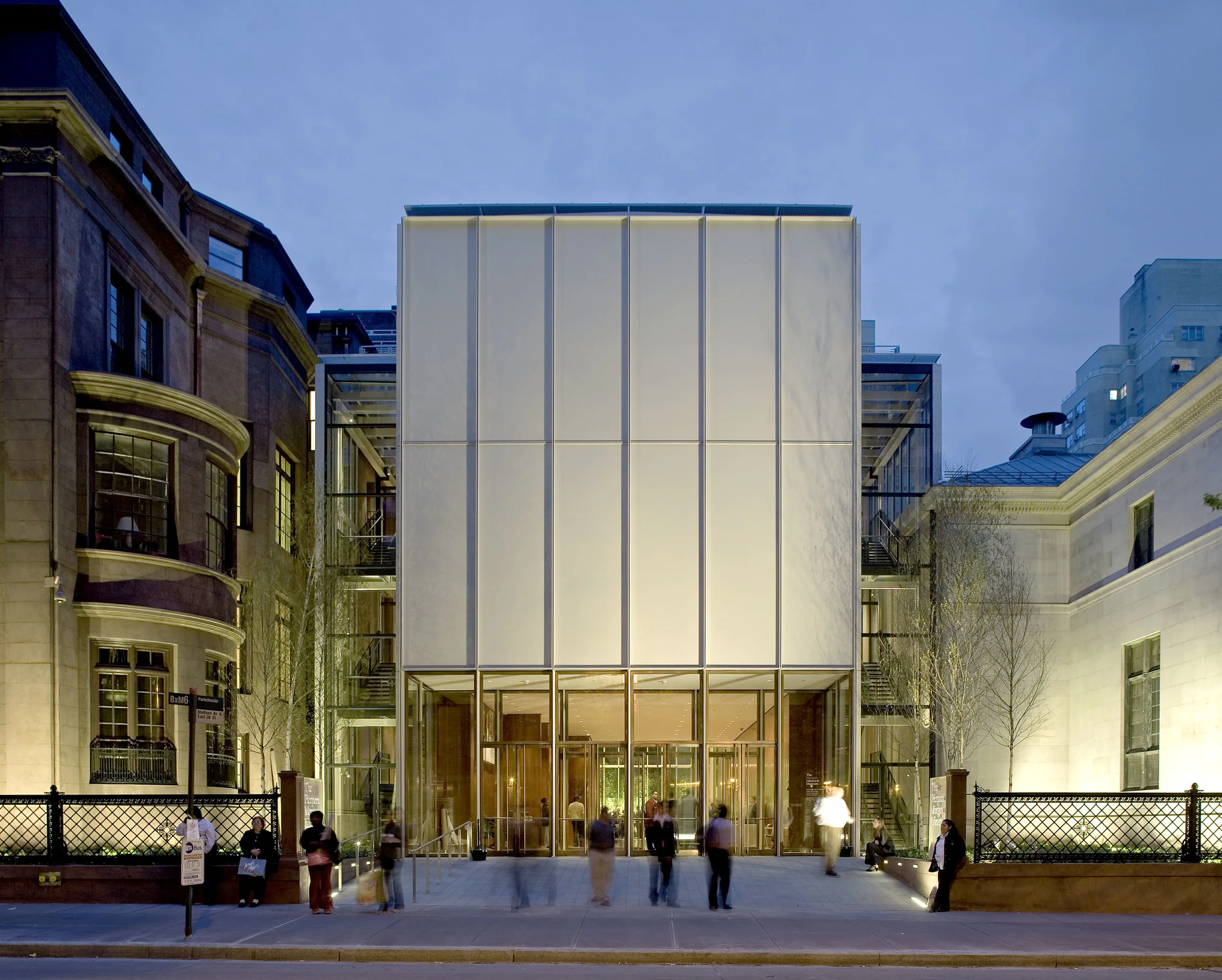
The Morgan Library & Museum, located in Manhattan, New York, is a museum with rotating exhibitions, a renowned research library that supports scholars worldwide, and a cultural space that offers programs and events for the broader community. The museum want to establish a clear and intuitive information architecture so users can easily find the information they need, and to optimize the experience for mobile use, ensuring users can research and access information seamlessly across different devices without limitations. This study was conducted by four UX experts from Pratt Institute to help The Morgan achieve its goals and address the challenges it is currently facing.
Problem Statement:
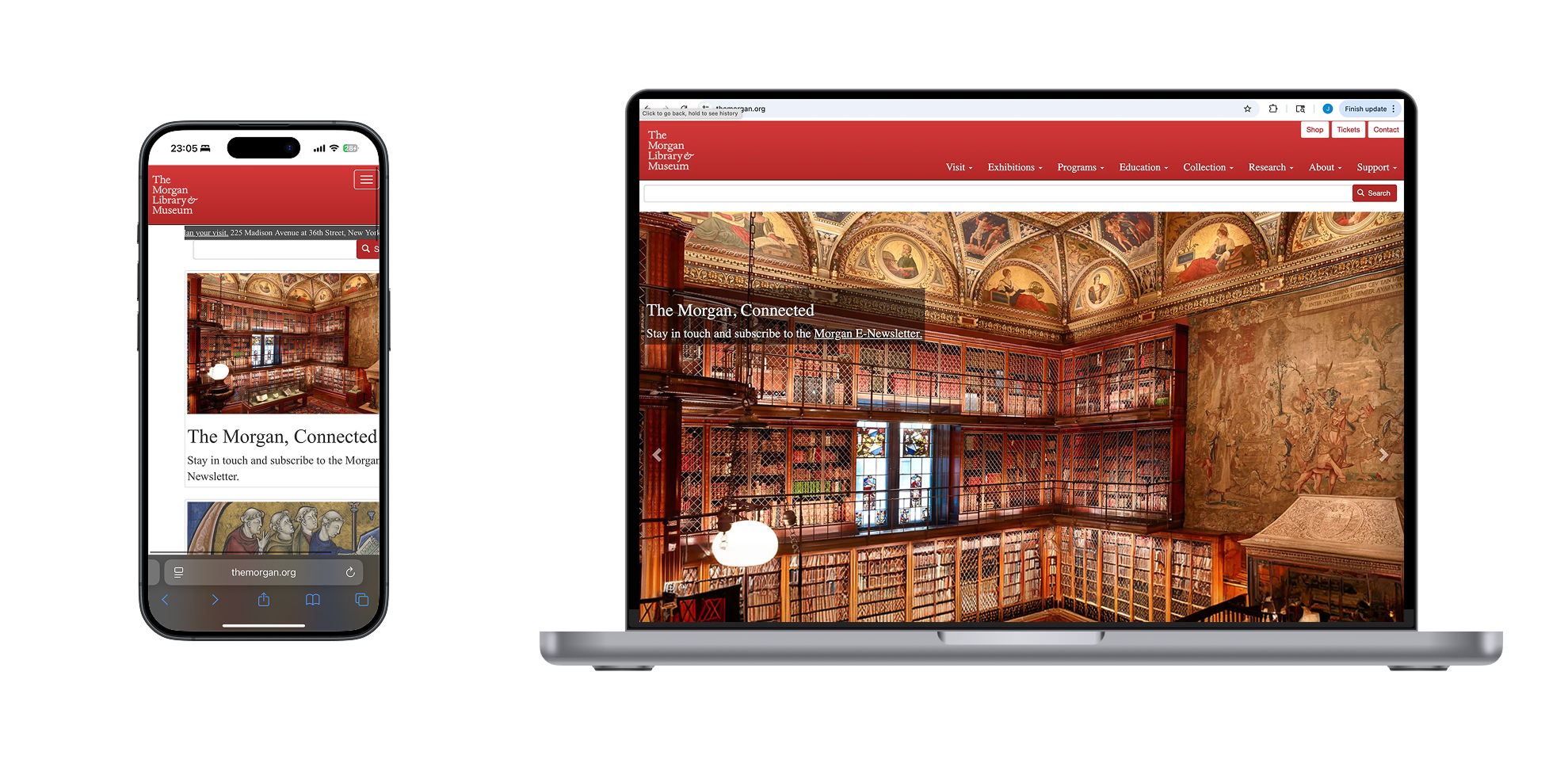
The Morgan Library & Museum: Issues with Outdated Website
The Morgan Library & Museum website has not been updated in years, resulting in accumulated content and an unclear information structure that makes navigation difficult for users. Without a clear design and intuitive navigation, the site risks reduced engagement, visitor interest, and opportunities for support.
The Design Process
1. Understanding the User Needs & Direct and Indirect Competitors of the Museum
Below are the process and methods we used for to achieve the learning pathway:
- User Interviews: We interviewed eight participants aged 18–35 who had visited museums, ranging from infrequent visitors (once a year or less) to occasional and frequent museum visitors.
- Affinity Diagramming: The interview data was analyzed using affinity mapping to integrate insights and identify key findings and recurring themes through the grouping of patterns across participants.
- Personas: We created a persona to better understand the target users we were designing for and to ground design decisions in user needs and behaviors.
- Competitive Analysis: We conducted a competitive analysis by identifying eight comparable competitors and evaluating each across key dimensions using a defined rating criteria.
Key Learning Through the User Research & Competitive Analysis:
Efficient Time Use on the Website
Users typically visit museum websites to purchase tickets and plan logistics, and therefore prefer to complete tasks quickly.
Mobile-First Behavior
Most younger users rely on their phones to search for information and visit museum websites, making mobile-friendly design essential.
Clear Navigation and Visual Communication
The website’s navigation and visual presentation need to communicate information clearly to help users understand and move through the site with ease.
2. Understanding the Users’ Mental Models
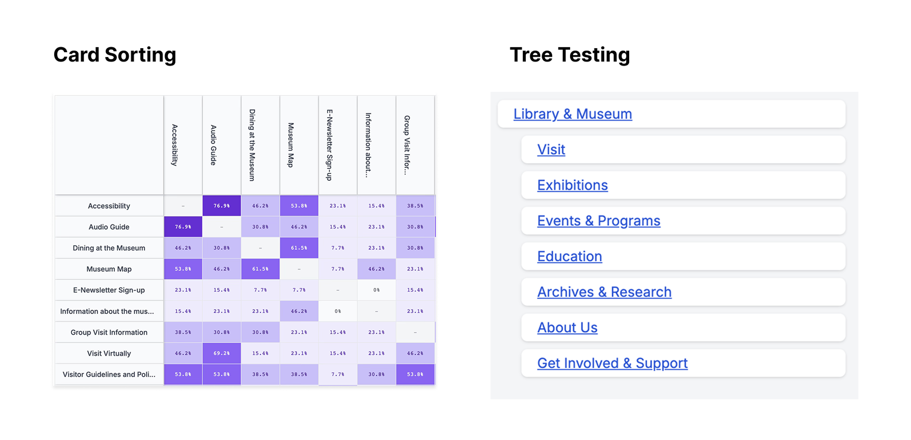
- Card Sorting:
- We refined the content down to 53 cards by renaming items to be more representative and easier to understand, while removing jargon, redundant content, and less important information that could confuse users. We tested with 13 participants and identified 47 unique groups. Based on these results, we drafted an initial sitemap to guide the information architecture.
- Tree Testing 1:
- In the first round of tree testing, it included 18 participants, each completing 10 tasks. The overall success rate is 59.4% and a 44.4% direct success rate as our results.
- After reviewing the results, we identified key issues related to unclear task wording and IA structure. We revised the questions to be more specific and made adjustments to the hierarchy and labeling to better align with users’ mental models.
- Tree Testing 2:
- In the second round, the overall success rate increased from 59.4% to 80%, and the direct success rate improved from 44.4% to 56.7%. These improvements were driven by clearer wording for tasks and an updated IA that better supported how users expected information to be organized.
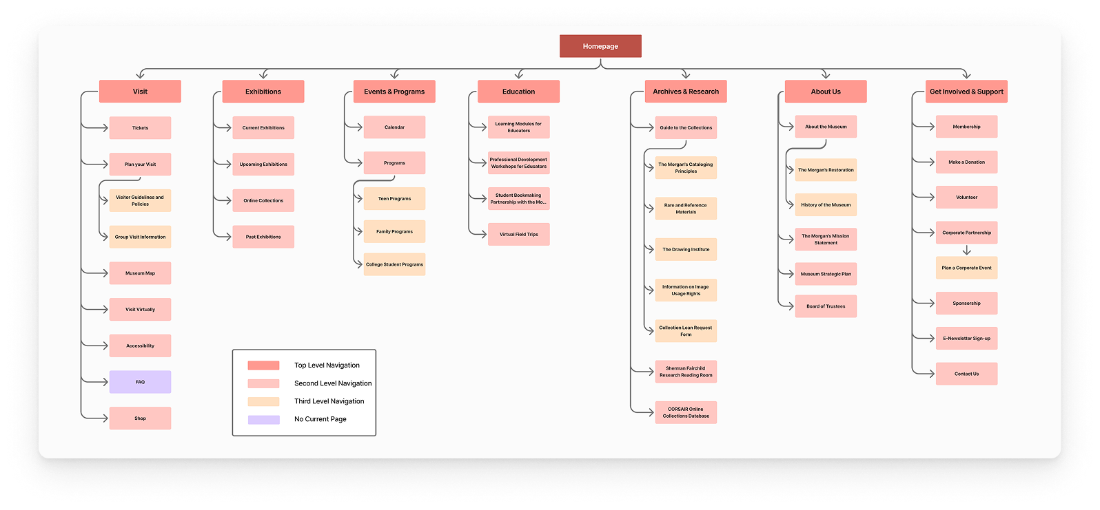
Initial Proposed Information Architecture
Initial Sitemap: Drafted After Card Sorting
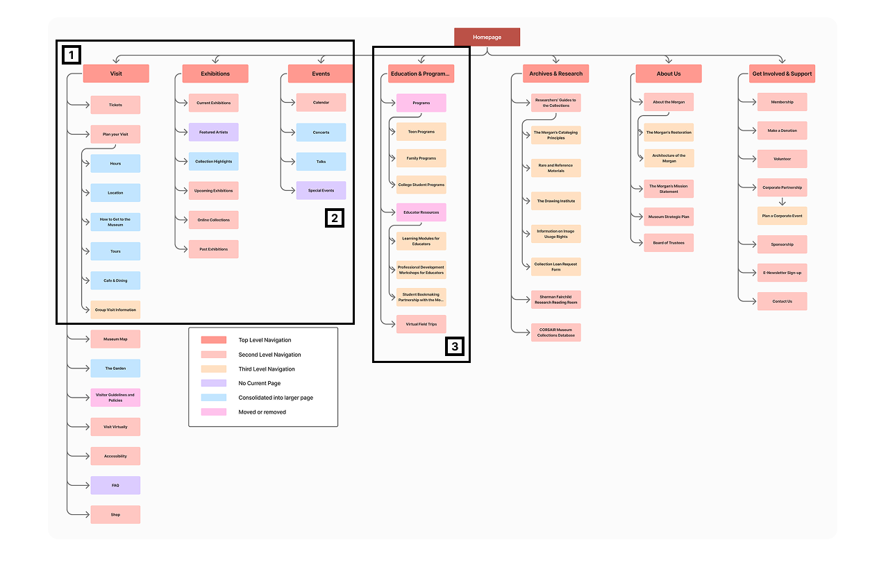
Key Improvement from Initial Sitemap
1. Pages Marked in Blue
We initially tested a larger set of pages, but ultimately consolidated the pages marked in blue to streamline navigation and reduce cognitive overload for users.
2. Pages Marked in Purple
The pages marked in purple were initially proposed as a new page based on the results from the card sort and competitor analysis. However, we later removed them to further refine navigation around the key sections and reduce the risk of split traffic across the site.
3. Pages Marked in Pink
Pages marked in pink were either relocated or removed based on research insights.
Final IA Proposal: create a final IA based on data from card sorting and tree testing
Prototypes & Testing
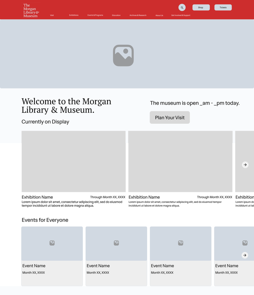
Initial Version of Our Prototype
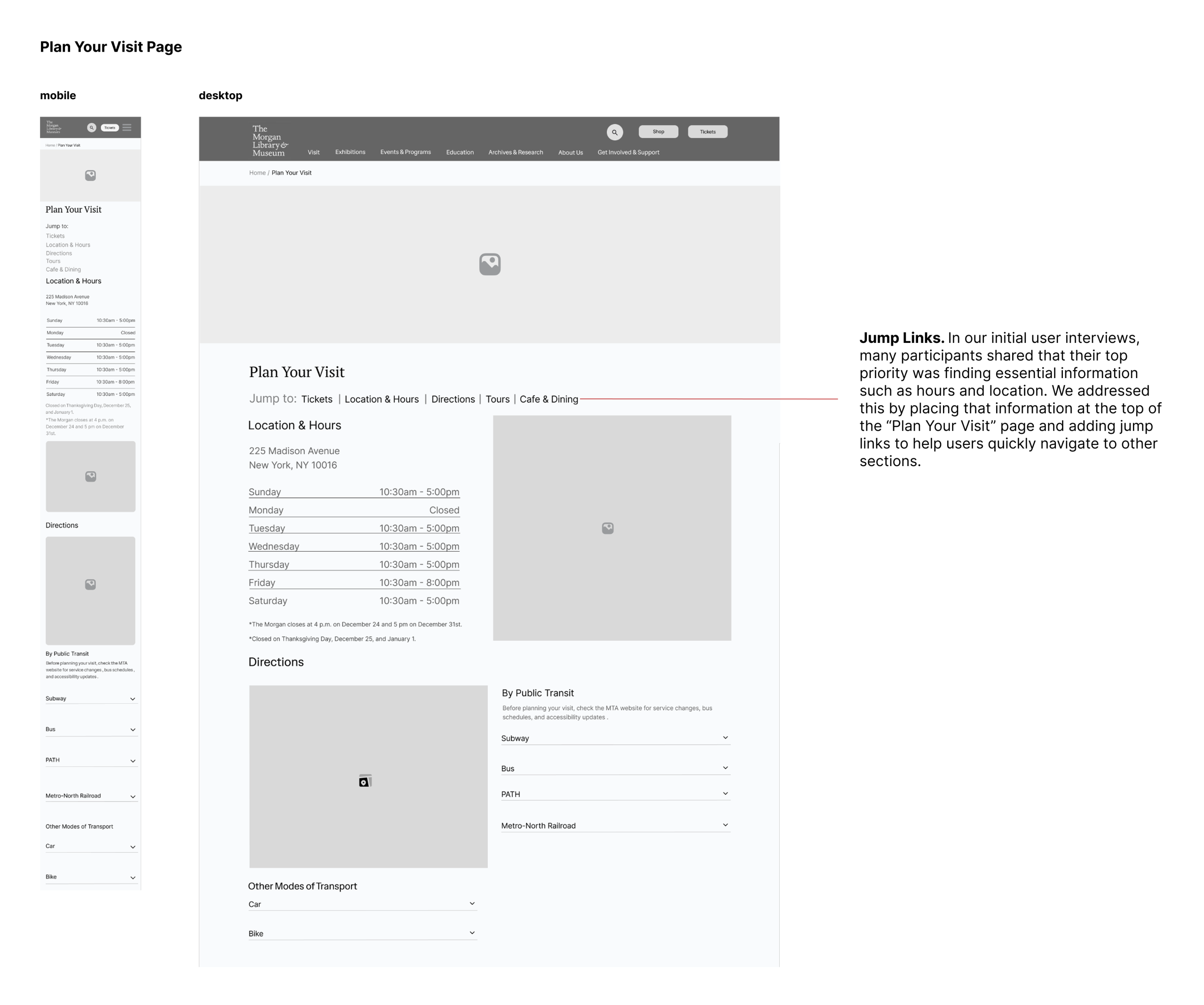
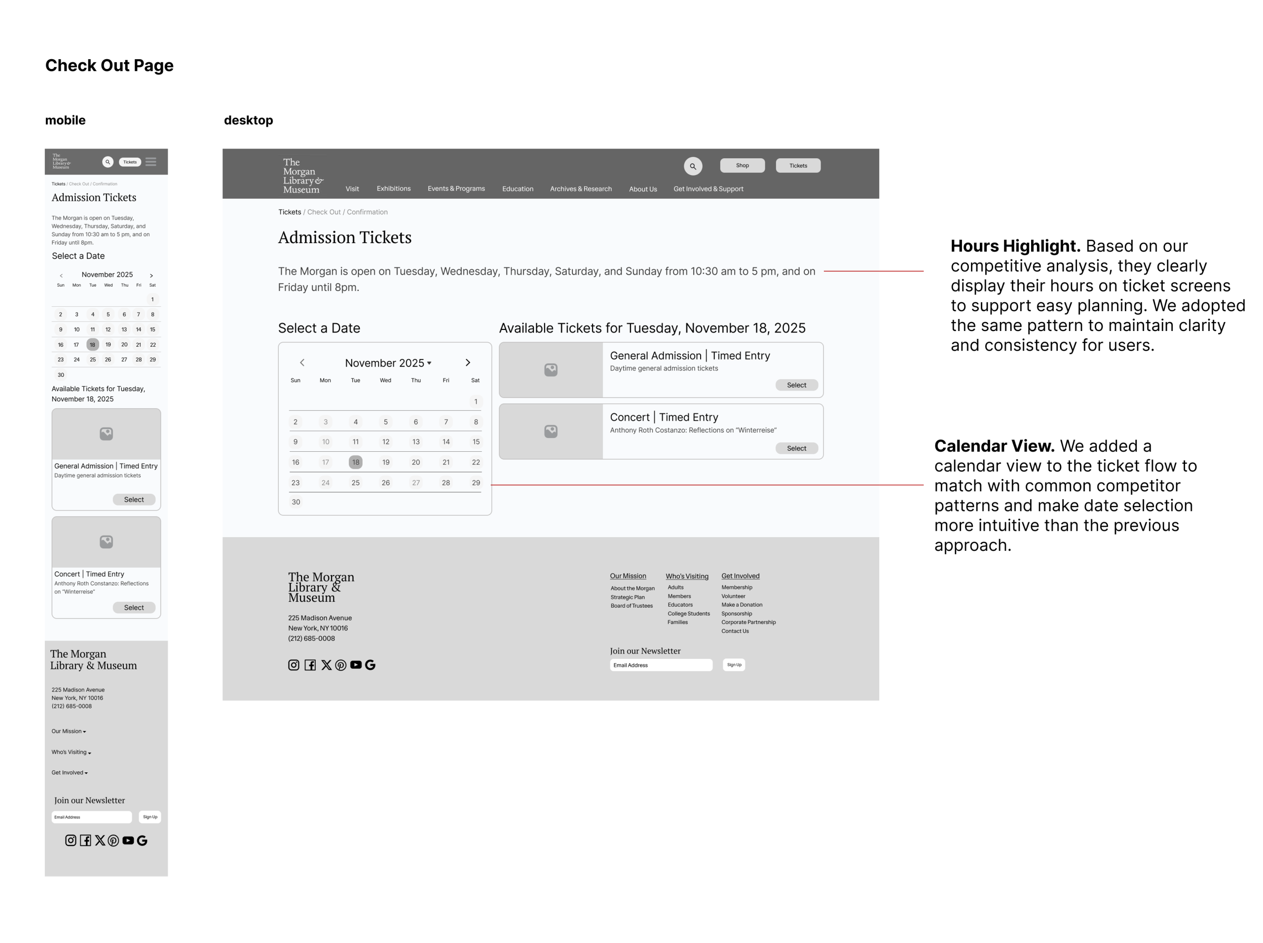
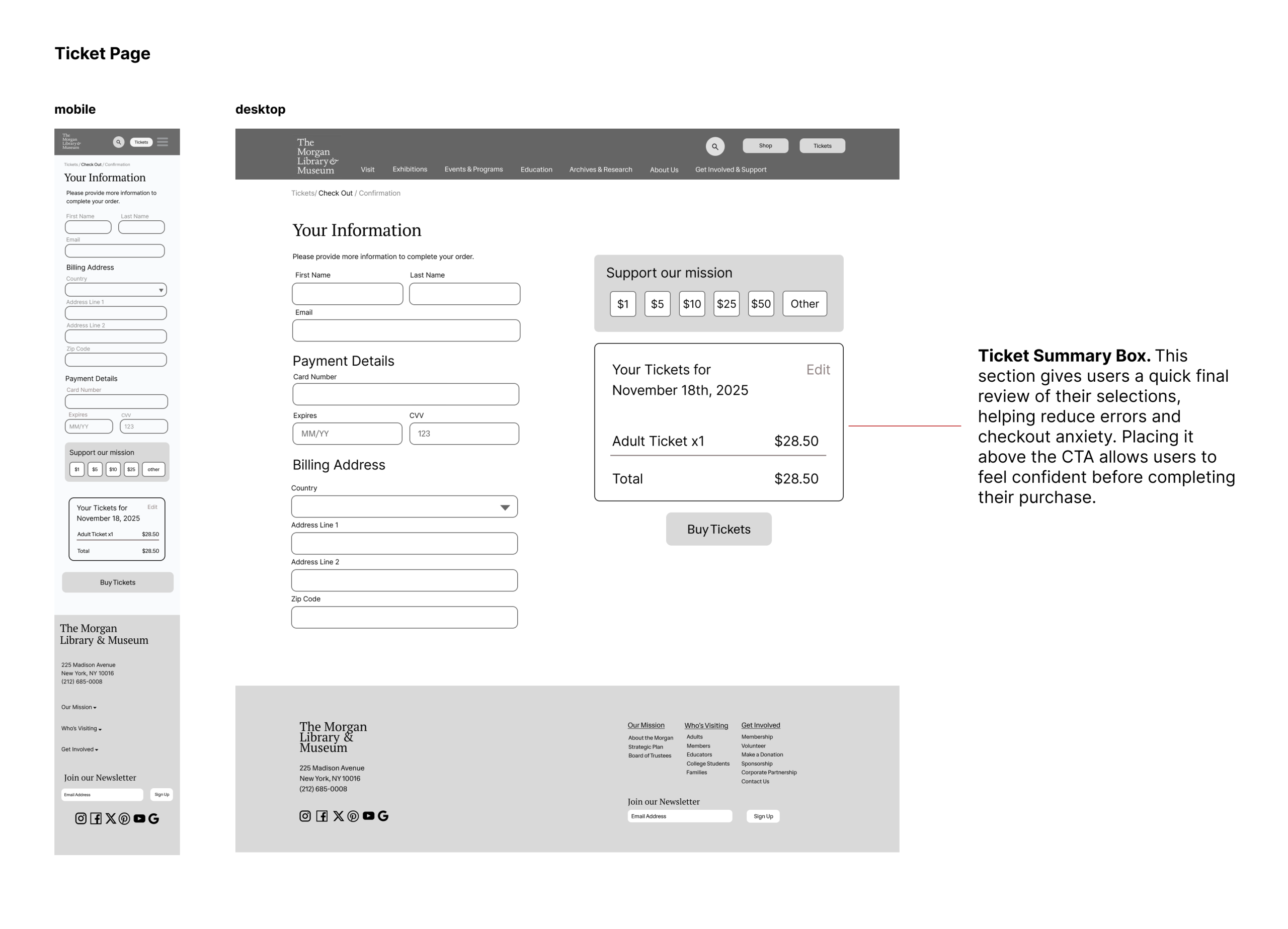
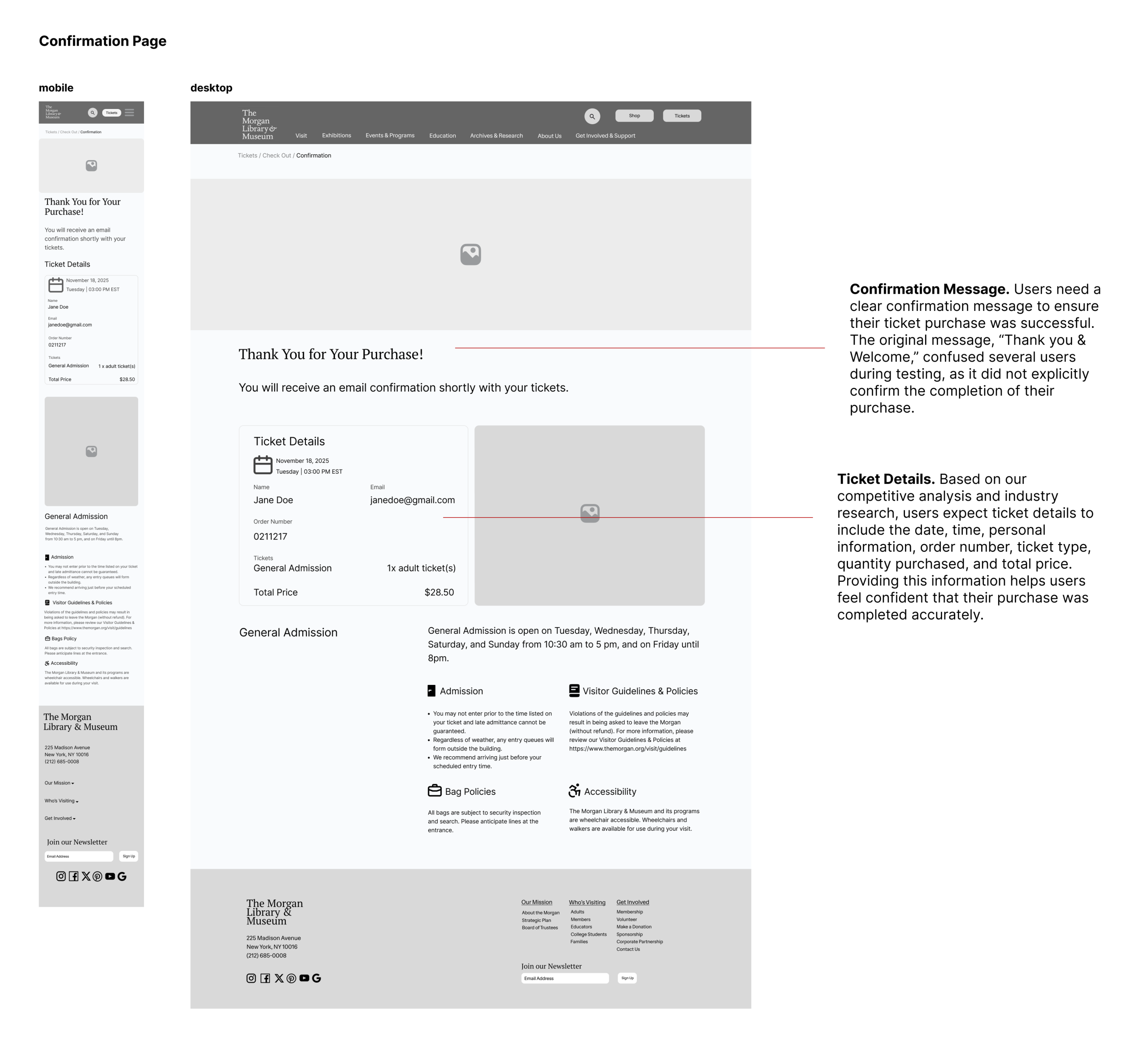
Based on the sitemap, we began drafting our initial design.
Usability Testing Process
Conducted usability tests with five participants to identify significant issues in our design.
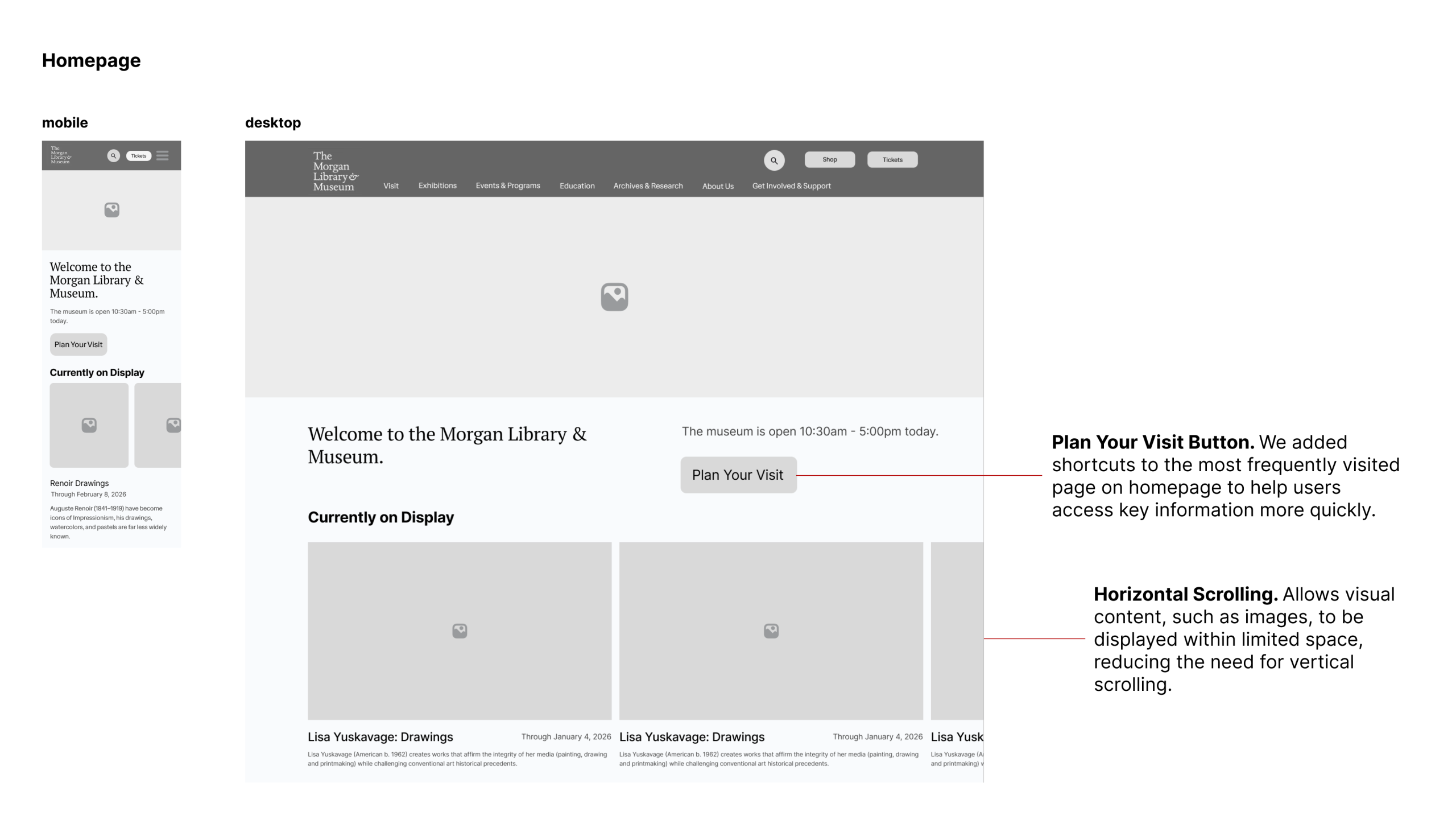
Final Prototypes for The Morgan Library & Museum
They were refined based on results and feedback from our usability testing.
Conclusion & Reflection
I really enjoyed working on this project with Francois Yap, Jie Sun, and Marianne Benyamin. We shared valuable feedback with one another and learned something new together throughout the semester. One of the main challenges for me was developing the final prototypes, as design is never truly finished, especially when usability testing continues to reveal areas for improvement. Overall, experiencing the end-to-end design process was incredibly valuable and helped me grow as a more confident and thoughtful designer.