Ever notice those small stone or metal posts on sidewalks that quietly direct where you can and can’t go?
Most of us walk past bollards without a second thought. But try pushing a stroller, using a wheelchair, carrying groceries, or crossing a busy street, and suddenly these objects matter. Their material, shape, and spacing affect how 4 billion people navigate cities worldwide, yet we rarely think about them until they get in our way.
The Chinese Context: Exclusion Through Mass and Adaptation
When I first encountered the topic of accessibility, I recalled a project my teammates and I did in 2022 on human-bollard interactions. We observed how people engaged with bollards across three Chinese contexts: an old district in a mid-sized city, a megacity downtown area, and a large commercial center.
The contrasts were striking. In high-end districts like Shanghai’s Xintiandi, bollards have higher aesthetic value and craftsmanship. Many are retractable, rising and falling to stay hidden when not needed, balancing traffic control with visual appeal. Near mid- to lower-income residential areas, bollards are typically mass-produced and cost-effective, with rounded edges for safety. Though designed to block electric scooters from sidewalks, their approachable height and shape turn them into informal seats for elderly residents.
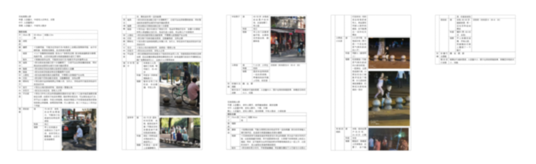
This pattern repeats across Chinese cities. You’ll see bollards everywhere: thick posts, short concrete columns, heavy stone spheres lining curbs to keep cars out. They mark boundaries, but people have adapted them into seats and even play equipment. That’s urban design. People always find new uses.
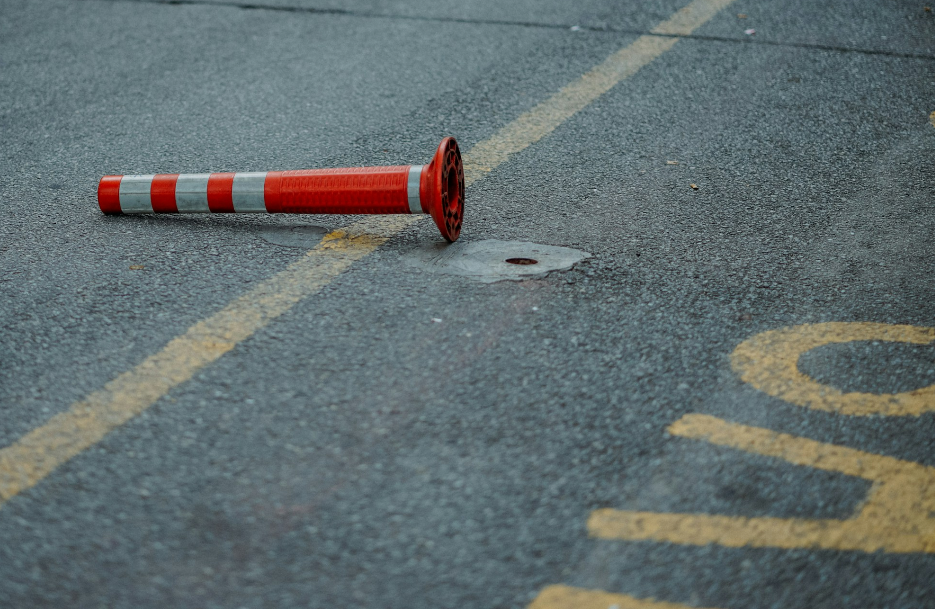
But this flexibility creates problems. Stone spheres are hard to spot for people with low vision, especially without color contrast. Bollard spacing can be random, blocking wheelchair users and people with strollers. When placement prioritizes stopping cars over guiding pedestrians, navigation becomes an afterthought.
The medical model of disability would frame this as individuals struggling to navigate obstacles. The social model shifts the focus: it’s not the person but the design choices that create barriers. Material, contrast, spacing, height, and placement. These seemingly minor details shape daily mobility for millions, showing how small decisions either include or exclude.
As designers recognized the trend of bollards being informally used as seating and the visibility issues that came with spherical forms, they did not eliminate the multi-use logic. Instead, they leaned into it and amplified it. The traditional stone sphere was modified with a flattened top, transforming it into a more intentional seat, sometimes even integrating wireless charging features. Internal lighting was added to improve nighttime visibility, allowing the bollard to glow subtly within the streetscape.
Rather than removing the ambiguity between barrier and furniture, designers refined it, formalizing its secondary functions while attempting to mitigate accessibility concerns.
The NYC Alternative: Standardization and Calibrated Control
New York City offers a contrast. Bollards here are slender steel or cast-iron posts at regular intervals, painted in bright, visible colors. The NYC Department of Transportation has standardized dimensions, spacing, and reflectivity to meet ADA accessibility requirements.
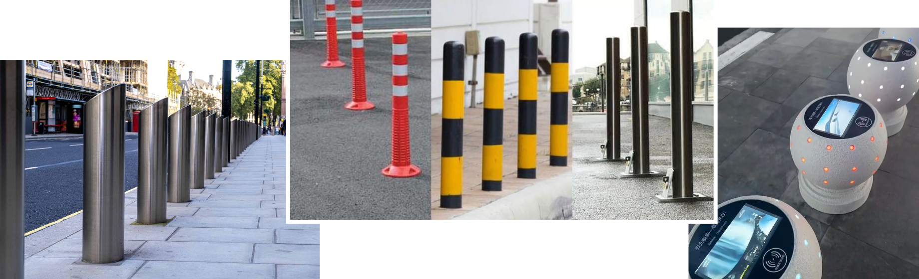
These bollards have consistent heights and diameters with reflective bands for nighttime visibility. This helps people with low vision and creates predictable routes for everyone. Steel allows slimmer profiles that deter vehicles without blocking pedestrians. Wheelchair users, people with strollers, and older adults navigate more smoothly.
Unlike Chinese bollards that double as informal seating or gathering spots, NYC bollards serve primarily as regulated safety infrastructure. It’s a systematized, accessibility-focused approach.
The accessibility implications are significant. The social model argues that environments, not personal limitations, create barriers. Bulky shapes, low-contrast surfaces, and irregular spacing. These design choices disable users.
NYC’s standardization makes pedestrian routes predictable with less physical obstruction and cognitive load. China’s heavier, sometimes irregular designs prioritize vehicle restriction, but that focus can make navigation harder for people with visual impairments or limited mobility.
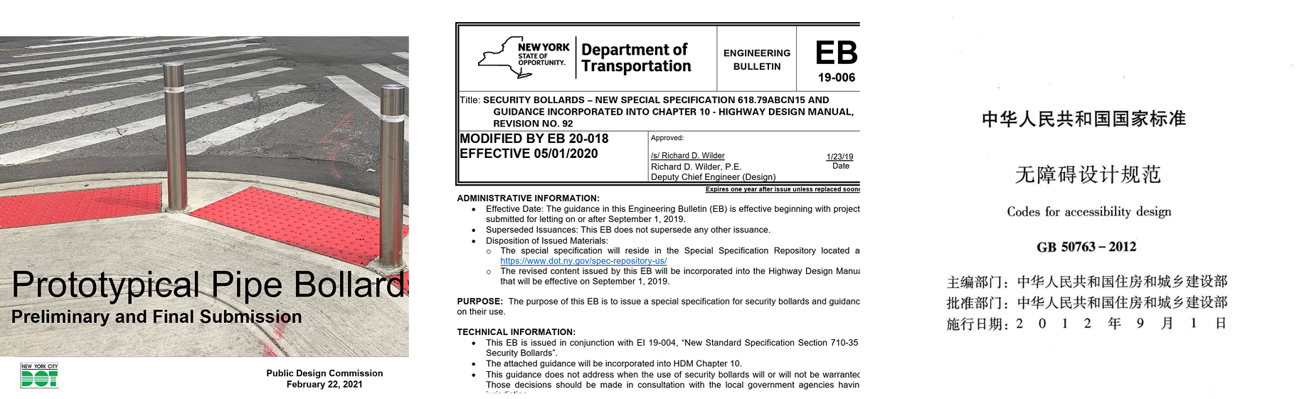
Middle: security bollards – NY.Gov
Right: GB 50763 – Code for Accessibility Design (China National Standard)
Exclusion as a Design Philosophy
Bollards reveal a subtle contradiction: accessibility often requires exclusion. Pedestrian-only zones must first remove vehicles. But the key question is how that exclusion is designed.
Is it heavy, irregular, and adaptive?
Or slender, standardized, and predictable?
Absolute force versus calibrated regulation.
Bollards may appear insignificant, but they embody decisions about who cities are built for. Through the lens of accessibility, they expose a deeper truth: excluding cars can protect pedestrians, but only thoughtful design ensures that protection does not become another barrier.