Are.na is a visual bookmarking and knowledge-curation platform that lets users collect images, links, text, and files into organized “channels.” It’s built for researchers, creatives, and thinkers who want a distraction-free alternative to Pinterest or Notion — without ads, algorithms, or social noise.
Meet Maya
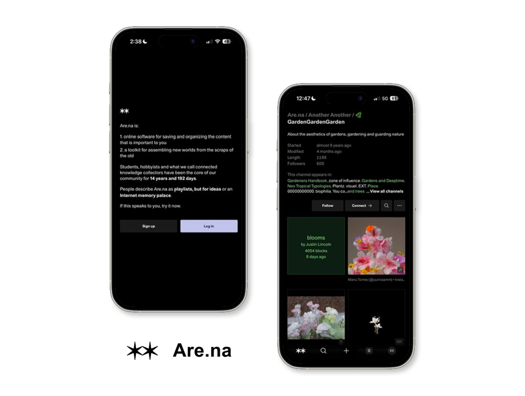
Maya is a 26-year-old graduate student in landscape architecture. She spends hours each week gathering references like images of gardens, botanical drawings, essays on ecological urbanism, and mood board material for studio projects. She’s tried Pinterest, but the algorithm keeps surfacing sponsored content and shopping posts that contaminate her research. A classmate recommends Are.na. Within minutes of signing up, Maya is hooked. The interface feels like a blank notebook rather than a social media feed. She begins building a channel called GardenGardenGarden — a growing archive of garden aesthetics, botanical photography, and writings on guarding nature.
What Are.na Gets Right
1. The Minimalist Interface as Affordance for Focus
The first thing the user notices when they open Are.na is what isn’t there. No advertisements. No trending content. No engagement metrics competing for their eyeballs. This is deliberate restraint working as good design.
Don Norman writes that good design communicates its possibilities through affordances (a relationship between an object and a person that signals how it can be used — without needing instructions). The simple, dark user interface of Are.na encourages collection and reflection rather than casually scrolling. Are.na’s two-column grid displays content at a human pace, in contrast to Pinterest, where visuals cause a sort of aesthetic vertigo. Subtle labels such as “blooms / by Justin Lincoln / 4054 blocks / 8 days ago” are examples of signifiers that provide just the right amount of context without being overpowering. This relates to what Jodi Forlizzi and Shannon Ford might call how artifacts afford behavior through their social and material contexts. Are.na’s restraint doesn’t just reduce distraction; it actively shapes the thinking users bring to the tool. The user finds themself reading their saved blocks rather than endlessly scrolling past them.
2. Channels and Blocks: A Strong Conceptual Model
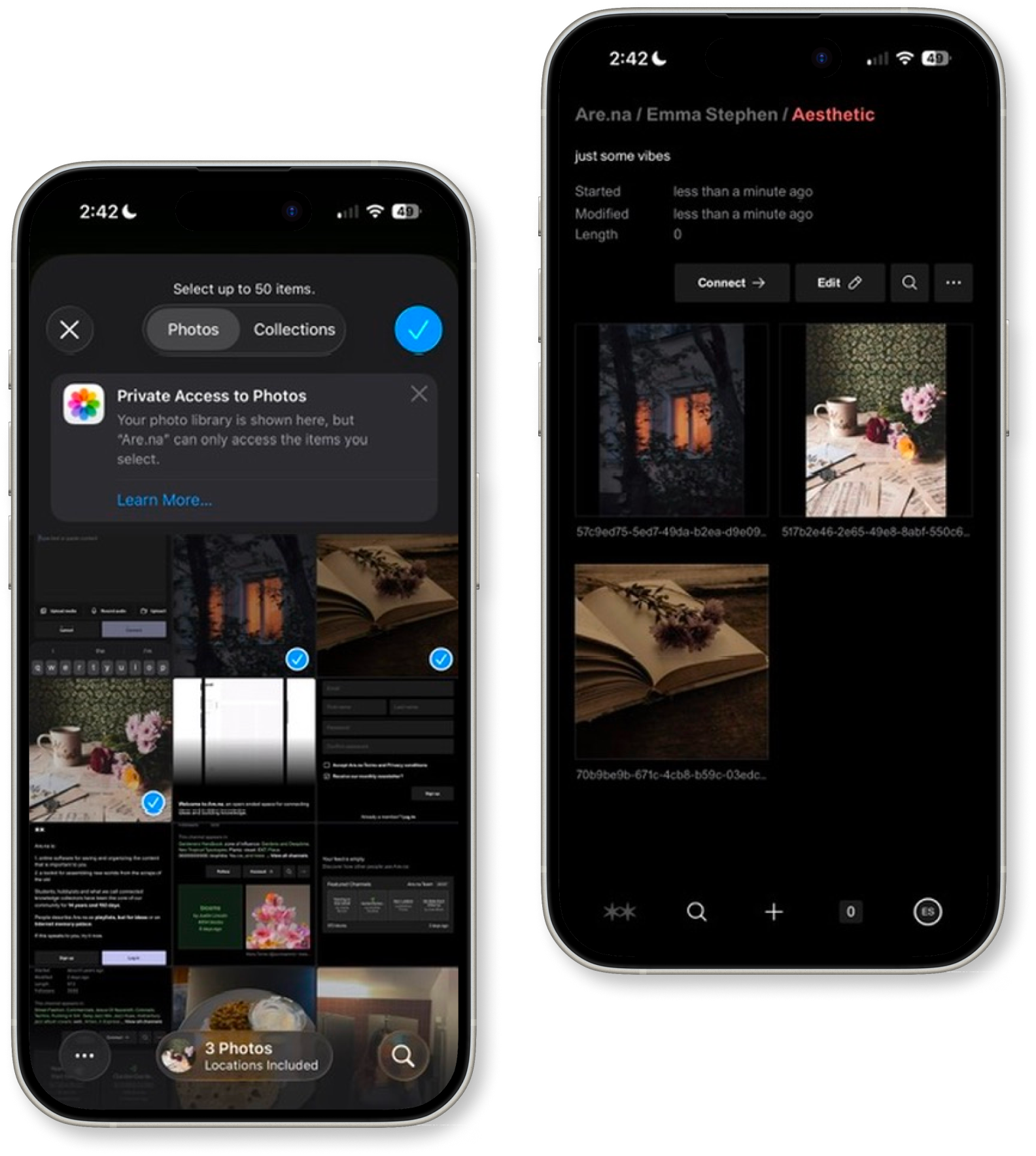
The fundamental structure of Are.na, which consists of channels (folders) that house blocks (content pieces), offers a clear conceptual model that is consistent with the way scholars actually think. Users create a channel, save an Instagram photo of a floral arrangement by Manu Torres, link both to a collaborator’s channel on Neo Tropical Typologies, and link the two channels to one another on Biophilia. According to Norman, the hallmark of a well-mapped design is mental association, which is reflected in this interface.
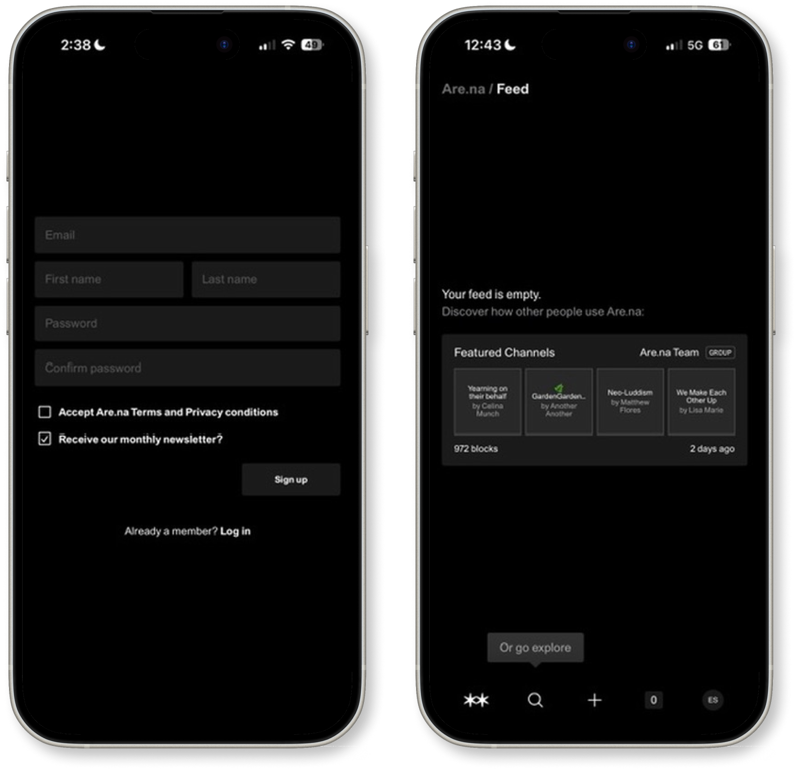
The mapping between action and result is transparent: saving a block to a channel feels like placing a card in a folder. There is no hidden logic, no algorithm deciding where things go. Users are always in control of their own information architecture.
Where Are.na Loses Users
3. Navigation That Ignores Gestalt Principles
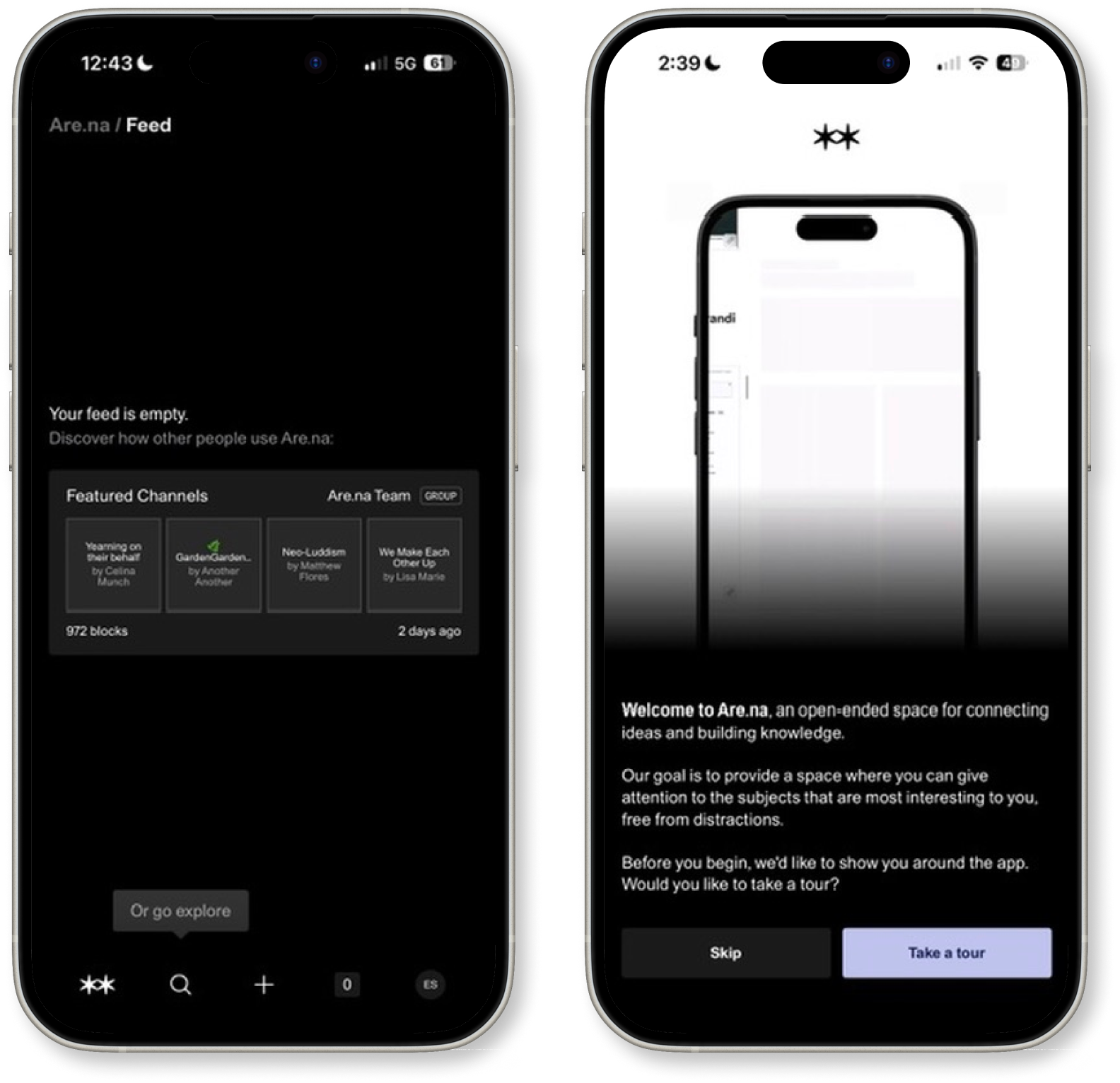
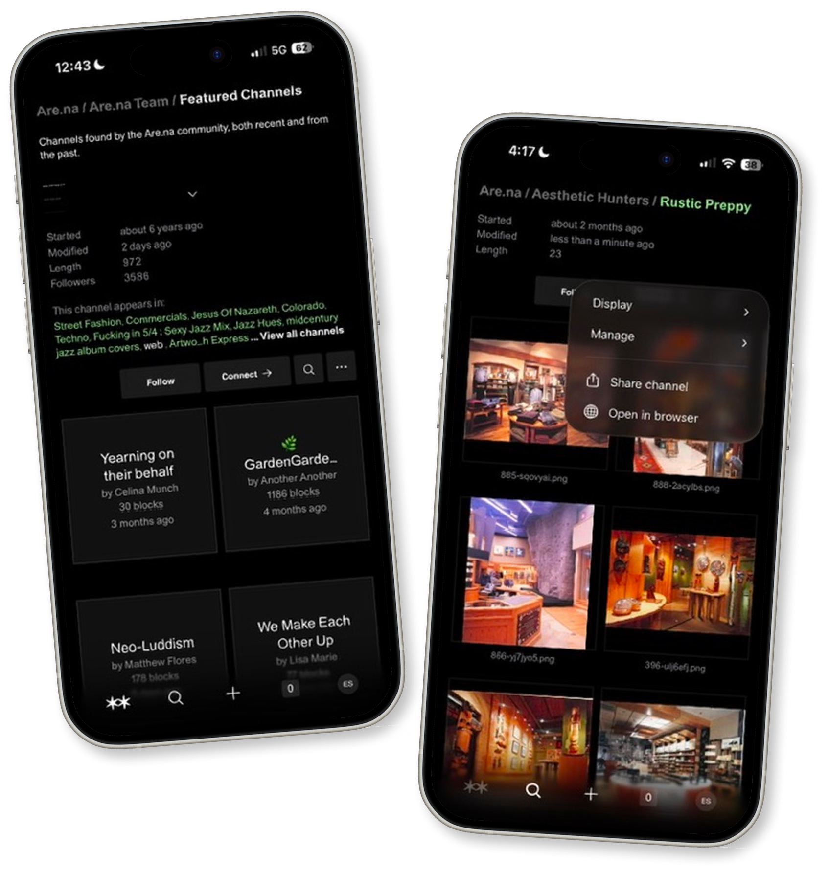
Opening the channel view, the user encounters the bottom navigation bar: a starburst icon, a magnifying glass, a plus sign, a circled “0,” and her avatar. None of these are labeled. The icons are visually inconsistent; the starburst has an illustrative, almost decorative quality, while the others are standard outline icons. There is no proximity grouping of related functions together, no similarity of visual style to communicate that these belong to the same system.
Norman could describe this as a failure of feedback and discoverability: if a user cannot determine what an element does simply by looking at it, the design has failed to communicate. The starburst, it turns out, is the home button, but nothing about its form suggests “home.” The user instinctively reaches for it and lands somewhere unexpected, breaking her flow. According to Gestalt principles, elements that share the same function should share a visual language. Here, the navigation feels assembled rather than designed.
4. The Channel Page: Visual Hierarchy and Information Overload
When the user opens the GardenGardenGarden channel, they see a description, metadata (started, modified, length, followers), a list of connected channels, and then the content grid — all in the same visual weight and rhythm. The Gulf of Evaluation widens here: the user has to work to figure out what is most important on the page.
Norman argues that good design guides the eye through constraints, using visual hierarchy to limit where attention goes and in what order. But Are.na’s channel page treats metadata, social context, and content as equals. The “This channel appears in:” section, which lists related channels in green hyperlink text, visually competes with the channel name and the content grid itself. It’s information-dense in a way that contradicts the minimalist promise of the rest of the app. The conceptual model the user brings to the page (I want to browse the blocks) is delayed by having to analyze data the user didn’t ask for. Progressive disclosure would help: collapse the “appears in” list behind a tap, reduce the metadata section to a single line, and let the content grid breathe as the clear figure against the page’s ground.
The Problem Statement
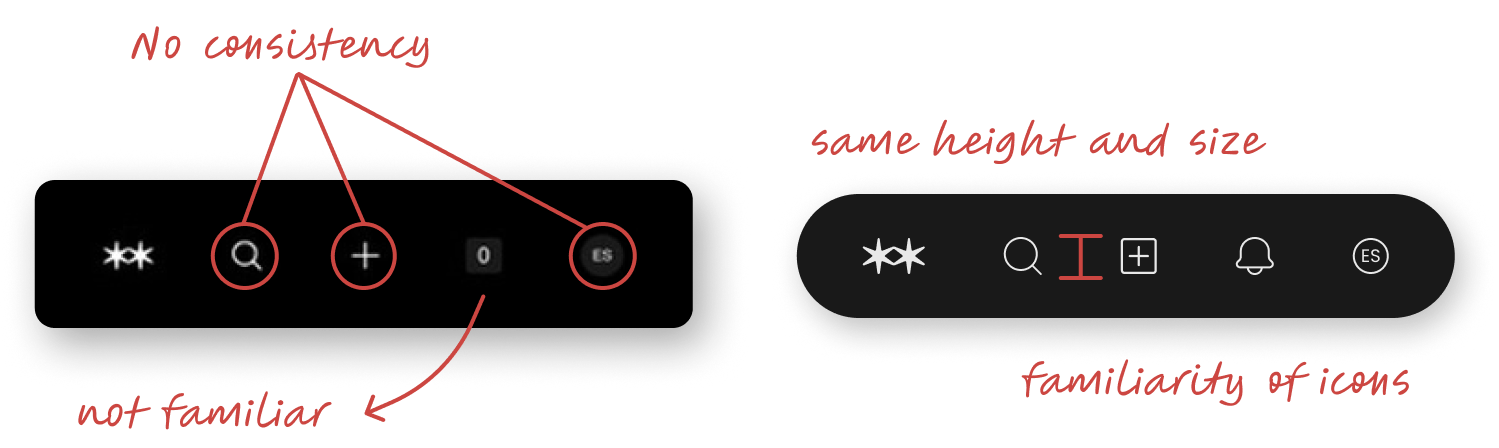
Are.na’s navigation bar presents five functionally distinct actions (home, search, add, notifications, and profile) without a consistent visual language to unify them. Three icons are enclosed in circles; two are not. The “0” notification indicator carries no recognizable iconography, and the user’s initials sitting in a rounded square badge reads more like a design leftover than an intentional navigation element. Norman would call this a signifier breakdown: the visual cues that should communicate “tap me, here’s what I do” are inconsistent enough that the user cannot form a reliable conceptual model of how the bar works as a system.
When elements that perform similar functions — navigation — look visually dissimilar, the user’s brain has to evaluate each one independently rather than reading the bar as a coherent whole. That’s wasted cognitive effort at the moment the user least wants to spend it.
Solution
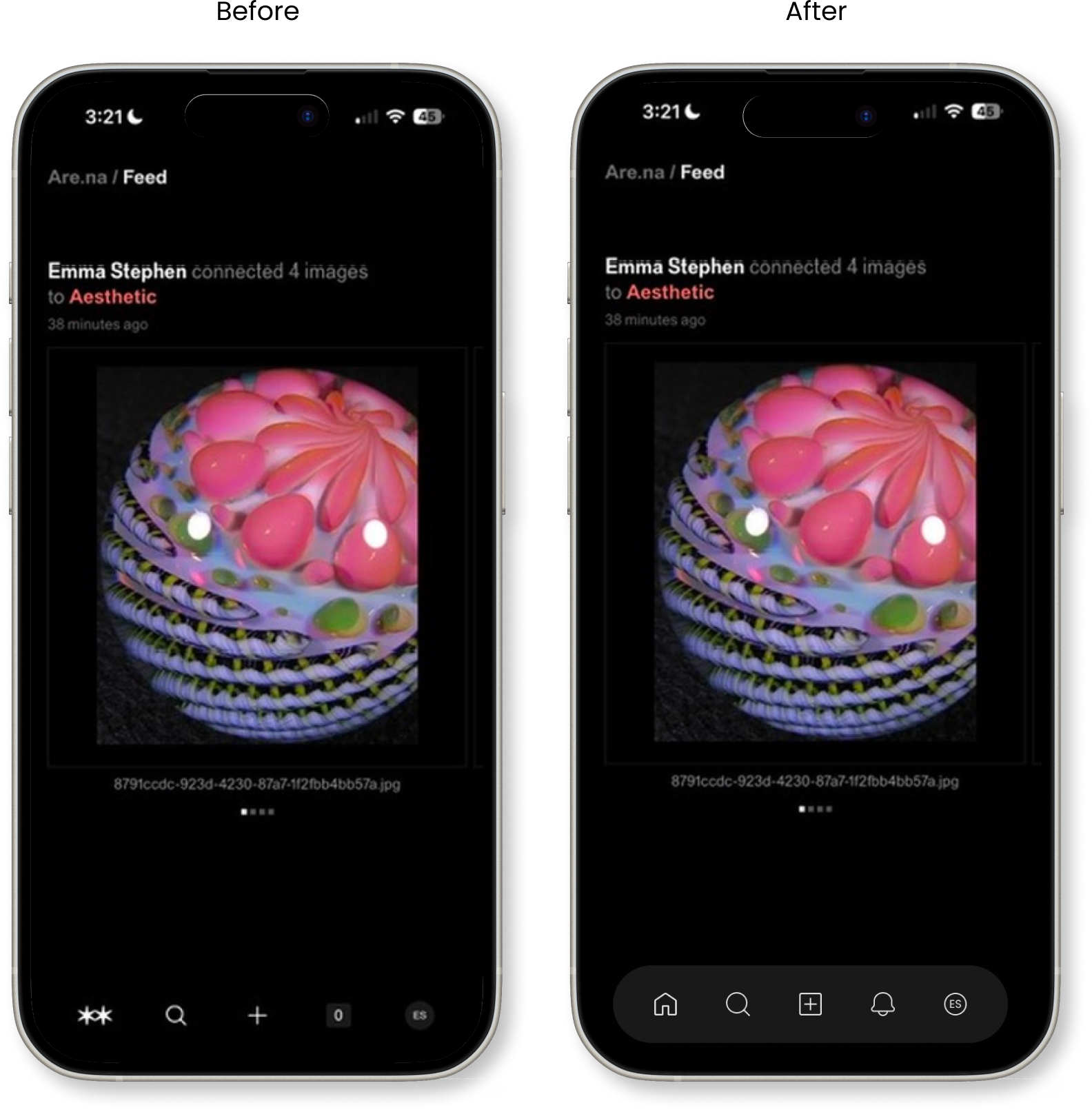
The redesigned navigation bar on the right resolves this by doing three things Norman would approve of:
Consistency as a signifier. Every icon now sits at the same height and scale inside a unified pill-shaped container. The visual consistency signals: these things belong to the same category of action. The Gestalt principle of similarity is doing the work that labels usually have to.
Familiar iconography over invented ones. The ambiguous “0” is replaced with a bell, one of the most universally recognized symbols for notifications in digital interfaces. Norman calls this knowledge in the world: the design borrows meaning that already exists in the user’s experience, so nothing needs to be learned from scratch.
Eliminating arbitrary variation. By removing the inconsistent circle enclosures on only some icons, the redesign closes the gulf of evaluation — the user no longer has to wonder why some icons are wrapped, and others aren’t, because they all behave visually the same way.
A container that declares itself. The redesigned nav bar sits inside a distinct, rounded pill-shaped background, separating it visually from the content above. Norman calls this perceived affordance through contrast. When an element is visually bounded, the user understands it as a discrete, interactive region rather than icons floating ambiguously at the bottom of the screen. Without the background, the original nav bar bleeds into the dark interface, making it harder for the eye to locate and trust it as a consistent anchor point. The container doesn’t add complexity; it adds clarity of structure, telling the user exactly where navigation lives before they even think to look for it.
Conclusion
Are.na is a genuinely thoughtful platform that prioritizes the quality of human attention over engagement metrics. For the user and for anyone who has ever felt that their research tools were working against them, it offers something rare: a digital space that respects how thinking actually happens. The channels-and-blocks model is elegantly mapped, and the minimalist UI affords the kind of focused, associative research that more noisy platforms undermine.
But the navigation bar is a stumbling block that breaks the spell for new users, and the channel page needs a clearer visual hierarchy to honor the information inside it. If Norman were reviewing Are.na, he might say: the philosophy is right, the execution is mostly right, and the navigation is where the design still needs to find itself.
With more consistent signifiers, cleaner Gestalt grouping in the navigation, and better progressive disclosure on channel pages, Are.na could move from being an excellent tool for the patient and initiate to one that welcomes every curious newcomer from the very first tap.