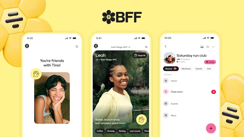
The BFF app is a standalone mobile app from Bumble designed to help users form platonic friendships using familiar dating-app mechanics such as shared interests, location-based matching, and verified profiles. As someone who recently moved to New York and has used Bumble before, I was curious how they designed their new BFF app.
Onboarding
Good Design
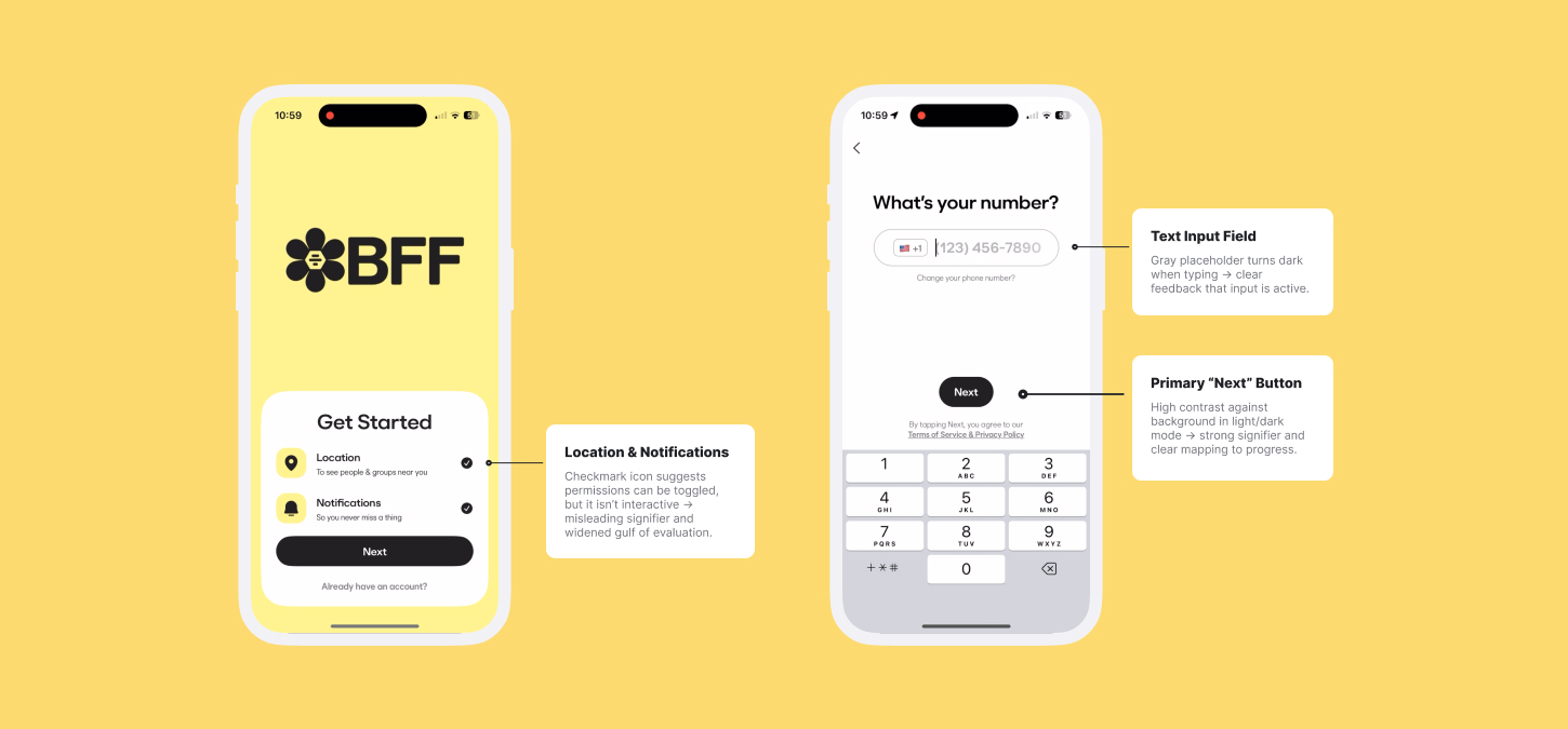
The onboarding interface closely aligns with familiar conceptual models from social and dating apps, reducing the gulf of execution by making required actions immediately understandable. Limiting authentication to only phone-number entry acts as a deliberate constraint different from other apps, eliminating unnecessary choices and streamlining the flow.
Each screen presents a single prompt paired with a clearly signified input field. The grayed-out text field indicates where input should occur, while the high-contrast “Next” button provides clear mapping between user action and system response. This consistent structure enhances learnability and reduces cognitive effort.
Bad Design
Early in the onboarding flow, BFF forces users to enable location services and notifications through system permission modals without providing much contextual explanation within the app. This creates a gulf of evaluation, as users lack sufficient information to understand why these permissions are required or how they benefit their experience.
The screen displays a circular icon with a checkmark next to location and notifications, visually suggesting that the setting may be optional. However, this element is not interactive, creating a misleading signifier that implies control where none exists.
Recommendation
Before immediately forcing location & notification enabling, the interface should present a brief, but detailed explanatory screen describing why location and notifications are needed. Alternatively, I would suggest the checkmark should be made interactive (at least for notifications) for users to have more control. Either change would clarify intent, strengthen mapping, and reduce the gulf of evaluation.
Profile & Personalization
Good Design
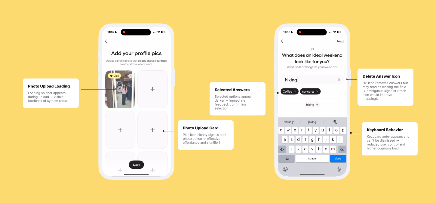
After creating your account, BFF introduces prompts focused on interests and lifestyle, such as “What does an ideal weekend look like for you?” These prompts support personalization and make the experience feel more social.
The screen allows users to either type out their own answers or select from different selected answers. BFF displays a grayed-out text input field that turns black/white (depending on light/dark mode) when typing, providing immediate feedback that input is active. Below it, predefined responses in the form of pills (ex: grabbing coffee, coffee) can be added via a plus icon, which acts as a clear signifier. Selected responses appear as darker buttons with an “X” icon, visually distinguishing them from unselected options and indicating it can be removed as well in case users don’t want that on their profile.
A similar pattern appears in the photo upload flow. The large rectangular photo cards use a plus icon to indicate upload affordance, and a loading symbol indicator appears during uploads, providing clear feedback about the upload process.
Bad Design
Despite the strength of the dual-input concept, BFF’s execution introduces usability issues. The on-screen keyboard for free-response answers automatically appears and cannot be dismissed, disrupting visual hierarchy and forcing users to divide attention between reading prompts, browsing options, and typing.
Additionally, the “X” icon used to remove selected answers in the free-response text input field may be confusing in a flow that also includes the predefined responses The icon can be misinterpreted as closing the input field rather than deleting a selection, creating an ambiguous signifier and weakening mapping.
By presenting multiple interaction methods at once without clear prioritization or separation, the interface increases cognitive load and widens the gulf of execution, as users must determine how to proceed without sufficient guidance.
Recommendation
The keyboard should remain hidden by default and appear only after the user taps into the text field. Allowing users to dismiss it would restore user control, reduce cognitive load, and narrow the gulf of execution.
Also, replacing the “X” icon with a trash icon for the free-response input field would further clarify intent and reduce ambiguity.
Identity Verification
Good Design
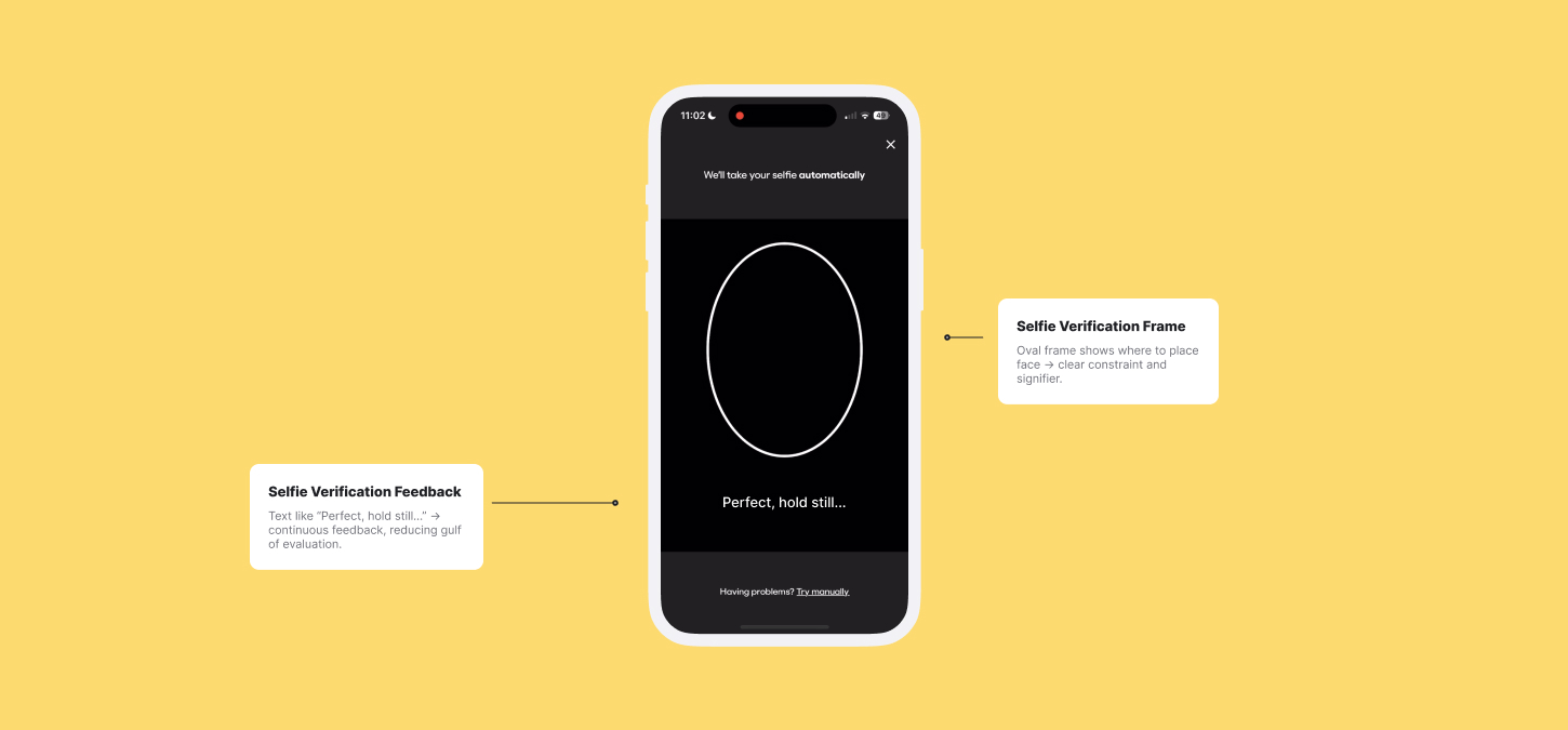
I think BFF’s Selfie Verification flow is one of the strongest examples of effective design in the app and something I haven’t really come across before for social apps. After uploading photos of yourself, BFF guides the user to verifying their identity to make sure they match up with their photos.
On the verification screen, an oval frame clearly indicates where the user’s face should be positioned, functioning as both a constraint and a signifier.
While scanning your face, BFF shows real-time messages such as “Perfect, hold still…” to provide continuous feedback, reducing the gulf of evaluation. Verification completion is clearly communicated to users through an visual checkmark and confirmation message, reinforcing trust and signaling successful task completion.
Conclusion
By building on familiar social app patterns, BFF makes it easy to get started while introducing features I hadn’t experienced before. Overall, the onboarding, profile personalization, and identity verification process feels seamless, but with a few targeted design improvements, it could better address moments of confusion and clarify user intent.