The Bing Bong Android application is a customizable widget that displays the current arrival times for the subway in NYC. Pulling from the MTA’s real-time data feed, the application operates primarily on the user’s home screen. The application itself is only for customizing the widgets, which serves as the user’s primary point of interaction with Bing Bong. Having used this app myself since I found out about it a year ago, I can say it works reliably and provides accurate data when I need it. It can be downloaded on the Google Play Store, here.
Widget Functionality – Refresh
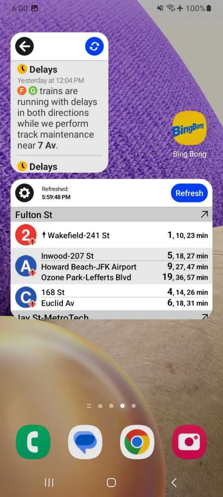
The app provides a great example of audio feedback when tapping the Refresh button. It plays the ‘bing bong‘ jingle that New Yorkers will recognize as the sound the subway trains play when doors are closing. This feedback lets the user know that the app is working. On top of this, with a recent update, the app also now provides visual feedback with the widget’s contents dimming when the data is old/stale. When the Refresh button is pressed, on top of the ‘bing bong‘ sound, the train line data returns to full opacity with current information.
A third point of feedback is the time in the lower left corner of the widget that shows when the data was last refreshed. The first two are customizable and able to be disabled by user preference, but the third timestamp feedback is permanent. This ensures that the user will always have at least one method to know whether or not they can rely on the information presented.
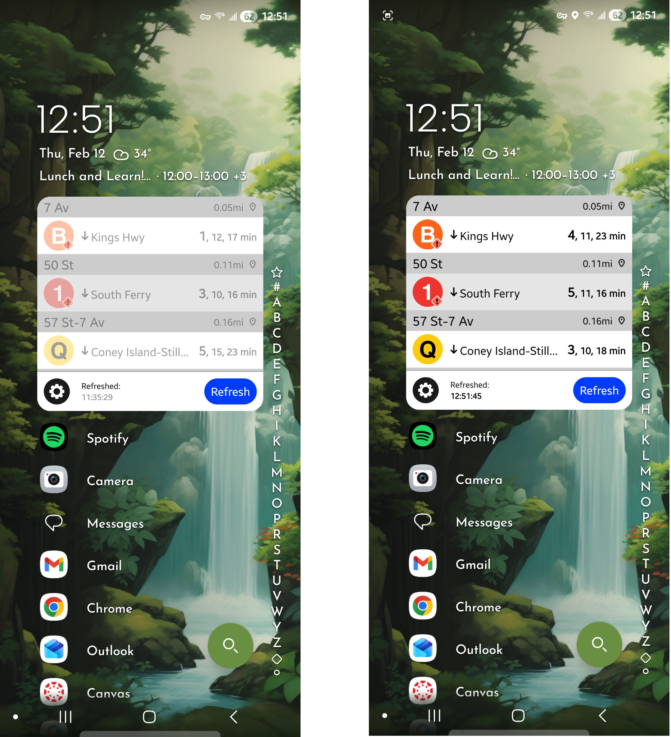
When the widget’s data is old, the user can easily see that they only have two undimmed options available, to Refresh the data or to customize the Settings. This focus on discoverability of available options and the fading of the primary data the user is trying to access both help to shrink the gulf of evaluation, showing the user the state of the data immediately. On top of this, by offering only one real option to operate the application, the gulf of execution shrinks also. After using the widget once and receiving the feedback of the data update and the ‘bing bong’ jingle, the user’s existing mental model of how train times work with the MTA helps to solidify the operation and value of the application in their minds.
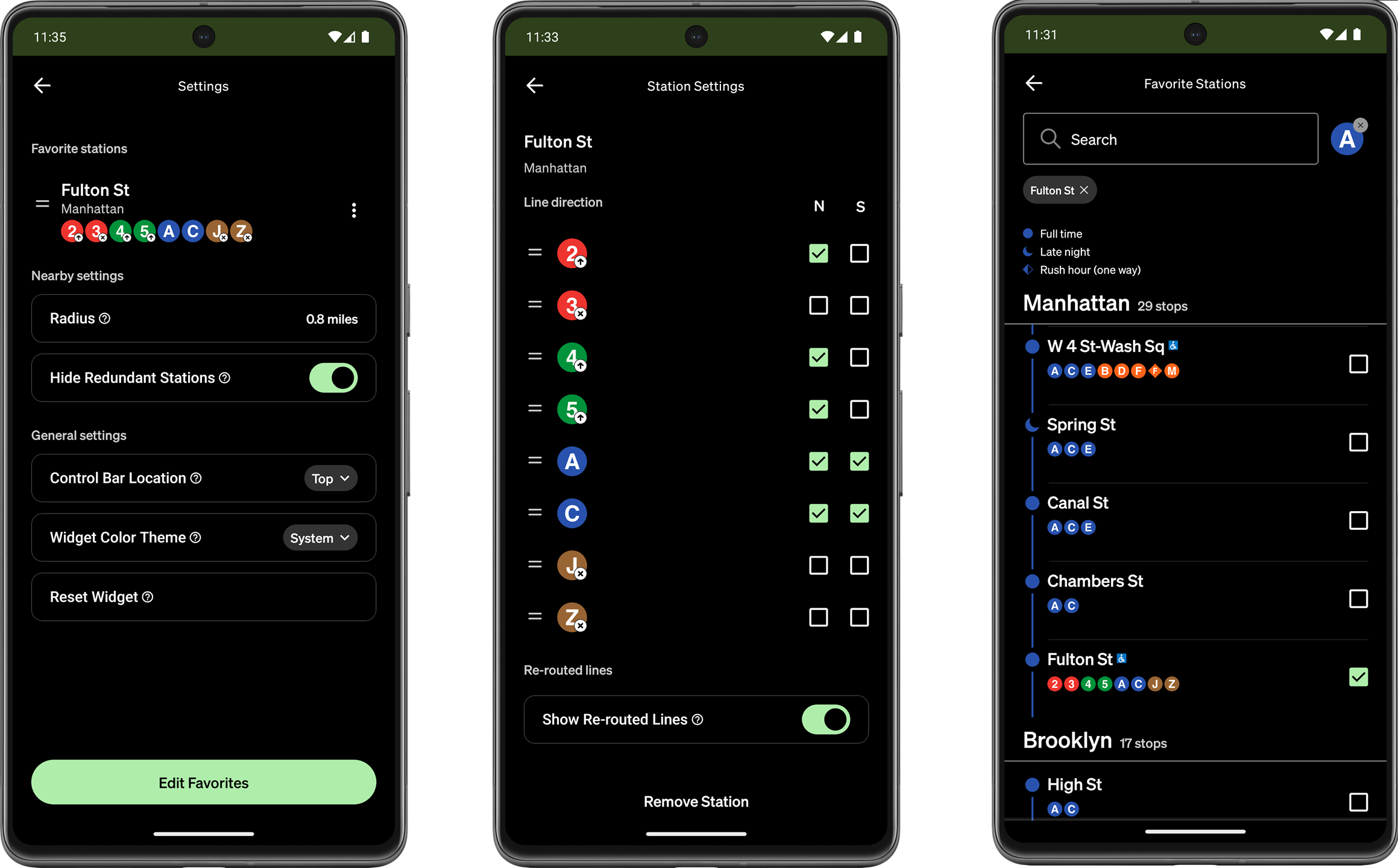
Application Settings – Widget Customization
Widgets can be set to display nearby train departures based on the user’s location, train departures for their favorite stations, or MTA updates (delay information). Most settings are straightforward to the average MTA rider, but there’s room for improving the wording of a convenient feature toggle: “Hide Redundant Stations”. When the user is close to multiple stations that serve the same line, this feature hides data for the stations further away. This improves discoverability of the intended line, but isn’t immediately clear. I would reword this to “Show All Nearby Stations”.
A user selected constraint I appreciate is that the widget can be set to only display one direction for a line; useful if your route isn’t always the same.