The app I chose to critique is Slack, similar to Discord, you may establish your own server and invite your friends to join; you may also publish important links or notifications inside your server so everyone can hear from you, whereas others are also welcome to shoot messages into your server so you guys can have chats. Inside the server, you may also set up multiple channels corresponding to different purposes, and you can also send members direct messages.
The reason I chose to research on it is because it is the communicating software my magazine company uses everyday, for example, in the photography channel we share our latest aviation photographs, in the general channel there are announcements, and in the editorial channel there are latest news shared which will be turned to articles by the editors.

I am going to identify 3 functions below for critiques:
- View Your Drafts
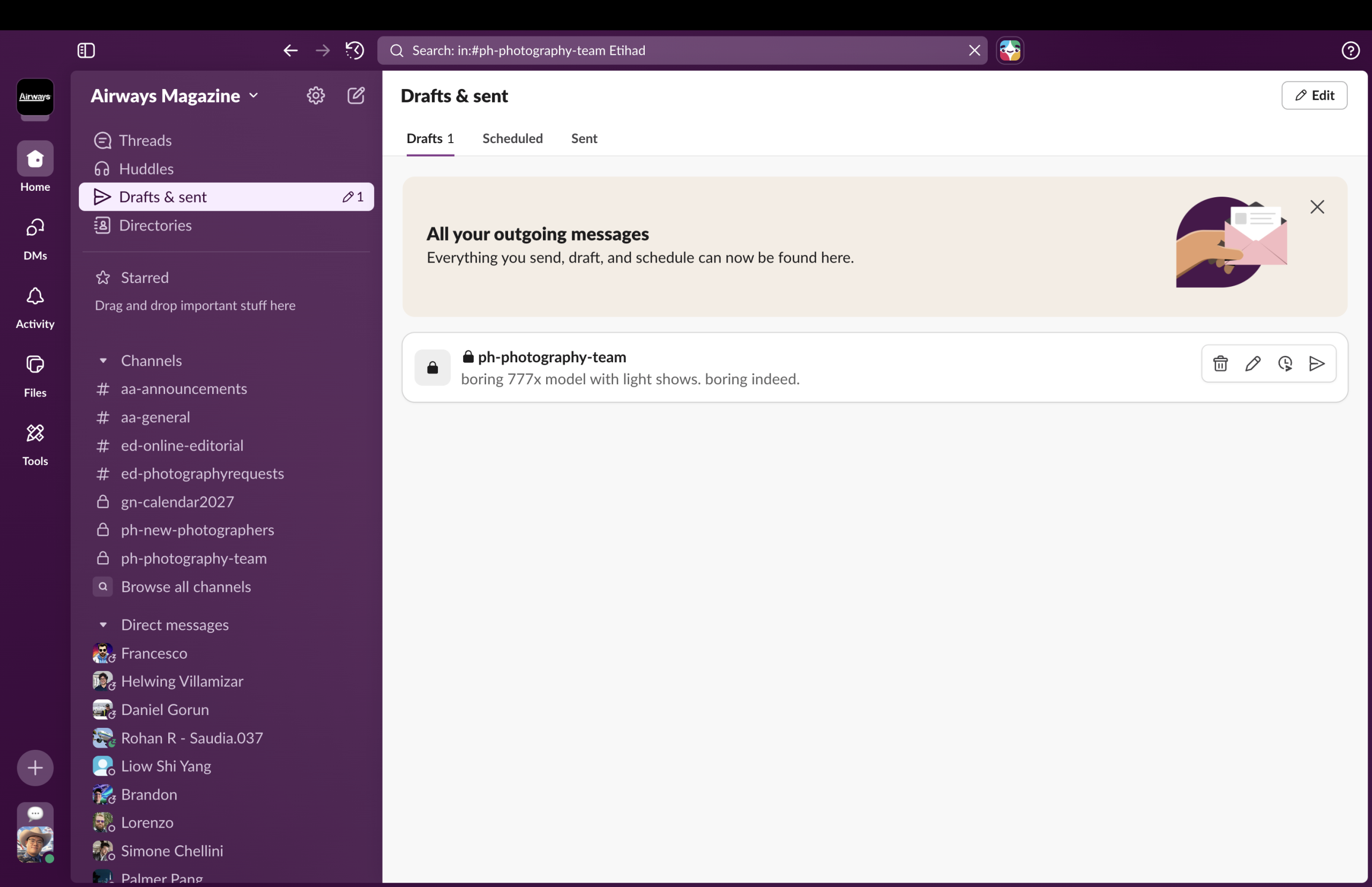
The discoverability of this function is good since above the purple background it uses white as the color of icon, creates a clear contrast that helps users immediately able to see the button, what’s more, next to the paper plane icon there is a pencil indicating whether you have drafts or not, and how many drafts do you have, and they can also be read immediately as they stand out on the purple background;
The affordances, however, is not quite good, since when people see the paper plane icon they might immediately think about “sending message” instead of checking for drafts, however the function there is called “Draft and sent” whereas the icon is only about sending messages, my suggestions will be the designer can move the pencil icon to the front TOGETHER with the paper plane icon so users can realize that function is about checking BOTH the sent messages and drafts.
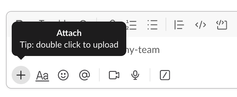
2. The Dialogue Box
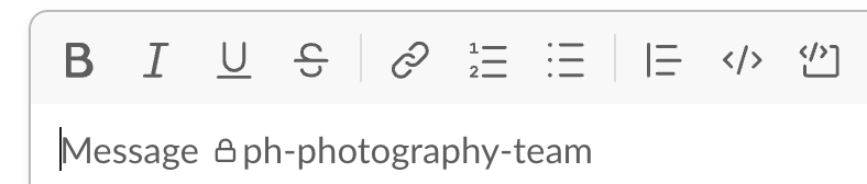
For discoverability, the dialogue box has an apparent dark grey border, users will immediately see there is a big box at the bottom of the app about something.
For signifiers, the buttons are labeled as clear grey texts meaning those are the places you should click to adjust text size, color, or so on; and the “type your message” part is also labeled with a huge text “Message” meaning you should type there.
The feedbacks is also convenient and quick, once you click the buttons there will be a direct change on your texts; for example, if you click “B” before you start typing, then you will begin to type bold texts right at the beginning, and if you want to select certain texts and change them to bold texts, you just need to select them and click “B”.
Last but not least, the mapping also does a good job, when you hover onto the plus sign meaning add documents, it will immediately pop up a widget reminding you that you should choose a document from your computer, hover above a button and get hint is a very natural flow to be considered.
3. Direct Messages
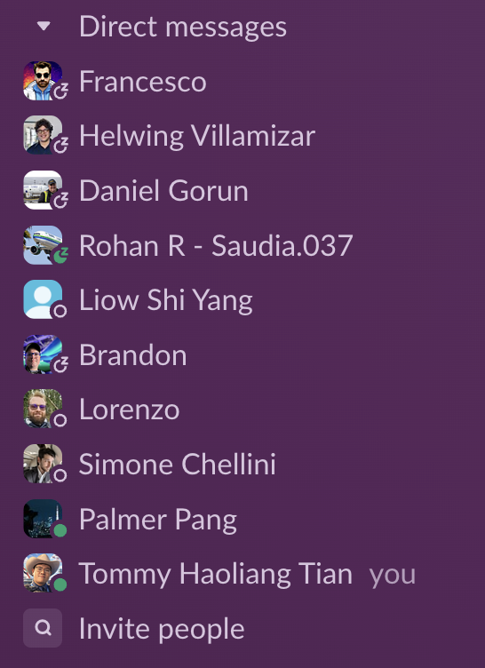
I will use constraints to analyze this part: this is a list of my collages that I have ways to directly contact, you will see some of them are labeled as green, means they are online, which means if you send messages to them now they might reply immediately and you don’t need to worry about whether they might feel quite bothered or not; however there are still people who labeled themselves as sleeping, so you will realize that you might not want to send them messages before they wake up.
In conclusion, Slack does a good job in the concepts of discoverability, signifier, mapping, and constraints, but it needs some improvements on affordances as some of the buttons are not labelled 100% precise.