
Introduction
Booking.com is a global online travel platform that allows users to search, compare, and book accommodations such as hotels, apartments, and vacation rentals. It also offers flights, car rentals, airport taxis, and travel experiences. The website is designed to help users quickly find and reserve travel services through a centralized search system, supported by reviews, pricing comparisons, and flexible booking options.
What works well
- Comprehensive review system with verified feedback builds user trust
- Clear service categorization in top-level navigation
- Consistent blue brand identity conveys reliability
What doesn’t work
- Visual information overload during first-time visits makes it difficult to quickly locate search functionality
- Promotional content interferes with primary task flows
- Insufficient affordance in certain interactive elements
1. Misplaced Priorities: Promotional Content Overwhelms Core Functionality
The credit card promotional banner consumes approximately 40% of above-the-fold screen real estate, significantly compressing functional areas. This design violates Norman’s “form follows function” principle, where user goals should supersede commercial objectives. The primary user intent is to search and book accommodations, not to apply for credit cards. Furthermore, this layout contradicts established information hierarchy principles. According to the F-pattern reading behavior, users’ visual attention naturally gravitates toward the upper-left quadrant and horizontal top section—areas currently dominated by promotional messaging. Consequently, the search functionality is pushed to a secondary position, requiring users to expend additional cognitive effort and time to locate core features.
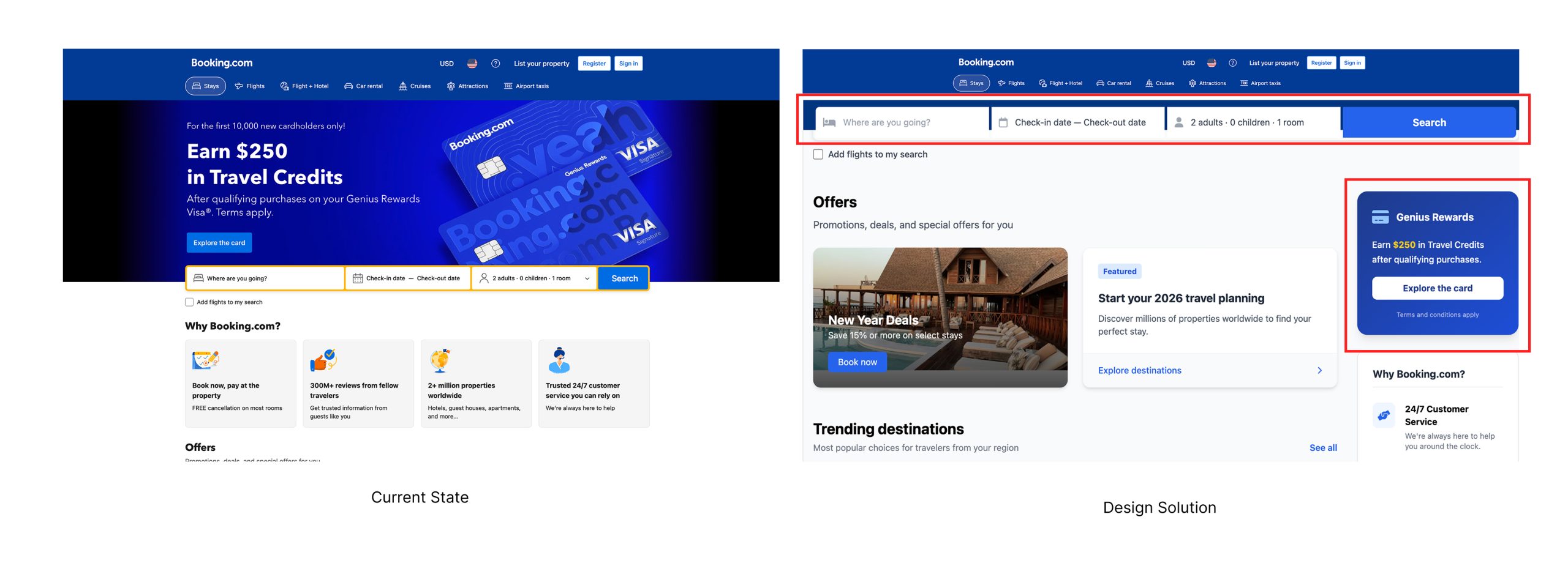
2. Improve the Details Interface
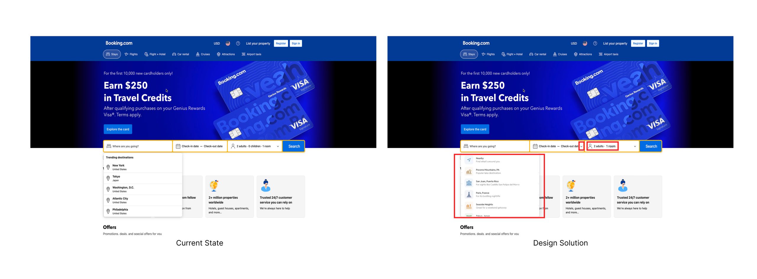
The interface exhibits poor affordance across multiple elements: the destination field displays as plain text without clickable indicators, date selection lacks visual interactivity cues, and the guest count selector omits standard visual signifiers such as dropdown arrows. Additionally, the conceptual model is flawed—displaying “0 children” violates the principle of showing only relevant information. When no children are included in the booking, this field should be hidden entirely rather than showing a zero value, which adds unnecessary cognitive load.
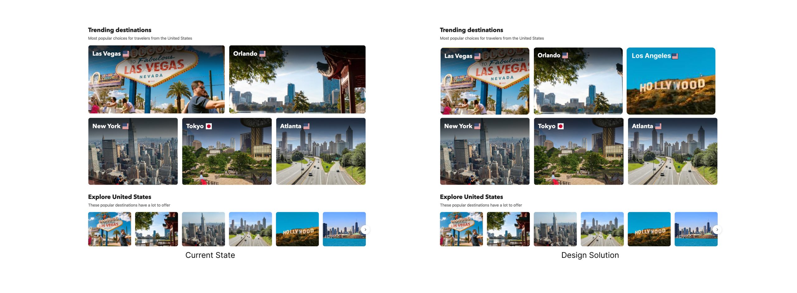
3. Consistency in Visual Hierarchy
Similar elements (all destination recommendations) should use consistent visual formats. Identical size and style create clear visual groupings, allowing users to immediately understand “these are options of the same category.”
Conclusion
Booking.com features clear navigation, strong brand recognition, a wide selection of accommodations, and a robust review system. Its unified color scheme aligns with users’ psychological expectations.
1.Structural Conflicts Between Business Goals and User Experience
Through an in-depth design critique of Booking.com’s homepage, I identified a fundamental tension: information prioritization conflicts with user objectives. This issue manifests across multiple interface layers, creating systemic usability challenges.
2.Restructuring Information Architecture
What requires adjustment is not a simple redesign or “deletion of business objectives,” but rather finding the optimal balance between user experience and business value—a systematic approach to problem-solving.
3. Design is not decoration, but a systematic methodology for addressing problems.
As Don Norman stated: “Good design is actually really hard to notice, great design is invisible.” The goal is to create seamless experiences where business objectives support rather than obstruct user goals.